WiP in WiP, post your screenshots!

chemelia

yndersn't
aa
May 11, 2014
406
619
more mutagen2 detailing

uVmxv0L.jpg

5JTAFlg.jpg
 

Uncuepa

aa
Oct 25, 2014
799
1,168
Well, decided I should actually show some screenshots this time before attempting an imp/ game day.

Here's some (semi) new geometry for koth_echelon:

http://imgur.com/a/6mfzb

Let me know what you think.

Tip: 2 minutes compiling is always worth it for the screenshots, its so hard to understand depth in hammer screenshots.

From what I can see, its all indoors. I tried an entirely indoors map once. Doesn't work. Ceilings and corridors make for really spammy and cramped gameplay space. I suggest ripping those roofs off, widening up those rooms.
 

Vel0city

func_fish
aa
Dec 6, 2014
1,947
1,589
If you want to see how it shouldn't be done, Junction.
 

Potada

L1: Registered
Jan 28, 2016
38
10
I appreciate all of the feedback so far. I'll try doing better screenshots in-game next time.
 

Crowbar

aa
Dec 19, 2015
1,455
1,298
imo indoor map is a theme decision not a gameplay one. So you can, like, have there a skybox in alpha and in beta decide for it to be like Hadal. And for sure it's bad when a general ceiling gets in the way of how it plays. Would also refer to Abyss and Hadal.
 

Idolon

they/them
aa
Feb 7, 2008
2,126
6,139
Thoughts?
design is really cool, roofs look really weird
I think the roofs look weird because the lower one appears to be intersecting through the volume of the taller building, which doesn't make sense. The second screenshot might be playing tricks on my eyes, but it looks like the lower roof is also sloped in multiple directions, which is really unusual.

I'd be interested in seeing what (if any) reference pictures this is based on, because the roof style is gonna depend a lot on the climate/culture. If there's not a lot of rain, shallow roofs with no hip/gable fit the bill just right. If this is higher income housing (or the climate is rainier) then steeper/nicer looking roofs are what you want.
 

Dragonisser

L1: Registered
Jul 12, 2014
37
18
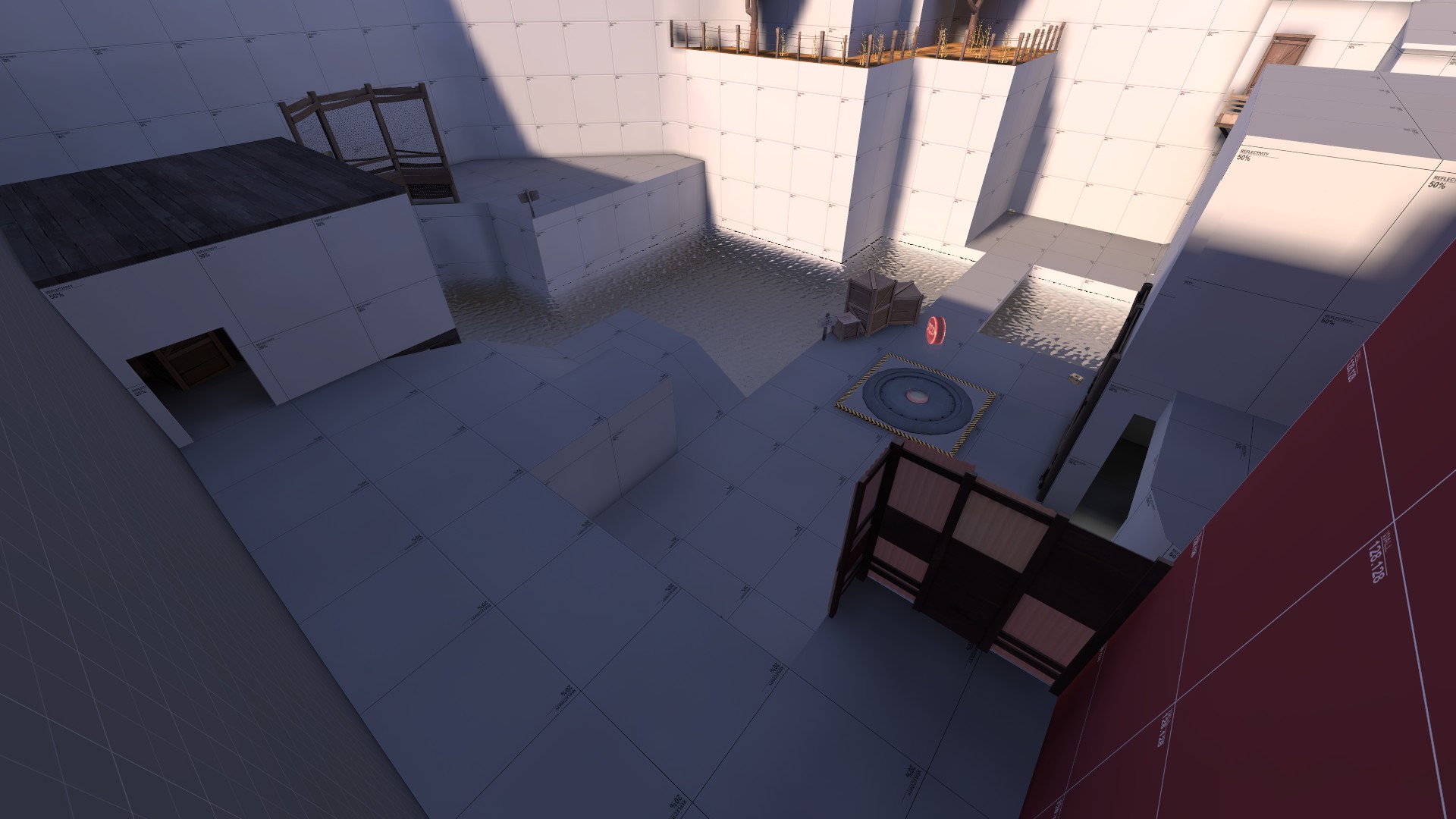
More pictures of a map i will probably never finish(working on it since 2-3 years i guess)

dFMxwne.png

ezL5SvF.png

Needs to be changed, dont like it at all how it is currently

jmtbRyb.png


And yes covers/crates/stones whatever is missing. Spawn door cant be sniped from the house on the right bottom since there are crates

3OhdoiC.png


At least the red spawn looks now better than last time as seen here:
https://tf2maps.net/posts/368917/


Some day i will finish it(ᶰᵒᵗ), which will maybe take some years.
 

14bit

L14: Bit Member
aa
Oct 5, 2014
669
2,134
I think it's been around a year since I started working on Holcan, and today I finally figured out some of the last few layout issues I've been having. Now I just have to finish the dang thing and seal it.

Here's the Hallway From Hell™ that was the largest issue. It looks simple now, but it was a pain trying to figure out how exactly it worked. It'll probably have to be rebuilt anyway.
a35cb9f073.jpg


Here's a yearly reminder of the intel room as well, I don't think anything has changed since last time I showed it off, but it still looks cool. There's supposed to be torch particles by @Exactol, but I didn't have them installed on this computer when I took the picture. Whoops. Tryin' to get those that few likes to reach veteran, don't judge me!
1e4c1fb647.jpg


I want to try and make more time for mapping, but you know, college and stuff.
 

nesman

master of fast travel
aa
Jun 27, 2016
1,503
1,294
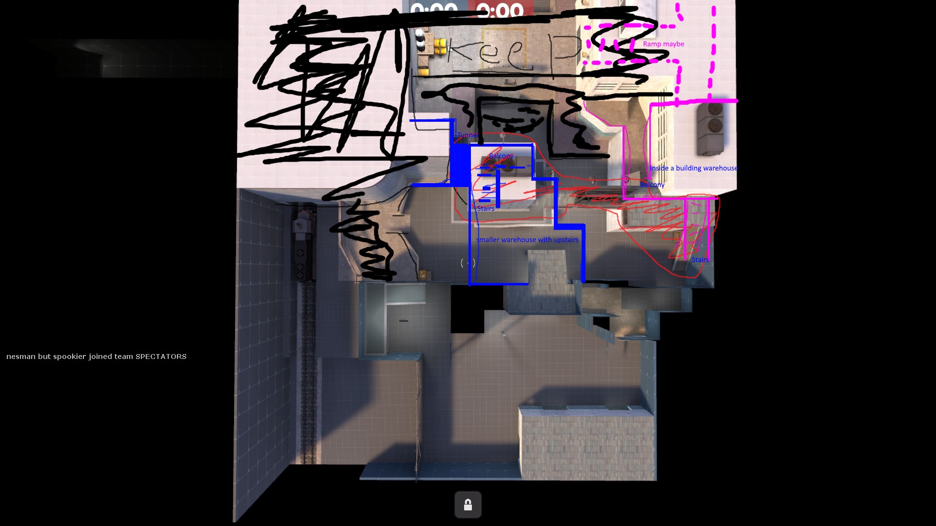
wWET2Pe.jpg


My crazy notes and sketch of the areas I want to redesign asap. Im not sure about the ramp maybe area. It would have the door on mid be used to get to the raised pink sections on both teams. Thoughts? Alligator suggested the blue area and it solves some issues I was running into. Red is removed, Blue/pink is new. Black is keeping.