WiP in WiP, post your screenshots!

SnickerPuffs

(*single chuckle*)
aa
Apr 10, 2014
1,325
1,866
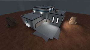
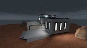
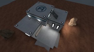
I tried converting the C building on Gravelpit to a Gorge-like style. I haven't added any lights yet, besides the env_light.

How well did I do?

20161030005516_1.jpg
20161030005620_1.jpg
20161030005613_1.jpg
20161030005545_1.jpg
20161030005554_1.jpg
 

ммα | ∂αиỉєℓ

L2: Junior Member
Feb 10, 2015
65
31
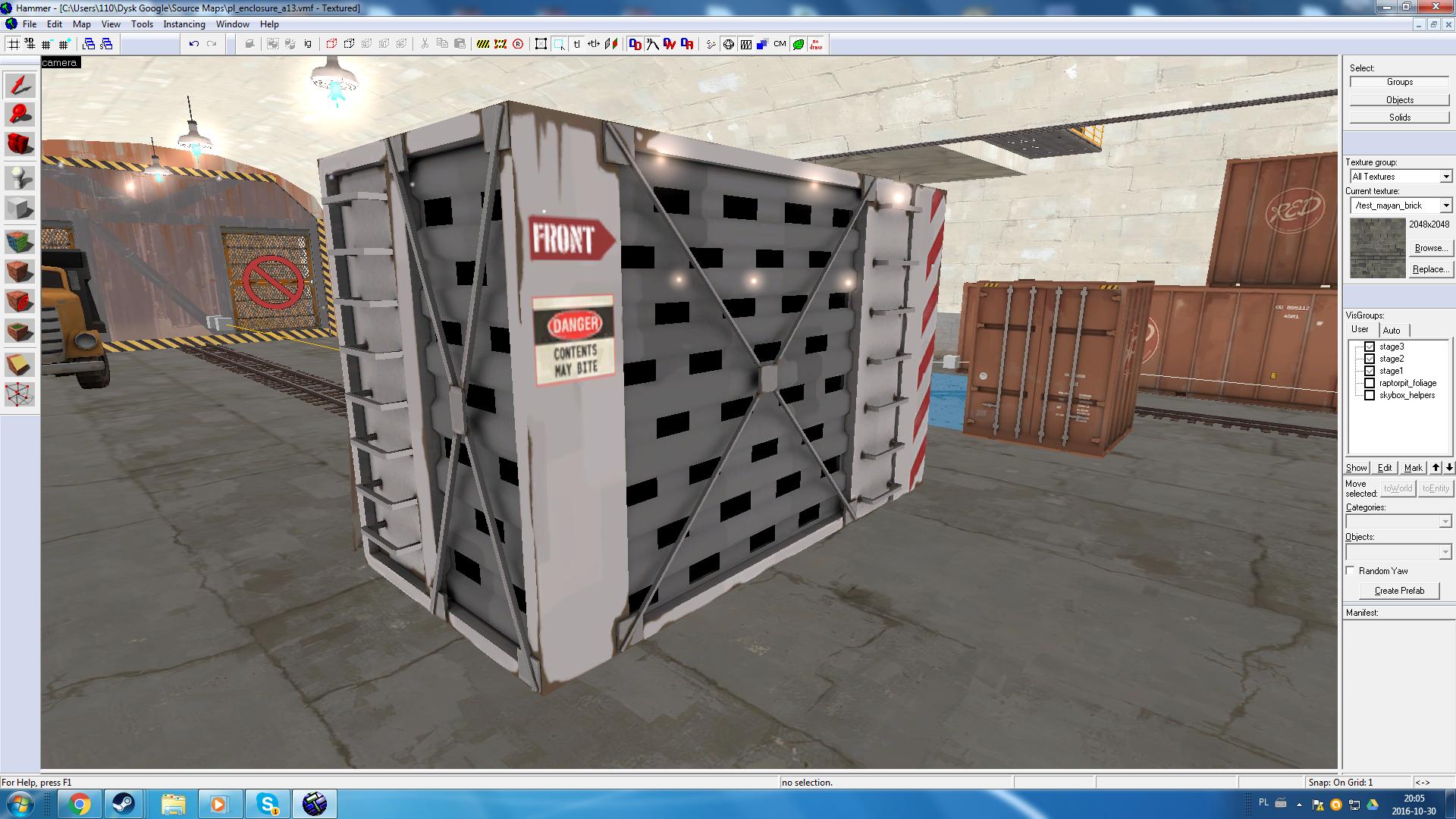
Making cages/kennels for pl_enclosure
Small variant (48w 96l 64h)
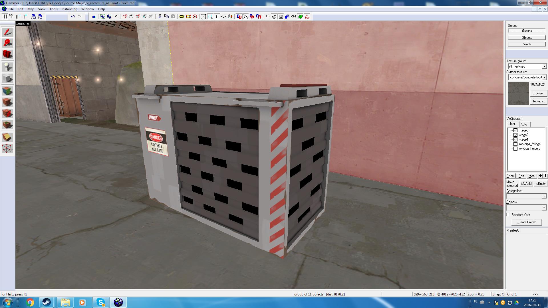
yEwNxyg.jpg

Large variant(128w 256l 160h):
pRUWbVe.jpg

Just wondering, are you going to add dino sounds and maybe some breath to indicate that there are some dinos in there like in opening scene from Jurassic Park? Gives a bit more life to the map I think. Anyways keep up the amazing work man.
 

CriminalBunny

Lasers are just deadly rainbows
aa
Oct 11, 2013
273
413
Just wondering, are you going to add dino sounds and maybe some breath to indicate that there are some dinos in there like in opening scene from Jurassic Park? Gives a bit more life to the map I think. Anyways keep up the amazing work man.
Making the cages shake a bit from time to time would be a nice touch!
 

AsG_Alligator

qhull precision error
aa
Aug 5, 2016
620
1,223
Just wondering, are you going to add dino sounds and maybe some breath to indicate that there are some dinos in there like in opening scene from Jurassic Park? Gives a bit more life to the map I think. Anyways keep up the amazing work man.

Most of these are supposed to be empty (these cages are replacements for those generic red shipping containers i have scattered around the map)

Plus those cages are meant for transporting things, not storing them.
 
Last edited:

AsG_Alligator

qhull precision error
aa
Aug 5, 2016
620
1,223
So I;ve added an additional exit from blu spawn in stage 1:
upload_2016-10-31_21-13-26.png

But im not too happy with it.
I may toss out that rock pillar in favor of an arch leading over the river, but im not sure yet.

Suggestions?
 

Moonrat

nothing left
aa
Jul 30, 2014
932
585
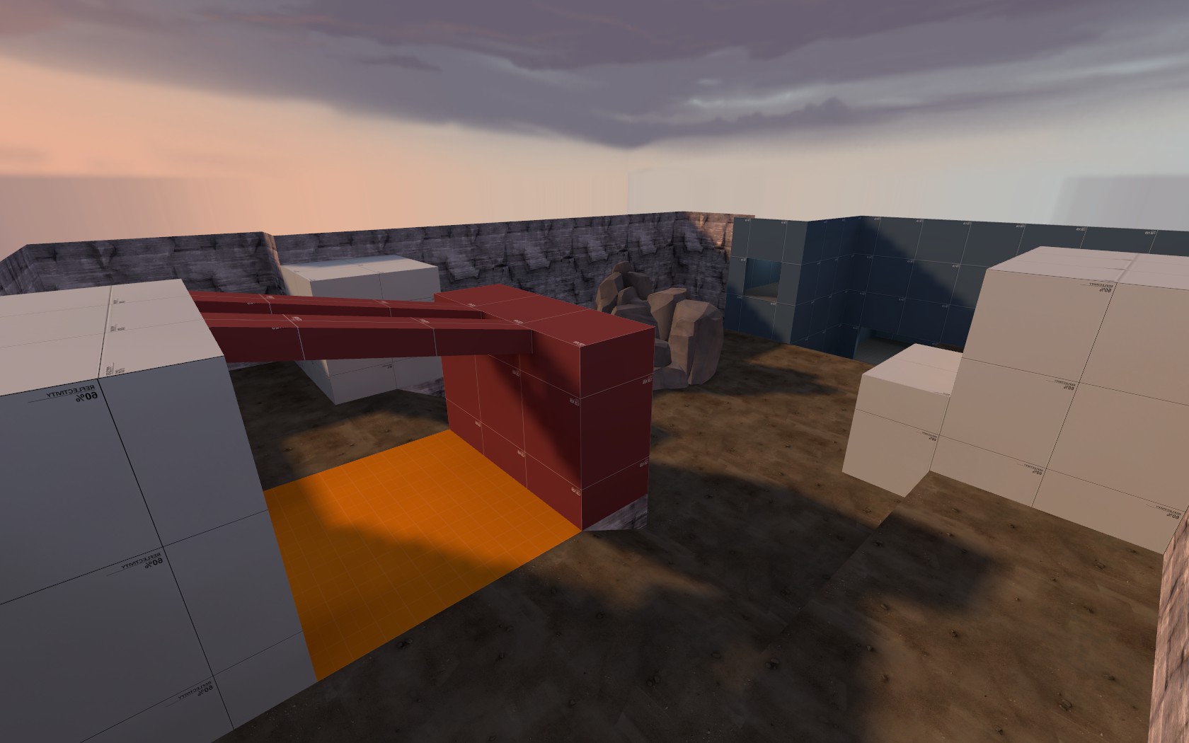
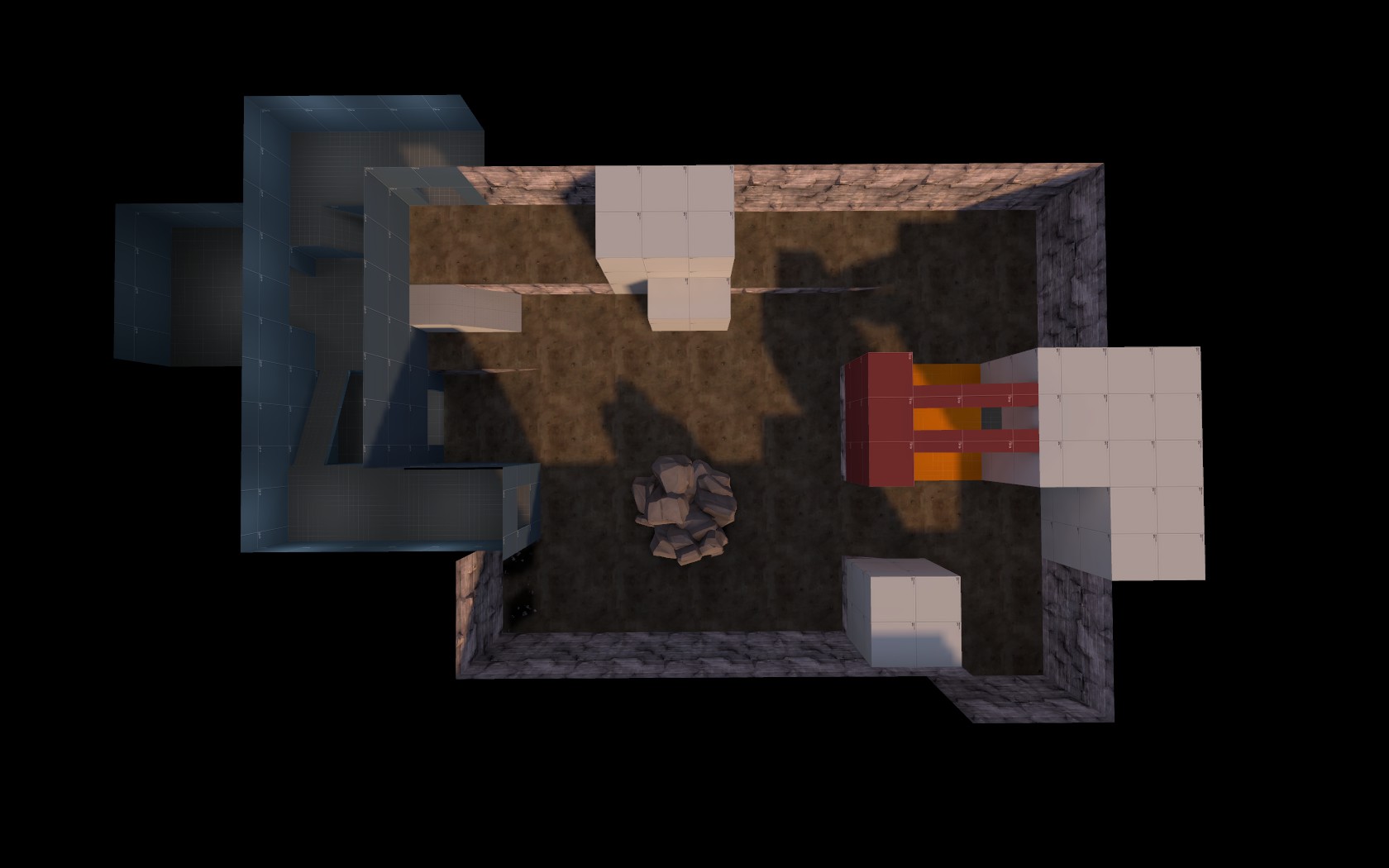
Haven't mapped for about 3 months now, so I am making a 2-cp A/D because I don't know any better.

OH2XTiU.jpg

qaGIYGR.jpg


I don't know what to do after the first point right now, so I'm going to keep whacking at it.
 

Tutankabron

L1: Registered
Feb 23, 2013
27
49
Actually I have been here more or less like four years, but I only write once in a while, and I'm that awful at designing real playable maps that I only post random detailling stuff here and there :p
 

nᵗʰSonata

Takes way to long to make and update maps
aa
Jun 11, 2015
433
436
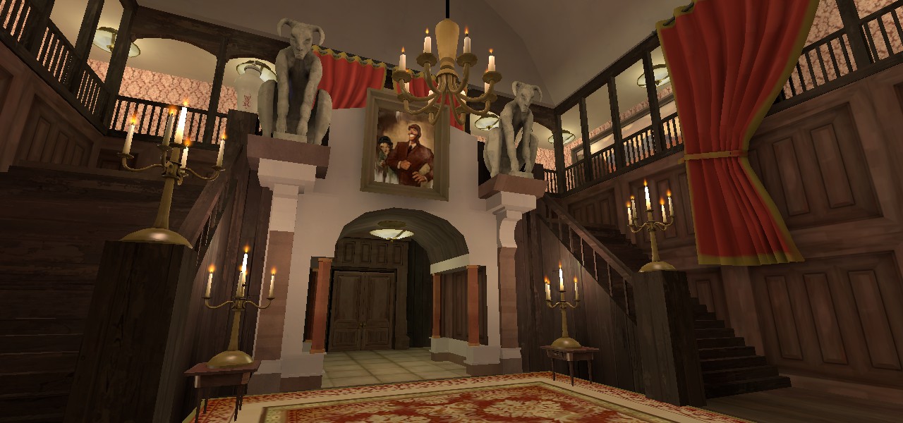
Well, we are still (kinda) on that time of year, so here you have a bit of detailling practise:

A few tips: it looks like the texture on the handrailings is misaligned, remember to use Alt+right click to align it to the face. (Here's a tutorial in case you didn't know how to do that.) I also think that the wood texture on the side of the stairs should be rotated 90 degrees, making it horizontal (just my personal opinion). And it would seem as if the carpet is underneath some of the wood posts at the side of the stairs; I would recommend placing it as an overlay instead of texturing the brush with it; that way you could also rotate it slightly to make it look more realistic. These are all just little nitpicks though, looks great!
 

Tutankabron

L1: Registered
Feb 23, 2013
27
49
A few tips: it looks like the texture on the handrailings is misaligned, remember to use Alt+right click to align it to the face. (Here's a tutorial in case you didn't know how to do that.) I also think that the wood texture on the side of the stairs should be rotated 90 degrees, making it horizontal (just my personal opinion). And it would seem as if the carpet is underneath some of the wood posts at the side of the stairs; I would recommend placing it as an overlay instead of texturing the brush with it; that way you could also rotate it slightly to make it look more realistic. These are all just little nitpicks though, looks great!

Thanks for the input, I forget to align the handrail, but thanks for the reminder anyway. About the stairs, I think the most logical way to build it would be cutting the wodden planks vertically, instead of horizontally as you suggested.

I already noticed the rug while I was working with it. Some mansions cut their biggest carpets sometimes when they don't fit with the house ornamentations, so I suppose that can be an excuse. Also, it is a prop, not a textured brush. I don't remember any tf2 carpet overlays that are not that two green and red manor textures.

Thanks for the help anyway
 

nᵗʰSonata

Takes way to long to make and update maps
aa
Jun 11, 2015
433
436
If you want to resize the rug, you could make it a prop_dynamic and change the Scale field to something like 0.75 ( although it doesn't show up with the changed scale in the editor).
 
Aug 30, 2015
359
451
Do you have a plan to vote? NOTHING IS MORE BADASS THAN BEING CIVICALLY RESPONSIBLE!

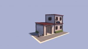
Anyway, here's pictures of a shitty modern style house I made for a class
20161101201836_1.jpg 20161101201847_1.jpg 20161101201852_1.jpg
 
Last edited: