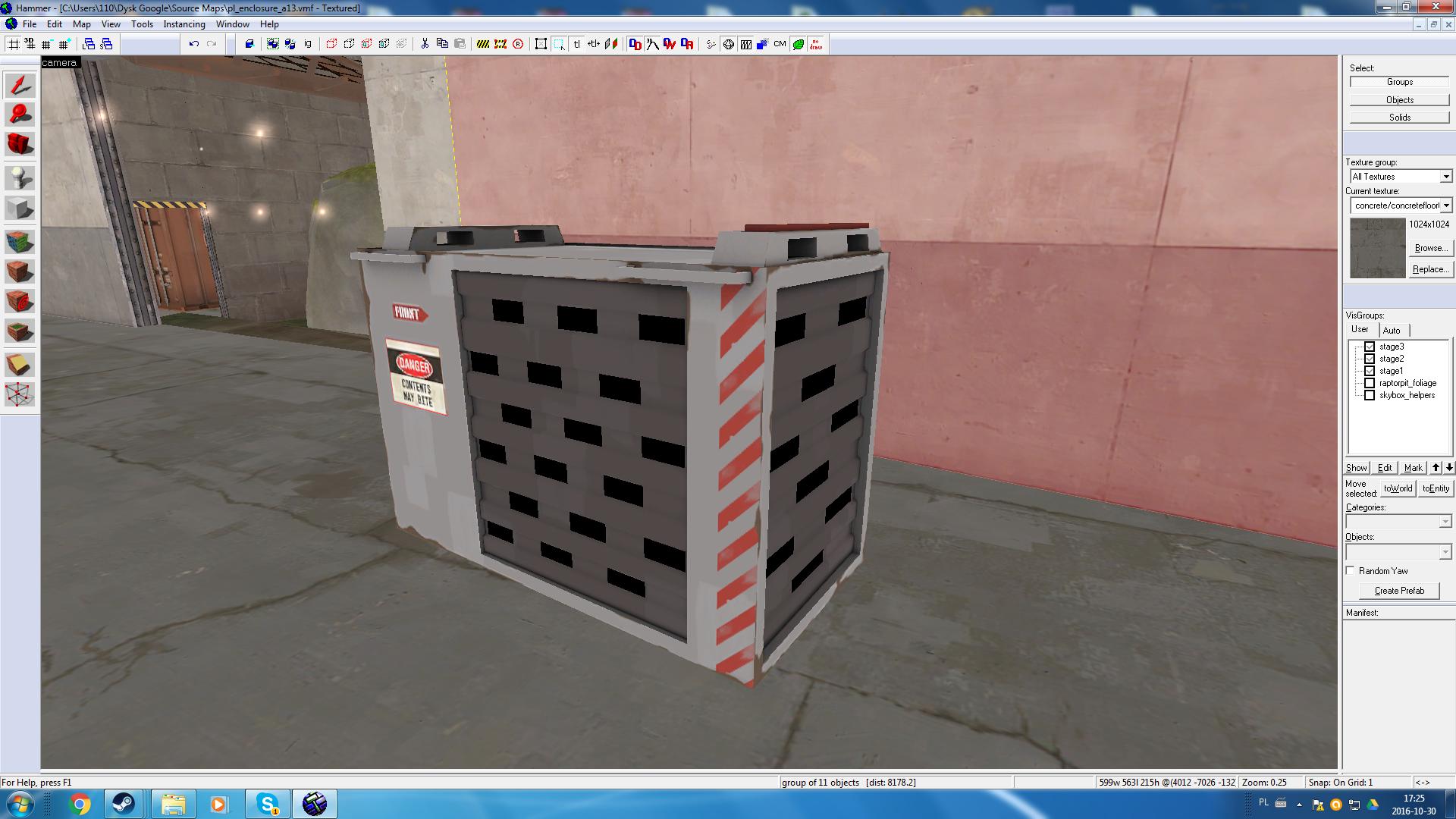
i did not know dustbowl looked like that, the map will be an industrial themeSo, you are remaking Dustbowl
WiP in WiP, post your screenshots!
- Thread starter Arhurt
- Start date
You are using an out of date browser. It may not display this or other websites correctly.
You should upgrade or use an alternative browser.
You should upgrade or use an alternative browser.
i did not know dustbowl looked like that, the map will be an industrial theme
I think he was joking about your second picture, which had Dustbowl in the background
You could probably get away with hiding the edges of the aviary behind cliffs, rather than attempting to connecting it all together.Thats how aviary looks in-game:

I'll have to fiddle with cliffs around this area cause the model doesnt really fit well with them (and it looks weird with map-skybox render order).
Still gotta work on the lighting and that interesting snow texture, but I'm actually getting stuff done.
You could probably get away with hiding the edges of the aviary behind cliffs, rather than attempting to connecting it all together.
In certain places I got skybox-map blending looking pretty good:
In others... Not so much (ignore lighting of the treecards)
Mmmmm. The only things I could think of is either moving back the aviary in that area, which I doubt you want to do. Or if you just changed the rock wall to the same concrete structure as that blended area. It'd probably look better without sacrificing any gameplay.In certain places I got skybox-map blending looking pretty good:

In others... Not so much (ignore lighting of the treecards)

I would go with much thinner beams, these thick beams dont realy fit well, especialy since they get wider near the sides. A straight thinner beam (see the width at the center) would look alot better.I would also try to get the cross sections better since those fences dont realy do well (i would expect a few support beams with those aswel, the transition from very thick to very thin happens too fast). And lastly i would even expect some diagonal supports. All those show some stronger structure but should visualy block less.Thats how aviary looks in-game:

I'll have to fiddle with cliffs around this area cause the model doesnt really fit well with them (and it looks weird with map-skybox render order).
Also, i would try to lower the displacements near the center. For birds you would want to prefer a much larger space for them to fly and atm it looks rather small. Closer near the edge a higher wall makes more sense to somewhat hide the part that its an aviary, and to hide its supports there.
I would also look at this (unless you dont want mgs5 spoilers):
Start at 0:23
View: https://www.youtube.com/watch?v=lbMI554TWWE
This already shows the height of an aviary (And it also has a bowl shaped top)
This already shows the height of an aviary (And it also has a bowl shaped top)
Hopefully it can inspire you
My problems making an underwater map!
working with lights! scary...but not pitch black.

good looking water!...hmmm, needs more bubbles.

Art Deco! is really hard to work with in this game...I CAN'T SEE IT!!!!

last...but not least...working around sky boxis.

what do you think? it is obviously a BioShock map.
working with lights! scary...but not pitch black.
good looking water!...hmmm, needs more bubbles.
Art Deco! is really hard to work with in this game...I CAN'T SEE IT!!!!
last...but not least...working around sky boxis.
what do you think? it is obviously a BioShock map.
i understand, the map is very far from done so i am more focusing on just the lightingA map should always be as bright as if its outside at daytime. No excuse.
I'm really iffy on the red grain elevator texture you have all over the walls. I think you might want to change it something else, but then again, I have yet to see the lighting for the map. Lighting could fix it quite a bit, but I'll reserve such judgements until you compile it.
Am I still relevant?

Am I still relevant?
A good way to make wooden detailing look good is to think about the alignment of the wooden planks on the texture. Angle them so they would logically have planks in that direction. To use some of my detailing as an example:

I used vertical beams on corners and horizontal beams to segment each layer of the building to make it look like it's actually behing held up.
The ordinary walls use vertical planks and for angled pieces of wood use the alt+m2 technique with the
I tried converting the C building on Gravelpit to a Gorge-like style. I haven't added any lights yet, besides the env_light.
How well did I do?
How well did I do?


