TF2M Migration Requests
- Thread starter nesman
- Start date
You are using an out of date browser. It may not display this or other websites correctly.
You should upgrade or use an alternative browser.
You should upgrade or use an alternative browser.


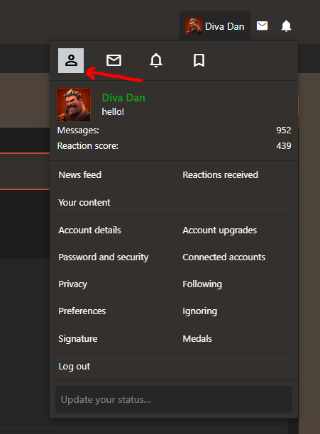
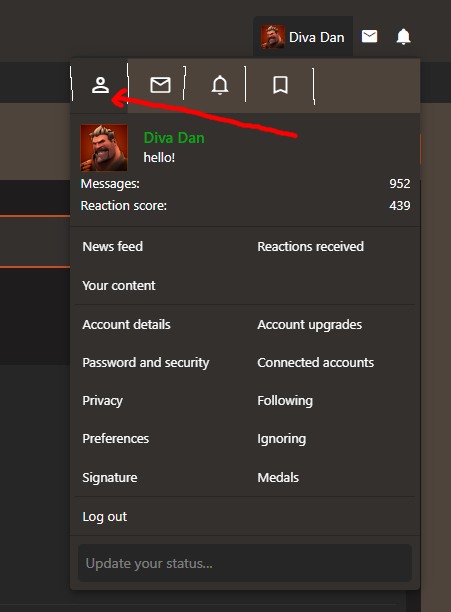
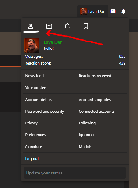
I would like if this element became highlighted to show that it represents a tab you are currently on, i originally tried clicking it thinking it would take me to my account profile (a button for this would be nice so i dont have to just click the username), heres some quick ideas of how it could maybe be designed?
Last edited:
- Sep 10, 2016
- 573
- 435
Reactions Given
Similar to the "Reactions Received" page in "Your Account", this would be a quick shortcut to all the posts you've given a rating to.
It would be useful in a similar sense to bookmarking useful posts, but with the ability to filter by the rating you gave the post (which Reactions Received already seems to have the technology for), as well as buttons to sort by date posted and date you gave it the rating (ascending or descending).
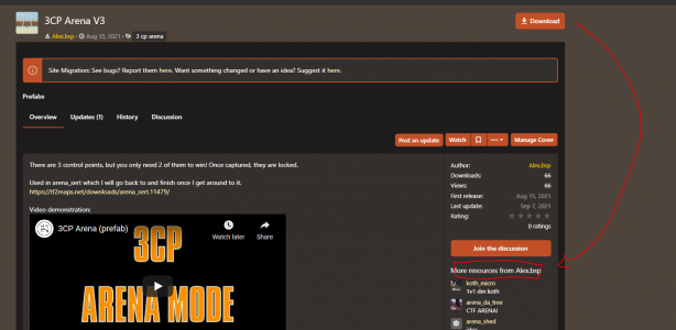

download page image carousel is nonexistant - it now looks like a stripped-down discussion page. reintroducing the carousel back up above the description and with a big shiny Download right below it like the old layout would be stellar. alex.bsp has already pointed out that the current download button location is way out of the way
download page image carousel is nonexistant - it now looks like a stripped-down discussion page. reintroducing the carousel back up above the description and with a big shiny Download right below it like the old layout would be stellar. alex.bsp has already pointed out that the current download button location is way out of the way
Welcome to the 2022 TF2Maps.net redesign!
Welcome to the new TF2maps.net! We've been hard at work the past few months on a major site upgrade, and it's finally here! While things might look a bit different, rest assured all the TF2maps.net content you know and love is still here. While much of the transfer was seamless, this was a big...
Yes. The data is all there we just need to insert it into the native system correctly.I was going to ask if all our favorite reaction options would be returning, but it looks like that might be a work in progress already?

I've been looking into this and it seems this is something xenforo has to change. Which sucks mega big time.
Done. Let me know what else breaks when I change that coloring.
Yes we just need to merge that data since Xenforo built their own system. Soon:tm:I was going to ask if all our favorite reaction options would be returning, but it looks like that might be a work in progress already?
This might be fixed when we migrate that data? Not sure entirely.Reactions Given
I think this has to do with XFA covers. Does this button work better or do I need to dive into the templates?
I agree that's kind of dumb. However, this is deep in the XenForo code something I don't have a ton of control over but I'll try to find it.When clicking on "Your ressources" or "Team ressources" it makes you leave the user profile. I think it's better to be still in the profile of the user after clicking those buttons
Everything on the site is now presented with equal visual importance and I don't think that's a good change compared to the old site theme
the sidebar content grabbing my eye with the exact same importance as buttons and headers makes the information feel overwhelming despite being the same information as always
idk if its possible but i liked how icons and images used to look before, but with the new site version everything just seems so small, making it feel like 80% of the site space consists purely of text. Idk I like to look at things rather than read them lol
Lonely Author
L2: Junior Member
- Aug 27, 2021
- 87
- 42
could you tweak the alerts so it can tell the difference between a map update and a model/recourse update pretty please?
- Jun 22, 2017
- 102
- 146
I didn't know it had to do with covers so I don't mind the button being there, but I personally would move it in case someone doesn't have a cover for their download.I think this has to do with XFA covers. Does this button work better or do I need to dive into the templates?
Comes from internet security principles - one of which is that persistent sessions should only last for 30 days before you should have to input an authentication factor again.
New website and 2FA still only trusts for 30 days? This was a complaint i had about the old site and it never got addressed.
the resource team tab or whatever should be public to everyone, that way it acts as a list of collaborators/contributors. also give me the ability to take away the ability to edit the download to certain members of my resource team, reason i want this ability is because if the team becomes public i would use it more as a contributors list so i don't want to give the ability to edit my download to someone who wasn't directly involved with it and just made a model or something i downloaded from the site for instance.
Out of our control unfortunately. Make a feature request to Xenforo.the resource team tab or whatever should be public to everyone, that way it acts as a list of collaborators/contributors. also give me the ability to take away the ability to edit the download to certain members of my resource team, reason i want this ability is because if the team becomes public i would use it more as a contributors list so i don't want to give the ability to edit my download to someone who wasn't directly involved with it and just made a model or something i downloaded from the site for instance.
Aulli
L4: Comfortable Member
- Jul 28, 2012
- 188
- 204
I really like the new prominence of updates/changelogs posts, if you already know a map this is very relevant information to be displayed up front. however, the text itself cuts off so short that it's basically useless. I don't think allowing much more text, maybe even two or three lines, would be unreasonable.
Maybe even an expandable box for the latest three, it's not like there's anything below that this would bloat, though if you did that I think the read more button should be moved up to or near the header.
Also on that note, maybe expandable boxes in the updates page in general, As when changelogs start getting large and including images it's very cumbersome to actually sift through to find something.
Maybe even rolling history and updates into one would be reasonable with that, when I want to look through versions of a map to find specific one I tab back and forth between these two pages anyways.
Last edited: