


It was set to 100 char limit so I bumped it up to 250. Making expandable boxes is pretty cumbersome and risky as I'm editing the template directly and that can have unforeseen consequences on other parts of the site.
TF2M Migration Requests
- Thread starter nesman
- Start date
You are using an out of date browser. It may not display this or other websites correctly.
You should upgrade or use an alternative browser.
You should upgrade or use an alternative browser.


The "Okay" and "Delete" buttons on the prompt for uploading and adjusting profile banners blend into the header background on TF2Maps Light and are really hard to see. Would help if they were darker or just gray/black.

Highlighting messages on TF2Maps Light causes them to have a light gray highlight, making it hard to see what I'm highlighting over.

The link text in announcements on TF2Maps Light is also somewhat hard to see against the white.

Highlighting messages on TF2Maps Light causes them to have a light gray highlight, making it hard to see what I'm highlighting over.
The link text in announcements on TF2Maps Light is also somewhat hard to see against the white.
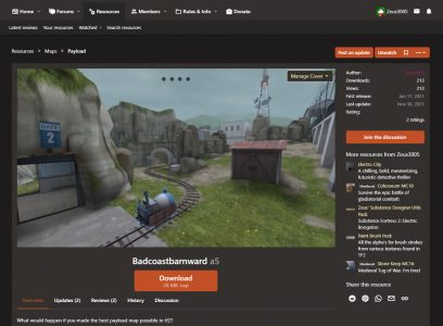
the download page image carousel has a bunch of stuff overlaid over the screenshot, which both:
- obstruct viewing the screenshot
- is kind of difficult to read overlaid over the image anyway
- has a 1:1 cropped thumbnail to the left? why's that there?
- swipes to the side with the image when the carousel cycles?
the information displayed here is small enough to fit alongside the rating and watch buttons.
also, another bug, the full-size image embed that gets inserted when you paste an image into a post can't be removed in the default post editor if it's right at the end. like this one.
the download page image carousel has a bunch of stuff overlaid over the screenshot, which both:
- obstruct viewing the screenshot
- is kind of difficult to read overlaid over the image anyway
- has a 1:1 cropped thumbnail to the left? why's that there?
- swipes to the side with the image when the carousel cycles?
the information displayed here is small enough to fit alongside the rating and watch buttons.
also, another bug, the full-size image embed that gets inserted when you paste an image into a post can't be removed in the default post editor if it's right at the end. like this one.
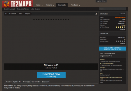
The download page is what we get out of the box with the Resource Manager plugin.
Attached is a mockup i did on our dev site of the changes I'd like to make to the download page. This is very close to what the old site looked like. Making changes to this kinda stuff is moderatly difficult so i'd like to get what we want before i do anything
I'm open to feedback. Feel free to DM me on discord or send me a photoshopped image
Attachments
The "Okay" and "Delete" buttons on the prompt for uploading and adjusting profile banners blend into the header background on TF2Maps Light and are really hard to see. Would help if they were darker or just gray/black.
Highlighting messages on TF2Maps Light causes them to have a light gray highlight, making it hard to see what I'm highlighting over.
The link text in announcements on TF2Maps Light is also somewhat hard to see against the white.
The light theme has not been given much love or attention; basically its just minimally usable. We will work on it when we dont have so many other issues to attend to.
- Sep 29, 2018
- 249
- 558
couple small suggestions
- the notification icon should turn red as before, not just get a tiny red dot next to it
- on the homescreen, maybe have user information show up faster when hovering over an icon? checking birthdays takes much longer now that i need to wait a second to see each persons name
- a button to quickly access your own resources from the homescreen would b super nice too
We dont have control over how fast the hover popup happens, but if you click their name it comes up immediatelycouple small suggestions
- the notification icon should turn red as before, not just get a tiny red dot next to it
- on the homescreen, maybe have user information show up faster when hovering over an icon? checking birthdays takes much longer now that i need to wait a second to see each persons name
stellar.The download page is what we get out of the box with the Resource Manager plugin.
Attached is a mockup i did on our dev site of the changes I'd like to make to the download page. This is very close to what the old site looked like. Making changes to this kinda stuff is moderatly difficult so i'd like to get what we want before i do anything
I'm open to feedback. Feel free to DM me on discord or send me a photoshopped image
Call_Me_Meme
L1: Registered
- Apr 21, 2018
- 41
- 7
It feels like that there's some wasted space on the redesign, even ignoring the temporary site migration banner? It'd be nice to se the top of the Latest Downloads section without having to scroll down.

It would also be nice to see the "Members Online" box moved up a bit, like in this mockup below:

Also, would it be possible to add the playtesting server info back to the Homepage?
It would also be nice to see the "Members Online" box moved up a bit, like in this mockup below:
Also, would it be possible to add the playtesting server info back to the Homepage?
We could prob move the ad below the featured downloads partIt feels like that there's some wasted space on the redesign, even ignoring the temporary site migration banner? It'd be nice to se the top of the Latest Downloads section without having to scroll down.
It would also be nice to see the "Members Online" box moved up a bit, like in this mockup below:
Also great suggesiton, we will totally move the members online above the ad.
Just know that the majority of our revenue we use for hosting comes from ad's we run on the forums.
Also, would it be possible to add the playtesting server info back to the Homepage?
Ad's have been moved as per @Call_Me_Meme's suggestion, as well we tried making them present better on mobile
Resources teams should now be publicly viewablethe resource team tab or whatever should be public to everyone, that way it acts as a list of collaborators/contributors. also give me the ability to take away the ability to edit the download to certain members of my resource team, reason i want this ability is because if the team becomes public i would use it more as a contributors list so i don't want to give the ability to edit my download to someone who wasn't directly involved with it and just made a model or something i downloaded from the site for instance.
How do you mean?Would be cool if Featured Downloads distinguished between maps and resources in some way

just some kind of visual difference or category separation for Other Resources among the Maps in Featured ResourcesHow do you mean?
On the old forum, the preview pictures for downloads were visible right in the thread's first post; now there's just a tiny thumbnail that's not even clickable. In fact, I think that feature also went AWOL the last time we migrated to a new forum engine and had to be recreated, and I was the one who brought it up then too.
in the birthdays tab hovering over users shows their entire user profile which makes the information you actually want to see (the birthday!) harder to find
i can click on them if i wanna see the whole profile! i just wanna see their age/birthday info!
i can click on them if i wanna see the whole profile! i just wanna see their age/birthday info!