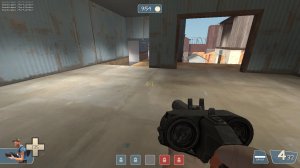
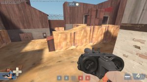
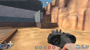
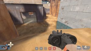
Reckoner uses red and yellow, and uses blue and green as pairs.Well, it is inspired by reckoner
WiP in WiP, post your screenshots!
- Thread starter Arhurt
- Start date
You are using an out of date browser. It may not display this or other websites correctly.
You should upgrade or use an alternative browser.
You should upgrade or use an alternative browser.
For the curious: Piet Mondrian's most famous paintings (amongst others) were a part of the De Stijl art movement, of which there is, to my knowledge, only one building built in the style:
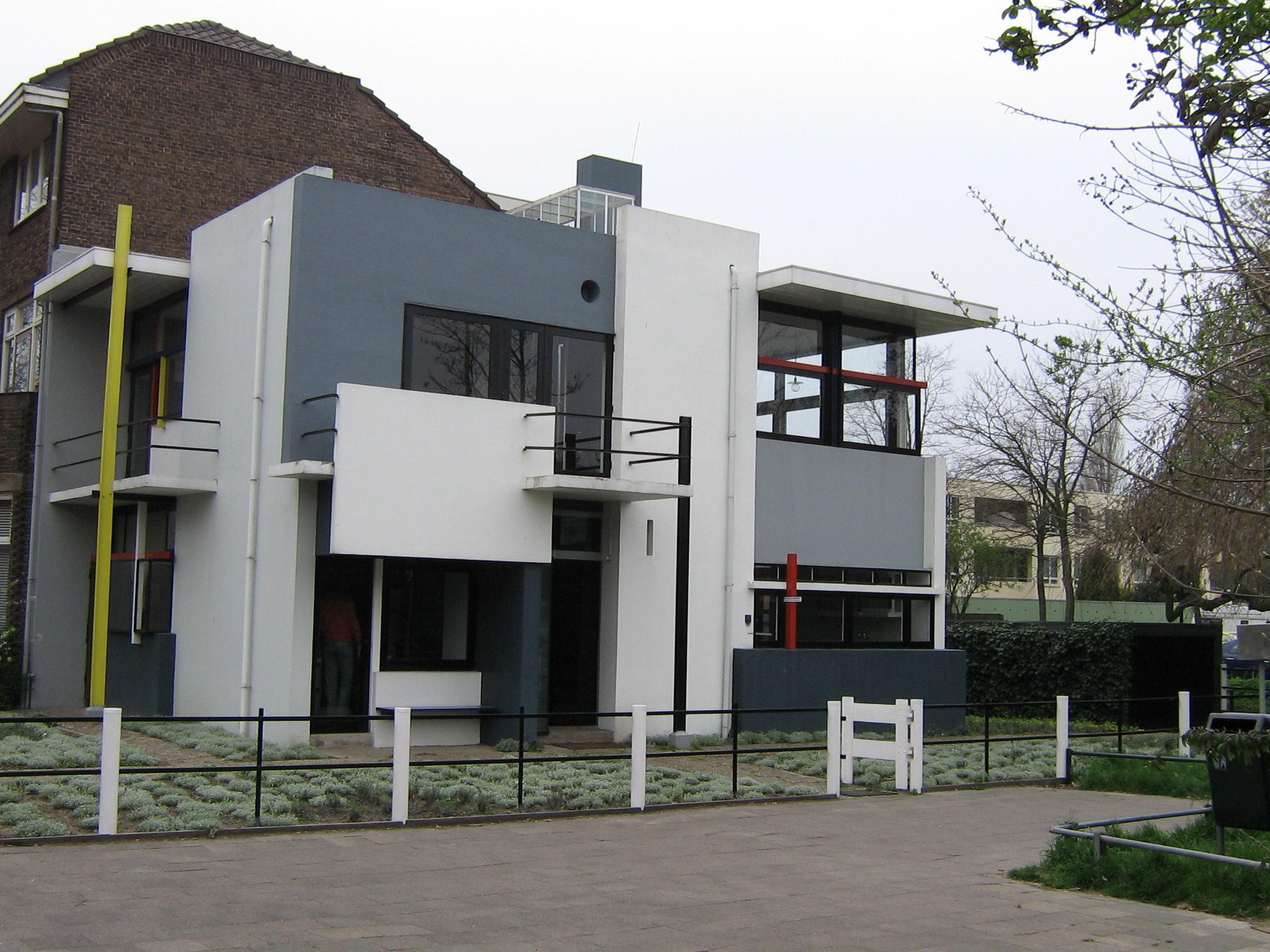
(Schroeder House, by Gerrit Rietveld)
Note that, much like Mirror's Edge, the use of color is rather limited, and strong color choices are limited to small elements (in the context of a videogame, you'd use these to draw the eye to high-traffic and otherwise important areas). Many modernists would even be offended by this building's use of muted shades of blue - see Richard Meier's white-washed buildings for an idea of what more "pure" modernism looks like.
Most (if not all) lines in the composition actually define some part of the architecture. There aren't any arbitrary "illustrations" on flat walls, the form of the building itself is just made complex to create a composition. De Stijl is also, in its purest form, composed entirely from right angles. Modernism doesn't have to follow these rules, but they're more or less good guidelines for making anything look modern.
X^3 + Y^3 = 88
Left side: The shape
Right side: The size
wow! how do you make this kind of math to geometry?
Take graph X^3+Y^3=1 within the space of the square ABCD A(0;0) B(1;0) C(1;1) D(0;1)wow! how do you make this kind of math to geometry?
Intersect it with lines that are 'a' degrees to the X-axis. The 'a's I used are 22.5 ; 33.75 ; 45 ; 56.25 ; 67.5
Calculate every intersection point.
Example: 53.89 ; 80.67
I make a brush using these coordinates as dimensions, rounded of course. So that is 54 wide and 81 high
Then I vertex edit my arch to the corner of the helper brush.
Now rotate the helper brush 90° and repeat. This is possible because the graph is, within the given space, symmetrical on the X=Y line.
EDIT: Forgot to mention, multiply coordinates with 88 because one half of the arch is 88 units.
Last edited:
And now you work at a supermarket.
Full time job with benefits, good pay, management position, I choose my own hours, I'm my own boss, plenty of time for rewarding hobbies? Yeah, you're right, guess it worked out fine.
Seriously, those knocking someone in my position are going to be in for a rude awakening when they get out of school. I'm living the dream.
- Aug 7, 2014
- 1,241
- 1,025


