WiP in WiP, post your screenshots!
- Thread starter Arhurt
- Start date
You are using an out of date browser. It may not display this or other websites correctly.
You should upgrade or use an alternative browser.
You should upgrade or use an alternative browser.
- Dec 15, 2013
- 535
- 803
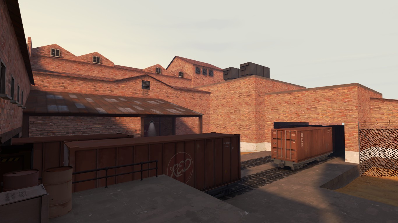
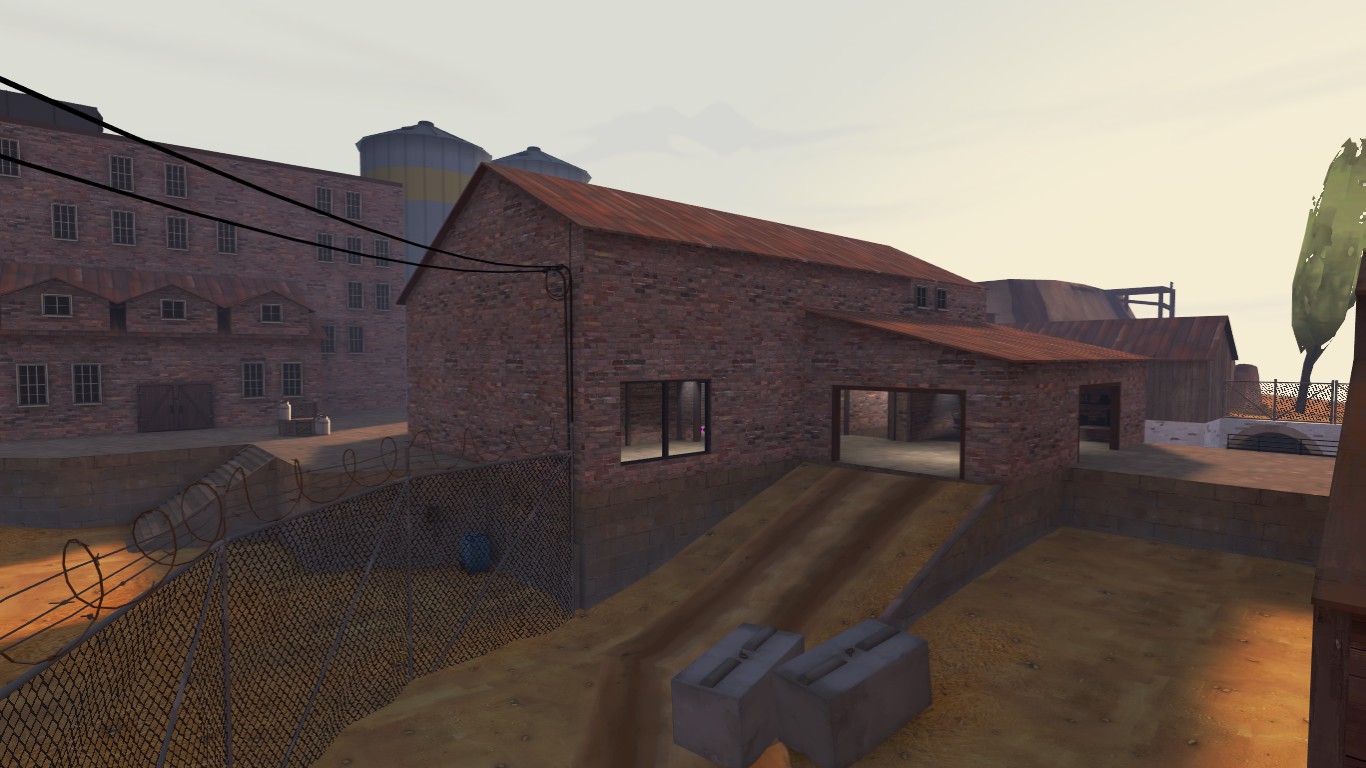
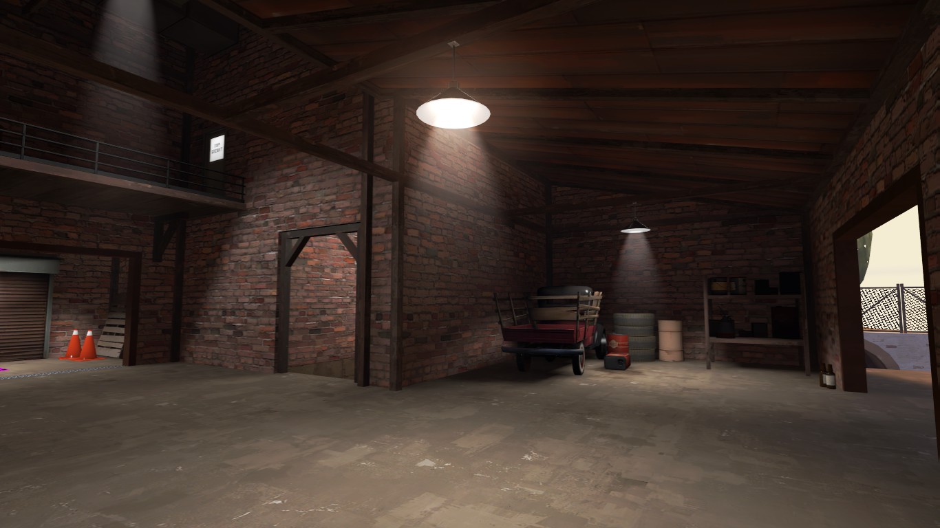
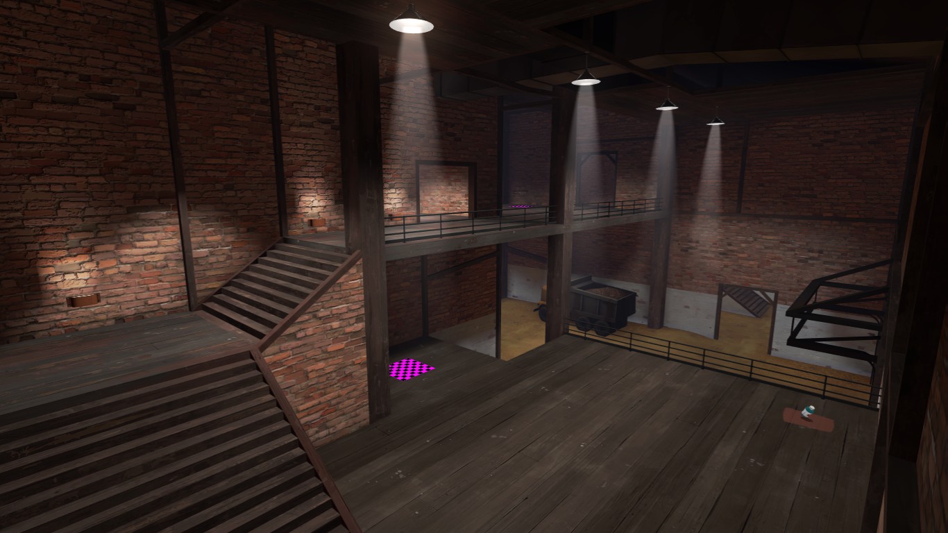
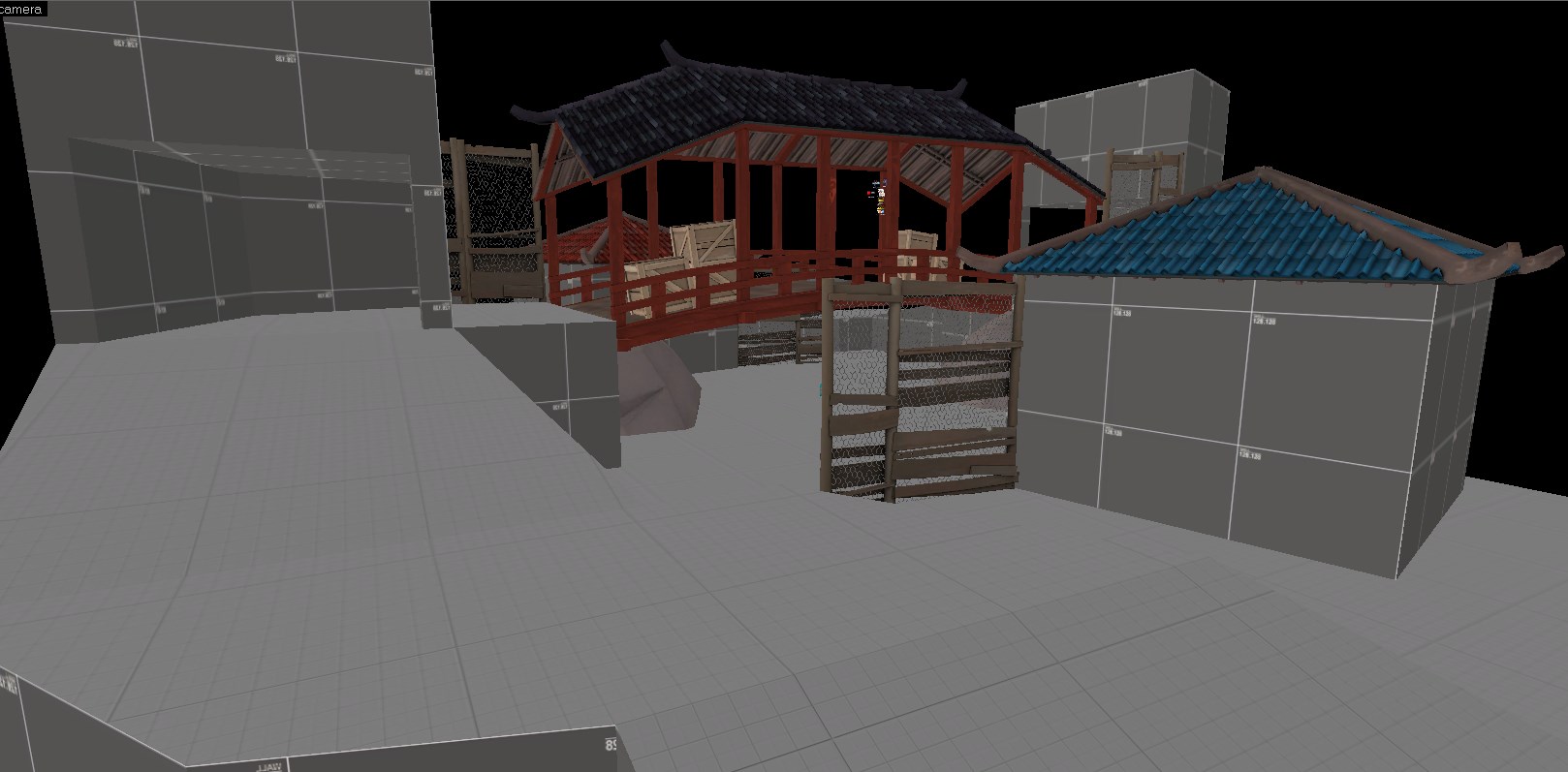
It looks nice but I can tell you were working on a large grid. There's a bit of sameness going on in how things were structured. Take a look at valve maps and don't be afraid to shift things around 8 or 16Hu.
Also experiment with different wall thicknesses. It looks like everything is 16Hu thick. Try some 8, 12, 24, 32, etc. I like to think of the 2fort facade walls. They have all kinds of different thicknesses, some are even more than 64 units. Doing this will add character to a map.
Also experiment with different wall thicknesses. It looks like everything is 16Hu thick. Try some 8, 12, 24, 32, etc. I like to think of the 2fort facade walls. They have all kinds of different thicknesses, some are even more than 64 units. Doing this will add character to a map.
Well most of the wooden beams are 8 units and the roofs are 4 units, but besides that you're right I guess. Detailing has never been my strong point really. Thanks though.It looks nice but I can tell you were working on a large grid. There's a bit of sameness going on in how things were structured. Take a look at valve maps and don't be afraid to shift things around 8 or 16Hu.
Also experiment with different wall thicknesses. It looks like everything is 16Hu thick. Try some 8, 12, 24, 32, etc. I like to think of the 2fort facade walls. They have all kinds of different thicknesses, some are even more than 64 units. Doing this will add character to a map.
hello,
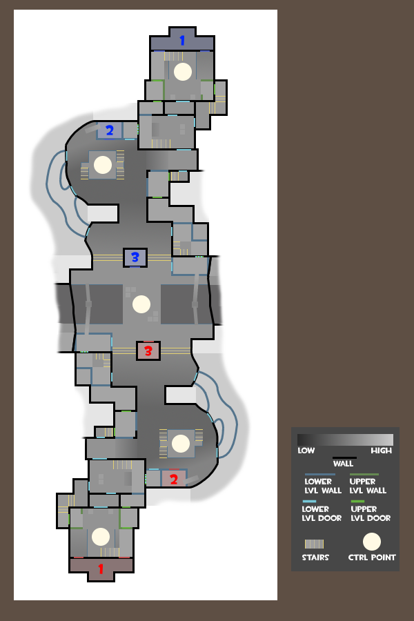
a few years back I promised a friend I'd try my best at making a payload level for tf2, haven't really made anything for tf since the golden days of tf classic - and that was like ~15 years ago >.< (but I am familiar with source overall)...
so after reading up on all tutorials here and over at developer.valvesoftware I've had some first stabs at trying to make a layout,
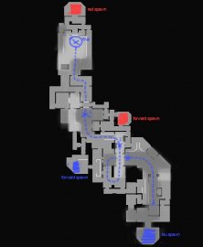
darker areas are low ground, and lighter areas are highground (right now everything is very blocky, and I'm planning to add some angles and switching out some corridors for some larger rooms)
I'll will hopefully be able to have a first playable version next week,
as a total noob in tf2 mapping I'm open to all suggestions/feedback (I know that it's super hard to give feedback from a flat top down img but anything will be helpful!)
thanks!
a few years back I promised a friend I'd try my best at making a payload level for tf2, haven't really made anything for tf since the golden days of tf classic - and that was like ~15 years ago >.< (but I am familiar with source overall)...
so after reading up on all tutorials here and over at developer.valvesoftware I've had some first stabs at trying to make a layout,

darker areas are low ground, and lighter areas are highground (right now everything is very blocky, and I'm planning to add some angles and switching out some corridors for some larger rooms)
I'll will hopefully be able to have a first playable version next week,
as a total noob in tf2 mapping I'm open to all suggestions/feedback (I know that it's super hard to give feedback from a flat top down img but anything will be helpful!)
thanks!
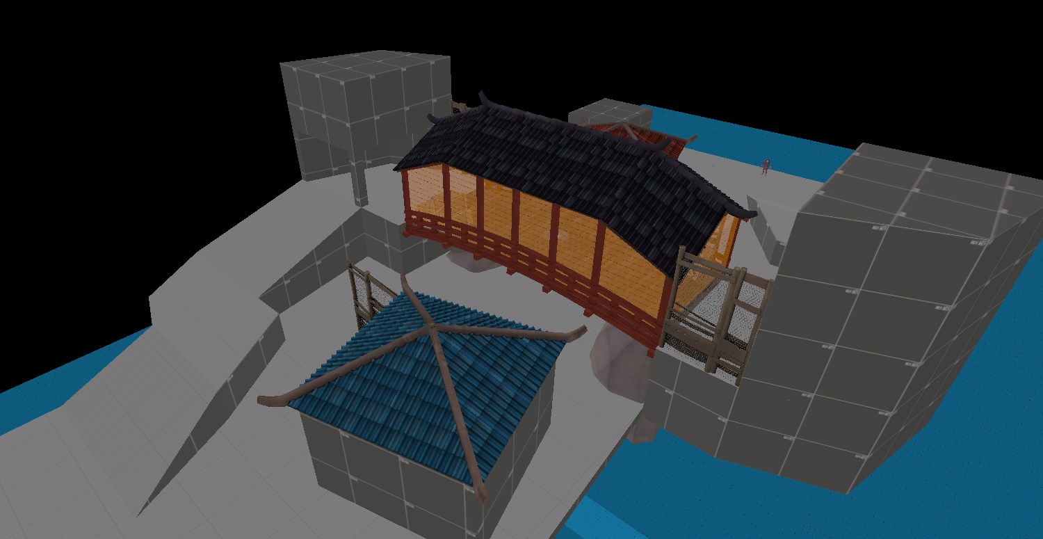
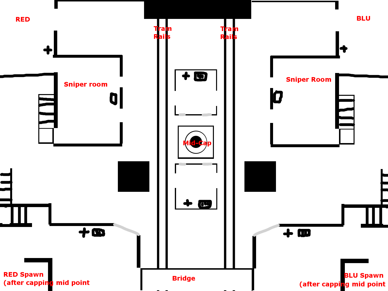
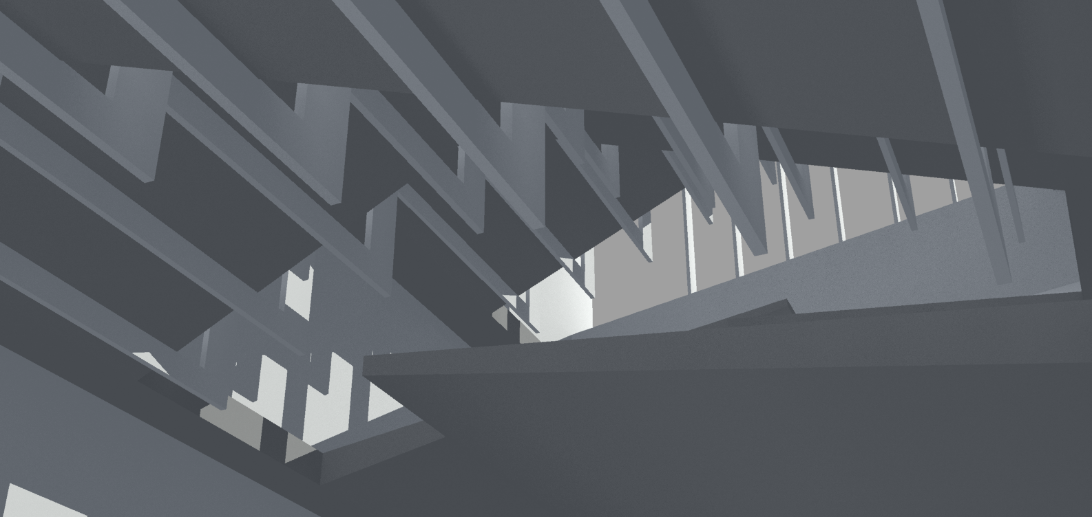
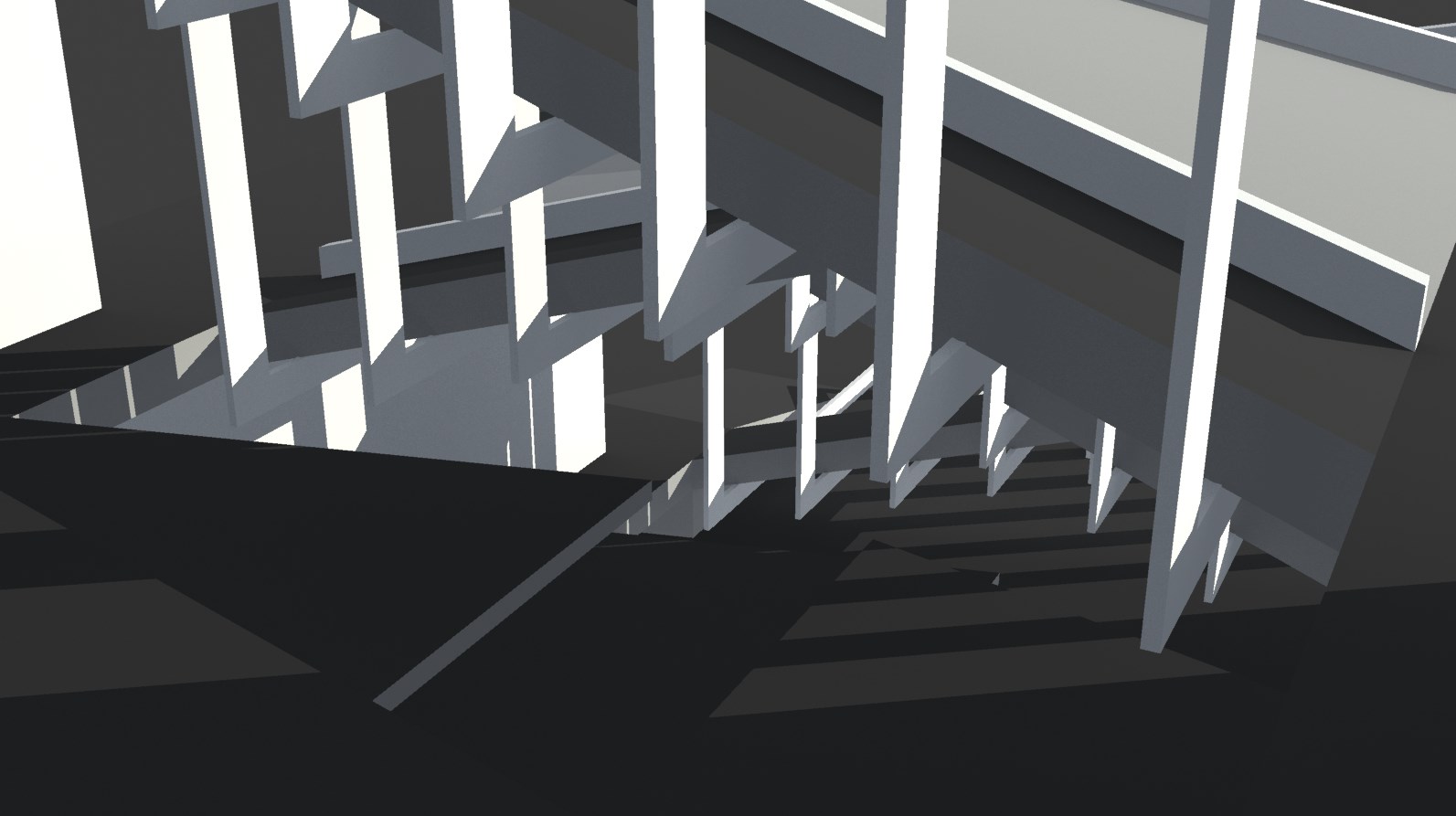
I worry that the bridge might be too cramped for a primary combat space, particularly with struts everywhere, but its a cool idea.
looks like you tried cramming it into a box rather than designing it for what would work best
Yeah, I see
- Aug 7, 2014
- 1,241
- 1,025
And hey, if things don't pan out you can turn it into a 5cp mid.Yeah, we'll see how it goes. Might be too tight and need adjusting.
Nice nice.After a night of half-assed work:
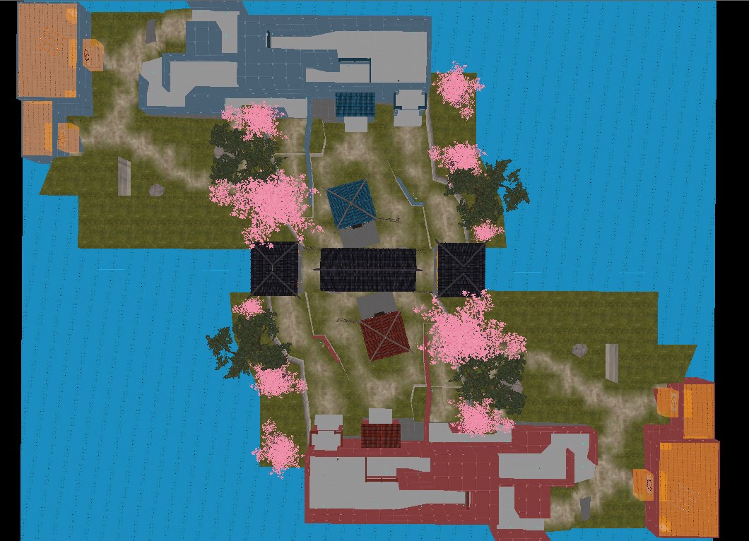
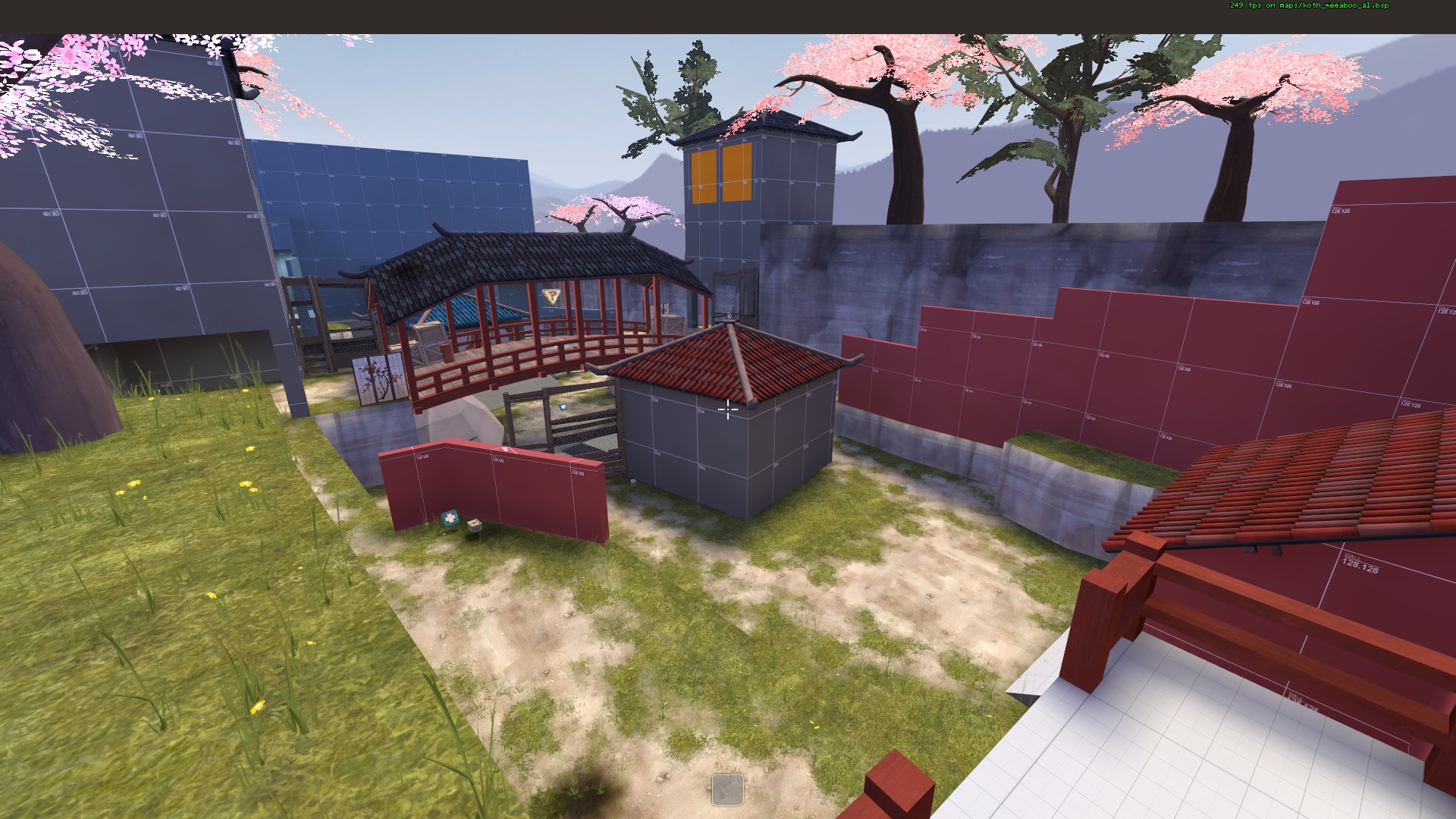
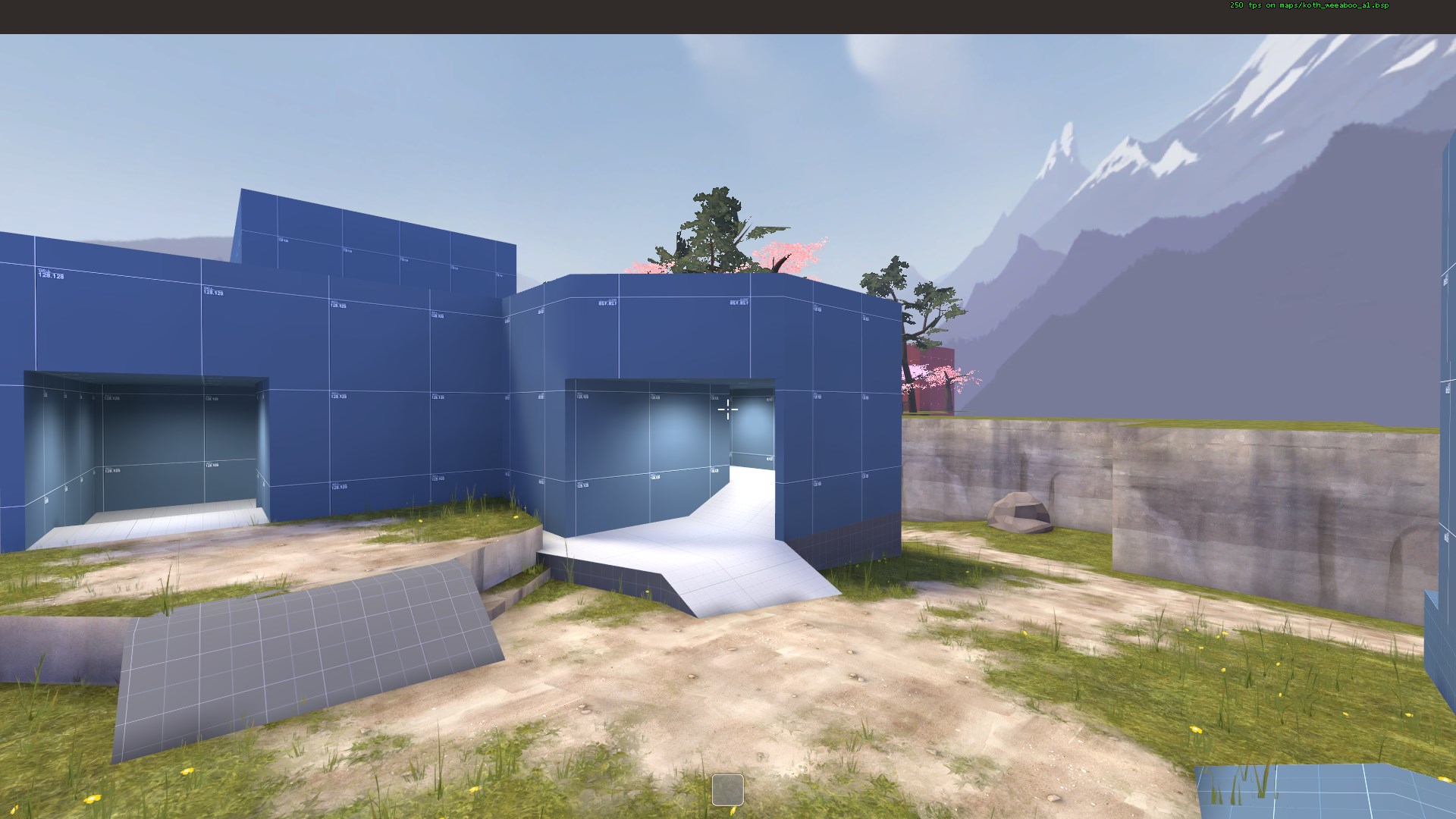
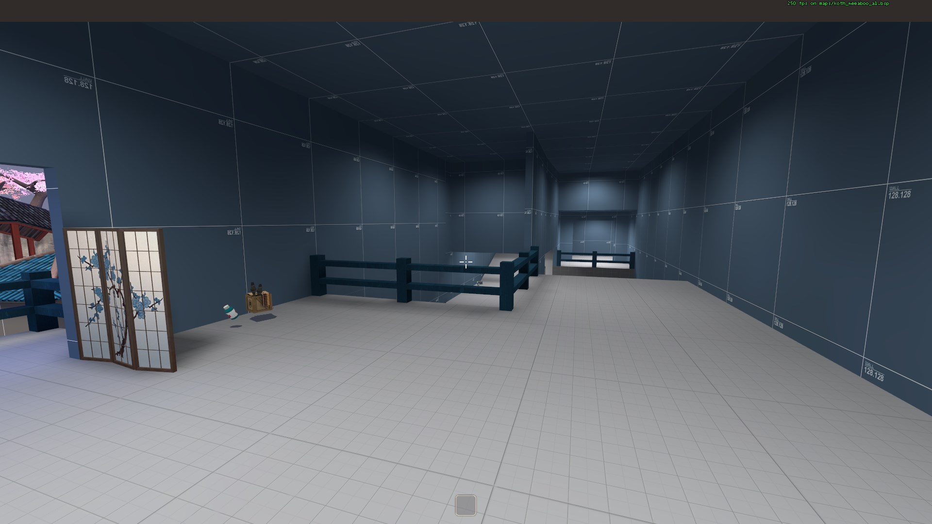
Still have to seal it all up, clean up a few odds and ends, and clip it. Then it should be ready for testing.
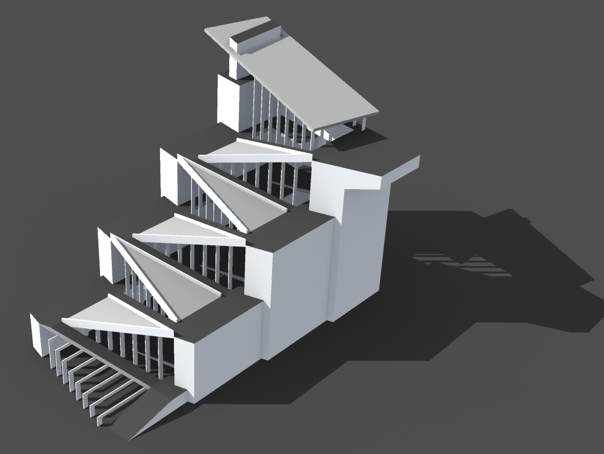
I still have one more map for the September Trilogy to make. So I decided last night to start working on it. Only problem was, I didn't know where to begin. So, I decided to start with the entities. Make sure they all worked, that I knew what I was doing, all that stuff.
I threw a test map together, and after 3 versions, the logic worked. So, as a teaser for cp_confusion_a1 (which is comming soon™), here's my test map.
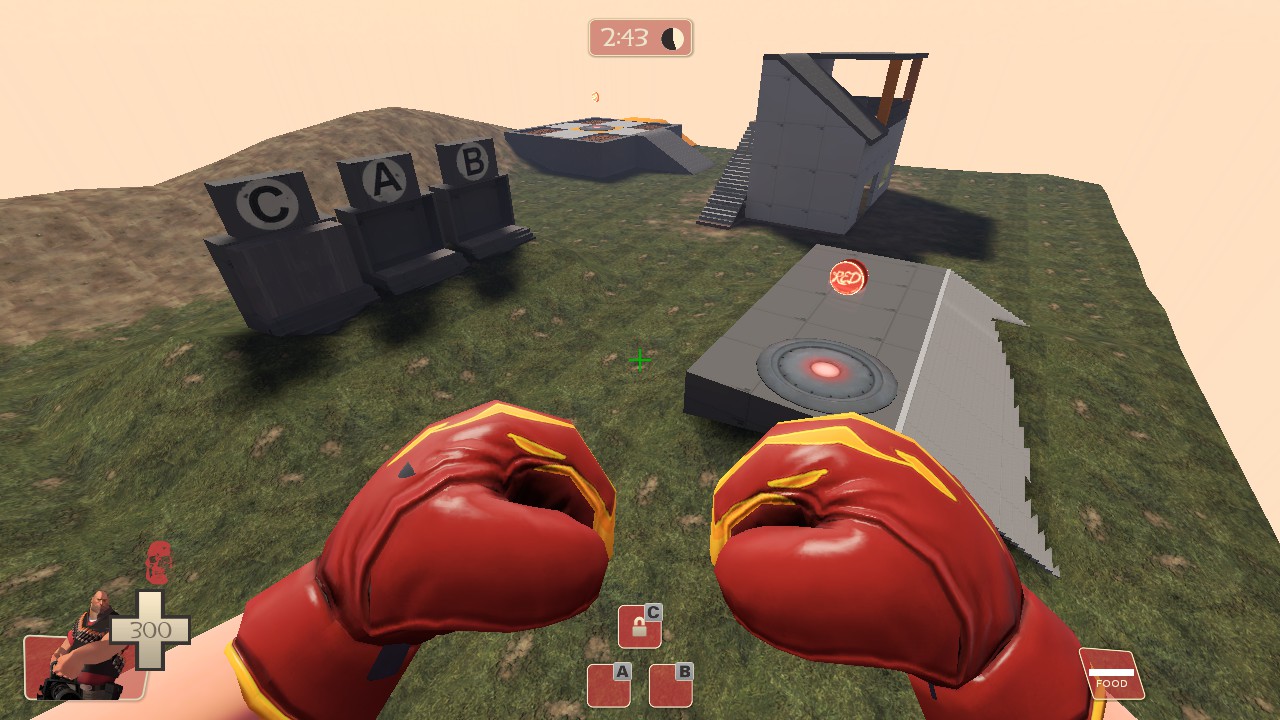
I threw a test map together, and after 3 versions, the logic worked. So, as a teaser for cp_confusion_a1 (which is comming soon™), here's my test map.

Might get some vvis optimization issues between mid and cp2, since it looks kind of sightliney.
But thats fine.
But thats fine.


