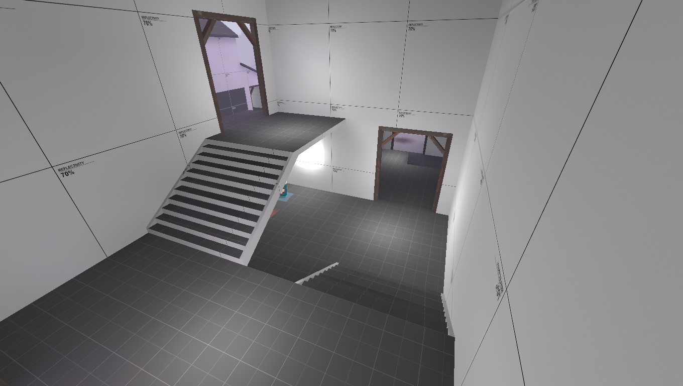
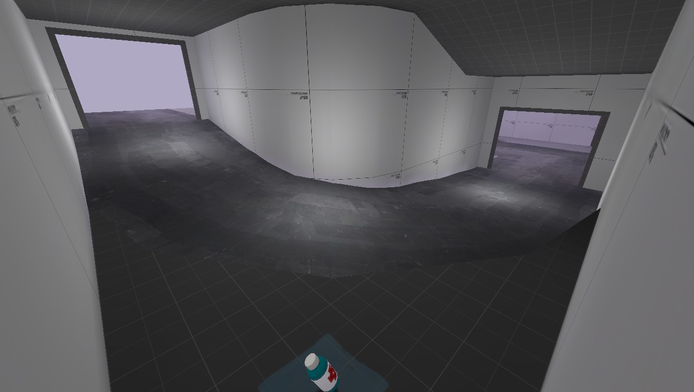
WiP in WiP, post your screenshots!
- Thread starter Arhurt
- Start date
You are using an out of date browser. It may not display this or other websites correctly.
You should upgrade or use an alternative browser.
You should upgrade or use an alternative browser.
1 thing that i dont like in most koth maps is the lack of decent flanks. If we look at how wide harvest is as koth map it shows how far you can build to the side. I prefer to see that more often in koth maps.After a night of half-assed work:
Still have to seal it all up, clean up a few odds and ends, and clip it. Then it should be ready for testing.
I do like the idea of the center though.
RataDeOrdenador
L5: Dapper Member
- Oct 12, 2015
- 230
- 105
hello,
a few years back I promised a friend I'd try my best at making a payload level for tf2, haven't really made anything for tf since the golden days of tf classic - and that was like ~15 years ago >.< (but I am familiar with source overall)...
so after reading up on all tutorials here and over at developer.valvesoftware I've had some first stabs at trying to make a layout,
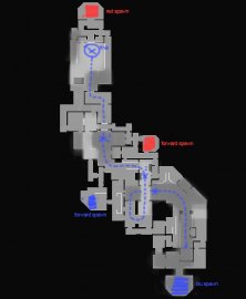
darker areas are low ground, and lighter areas are highground (right now everything is very blocky, and I'm planning to add some angles and switching out some corridors for some larger rooms)
I'll will hopefully be able to have a first playable version next week,
as a total noob in tf2 mapping I'm open to all suggestions/feedback (I know that it's super hard to give feedback from a flat top down img but anything will be helpful!)
thanks!
Between point 1 and 2,it reminds me of another PL map that I forgot its name... xd
But the bridge-part was a really crowded place... and well,99% of the people dropped down to the river and attacked RED from behind.
Either way,the layout looks promising. Can't wait to see some screenshots of the actual map.
- Feb 18, 2012
- 246
- 407
It is pretty big (480 x 512 u), but it's mostly to compensate for its great height disadvantage relative to the cliffs surrounding it.That seems like a pretty large capture area.
With a dash of work, those textures for the ground don't look half bad. I assume it's radiant grass?
Update coming in for landing...

Oh well, I had the same idea...
With a dash of work, those textures for the ground don't look half bad. I assume it's radiant grass?
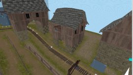
the grass is from tf (nature/grass_07), the custom ones are the cobble stones

and the roofing and stone wall etc,
the normal and spec seems to work good in other versions of source but not in tf2, so right now it all looks pretty flat, but I'm pretty sure its just something I'm forgetting in the vmt
Does it have a bump map?
ye, diffuse, normal, spec, tried phong first, but it seems it's only available for models, inspecting the materials with fullbright 2 in game shows that the cobble texture aint working correctly (however all the other materials seems to work)...need to pull out the detective hat and investigate...when I got the time
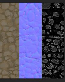
I think Source 2 uses a radically different model for blending, since it allows for blending between up to four textures at a time (although I think maybe that was actually introduced in one of the Left 4 Dead games?) If that third image is supposed to be the blend texture, I'd guess the new model requires a separate heightmap for each texture and then calculates blend based on their relative heights — since that's basically how it works in real life.
I think Source 2 uses a radically different model for blending, since it allows for blending between up to four textures at a time (although I think maybe that was actually introduced in one of the Left 4 Dead games?) If that third image is supposed to be the blend texture, I'd guess the new model requires a separate heightmap for each texture and then calculates blend based on their relative heights — since that's basically how it works in real life.
the this img is spec/phong mask

RataDeOrdenador
L5: Dapper Member
- Oct 12, 2015
- 230
- 105
the this img is spec/phong mask

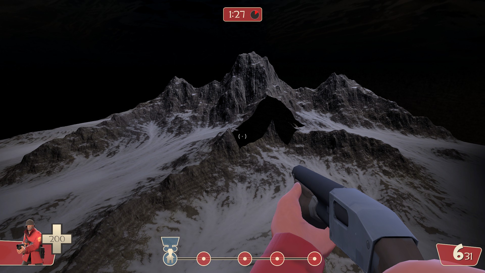
Oh yes,that's really awesome. And it looks like a night-ish theme too. Don't think there's many map that has that night theme (excluding halloween maps,of course.)
Can't wait to test it. :>
About that image there are a few other things i notice:the this img is spec/phong mask
The lower rock wall textures are overdetailed compared to the floor and upper walls. It doesnt fit tf2. The floor textures is fine to me.
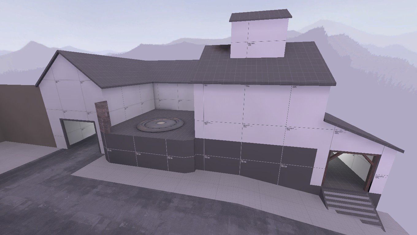
The roofs look very blocky as if its made with regular brushwork. Using displacements might have been a better option to create a smoother looking roof. The way the tiles hang over the edge of the roof doesnt look good aswel. A roof should be looking somewhat solid, bended tiles looks like they cant even hold the rain. Luckily solving this also makes the work on displacement roofs easier. The bumped roofs can still be done with displacements, and in that case it also should be easier.
Maybe go to some existing tf2 maps and check how the roofs are done.
The building support beams are fine.


