TF2Maps.net Major Contest #15: Payload Checklist Contest [FINALIST VOTING]

Status
Not open for further replies.

Idolon

they/them
aa
Feb 7, 2008
2,123
6,137
contest banner.png


FINALIST VOTING THREAD

Voting Format

There are now only 10 maps. Public voting is just a bit more involved this time: Instead of a straight up or down vote, we're now asking for a 0-10 overall score.

Note that the provided rubric provides spaces for Gameplay, Aesthetics, and Contest Theme categories. These categories are not required. If you fill them out, they are only for the benefit of recording statistics and providing feedback. Only the Overall score will be used to calculate the winners.

You must cast a vote for at least six maps for your vote to count. You must play these maps with other people - do not vote from screenshots, flying around an empty map, or playing with bots. I reserve the right to throw out any votes that do not fulfill these criteria, as well as the right to throw out any votes for any other reason (although I do not really want to).

Use this table to cast your votes:
Code:
[table=head]
MAPS | OVERALL | Gameplay | Aesthetics | Contest Theme
Amaryllis | | | |
Cannonburg | | | |
Fractal | | | |
Highwood | | | |
Josh | | | |
Kinder | | | |
Munitions | | | |
Rush | | | |
Snowthistle | | | |
Wizard Town | | | |
[/table]

Here is a more thorough explanation of the scoring categories:

Overall:
All things considered, how good is this map overall?

Gameplay:
How fun is the map to play? Is this a map you want to come back to and play again? Does this map provide a unique kind of gameplay, or does it parrot existing maps? Is there any recognizable layout theory behind the map that you find impressive? Does the layout do anything particularly ambitious or risky? Does the map’s logic ever break?

Aesthetics:
How good does the map look? Does it feel like a place? Is it recognizable, or does it feel like just another TF2 map? Are there any graphical hitches? Does the detailing ever get in the way of gameplay?

Contest Theme:
How well does the map fulfill the checklist items it set out to fulfill? Does fulfilling the checklist make this a better map, or a worse map? Does it fulfill any of the items in a creative manner?

Official Judging

For the finalists, there is a panel of official judges who will provide full scoring and detailed feedback for every map. That panel consists of myself, 14bit, Phi, Startacker!, and Diva Dan. The average of the judge's scores will be weighted 50/50 against the average of the public votes to determine the final scores.

This is the rubric official judges are using. You may also use this rubric to determine your own scores if you find that useful - just make sure to submit your final scores using the table above.

Deadline

Voting ends on 11:59 PM on 22nd April 2019 GMT+1. Click here for a live clock.
 

MegapiemanPHD

Doctorate in Deliciousness
aa
Mar 31, 2012
2,004
1,313

MAPS | OVERALL | Gameplay | Aesthetics | Contest Theme
Amaryllis | | | |
Cannonburg | 7 | 7 | 6 | 9
Fractal | 5 | 5 | 6 | 7
Highwood | 9 | 8 | 10 | 10
Josh | 7 | 6 | 6 | 6
Kinder | 6 | 5 | 8 | 7
Munitions | 9 | 8 | 8 | 10
Rush | I | Made | This | Map
Snowthistle | 7 | 7 | 8 | 10
Wizard Town | 7 | 7 | 5 | 10
 

nesman

master of fast travel
aa
Jun 27, 2016
1,390
1,232
Update: was unable to vote this time due to finals for my classes


MAPS | OVERALL | Gameplay | Aesthetics | Contest Theme
Amaryllis | | | |
Cannonburg | | | |
Fractal | | | |
Highwood | | | |
Josh | | | |
Kinder | | | |
Munitions | | | |
Rush | | | |
Snowthistle | | | |
Wizard Town | | | |

will be updating over time
 
Last edited:

Maid

Succubus
aa
Sep 29, 2018
246
554

MAPS | OVERALL | Gameplay | Aesthetics | Contest Theme
Amaryllis | 8 | 8 | 8 | 6
Cannonburg | 8 | 9 | 7 | 8
Fractal | 7 | 7.5 | 6 | 6
Highwood | 7.5 | 7 | 9 | 7
Josh | 6.5 | 6.5 | 7.5 | 4.5
Kinder | 5 | 4 | 8 | 4
Munitions | 5.5 | 4.5 | 8 | 3.5
Rush | 6.5 | 5 | 6 | 9
Snowthistle | M | I | N | E
Wizard Town | 5.5 | 6 | 4 | 6.5
 
Last edited:

Idolon

they/them
aa
Feb 7, 2008
2,123
6,137

pumpko

L3: Member
Jul 31, 2018
125
208

MAPS | OVERALL | Gameplay | Aesthetics | Contest Theme
Amaryllis |5.5|5|8|6
Cannonburg |i|made|this|uwu
Fractal |6|6|6|6
Highwood |9|8|10|8
Josh |8.8|9|8|8
Kinder |5|5|8|6
Munitions |5|6|7|5
Rush |5|6|4|5
Snowthistle |5|5|8|7
Wizard Town |4|4|5|7
scale isn't really based on a 0-10 rating, but a simple way to look at it is to just compare the scores to other scores. a 9/10 map isn't really a 9/10 map, but rather a 9/10 compared to other entries. i dont know
 
Last edited:

Another Bad Pun

In the shadows, he saw four eyes lit by fire
aa
Jan 15, 2011
806
1,850

MAPS | OVERALL | Gameplay | Aesthetics | Contest Theme
Amaryllis | 4.4| 4.5|4 | 4.5
Cannonburg |6.9| 7| 4.5| 9
Fractal | 4|4.5 |4 | 3.5
Highwood | 6.7|6 | 8| 6
Josh |- |- |- |-
Kinder |5.2 | 3.5| 6| 6
Munitions |5.9 |4.5 | 6| 7
Rush | 3.7| 2|3 | 6
Snowthistle |4.7 | 3.5|5.5 | 5
Wizard Town |4.4 | 4| 3.5| 5.5
 
Last edited:

ZungryWare

L3: Member
May 24, 2018
123
109

MAPS | OVERALL | Gameplay | Aesthetics | Contest Theme
Amaryllis | | | |
Cannonburg | 7 | 7 | 7 | 7
Fractal | 7 | 7 | 7 | 7
Highwood | 8 | 8 | 9 | 9
Josh | 8 | 8 | 8 | 8
Kinder | 6 | 5 | 7 | 5
Munitions | 7 | 7 | 5 | 7
Rush | 6 | 7 | 3 | 6
Snowthistle | 9 | 10 | 7 | 10
Wizard Town | 5 | 6 | 4 | 6
 

_Blamo

aa
Feb 18, 2017
25
97

MAPS | OVERALL | Gameplay | Aesthetics | Contest Theme
Amaryllis |6 |5 |6 |7
Cannonburg | 7.5|7.5 |5 |7
Fractal | 5|4 |4 |6
Highwood |7.3 | 7| 9 |7
Josh | 5|4 | 6|6
Kinder | 5| 4| 5.5|6
Munitions |6 |5 |7|7
Rush |4 | 3 (always ends in a spawncamp) |4 |6
Snowthistle | 7.5| 7.4 | 6| 10
Wizard Town |5 | 4 (crits r dum)|8 |6

Gameplay scores are worth more here compared to other aspects of the map, as that is what I tend to look for the most (Which explains why Cannonburg still has the same score as Snowthistle despite the latter scoring more in other categories besides gameplay. Plus, said categories aren't technically required)

And regarding the Contest Theme score: I have set a default score of 7 for each of these maps, and said score had either increased or decreased depending on how much a certain item from the checklist had made or ruined a map. For example, the Rollback requirement hindered my enjoyment of pl_kinder's first point by quite a bit. On the other hand, having Crossing Paths in conjunction with Multiple Carts benefited Snowthistle greatly.

Also I hate Halloween Spells/Pumpkins so that also affected gameplay for me regarding Wizard Town somewhat


Edit 4/17/19 (or 17/4/19)
Changed some scores around

Edit 4/20/19
Changed a few scores again
 
Last edited:
Jan 20, 2019
391
622

MAPS | OVERALL | Gameplay | Aesthetics | Contest Theme
Amaryllis | 7 | 5 | 6 | 7
Cannonburg | 8 | 8 | 6 | 7
Fractal | 7 | 7 | 3 | 8
Highwood | 10| 10 | 10 | 6
Josh | 9 | 8 | 10 | 6
Kinder | 9 | 8 | 10 | 5
Munitions | 10 | 10 | 10 | 6
Rush | 7 | 8 | 5 | 7
Snowthistle | 10 | 10 | 9 | 10
Wizard Town | 10 | 9 | 10 | 7

Amaryllis
I played on this map and I can say that the gameplay on it is familiar. You are pushing the cart through the enemy’s positions to destroy something at the end. Unfortunately, this gameplay isn't very memorable. The fact is that there are no memorable moments on the map. This is a problem with this map. The jungle decorations themselves are great, you believe that you are in the jungle, but you can’t remember anything other than the jungle and the bridge. 8 for Aesthetics (6 for jungle and 2 for buildings). According to the contest form - everything is simple. 6 points for Contest (5 for completed assignments and 1 for crossings (hazard and path)). Gameplay - 5. Overall - 7.

Fractal
I will not pull, I will say right now. Aesthetics - 3. The map looks very empty, it seems ugly because of its color and boring buildings. The only thing that is remembered for the whole map is the abyss and the portal at the end. But in the contest you received - 8 (2 for basic elements, 2 for multi-stage and 4 for ideas with a cart). As for the gameplay - 7, pretty cool and I want to come back again, a bit like a badwater. BUT CHANGE MAP DESIGN PLEASE. Overall - 7.

Highwood
It's simple. Beautiful, playable, aesthetic. Contest - 6 (4 base points and 2 for respawns). All 10

Josh
Interesting Egyptian map. Aesthetics - 10, all according to the laws of Egypt, beautiful, friendly. Gameplay - 8, there are flaws with a balance at the end of the map. Contest - 6 (4 base and 2 for cart). Overall - 9. No bonus points for meme

Kinder
Everything is very simple. Take hightower, sprinkle with goldrush, add fastlane, pour in badwater, salt with badlands, run into the oven and get Kinder at the exit. Aesthetics - 10. Gameplay - 8. Contest (map maker forgot to add some cool stuff) - 5 (3 bases and 2 crossings). Overall - 9.

Rush
Rush b, chiki briki and damki, This map looks dull and gray like Russia. Aesthetics - 5, add more colors, wood and snow are boring, there is no lore in the map. Gameplay - 8. Good gameplay for cart race. Contest 7 - 3 base, 2 multistage and 2 for carts. Total - 7. Try to make sense on your map - to blow up the cart in the center of the map just doesn't make sense, the first stage is quite small and interesting, while the second is large and dispersed.

Wizardtown
The aesthetics are great - 10. You feel yourself in the city of Merasmus, all in Halloween. The end of the map is very interesting. Waiting for you to change your 3D skybox from the water to something else. Gameplay - 9. There are some problems with balance, pumpkins, but it's pretty fun to play and you want to come back here again. Contest - 7, 4 base and 3 for elements. As a result - 10. I will say that the end of the map is very cool and I hope this map will come out into this year's Halloween!

UPD:

I played the remaining maps with a small Russian community. I decided that I needed to compare Cannonburg and Munitions, since these are two maps with a single theme - the munitions factory.

Munitions - 10 POINTS FOR SOVIET THEME.
The aesthetics of the maps are pretty nice. It feels like a factory. Outdoors and Indoors areas look great. Soviet aesthetics is really nice and will fit in tf2. Aesthetic - 10.
I will not find fault with the gameplay - everything seems to be good. For the contest - 6.
I would like to see more Soviet symbolism (need a lot of propaganda for factory workers) and the buildings don't looks like Soviet, I think so.

Cannonburg
As for me, you made the city real, and the factory is fake. The factory looks very empty, as I noticed, apart from 1 tank, piles of coal and a couple of boxes there is nothing military here. Unlike the Munitions, the map looks poor. Aesthetics - 6. For the contest - 7. The gameplay seems to be good, in some places there are interesting moments - 8. In total - 8.
I advise you to make your factory more real, and your city - comically fake. And also add more memorable moments and elements.

Snowth.... Snowthistle
(There should be a joke about the carts, but it was cut out)
Let's start with the contest - 10, 3 basic, 4 for the new gamemode and 3 for the carts. The map is very beautiful, the lighting is calm, peaceful, everything is done in the snow-medieval theme. But! The fact of the matter is that this is a snow-medieval style, for a player this is a new style and their first impression will most likely be about the medieval gamemode. I would advise you to add industrial buildings behind the map and give a lore to this map, something like "Stupid mercenaries are trying to seize the artifacts of the ancient Scots and the contact of various artifacts makes them blow up." Think about it yourself. Aesthetics - 9. Playing on this map is fun with friends, the layout is good and this is also a new game mode - 10 for the gameplay. Overall - 10.

Good luck everyone!
 
Last edited:

Suna

What's a greybox?
aa
Nov 10, 2017
416
627

MAPS | OVERALL | Gameplay | Aesthetics | Contest Theme
Amaryllis | 6.66 | 6 | 8 | 6
Cannonburg | 7 | 7 | 6 | 8
Fractal | 6.66 | 6 | 8 | 6
Highwood | 8.33 | 8 | 9 | 8
Josh | 6.33 | 6 | 7 | 6
Kinder | 7.33 | 6 | 10 | 6
Munitions | 8 | 8 | 8 | 8
Rush | 6.33 | 8 | 4 | 7
Snowthistle | 6.33 | 7 | 5 | 7
Wizard Town | 6.33 | 7 | 5 | 7

Amaryllis:
A pretty good looking map, with some solid gameplay on the first, second and last point. However the third is almost always a roll for BLU, and there are some pretty serious exploits on the map (which I won't go into detail on, but one involves the water under the bridge)
The entirety of the third point feels like it was thrown in last second to try and meet the payload checklist requirements, and the cart looping around itself is especially forced. I am a fan of the second point though, feels very good to play on.

Cannonburg:
The gameplay on cannonburg is pretty solid overall, though the first stage feels noticeably weaker than the second. It does a good job with the frontline theme, though I personally am not a fan. It incorporates the contest requirements very well and it often goes unnoticed, blending with the rest of the map very well.

Fractal:
The first stage of fractal plays quite well, aside from the very large rollback zone before the second point. The Aesthetics of working your way up a mountain base is very cool, and executed great. HOWEVER the second stage plays... not good. It feels very cramped and a lot of the geometry looks strange. The Aesthetics have also suffered, losing a lot of the detail seen in the first stage. The final point doesn't play well at all, and in all the times I have played it, the second stage has been always been a roll for BLU.

Highwood:
Highwood looks great, plays great, and incorporates the contest requirements very well. The only area I have a problem with is C, being maybe a bit too difficult to push. Overall one of my favourite maps from this contest.

Josh:
Points A, B, and C all have their fair share of problems. A requires a door to open before you can cap it, and before that there's only one way for attackers to access the point itself. B has the same problem, but the point is situated in a small room, being very difficult to push into if an engineer has a sentry set up in there. C is the worst, going directly past RED spawn before it even reaches the end. This always feels like a nightmare to attack. The map looks good, though a lot feels way too blocky, and it feels like the egypt theme was used as a means of laziness, rather than creativity. There are multiple problem-causing sightlines around the map, mostly caused by the chosen 'ticks' of the checklist. Not a 'bad' map by any means, though often feels more frustrating than fun.

Kinder:
Kinder looks incredible, but it often feels like the aesthetics were placed above gameplay a few too many times. Playing defence on last has always resulted in us being spawncamped, and offence on the first point feels like a chore due to the gigantic rollback (which is poorly placed in the map) and the second point is extremely chokey, funnelling down to just two small routes. The checklist requirements feel forced-in and are mostly just not fun, aside from the bridge just after the third point which I love.

Munitions:
The gameplay of munitions is pretty great, the only areas that I feel have problems are point B of stage 1, which feels annoying to try and push the cart up the hill, point B of stage 2, which has some nasty sightlines, and point A of stage 3, which is a huge choke. The aesthetics are a bit rough in places but otherwise look great, making good use of the frontline assets and a Russian theme. The map incorporates the checklist requirements very creatively, and I love the elevator used for point C of stage 2.

Rush:
Rush plays very good, but is brought down by its looks, using dev textures and having very little detail in both props and geometry; ending up looking very bland in some places. The second stage both looks and plays much better than the first, and is very creative in how it implements the requirements of the checklist. Overall a blast to play on, but not to look at.

Snowthistle:
Snowthistle plays alright, and the chosen gamemode is very interesting; and allows it to meet the checklist requirements easily. However the aesthetic is very bland and basic, and despite the small size of the map there is very little detail overall (aside from the flora, which looks pretty nice). The lack of a 3D skybox also hurts it in this regard. Still, quite fun.

Wizard town:
Wizard town is a pretty nice map, having a neato finale and cart gimmick. The map itself plays nicely, though C is often a roll for BLU. The map, despite being B2, uses primarily dev textures past the first point which hurts its aesthetics greatly. The first point however is very well detailed. I am personally a fan of crumpkins and pumpkin bombs (for a little while), so having halloween enabled here didn't bother me much.
 

Kube

Not the correct way to make lasagna
aa
Aug 31, 2014
1,342
1,850

MAPS | OVERALL | Gameplay | Aesthetics | Contest Theme
Amaryllis |Didn't play enough|-|-|-
Cannonburg |Didn't play|-|-|-
Fractal |6|4|7|10
Highwood |8|6|10|10
Josh |9|9|8|10
Kinder |5|4|5|10
Munitions |9|8|9|10
Rush |Didn't play|-|-|-
Snowthistle |5|3|7|10
Wizard Town |6|6|6|10

Fractal:
Gameplay ~ Pushes felt cluttered, and certain parts of the cart path were a bit overly tight for the purposes they serve in gameplay. When you work on Beta, don't be afraid to shift around buildings to better suit the player's movement.
Aesthetics ~ I like the gloomy style you went for, although some of the brushwork is underdeveloped (understandable for an alpha). I'd also like to see more emotive(?) lighting, if that makes sense. Overall, it's obvious you put a lot of work into this map's aesthetics, and the next step is polish.

Highwood:
Gameplay ~ A tad too many hard chokes for my liking. It's difficult feeling like Blu can't make any progress on the cart. C seems like it was consistently held up, but A's hold was the most punishing. Otherwise, I was impressed by gameplay brushwork on this map.
Aesthetics ~ My favorite aesthetics of the contest! I'm a huge fan of the theme, and the lighting is especially beautiful. There's a healthy heaping of environmental storytelling. For RC, I'd polish up texture choices (there's a lotta wood-on-wood) and flesh out the rock formations in the 3D skybox.

Josh:
Gameplay ~ My favorite gameplay in the contest! Each area is unique and memorable. Players keep their attention toward the cart. I'm a big fan of the height variation across the map, especially at last. Your next step is to perfect balance between the teams, especially in the very-experimental C area.
Aesthetics ~ This detailing is beta-quality, albeit an early beta. Lighting is superb, what's left is to flesh out brushwork and prop usage.

Kinder:
Gameplay ~ I struggled with the sightlines on this map, and C always felt very harrowing to attack. I'd also work on making B easier for Blu to reach (right now, the most obvious route is the most dangerous). On a different note, I'm a fan of your usage of rock displacements within gameplay space, and I think it helps make the map interesting to navigate.
Aesthetics ~ Building brushwork is impressive, but the map could use more texture variation (i.e. less purple metal). Prop usage is a tad cluttered. Polishing these two issues up would improve the map's aesthetics dramatically.

Munitions:
Gameplay ~ The first stage is quite fun, the second stage struggles with a punishing choke at A. The finale is remarkably memorable and exciting.
Aesthetics ~ Very neat angled buildings, spaces, and custom props! I'd like to see these aesthetics highlighted with lighting that's less flat. You might even want to consider different environment lighting. Also, the texturing on the third stage could very much be fleshed out. I'm looking forward to seeing this map as an RC.

Snowthistle:
Gameplay ~ Rounds are usually quite quick, and I feel it's because of how the layout handles the gamemode. When the carts are about to collide, it's very difficult for the losing team to escape what feels like inevitable defeat. Unrelated, the clipping plane hampers Snipers on this map.
Aesthetics ~ I'm a fan of this map's solidly-beta visuals. Each snow blend used on the map looks superb. I'd note that the map's environment fog is a tad overbearing, and that shadows on the vine props needs adjusting.

Wizard Town:
Gameplay ~ I appreciate how unique this map plays! Ultimately, on your march towards RC, you'd be best served iterating and improving upon the gameplay motifs already in place. My biggest gripe with this map's gameplay was how dangerous it is to approach the cart as a Blu player, especially around A. You've shown a tremendous willingness to make big changes to the map's layout. Keep with this philosophy and you should be set.
Aesthetics ~ Lovely brushwork, your next step is to flesh out the second half of the map like you did the first half. The detailed chunks of this map are genuinely quite spooky...
 

dotmd

L2: Junior Member
Jul 23, 2016
81
197

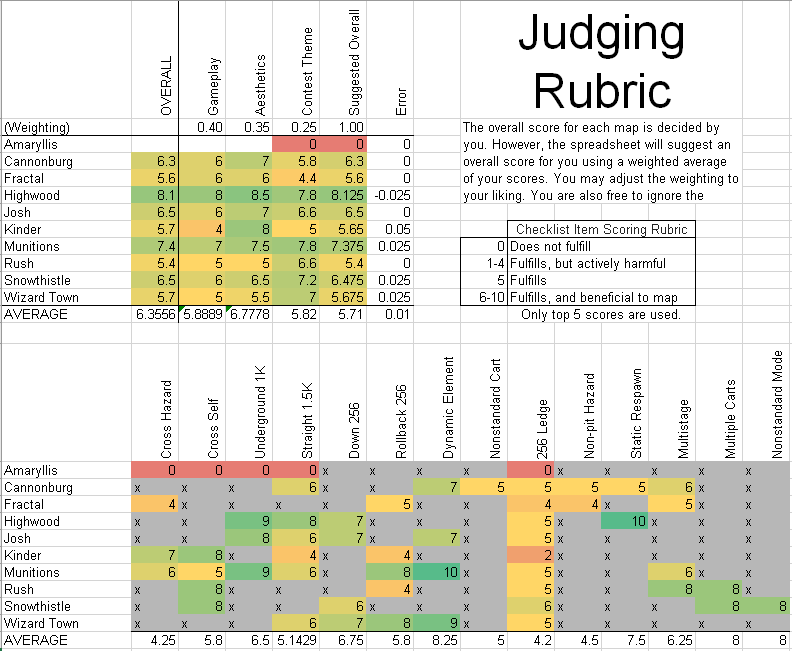
MAPS | OVERALL | Gameplay | Aesthetics | Contest Theme
Amaryllis | mine | - | - | -
Cannonburg | 6.3 | 6 | 7 | 5.8
Fractal | 5.6 | 6 | 6 | 4.4
Highwood | 8.1 | 8 | 8.5 | 7.8
Josh | 6.5 | 6 | 7 | 6.6
Kinder | 5.7 | 4 | 8 | 5
Munitions | 7.4 | 7 | 7.5 | 7.8
Rush | 5.4 | 5 | 5 | 6.6
Snowthistle | 6.5 | 6 | 6.5 | 7.2
Wizard Town | 5.7 | 5 | 5.5 | 7

NkwEC0Y.png
 
Jul 30, 2014
75
153

MAPS | OVERALL | Gameplay | Aesthetics | Contest Theme
Amaryllis |6 |4 | 6|6
Cannonburg |5 | 4|5 |6
Fractal |3 |3 | 4|6
Highwood |8 | 8|7 |7
Josh |5 |3 |6 |6
Kinder |4 |3 | 5|6
Munitions |6 | 6| 6|6
Rush |3 |4 | 3|5
Snowthistle |7 | 7|6 |7
Wizard Town |6 |7 | 6|5
 

Asd417

Sample Text
aa
Mar 20, 2016
1,461
1,035

MAPS | OVERALL | Gameplay | Aesthetics | Contest Theme
Amaryllis | 5 | 4 | 5 | 6
Cannonburg | 6.5 | 7 | 5 | 7
Fractal | 6 | 5 | 7 | 6
Highwood | | | |
Josh | 6.5 | 6.1 | 7 | 7
Kinder | 5.7 | 5 | 8 | 5
Munitions | | | |
Rush | 6 | 6 | 5 | 6
Snowthistle | 7 | 7 | 8 | 7
Wizard Town | | | |
 
Nov 28, 2017
130
119

MAPS | OVERALL | Gameplay | Aesthetics | Contest Theme
Amaryllis | 6.9 | 5.75 | 7 | 5.75
Cannonburg | 6.8 | 8 | 5.28 | 5
Fractal | Mine | Mine | Mine | Mine
Highwood | 7.3 | 6 | 8.5 | 5
Josh | 6.5 | 5 | 7 | 6
Kinder | 6.3 | 4.25 | 8.5 | 4.5
Munitions | 7.1 | 5.5 | 6.5 | 6.167
Rush | 5.3 | 5 | 5.5 | 4.5
Snowthistle | 7.0 | 6.5 | 6 | 7.5
Wizard Town | 6.8 | 5 | 7.25 | 6.25
There were a lot of great maps, all of them I enjoyed playing during the contest. I'm going to write full descriptions later after the contest, but the numbers were based on the gameplay, detail, contest validity of each point (since this is a PL contest). There are multipliers within these points so its not just simply averaging out the categories, especially since some maps have more cap points then others.
 
Status
Not open for further replies.