Contest #50: Rule of Threes [MAJOR CONTEST] [VOTING]

Status
Not open for further replies.

Idolon

they/them
aa
Feb 7, 2008
2,107
6,116
unknown.png

Main Thread | Microcontest Thread
Minor Contest: Uploads | Voting | Results
Major Contest: Uploads | Voting | Results

deadlines-png.142933


Major Contest voting ends September 13th, 2021,11:59 PM (23:59) GMT. If turnout is low, voting will be extended an extra week.

Playtests will be held regularly. I will be hosting one or two every weekend, and there may be sporadic tests during the week as well. Join our Discord or our Steam Group to be notified whenever a map test starts!

scoring-png.142937


Maps will be scored on a 0 to 100 scale, using 50 as an average score. Provide a single Overall score for each map, weighing gameplay and detailing as you see fit. You can use an optional 'Advanced' ballot that has Gameplay and Detailing scores, but these are just for stats. Only the Overall score will be used in calculating the final placement of each map.

Written feedback is encouraged but not required.

Optionally, you may award these honorary titles:
  • Most Creative
  • Most Pleasant
  • Best Sound
  • Best Name
  • Best Development Log
  • Favorite Gameplay Area (Please describe the area if awarding this title.)
  • Favorite Small Detail (Please describe the detail if awarding this title.)
A ballot must contain scores for at least 6 of the 9 maps to count. (Nice.) You may not vote for your own map, obviously. Ballots may be thrown out at discretion of staff. A public log will be kept of any ballots that are disqualified for the sake of transparency.

If you wish to submit your ballot privately, DM it to me on the forums. Any private ballots will be made public at the end of voting for the sake of transparency.

There will be a panel of official judges casting their own ballots. The average judge vote will be weighed 50/50 against the public vote. The judging panel consists of myself, Suna, and Ibex.

Use one of these ballots to cast your vote:

Code:
Standard Ballot

[table=head]
MAP | SCORE | HONORARY TITLES
Altitude | |
Azumith | |
Gridiron | |
Pine Peak | |
RO3Pont | |
Roofrack | |
Rumford | |
Smalltime | |
Spacewar | |
[/table]

Advanced Ballot (Optional)

[table=head]
MAP | OVERALL | GAMEPLAY | DETAILING | HONORARY TITLES
Altitude | | | |
Azumith | | | |
Gridiron | | | |
Pine Peak | | | |
RO3Pont | | | |
Roofrack | | | |
Rumford | | | |
Smalltime | | | |
Spacewar | | | |
[/table]

For easy reference, here is a link to every map thread:

Altitude
Azumith
Gridiron
Pine Peak
RO3Pont
Roofrack
Rumford
Smalltime
Spacewar

Combined map download (211 MB)
 

FlipFTW

L1: Registered
Jul 12, 2020
12
17
Congratulations to all mapmakers - looking forward to seeing how the public results turn out.
To all mapmakers, I hope that regardless of the results, you all continue to develop your maps - polishing and refining them beyond the scope of just the competition.

I'll update my scorecard and write reviews of each map in collapsed sections below.
Alright, here we go - the thread says to “Provide a single Overall score for each map, weighing gameplay and detailing as you see fit.”

I have an appreciation for things that look nice, but don’t have enough of a sense of aesthetics to tell you what is good and what is bad detail unless it sticks out like a sore thumb to me. Instead - I’ll be leaning to interpreting detail from a gameplay perspective (it’s not double dipping - and if you think so sue me). How well does detail contribute to your map, how much does it impact gameplay - and if so is it positive or negative. Basically I’ll reserve detail to my nitpicks, plus or minus some “ooh, pretty” points.


MAP | OVERALL
Altitude | 65
Azumith | 55
Gridiron | 40
Pine Peak | 70
RO3Pont | 40
Roofrack | 40
Rumford | 75
Smalltime | 60
Spacewar | 55

I think Altitude does Altitude wrong

You know, there’s always a risk when you make a snowy map. That risk being that there will inevitably be a portion of the playerbase that likes to draw the curtains and play in a dim room where the doors opening to a snowy map promptly blinds them - probably causing them to hiss like the vampires they are. I won’t deny some tears forming and some aggressive squinting during some late night playtests, but I will say the way the map looks - it was worth it.

In my completely unprofessional opinion, there are a multitude of maps that work with wood, grass, and dirt. It’s gotten to the point where I would say it's a bit monotonous. The wood work on Altitude, however, feels more natural - the environments feel like a real place - snow and wood blend well, and the beauty of it is that its areas feel natural without blurring the line between what is gameplay and what is environmental. The quality of the areas is testament to Defcon’s abilities and experience as a mapper.


I think one of my favorite aspects of playing altitude was the weight behind each capture point. When you look at the scale of the 2nd and 3rd point, you see buildings that you’re capturing, areas with purpose and meaning - maybe I’m just a sucker for a map with some story, but I think it’s a nice touch that deserves some praise and attention.


Onto gameplay - I think altitude’s weakest part is… how it plays with altitude. I look at 2nd and 3rd as an attacker and I can’t help but notice that there is no way to convert a blu-positional advantage into damage or even frags on a large majority of red’s players (where’d I expect them to be holding). Both 2nd and 3rd reuse the same gimmick of a height disparity so extreme, the attacking team has no option but to drop into fortified red players. 2nd even does so blatantly intentionally with chicken-wire that screams “no, sorry, you can’t actually do anything up here”

oJlvTGH.png


3rd has a similarly infuriating region where as a reward for pushing in and taking the high ground, you’re given a staircase with the option to give up the high ground for... nothing?

PMlBmq8.png


3rd additionally has the frustrating aspect of the main viable route (not through a tiny doorway or next to a cliff) actually requires a full 180 from the “lobby” - which is doubly frustrating as this route ends up serving as a flank route for the attackers while the attackers are focused forward. This could be player experience with the map, but ultimately I think the 2nd and 3rd point design leads to heavy dependency on uber due to a lack of attacker-viable sightlines.

And to complete my hypocrisy - I think the first point suffers from too many good sightlines - the moment the first hill is taken - the sightline over and across the point basically prevents anyone from being able to contest the point. While the hill is held by the defenders - there is no exit out of spawn not covered by the sightline, generally resulting in a degenerate minute or so where I’d honestly rather wait in spawn hoping our team can take the high ground before leaving.

Finally: my nitpicks

Demo jump - you can jump from 2nd red spawn to blu spawn. Also this spawn having 1 door is campable. I recognized this when I opened the map to do a review - and put it practice in the next playtest - where three other people noted that the spawn was easy to camp.
https://gfycat.com/anotherheavenlydarwinsfox

Clipping - This is really badly clipped - you can’t stand on the rocks because of how aggressive the playerclipping is, but its not clear at all. I'm being overly picky, but this clipbrush really bothered me
cLXuCR2.png

mC4pBOS.png


WrongWay Doors - PUNISHES players to leave the “lost point” of 2nd by getting them caught in lobby - Incredibly unfun to meet a brick wall, especially when making a preventative play - trying to salvage a situation of how many of your players have wiped or knowing they have uber and your team doesn't. The particularly egregious part is how it really completely seals the last - even thinking you could rotate to a different door gets you met with a small door, a large door, then probably the entirety of blu respectively. Whenever you add doors like this, consider that there are players who can recognize a losing situation and choose to regroup with the next spawn wave - and you're screwing them over.

Conclusion: A strong contender if not the top dog when it comes to detailing, but in the business of gameplay - I see repeated concepts that I dislike, frustrating inability for attackers to convert advantages, and a half-"moshpit" design over interesting geometry. I suggest considering badwater or even gorge last - having highground over said pit giving the attackers the option to play positionally, forcing the defenders to GIVE position to directly defend an objective.
Solid first, nasty sight lines on second, a troubled last.

Lux has demonstrated both the determination and tenacity of a great mapper, but sadly in terms of experience in design (or rather re-design) he seems to fall short. Azumith’s development felt a bit like many shots in the dark in an attempt to see what would work, but in doing so the overall quality of the map on each point becomes a coin flip, and unfortunately in the final contest version things were not quite right.

As for the map itself, I think that the first point is relatively solid - with my greatest concern being the right flank (attacker pov) not offering a good angle of attack compared to the other doors. Whenever there is high ground I think a mapper needs to be cautious that either 1) It is easily accessible by the attackers, or/and 2) It cannot “watch” a significant number of doorways.

Thinking about the maps 2nd, I think that the simplifications to the left side (attackers) are nice from a flow standpoint, but do make pushing out of first into a potential slog - as the similar issue of one high ground (the crates) watching all doors is a bit rough. The point itself being so open creates an issue of some extreme sightlines. Personally I’d prefer something like gravelpits “indoor” points, as it is now the defenders always have a large sightline and even an uber cannot dislodge this position as long-range classes such as a sniper are far enough away from significant corners that the uber is basically ending on them. In general I’d say the sightline or the open-ness of the point could be reduced, at the very least some sniper sightlines into the sides of 2nd should be reduced.

3rd is probably the point that I think Lux is more frustrated by the contest result of, I think designwise it makes sense for the point to be frustrating, as the design is essentially a two-choke in close proximity. If you think to the “being able to watch all entrances” this choke has the additional difficulty of there being multiple areas to watch every entrance - this creates a deadly crossfire which can quickly overwhelm any attackers. It can also be difficult to capitalize on something like an uber as a lot of the ground is inaccessible or too far away. In particular a sniper on the left building (defender pov) can snipe across into one door and prevent a cross from the other two. While I am a big fan of 3-choke design (or rather 2.5), I think it important to distinguish between chokes. I think the style and length of the lobby makes me think something like goldrush 2nd could work. I’m not sure if this is what style you wanted to go for.

For nitpicks, making it impossible for attackers to access the 2nd spawn is a bit annoying - I know gorge does something similar, but it does feel like it’s unnecessary nurfing spies. I have no major complaints about clipping, but I do think there are some areas such as the left house w/ pack on 2nd that feel somewhat like dead zones. I can’t really confirm my feelings, but I don’t think it’d be a bad idea to compile demos from the map’s latest version and try to see what a heatmap of deaths tells you.

Overall, I think azimuth is a fun map I’d be interested in playing - I hope that Lux decides to continue to develop and refine his map in the following months, and I’m looking forward to seeing where it can go!
Pretty map hiding mediocre gameplay. Not a map that highlights strengths of passtime.

There is an appeal to lesser known game modes - for players it can be a breath of fresh air from the koth-army, but for mappers I think it’s something else. The cynic in me thinks that what many people draw from working on lesser known modes is freedom. A thought that by traversing unwalked ground that you are free to develop as you wish, but this couldn’t be further from the truth. Every game mode has problems, but for the popular ones players often understand what these are, and mappers have documented attempts and solutions to every imaginable problem, for walking the less beaten path a developer should identify the mode’s problems and then work toward a design. Great maps in obscure game modes should require even more work on the developer than a traditional one, especially when it comes to an understanding of the strengths and weaknesses of the mode.

Gridiron feels like the map was made, but it wasn’t made for the game mode. Fundamental concepts such as crossfire make many routes unpushable, the map seems to funnel perhaps as an attempt to encourage teamwork, but rather than being easy to attack the map design lends itself to being easy to defend. As a result stalemates are the natural state of the mode, with little to no ability to aggress even if you have possession if you don’t own the mid, and little ability to push even if you hold the mid without possession.

I’ll end my review by saying I think the map detail for gridiron is good, and there is a clear layer of polish on the map highlighting megapieman’s experience - but I think that there needs to be more thought put into the weaknesses of the gamemode - questions that the map hasn’t asked itself in order to improve further.
solid first, nasty sight lines on second, a troubled last.
Overall a map I feel hurt by the contest theme, but one I know that is MCL15 sticks with will be great.

MCL15’s dedication as a mapper has touched me. I contacted him early in the map development to offer some detailed feedback, and was pleasantly surprised with how far he was willing to go when it came to listening and understanding my comments. Having seen MCL’s dedication - knowing how he reviews every demo played on his map, and how he uses tools at his disposal I can confidently state that with his disposition and rigor I doubt any map he works on couldn’t shine eventually.

The contest version of pine peak I think has clear concepts and good options for attackers and defenders, but lacks some of the polish - with a series of notable nitpicks I noted.

Let’s start with first, there are three routes for attackers, the right flank leading to high ground over the main hold as well as a potential route to back lines, the middle route leading to fast-low ground, and the left route leading into a hallway with the end being the main hold. Right away I love this design because it reminds me of a 6s theory. When you think of doors in 6s, there are only three types. 1) doors you always use Uber through, 2) doors you never use Uber though, and 3) doors that can be either. On pine peak first it would make no sense to Uber from right given the distance from any attackers, conversely it would make sense to always use Uber when pushing through main because otherwise the distance to cross is too great - which leads to the interesting dynamic of the left hallway, where without control or the hallway there is no ability to get close, using Uber to get control of the hallway is possible but then there is little ability to push further. Overall I think the decision process on first is a fun one - and this might just come across as self-indulgent flattery, but I really enjoy the design. If I had to nitpick, I think the right high ground concerns me in terms of being too powerful for attackers, as I worry that a supported demo could easily take control and lock out defenders. I also think MCL15 spotted a problem but was unable to resolve the left attacking route having a long rotation. He tried to solve this with a window jump, but it resulted in attackers being able to use this route to watch and bully main as well.

Moving on to second, we have a choke and two paths - both paths leading onto high ground means the defenders have to take pushes from these chokes seriously, for the right flank (attackers) the proximity of high ground to the doorway makes an Uber threatening. For the left door (attackers) the one-way can serve as a double edged sword, but in general it means the attackers should have a slight edge on the immediate high ground. The choke remains largely unpushable, in part because a sniper near the old spawn can watch the main choke and have a quick rotation to snipe the high ground flank- making keeping these high grounds without a strong push unlikely. If I had to adjust the 2nd, I would try to make choke more inviting - and give it some ability to attack the high ground opposing it from the ground. In this way players pushing choke could help players pushing the 1-way to create strongly owned high ground for the attackers. As it is now, players standing on the high ground above choke can have a dominating presence and keep an eye on the one-way. The way I’d do that is to directly open up the choke. There is a corridor with a pack that I think could simply be opened to the outdoor - in which case the attackers can have a clear “safe” zone to buff and setup for a push. A small issue with the current version seemed to be red-push outs, as with no strong defending setup the attackers found themselves being forced to push through first yet-again!

For the trek to the last point, I think that the shutter-doors are largely unnecessary, and I find the long straightaway of the map to be a bit like an entire point, but without the capture zone. The reason why I said the map was partially hurt by the theme is because of this ghost third point, in terms of contest theme it feels like it circumvents what appeal there is (if any) to having a three point payload. In terms of map design it feels like a long push with no point to cap. The map design - a sharp corner in particular does help enable a blue eventual hold, but it does feel like quite the journey to even begin to attack last.

I’ll reserve my judgement on the last point as my it seems to be the most chaotically - in development portion of the map. I’m unsure what the preferred method of holding and pushing it has been found to be in the recent playtests, so don’t feel comfortable commenting on it beyond that the attacking team may need to have an easier “lobby” to take control and rotate to different push routes from (Thinking 5cp design).

I know MCL has reservations about continuing his map “polishing a turd” as he put it, but I think that the map does have a significant amount of potential. I'd encourage him to reach out to players with more experience, in particular competitive players for detailed feedback and targeted problems. Even if he doesn’t intend the map to be played competitively, a competitive perspective backed by experience might be able to offer insights or suggestions to some of the maps problems. I know there are many mappers who get caught in a pursuit of perfection, often times going months if not years without publishing or completing works. I won’t say anymore if MCL has decided to work on a new project, but I do think if that is the case he should go into it with the same attitude I saw him take evaluating pine peak and I'm sure he'll find sucess.
Feels like I’m going back in time, but the game has developed overtime.

RO3Pont is a dustbowl-like. This is idue to it's choke design, many areas on the map, particularly transition zones, are claustrophobic one-chokes or two-chokes. The lack of open combat space generally results in what I would call a lot of “indoor” fighting, but I think maps should be looking to appeal to multiple classes. I found RO3Pont to be very limiting in terms of classes that I wanted to play. For example, if I think of badwater, I think of areas I’d like to play around in as a scout, and areas I’d like to be positioned as a soldier, it feels like RO3Pont doesn’t really have considerations to enable some classes - in particular transitions resulting in a one-choke I can see being brutal with a capable sniper, and near impossible to push past or thought without an uber. This problem is exacerbated by the lack of good “holding spots” for the attacking team. With an aggressive uber from the defenders - oftentimes setups into 2nd in particular were wiped resulting in a long trek and a lot of ground to slowly recover. This is in part due to the short sharp corridors, but also the claustrophobic “preparation lobby” which gives the attackers little space to kite.

Overall, I think the concept of the map wrapping up and around itself makes for a neat visual effect, but the gameplay and design was just not the gameplay nor design that I enjoy. I think that the map borrows aspects of design from earlier era tf2 maps where I feel the game was played differently, or at least when the ability to lock and hold chokes of general players was not at where it is now. To me the map serves as a light reminder that the dynamic and even design of tf2 is evolving, and how I believe in a “modern” design to fit the current player environment.
Interesting concept, but balance and execution fall short. I think the gimmick wasn’t really designed around - or is overshadowed by other choices.

I think the closest cart analogy would be frontier. Frontier has brutally difficult to push routes, but the attackers have the ability to use a large cart-prop as cover. This is a double edged sword as when momentum is not in the attackers favor, the chokes then become brutally hard to push. Roofrack often gets around this problem by having a main mechanic not be the actual cart, despite a large portion of the map being designed around this cart. Early in the map the star of the show is the one-way gate - which effectively is the fastest and most efficient way to take high ground and push the point.

On the nitpick end, I think the last design is particularly brutal, the proximity of the spawn coupled with primarily low ground routes to push seems overkill, the slowly opened doors possibly delaying the cart from even moving for a period of ~15 seconds slows the gameplay way too much - and some of the routes/design feels unusual. I think especially going into last there are a couple of rotations which feel stiff, it’s easier said than done, but I do think that good design enables players to look at an area and immediately have an idea for how to get there - many routes on roofrack left me initially confused as to how to quickly rotate or get to some positions, I think even playing the map more, I basically stuck to fixed routes and didn’t feel much need to “explore” or push alternative routes besides my singular choice.
Payload with good potential, but still needs refinement.

Rumford feels like a traditional payload map, it checks the right boxes when it comes to chokes, sightlines, - the largest complaint I would have with the map is on 2nd - particularly the way the attacker’s options work rather than being able to help push choke from the flank and vice versa it feels like the defenders instead have the ability to watch all the routes being pushed from a single location. Although this is technically two-choke design - it ends up feeling like 1 because the defenders can hold two routes from one spot while the attackers can only push separately.

From a nitpick perspective, I think this pl map suffers the same symptom of having a ghost 3rd point, which makes me feel like that either the contest theme was chosen poorly, or the map doesn’t appeal to the aspect of design I'd expect from a 3cp payload map, if there was a judging criterion of contest theme I don’t really think the map highlights anything in particular.

Overall a very solid map, I’m interested in seeing where nesman takes it.
Passtime done better - a step of progression in a rocky gamemode.

If you were to ask me who I think has the best understanding of passtime’s problems just looking at modern passtime maps, I would have to say Flurry - and smalltime sets out to do what I love to see - address the problems of the gamemode and attempt to fix (or mitigate) them. I think for what it is - the map is remarkable in the design and the steps I see it take make it a superior map pushing the boundary of what is possible with passtime.

I think the aspect of design I would highlight in importance is the tenuous “ownership” of mid, instead of having doors to lock, the balcony and the sheer size of the main door ensures that the defensive team always has decent options to push into mid. This “hard to hold” design is crucial to preventing stalemates in what I think should be a faster-paced mode.

My largest complaint is that the map fails to solve what I would call the problem of possession and control - namely:

When you hold the ball but don’t have the mid, you can’t do anything
When you hold the mid but don’t have the ball, you can’t do anything.

Overall, I can’t help but give Flurry the thumbs up when it comes to pushing the gamemode in what I think is the right direction. I look forward to seeing how the gamemode will continue to develop under their leadership and contributions.
It’s 5CP, but this map needed more tests and balance reworks.

If you had me guess the contest theme, I wouldn’t think a map with pl map with 5 points could count as a RO3 map, but regardless my ultimate evaluation is that what essentially was created is a 5cp map with a few more steps.

I think the detail and general layout of the map feel solid, but there are just a few difficult to chew decisions and routes. In particular I think the route essentially allowing a full uncontested flank into last from 2nd feels unfair - in a traditional 5cp map it would stop any pushout with an immediate backcap, in the payload variant, it would surely give the defender the impression that attackers are simply coming from all sides - unless they give up the entirety of track between 2nd and last’s large room. The latter is not really an option given the extend of speed the cart can build, meaning holding “close” to the capture zone is often too risky.

Routewise the path beneath the point seems like a large flank with little to gain from both sides, as they either exit through a tight tunnel or a low-ground pit. The teleporter route is interesting, but it essentially causes the same problem of push out - how is a team supposed to push when they have to be constantly concerned about getting flanked?

Overall I think the map has many neat concepts, but I think they need refinement and possibly more playtesting. The impacts on gameplay of each route and gimmick should be more closely considered from the attacking and defending perspectives. Given that I think the map is a 5cp-like, I think that the developer should consider each of the points in three scenarios - leaving, pushing (through), and holding - I think that there are a few design decisions that end up breaking this flow creating strongly commitial circumstances or stalemates where both sides are on essentially hills overlooking a valley. If the mapmaker intends to make the map have less stalemates, I think it would be a good idea to reduce the number of decisive highgrounds, so that they become a focus to fight for rather than the normal position of many players.

I wouldn't feel right if I didn't say a few words about my evaluations and thoughts - I really have to apologize for to the mapmakers for my thoughts this time as I set a high bar for myself when it came to evaluating a map for this competition. After two days had passed before I finished writing up my thoughts on Altitude, I realized I would have to pick up the pace when it came to writing my thoughts. I tried to do my best, but overall I'm not happy with the level of my analysis, particuarlly for those maps later in the alphabetical order (the order I evaluated the maps in).

Regardless, I'd encourage any mapmakers interested in continuing their map to contact me - either expressing interest in hearing more of my opinion or even to have a discussions regarding map design, potential changes, and etc.

I think it is a shame that it seems like so many contest maps seem like they live only for the lifetime of the contest, I sincerely hope that regardless of the results some mapmakers take the wealth of feedback given to them by the contest and make steps to improving their maps rather than abandoning them.

Discord: FlipFTW#0777
 
Last edited:

Tiftid

the Embodiment of Scarlet Devil
aa
Sep 10, 2016
524
395
Took inspiration from Izotope and weighed 60/40 for gameplay/detailing. If I was going to be honest with how much weight these categories carry for me personally it would be more like 80/20, but that's not fair.
I also took 10 points out of Rumford's detailing after playing on the map some more and deciding that I felt more unnerved than pleased by it. And, I updated my notes on Altitude's gameplay (mostly regarding C, since I felt that my initial description of that point was only a limited representation).


Map | Honorary Title(s) | Overall Score | Gameplay Score | Detailing Score
Altitude | Most Creative | 74 | 60 | 100
Azumith | | 43 | 45 | 40
Gridiron | Best Development Log, Favourite Small Detail - the paint on the front wall of RED's backward spawn | 46 | 30 | 70
Pine Peak | | | |
RO3Pont | Most Pleasant | 50 | 50 | 50
Roofrack | |I |made |this! :)
Rumford | Best Name | 72 | 90 | 50
Smalltime | Favourite Gameplay Area - mid cause it's fun| 57 | 55 | 60
Spacewar | |This |map |died :(


Map | Gameplay | Detailing
Altitude | I don't think this map's gameplay is worth the 90 some people are giving it, not even close. A works well, and B works well when it works, but there's a pretty glaring issue - A has a design where RED players are encouraged to hold A from a flank, so BLU can watch their only other route into the point area, forcing RED to abandon A prematurely, giving them time to set up on B - as was done on cp_mache. This is a cool idea on paper, but in reality, this means RED are often alive when BLU caps A, then BLU moves onto B and leaves them behind, so RED gets to camp BLU's new forward spawn which is right next to them, but they lose B in the process. This forward spawn wasn't on cp_mache, so on that map it's fine to let BLU go forward without killing all of RED, because BLU will be able to return to the A area and take full control over it later. B is also hampered by the issue of the low-ground flank - if BLU feels like it, they can completely bypass B and go to C for a sneaky backcap as soon as BLU caps B, which is not terribly fun. And, the biggest issue with this map in my eyes - C. RED doesn't really get a forward hold. They can now push into the big highground window room, but they still can't form a solid choke at any point - if they push into the window room, BLU will just use another route that goes right under them and force them to retreat. This means that RED just aren't rewarded for being skillful at all - either they push forward and wait for BLU to flank them or they stay where they are and wait for BLU to push into them. Either way, an uber wins the point - or it would, if RED didn't spawn just close enough and just fast enough to occasionally clear BLU off the point before they can cap. By the way, BLU isn't rewarded for being skillful either. Even if they take both the main route and the flank, ultimately they still have to push into the point area and pray for good respawn RNG to let them cap the point. Naturally they have a harder time if they lose the flank, but it's not like it's hard for them to retake it, because they have supreme high ground over it, and they can make RED vacate it simply by pushing the point. So ultimately, the gameplay boils down into mindlessly running at the point and hoping it works, which isn't really fun for either team. Even Dustbowl is better than this C point.| For as much as I hate this map's gameplay (even though it's better than every other contest map except Rumford's), I cannot fault its detailing. The theme is clever, well-executed and fits in well with TF2's assets and style. Well done Defcon :)
Azumith | As other people said, C is ultimately impossible to push (if it doesn't roll - but rolling is another scenario you definitely wanna avoid). With two engineers you can lock down all possible angles, and even with one engineer you can easily put a sentry on the low ground, rescue ranger it for all it's worth (either from spawn or the balcony) and then right-click it and immediately put it in another position that guards the point really well. Ubers, flanking, all worthless for BLU. B has a pretty serious rolling problem, but it works well enough when it doesn't roll. I think A is fun, though snipers can sometimes become an issue due to the openness of the space. | The detailing is okay. It feels underdetailed in some places, and the map has a bit of a nothing-theme, but the point buildings are pretty sick to look at (although they suffer from beam-thickness). The skybox behind C is unsurprisingly rough, considering it was made in like 3 hours.
Gridiron | This map suffers greatly from being PASS Time. Having one teleporter to mid after your team scores a goal makes it very difficult to lose, and of course engineers can just set up at, or in front of, the goal and make it miserable to push, which also makes it difficult to lose when you're up a point. The changing spawns should in theory fix this, but having a teleporter to mid means that you can keep the jack out of your base forever, which means the spawn never changes, which means you as an engineer never get griefed. And, the forward spawn isn't actually very forward (making it difficult to attack the enemy goal) and the forward spawn is very easily campable. And, even if someone manages to sneak the ball past you and score in the bonus goal, you feel like you got cheated because now you have to deal with the enemy team keeping control of mid forever and making themselves unable to lose. It's just not very fun.| The detailing is pretty decent. I'm not a big fan of the Foundry theme, but its execution here is decent. I feel like the map lacks a fantasy as to what you're scoring in, but then it's hard to craft a fantasy for PASS Time without people raising the obvious "why the fuck are these goals here" problem. Mid is a particular highlight, with the furnaces, the weird curved-roof things and the different textures compared to the rest of the map really making it memorable. The big problem with Foundry is that every area looks the same, but mid subverts that, so good job there.
Pine Peak | |
RO3Pont | I'm not enthusiastic about this map's gameplay. A is impossible to defend - as it should be, but not in a fun way. As it is right now, BLU just pushes out of spawn and as soon as they win one fight they have the point, which is frustrating. B is - well, it works. C, however... This is my major gripe with this map. Ultimately, it's just a warren of routes between two courtyards, meaning if RED can set up a defense in either courtyard - which isn't hard given that they spawn right next to one and have a huge variety of routes to the other - BLU cannot pass them without using brute force. This griefs Snipers, Scouts and Spies super hard, since they're incapable of using brute force, and is generally uninteresting, nullifying the choices you make by throwing you into the same courtyard each time. | The theme is nice - Goldrush's skybox with alpine assets is a novel idea which doesn't look too bad - but the map is entirely just wood. A, B, C, I can't tell the difference; all of them just use a blend of two or three wood textures, rocks, and some beamwork. Oh, and identical lighting colours - you either get yellow sunlight, yellow artificial lights, or the occasional white or blue light that's barely noticeable since white is adjacent to yellow and it's on the same wood textures as all the other lights. The tunnel under C was interesting and different, and it would have been good to see that expanded to the entire point (somehow). There's not a lot of fantasy to this map - other than the bridge, I don't think of anything I'm besieging as anything other than "wooden building". Players like to have a fantasy.
Rumford | Long-time fans of this map will know that I was originally unenthusiastic about its gameplay. But, many of the problems I had with it originally (A being a meat grinder, C rolling) have been neatly fixed, and now all three points work well. The only real gripe I have is that some of the gameplay spaces are kinda rough - the connector between A and B as well as the turntable room come to mind, being largely unfocused spaces which don't favour any class in particular too well and don't offer many different options. RED's first spawn is also jank, and when B is capped BLU is given a spawn so close to it that they often get spawncamped, which is no fun. | I don't see what people see in this map's detailing. But then again, I think Suijin is ugly, so it's no surprise that my opinion differs in this regard as well. The lighting is very flat as it is in most of these maps. Generally everything is standardised to the same sort of brightness and colour, except the very specific example of C. In fact, the consistent blue-purple-ness of everything really creeps me out; it's like the sun has no influence. The paper-mill theme is nice, and fits in with TF2's assets well enough, but I feel that unlike Altitude no more than that has been done in this regard. It's just fairly generic alpine with the occasional pertinent decal or paper-roll. The structures throughout the map are well-thought-out enough, and the composition is decent, but nothing particularly jumps out at me as being "amazing" except the metal building at A, and even in that case the texture kinda betrays it.
Smalltime | This map is the best version of PASS Time to date. Does that mean it's fun? Not really. The smaller size of the map is great for ensuring that a team can actually score after winning a fight, and it solves the goal-camping problem to some extent, because you need to have mid presence so that an uber doesn't still score on you. However, it also makes it hard to push out of your goal area, because then a scout with a couple of power classes as bodyguards sneaks the ball past your entire team and scores on you. It turns out that having the fastest-moving objective in the game, and making it heal players, makes attacks very hard to respond to. The geometry is also not designed in a way that helps with this - the high-ground connector between mid and the goal is nice to block sightlines, but it's not an easy place for defenders to reach from their goal - so, the team who has control of mid can easily use this high ground to sneak a cap as soon as the defenders leave their base. It is sad to see a map that attempts to solve a bad gamemode fall flat, but that's just how it is. I don't want to be forced into a purely defensive playstyle in a gamemode where I need to be aggressive to win. | This map's detailing is okay. It takes a finished, official theme off the shelf (although "finished" is heavily arguable for Powerhouse), and it even does it better than the official map. Again there's no fantasy as to what you're attacking, but again that's excusable thanks to PASS Time. The thing I specifically don't like about the Powerhouse theme is that every part of the map uses the same textures, and that's still true here. Every building looks the same, and it's hard to tell which team's side you're on. The exceptions are the caves outside each team's spawn (though the lighting is a little rough, with the entire cave practically glowing despite only having some holes in the roof and a construction light, both of which should leave very distinct shadows but don't), and some clever stuff being done with broken walls and windows. There is also a particularly strange connector (between the goal area and high ground) where the same security fence props are used both to distinguish in-bounds and out-of-bounds space from each other and different out-of-bounds spaces from each other, making it hard to tell which is which.
 
Last edited:

Xbmann

aa
Jul 8, 2019
63
52
I've played all of them a few times by now so these should be final unless i have a sudden change of heart.

MAP | SCORE | HONORARY TITLES
Altitude | 90 | Most Creative
Azumith | 35 | Best Name
Gridiron | 65 |
Pine Peak | 40 |
RO3Pont | 70 |
Roofrack | 40 |
Rumford | 83 | Best Sound
Smalltime | 75 | Most Pleasant
Spacewar | 100 | Favorite Small Detail (The mechanic where players get launched out of orbit was funny and unique)

Feedback

Altitude: This map has some absolutely stunning views, the attention to detail in the artpass is probably the best of the contest. I really enjoyed the theme and the 3d skybox work does a good job of selling it. It feels very polished and any technical oversights I could find are things that noone will ever notice (tree models popping in and out to the right of blue's second forward spawn). The soundscapes do their job well though the first two points only really have the two same indoor / outdoor ones copied around. The first two points play incredibly well while the last point can be somewhat messy gameplay depending on team composition. I have no optimization complaints for the map, it seems to be handled pretty well. r_lockpvs was very nice.

Azumith: Details on this map are fairly simple and square. The medium kit room attached to the B point is particularly egregious. There is a lot of areas that just feel empty or underdeveloped. I noticed that some of the 3d skybox details visible from last can partially be seen floating above the water from the back of blue's first spawn. The alligator and swamp assets next to a bunch of dry farmland is a bit weird and it's not very clear what the theme of the map is going for. It kind of feels like there's two or three different themes depending on the point you go to. The out of bounds areas look very two dimensional, everything is laid out like its a set for a play and their only job is to cover up whatever is behind them. The soundscapes are there but not really noticeable, the lighting is ok but messy in some places. A and B are pretty hard to get set up on and the locations to build as engineer are not very intuitive. I feel like most of my defender rounds went to C and stayed there for the whole round time. C has been extremely hard to push since the choke is so far away from the actual defense positions. Often the attacking medics will be forced to use uber miles away from any of the sentries or players and by the time they get to a good position the uber has already faded. Playing engineer on last and rolling is all that brought me joy on the map.

Gridiron: Congrats on fixing the optimization last minute, b6 is WAY better than b5, I am excited to play this map with above 60 fps. I won't score this yet but the spawn and the goals are very visually appealing. In my opinion the visuals start to fall apart at mid. Everything looks kind of blocky and depressing and it's kind of hard to tell what anything is. The most interesting part of mid is the foundry prop. The lighting in the map is functional but kind of flat and uninteresting. I'm thinking it might benefit from some more intense fog and more contrasting materials.

EDIT: After playing I can confirm that the framerates are still kind of messy but have improved. I'm starting to think my pc just dislikes rendering pass time like I dislike playing it. I really want to try to be fair to the gamemode but it feels like you need a competitive team studying the meta in order to conclude a round before the timer runs out. In the last test there was two full rounds played that came down to time and a total of one point scored. While DM is fun it is disheartening to make that little progress. The stalemates usually involve one team with a sentry nest on mid while the other team decides to just build on last since they're already in a losing position. Ownership of mid rarely ever changes. It might benefit from downsizing the walk between sides and making the route near the bonus goal booster a bit more approachable.

Pine Peak: I had fun on the first two points as spy sniper and engineer. These seemed fairly balanced with a lot of options for both teams to take advantage of. Sometimes this meant that flankers could get behind for free but it didn't tend to be a huge issue. Last point felt a bit more unfocused. Often the entrances were easy to spam out and teams would get split up between the three separate areas. Sometimes we would commit to one route too hard and the rest of our team would get destroyed by the flankers before we would get back. The detailing feels shallow and blocky. Many of the gameplay areas feel kind of empty and repetitive while out of bounds areas are lucky to get a few tree models before abruptly becoming skybox. This could benefit from a proper 3d skybox and putting more thought into the small details of each room. The change of style between B and C are also fairly abrupt and there isn't enough put in to make that transition feel natural. Optimization seems good enough as far as I can tell, but could use more work sealing the map more closely and simplifying some visleafs. Luckily we arent scoring maps on how long they take to compile though. While the rollback on last doesn't really make sense the finale is pretty cool.

RO3Pont: I really like the idea of the spiraling path between points, giving a view from B to A and whatnot. With that said it feels like the gameplay past A was kind of limited by this and a lot of the space between A and C feel like big hallways. This lead for a lot of rounds to feel like mindless spam battles and if your team is unequipped to deal with that when attacking then you feel basically powerless. The quality of the detailing stands out, it seems fairly polished. One thing that worried me was the amount of other points you can see from A since it seemed like it might be a problem for optimization. This didn't turn out to be a noticeable issue (at least for me) since all the action should be taking place on only one of the points anyway. Had this map been given more time to refine the gameplay I think it may have been one of my favourites of the contest.

Roofrack: Messy detailing, distinct lack of polish with the displacements and brushwork. Lots of random seams, cart tracks not lining up, zfighting props or inconsistent materials. Feels like random chance whether or not any point holds. Massive sightlines, every engineer spot is spammed out immediately until the last point. The one way routes are not fun to fight around. The cart mechanics lead to some interesting gameplay situations but it feels really buggy. This has a lot of potential given more time but it does not feel finished in its current state. Lighting is adequate, soundscapes are fine, no optimization complaints, might benefit from some fog.

Rumford: Rumford had some setpieces that I really liked. The bridge at A and the sawdust containers at b were well done. With that said it feels like some of the transitions between these details didn't have much to offer. A lot of the indoor areas of A and B seemed kind of generic and empty. The interiors at the last point were much better and it felt like a lot of time had been put into most of the areas. The gameplay felt balanced, most of the points felt feasible to defend while not being painful to attack. B in particular is a pretty hard choke that required coordination to break through but it was done many times. I appreciated the sound design, every piece of machinery had a fitting sound emitting from it. No optimization complaints, everything was clean. Overall it's a good theme executed well.

Smalltime: I am not a passtime enjoyer but I am a hydro enjoyer and this map has the nicest atmosphere. The lighting around spawn is really beautiful and interesting, and the vibe overall is just vibrant and happy. There is a good balance of detail while not looking cluttered and still directing attention to the goals. Some concerns I have with the map is that there are a few texture alignment issues with the concrete that could probably be centered or improved to fit properly. More could also be done with optimization with prop fades that apply at mid, there's a few spaces with props rendering at mid that don't need to be. I will need to play it more before I can rate gameplay

EDIT: I played it more and it feels very nice, the mid plays very well but it still suffers from a lot of the same stalemate problems as a lot of other passtime maps. I had fun defending the base and taking mid but not pushing into the other team generally. This is definitely handled better than most passtime maps but it still hinders gameplay.

Spacewar: This map probably had the worst stalemates of the group, there was certain areas that were really hard to clear out so teams would be stuck between mid and last for most of the game. The moonbase assets aren't that appealing and the way they were used made the map look kind of barren. Custom content often didn't fit well with TF2's style. It lacks polish, the displacements are noticeably just subdivided without detail and don't align well in many places. The soundscapes were alright but not really varied and a lot of the sounds were taken from hl2. I still had a lot of fun on the later versions just messing around and ignoring the objective. Mid renders almost in its entirety from other points, the optimization is concerning.
 
Last edited:

Fluury

L5: Dapper Member
Jul 30, 2017
236
170

MAP | SCORE | HONORARY TITLES | NOTES
Altitude | 88 | Most Creative | Overall by far the most solid map of them all here. The extreme verticality is a lot of fun and in general most point designs are very cool. Feels like the map loses some steam when it comes to C though, and B allowing RED to retake the roof for free if BLU doesnt completely wipe them feels somewhat rough, too.
Azumith | 45 | - | Obligatory overused "map has potential" sentence. Feels like the map currently lacks polish and is somewhat rough around the edges - A > B is pretty painful for BLU if they dont instantly get control of the point area as their options are quite limited - C feels heavily biased to one side exclusively. A is fun tho.
Gridiron | - | - | -
Pine Peak | 35 | - | Lots of wide, long flanks until they suddenly stop being a thing on The Hill(tm) from B to C. A is pretty workable, B seems to get rolled(?) almost every single time and C is very messy with incredibly blu-favored flanks all over the place. If BLU manages to get past The Hill(tm) they usually have the game in the bag. The saw is funny for the first time, but after that just becomes kinda annoying, unfortunately.
RO3Pont | 50 | - | A is fun. C is nothing to write home about but does the job, a bit too flat for my taste. B is pure pain for BLU, the dustbowl corridor really isn't fun to be in.
Roofrack | 29 | - | The payload is kinda janky to play around and feels like a very tacked on gimmick. A lot of routing and areas feel very incoherent - giant sightlines, lots of one-way-shutters in gameplay space. I just don't know where the frontline is and where my team scatters all about. The map really suffers from a lack of focus which makes playing it feel very strange.
Rumford | 78 | - | Solid Payload although last feels somewhat painful for BLU - I wish there was a third option to go.
Smalltime |
782454379440504862.gif
| I made this
latest.png
| -
Spacewar | dead but not forgotten | Favorite Small Detail (As dumb as it is I really like the completely random small vent death pit at last, I still remember D0om falling into it like yesterday and getting absolutely owned) | Winner of our hearts
 
Last edited:

Izotope

Sourcerer
aa
May 13, 2013
698
764

MAP | OVERALL | GAMEPLAY | DETAILING | HONORARY TITLES
Altitude |70 |51 |82 |Best Name
Azumith |41 |42 |41 |
Gridiron |53 |36 |64 |Favorite Small Detail: Red Paintjob in RED's extra spawn
Pine Peak |33 |29 |35 |
RO3Pont |61 |63 |60 |Most Pleasant
Roofrack |37 |20 |49 |
Rumford |- |- |- |-
Smalltime |54 |39 |64 |Most Creative
Spacewar |28 |30 |27 |

I weighted 40% GAMEPLAY against 60% DETAILING and rounded where applicable.

If you want to know why I scored your map this way, you can shoot me a DM on Discord.
 
Last edited:
D

Deleted member 33500

Votes are subject to change if/when I play more and change my views on the maps.
Not voting on maps that I haven't played the most recent version of, for fair play.


Map | Score | Honorary Titles | Brief Notes
Altitude | 82 | Most Creative | Unique & fun, even if C is quite underwhelming.
Azumith | 61 | Favorite Small Detail; The crocs in the river at C | I have decent fun on this, and I think it's quite good for the mapper's first beta map!
Gridiron | 37 | Best Sound | The detailing is neat, but the gameplay is really stale.
Pine Peak | 66 | | Somewhat fun, though quite chokey.
RO3Pont | 79 | Favorite Gameplay Area; The basement at C | B is hell to push, but otherwise, the map is fun & it looks great!
Roofrack | 42 | | I love the detailing, but the Payload cart being encased in a little baby jail is really not fun to play around, and last point is unreasonably difficult to push.
Rumford | 95 | Most Pleasant | The detailing is beautiful, and the gameplay is really fun, great job!
Smalltime | 58 | Best Development Log | Similar deal with Gridiron, the detailing on this map is amazing, but the gameplay feels kinda stale, despite the immense changes to the mode.
Spacewar | 22 | Best Name | I appreciate the experimentation, but this doesn't work very well, and the map looks nothing like TF2.
 
Last edited by a moderator:

Wilson

Boomer by Sleep
aa
May 4, 2010
1,385
1,223
I will add more and maybe update existing scores as I play more.


MAP | OVERALL | GAMEPLAY | DETAILING | HONORARY TITLES
Altitude | 95 | 90 |100 |
Azumith |35 | 25 | 30 |
Gridiron | 50 | 40 | 55 |
Pine Peak |40 | 30 | 20 |
RO3Pont | 60 |55 |50 |
Roofrack |20 | 15 | 20 |
Rumford | 80 |75 | 70 |
Smalltime |95 |100 |95 |
Spacewar | It's |fucking | gone. |

Altitude: Coming soon(tm)

GAMEPLAY

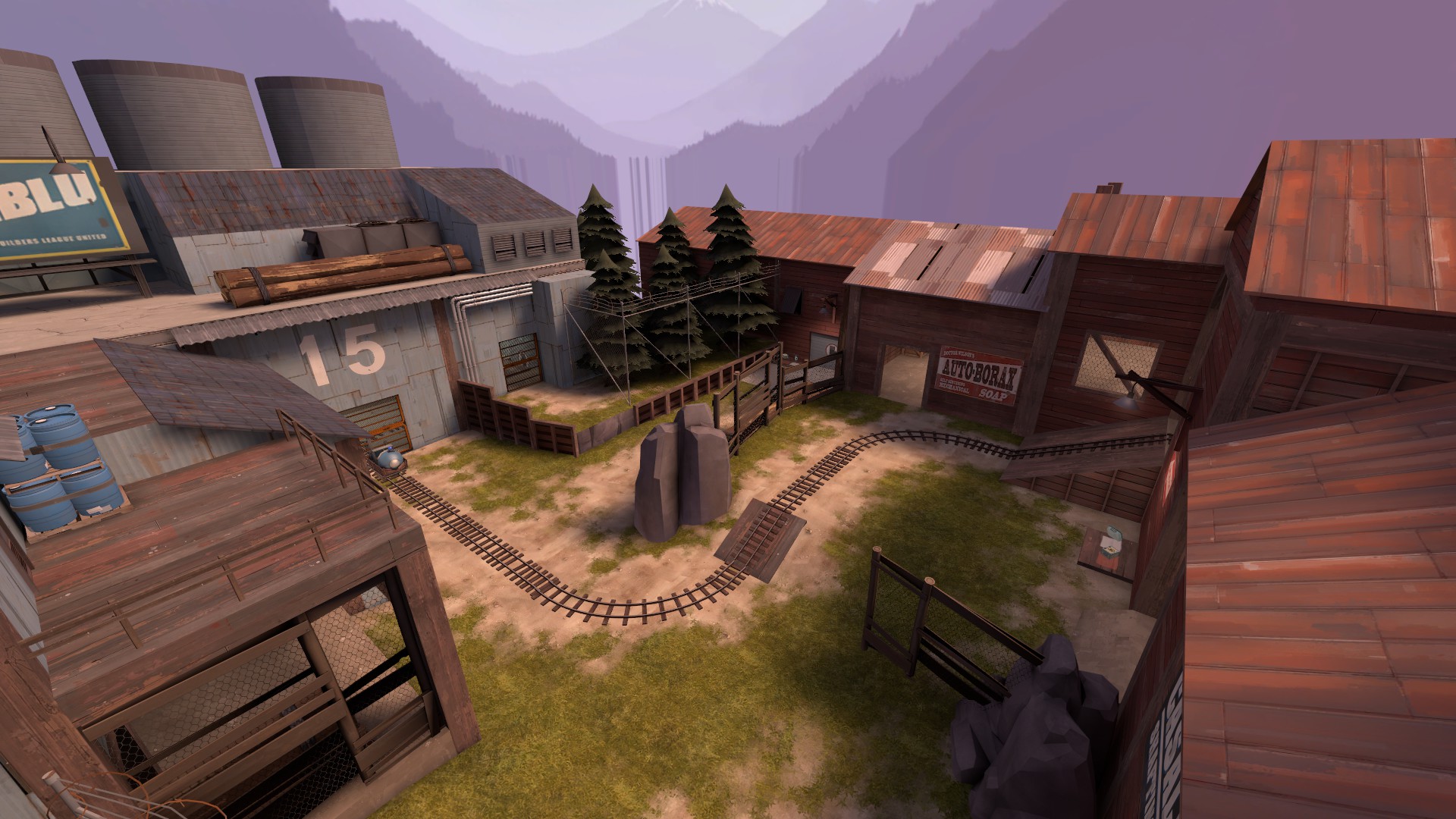
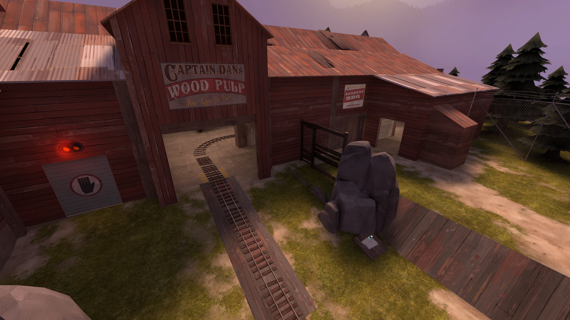
Azumith is a map that feels like it has potential for interesting and fun gameplay areas, but many parts of it feel very unpolished, rushed and/or poorly thought out. Many times my first impressions when walking around the map for the first time was "Wow, this area looks fun to fight in", only to discover that it either wasn't or the fun was very one sided towards one team. This becomes very apparent right away on the A point. I had a lot of fun defending, but when it was my turn to attack, I quickly realized that I had fun on defense because the attacking teams options are extremely limited and often just plain unfun to fight around.

a3G2M6v.jpg

8343SO0.jpg

HMwUXSv.jpg


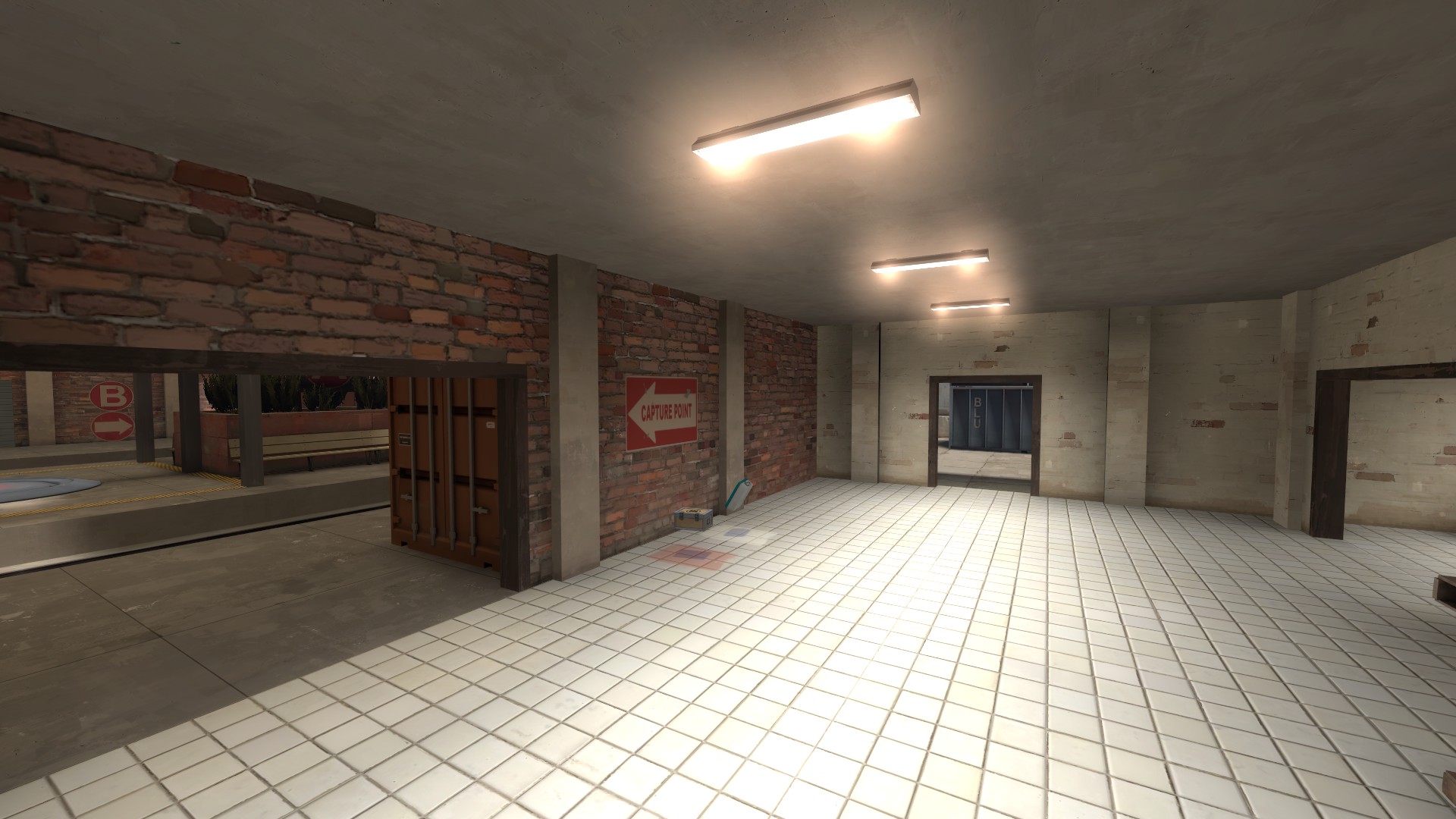
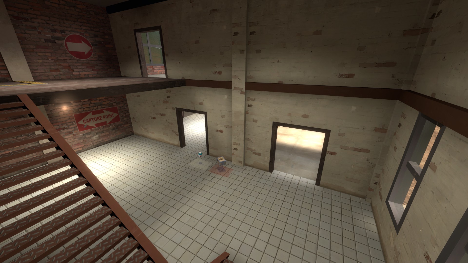
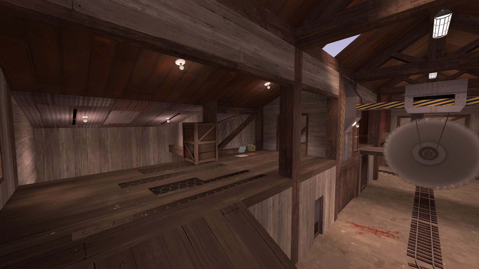
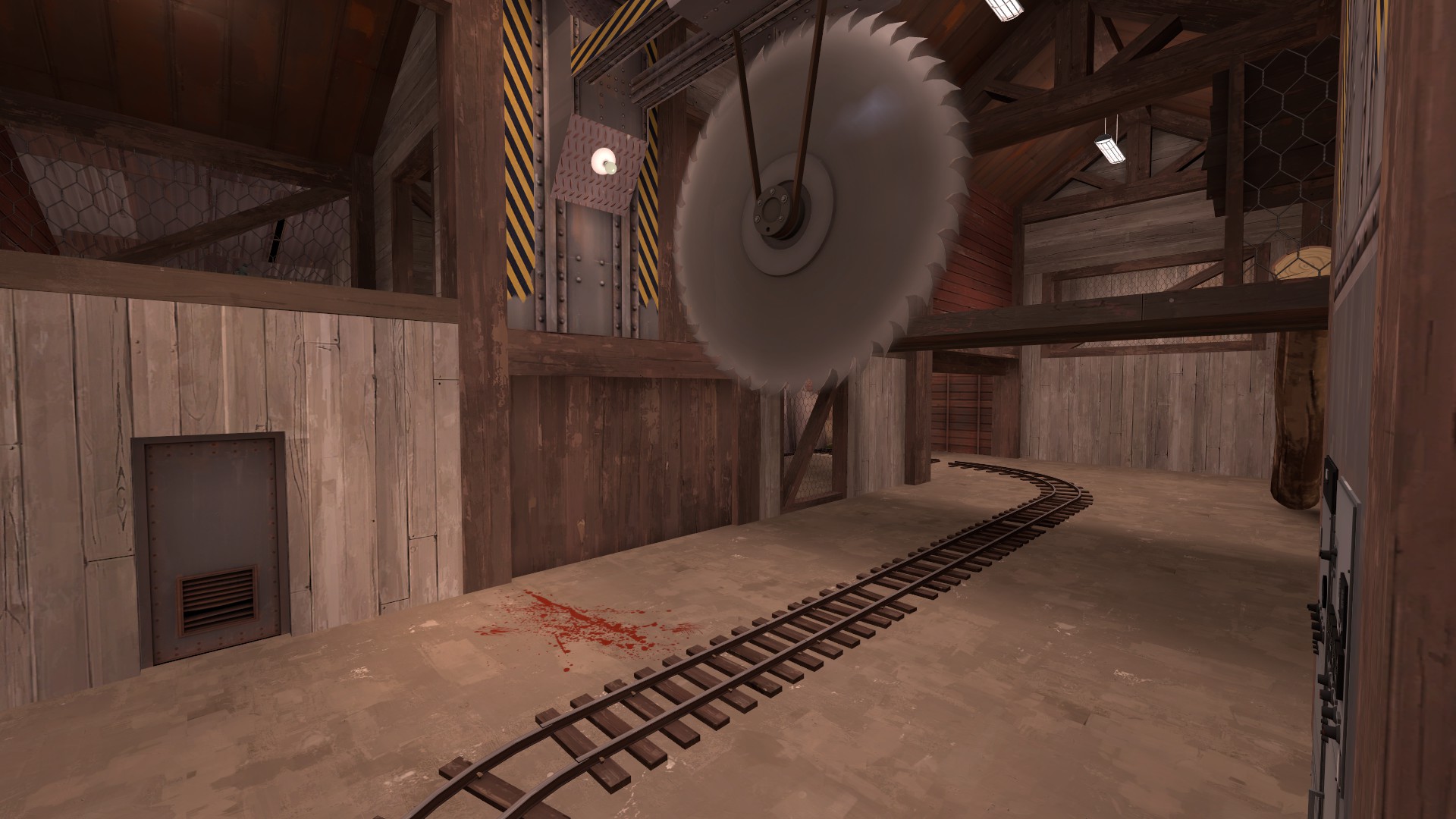
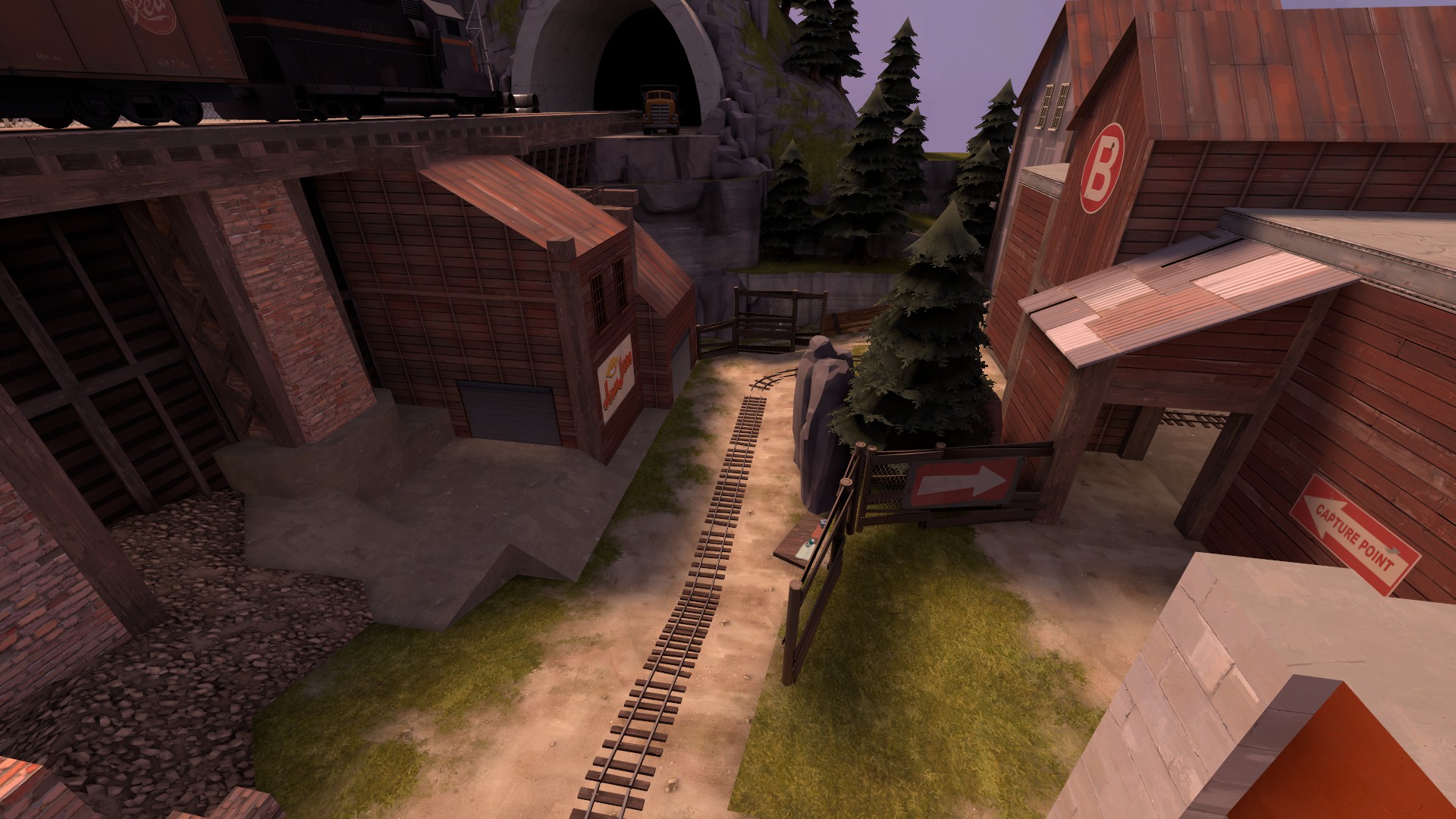
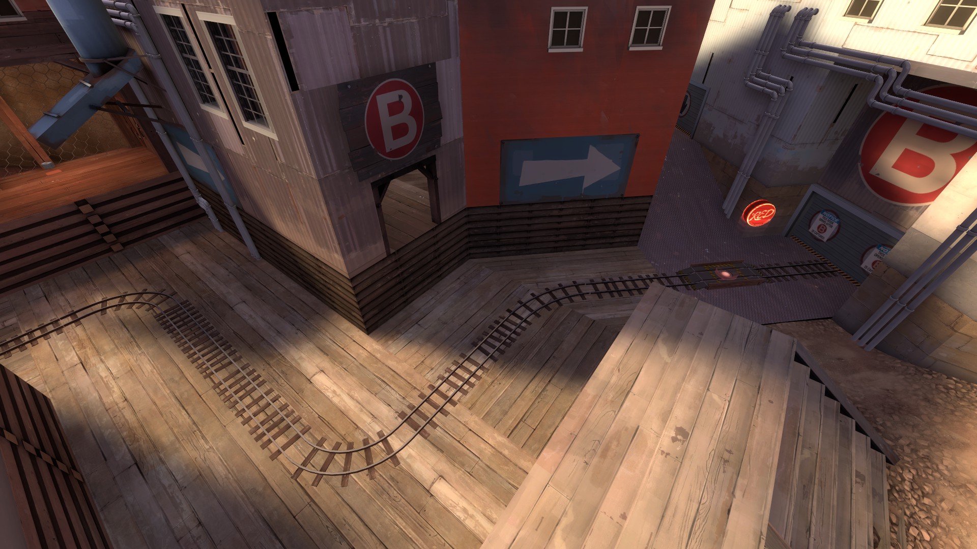
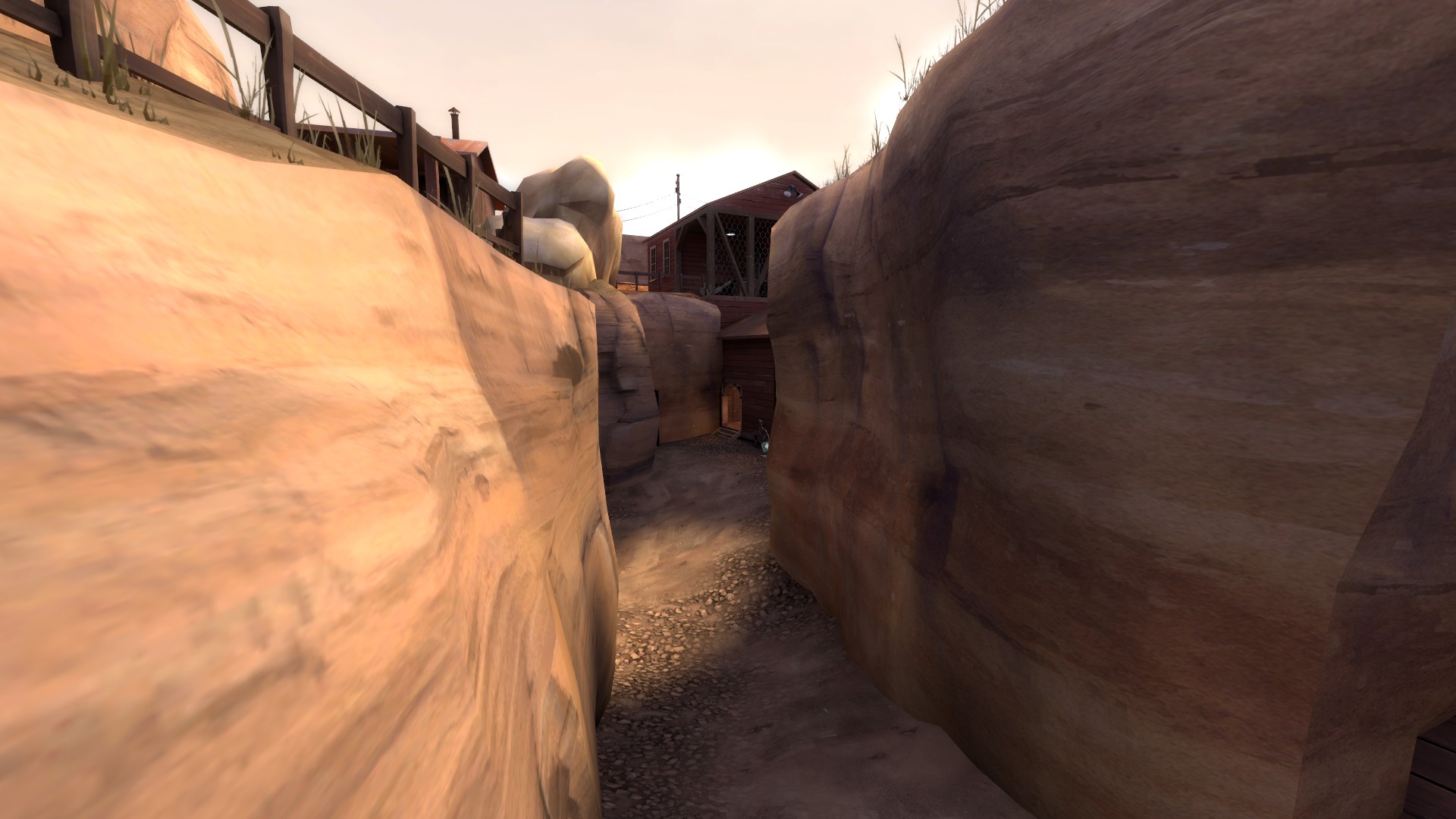
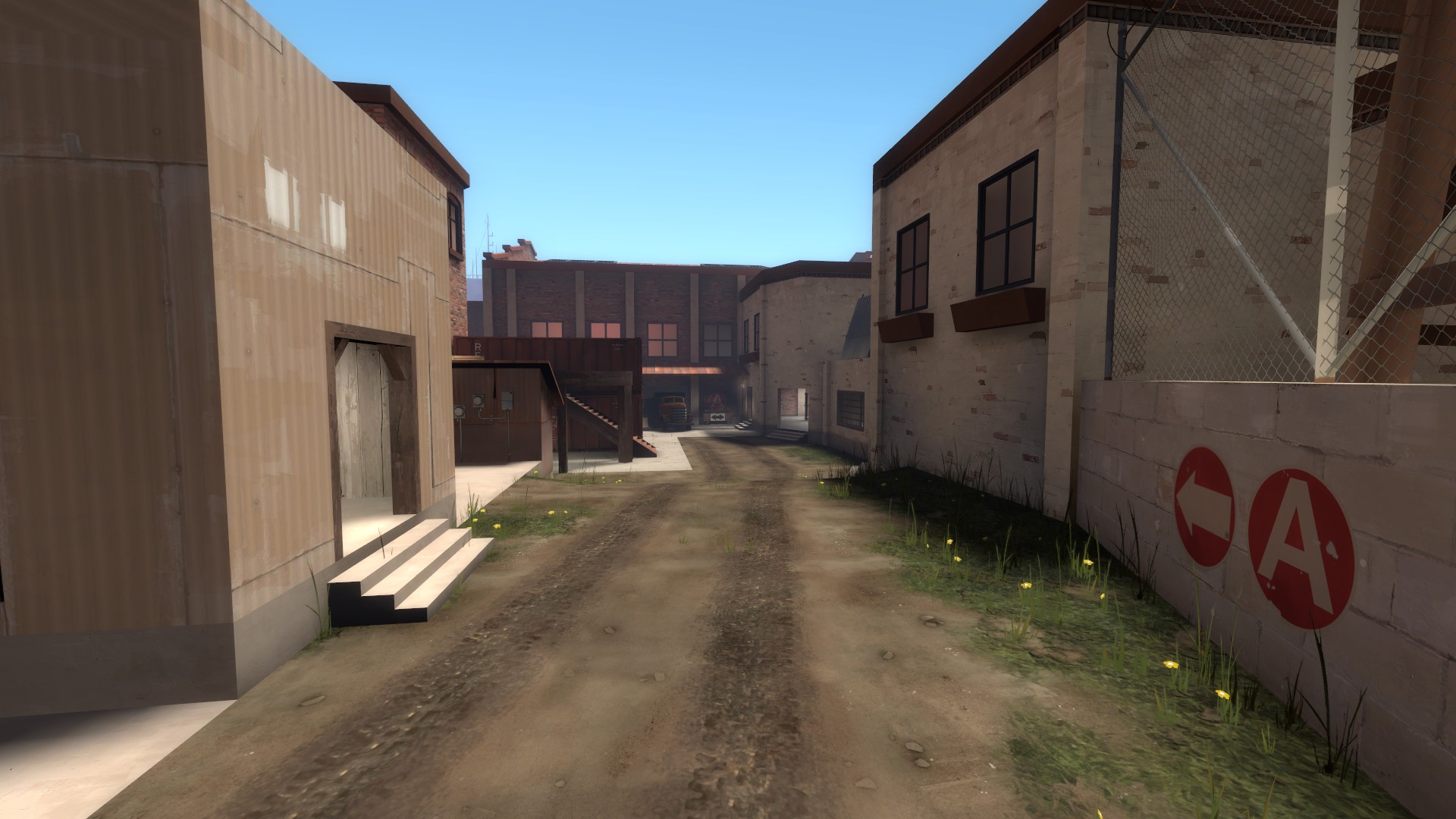
Look at all these small doorways on the low ground you have to push through to get anywhere near the point, this feels like I have been transported back in time to early days of TF2 and I am suddenly playing Dustbowl with million demomen spamming every tiny crack you have to try to push through. There is nothing wrong with small doorways and easily spammable routes, those can actually be very important for gameplay, but when every option you have is the same, your choices when attacking don't matter and defending becomes basically an act repetition of same thing every round. The gameplay doesn't evolve, it remains static.

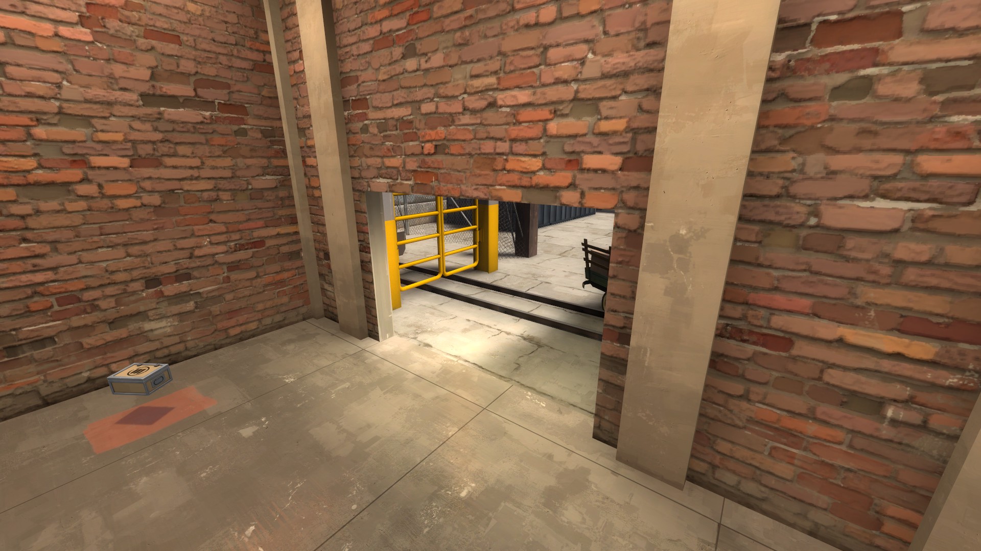
The problems don't end there, beyond a heavy and demoman sitting on the deck with the one way door, spamming the tiny doorways, there isn't much of a forward hold on A. After mentioned hold on the upper deck also allows red to keep jumping on blue trying to push through the outer route and can be very painful to break up because the only ways in are, you guessed in, tiny doorways. One of which is behind a very roundabout route through a rooftop and a very narrow ladder which can be a death trap if you are spotted while crossing.

aoODvYF.jpg


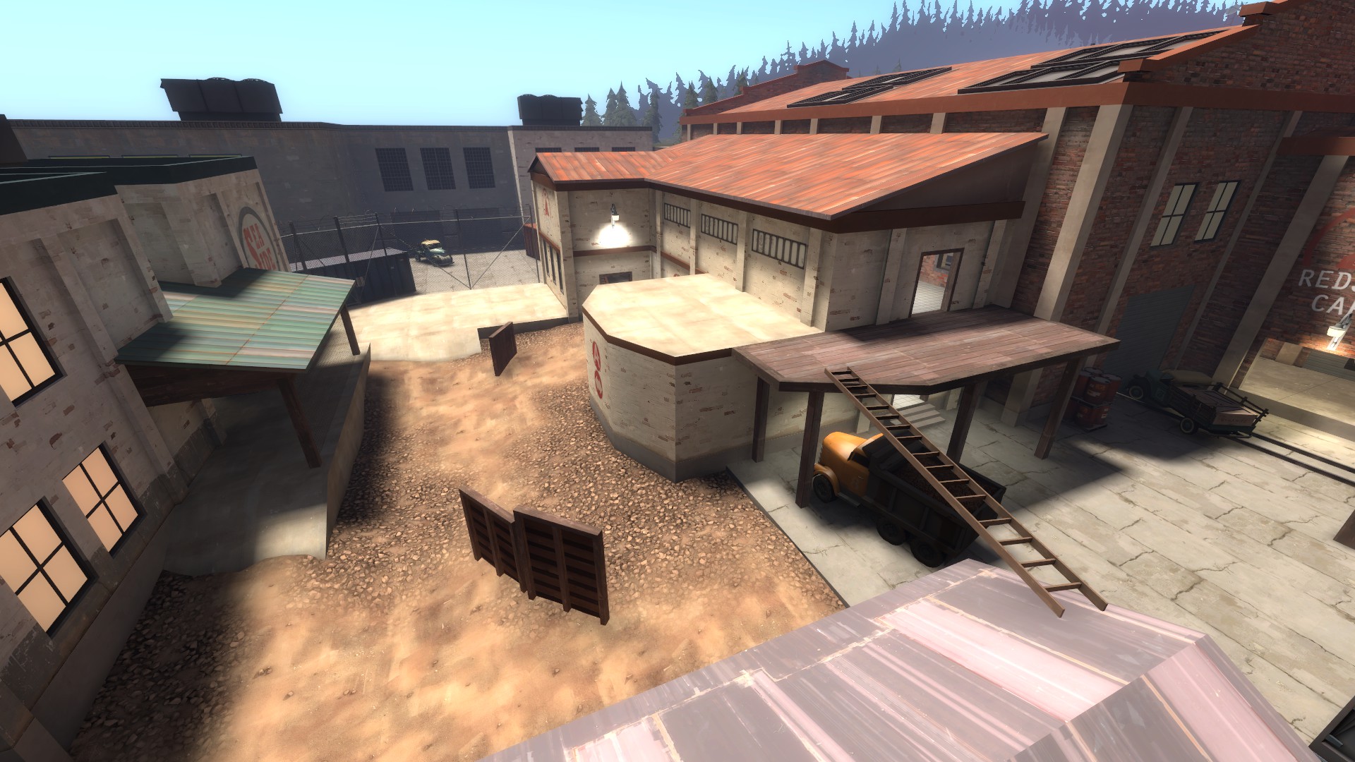
The starting area in general is very uninteresting and doesn't lend itself to any sort of a proper front line, it is much better to just sit on the point and wait for blue team to come to you, which is fine but it is really the only gameplay you are going to have here. The outer upper deck is only place where you can really try to make any sort of a forward stand and not even that is very good, despite overlooking most of the starting area. It is very exposed and it is much more effective sit indoors and force blue to push through all the spam heavy routes. In general, this area feels very much like a box that has been filled with some fences and a building to the side, if there is one area I would outright redo entirely on this map, it is this one.

I haven't got much to say about the point itself, it seems like an interesting point, but nothing leading up to it is really doing anything to let anything of interest to happen. If the area before it was suited for an initial front line and the routes allowed for more interesting options and playstyles, the point would probably play really well with very little changes.

Also side note, there is plenty of room on the map to have a red forward that doesn't require doing a loop, nobody likes needlessly complicated walks from spawn to the front line and it just makes things needlessly confusing for someone new to the map.

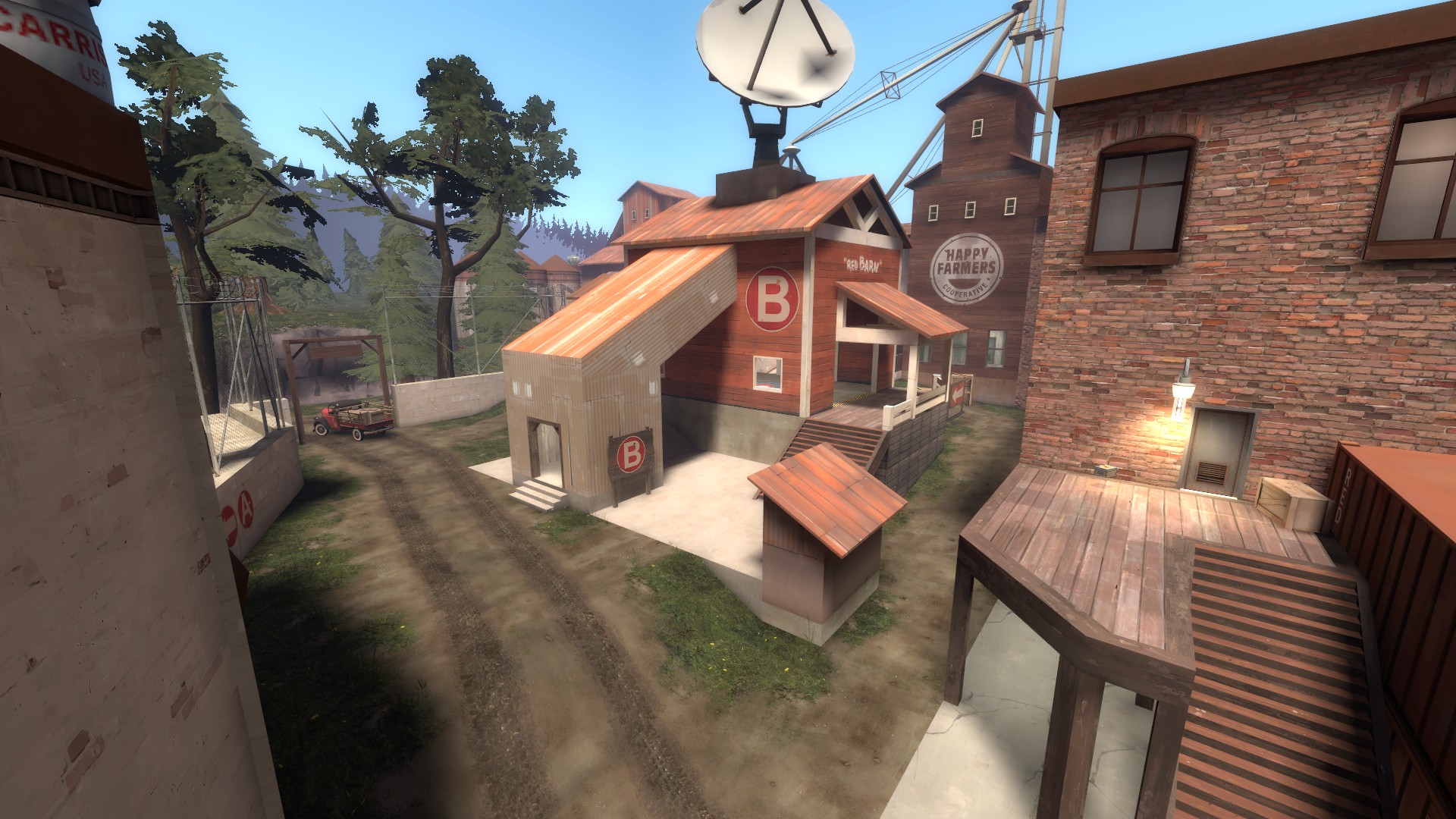
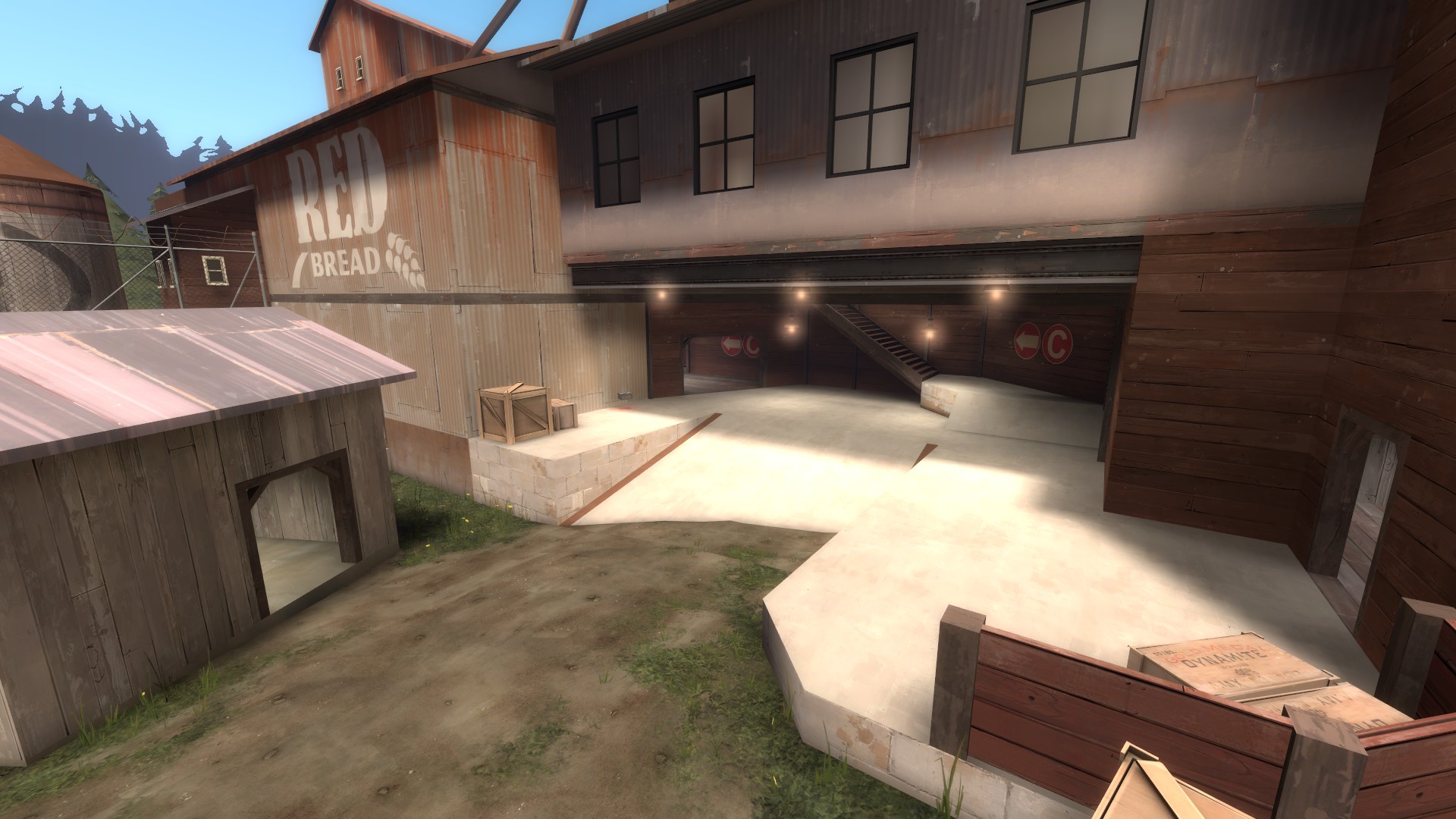
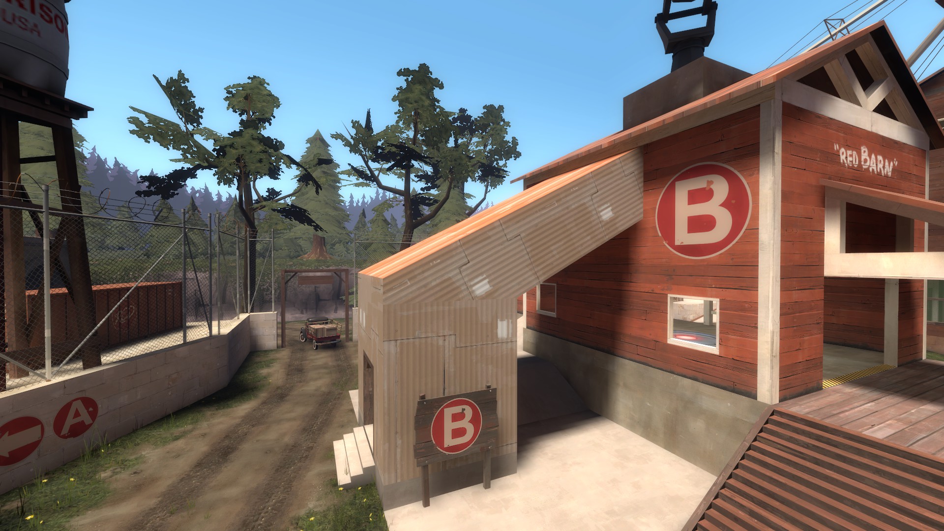
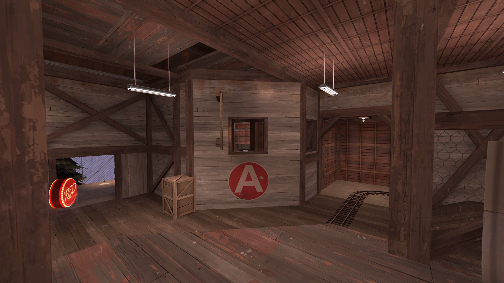
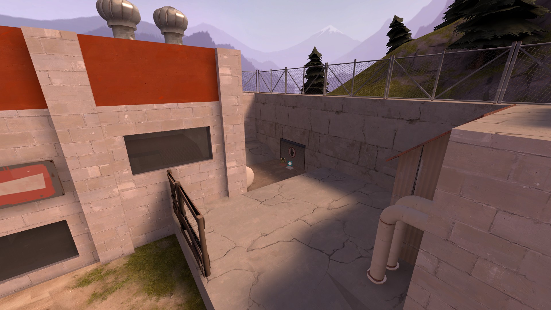
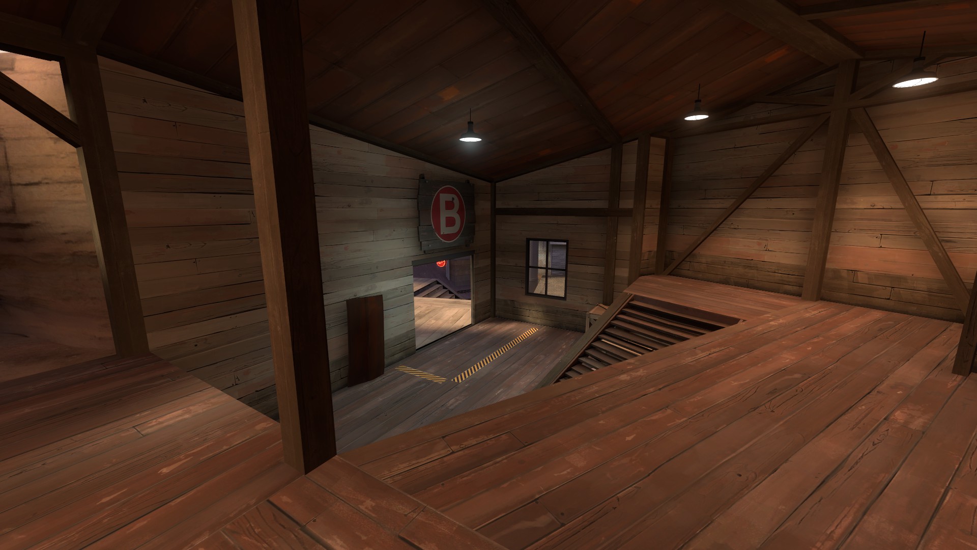
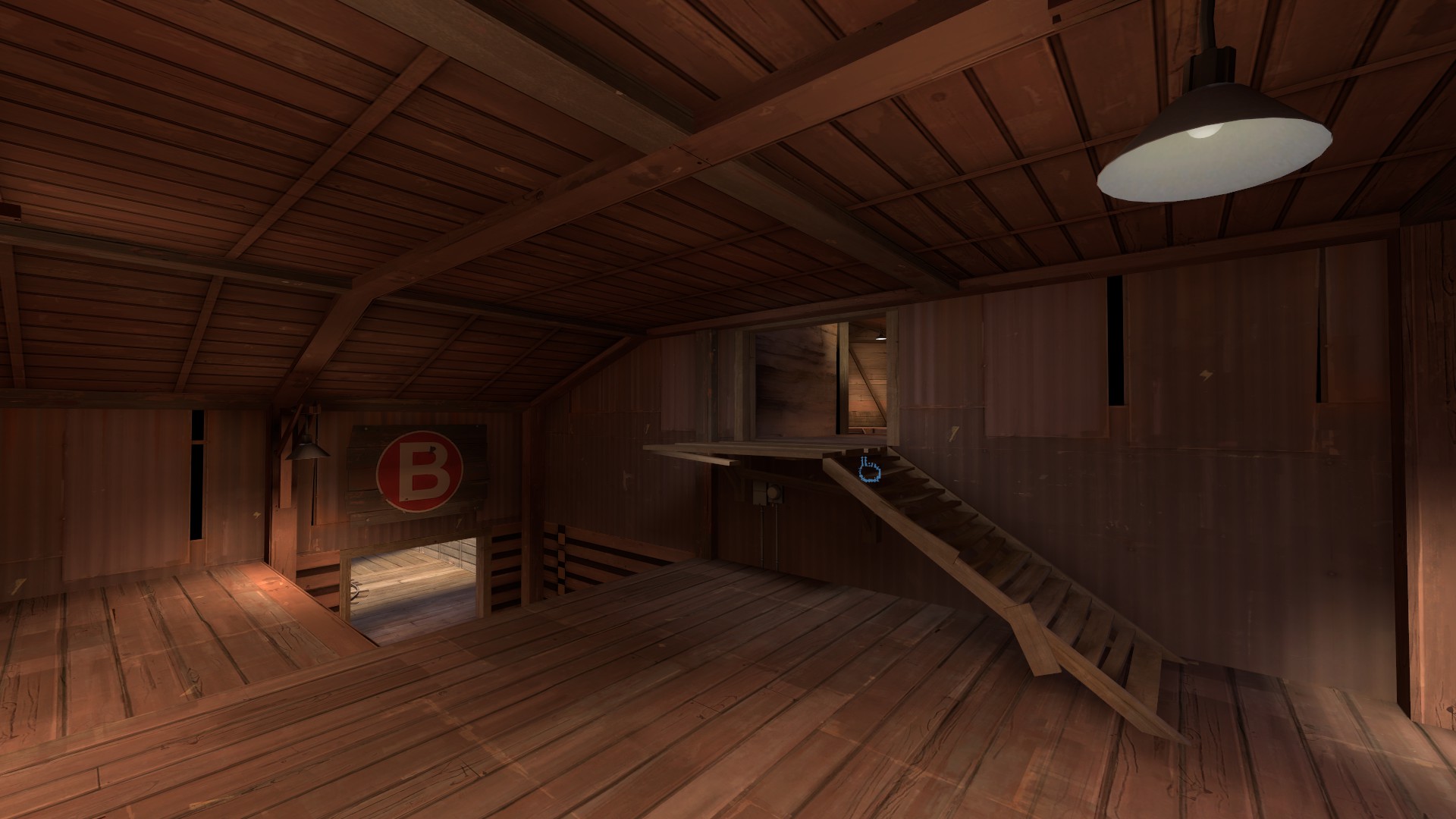
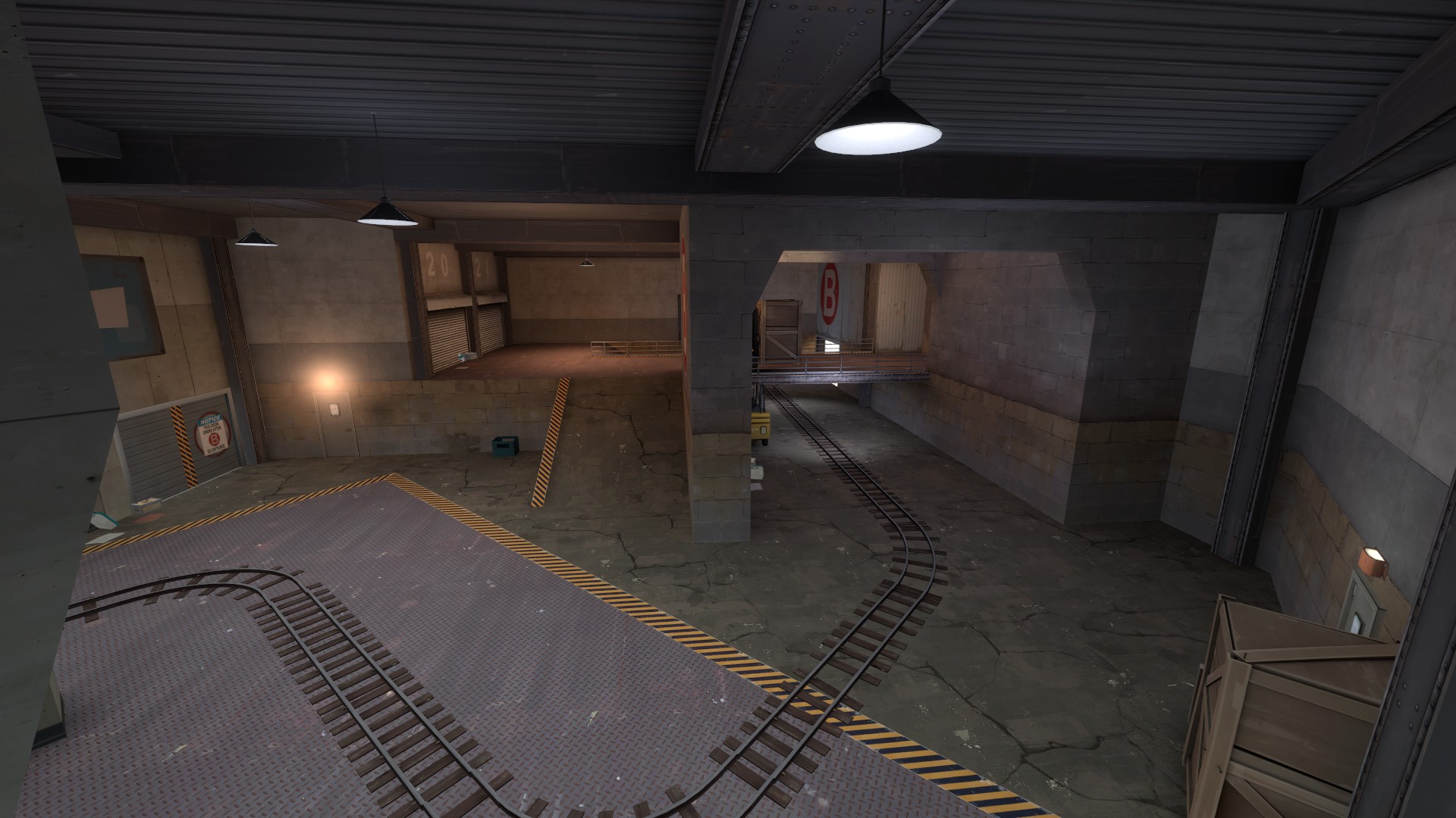
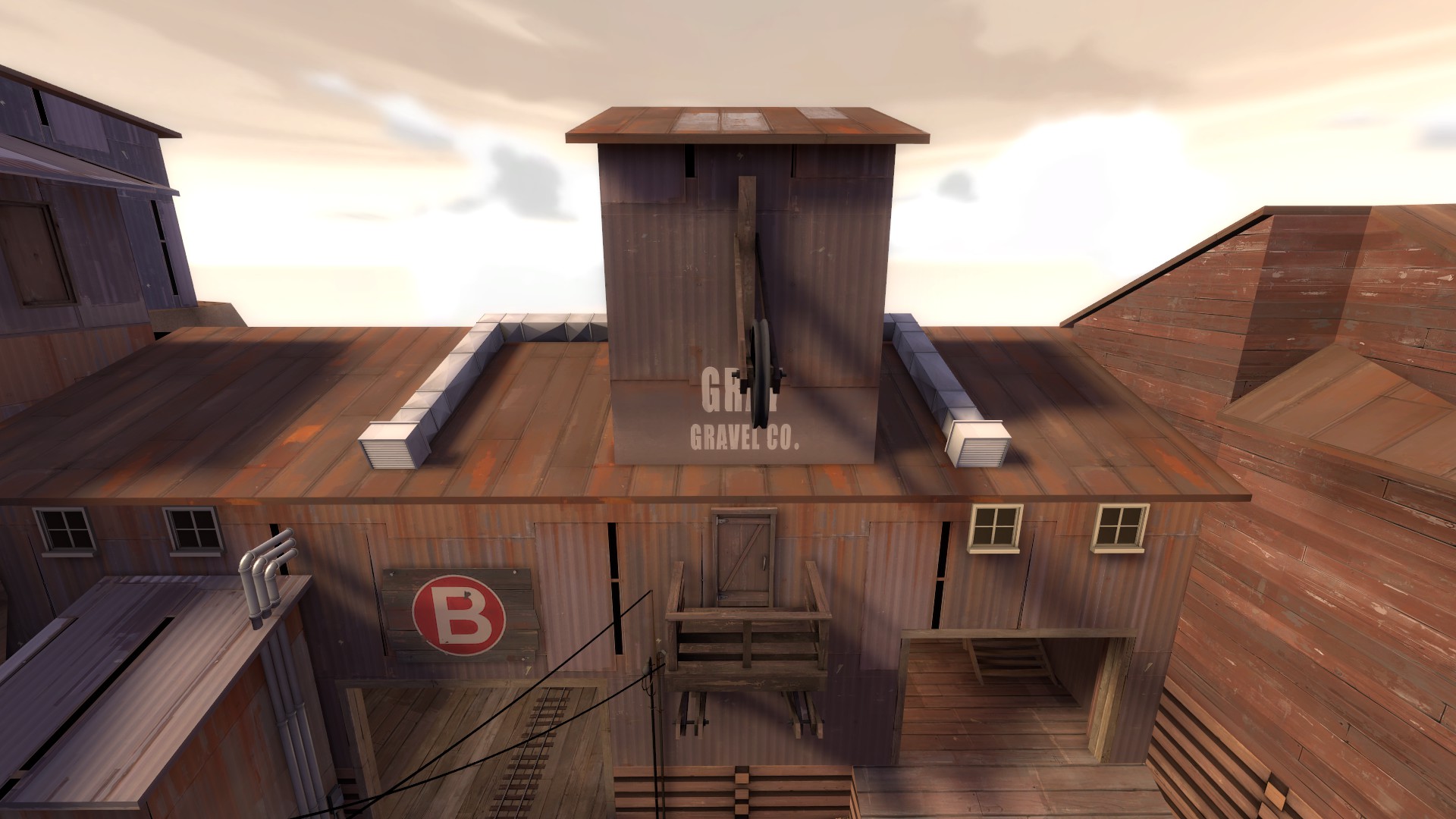
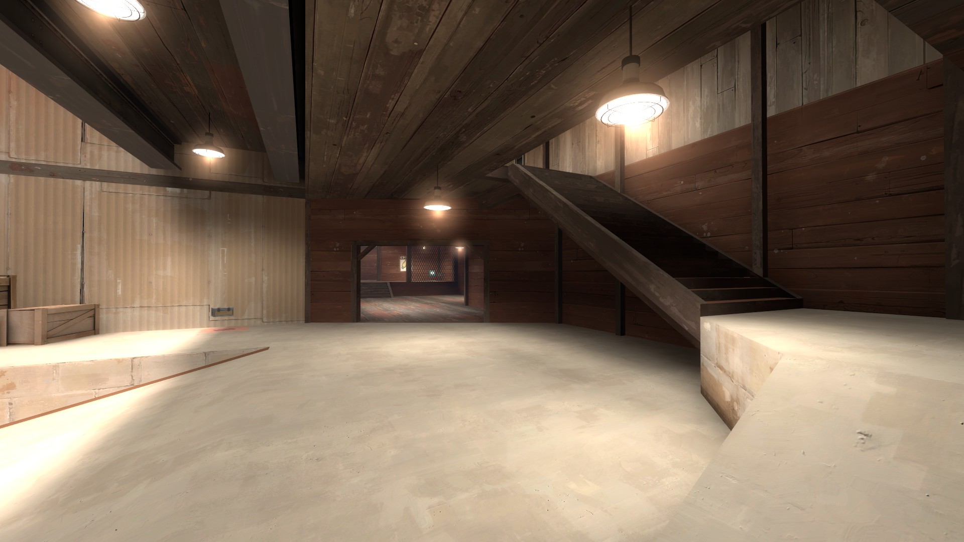
Now, onto B, and this is where this map really starts to fall apart in my opinion. B point itself once again seems like it could be interesting but the area before it feels like it repeats all the mistakes of the previous point on even more extreme scale.

9rZWVlb.jpg


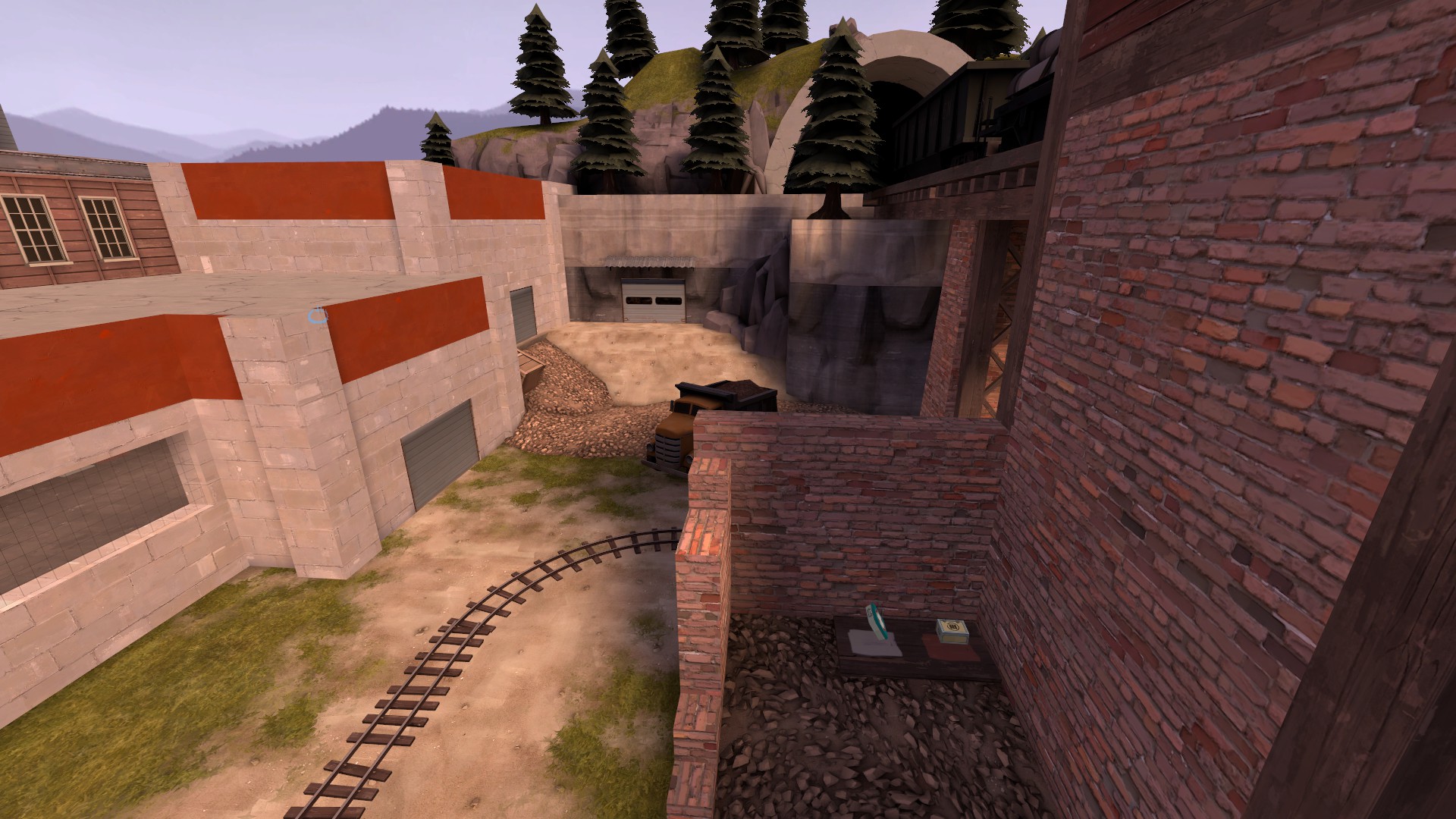
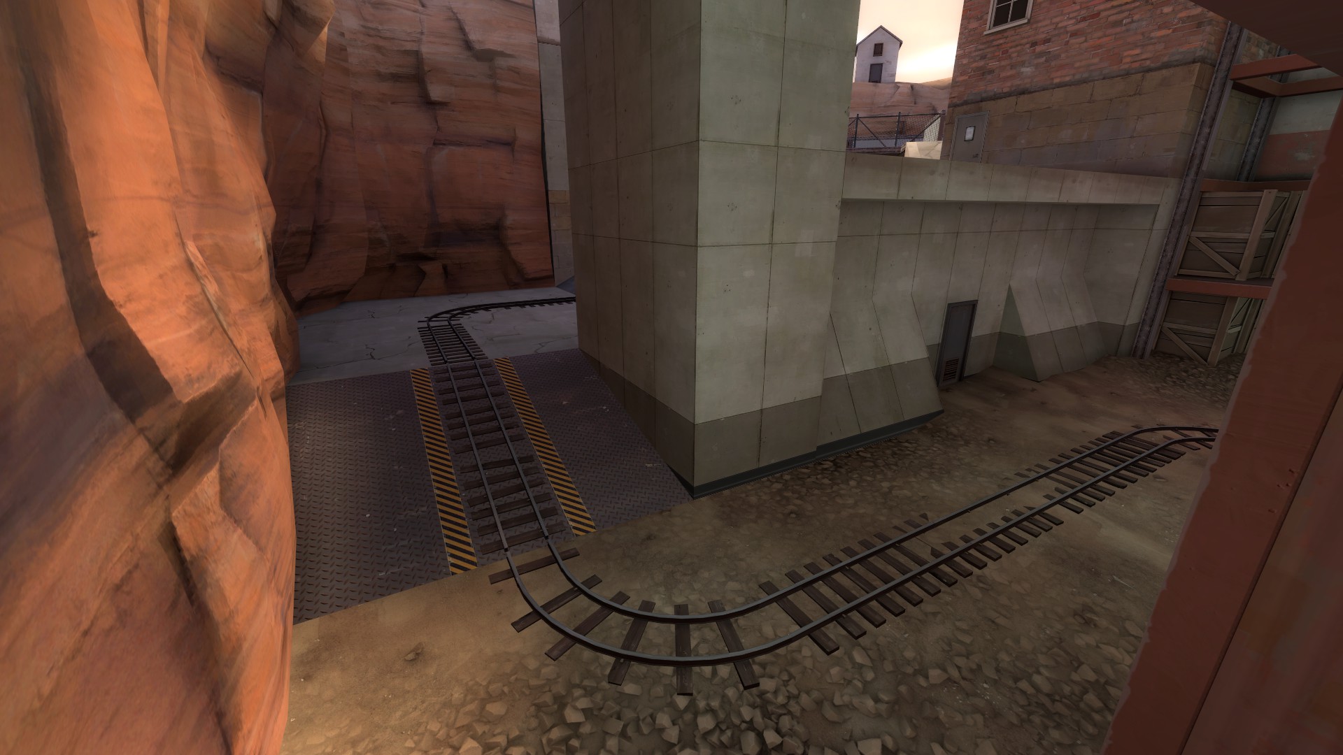
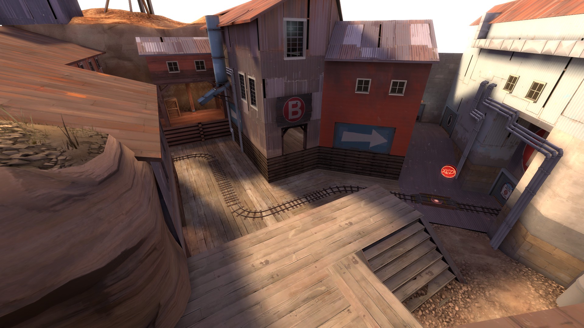
Right out of the gate you are met with this area, now with even more doorway based routes that are all underneath an immense height which can easily be abused and is extremely painful to fight against, especially if the defense knows what they are doing. Once again, my options as attacker are being limited by the map itself, I can choose a doorway to an area that holds gives you no real advantage to another doorway to an area that gives you no real advantage but it is behind longer walk time. This is not an unbreakable position, but boy is it dire to play around, but the problems don't end there.

12QRcqj.jpg


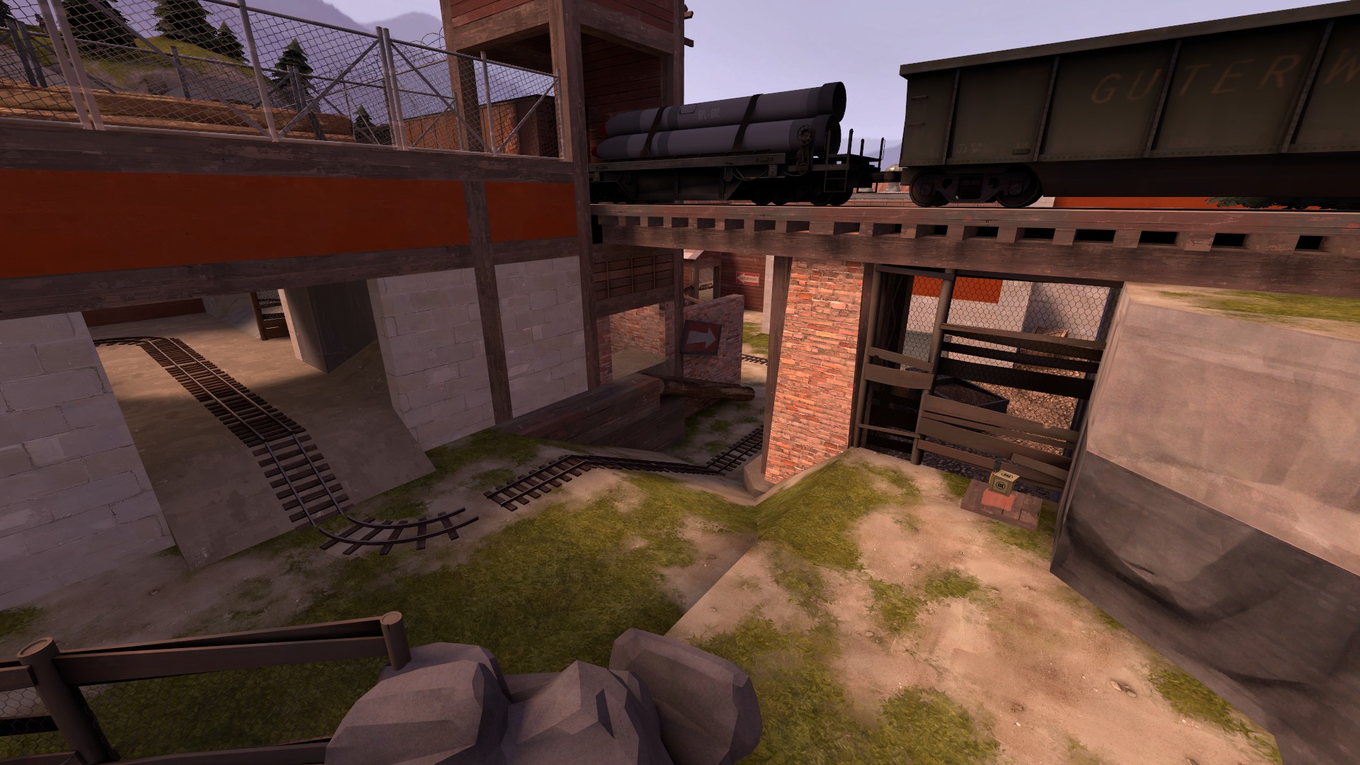
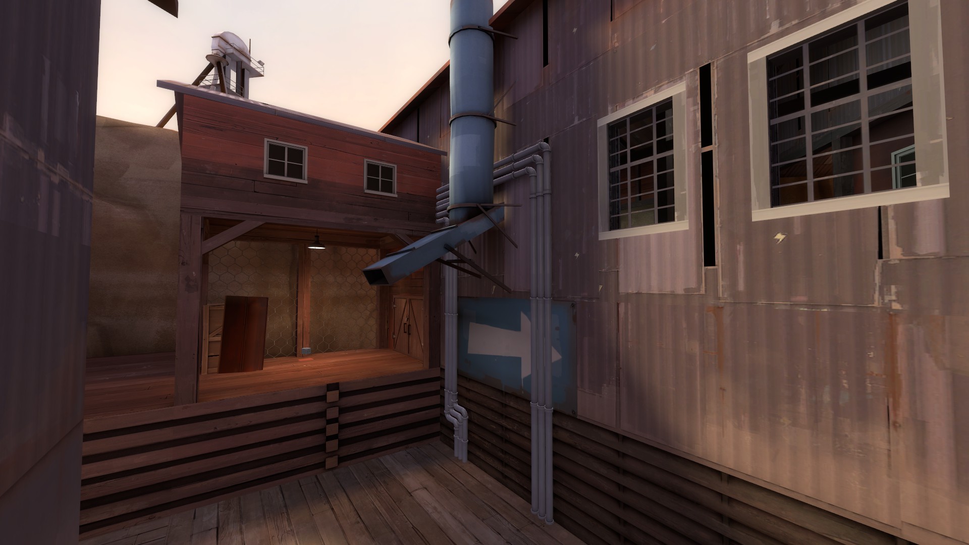
Sightlines, sightlines everywhere. Even if you manage to get enough of a foothold to not have red just sitting on the container, you basically have to play and push through this long rectangle with most of the routes leading you right into the sightlines across this entire area. Pushing into Doom playing sniper in this area was one of the most aggravating experiences I've had in TF2. There is a way around it however, but it is almost suicidal.

sZ4OVAB.jpg


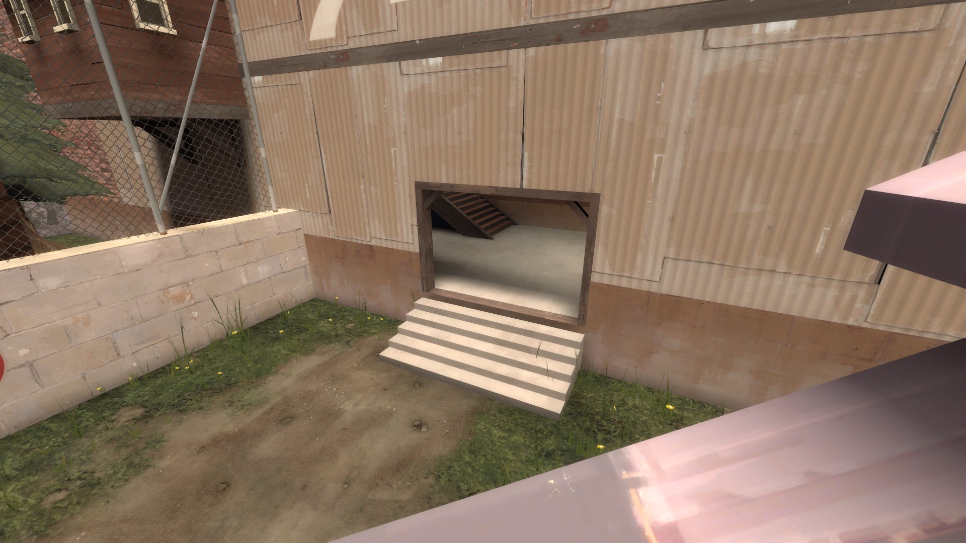
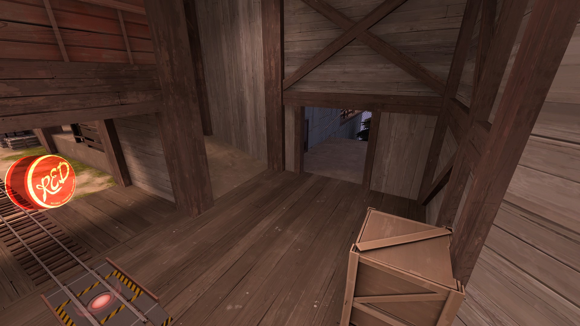
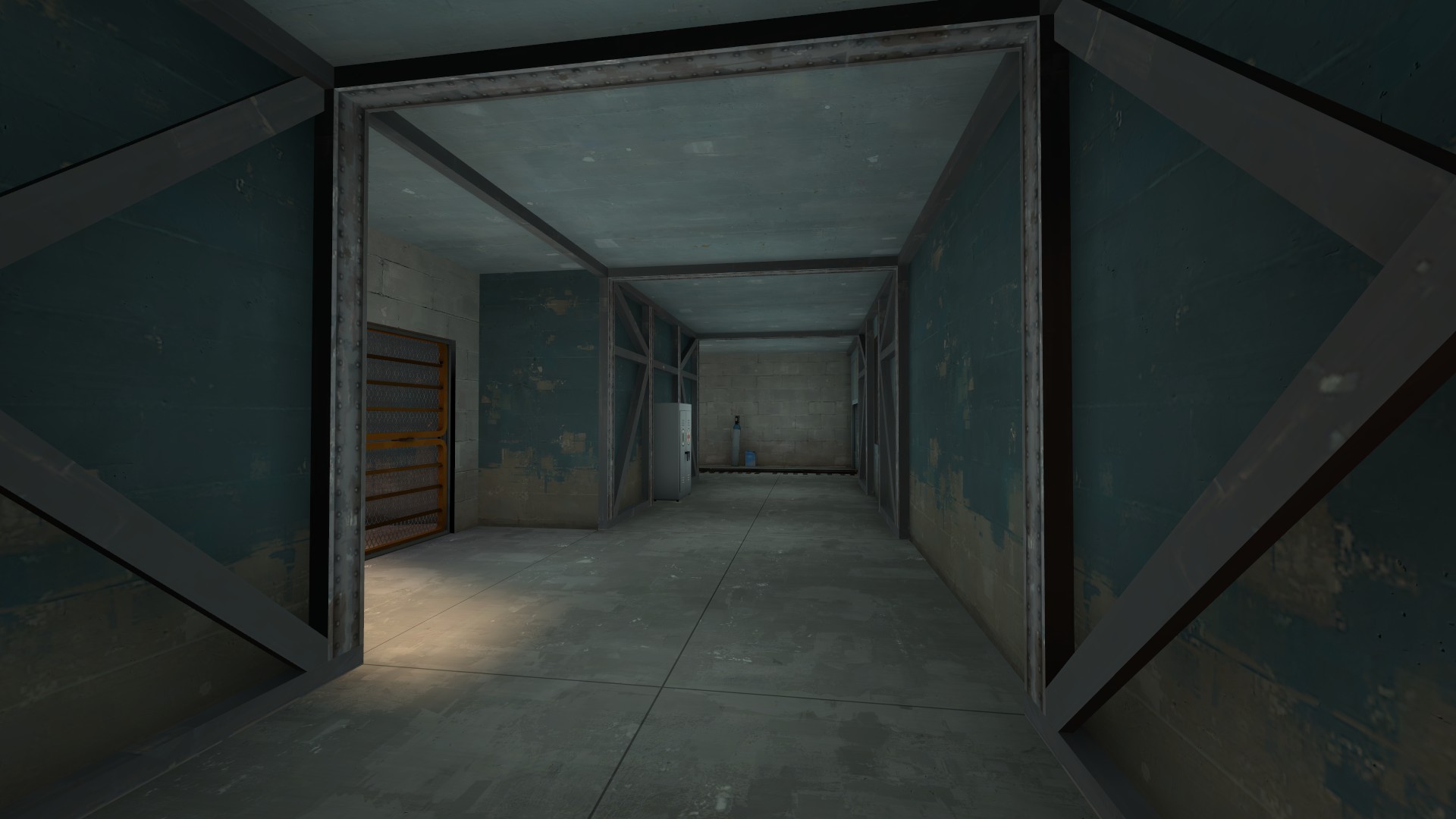
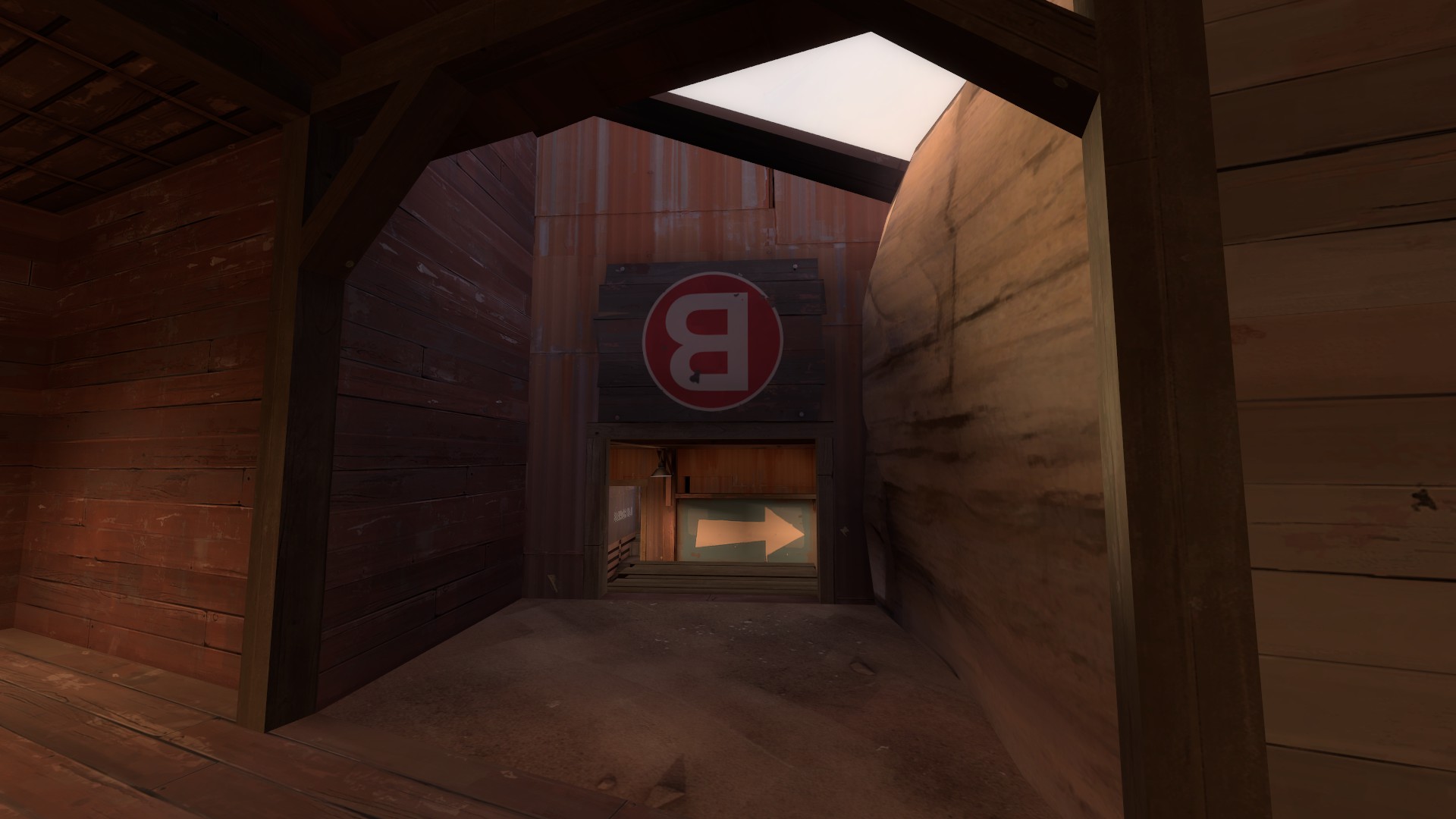
Now introducing, the ultimate small doorway of death. Not only are you pushing through a small doorway, the area around the doorway is also small and you are pushing into a blind corner with no certainty what you are pushing into. There is also a platform above you that could be under red control, you have no way of telling. This route could be viable if it at very least had a window I can look out of to see what is waiting for me around the corner.

ty4Gto2.jpg


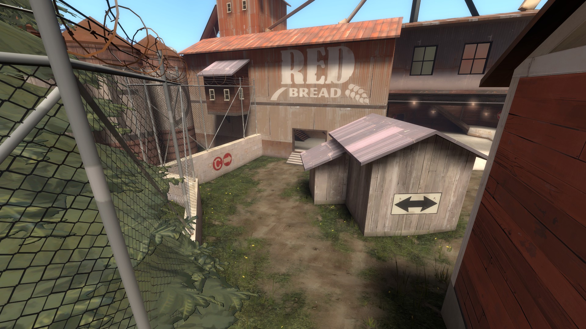
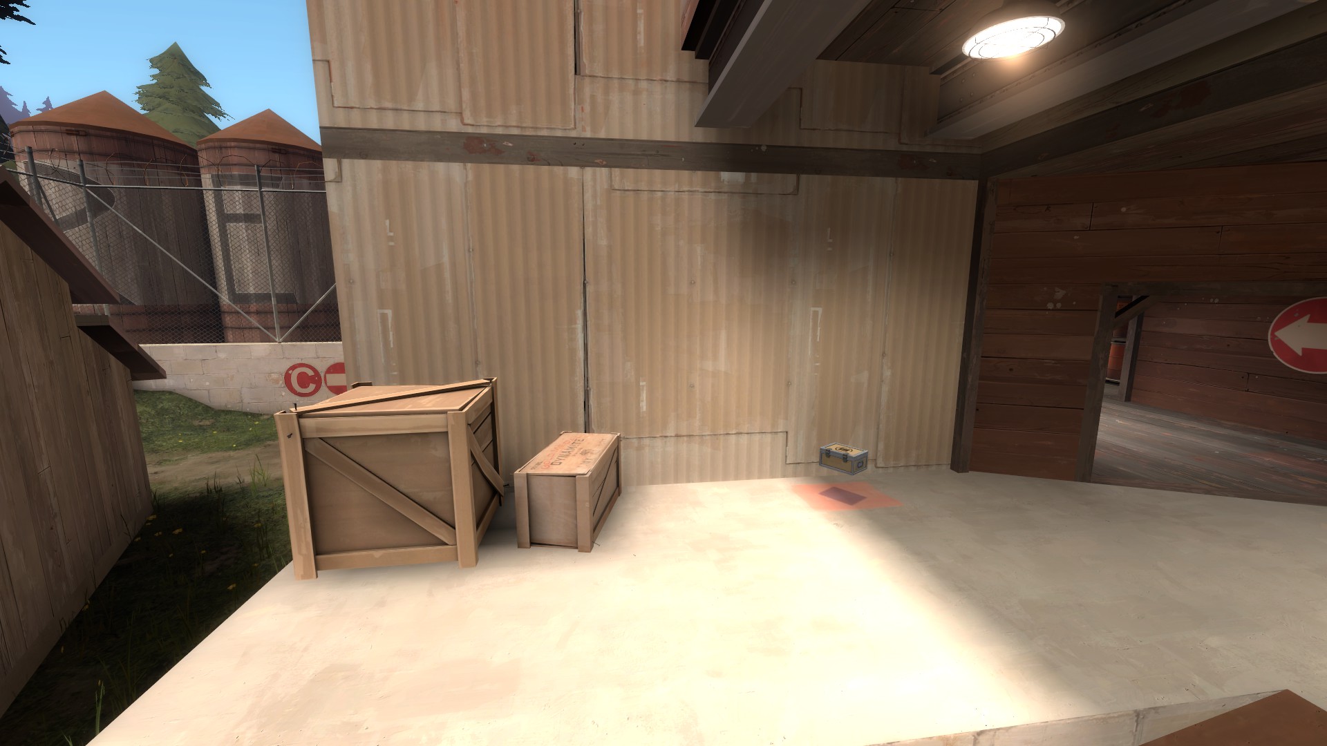
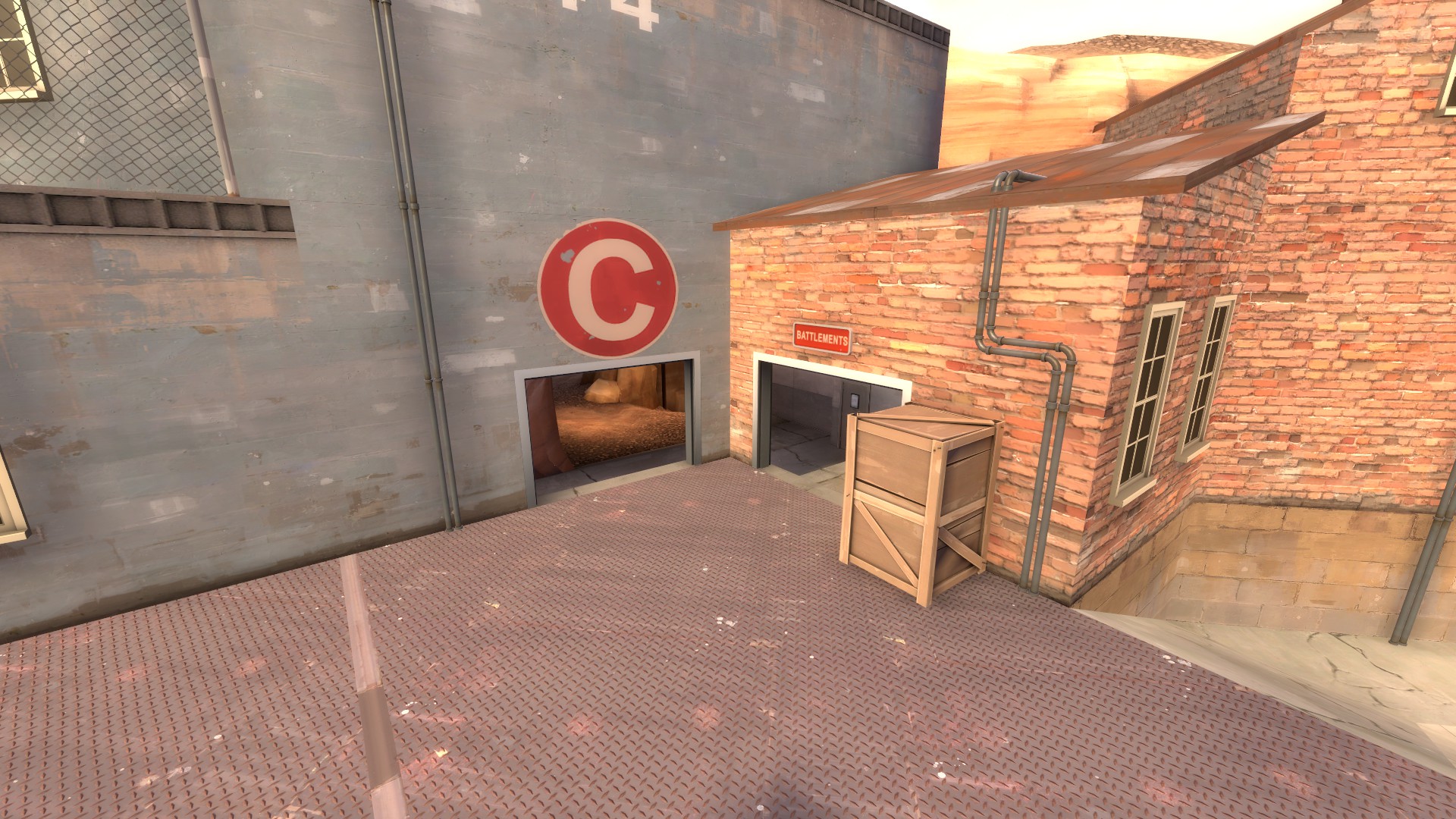
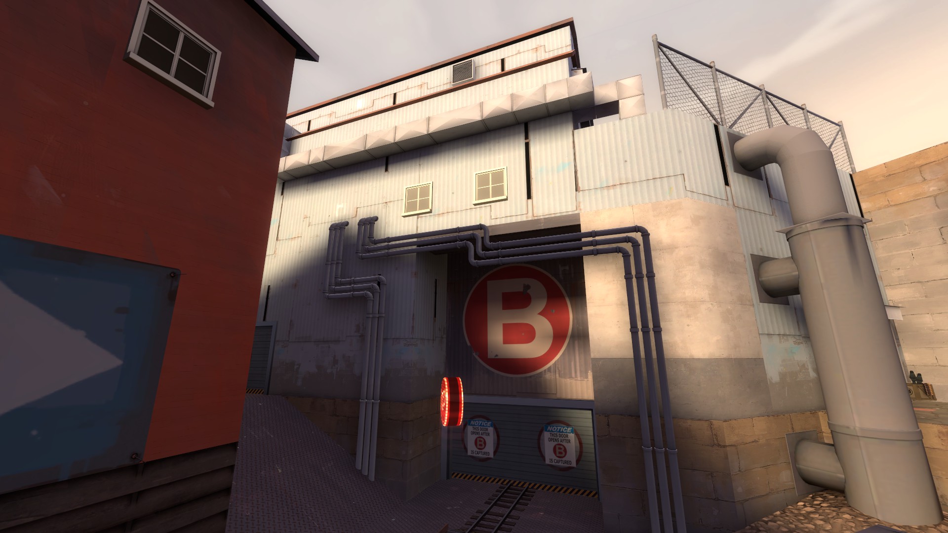
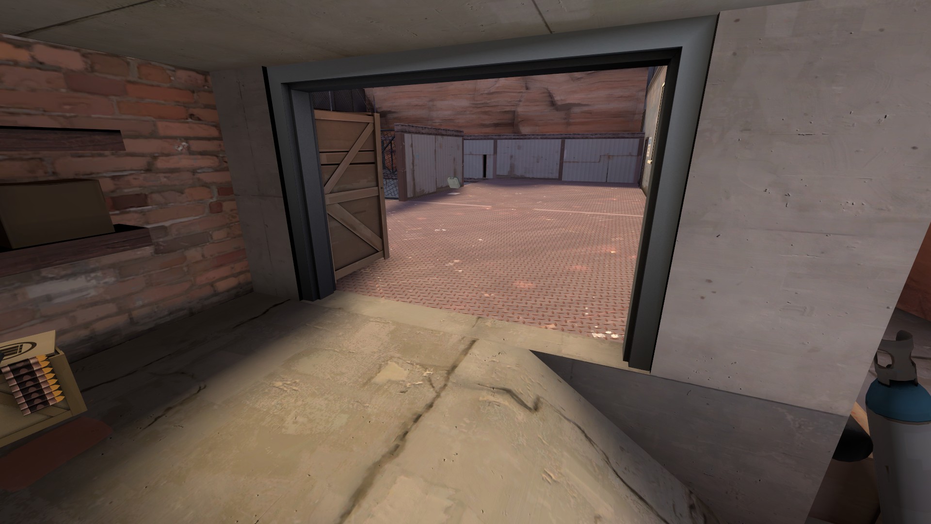
Side note: You should probably close this door until B is capped to prevent combos just skipping the point and walking all the way around C to the red spawn. It is not a big or common issue but something to consider.

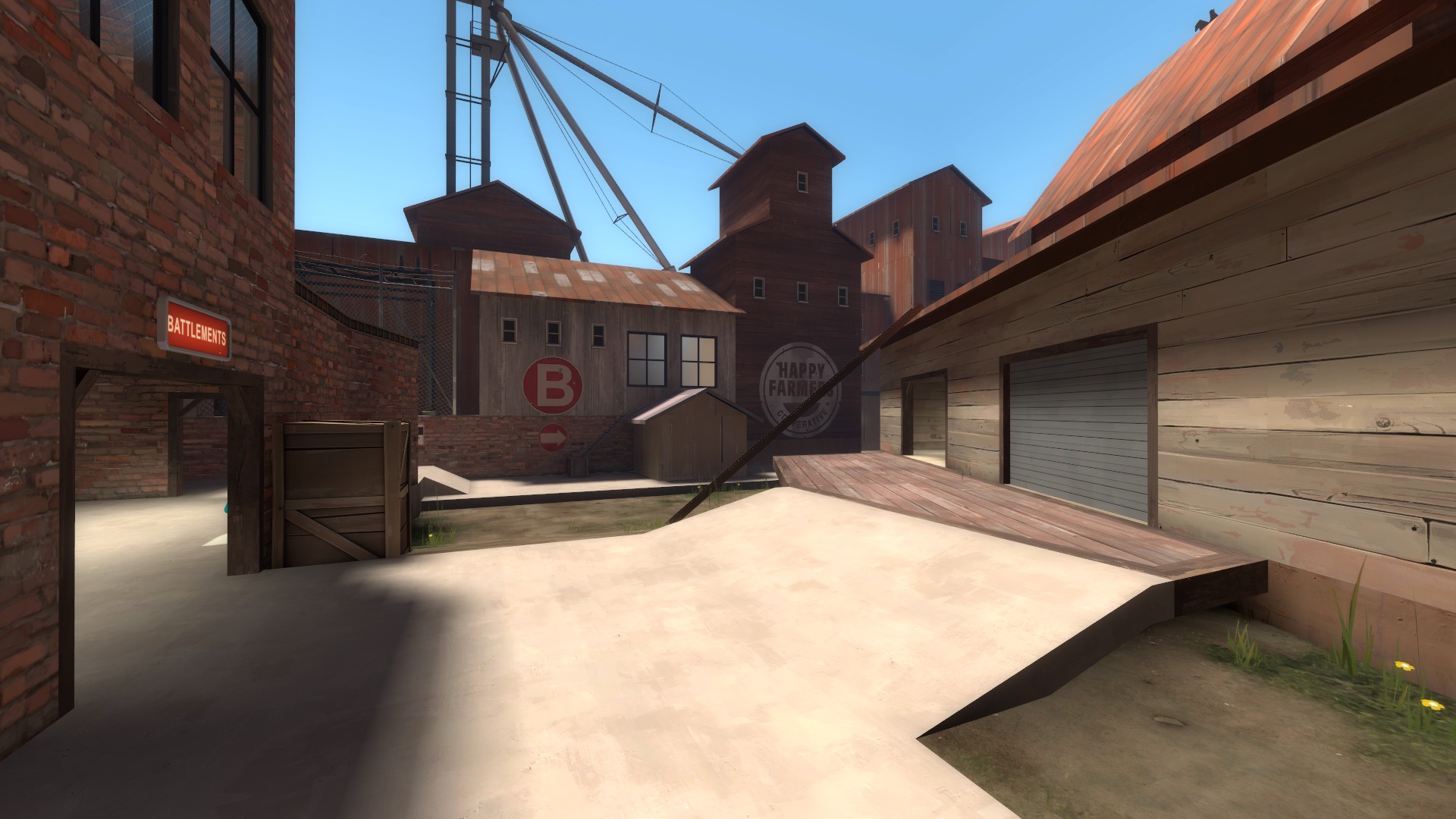
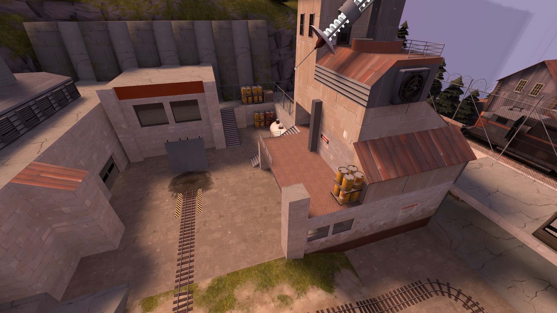
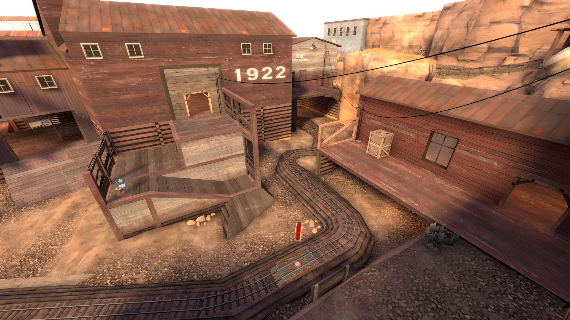
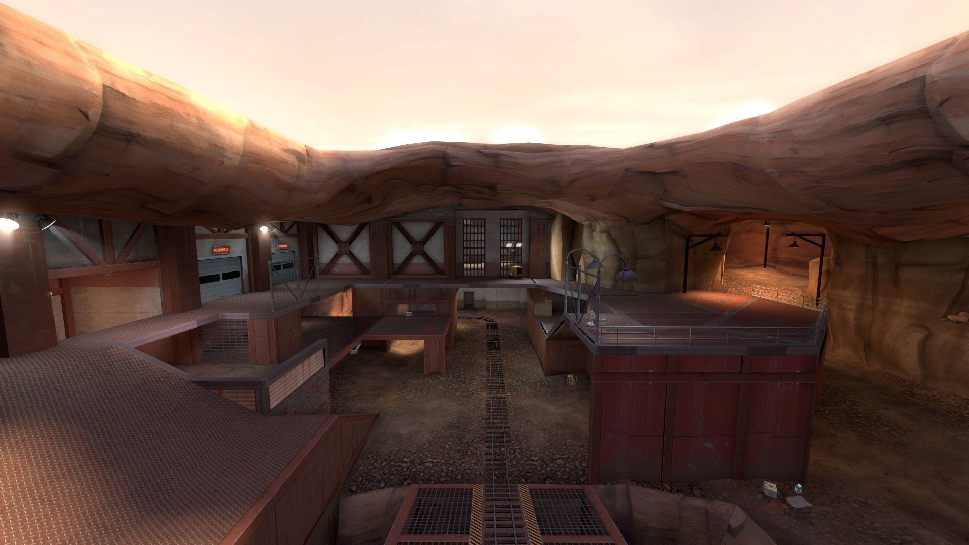
Now, we move on to the C point, which can be an absolute nightmare to get even remotely close to if red manages to set up their defense. The problems begin all the way from the blue forward, from which the routing feels almost overwhelming and needlessly complicated. There is also a lack of any sort of a bottleneck to prevent red from bleeding into this area if blue is pushed back.

6d27sDV.jpg

QcCgmI1.jpg


Look at all these routes and doorways, it is an information overload for a new player. In my opinion routing from forward spawns, especially for blue, should always be as simple as you can make it without making the map too basic. More complicated and spread out the routing is, harder it becomes for new players find their way and for the attacking team to stop red bleeding into the area and find a consistent front line naturally, something which they almost never have on C. Beyond the overly complicated pathing, it doesn't help attackers cause that their lobby just kind of sucks.

y6hJysk.jpg


This is the lobby and the primary path to it, the lower route doesn't really give you much of an advantage and forces you to cross some very awkwardly angles sightlines that cut through the main doorway to C. You are also very likely to die to a combo pushing in from red through the door further back. There is also no good way to rotate to the high ground if you are in the lower lobby, you either cross the after mentioned sightlines or you take another door, which is totally out of the way and disconnected. (And even then you have to do a 180 degree turn to even get to the high ground.)

l97ACoK.jpg


This is just all very awkward, and while this is more a critique post than a feedback post, I can't help but suggest something that would make this lobby simpler to navigate, easier to hold and just generally more interesting to play around. You would have to still make changes to B and C overall, but this is something to keep in mind.

JlN04Z8.jpg


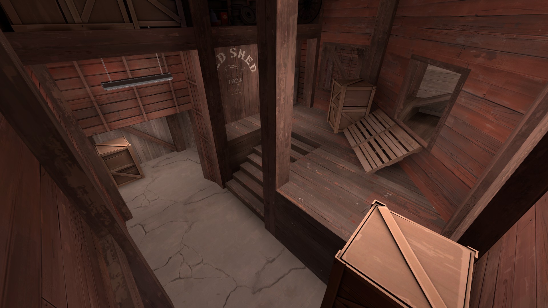
I would get rid of the doorway to the side entirely, hell, the whole area behind shed even and replace it with a doorway here that leads to a stairs to the upper level. Get rid of the old stairs up and then flip the high ground above the lobby like this.

fxulNKk.png


Now the rotations are smoother and holding the lobby is easier because you can clearly hold the primary way red has in and there is no more sneaky flank to get around the entire blue team when they are pushing from their forward spawn. This would also make much more sense as a staging area for blue and offensive engineers. All this said though, C's problems don't end in the lobby and the forward spawn.

N7Oi669.jpg

0lQ8cxt.jpg


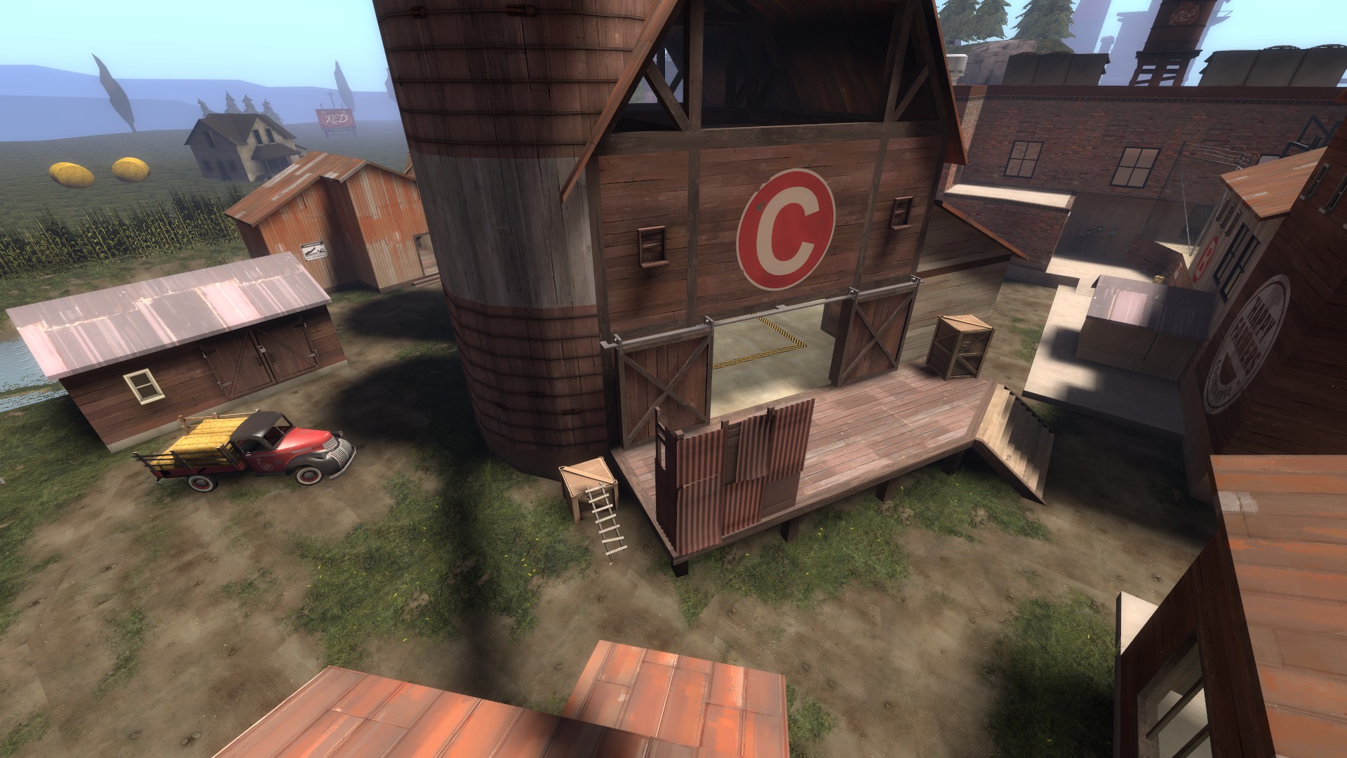
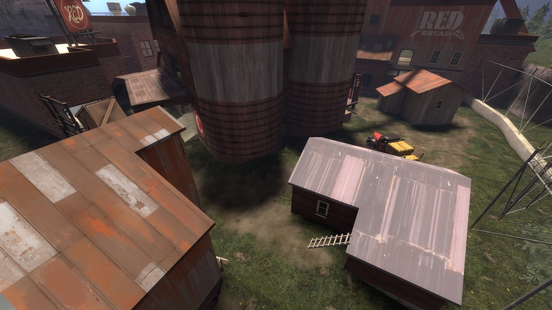
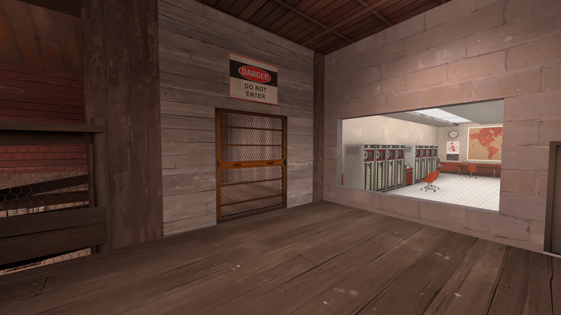
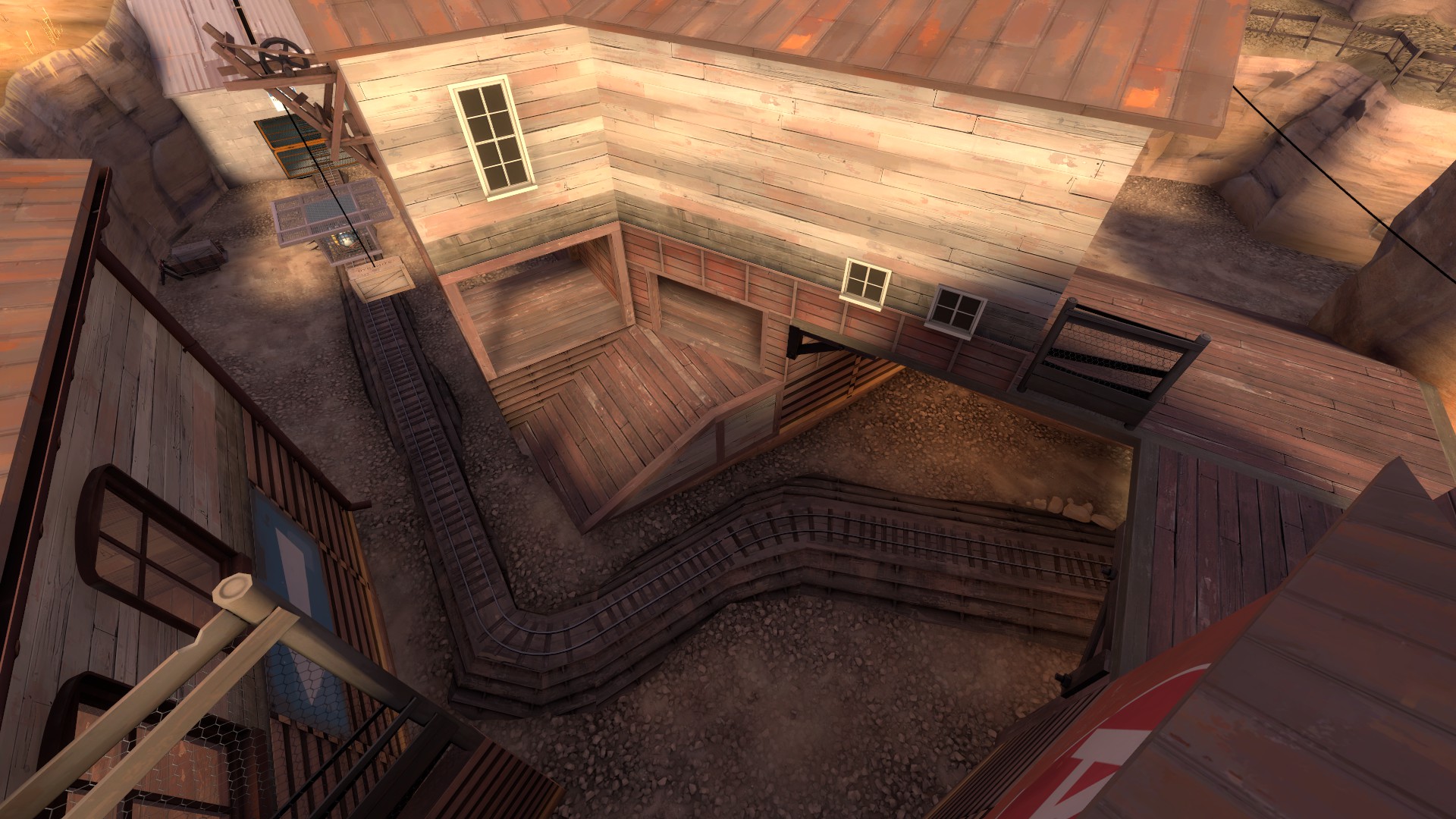
C overall is suffering from very clearly being a large space surrounding one building that has been filled with useless buildings and various props that don't really do anything for gameplay, everything is also in a very awkward angle because of the main building, making sightlines feel very janky and combat generally just overall very uncomfortable. There is also the issue of unbreakable and unfun high ground, if red is not being exceptionally bad. Both of the ways up to the high ground overseeing the point area requires attackers to go the red spawn and trying to spawn camp them. This is just not at all fun and honestly just very poor gameplay, spawn camping should be only happening if a team is getting rolled or someone is doing something sneaky, not as a necessary measure to win a round or gain control of an important area on the map.

It doesn't help that the flank for blue is just not very good.

WmeDLyP.jpg

amy1cNB.jpg


It can easily be seen from the platform overlooking C and the space you are trying to push through is very cramped because of a building that has just been slapped in the middle of the area. I would just remove the building and try to add some interest with some small cliffs and displacement work, the building feels a lot like it was just plopped down to make the area less flat and open.

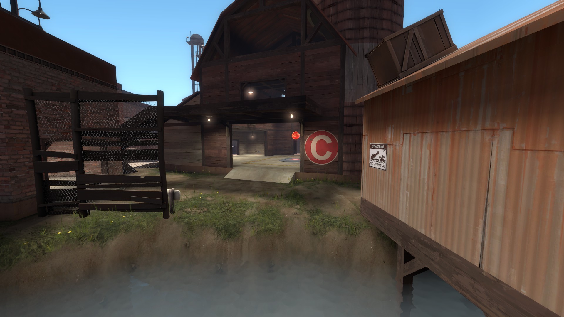
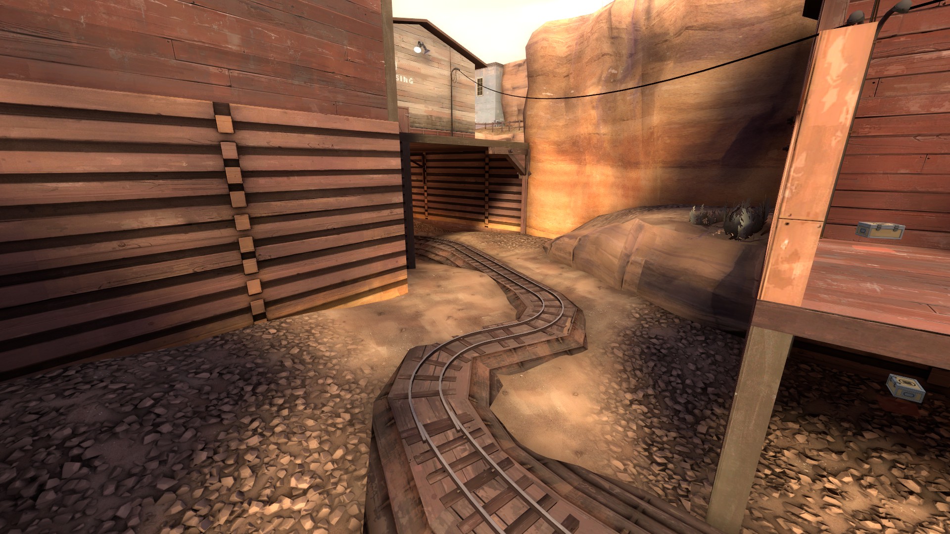
Even if you manage to push through this, you are then faced with a blind corner with a death pit around you. I have seen illegal amount of wasted ubers in this area because one pyro you cannot see will end your push before it even started. There would be nothing wrong with this, if this wasn't the only other viable route for blue on C and perhaps their only viable route.

m2PsBpc.jpg


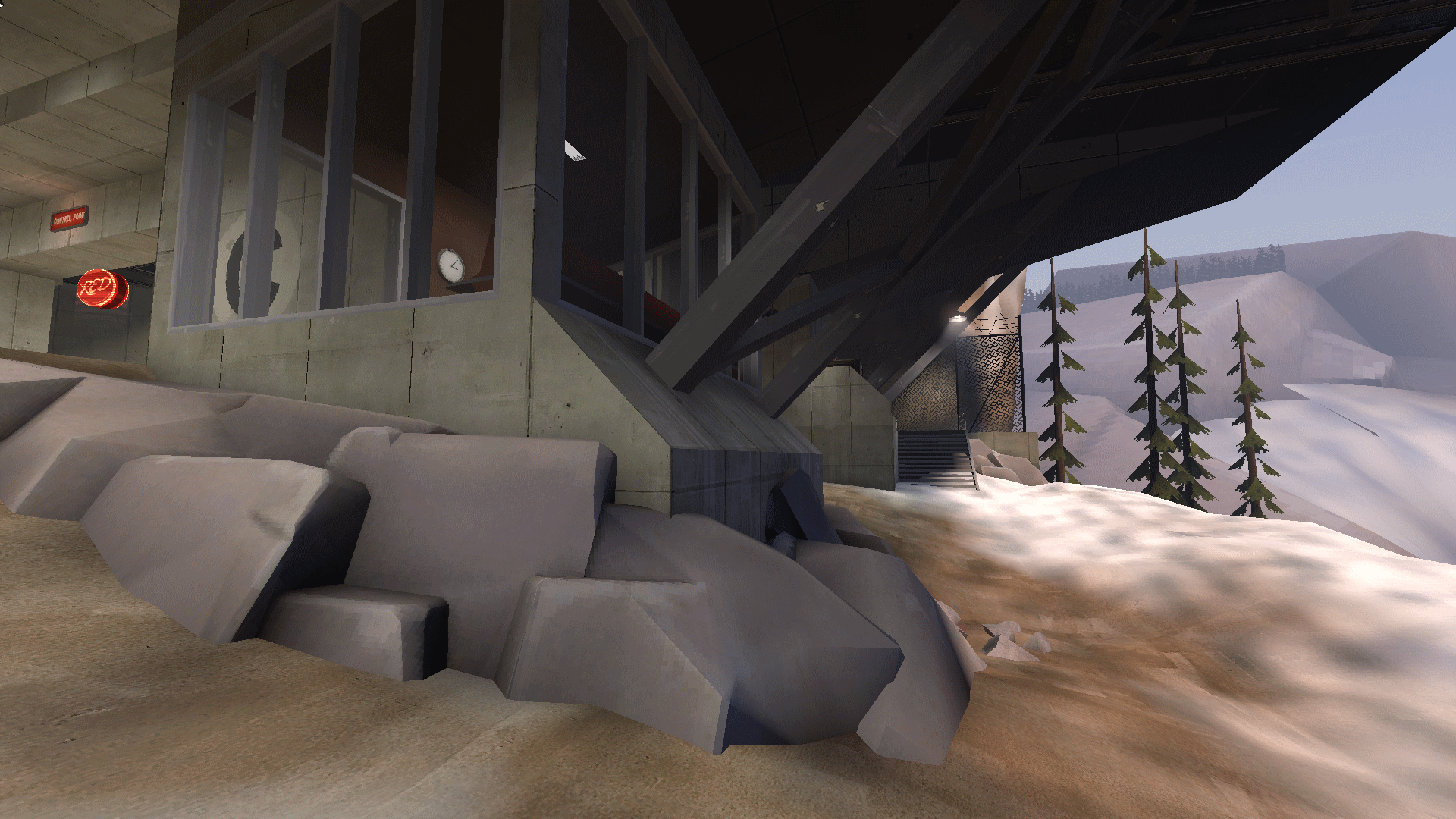
When I was defending C for the first time, it was very easy to not fully grasp where the last point actually is. This is the view you get from the red last spawn, everything in front of you is actually the wrong way to go, C is in fact to the side and you have to turn 90 degrees and more to access it. This is very annoying, especially when playing the map for the first time.

EndAFBa.jpg


There is also this whole area here that doesn't really contribute much to either team and feels weirdly disconnected and out of place, it's only function seems to be an impromptu sniper deck for snipers. There is no reason red spawn just could have not been here instead of a weird corner that directs you the wrong way upon exit.

DETAILING

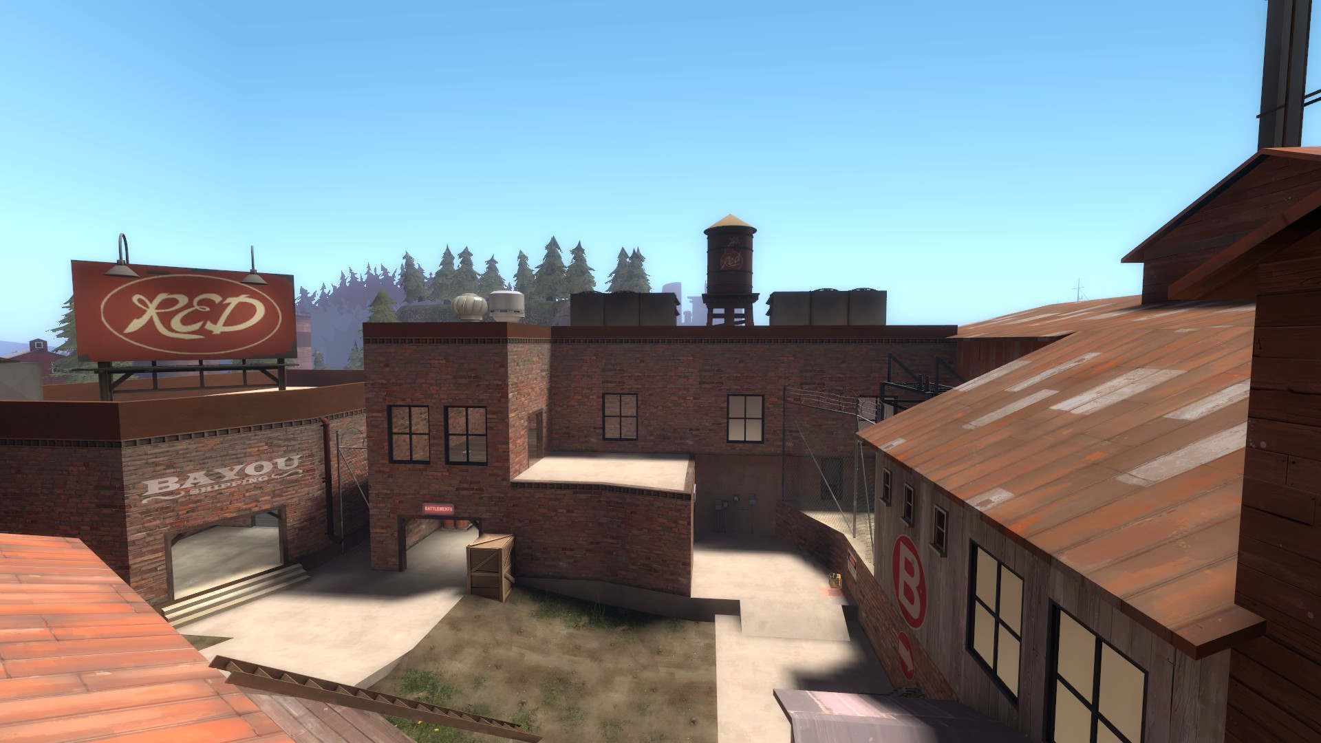
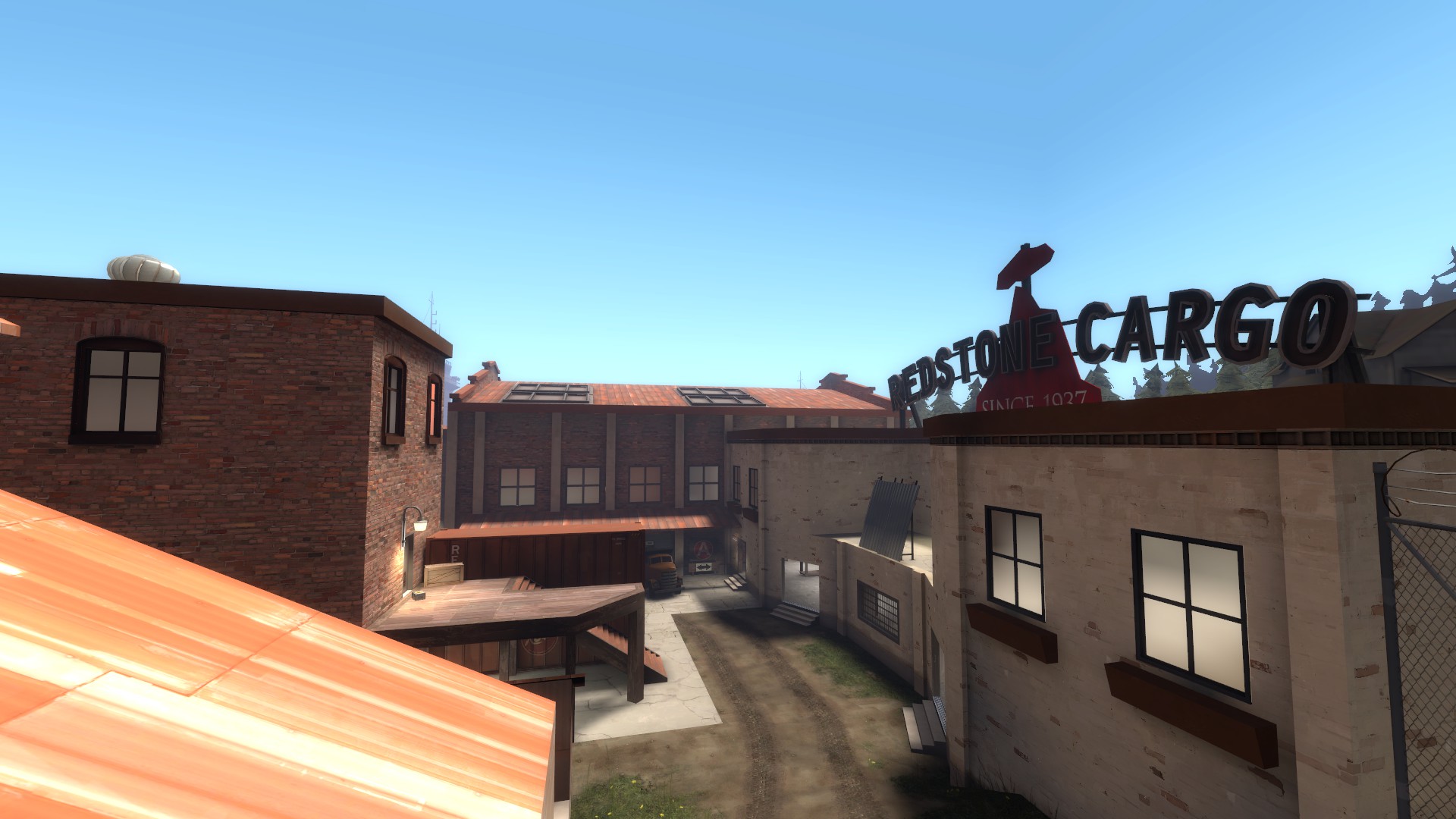
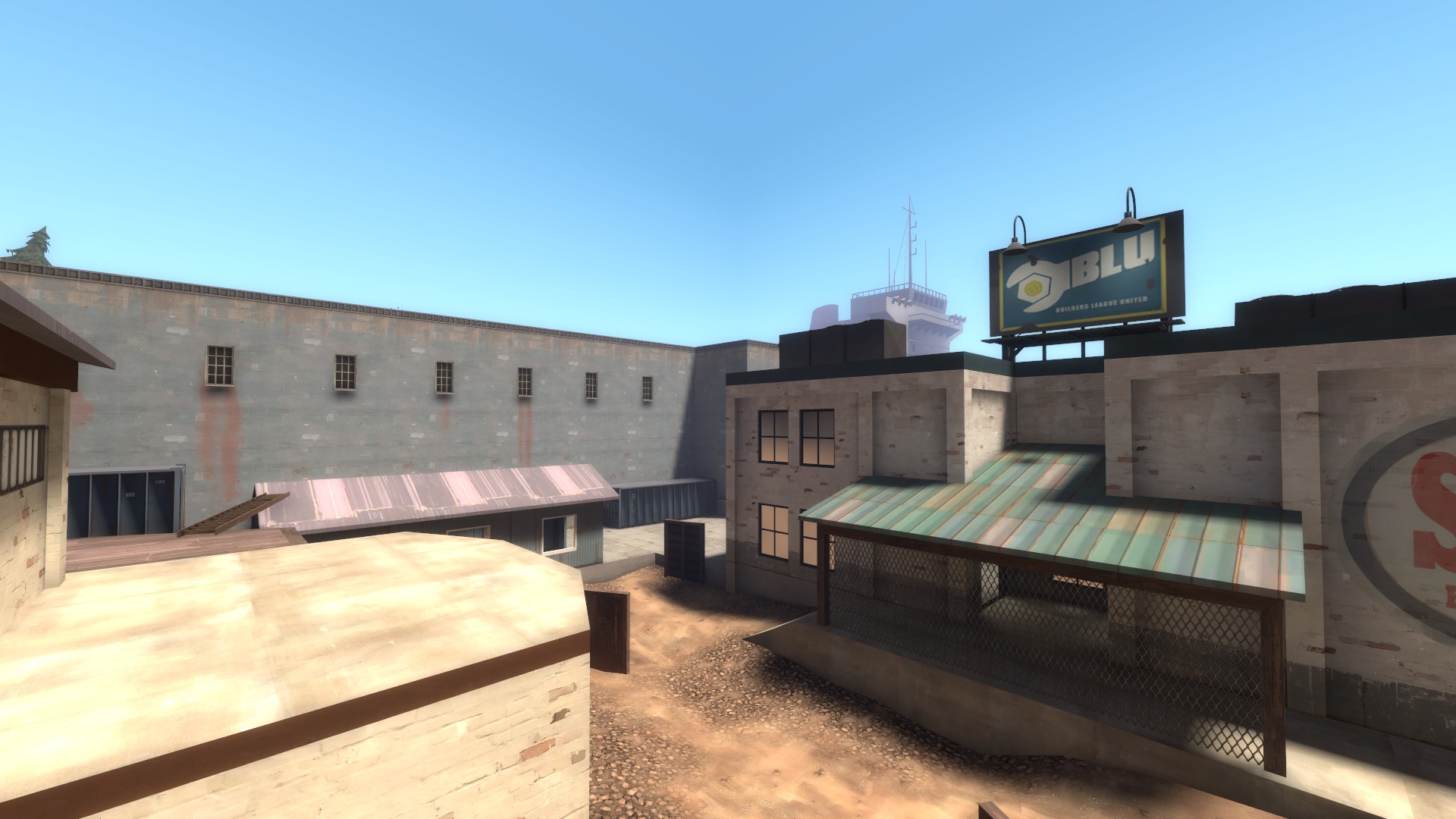
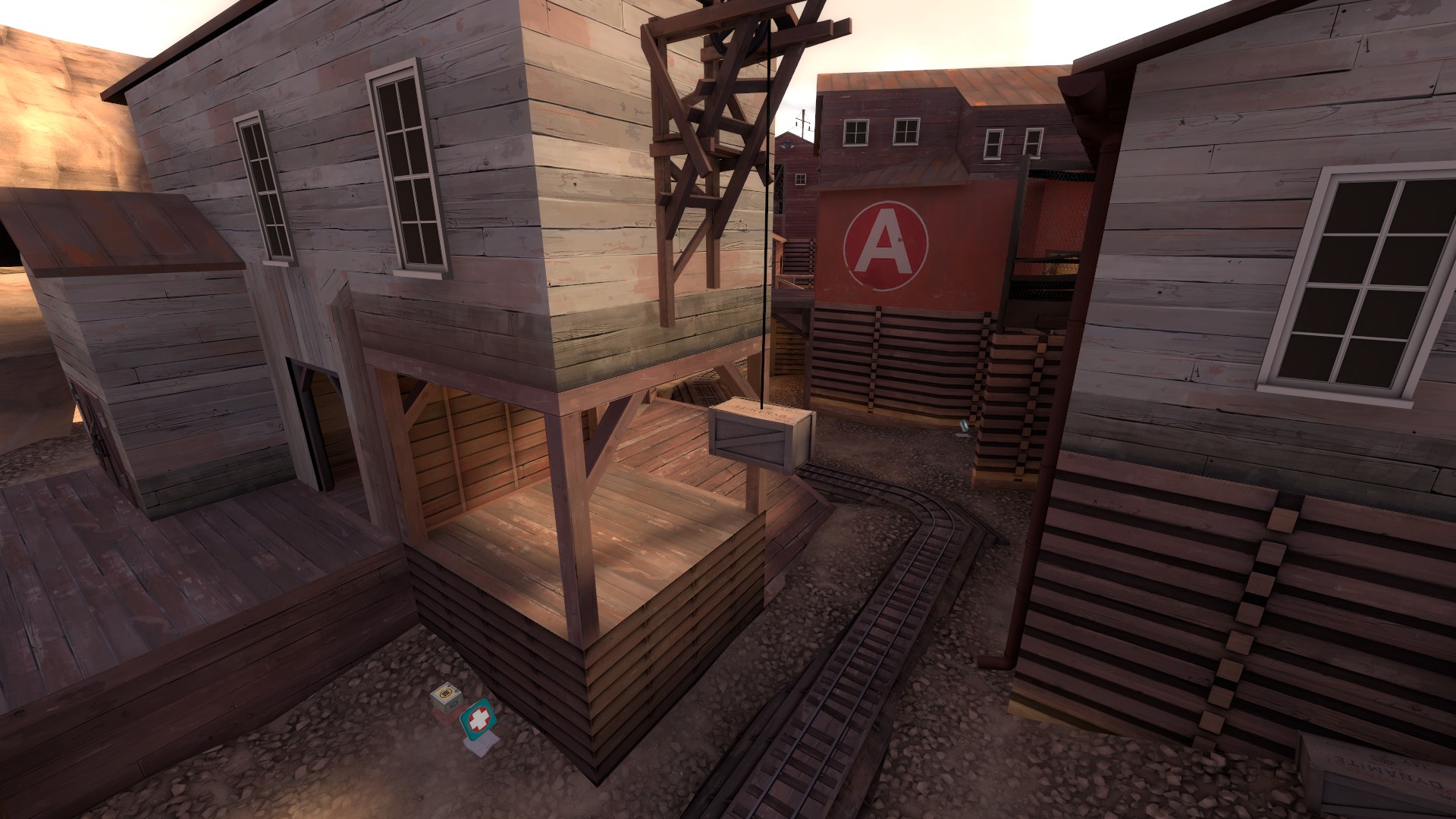
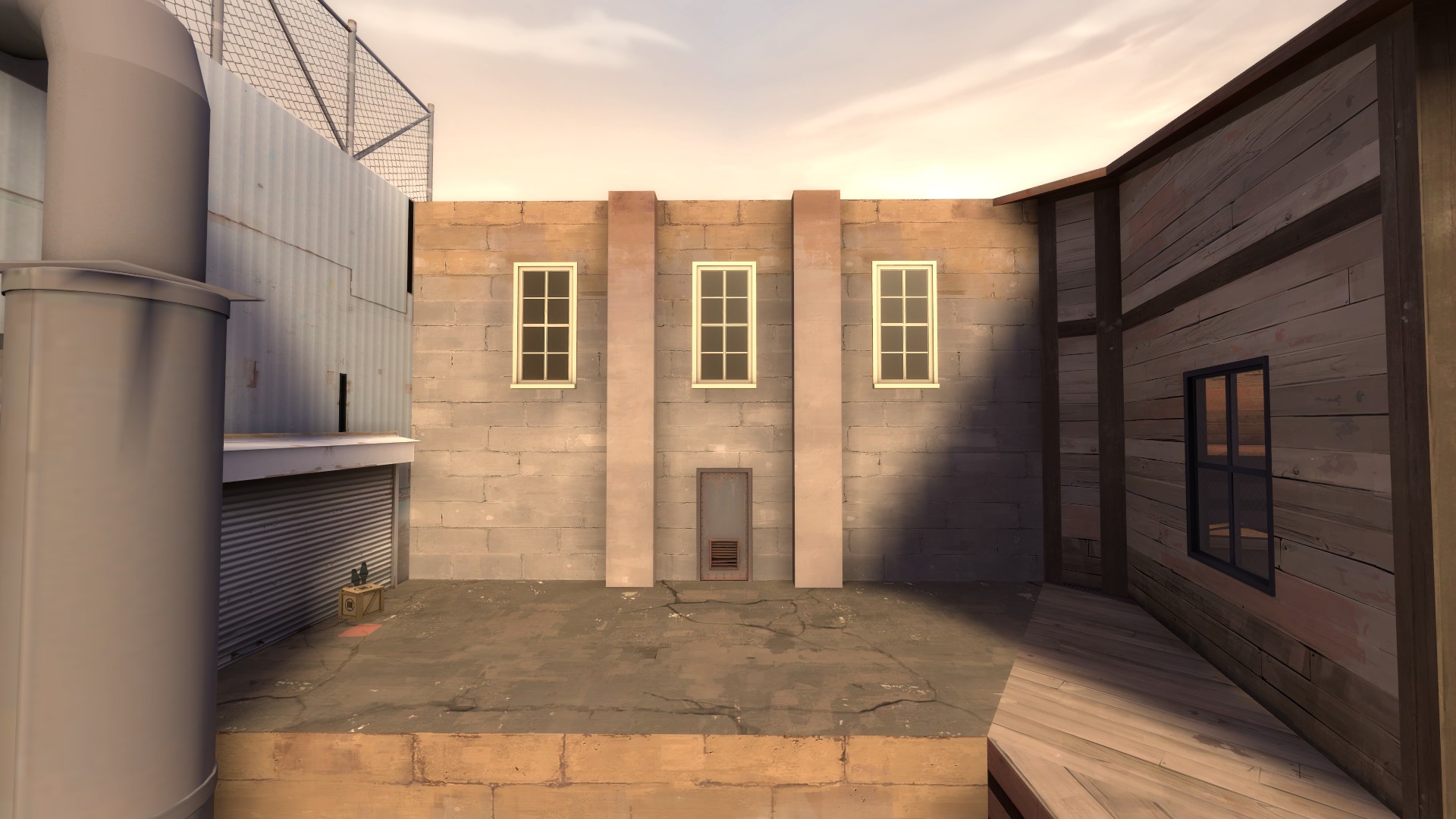
Right away on the first glance, it is obvious a lot of buildings are just blocks and exist to either box you in or to break up areas for optimization. Obviously a lot of building in even the most detailed maps are very boxy and serve this same purpose, but this map does very little hide the illusion and you can tell right away even in the middle of intense gameplay.

O3SjpGb.jpg

bKQ1taK.jpg

FtxICQS.jpg


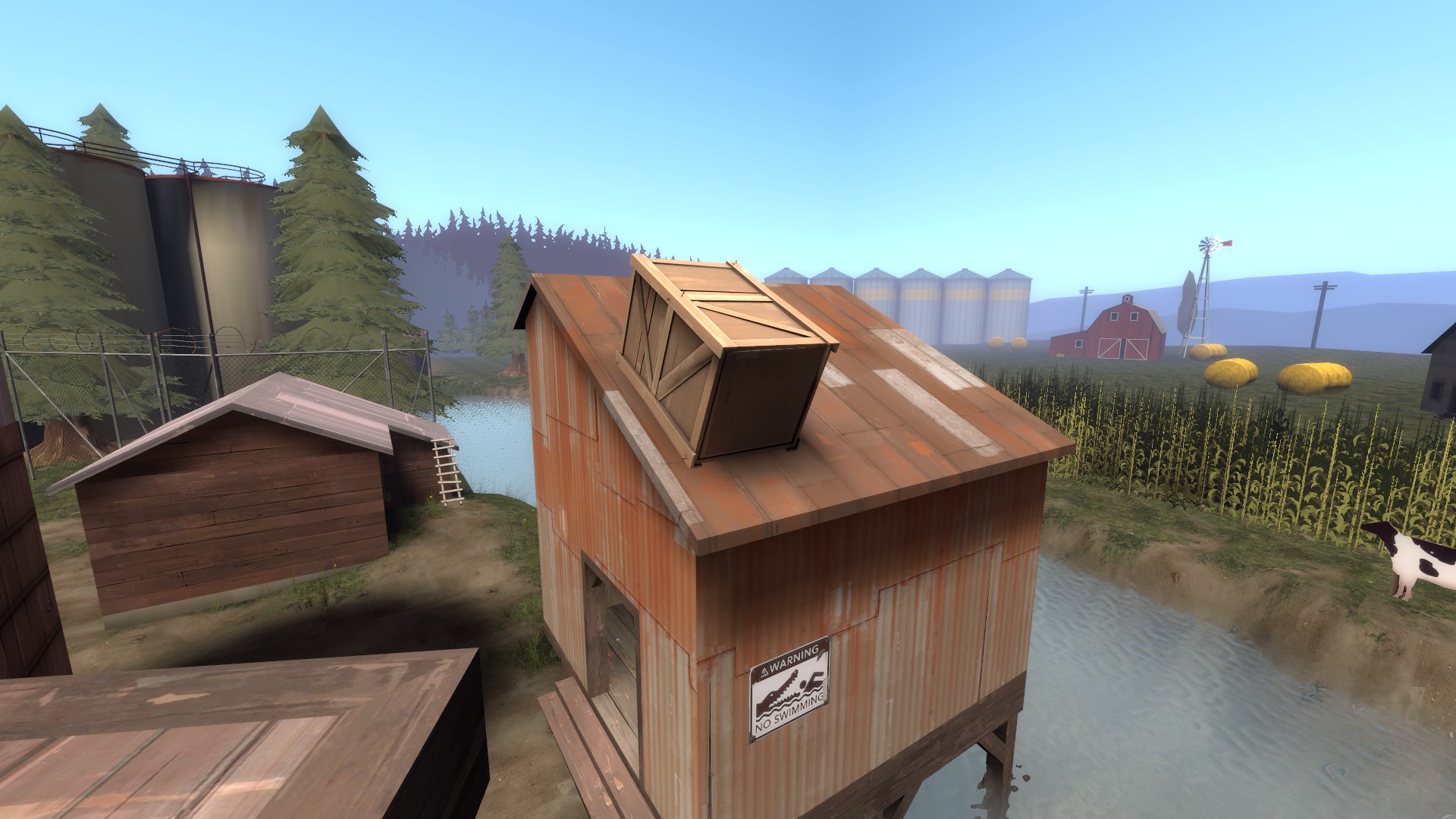
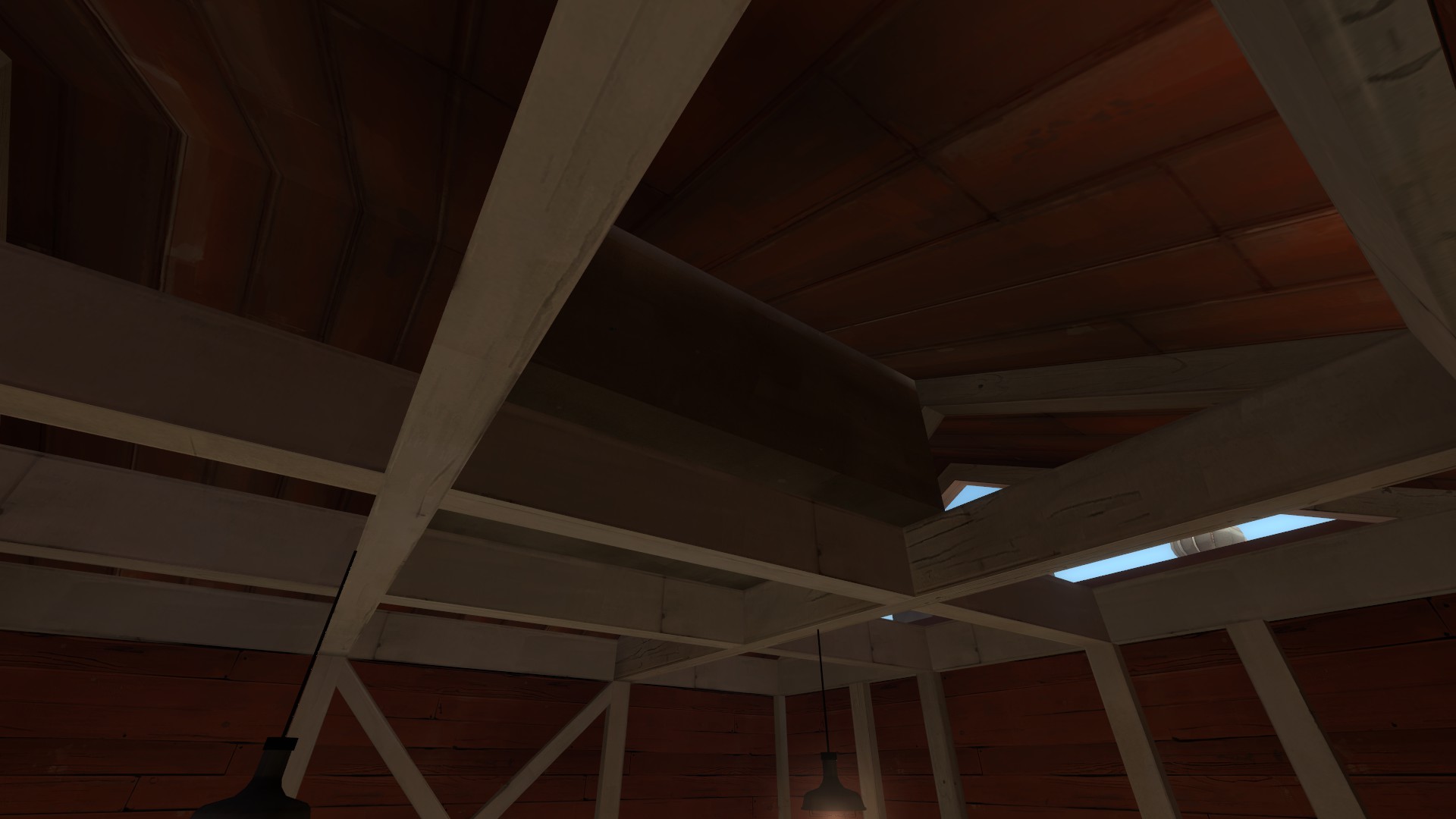
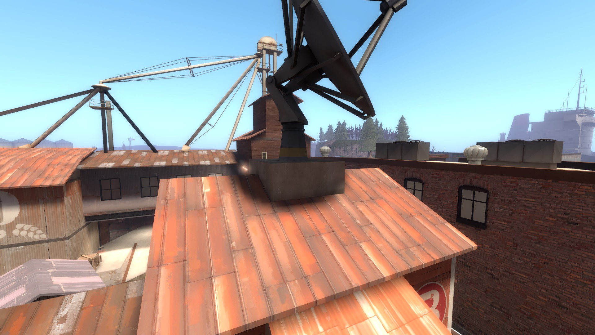
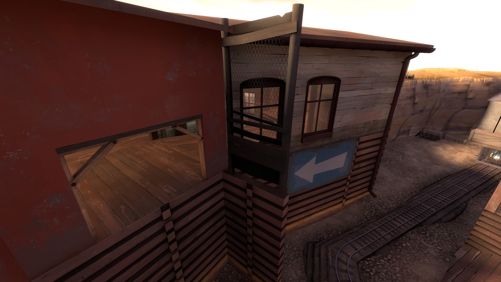
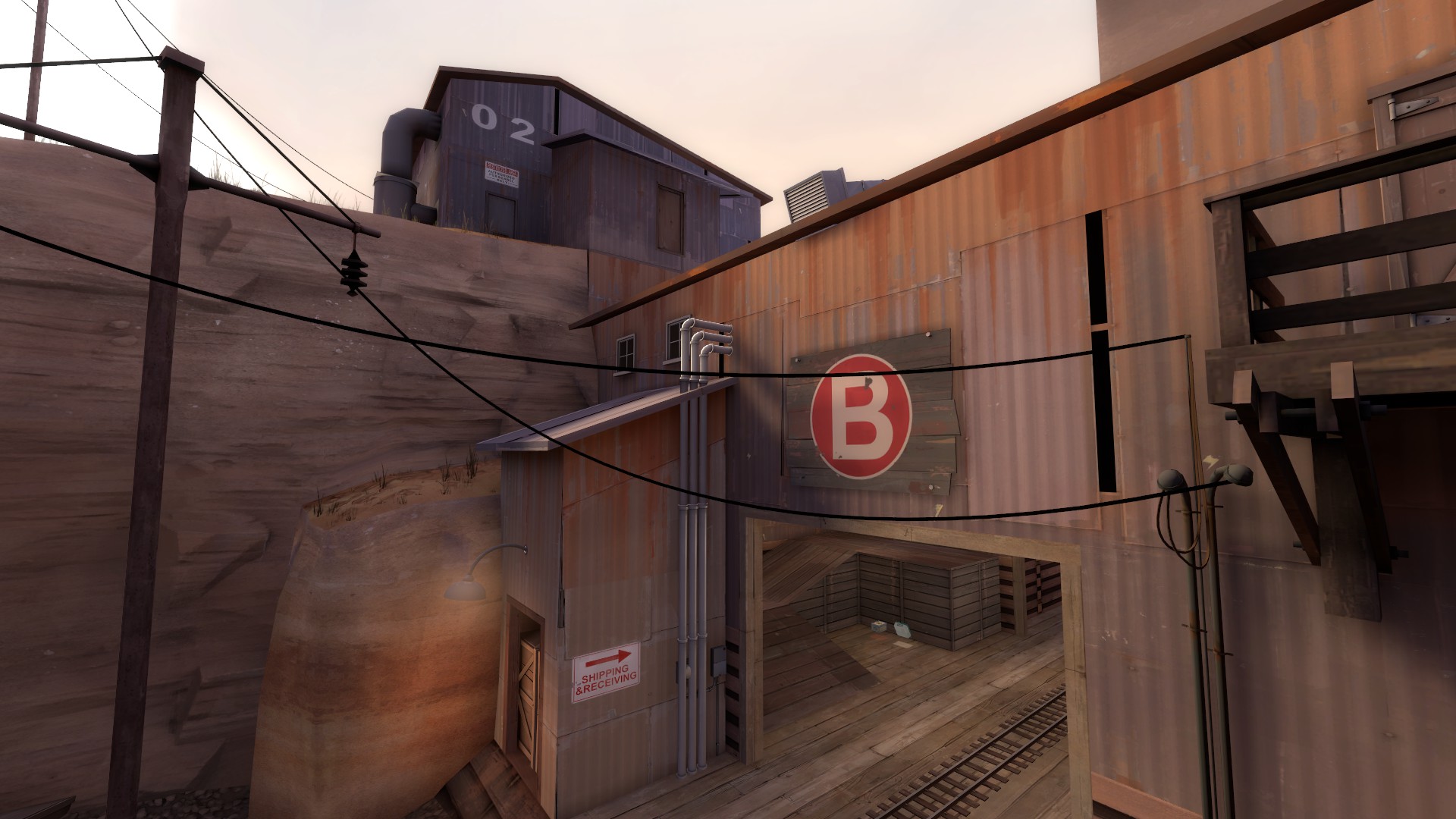
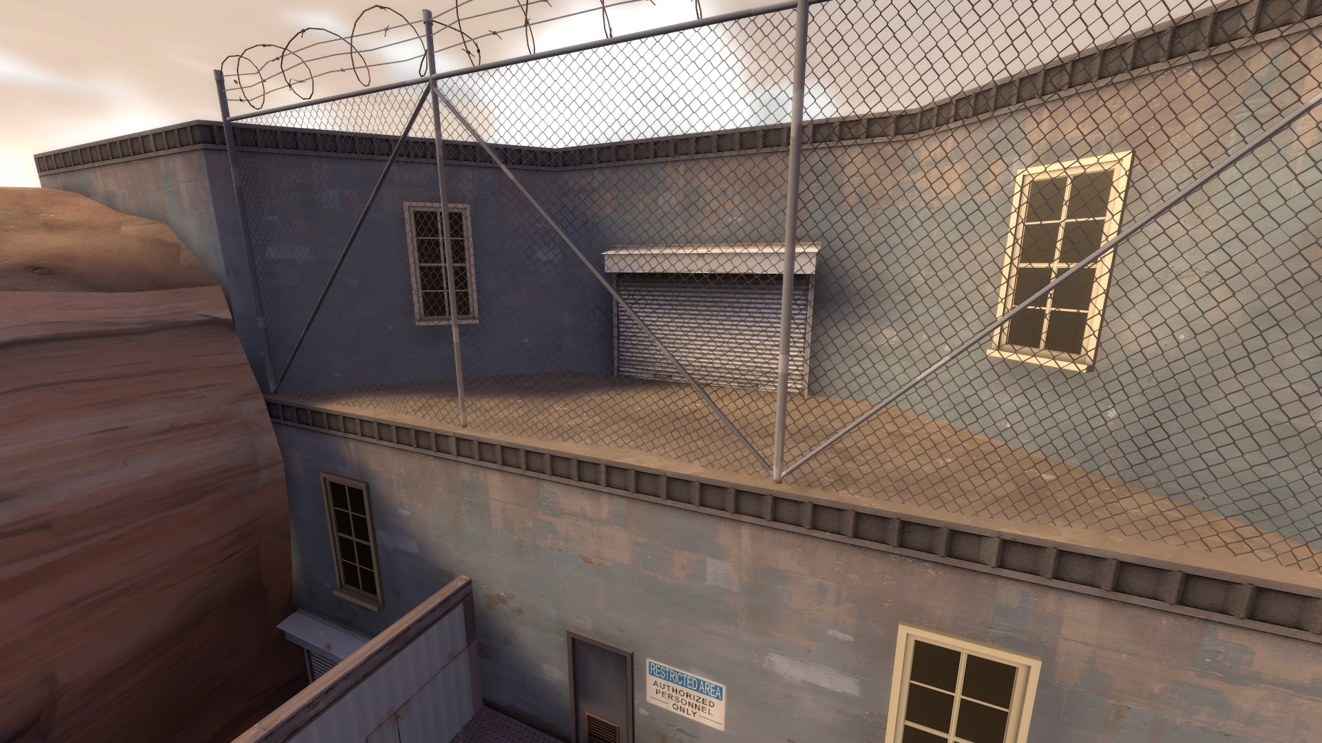
Almost everything is uniform in height, most buildings lack any sort of break up in their form and angled roofs, even when there are some angled roofs, they too are usually around the same height as the other buildings and most of them feel bit too thick to not look blocky too. The 3D skybox is very minimal and doesn't really add depth to the surroundings, most of the time the map feels like the world is floating in a blue void.

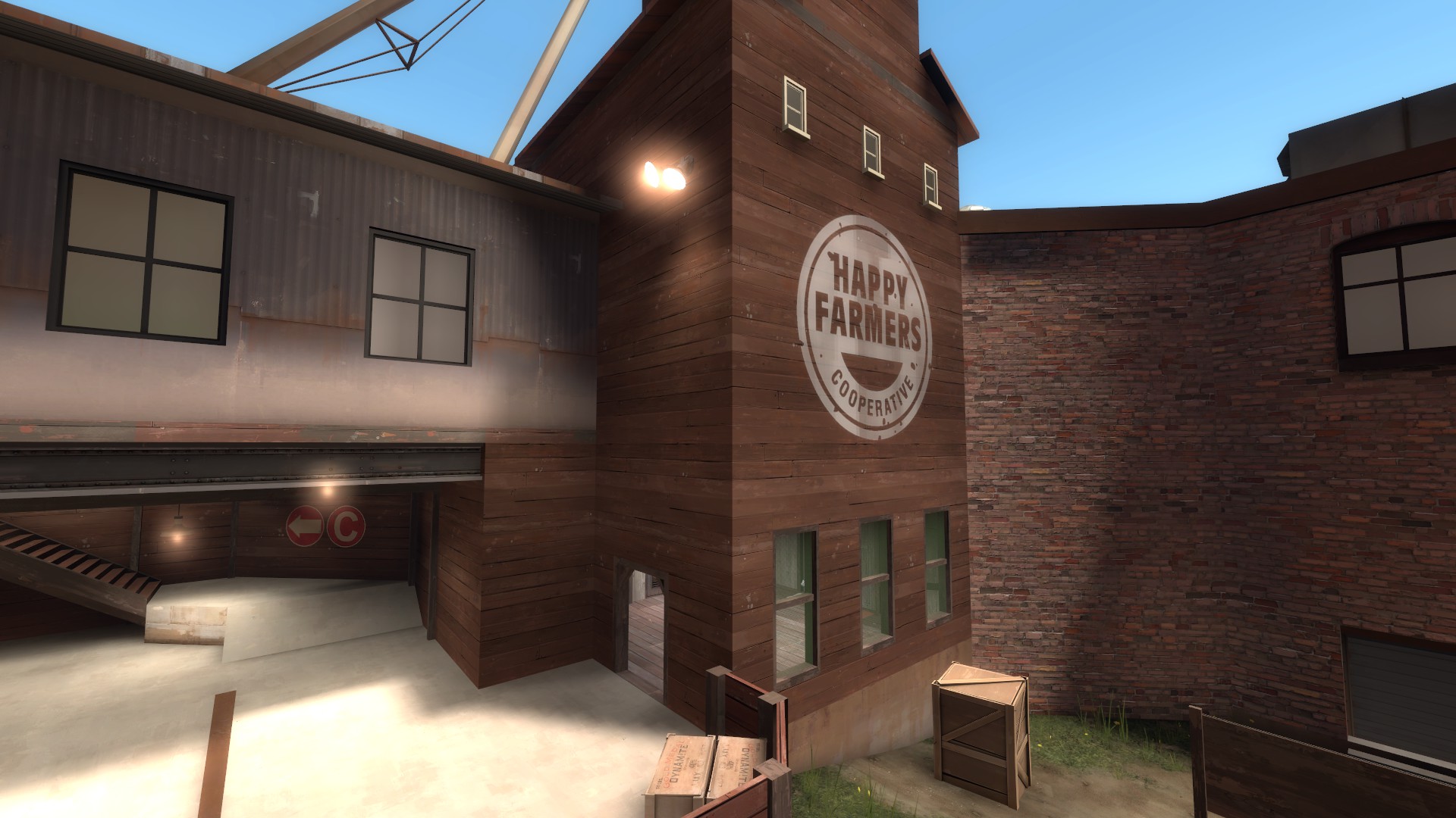
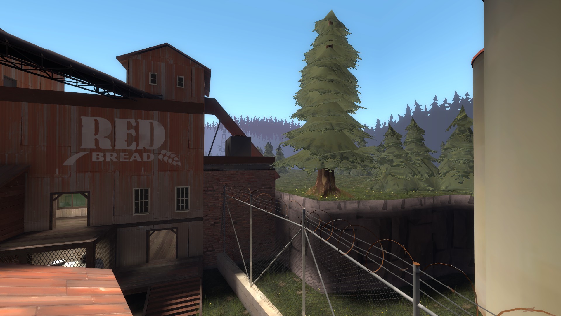
The transitions between the areas feel very strange and sudden too, there is nothing wrong with the idea itself, I quite like the rather reverse progression map has. Normally a map like this would start in the distant farmlands and end at the docks, with the latter being the spytech facade, but here it is reversed and I really like this concept. Unfortunately the transition is not at all subtle and the map kind of just turns from industrial to farms and forests between one room, there is a lot more that could be done with the transition between those two themes and the eventual facade at the end.

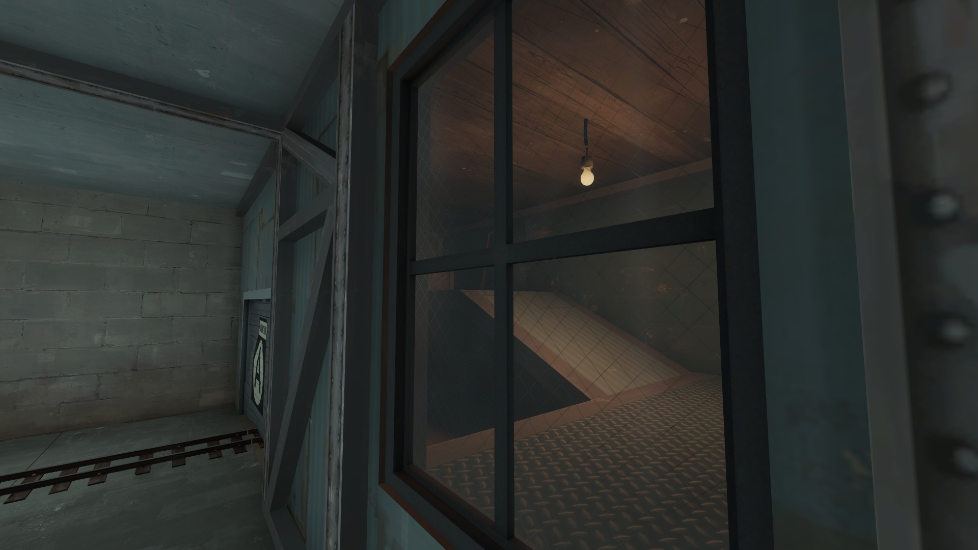
There are way too many glow effects on the map, most of the lights on it should use the spotlight effects instead and they look especially off on all the florescent lights.

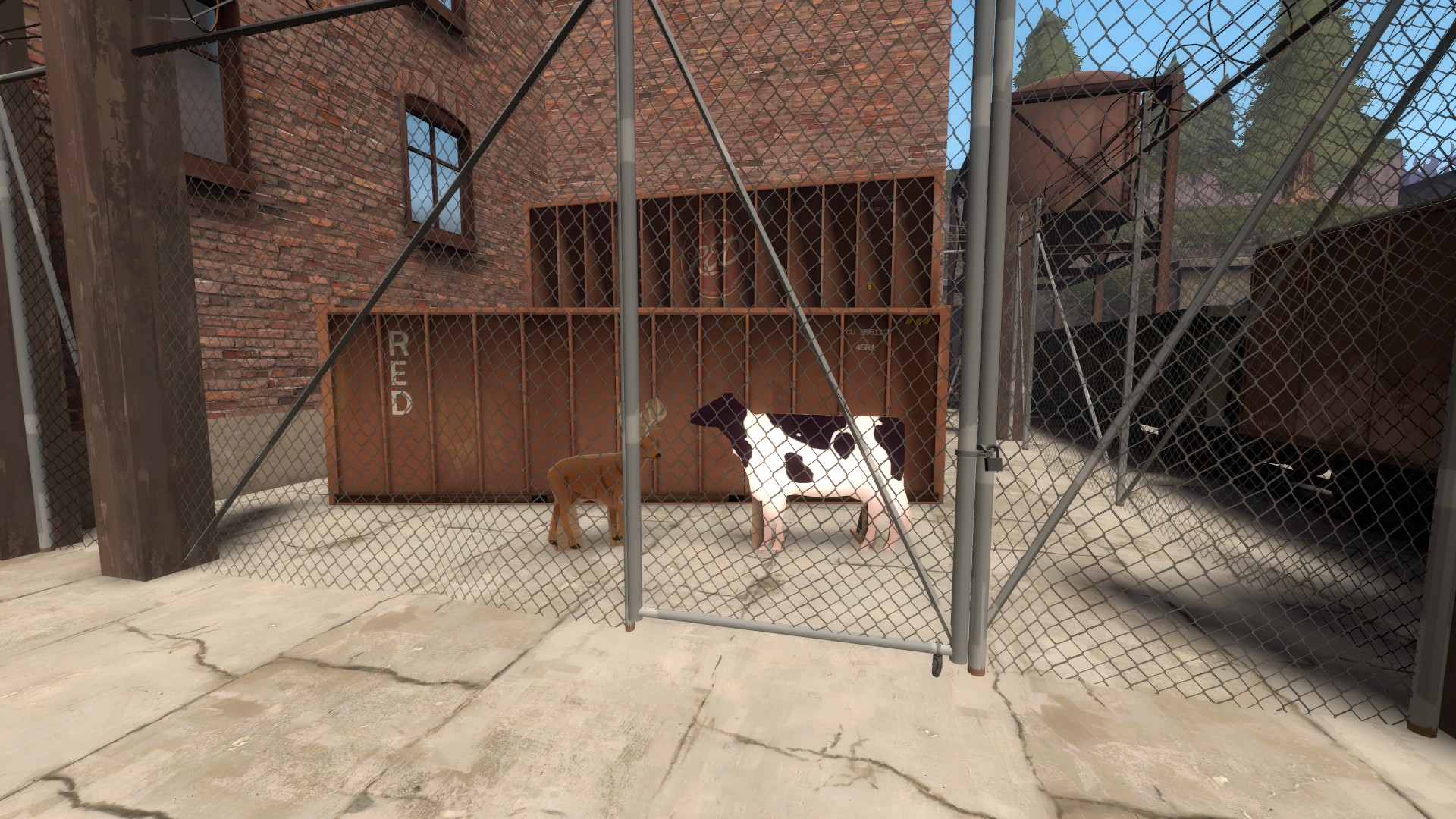
There's also some very... strange details that really stick out as weird, off looking and some times just totally random.

CRUgfRv.jpg

MJ8ZK9u.jpg

sdtZbEs.jpg

OYWemRm.jpg

25X7uS0.jpg

AiBcFzf.jpg

9SYpVUV.jpg

wVPMRtH.jpg

Gridiron: Coming soon(tm)

GAMEPLAY

Pine Peak, more so than any other map in this contest, feels like it really just needed more time in the oven. A and B as points in a vacuum feel fine, there is something very workable there, but the the map around these points and the routes to them leave a lot to be desired. Be it the scale of everything just feeling touch too small, flanks that are overpowered, areas that just exist for no reason or pick up placement. I know "It has potential" is often overused thing to say about a map and people say that way too readily about everything, but this map does have potential, I can see a good map under all the problems, and hopefully after the contest, you find the time to really grind out the issues without having to worry about a deadline.

Let's get some of the more small scale issues out of the way first.

7uZgD29.jpg


This area is pointless, it leads nowhere you can't get just by using other routes, it gives no team advantage and just kind of exist. It isn't even a good spot for a stealthy teleporter.

KnnSr6Z.jpg


Another area that just kind of exists and leads to room that another route right next to it goes, this space probably could be used just to make this area more spacious and for something more interesting gameplay wise.

qU0b1PY.jpg

2ubRu6Z.jpg

i6WPHQD.jpg


A to B transition has a very poor pick up placement, a lot of them are hidden or out of the way and not really in useful spots. In my opinion, pick ups should be in very obviously visible spots, players should not have to think too much about where to find it when playing the map for the first time. A rule of thumb I give a lot of people is to think pick ups as mini control points, they are important, they give control of an area to whoever holds it and the amount of control depends on the size of the pick ups. You would not put control points in dead ends or hide them away.

Let's get started with the major stuff.

fuwihhR.jpg


I really don't like this starting area, it is small and dangerously close to a box filled with some rocks and coal fences. Because this area is so small and really lacks cover or points of interest, any sort of a forward holds are doomed to usually get instantly wiped and it is generally just not very interesting. If you try to have an initial front line here, you are forced to be so up close to the gates that it is better to just stick around the point. I don't expect you to be able to hold the line here, but it does feel like the map is limiting my options, which brings me to the A point itself.

em7QfIA.jpg

UmHJScL.jpg

iwB780N.jpg


Speaking of limiting my options. This flank is stupidly powerful for how easy it is to access, as soon as red loses control of the yard outside, there is nothing stopping blue from flooding in here and getting high ground over whole A or even skipping entire point and just running to B. It is ridiculously easy to just wait for the first initial fight to die down outside and then just drop an uber onto the poor red team trying to defend A.

I really, really don't like extra powerful flanks that are granted for the attacking team for free, I don't think it is good for gameplay and just forces the map to be played in one certain way for both teams. Why bother using your other options as attacker when one is obviously infinitely more powerful than the other, why set your defense up any other way because controlling certain area is too important, A feels good to play in but this route being like it is now just eliminates natural push and pull dynamic from the whole area.

If you look at almost any attack/defend type map, more powerful the flank is, harder or riskier it is to get into and usually requires blue to get control of certain type of an area. This way, as the front line moves, your options as an attacker evolve and your priorities as a defender shift, this makes for much more interesting gameplay and the map doesn't ever really play exactly same every round. This in my opinion is one of the major keys to a good map.

D6MwtOh.jpg

Smqz86Q.jpg

jBPtshb.jpg

8NjFlmG.jpg


B point repeats many of the A points mistakes, right away, both of the flanks that grant blue the high ground are stone throw away from A, in an area that red more often than not totally loses after A has been captured. Once again, it is ridiculously easy to push a combo onto the high ground and prevent red from ever getting a solid foothold onto an area that should naturally be theirs. Gameplay becomes more about holding the flanks than it becomes about front lines and holding the point.

I really dislike the saw in the ceiling, it is funny for about two seconds, then it becomes this big hazard that just gets in the way of fun gameplay. It blocks sightlines from the deck above, but not enough to fully block them, so it actually creates worse, more awkward, sightlines by existing. It is even worse if you are trying to hold bit more forward at the corner and have to retreat, a lot of people naturally like to jump around to make it harder to shoot them and far as I know, no other map in the game has a hazard that punishes players for doing that, I think it is time to retire this saw.

bzaIXss.jpg

grU7ouS.jpg


After B comes the transition between B and C, which is just... kind of there. It doesn't see much play beyond the hold of death on top of the hill and even if it sees play, it just isn't very fun. Everything here is just kind of narrow and small, this whole section could just use more room to breathe and rely less on building with shutters for spacing the area out.

Bq5E5vT.jpg

rtyVNRw.jpg

eeQWmpA.jpg

a6ydMo3.jpg


C point feels like it just doesn't work in any capacity, the only area you can really hold here is the little hill around the corner before the point, because that might be the only part of the map that doesn't just grant attackers everything they need on a silver platter. Once the hold there breaks, there is not much red can do to hold before inevitably being forced back into their spawn and spawn camped until the cart rolls onto the stain on the concrete. (Why are we blowing up a Hydro metal sheet anyway?)

There are not one or two, but three flanks, all of which start away from the actual objective and let attackers to circle around the defense. One of these routes also grants attackers high ground over the red spawn, which usually results in the red team being spawn camped and just generally makes this point a colossal pain to try to hold.

In general this point is pretty flat all over and most of the areas with potential for interesting gameplay seem to be away from the point you are holding, instead of being around it, which means standing around the actual objective when the cart is deep is most of the time about as interesting as watching paint dry. That is if you even get to hold it with the amount of ways blu has to get around any sort of a hold.

DETAILING

I don't have much to say about the detailing, it looks a lot like a first pass when a map starts to transition from alpha to beta. A lot of square brushes that are just textured, no 3D skybox, lack of displacements in certain areas, lots of roofs that are just clipped brushes, etc. There are some finished looking buildings, but I can only assume this is mostly an unfinished product due to time constraints and subject to change, so I am not too sure what to say.

RO3Pont: Coming soon(tm)

GAMEPLAY

Despite what a lot of people seem to think, I personally don't think the box cart is that bad or even the problem on this map, I think unique carts are very under utilized and experimented area in TF2 and I welcome any attempt to do so. The thing with custom carts that break the formula of a regular payload cart is that rest of the map needs to alter drastically from your usual payload design and you need to be very careful with how you design your spaces or the custom cart becomes a problem rather than addition to the gameplay.

If you look at Frontier, many areas, a lot of the chokes especially, are designed with the size of the cart in mind. There are almost no parts on that map where the cart totally prevents efficient use of the area it is in and the track in general is more straight forward than your usual payload cart because Lil Chew Chew acts as a giant mobile sightline blocker. This is something Roofrack does not do at all, which results in the cart becoming this awful obstacle you just don't really want to interact with.

fNxTJC0.jpg

1ByW8h3.jpg

uCQIcDB.jpg

EH7K3qt.jpg


There are so many areas like this on this map, small, narrow and full of small turns. They might work with a normal payload cart, but the cart on this map is a large box that eats up a lot of space, especially when it is in various angles. Suddenly, this already small area becomes even smaller and the cart changes from large dynamic cover to a roadblock blocking a bottleneck on the map. This is not even remotely fun to play around, especially for lighter classes who rely on their mobility, I cannot imagine a scenario where playing scout on offense is an enjoyable experience on this. But even if this map had a normal cart, it still would not play well, because this layout is kind of a mess. Let's start with A.

vYNjtK4.jpg

KXJ5jmZ.jpg

lXCDIlr.jpg

QjEpIIC.jpg

zBlk3Ti.jpg


A point on this map has to be one of the biggest information overloads I have had when playing on a map for the first time, the amount of angles and angled doorways that seem to only exist for sake of having angled geometry, the sheer number of doors and different holes you can be shot from, it is all very staggering when you get here for the first time. It feels like there was an assumption that if you just have a lot of random changes in geometry and angles all over the place, it makes the map interesting, but that is not really what ends up happening here. It took me forever to find any sort of a comfortable position to defend from. Not that this knowledge really helped me in the end because unless the teams are stacked, this A is undefendable.

Only high ground you have over the point itself and where the teams might feasibly set up their main defense away from sightlines is on the platform with the medium health pack, but there is a platform and entire area blue can use right above it and the only way to rotate there is to leave the point entirely. This same area also has three whole ways to skip entire A and go to B, which not only makes the flow an absolute clusterfuck, it means you absolutely have to defend this upper deck to even stand a chance, but then blue will just use the canyon flank that just loops around entire A and gives them high ground too. To hold on anything here, you have to spread your forces so thin that if any power class dies even once, it is most likely game over for A.

oGxs871.jpg


As for B, I struggle to even really say anything about it other than nothing about it works. It feels like a small transitional area between two important areas but someone slapped a control point in there for fun. There is no space to really hold the point from anywhere, there is no real area where red can even set up because the big platform has a blue one way on it, so blue basically gets this entire area for free and only thing keeping it from totally rolling every time is the fact that red spawns right next to the point. And because the routes for both blue and red split people between two directions, there is no real front line to speak of on this point. It is just chaotic DM until someone pushes the cart or red manages to hold on for what feels like forever because A caps so quickly 99% of the time.


CYAxMJp.jpg


After B, we get this area, which is fine. This is probably the best area on the map, but it sees zero gameplay because it just exists to stall out blue while they wait for the doors to C open. I really have to wonder why B wasn't inside this building and instead in a tiny alleyway before it, this room feels more like a point than the point that unlocks it.

fyLp9NM.jpg

ixKXNPU.jpg


And then we finally reach C, possibly one of the most impossible to attack points I have seen in a long while. If the red doesn't overextend, I don't think it is possible to break through the defense, no matter how much you uber in. All the routes for blue on this point, with exception of one, are on the lowest of the low ground and the rotation to the higher path is extremely long. With the rotation between routes being so awkward, more often than not, red starts taking control of the upper deck and using the flank instead, gaining high ground over most of the area before last.

On top the routes just not being viable for attacking, everything on last is around a 180 degree turn, no matter which route you take. All of the defensive areas are basically around the corner and above 90% of the routes blue has, you are always pushing in blind. Fighting against targets high above you is already hard enough as it is, fighting targets high above you while they are also directly above your only means to reach them is some seriously masochistic stuff.

DETAILING

Detailing on this map looks like it was extremely rushed and a lot of times totally random, I feel like I find more and more things that look wrong or just plain random every time I load in to take screenshots for this wall of text. A lot of props that shadows are broken because they are clipping into things, a lot of pipes that are just going through roofs and just going past the building they are attached to. It is also very obvious the map is just floating in a void, everything is surrounded by high walls and there is nothing in the 3D skybox to give illusion that the world continues beyond those tall structures.

There is also a massive overuse of the sliding garage doors after B, they are everywhere, whether it makes any sense or not. Also a lot of rooms, especially around C, have their ceiling way too far down and makes the rooms look like I just entered someone's crawl space. Texturing feels very random and a lot like the textures were just applied on the brushes haphazardly in a hurry. There are a ton of spots where buildings just have random patches of totally different kind of material in the middle of them, like the map is afraid of have a single wall be consistently made out of the same texture.

Here is a collection of various just plain weird details, there are many more but these stuck out to me right away on first glance.

3ZqmMbA.jpg


No light source anywhere, the textures are very inconsistent and the support beams are constructed like they are made out of wood. I can't ever recall seeing cross beam metal structures like this unless they were supporting something heavy and large, and nothing about this building looks like it warrants it.

ir3Ei3N.jpg


The big shutter door and tracks lead to... a tiny room with a tiny ramp and nothing else?

6ofs38O.jpg


Why are they using a crane for a tiny crate, what is the crane for if the platform doesn't lead anywhere and there is a ramp up to it anyway? The rope also has wind turned on.

whlrMVI.jpg


What?

WbIxjY3.jpg


Pipes.

UuPTxfe.jpg


This vent looks out of place on the roof like this and it doesn't even go anywhere, it just loops to another vent right next to it.

7STTIck.jpg


Pipes here look out of place, what is the grain elevator (I think I got what that thing is called totally wrong) here for and the sign is under the pipes. This is all just very messy.

JoSKtWu.jpg


Sign

i8euSO5.jpg


More out of place looking pipes and vents, feels like they were just randomly scattered around here to make the building less like a block and hide the plain walls. Also, why is there a random patch of white concrete?

RtO3m7X.jpg


Blatantly obviously just a brush with nothing behind it, no roof or anything.

Xc5w8XC.jpg


Doorframe and also extremely cramped.

GGykiMy.jpg


Why is there a garage door here, what is the point of this area, why would anyone go here?

4T2gOzL.jpg


Same as above.

Rumford: Coming soon(tm)

Smalltime: Coming soon(tm
 
Last edited:

MC_Labs15

Server Staff
Dec 10, 2020
90
76
To be updated later


MAP | OVERALL | GAMEPLAY | DETAILING | HONORARY TITLES
Altitude | 80| 75|90 | Favorite Gameplay Area (B point)
Azumith | | | |
Gridiron | 67|60 | 80| Best Development Log, Best Name
Pine Peak |Somebody |Once |Told |Me
RO3Pont | 70| 65| 75| Most Creative
Roofrack |50 |60 |40 |
Rumford |78 | 75| 85| Favorite Small Detail (Paper accident)
Smalltime | 78| 70| 95| Most Pleasant


MAP | NOTES
Altitude | A very solid entry overall. With a bit more refinement, this map would be a welcome addition to the official map pool. Altitude feels very unique with how it uses verticality to its advantage. The only official map that could compare in this regard is Upward. The first area can be a bit troublesome for BLU if RED has some good snipers, but it's usually not too bad. I really like point B and the area around it. The roof of the building being accessible from the hill is quite cool and it's interesting that RED has to defend from quite a significant low ground. The cliff hazard is fun and comes into play just enough that you're aware of it without it being annoying. Point C still feels lackluster to me, though I quite like how it ties into the theme with the gondolas.
Azumith | TBD
Gridiron | This is a pretty fun map if you just want to mess around, but I honestly always felt as though approaching the goals themselves was a bit too difficult. I'm no expert on the gamemode, but perhaps the distance between spawns could have been smaller? Not really sure. The detailing looks quite solid in all of the playable areas (the foundry theme was a good choice), though some of the OOB areas look a bit blocky and repetitive. You commented on it yourself, but those pesky black holes in the sheet metal textures really make the tiling stand out if it's not broken up by something.
Pine Peak | N/A
RO3Pont | The first area of this map plays pretty well in my experience (though there's an annoying ledge on the left side of BLU spawn that annoyed me a bit when trying to use the left exit). The transition from A to B is quite tight and chokey, though it actually played pretty well most of the time once players got used to it. Being able to see down into the first area from up above is quite cool, and I wish more maps did this kind of thing to give players a sense of progression. I like the last point, but the routes into it feel somewhat disjointed and counterintuitive. One route in particular is insanely tight and isn't really fun for anyone without explosives. The detailing on this one really impresses me considering how little time you actually had to do it. There are a few nitpicks I could make here and there, but nothing major stands out to me. It looks pretty good and cohesive throughout.
Roofrack | I think this map has a lot of interesting layout ideas, but the execution leaves something to be desired. A lot of the routing for players is rather counterintuitive, especially when taking the one-way doors into account. The A and B points feel kind of like they were just sort of plopped down without much geometry around them to help the defenders. In contrast to this, the last point is crazy strong for the defenders, because it gives them massive high ground over the track from multiple angles with few ways for BLU to reach it effectively. Detail-wise, I like the Australia theme, but I think you'd need to do more to really sell it. If I didn't know what the theme was ahead of time, the only noticeable clues are the kangaroos and the upside-down signs, the latter of which I initially thought was a mistake. The map is surrounded by high walls for the most part, which made it feel rather cramped. Perhaps some fences and wide-open skybox areas would feel nicer and make it easier to convey this theme. I like what you did with the cart path and the mechanical doors, and the cube thing at last is pretty cool.
Rumford | This is a very solid payload map. The first two points remind me a lot of Hoodoo Badwater. The first and last points are quite fun and feel very and distinct, though I'm not a huge fan of point B. In my experience, it's annoying for BLU if RED manages to set up ahead of time, but if they don't set up in advance, RED has almost no chance of holding it. The detailing is very pleasant to the eye, and I love the steady sense of progression provided by the paper mill theme. I especially like the areas with woodchips being piled up and moved along conveyor belts.
Smalltime | I'm usually not a huge passtime fan, but this map has always been fun to play on. I think the small scale really lends itself well to interesting, dynamic gameplay, and it makes slower classes more viable when the walking distance is so short. Perhaps the tweaks to the scoring system are a bit much, but it isn't a huge deal. Detail-wise, I love the hydro theme, and it's been done very well here. This is arguably the prettiest map of the bunch. The lighting is very pleasant and the details really sell it without going overboard.
 
Last edited:

DoctorDoomtrain64

func_witch
Server Staff
Nov 26, 2012
124
157

MAP | OVERALL | GAMEPLAY | DETAILING | HONORARY TITLES
Altitude | 85 | 80 | 90 |
Azumith | 55 | 50 | 60 |
Gridiron | 80 | 80 | 80 | Best Sound/Favourite Little Detail: The furnaces blasting the Jack back in to the game space
Pine Peak | 60 | 70 | 50 |
RO3Pont | N/A | N/A | 80 | Most Pleasant
Roofrack | N/A | N/A | 60 | Most Creative
Rumford | 85 | 90 | 80 | Best Name/Best Devlog
Smalltime | 85 | 80 | 90 |
Spacewar | N/A | N/A | N/A | Got thrown into space
 
Last edited:

Another Bad Pun

In the shadows, he saw four eyes lit by fire
aa
Jan 15, 2011
801
1,845

MAP | SCORE | HONORARY TITLES
Altitude | 80| Most Verticality
Azumith |50 | Biggest Boat
Gridiron |60 | Most Complete
Pine Peak |55 | Saw
RO3Pont |45 | Most Binski
Roofrack |50 | Most Layout
Rumford |70 | Cumford
Smalltime |45 | Most Informative
Spacewar |75 | Best Map for Gunspy
 
Last edited:

Mâché

Big Ferret
aa
Sep 7, 2015
381
301
all scores here are temporary and some haven't been determined yet

MAP | OVERALL | GAMEPLAY | DETAILING | HONORARY TITLES
Altitude | 75 | 65 | 90 |
Azumith | | | |
Gridiron | 65 | 60 | 75 |
Pine Peak | 65 | 65 | 65 |
RO3Pont | 80 | 80 | 80 | Best Sound, Favorite Gameplay Area (the B bridge, if only because I admire how you were able to mostly pull off such a tight and limited space, definitely could use a bit of tweaking though.)
Roofrack | 40 | 40 | 40 |
Rumford | 80 | 80 | 85 | Most Pleasant, Best Name
Smalltime | 75 | 70 | 85 |
 
Last edited:

Alex.bsp

Professional Nap Taker
Server Staff
Jun 22, 2017
102
144
Hold up Imma brb

Ight I'm back


MAP | OVERALL | GAMEPLAY | DETAILING | HONORARY TITLES
Altitude |80 |70 |95 |Gorgeous
Azumith |70 |70 |70 |
Gridiron |65 |50 |70 |Underrated
Pine Peak |50 |50 | 50|Made it just in time
RO3Pont |80 |80 |80 |I like my gameplay tight
Roofrack |65 |60 |75 |Wacky cart
Rumford |80 |75 |80 |Most interesting development
Smalltime |80 |70 |90 |Passtime, but mini
Spacewar |- |- |- |-
 
Last edited:

D0om

L2: Junior Member
Feb 26, 2016
97
104

MAP | SCORE | EXPLANATION
Altitude | 80 | would be higher if not for the last point, too flat, too spammy
Azumith | 50 | unfortunate last minute unpushable last change
Gridiron | 55 | would be higher for the older, more open version with medium hp at mid
Pine Peak | 65 | pretty fun until the last point
RO3Pont | 30 | too many close quarters, lots of issues identified but not fixed
Roofrack | 20 | moving box cart doesn't play well, one way door chokes, unpushable last
Rumford | 75 | unfortunately flanks are the biggest drawback. I still enjoyed the map.
Smalltime | 75 | despite fluurys best efforts to remove engie, I had lots of fun with the wrangler
Spacewar | no vote | I can't in good faith rate a tug of war map, I really dislike tug of war
 
Oct 6, 2008
1,948
446
In the interest of transparency and to remove any cases of bias since I have an entry in the contest, I will be abstaining from voting.

Good luck to my fellow competitors!

Buggy
 

Ismaciodismorphus

I just made you up to hurt myself
aa
Oct 5, 2020
389
212

MAP | OVERALL | GAMEPLAY | DETAILING | HONORARY TITLES
Altitude | 90 |80 |100 | Most Pleasant
Azumith | 40 | 40 | 40 |
Gridiron | 90 | 90 | 90 | Best Sound
Pine Peak |70 |70 | 70 |
RO3Pont |50 |40 | 90 |
Roofrack | 40 | 50 | 50 | Favorite Small Detail : The cube at last.
Rumford | 70 | 60 | 90 | Favorite Gameplay Area : Last is pretty fun to hold as engineer.
Smalltime |60 | 50 | 100 | Best Name
Spacewar |60 |60 | 20| Most Creative
 
Jan 20, 2019
356
603

MAP | SCORE | HONORARY TITLES
Altitude | 90| Most pleasant, Most creative, Best Gameplay Area (B point, Silo, Little Triangle roof house), Best Detail (I love banner of the mountain)
Azumith | 50|
Gridiron | 50|
Pine Peak | 40|
RO3Pont | 40|
Roofrack | 20|
Rumford | 75| Cumford, Hoodoo - Best Name, Best Sound, Best Development Log
Smalltime | 60|
Spacewar | Winner|
 
Last edited:

Westor Lowbrood

L1: Registered
Jul 25, 2021
1
2

MAP | OVERALL | GAMEPLAY | DETAILING | HONORARY TITLES
Altitude | 70 | 70 | 70 | Good
Azumith | 65 | 60 | 75 | Costal Corn Capital of the world
Gridiron | 30 | 0 | 45 | My god do the rounds here either stall or kill offer the player base. This is a great example of why people like me dislike passtime and its maps.
Pine Peak | 80 | 90 | 70 | This is the 1st map the server really clicked with me. Just fun in general.
RO3Pont | 45 | 30 | 60 | I really love the detailing of the map, and its strange route that loops on top of itself. It has way too many chokes that are a total slog to push through.
Roofrack | 40 | 30 | 55 | Naughty Cart Goes in the Cage
Rumford | 75 | 70 | 90 | Coolest setting
Smalltime | 10 | 5 | 30 | I don't like passtime. I almost sort of like this map. Its technically the most fun I've had in passtime, but thats not a lot.
Spacewar | 40 | 40 | 65 | Really ambitious design featuring tons of unconventional mechanics.
 

PigPig

Entitled Elitist
Apr 27, 2015
104
155

MAP | OVERALL | GAMEPLAY | DETAILING | Notes
Altitude |80| 60|100| Not a fan of the awkward deathmatch areas / sightlines, being locked out of last, and the width of the map allowing for easy flanks. Detail is on point tho.
Azumith |55 |50|60| I like the first point, 2nd point is awkward to hold, last is painful to push. Still enjoy myself while playing it!
Gridiron |52.5|35|70| The gameplay doesn't cater to the few strengths of pastime, Map looks quite cool in some spots!
Pine Peak |63.25| 65| 61.5| Map has areas that slow down to a crawl while other areas are fun. Wish the time constraint didnt hinder this map as much as it did. Cheers!
RO3Pont |66|55|77| There is little to no breathing room on this map!
Roofrack |35 |25|45| My gameplay score would still be 25 even if the carts gimmick was removed. Didn't enjoy it. I respect the off grid geometry, but it doesn't add anything meaningful.
Rumford |95|100|90| I love this map! Awesome layout, interesting theme.
Smalltime |~85|~80|~90| This map makes me interested in passtime. Much more aggressive and frantic, in contrast to traditional of pastime maps. A lot of thought has been put into this map, not only in layout but game mechanics. My only gripe is the amount of stalemating. Haven't had time to digest why that is with the new mechanics. Might come back to change these values.
Spacewar |48 |50|45| The map is slapstick fun, if you take yourself too seriously you will not enjoy this map. Otherwise its just a lesser version of 5cp with teleports. Pushing as a team on this map is impossible with how the routes split you up. The cart being required to push into the next area takes a lot away from the 5cp formula.
 
Last edited:

Niro

L1: Registered
Jun 28, 2019
45
21

MAP | OVERALL | GAMEPLAY | DETAILING | HONORARY TITLES
Altitude | 60 | 35 | 100 | Favorite Small Detail (Husky Acres sign) + Best name
Azumith | 45 | 45 | 45 |
Gridiron | 35 | 25 | 55 |
Pine Peak | 45 | 50 | 40 |
RO3Pont | 35 | 30 | 45 |
Roofrack | 30 | 25 | 40 |
Rumford | 70 | 70 | 60 | Favorite Gameplay Area (1st and 2nd point) + Most pleasant
Smalltime | 20 | 10 | 70 |
Spacewar | 50 | 60 | 20 | Most creative
 
Last edited:
Status
Not open for further replies.