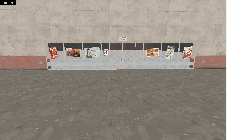
The upper floor has a column that comes down on top of the doors, which looks wrong. I'd recommend either continuing the columns on either side of the door up, or just not having any. You might also consider resizing the front portion to be 3 regular spacings wide instead of 2.
Same sort of inconsistency appears here, where the column comes up from the bottom and then stops. It makes more sense than the previous example, but I'd recommend picking one and sticking with it.
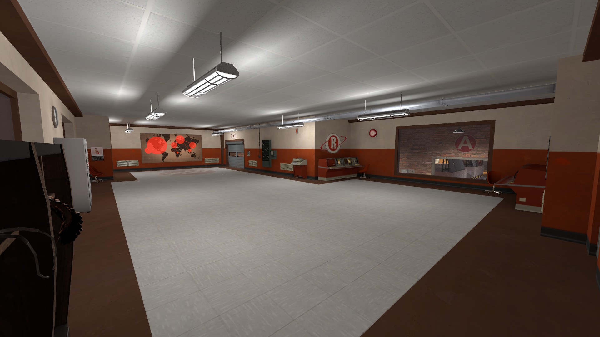
Also, using a wall clock for what I assume is a city hall is pretty funny, but I don't think it's supposed to be a joke.
Storefronts are usually continuous. i.e. the doors would likely be a part of the same "unit" as the windows with no structural walls/columns interrupting. It's easier to insert new storefronts when store owners change, and its also easier to provide an awning over both the door and windows. In your case I think you'll also find that moving the door inwards will make some nice symmetry.
WiP in WiP, post your screenshots!
- Thread starter Arhurt
- Start date
You are using an out of date browser. It may not display this or other websites correctly.
You should upgrade or use an alternative browser.
You should upgrade or use an alternative browser.
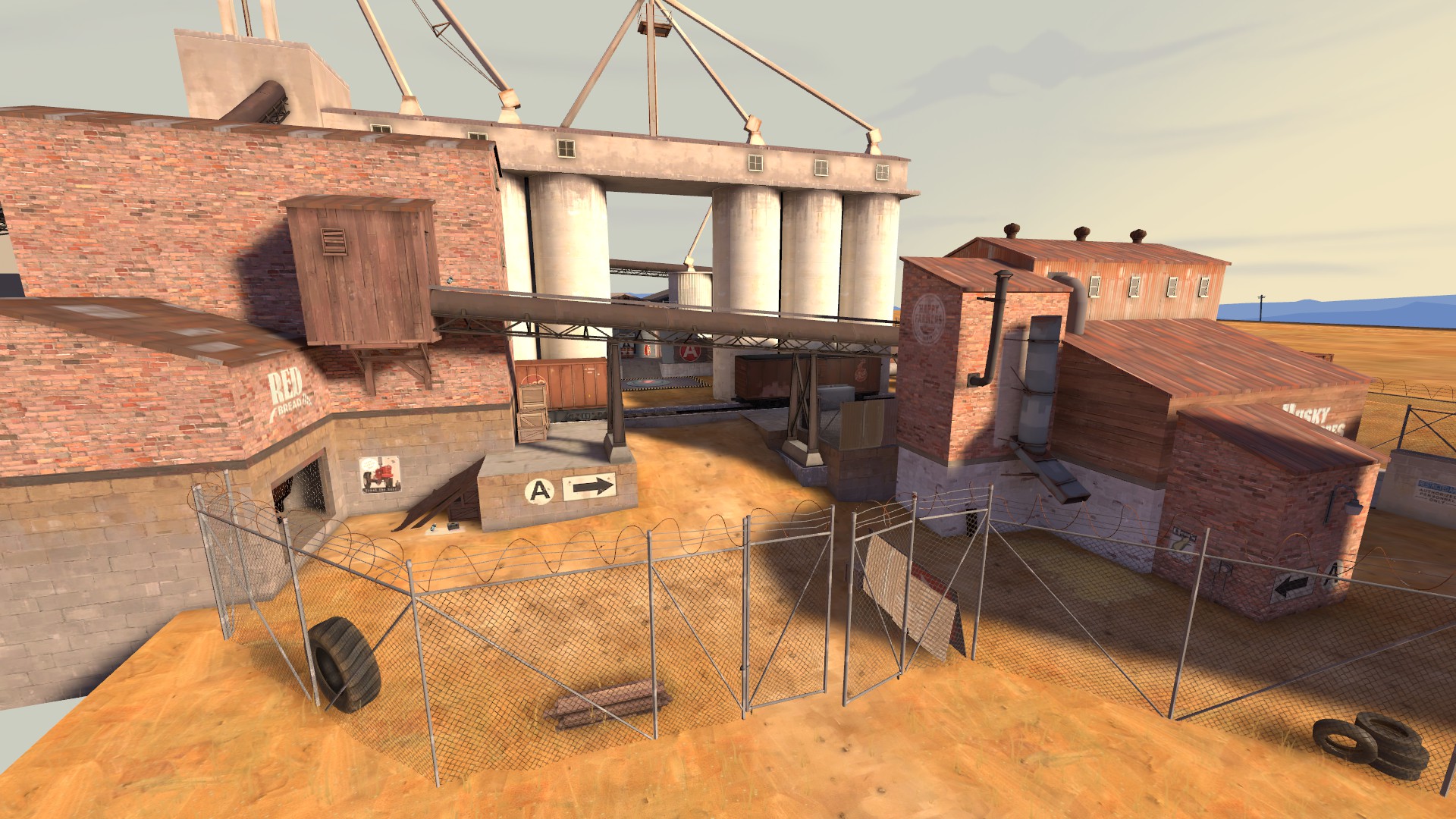
(not granary ripoff)
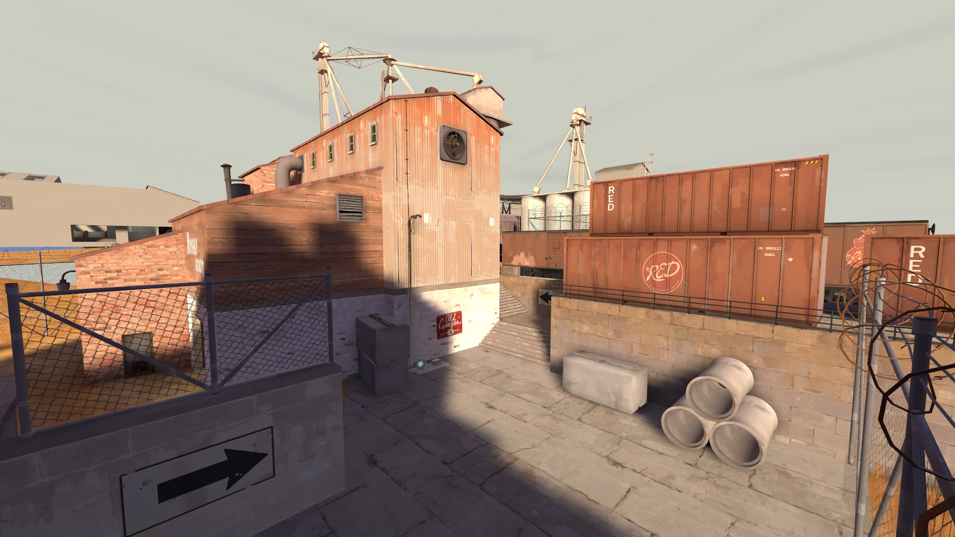
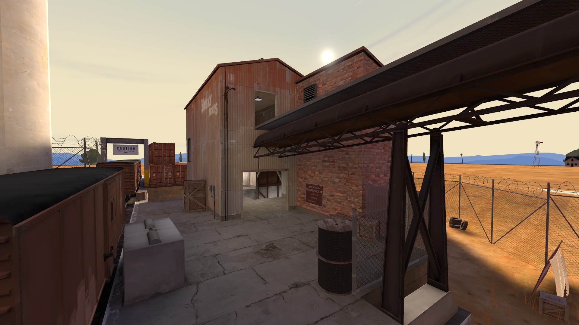
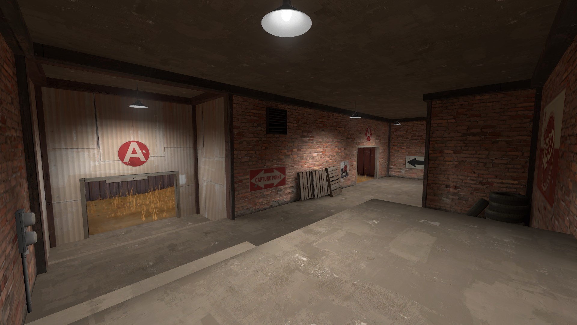
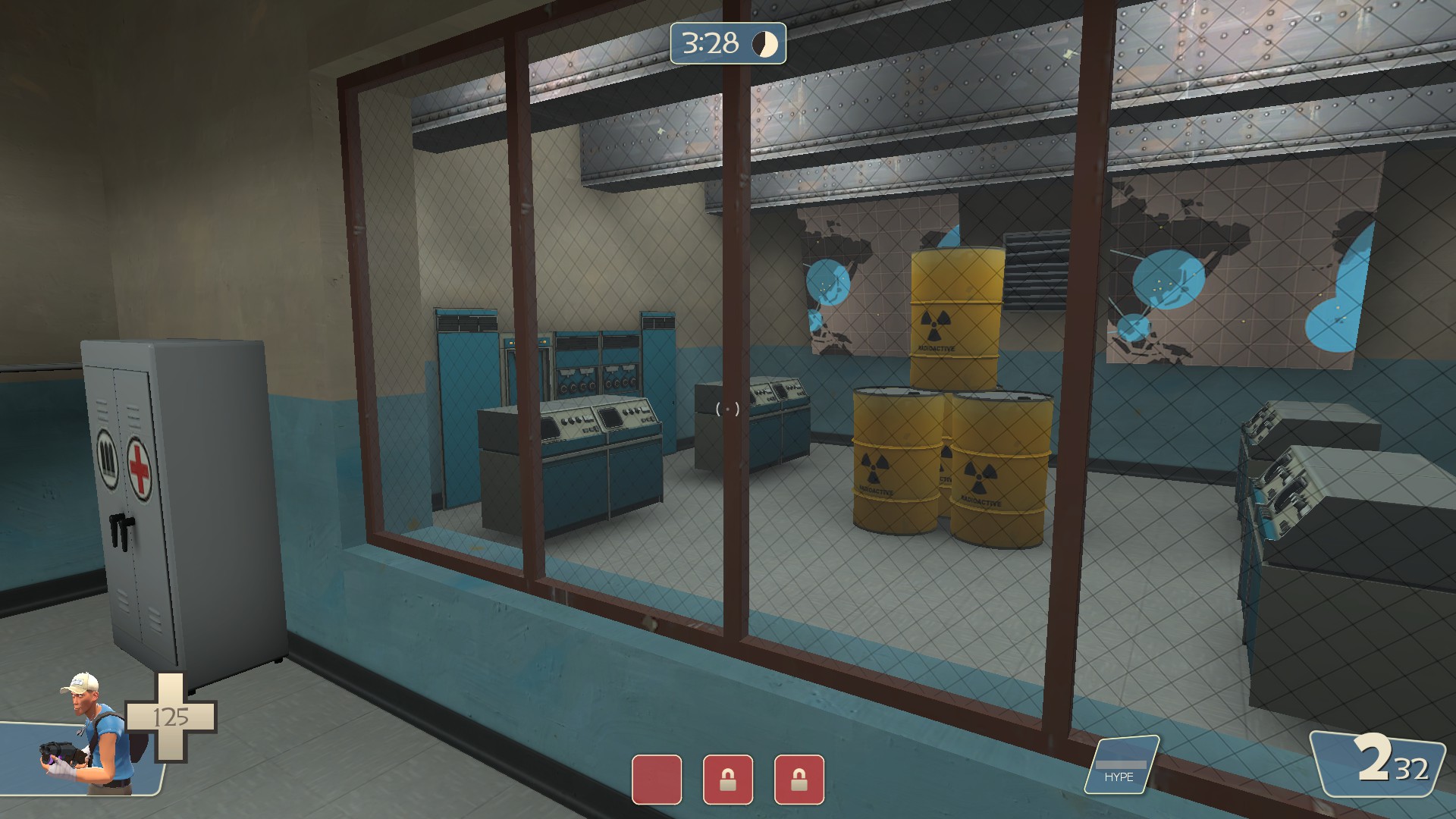
This building is several different materials at once and it looks pretty bad. Stick to fewer and it'll look cleaner. Also consider that you've got an entire map's worth of Red buildings to make - maybe this one could be be more grey/blue industrial since it's further away from the complex?
(Note: When you see multiple buildings next to each other, thats when you see multiple textures next to each other. This reads as one large building, so the textures should do that too. Sometimes you can get away with multiple textures, but usually if they complement each other well, like variations on the same basic metal texture.)
(Also note: Interior and exterior textures don't always need to match. This is especially true for walls that don't have wood framing, as that implies the framing is between two exterior wall finishes as opposed to simply being a frame with an exterior finish and no interior finish.)
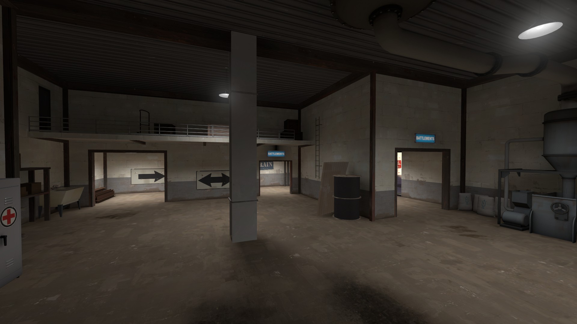
Use spots, not points.
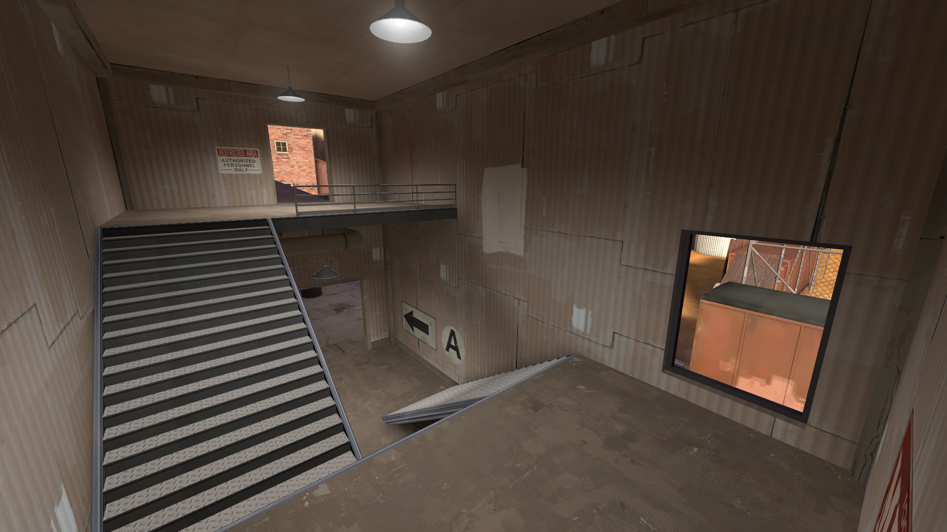
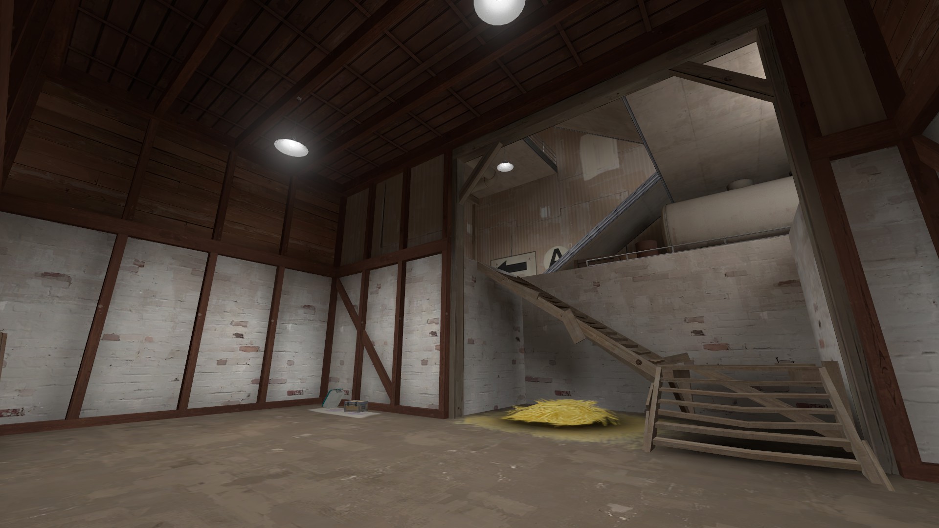
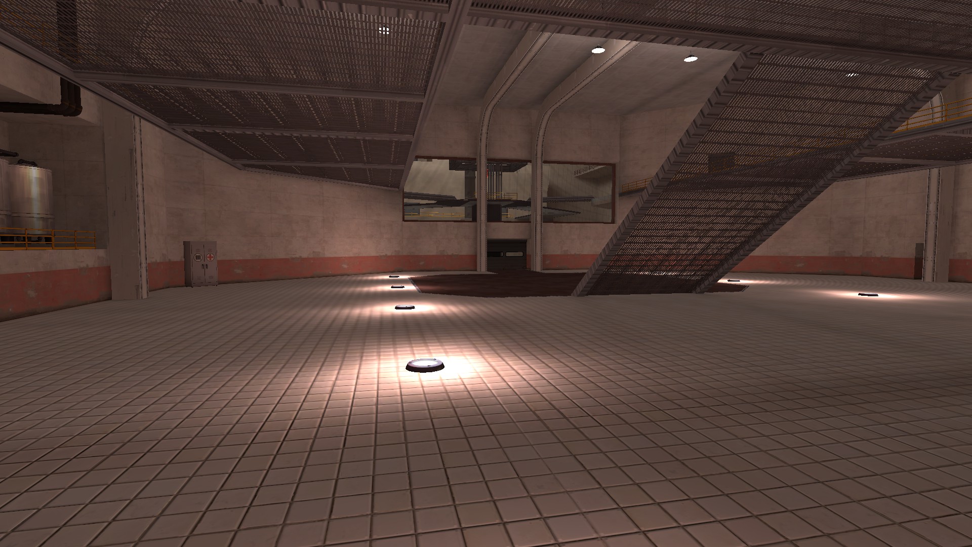
I'm a fan of this room so far. However, I'm not sold on the wood stairs built into a brick foundation, and the wood framing could use some work - more cross-bracing members, and run the ceiling beams in the perpendicular direction (ceiling beams should always run the shorter direction).
You'll want a less noisy wall texture for this since its a large surface. I have a personal vendetta against this texture because it's ugly and repeats pretty obviously.
(Note: The middle landing of the stairs should probably be metal, since they're part of the stairs rather than being their own platform. Consider changing the upper platform too, although also consider how it blends into the long platform over the grain conveyor.)
There's some more notes I want to make but I need to go make dinner. More later? I get the vibe that this is relatively early detail work so I don't want to drop a bunch of feedback this early, as I'm sure you'll slowly improve the finer things as time goes on.
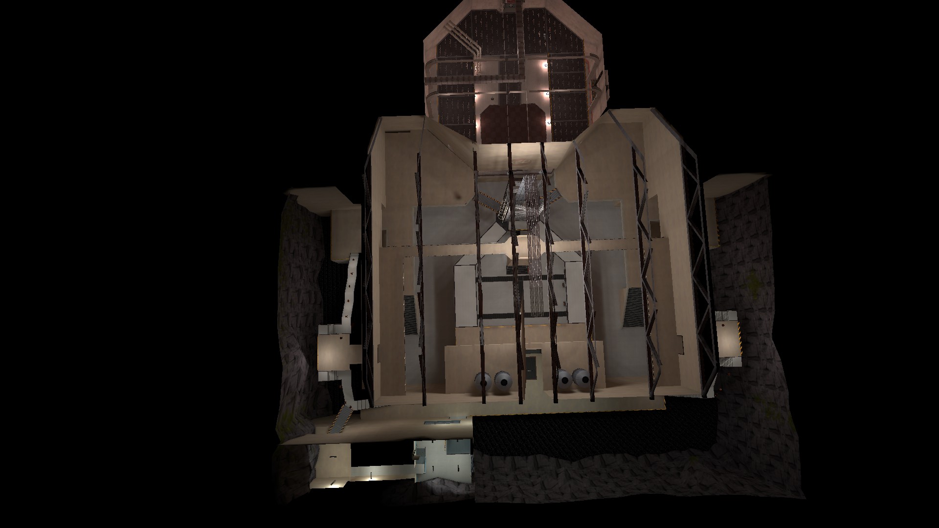
whatcan you put a jungle retro-futuristic australium mining facility in space?
P
Prosciutto
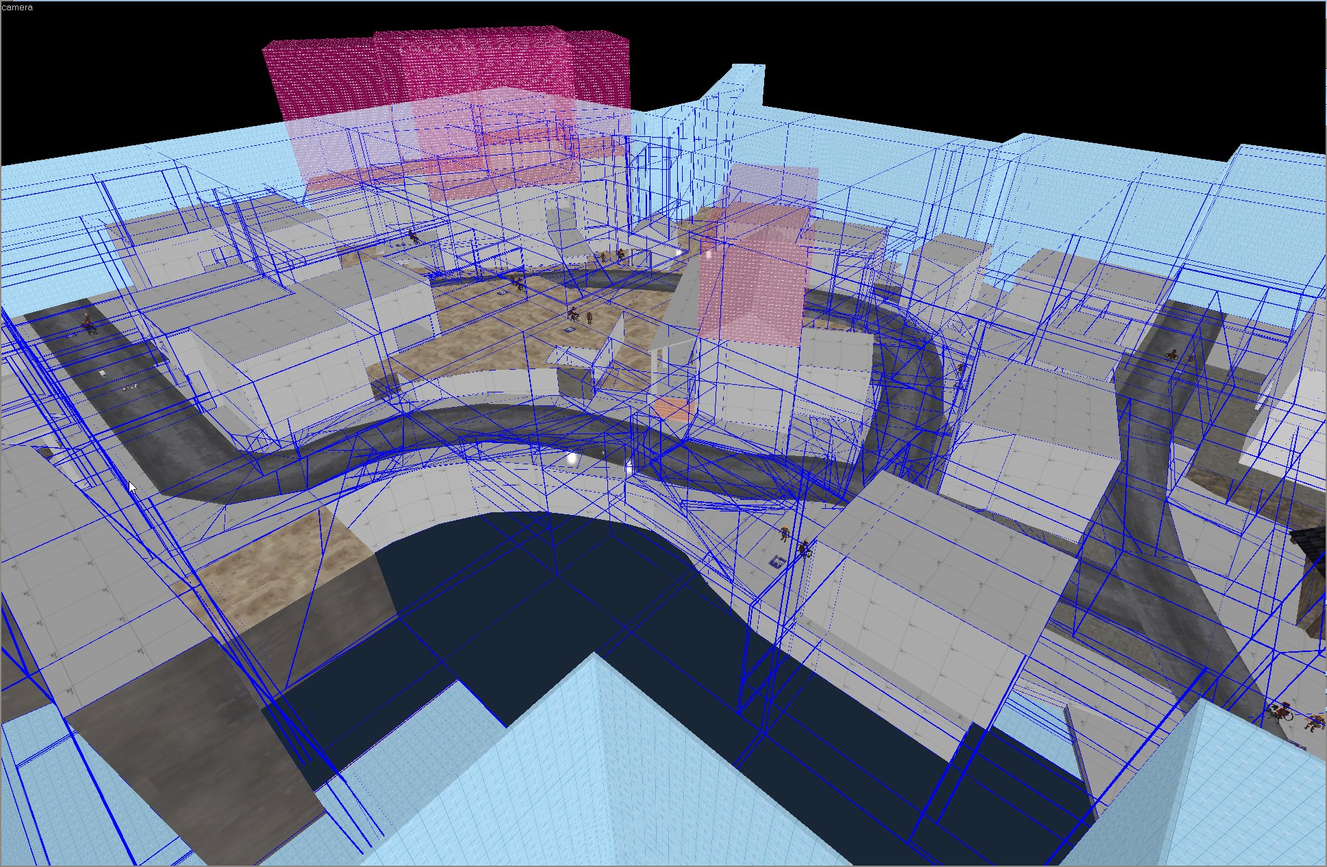
Boom, lot's of work (I think I may be nearing completion)
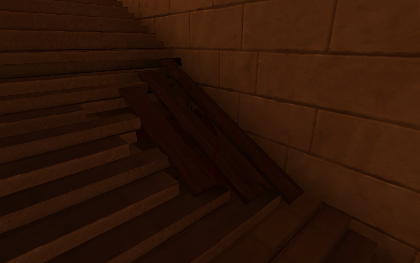
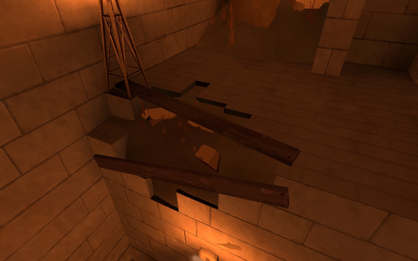
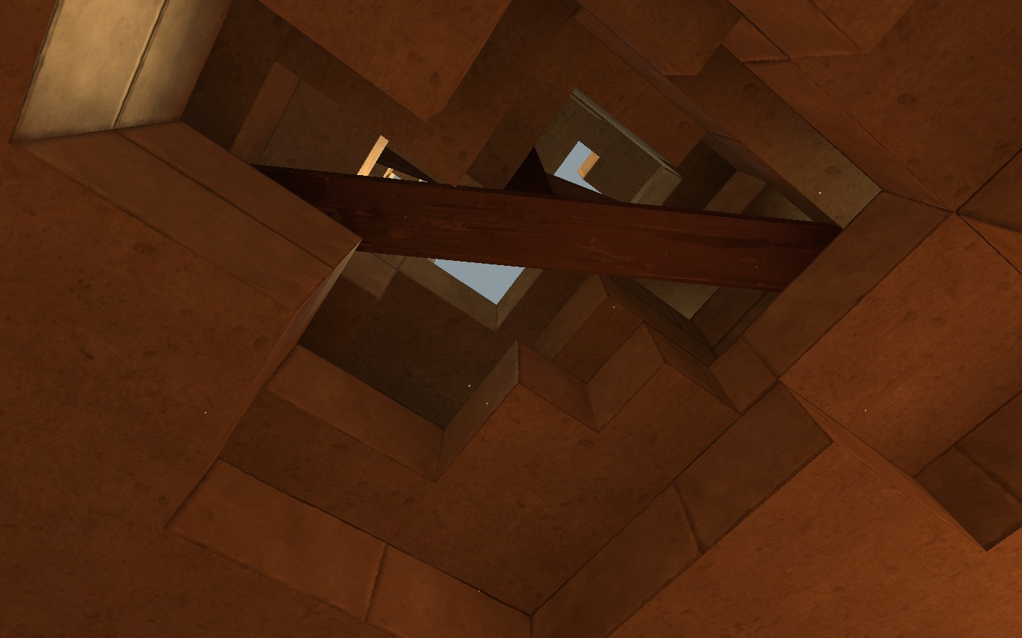
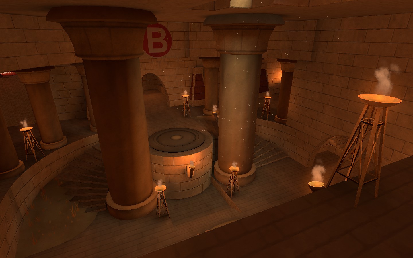
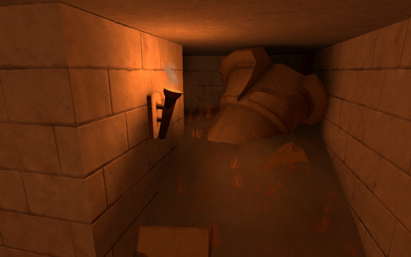
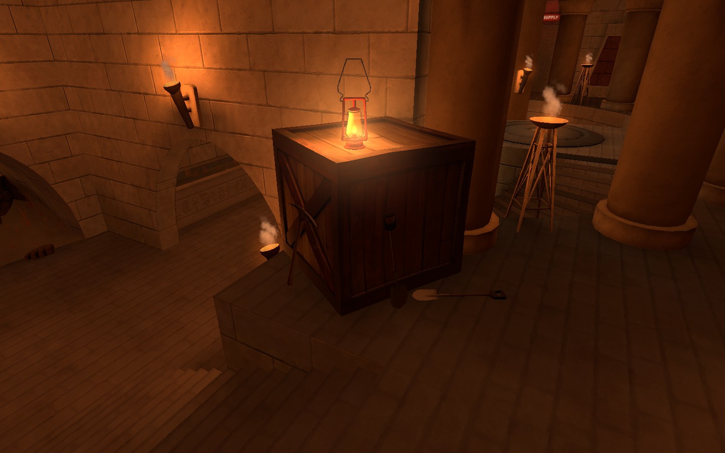
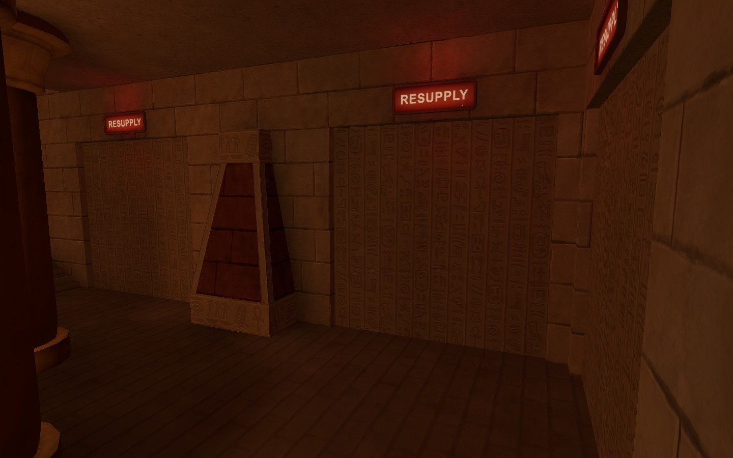 I Added in a place where red would spawn, but I don't care enough to make an actual respawn room...
I also added in some places where the temple has broken down a bit, and replaced the gravel with sand...
Also, nice beautiful sunlight breaking through and onto the final point!
I also added in some places where the temple has broken down a bit, and replaced the gravel with sand...
Also, nice beautiful sunlight breaking through and onto the final point!
Boom, lot's of work (I think I may be nearing completion)
I Added in a place where red would spawn, but I don't care enough to make an actual respawn room...


I also added in some places where the temple has broken down a bit, and replaced the gravel with sand...
Also, nice beautiful sunlight breaking through and onto the final point!
Kinda strange that a wood board is nailed to stone in that second pic. Also, I'm not sure if you can remove them, but I don't think little bits of grass would be growing on that sand. Outside, yes; inside where there's barely any light, not so much.
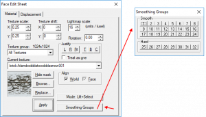
Use some smoothing groups on those curved walls to get smoother lightingBoom, lot's of work (I think I may be nearing completion)
I Added in a place where red would spawn, but I don't care enough to make an actual respawn room...


I also added in some places where the temple has broken down a bit, and replaced the gravel with sand...
Also, nice beautiful sunlight breaking through and onto the final point!
Wait, hold up... what's a smoothing group?Use some smoothing groups on those curved walls to get smoother lighting
Smoothing groups make it possible for vrad to make rounded walls actualy behave as if they are 1 surface instead of being seperate flat edges. And this can realy give it a cilidrical feeling.Wait, hold up... what's a smoothing group?
https://developer.valvesoftware.com/wiki/Smoothing_groups
https://developer.valvesoftware.com/wiki/Hammer_Smoothing_Groups_Dialog
Attachments
moustetail
L1: Registered
- Mar 5, 2017
- 37
- 2
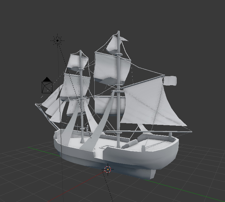
From what I can tell it would already be very small in size, if this is the default grid size of Blender.release this as a model we can use... (but downsize it, so we can just hide it on a shelf in a spawnroom, as an easter egg...)


