blomp
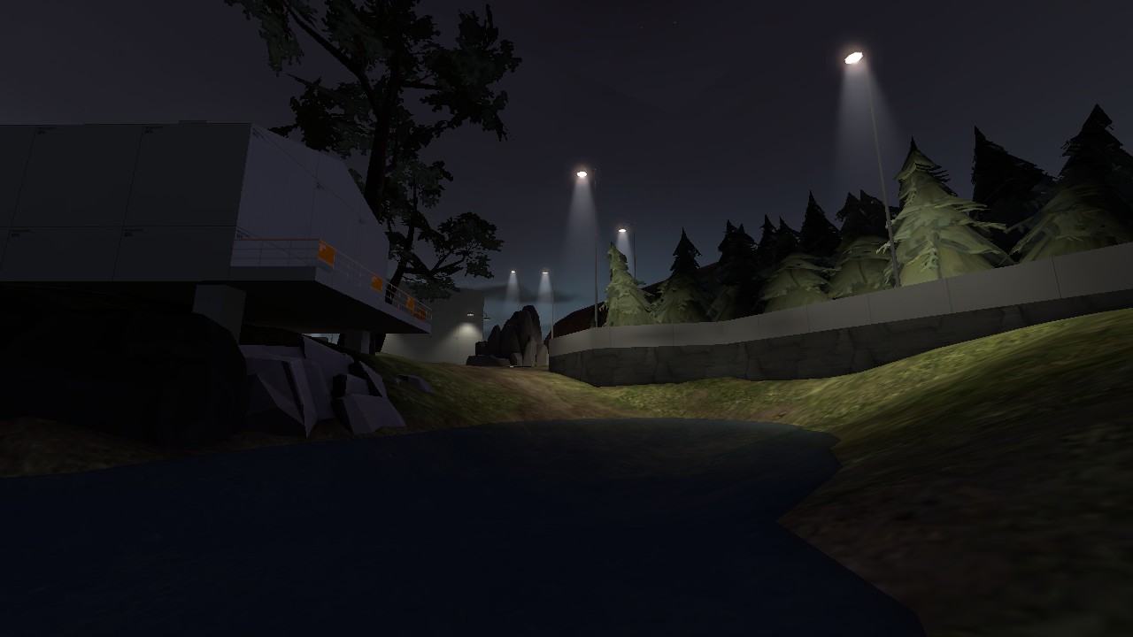
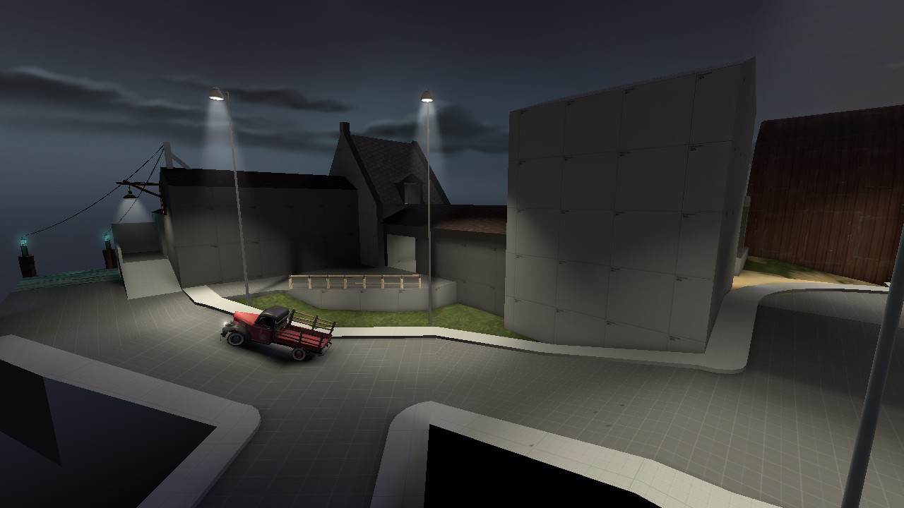
Yes. we need more nighttime maps. (i know it's wip, but the gameplay space is rather dark)
blomp


Not even once?I've never actually played mvm, but I wanted to try my hand at the contest.
Well the one time I was interested in trying it out I made the mistake of queuing bootcamp ha. Quit after 15 mins of people entering/leaving without readying.Not even once?
Forget that, what's with the LSD inspired walls?I discovered an interesting interaction between weapon attributes
These are normal maps for usual rock walls that, for some reason, have a material themselves. IIRC Doomsday has that and also a ground texture normal as a material.Forget that, what's with the LSD inspired walls?
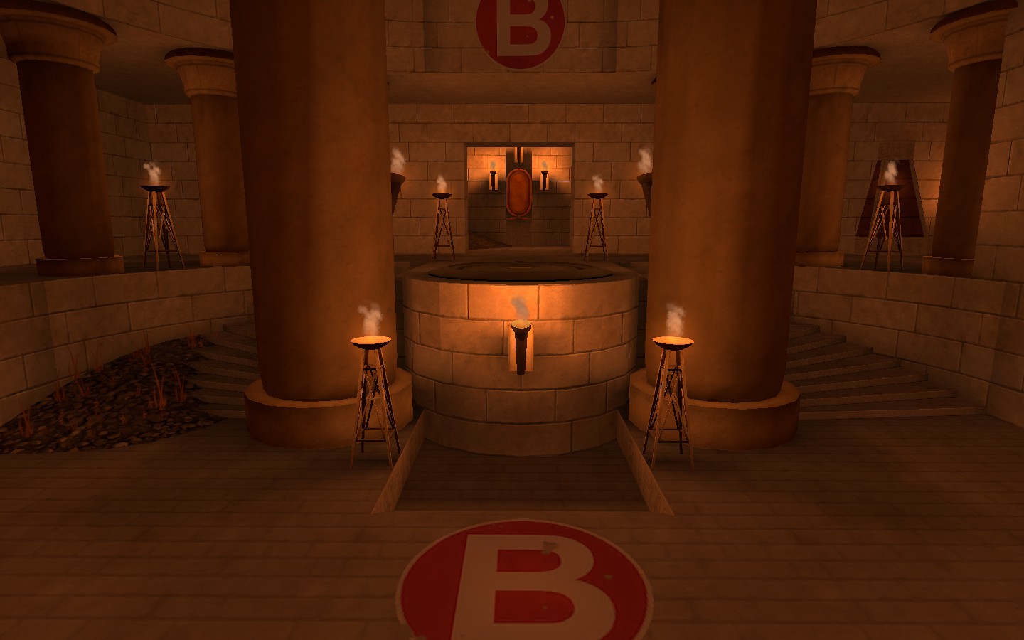
If you notice the post above: I don't care too much about lighting at the moment, I'm currently just trying to get the gameplay details in...The control points needs some lightning pointing at it because it isn't that easy to notice, also points of interest should always be highlighted and most visible.
Apart from that, looks pretty good
None of the doors aren't 192 high... the big archway is actually 256 high...Remember to make doors tall enough for giants. 192 seems to work.
I feel like the sand blend texture would work better for those displacements of rubble. Just my thoughts though.Shit ton of work today:
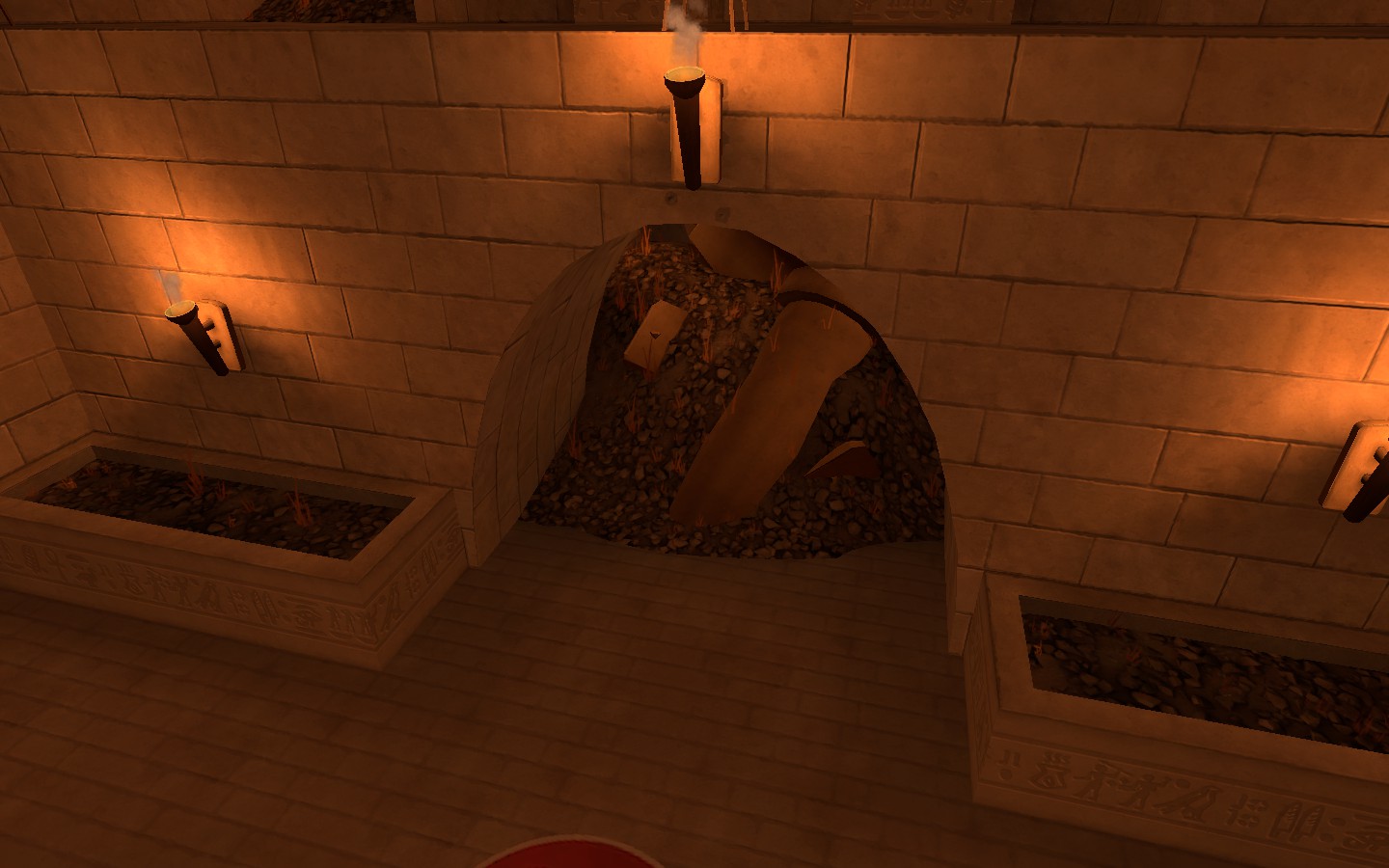
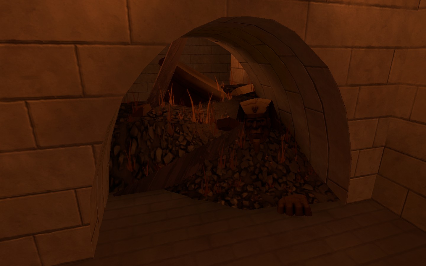
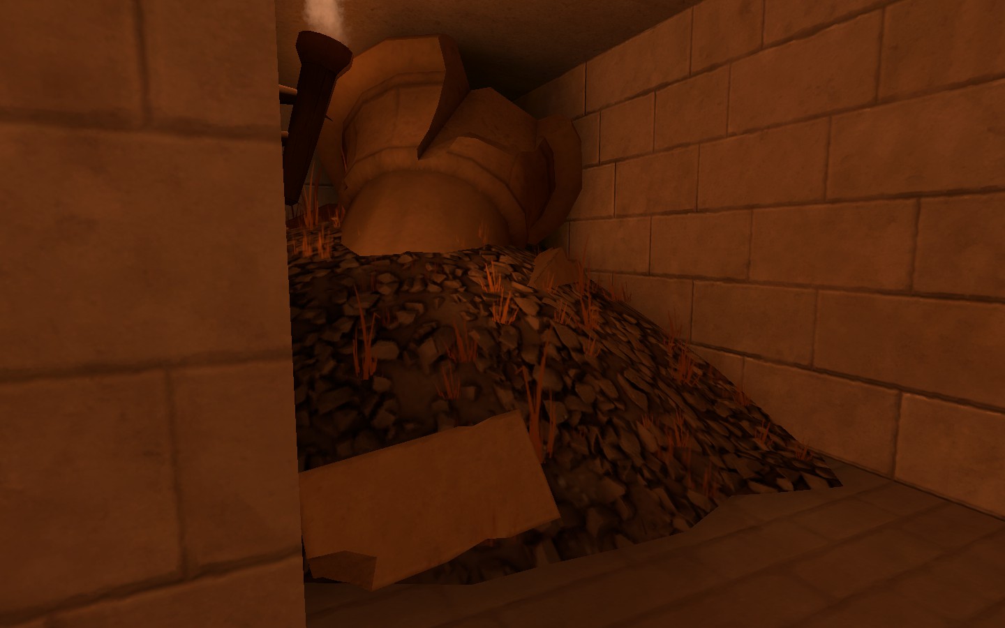
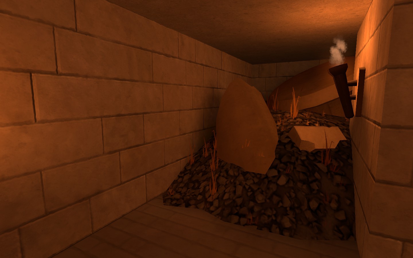
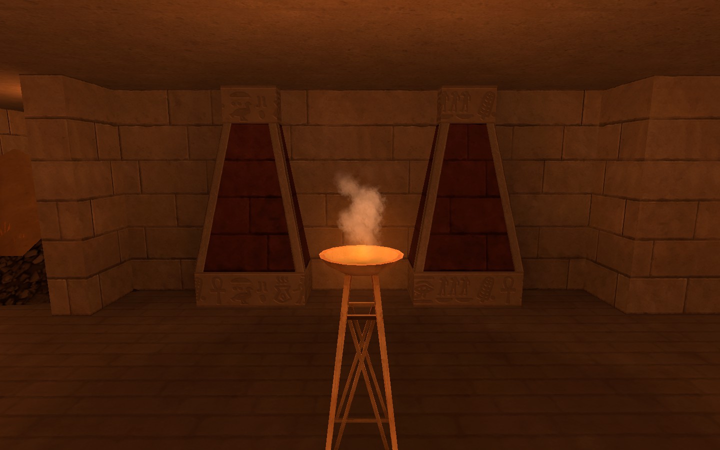
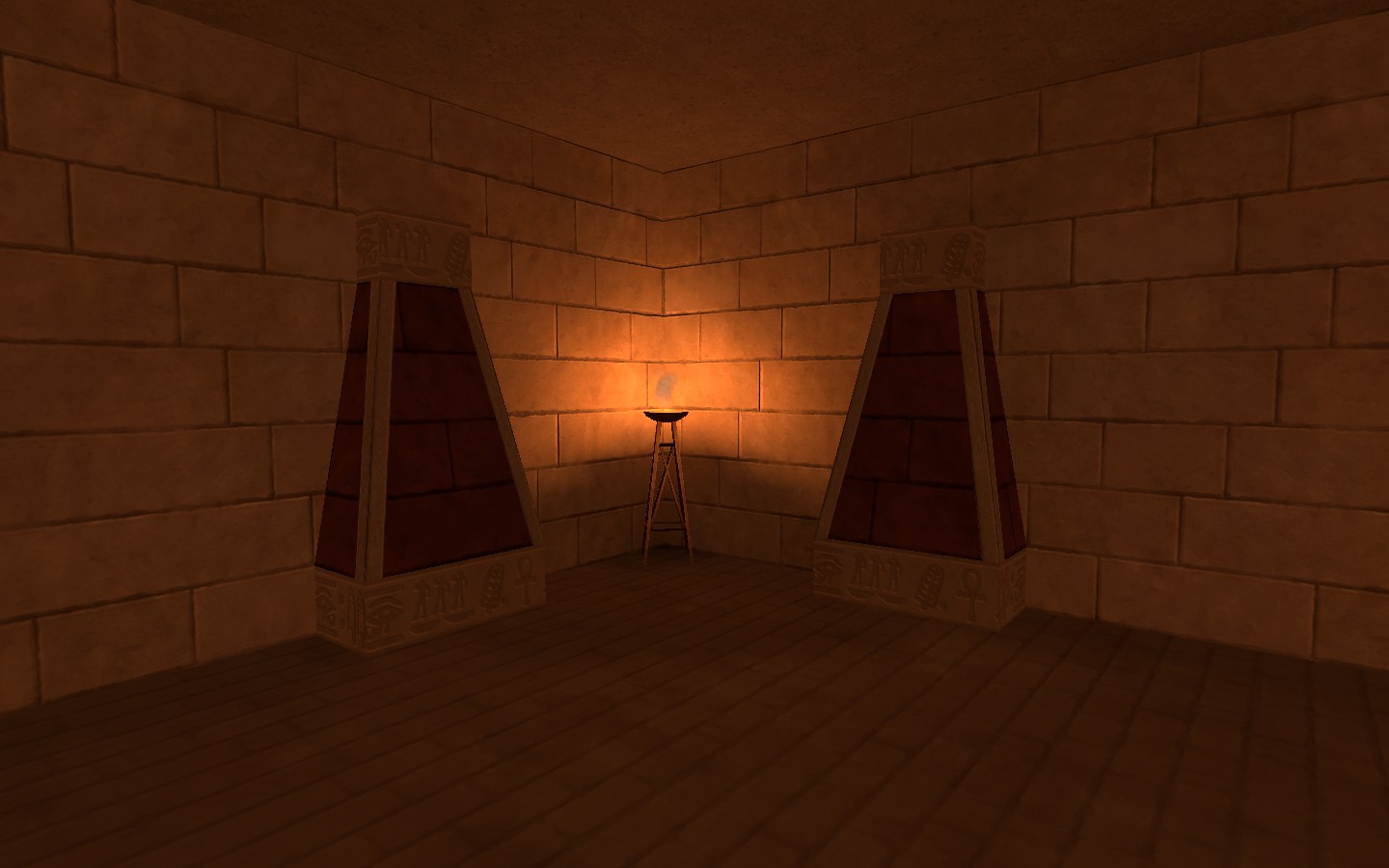
I managed to completely seal my map from the god awful skybox, threw rubble into the exits (to make it seem like the map is more than just the final cp, and also to keep them in the final cp area), threw some signs around to tell you what point you're trying to cap, and threw in a nice set of things to break up the wall texture... I completely forgot about red's spawn, and should probably fix that...