WiP in WiP, post your screenshots!
- Thread starter Arhurt
- Start date
You are using an out of date browser. It may not display this or other websites correctly.
You should upgrade or use an alternative browser.
You should upgrade or use an alternative browser.
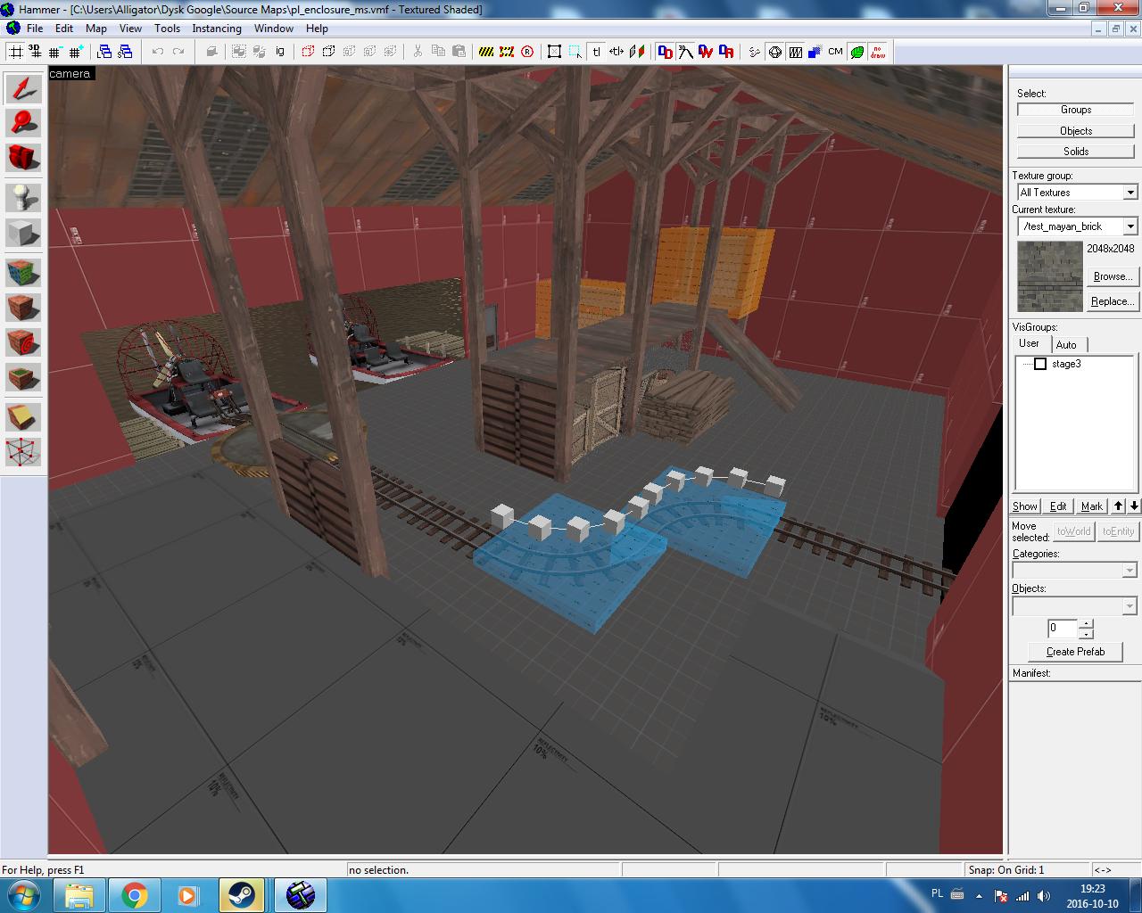
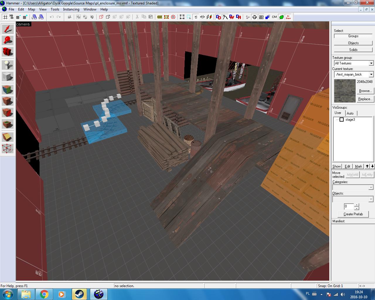
Is that just a straight vmf rip from tfc or is that remade?mistakes were made

the displacement brushes where simply not going to be viable so it's built from the ground upIs that just a straight vmf rip from tfc or is that remade?
B!scuit
L5: Dapper Member
- Aug 12, 2016
- 206
- 267
I started making custom overlays for Smissmas Eve. Created this theme-testing area for me to trial how well they fit in the map.
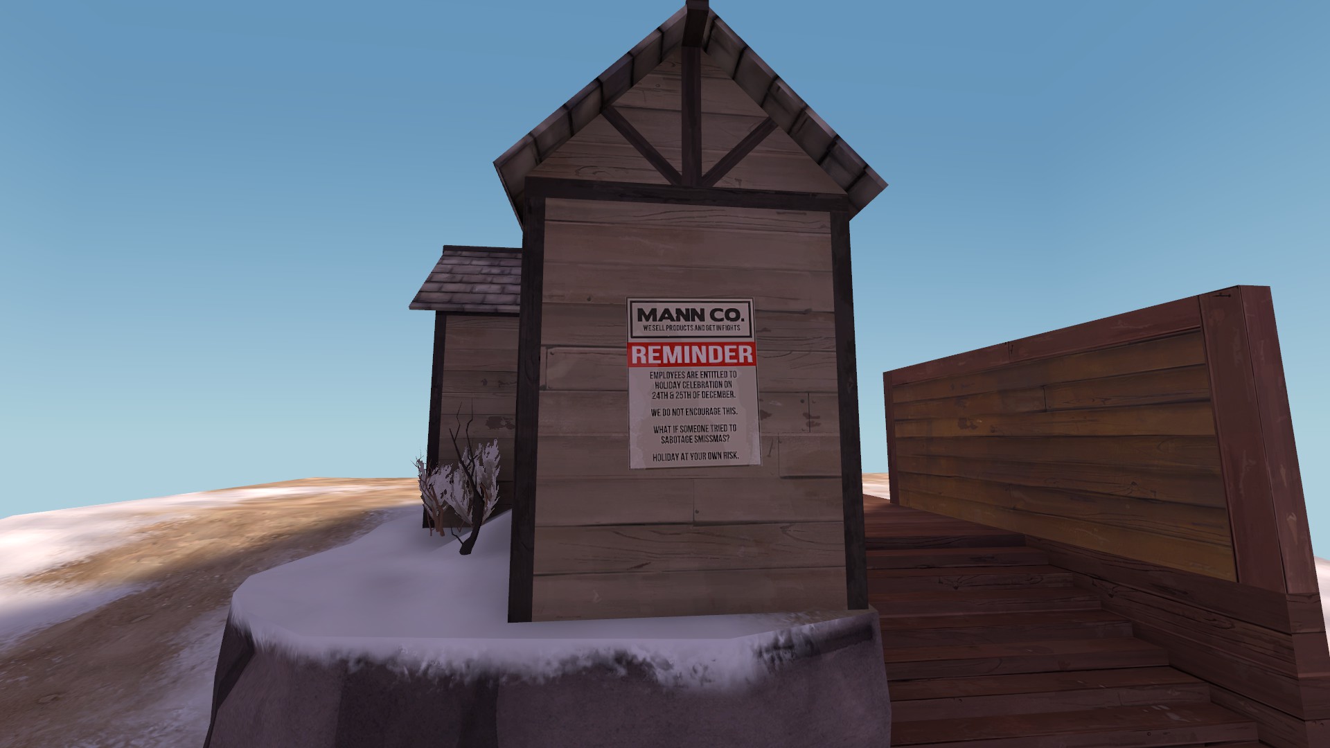
Your Mann Co poster looks good and I like the joke but I think you should worry about how long it takes players playing to get the joke.
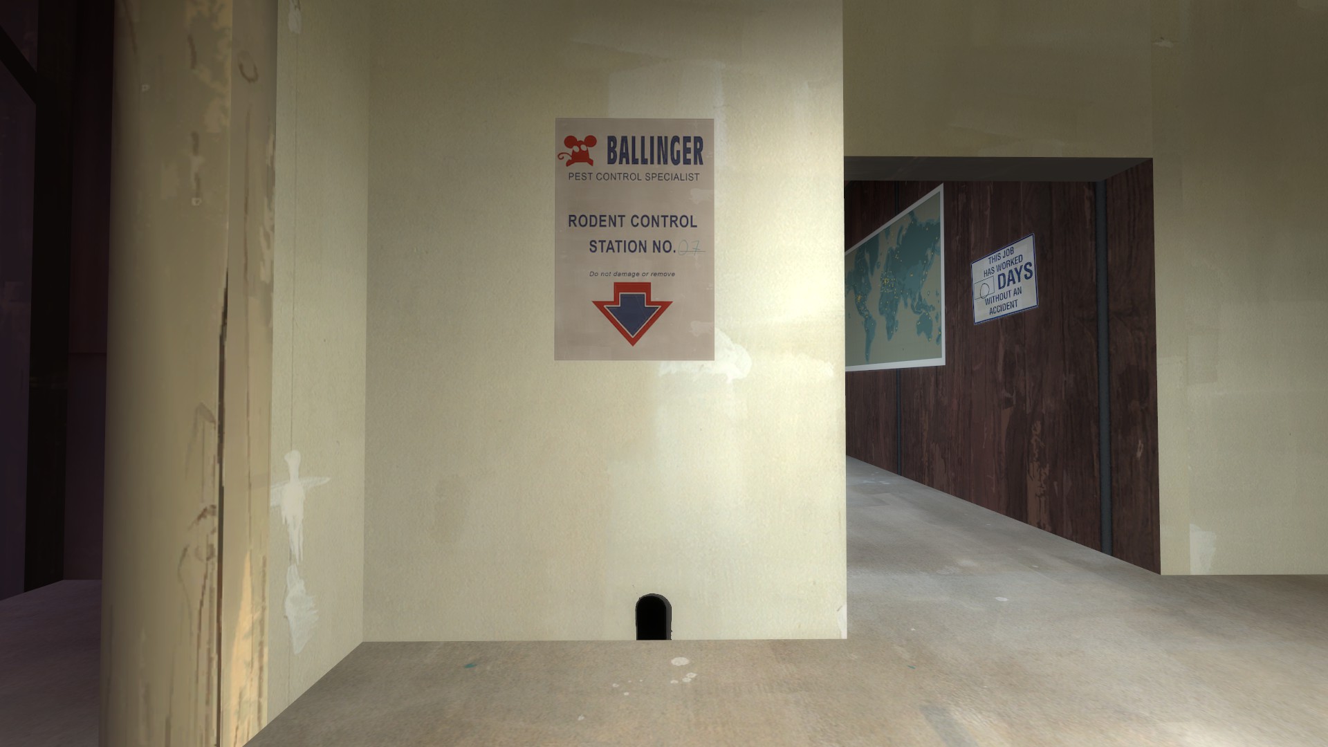
I've always liked this piece from dustbowl because its got some well used font variation and if you just connect one little piece (by following the arrow) you feel a little like you made the joke yourself.
Sadly i still see alot of mistakes for it to become decent for tf2:mistakes were made
- Warpath by its design is mostly a 1 path system. for tf2 nearly all maps feature a 2 to 3 path system (1 main and 1 or 2 common flanks - and sometimes minor flanks - flanks that have a significant delay in walk times or require rocket jumps, double jump). Even old maps like cp_well, and cp_granary do that. 2fort is being an exception there by having only the bridge as main and all other flanks are minor flanks.
- Any map with a single spawn exit is very sensitive to spawncamping. The exceptions where its considered acceptable are those where the attacking team already have shown to be able to push forward. And for defenders there is only 1 exit when its a multi stage map. And even there on the last point there usualy are 2 spawn exits (although you might not have a free choise in which you leave)
- Sniper friendly areas. There is a reason why warpath is popular, but its the same reason why for many players its bad. Its very sniper friendly due to it being hard to reach them (all good sniper spots are behind the bottleneck).
- The warpath building style itself is very un-tf2-ish. Flat roofs, single entrances and nearly always favouring the defense. I would recommend already trying to figure out how you can make a certain path walkable. The first forward spawn and the small bridge to cp2 is for example one of those things that you normaly wouldnt see in tf2. Instead that bridge would be blocked off, and once leaving the spawn you would drop down and remain unable to get back up. With that, it should probably feature a nobuild zone to avoid a sentry taking that spot (due to it being very powerfull as its hard to get into a position to safely attack it.
- To reach the final cap you have to get past the enemy spawn exit. This is extremely bad for nearly all maps. In a ctf game a short moment can be enough, but for a cp map you need to hold out longer.
- And again, this is mainly amplified when there is a huge bottleneck in front of it
- As warpath used a ctf system to cap rather than the tf2 capture system you must adjust the map to allow the gameplay change. In tf2 its many times the other way around where the defenders instead face 4 potential angles at once and the attackers can usualy be attacked from only 1 or 2 sides. This is also probably why the 2fort system was that diffirent. Since its a ctf map pushing through the defense already should be harder.
- For example look at turbine and powerhouse. both could feature a 3cp system, or ctf system. both have the intel next to the spawn rather than behind it. And this makes it possible to reach the intel in 1 strong attack.
- Even look at badlands where to reach the final cap you have plenty of blind flanks which attackers can use to take out specific defenses.
Warpath is a realy poor map to be converted to cp because of the many issues it features regarding to balance. Unlike badlands where both teams have somewhat equal chances to reach each area and lacking a single-path-bottleneck entirely.
I actualy even think that to make warpath work, it would have to be edited into a state you dont even recognise the areas anymore from tfc unless you know where to look for.
Crosspost from the Frontline! thread.
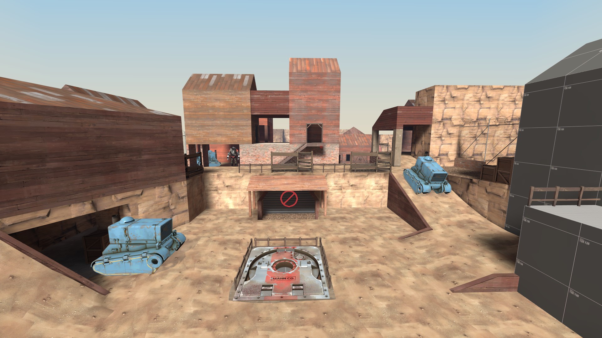
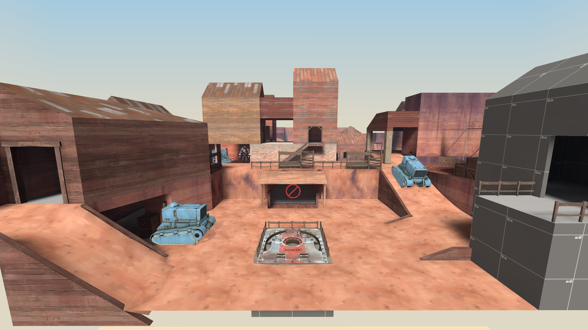
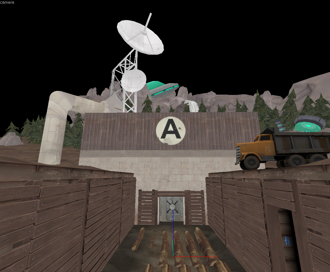
Here's an in-Hammer what I was thinking of when I said this. It's really sloppy, as I threw it together in 15 minutes (8 of which were spent finding models.
Typically I wouldn't do this, and I haven't been in the mapping mood lately, but recently I stumbled upon an ancient folder of maps that I haven't really shown anyone. They're pretty much lost to time by this point, so why not show them off?
This is a still from a Portal 2 map I never finished. It was never very good.

I detailed a map by Amit, who is extremely talented, a couple of years ago. It was intended for a mod and will probably never be played.

It had a very extensive BTS area that I don't seem to have many pictures of anymore.

This was a detailing job I did on a map by LPFreaky back in 2014 or so. The inclusion of turrets was bad, and this one isn't going to see the light of day either, at least, in this form.

A guy named Zach handed me this unfinished map and I finished the first puzzle. I probably showed this at some point in like 2013.

This was more of a personal project of mine. I think I released it at some point, but it was never very fun. Too much walking. It looked decent, at least.

I would like to finish this Portal map of mine someday. I've been working on it slowly for about 4 years, and it has a twist, so this is all I can really show without spoiling. This will maybe be released. Maybe...


I could never get this section to look good. It's scrapped now.


I detailed a map by Amit, who is extremely talented, a couple of years ago. It was intended for a mod and will probably never be played.

It had a very extensive BTS area that I don't seem to have many pictures of anymore.

This was a detailing job I did on a map by LPFreaky back in 2014 or so. The inclusion of turrets was bad, and this one isn't going to see the light of day either, at least, in this form.

A guy named Zach handed me this unfinished map and I finished the first puzzle. I probably showed this at some point in like 2013.

This was more of a personal project of mine. I think I released it at some point, but it was never very fun. Too much walking. It looked decent, at least.

I would like to finish this Portal map of mine someday. I've been working on it slowly for about 4 years, and it has a twist, so this is all I can really show without spoiling. This will maybe be released. Maybe...


I could never get this section to look good. It's scrapped now.

Last edited:
Typically I wouldn't do this, and I haven't been in the mapping mood lately, but recently I stumbled upon an ancient folder of maps that I haven't really shown anyone. They're pretty much lost to time by this point, so why not show them off?
This is a still from a Portal 2 map I never finished. It was never very good.

I detailed a map by Amit, who is extremely talented, a couple of years ago. It was intended for a mod and will probably never be played.

It had a very extensive BTS area that I don't seem to have many pictures of anymore.

This was a detailing job I did on a map by LPFreaky back in 2014 or so. The inclusion of turrets was bad, and this one isn't going to see the light of day either, at least, in this form.

A guy named Zach handed me this unfinished map and I finished the first puzzle. I probably showed this at some point in like 2013.

This was more of a personal project of mine. I think I released it at some point, but it was never very fun. Too much walking. It looked decent, at least.

I would like to finish this Portal map of mine someday. I've been working on it slowly for about 4 years, and it has a twist, so this is all I can really show without spoiling. This will maybe be released. Maybe...


I could never get this section to look good. It's scrapped now.

[/SPOILER]
People have asked me why dauphin took so long to make at first, and the answer is that although I made tiny changes, I was extremely meticulous and careful. Combined with my slowness, it just took a while. I also contracted some medical problems which haunted me for those two years, and still do today, but I think it mostly just came down to me being slow and having no good ideas.
Here's a tour of the 20 something organized versions I created:
Blue Spawn Area:
Version 1 (8/4/14)

Version 2 (8/24/14)

Version 6 (11/2/14)
This one is more complete, but lacks the back tunnels.

Version 10 something (5/10/15)
The map now has tunnels, although in a completely different form than it has them now. All of the pickups are altered, and an exit is gone.

Today -
The tunnels are completely different, but otherwise, not much has changed. This area probably changed the least, actually.

Point A -
Version 1 (8/6/14)

Version 1.5 (8/24/14)
There is a deathpit along the side of the cliff. The point is sitting in some random spot with no significance.

10/11/14 and 11/2/14
Visible changes


9/29/15
The ramp downwards is replaced by a tunnel exit.

Today -
I'm just going to go ahead and skip to the present day. The A > B connector is no longer outside, there are small changes in where the ramps are, among other things.

I would show the horrible things I did in order to make point B, but i'm tired and I'm not sure if anyone actually cares? I think I made and scrapped that point at least 7 times before I found a basic layout I liked.
There was this transition to an imaginary point B

at some point there was a drawbridge involved and it didn't loop around like it does today

at some point, I created a new .vmf and then made this cringe

disgusting

And that's pretty much it for dauphin, although I could share more if I dug further.
Your Portal mapping game is on-point. That BTS detailing, man... I really love it. Fantastic work.
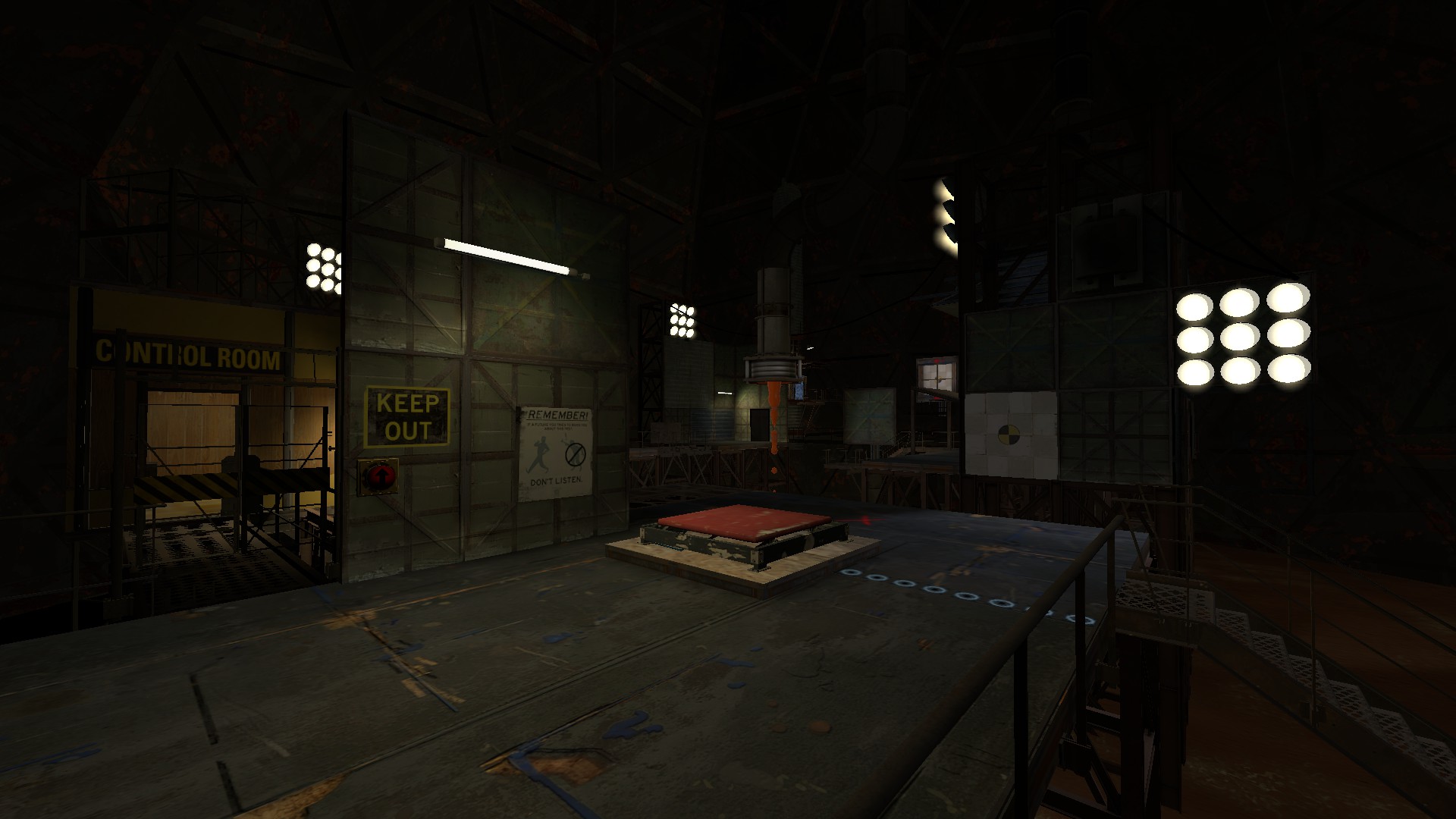
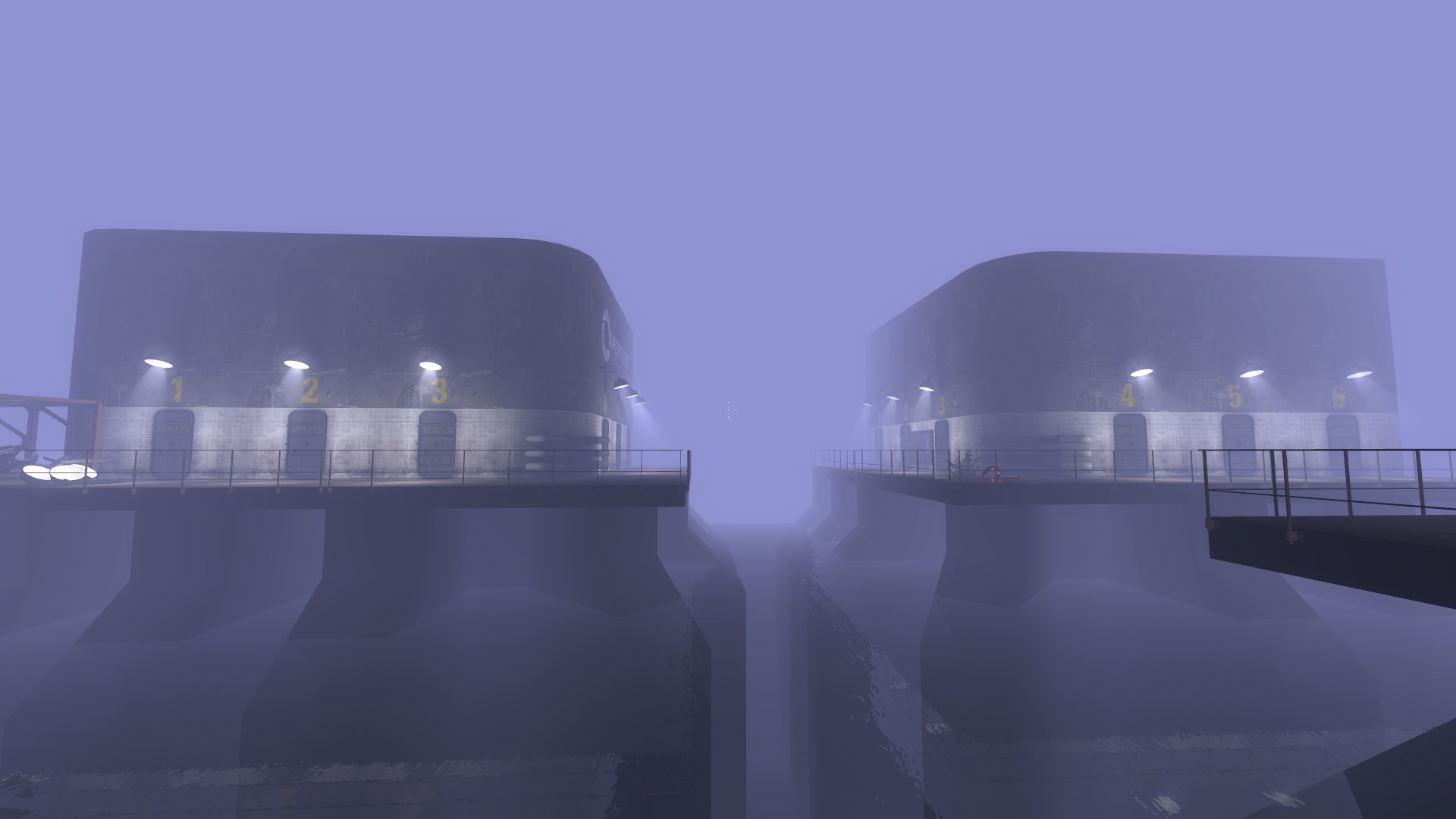
I worked on a Portal 2 mod for a long while, though there was never a finished product. Here are some screens I've dug up:
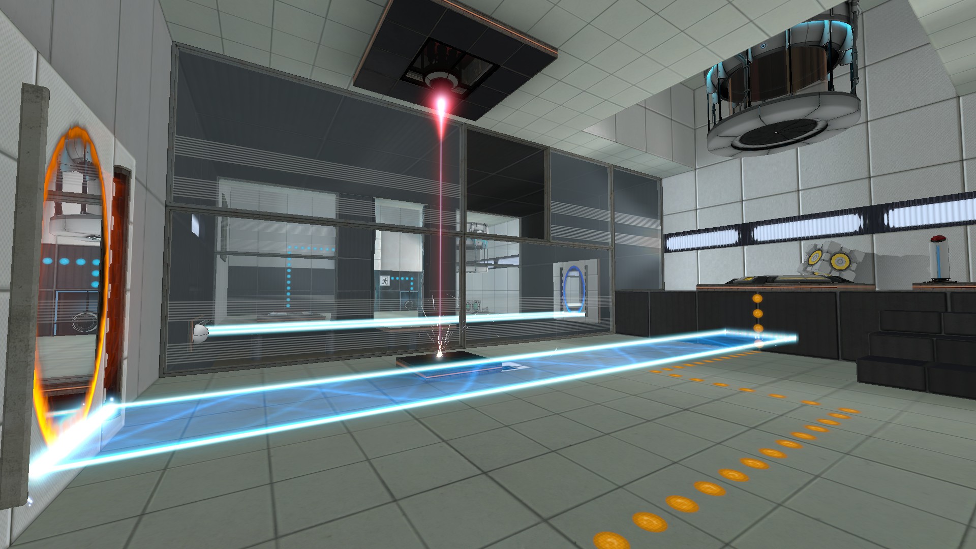
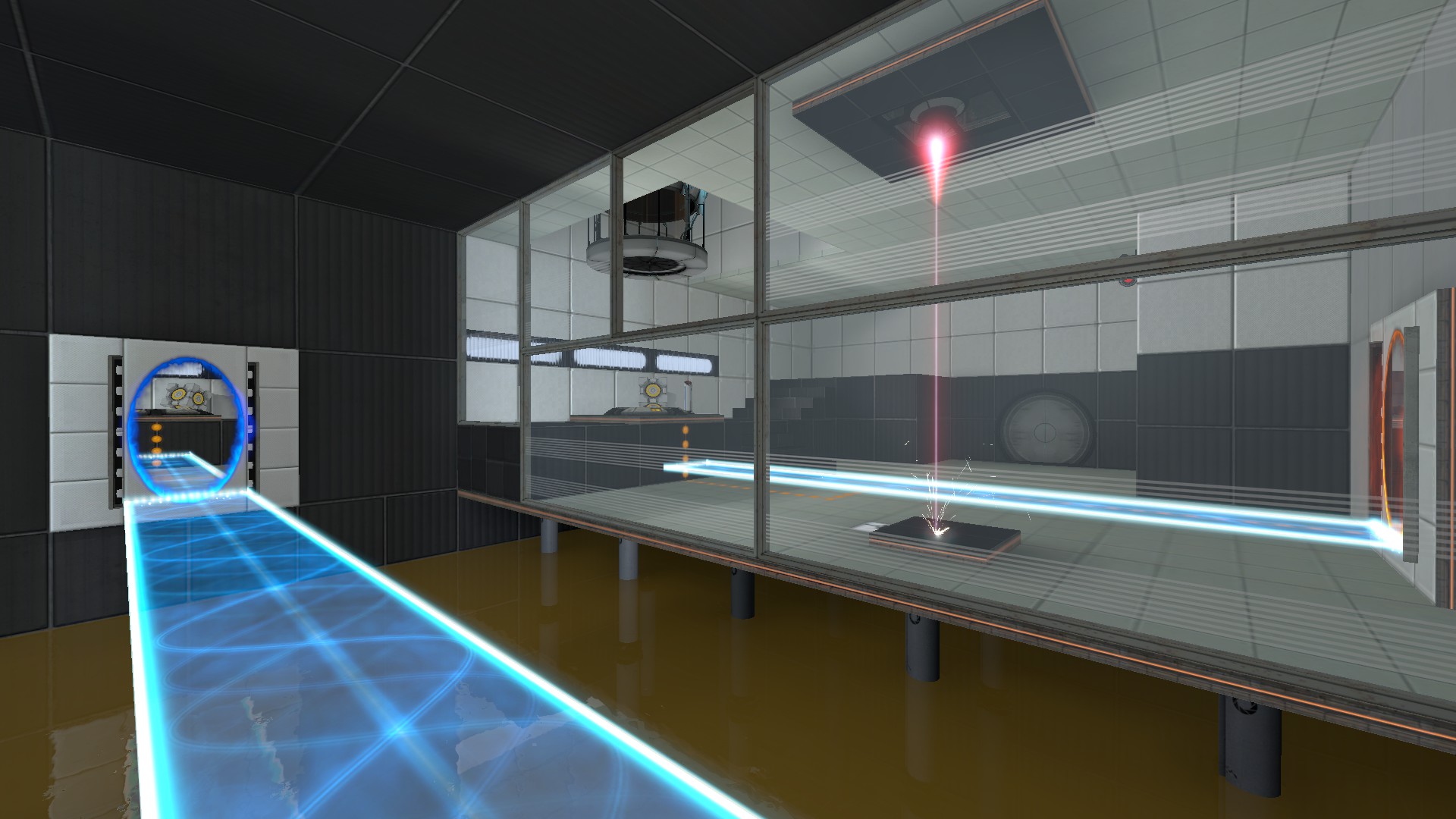
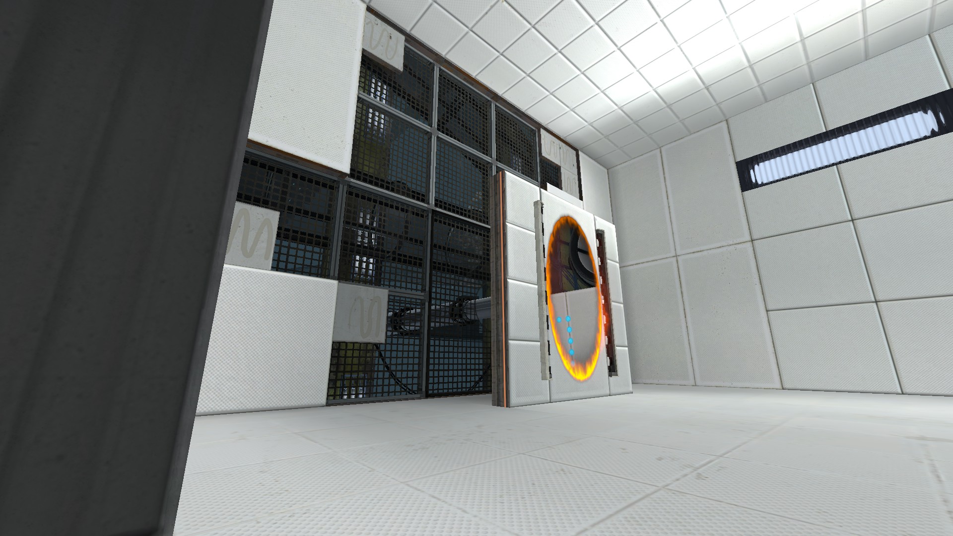
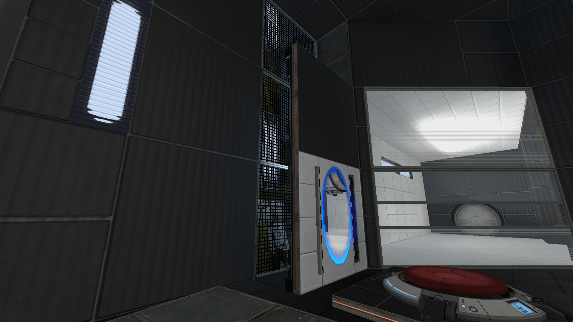
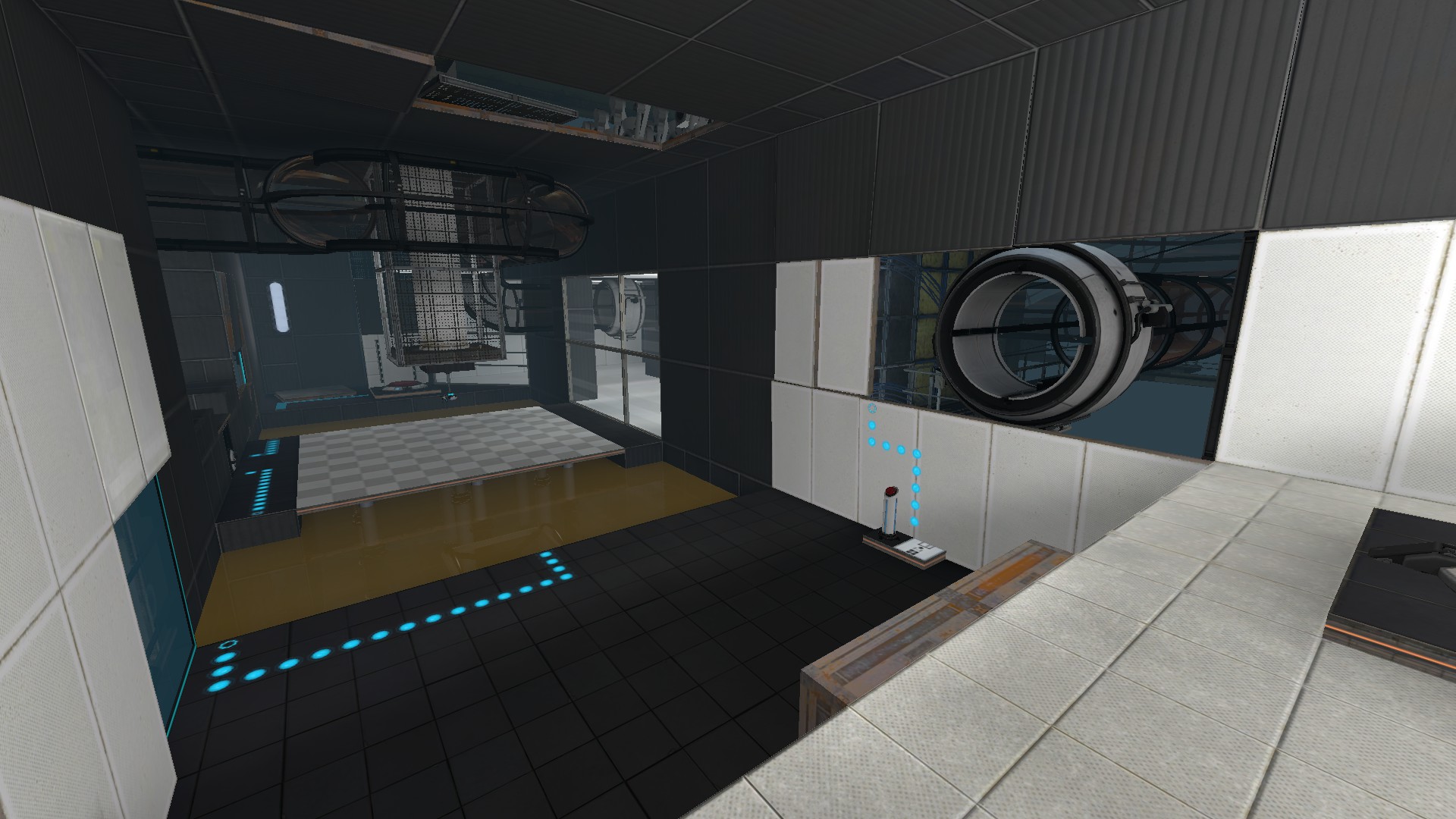
Yeah, I was a fan of grating...
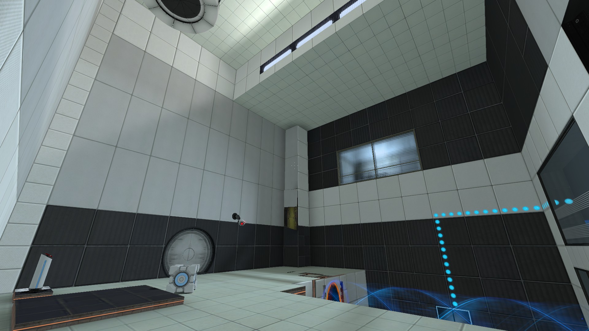
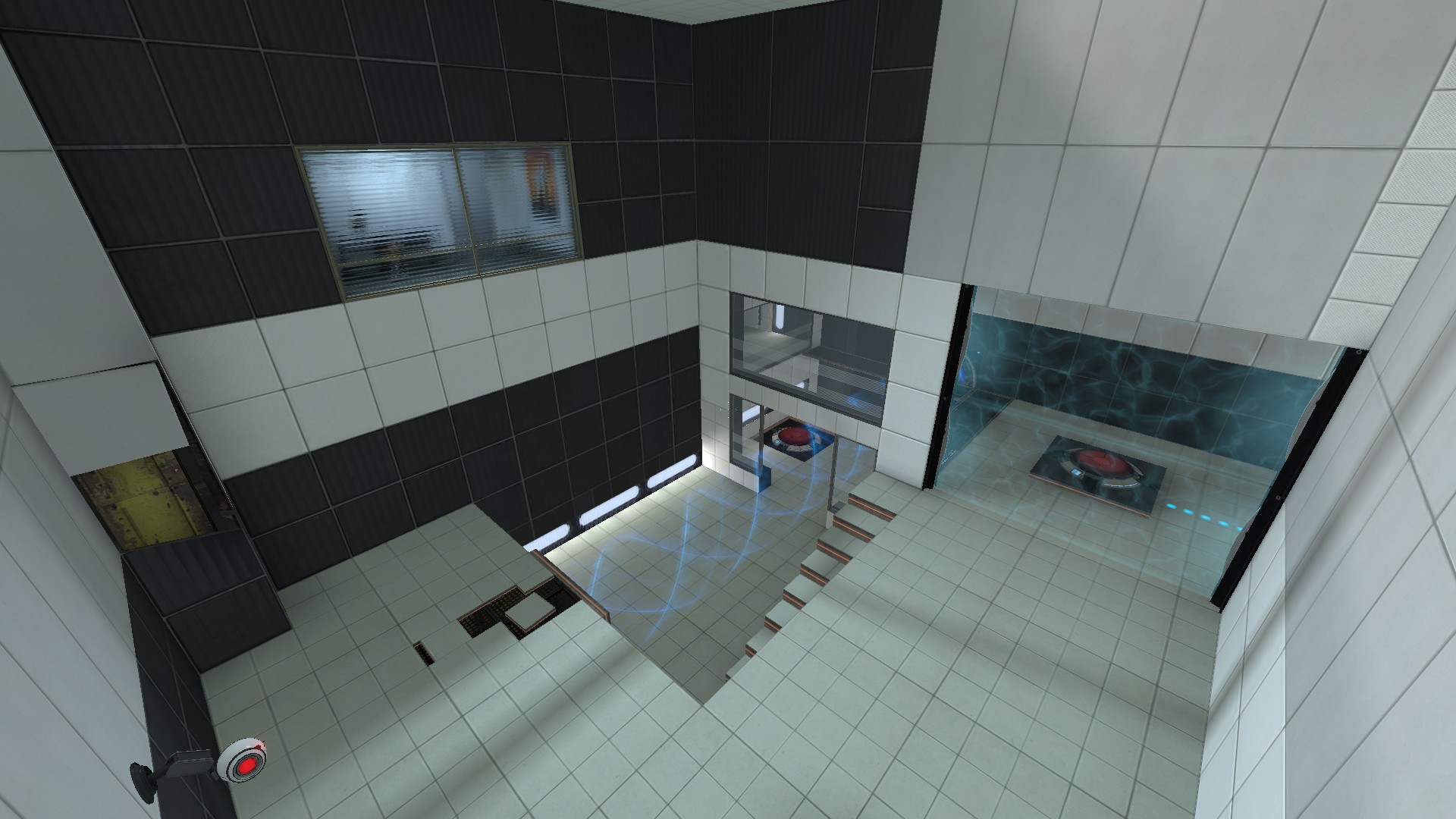
Pretty bad lighting on this next pic. Though this is a map that I eventually want to release by itself onto the Workshop.
Bonus pic: one initial (REALLY EARLY) concept for the mod.
Last edited:
Yeah but it doesn't really scream spookyness. Seems more like a peaceful town at the foot of a mountain than a spooky scary skeleton-spawning HHH-infested spooktown like Helltower or Mann Manor.See, this is how Halloween maps should be. All original and beautifully done.


