WiP in WiP, post your screenshots!
- Thread starter Arhurt
- Start date
You are using an out of date browser. It may not display this or other websites correctly.
You should upgrade or use an alternative browser.
You should upgrade or use an alternative browser.


why would you try to localize RED and BLU into a language where the acronym doesn't even translate?
Haven't you heard? Rainbows in Russia are made of entirely different colors. Instead of red and blue you have labor and tears. It's why Putin is more afraid of homosexuals than other world leaders; their pride flags are HORRIFYING! You should look it up.
But really, I think they are fine. I like the style they are in and it's refreshing to see something other than "RED" and "BLU". I do think however that the blu one should just have one big tool in the background like the original instead of 2 crossing ones, similar to how the red logo has a single dynamite replacing a single bomb.
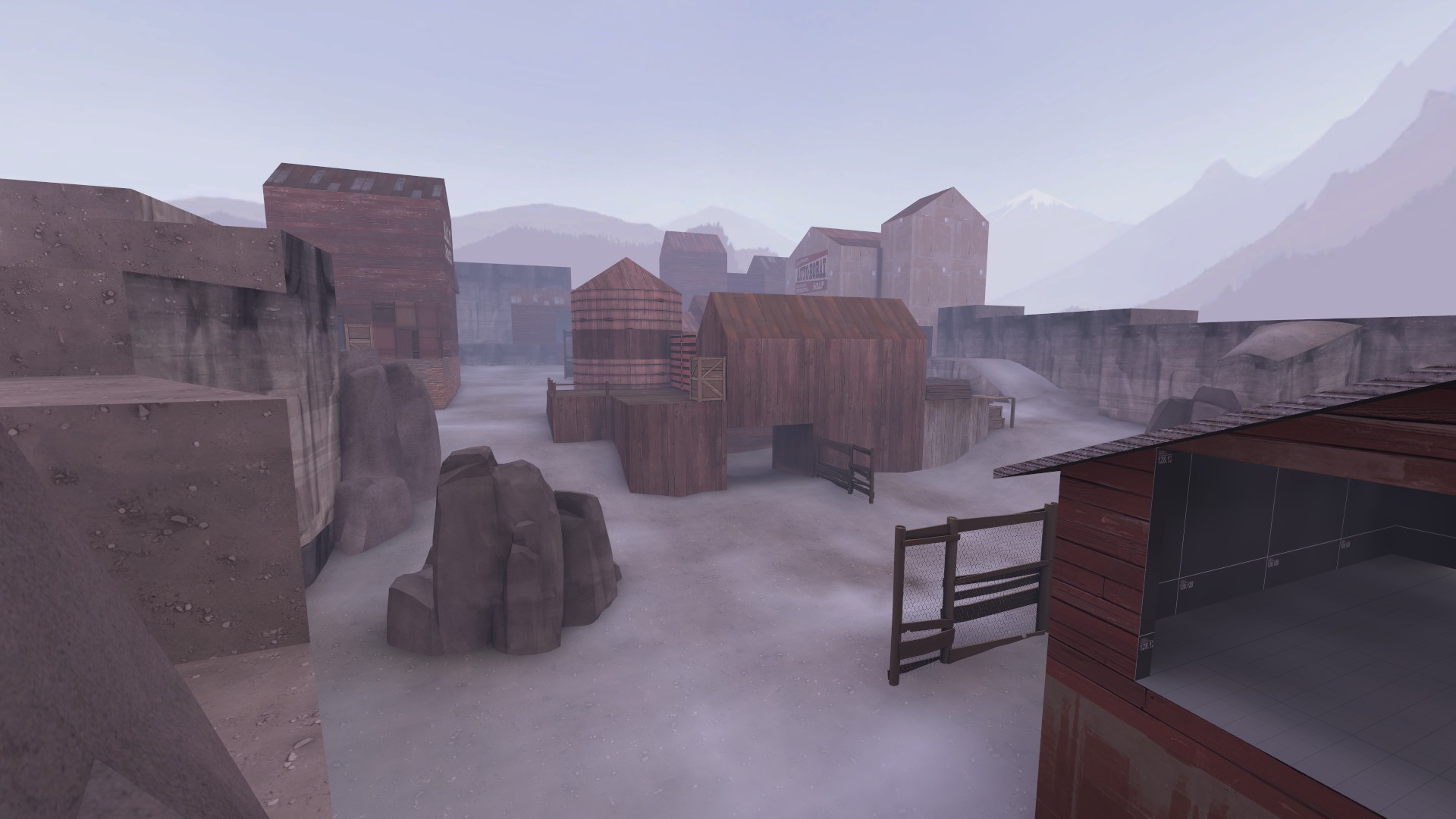
Just going to post some screenshots of my brand new, super duper payload map. Why? Why not.


Their not up to date and I'm still working on the fourth point. By which I mean I'm out of ideas and inspiration and in danger of making an arena map for no good reason.
And no, the cart's not backwards, it just need the proper care and support.
Their not up to date and I'm still working on the fourth point. By which I mean I'm out of ideas and inspiration and in danger of making an arena map for no good reason.
And no, the cart's not backwards, it just need the proper care and support.
Also the font for KPC is pretty uggo for a company logo. I don't know if the text on the RED logo was handmade, but I wouldn't be surprised.
And not to rain out your entire parade, but why would you try to localize RED and BLU into a language where the acronym doesn't even translate?
The translations I am using are the ones ingame (or in wiki at least). And yeah the red logo font was hand made, gotta check if I can find a more suitable one, KPC is a hard combination to fit with the same style the original red logo had.
Haven't you heard? Rainbows in Russia are made of entirely different colors. Instead of red and blue you have labor and tears. It's why Putin is more afraid of homosexuals than other world leaders; their pride flags are HORRIFYING! You should look it up.
But really, I think they are fine. I like the style they are in and it's refreshing to see something other than "RED" and "BLU". I do think however that the blu one should just have one big tool in the background like the original instead of 2 crossing ones, similar to how the red logo has a single dynamite replacing a single bomb.
I could not really decide on what tool to use, a single railway wrench did not look good, and a single hammer does not represent BLU enough imo. I based my logo on an old soviet railway workers pin I found.
»FF« Wanderer | Engie
L1: Registered
- Nov 27, 2015
- 32
- 7
i feel as if getting through that hell is really reliant on the healthkits being there, and if someone else has taken a bunch you are likely dead. 10 damage per second is quite alot, id say probably lower it to 6/4 so people can get through hell easier.
You can use BSPSource to decompile any bsp. Just be aware that decompiling other peoples' maps should only be done to study them and not with the intent to edit or copy any/all of it.Guys is there any way to decompile 2fort_invasion ?
I'm pretty sure it's in this big download of maps already decompiled: https://tf2maps.net/threads/valve-maps-decompiled.5952/Guys is there any way to decompile 2fort_invasion ?

Malachite Man
L6: Sharp Member
- Oct 16, 2015
- 392
- 250
It does not have to be easy since it rewards youi feel as if getting through that hell is really reliant on the healthkits being there, and if someone else has taken a bunch you are likely dead. 10 damage per second is quite alot, id say probably lower it to 6/4 so people can get through hell easier.
nitewalker
L2: Junior Member
- Aug 5, 2014
- 64
- 142
Is my Russian correct? Had to learn how to SFM just for this.
edit: woo veteran!
Yeah, it's OK.
Last edited:
Hi guys, I'm here to tell you that I won't finish pl_upward_event I'm running out of time, I have to finish the Halloween event I made on a group, so I won't be able to finish the map before the deadline. Unless someone helps me to do the underworld, I think I'll release it next year.
Its better to delay the map by 1 year and improve it massively in the meantime then to rush a map. You might initialy think the map looks good, but in 3 months you will notice all mistakes you made. So taking the safe side is better on this.Unless someone helps me to do the underworld, I think I'll release it next year.
What do you all think of this building? I feel like it's missing something but don't know what.
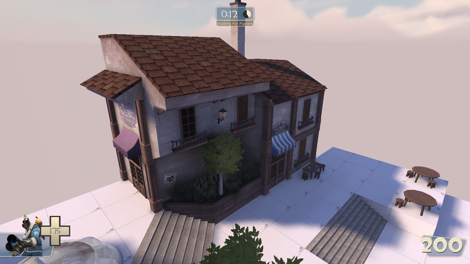
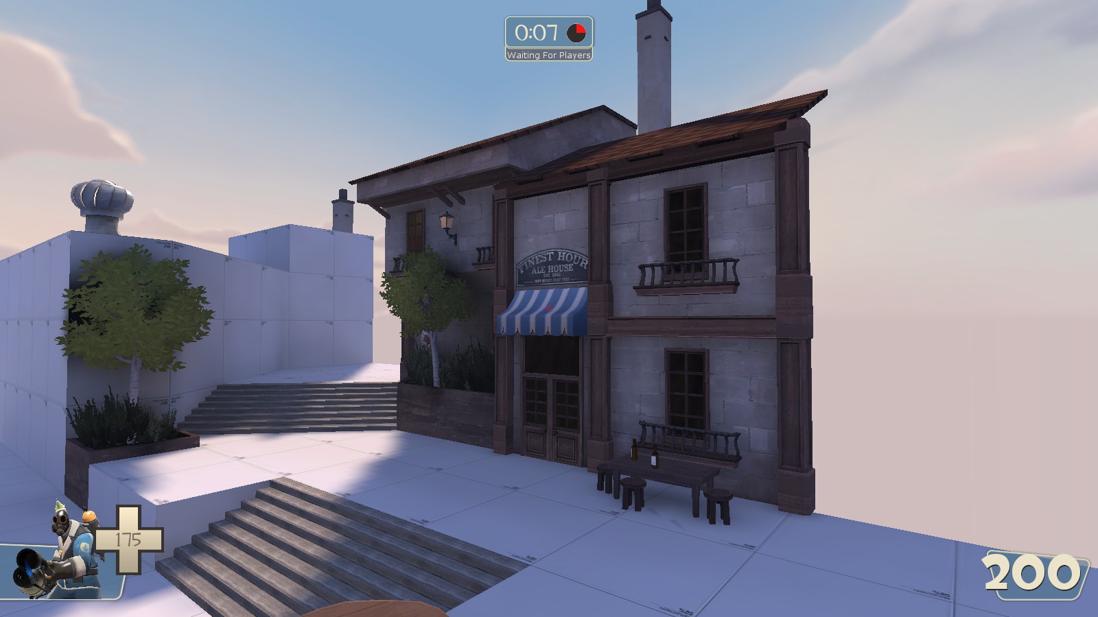
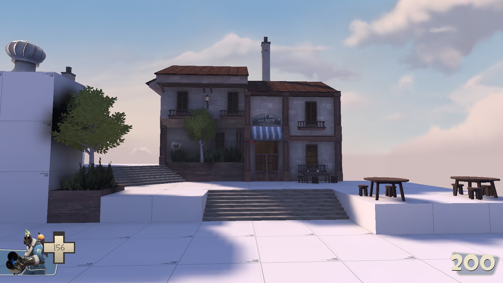
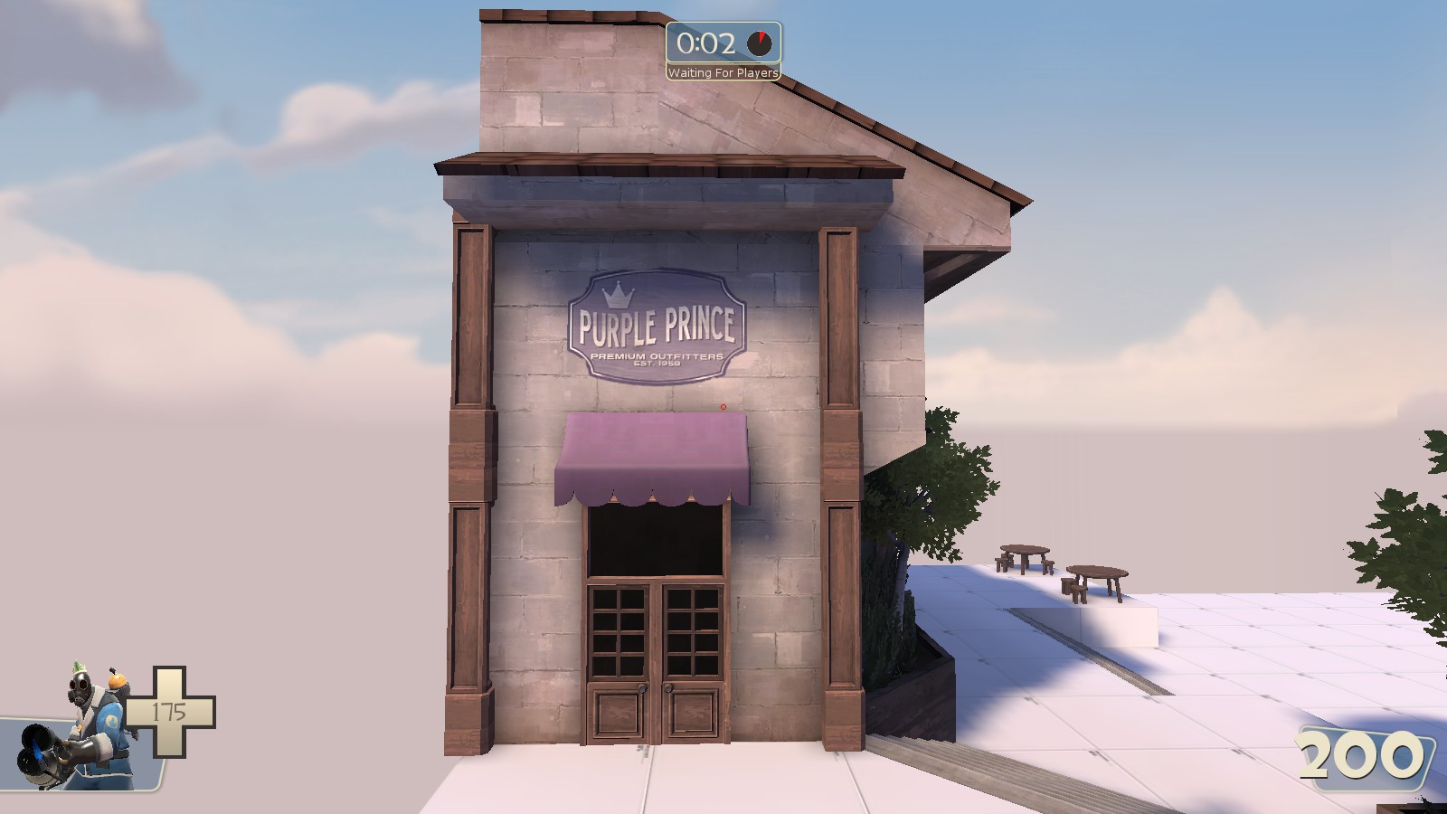
I don't think it's missing anything at all, I think it's in fact a little bit over detailed. Not sure what I personally would remove though.