WiP in WiP, post your screenshots!

Jul 6, 2015
1,425
820
Ok, I changed textures in my MvM map
M2ceYMU.jpg

or
C2SCveQ.jpg
#2
 

Vel0city

func_fish
aa
Dec 6, 2014
1,947
1,589
See, this is how Halloween maps should be. All original and beautifully done.
Yeah but it doesn't really scream spookyness. Seems more like a peaceful town at the foot of a mountain than a spooky scary skeleton-spawning HHH-infested spooktown like Helltower or Mann Manor.
 

Diva Dan

hello!
aa
Mar 20, 2016
1,034
1,954
Yeah but it doesn't really scream spookyness. Seems more like a peaceful town at the foot of a mountain than a spooky scary skeleton-spawning HHH-infested spooktown like Helltower or Mann Manor.

the details already tell a story if you look close enough! if you look around at the earlier screenshots posted, the eeriness is much more subtle. It's a very cool way to make a Halloween map instead of a big mansion with a bunch of green clouds.

In my opinion, it shouldn't have to scream spookiness to be scream fortress!
 

UKCS-Alias

Mann vs Machine... or... Mapper vs Meta?
aa
Sep 8, 2008
1,264
817
Yeah but it doesn't really scream spookyness.
https://wiki.teamfortress.com/wiki/Ghost_Town (coaltown)
https://wiki.teamfortress.com/wiki/Eyeaduct
https://wiki.teamfortress.com/wiki/Ghost_Fort (lakeside)
https://wiki.teamfortress.com/wiki/Sinshine

These maps dont excel at spookyness aswel, some maps have some more indications than other, but none of them are fully detailed into halloween theme. Does that realy mean its bad? Not at all. I rather have a nice looking and decent playing map with a gentle halloween theme than those that try to go over the top at a cost of actualy looking nice.
Seems more like a peaceful town at the foot of a mountain than a spooky scary skeleton-spawning HHH-infested spooktown like Helltower or Mann Manor.
https://wiki.teamfortress.com/wiki/Helltower
1 side has some spookyness side similar to ghost fort. but the other side is still equaly bland.

https://wiki.teamfortress.com/wiki/Harvest_Event
Yes, its skybox is spooky and has some halloween props, but other than that it still has the general theme of the non halloween map.

Many might think that a halloween map must be stuffed with things, but thats often bad as visual clutter only makes the gameplay end up less good. More often its just the basic map with some alterations in the skybox to actualy avoid players to be hindered. I rather see a map that has some proper artpass on it that doesnt look like it recieved some specific additions to halloweenify it. It should have the theme by default.

Even looking at my own map
http://steamcommunity.com/sharedfiles/filedetails/?id=455168490
It has a huge skull in the middle, and on the sides it has some halloween props. but if i would put normal lighting in it and exchange those props for regular tree's it wouldnt change the map at all in gameplay. And it would remove its spookyness. The only reason you probably see it as being spooky is that skull...

If there is something i dislike about all these recent halloween updates its the spam that valve puts in the game 'to make it interesting'. Sure bossfights can be nice with it. But that bossfight realy doesnt need an overly visual spammy map with it.
 

AsG_Alligator

qhull precision error
aa
Aug 5, 2016
620
1,223
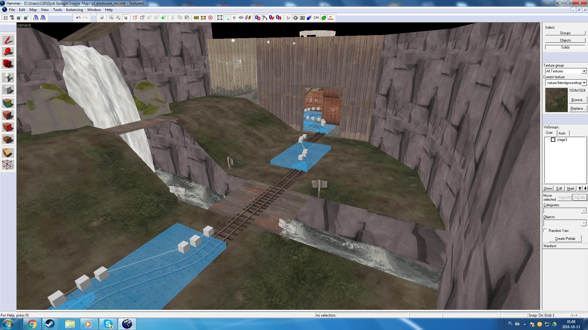
So I figured a waterfall would be a nice addition to this area:
0XmzC18.jpg

Not sure how that fast flowing water texture looks in-game (its from mayann pack), plus i'm not sure if people will like the idea of a deahpit in the form of dangerous rapids.
 

Gale

L1: Registered
Aug 28, 2016
38
14
So I figured a waterfall would be a nice addition to this area:
0XmzC18.jpg

Not sure how that fast flowing water texture looks in-game (its from mayann pack), plus i'm not sure if people will like the idea of a deahpit in the form of dangerous rapids.

Put a nice skull and crossbones sign there and it should work! it looks like you have already, though.
 

AsG_Alligator

qhull precision error
aa
Aug 5, 2016
620
1,223
Put a nice skull and crossbones sign there and it should work! it looks like you have already, though.
I'm still not sure if I want that skull sign or the "No swimming" sign from props_swamp there

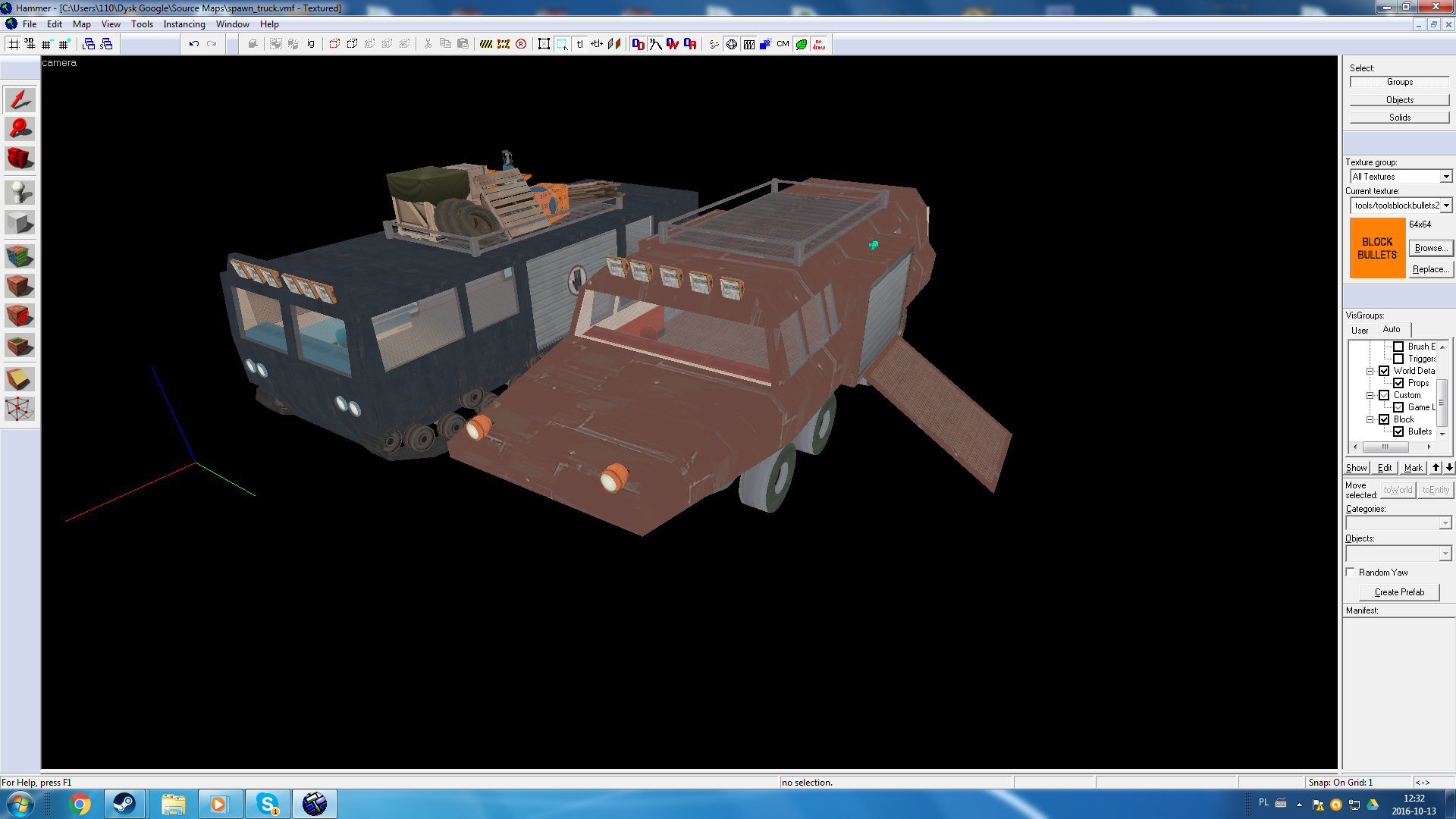
I found this old af prefab of spawnroom vehicles i made ages ago (file last modified in 2010):
AGgDVwO.png

with a little polish and custom modelling I can make them look somewhat nicely (I think I'll use the blue one for pl_enclosure)
 
Last edited:

Pocket

Half a Lambert is better than one.
aa
Nov 14, 2009
4,701
2,583
I found this old af prefab of spawnroom vehicles i made ages ago (file last modified in 2010):
AGgDVwO.png

with a little polish and custom modelling I can make them look somewhat nicely (I think I'll use the blue one for pl_enclosure)
Definitely one of those cases where you'll want to use -staticproplighting (if not prop lightmapping) on every compile, but go for it.
 

nᵗʰSonata

Takes way to long to make and update maps
aa
Jun 11, 2015
433
436
Working on a 3 stage Japanese themed Payload. So far I've got the first half of stage one completed.
pl_kazan_a10000.jpg
pl_kazan_a10001.jpg
pl_kazan_a10002.jpg