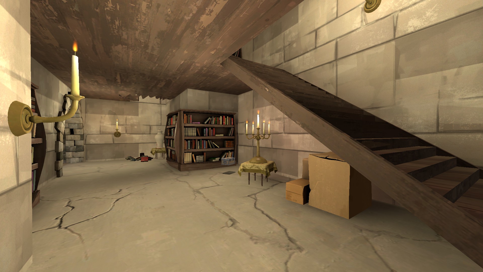
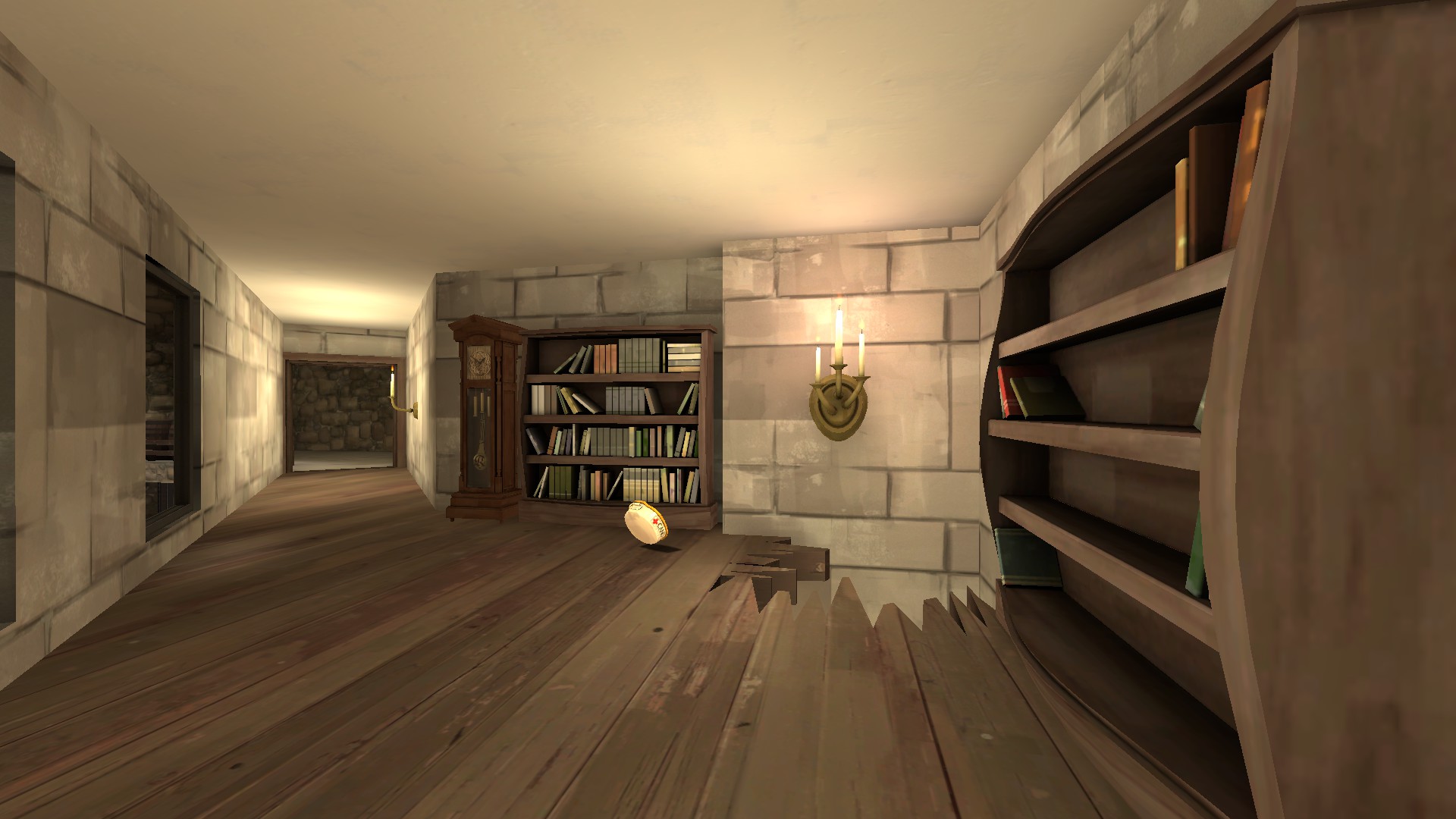
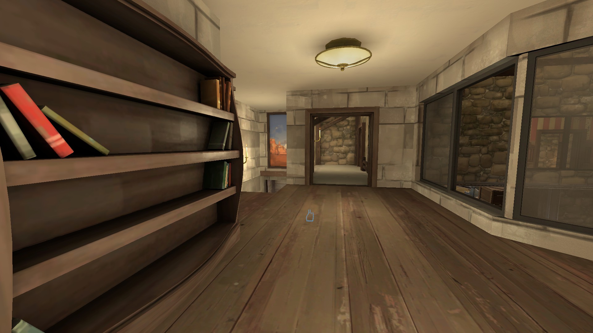
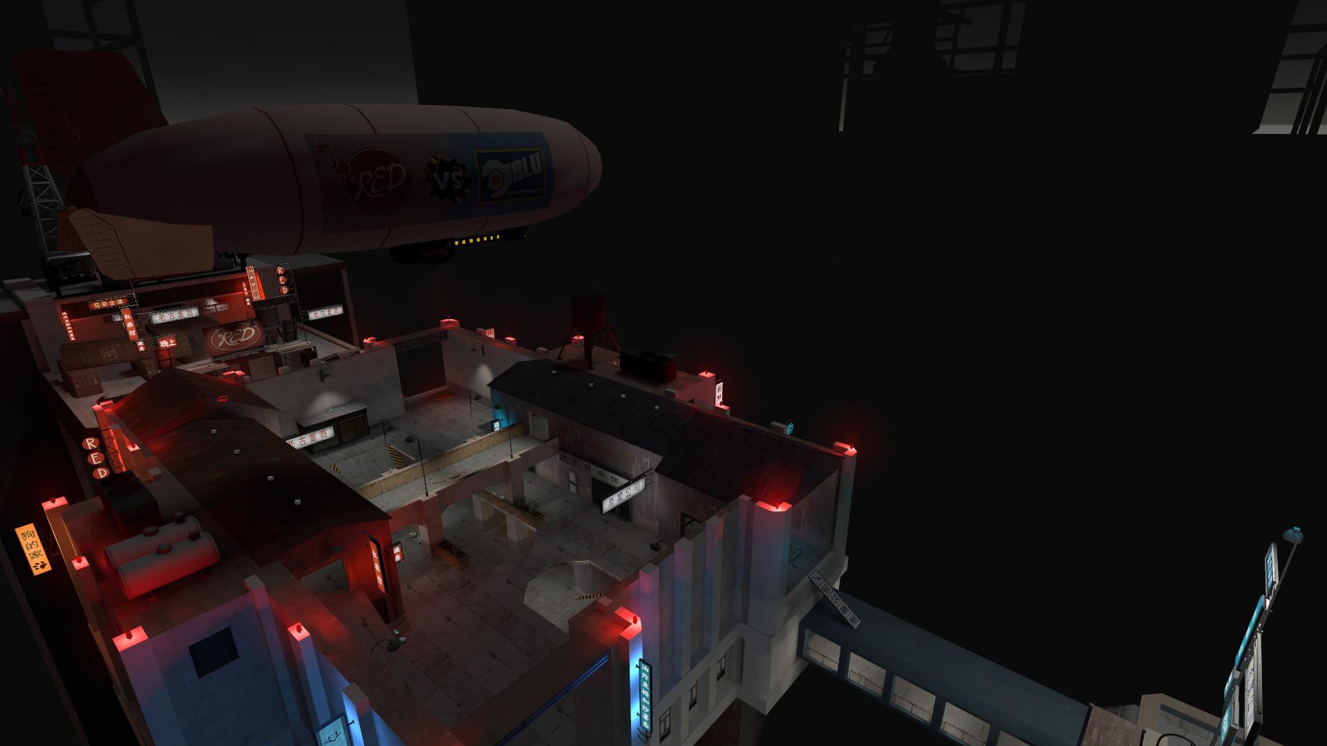
WiP in WiP, post your screenshots!
- Thread starter Arhurt
- Start date
You are using an out of date browser. It may not display this or other websites correctly.
You should upgrade or use an alternative browser.
You should upgrade or use an alternative browser.
Malachite Man
L6: Sharp Member
- Oct 16, 2015
- 394
- 254
^ Nice poster
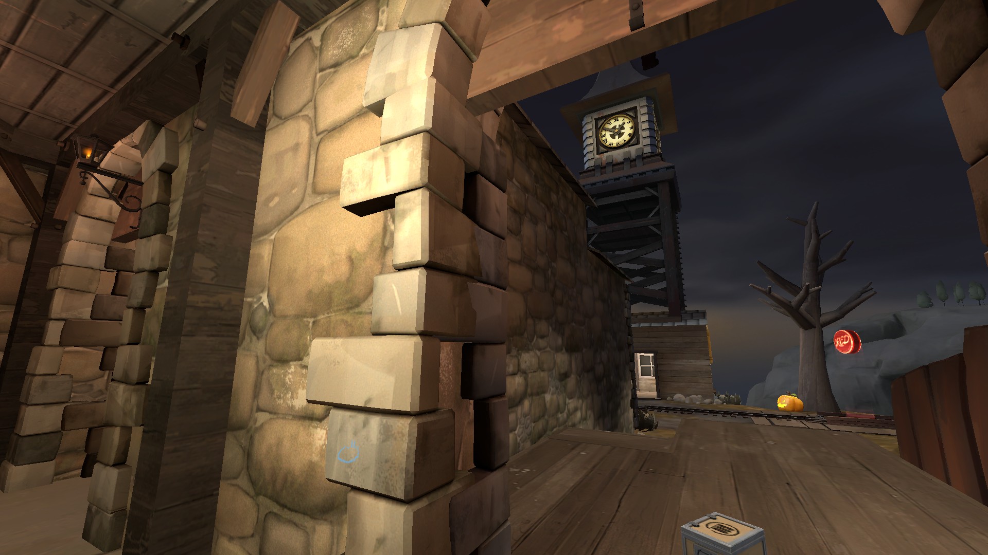
Lil update, my friend finished the rip of the small clock face I wanted :3 now this is how it looks:
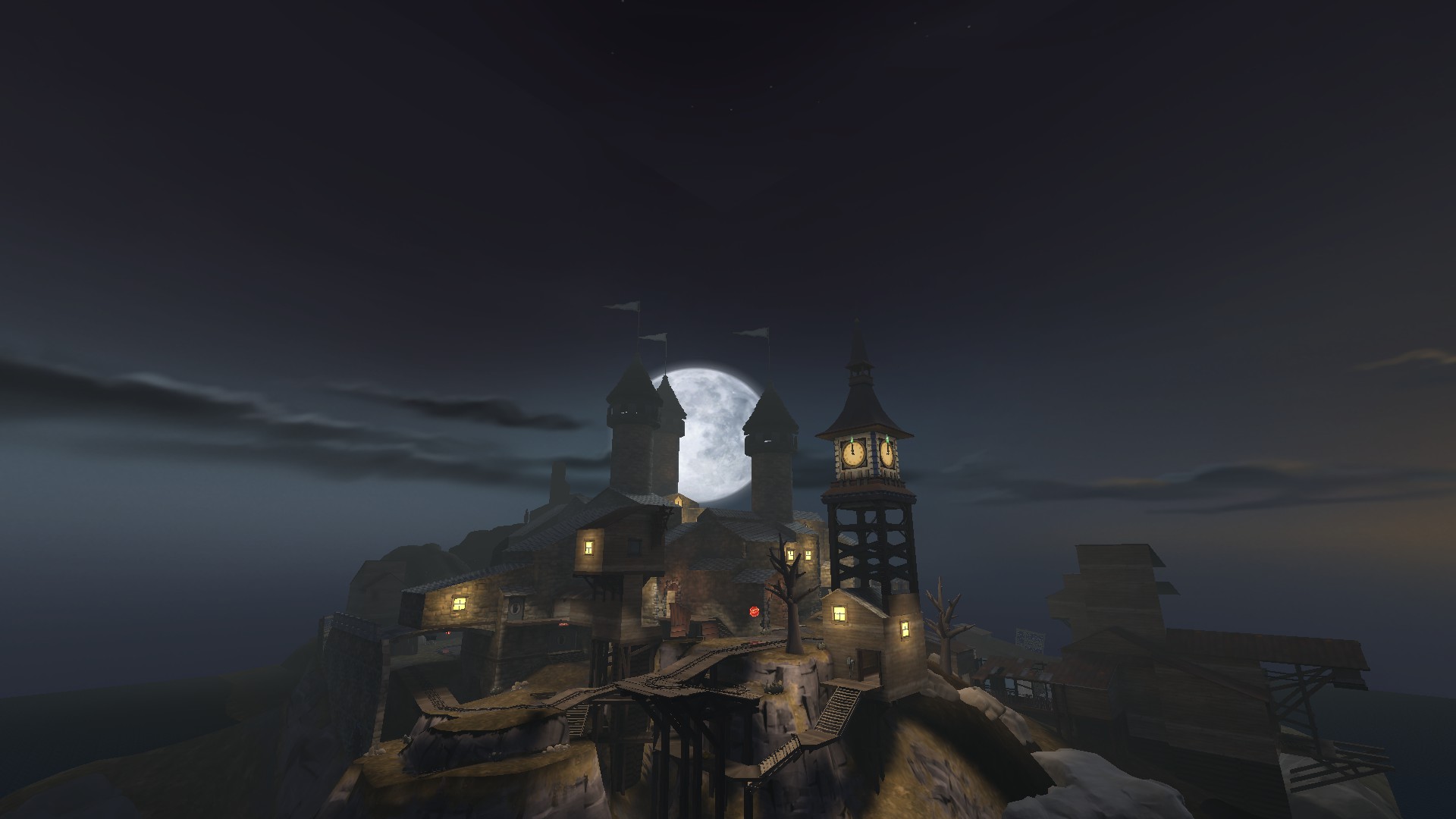
Lil update, my friend finished the rip of the small clock face I wanted :3 now this is how it looks:

^ Nice poster
Lil update, my friend finished the rip of the small clock face I wanted :3 now this is how it looks:

At the moment it's still very obviously based on the original geometry. As Muddy says, i suggest focusing on changing up the out of bounds architecture in order to really nail the look.
That said, this is coming along nicely, and i'm looking forward to seeing it finished
Sure! I will change the roofs, btw mind to share me some pictures on how you would like to see them?At the moment it's still very obviously based on the original geometry. As Muddy says, i suggest focusing on changing up the out of bounds architecture in order to really nail the look.
That said, this is coming along nicely, and i'm looking forward to seeing it finished
Sure! I will change the roofs, btw mind to share me some pictures on how you would like to see them?
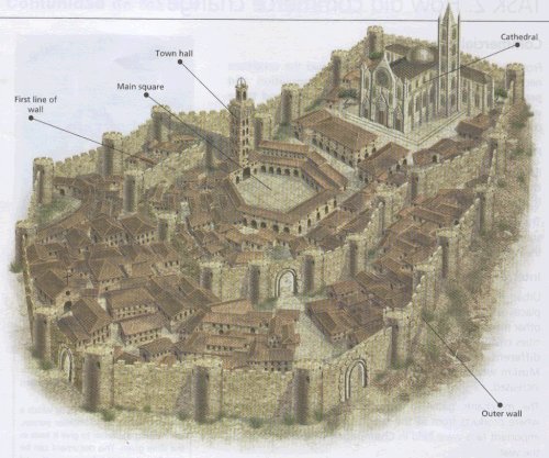
given the size and shape of the main complex of buildings, you could really go all out and make a full sized clifftop castle.

or perhaps more of a cathedral vibe:
something like this looking out over a city in the place of the water below would be amazing, and really consolidate that spoopy feel - imagine this but with the cathedral raised 100 feet above the rest of the town
- Oct 11, 2013
- 273
- 413
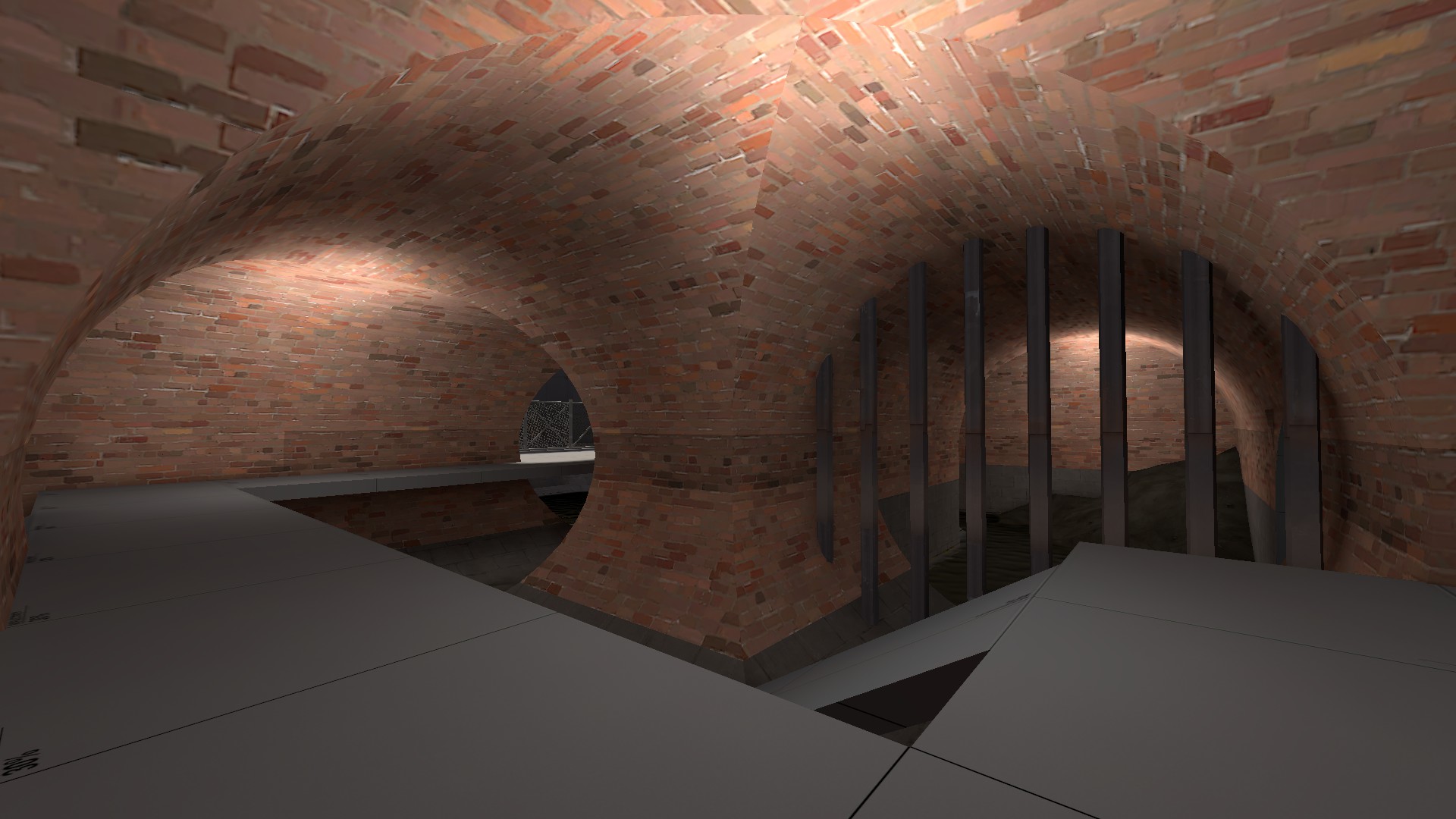
You should add stone arches underneith this building:
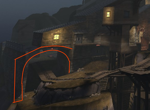
you could make this a tunnel with a portcullis at either end, and make the grate in the floor of the spawn above look like murder-holes
Rip our collabI've been thinking in joining the Asymmetry Contest, and this is what I have so far (didn't start too long ago)
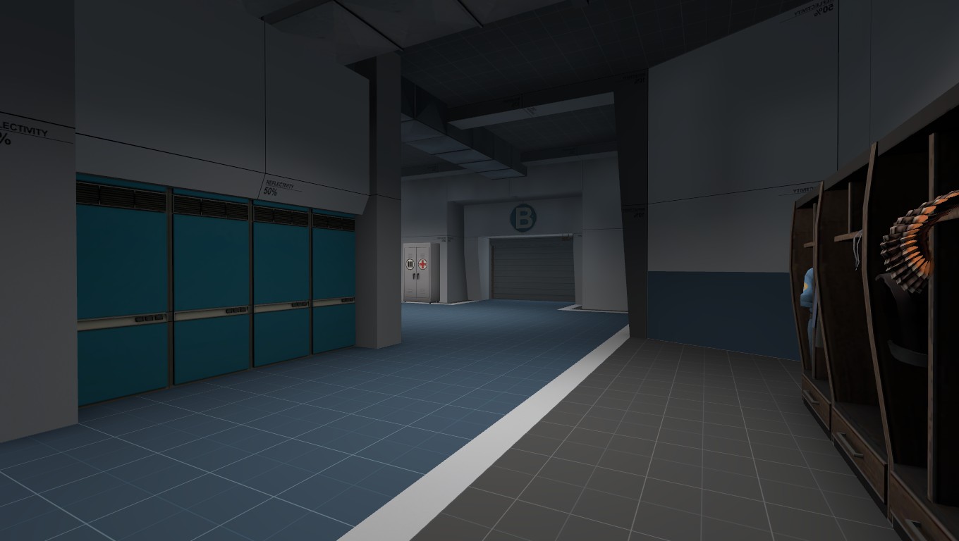
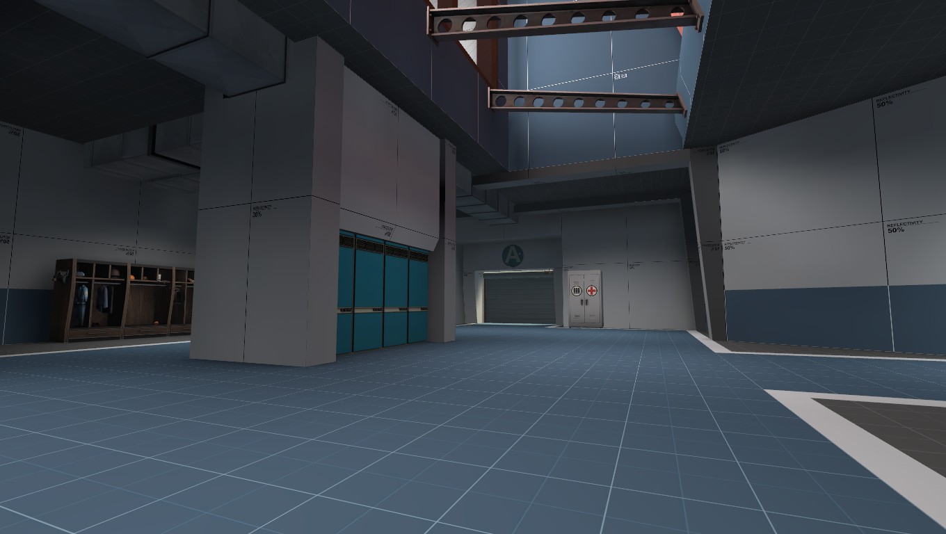
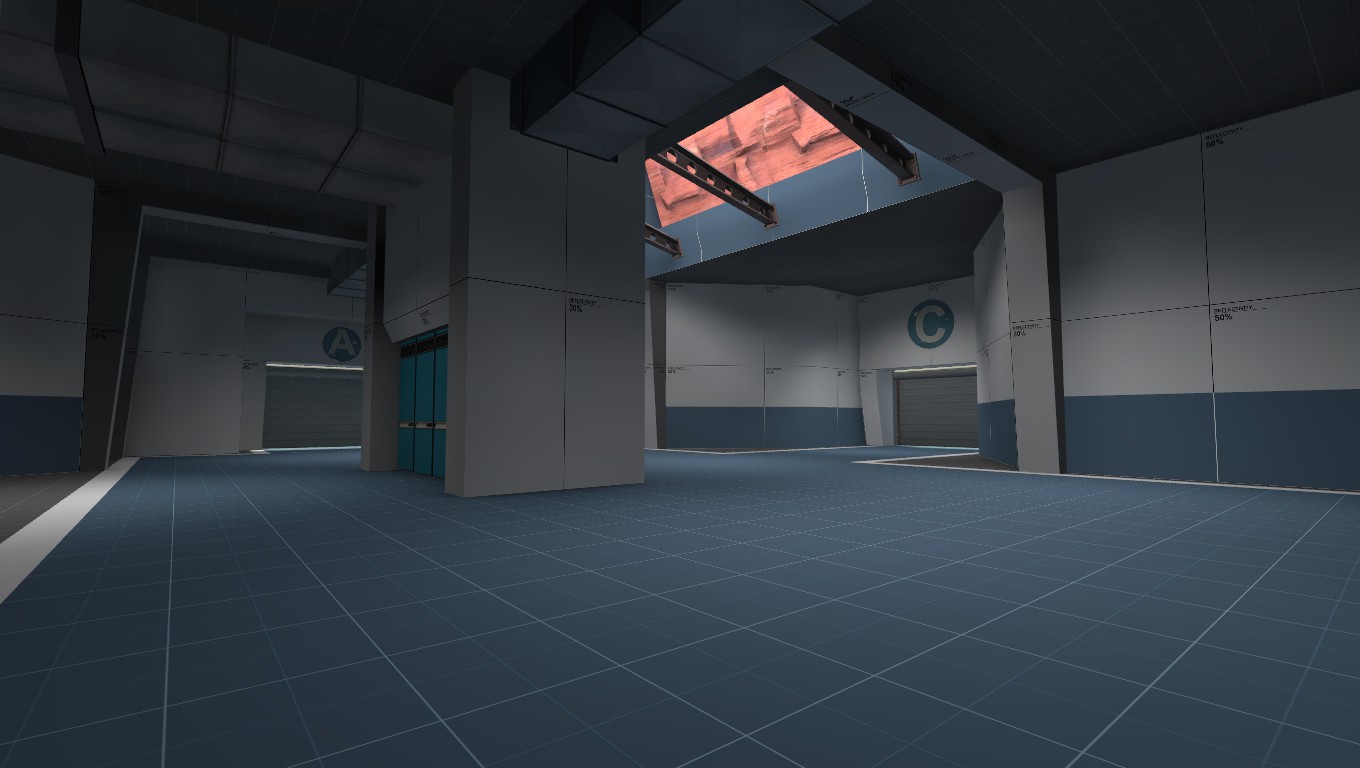
Gale
L1: Registered
- Aug 28, 2016
- 38
- 14
given the size and shape of the main complex of buildings, you could really go all out and make a full sized clifftop castle.

or perhaps more of a cathedral vibe:
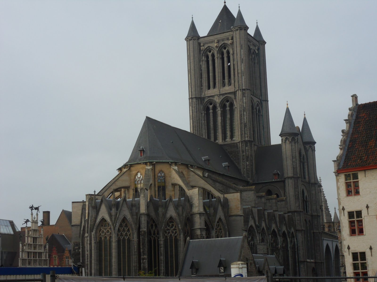
something like this looking out over a city in the place of the water below would be amazing, and really consolidate that spoopy feel - imagine this but with the cathedral raised 100 feet above the rest of the town

I've always wanted to try to make a cathedral. Flying buttresses and all!
Malachite Man
L6: Sharp Member
- Oct 16, 2015
- 394
- 254
If you want i would like to collab pm me if you would like to.Rip our collab
Gale
L1: Registered
- Aug 28, 2016
- 38
- 14
Be careful! If you have to do a big change to the map and you're really far into detailing, it's going to be very difficult to motivate yourself to delete and redo all that work!I Started to detail in Alpha, I can't help it xD. I will try to use some train logic and experiment with it.
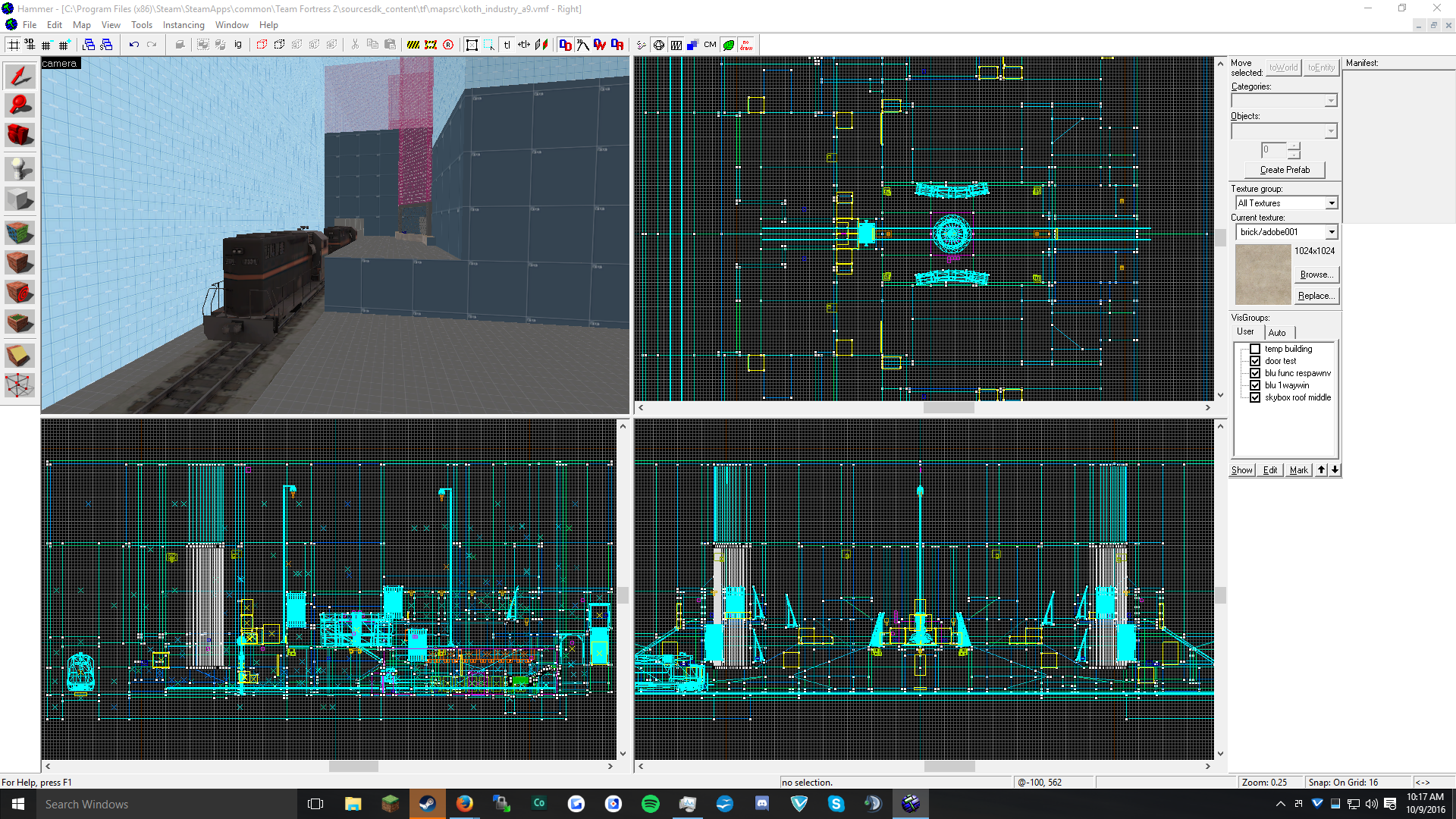
If detailing (like the train) is part of the gameplay of the level(ie, can kill players, block sight lines) then I'd say it's more than okay.


