I think I just peed a little.I haven't posted any of my sulfur work in here yet, I wanted to surprise people! But now that I've finally got the map to compile and working on lighting, it's starting to shape up.

WiP in WiP, post your screenshots!
- Thread starter Arhurt
- Start date
You are using an out of date browser. It may not display this or other websites correctly.
You should upgrade or use an alternative browser.
You should upgrade or use an alternative browser.
Reminds me so much of thisI haven't posted any of my sulfur work in here yet, I wanted to surprise people! But now that I've finally got the map to compile and working on lighting, it's starting to shape up.
snip

They put chemicals in the water that makes your pee turn blue so don't do it in the poolI think I just peed a little.
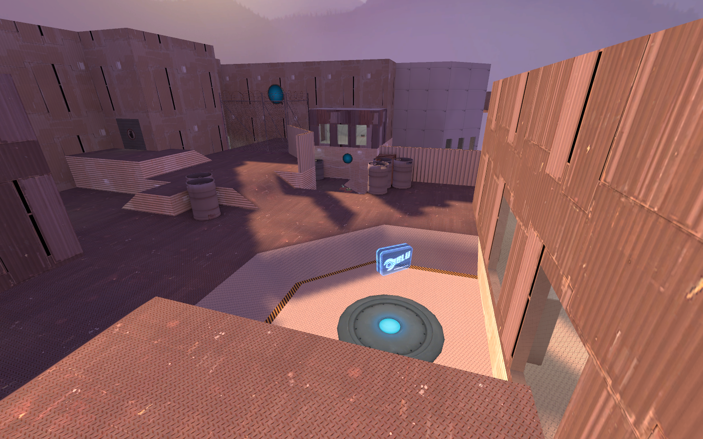
Wow that's interesting, a universe made entirely out of metal.
A new C point appears!

I think you could get away with half as many of those turbines. Like two in the middle with the walkway & point, and the walkway wraps around each on the way to the point. As it is, the lower floor looks cramped and difficult to figure out who will be coming from where.
But I do like it much better than the old one.
A new C point appears!


The vents are still only active if a Blu player is in the capture area. It still needs some work, but I think this will be a lot better gameplay wise.

Well, If I'm honest, I don't think the amount of detail matter, it's the quality and texture of the detail. To me, that mountain looks a bit too photorealistic for TF2. As if it's an actual photography of a mountain.
The trainyard skybox is farther back, obscured a lot by other things and is more vector/posterized than that. It's not the best mountain, but it doesn't look anywhere near as photorealistic as that one.100% disagree. It's got less detail than the trainyard skybox.
I would agree with it being more realistic than most other sky boxes, however, I would also say that making it less realistic would make it less recognizable.
Wow that's interesting, a universe made entirely out of metal.
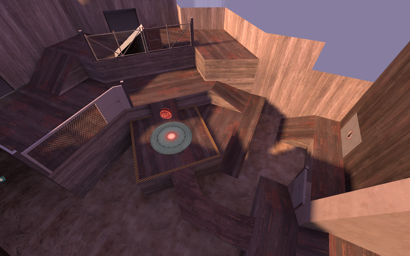
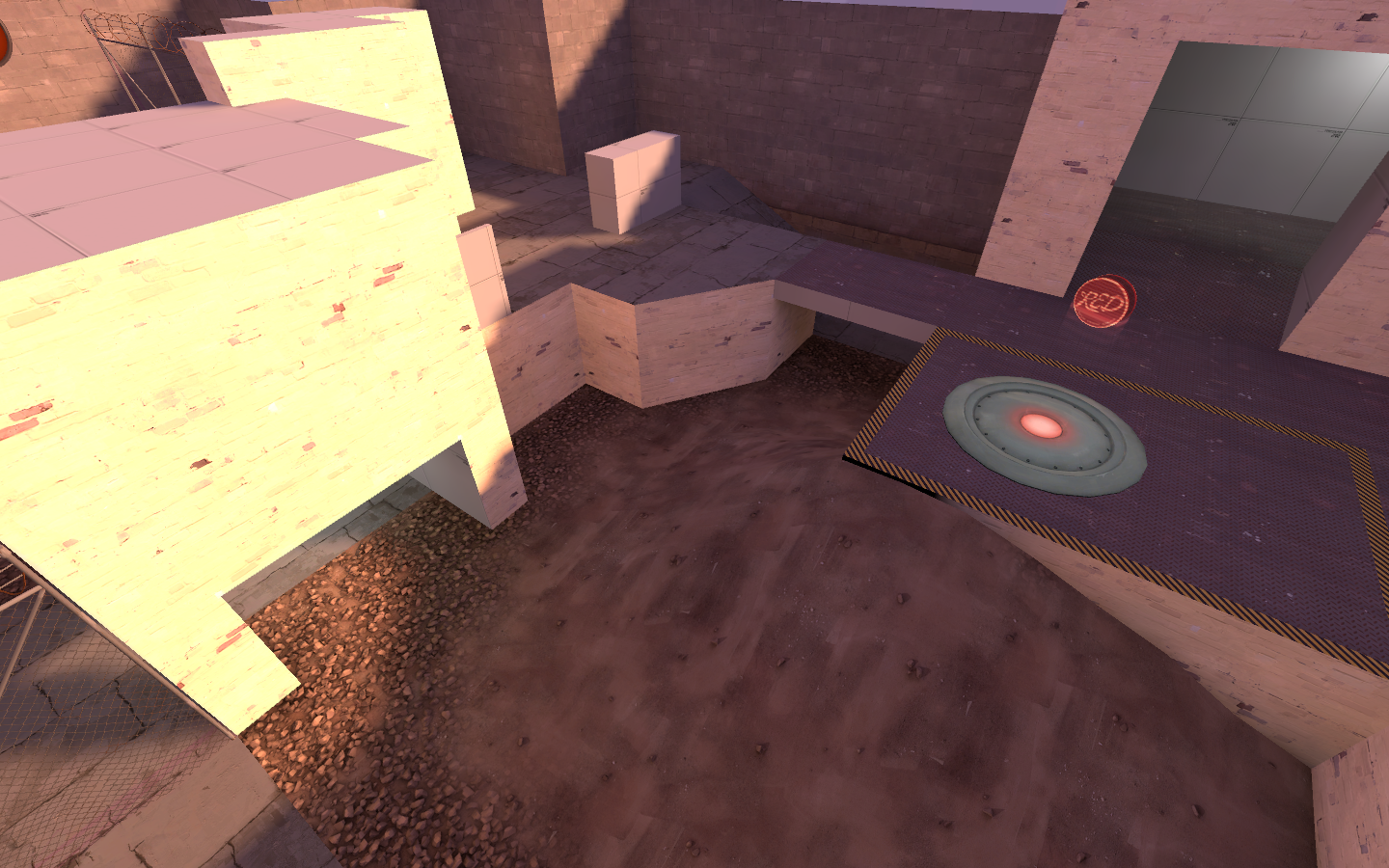
Actually, every area had a unique look. I did that because of all the players complaining about getting lost. I gave every point area a texture set to go along with it. There was a metal point, a concrete point, a wood point, and a brick point.


I don't have a picture of the concrete one for some reason....
Though basically, the concrete point will be A, the brick point B, and in the second round, the wood point A, and RED's last will be the final point.


