WiP in WiP, post your screenshots!
- Thread starter Arhurt
- Start date
You are using an out of date browser. It may not display this or other websites correctly.
You should upgrade or use an alternative browser.
You should upgrade or use an alternative browser.
Shogun
L6: Sharp Member
- Jan 31, 2014
- 260
- 221
You should make the nose broken off
Or nose will brake and fall down, when robots will trow bomb into pit (because it's MvM, right?)
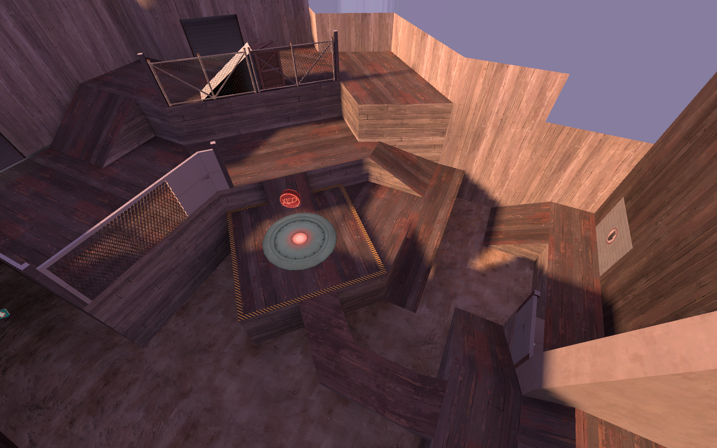
Actually, every area had a unique look. I did that because of all the players complaining about getting lost. I gave every point area a texture set to go along with it. There was a metal point, a concrete point, a wood point, and a brick point.

Just an FYI, I'm using this point design in one of my maps. It looks like you've changed it a decent amount, so I won't force you to change it. Just be aware that it might be weird for people who recognize it from my map.
I haven't posted any of my sulfur work in here yet, I wanted to surprise people! But now that I've finally got the map to compile and working on lighting, it's starting to shape up.

You always find a way to slap your name on a map, don't you?
I changed it in Underbid due to you saying that. Though I stuck close to the original design due to Underbid's brushwork. I'll be further altering it for Burough.Just an FYI, I'm using this point design in one of my maps. It looks like you've changed it a decent amount, so I won't force you to change it. Just be aware that it might be weird for people who recognize it from my map.
Also, Ashpipe could use some new site love.
- Nov 25, 2008
- 782
- 851
I would lighten up the spotlight effect just a smidgen, I'm not sure what you currently have it set to, but maybe take it down by about 1/4 of what it is already. Other that that, maybe just slightly increase the ambient lighting overall and it'll be perfect! (might be brighter in game than in the screenshot though) Also, add a block light in front of your spawn door, that's just sore eye candy.Cardinal sin of doubleposting but:
old, flat lighting

sexy high-contrast lighting that all the ladies love

Thats looking really good @Corvatile
My suggestion though for the spawn room, is that if possible, get some natural light in there via windows or cracks or something. Helps makes thing look even less flat, and opens up some fun-times with lighting styles.
My suggestion though for the spawn room, is that if possible, get some natural light in there via windows or cracks or something. Helps makes thing look even less flat, and opens up some fun-times with lighting styles.
the floor/ room looks pretty dark for that amount of lights, i second putting in a window, or perhaps an open roof, g-pit style
- Dec 15, 2013
- 535
- 803
Pretty pretty!I haven't posted any of my sulfur work in here yet, I wanted to surprise people! But now that I've finally got the map to compile and working on lighting, it's starting to shape up.

How about now?

Also bonus picture of the out-of-bounds area by spawn


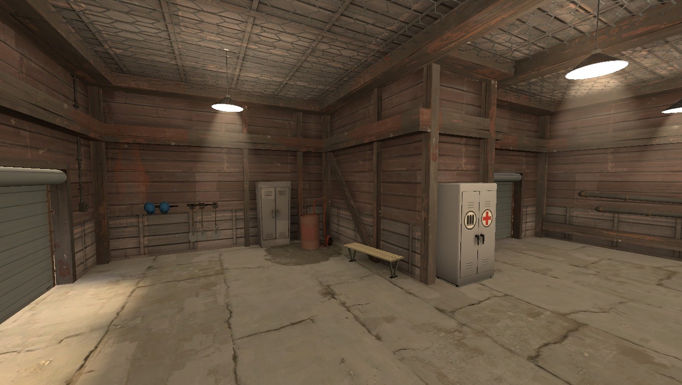
I spent a large chunk of my day detailing this room on koth_grizzly. Pretty happy with how things are looking so far.


