alex76:
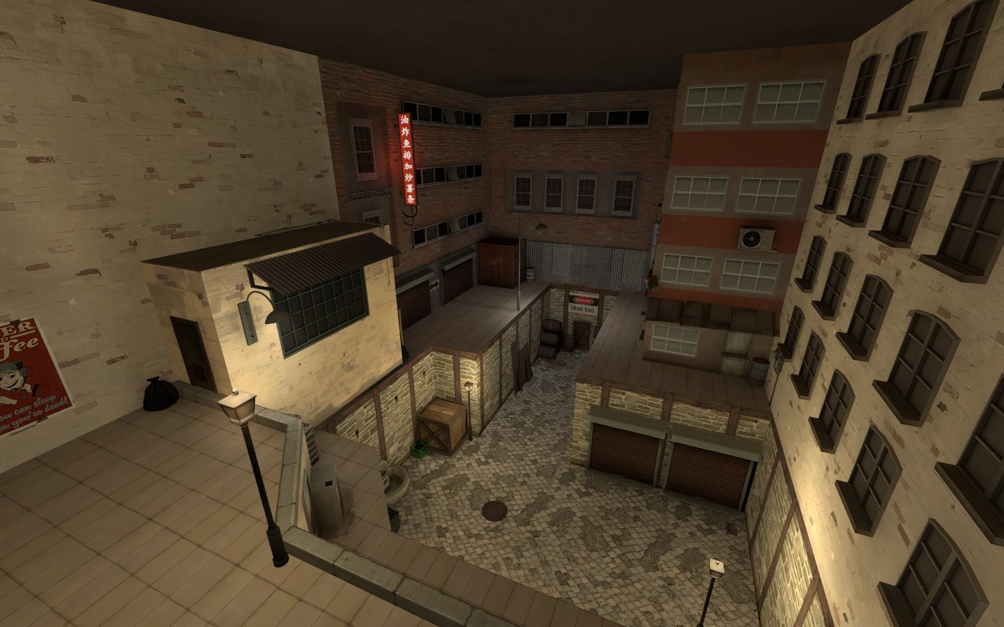
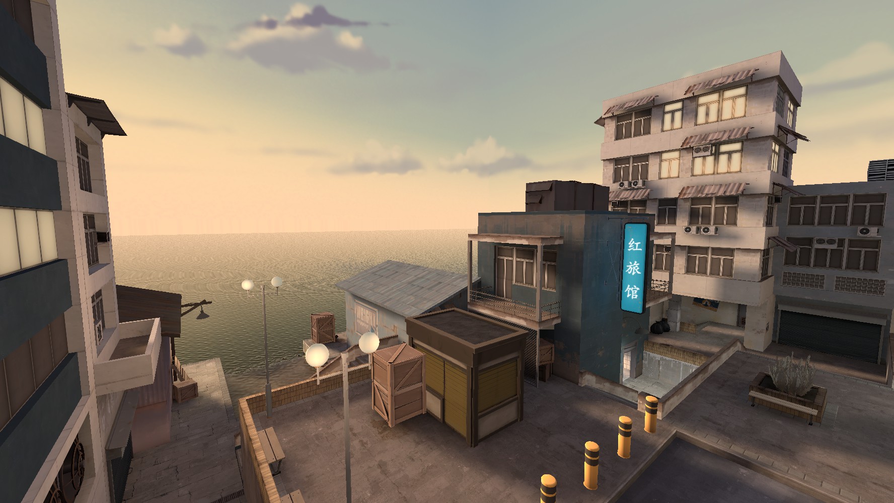
-The style of the map is very unique, it's fun to imagine the things that might go on here.
-The under-areas of the map are really cool, I like the style all-together.
-I like the idea of the industrial english-speaking blue being fenced off from the slumish area which takes up the majority of the map. However the transition from the two areas is not great; the pylons are pretty thick and look awkward (you could have sized them down in modelscale maybe), if this new road was built at the edge of a slum I would expect a more harsh transition instead of the smooth & clean unbroken road->walk area (was a chainlink fence all it took to secure order between the two areas so that neither were affected by each other?).
-You used the space well. Seeing as you used a 3dskybox to add length to the water you could have done something similar for some of the port-buildings which look thin and unnatural.
-No soundscapes at all?
aly:
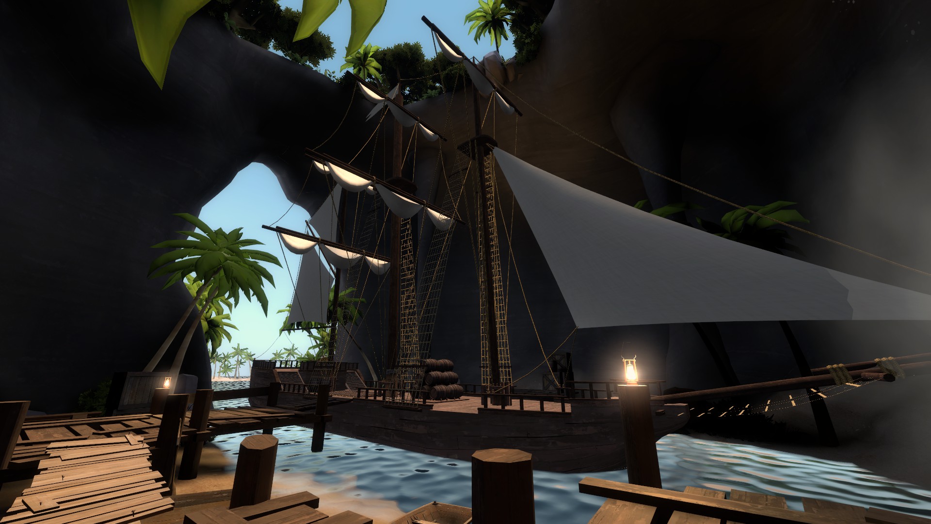
-It's a cool idea and the environmental aspect of it is well done.
-I expect to see more scattered beer bottles when dealing with pirate coves.
-The hold of the ship is filled with water!
-The lighting in the cave and on the assorted crates was cool.
-While you do have your world displacements sewing correctly to your 3dskybox displacements, because the 3dskybox displacements invade world space it makes some weird water-artificating stuff happen. Also the jump in lighting is a bit noticeable. Also it looks like the two water planes do not share the same env_cubemap.
-I know it's not part of the judging but the clipping was annoying.
cubemap:
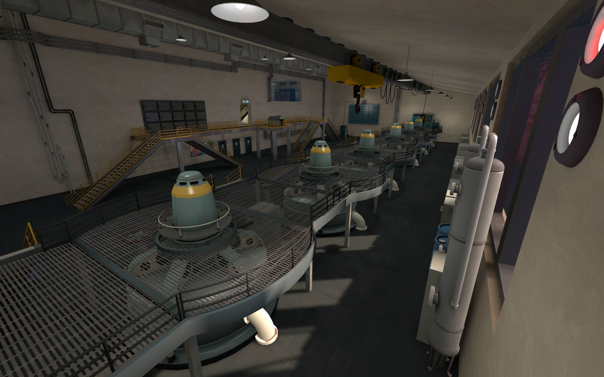
-The starting area's concrete is very clean, especially under the stairs which gets a focal-lighting treatment.
-The edges of the main room feel very empty, you could have used more support beams or messed them up a bit at least so they aren't so clean.
-Good sounds and detail on the turbine things.
-Including the outside area was really cool, I like the good change in scenery.
-I don't know of many water-proof computer terminals, I'm not sure so many of them would occupy this space near the water turbines. Also the ones on the side of the room on the metal grate probably wouldn't be located there - not on a metal grate. could have supported that floor as just solid metal to make it look more sturdy.
-The assorted colours of lights behind the turbines are hard to tell at first glace, maybe using the 'color' renderfx to tinge the colour of the object entirely might have made it more distinguished.
-Outside displacement cliff walls were a little chunky, and you perhaps could have used some fake lights/blocklight to emulate good sky transition through the skybox->world walls.
drsascha:
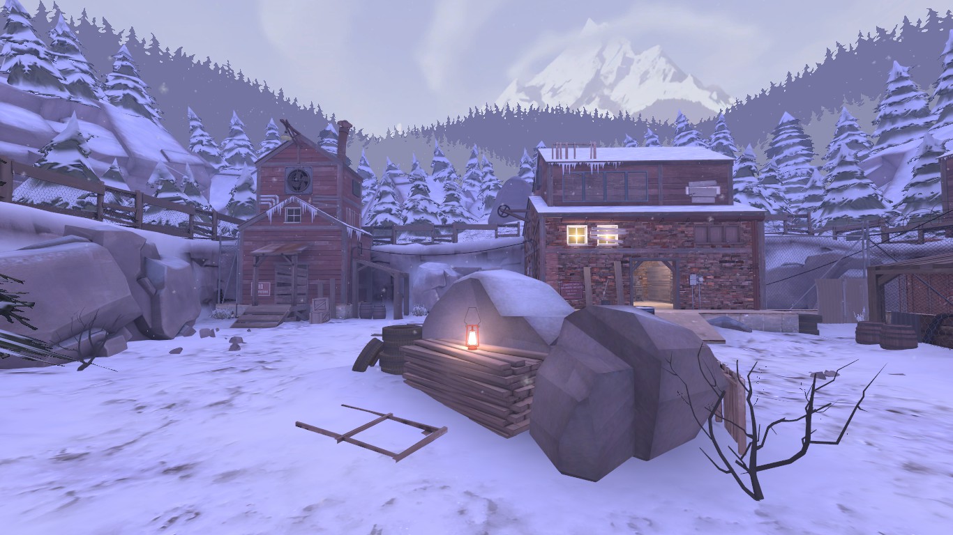
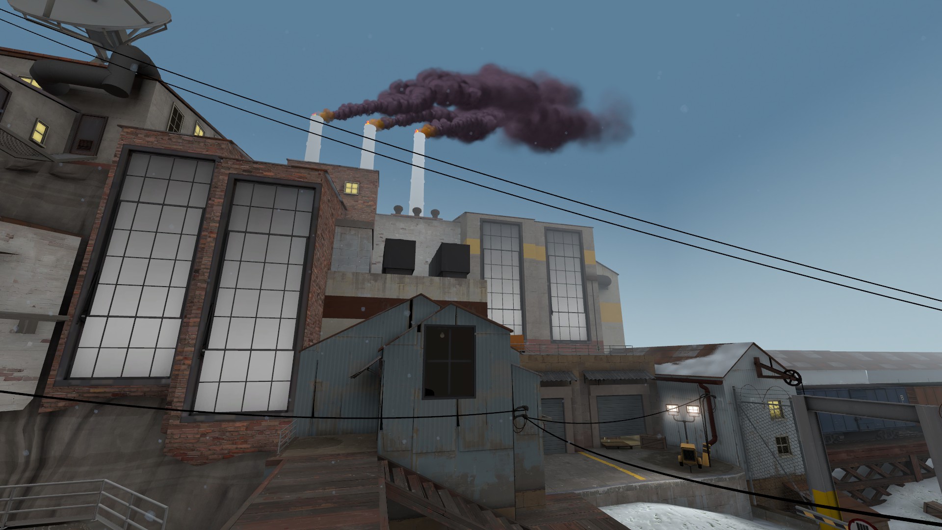
-Cool feeling with the snow and general sense of the area. Good scale.
-Some cool small details - the overlapping tire tracks, the kicked-in-sideways pylon next to the trucks. Makes it feel lived-in and natural.
-Some really cool building geometry in the corner of the area, unique stuff.
-Those large windows are probably a little too large for the building faces, probably could have made them prop_dynamic and did a modelscale on them to shrink their size a bit.
-Why does the low sewer exist? Why would you want drain things into a room with just a door and some pipes/valves - should lead the drained stuff somewhere.
-Not sure it makes sense to broadcast/receive messages from a point below taller surrounding structures.
-The building with the half-broken slanted metal roof's front porch doesn't have much purpose, probably could have put tools like they were repairing the metal roof sheets, or some cans of oil or something.
-I like the repeaty storage sheds.
fantasmos:
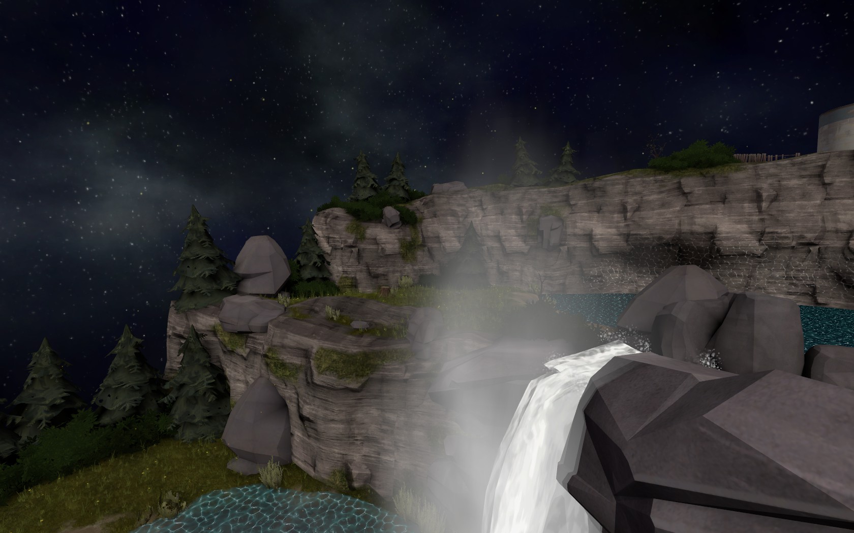
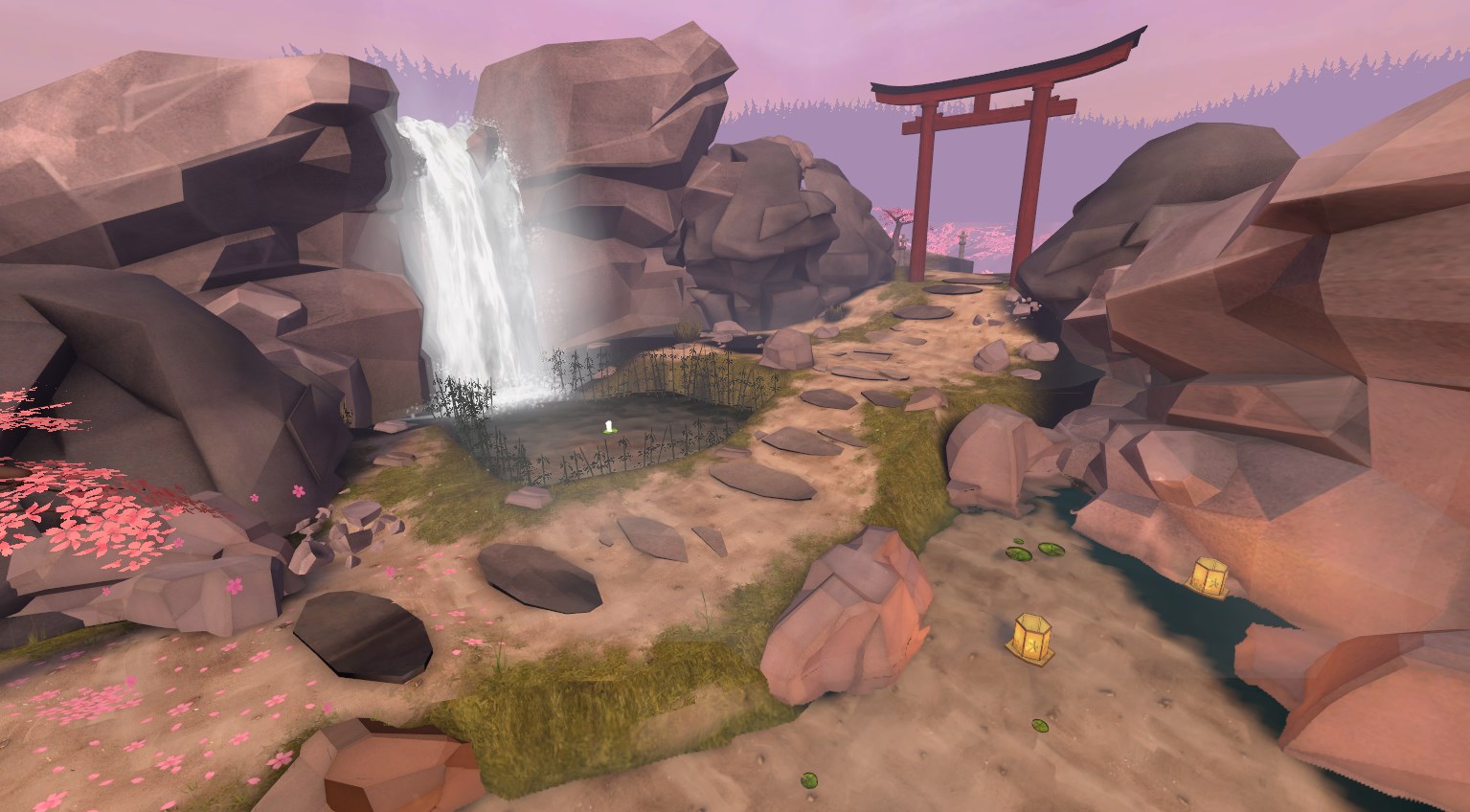
-The feeling of all the steam and mist, and the lighting off the rocks is really awesome. Lighting in general is very good.
-The giant cherry tree in the skybox is a cool idea.
-Good displacements, sounds, and idea of place.
-The candle on the lilypad is noticeably motionless next to the waterfall landing.
-The ridge-line in the skybox is very flat-topped, intentional?
hqdefault:
-I think it looks like a weathered and ruined TFC base, and if that's what it is you did a good job representing that. It could have been done better all around though.
-The ripped up ground doesn't make sense to me, but maybe it actually does make sense irl? To me, it looks like someone or something tore up half of the ground except around key components, and then cleaned up after themselves to get rid of the garbage, but like, why would they do that in such a place as this and leave the rest of the building let alone the rest of the ground?
-In general the ground looks way to clean; there's some staining but I except to see like leaves and smut blown in through the broken windows, or dust and dirt in the corners, sounds and signs of rats and animals taken shelter in the decaying base.
-Your displacements don't really match the skycards surrounding them, it looks noisey for the sake of noise. Although, you did an okay job on that displacement mountain/waterfall.
-Wish I could see more of the SD rocket platform because it's cool and monstrous but you hardly see it past the windows.
-It would have been cool had you included more sounds, like dripping of the water, or a dull hint of the waterfall outside, or again wildlife noises.
-It would have been cool had you implied more of a narrative to the situation. There's a ladder in the middle of the room suggesting someone came into the room to observe or tear apart at the middle columns, is that a robber? Is that someone who just rediscovered this base, turned the light on, and is checking for damage? If the latter you should imply that more like with a rope descending into the open hatch, or with a car nearby with the engine rumbling and murmurs outside from people inspecting.
idolon:
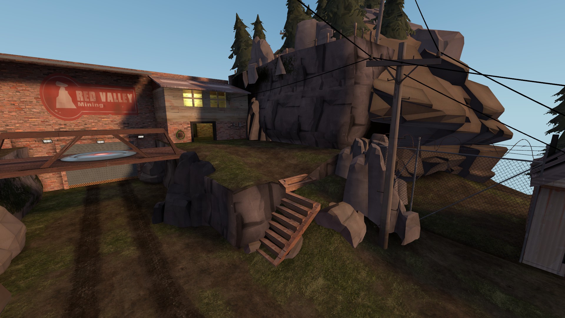
-Phenomenally excellent job on that mine. Reminds me of the interiors of that disneyland minecart ride. The load and transport area outside is also very good.
-The lack of things in the 3dskybox hurts because what you have is okay, but with only what you have it looks bad.
-The silence of no soundscapes is killing me, yet you do have some sounds in the map?!
-Of course missing polish on some otherwise empty rooms and corners and things, hinting at the obvious of how monumental of a task this map is - but what it could have been!
iiboharz:
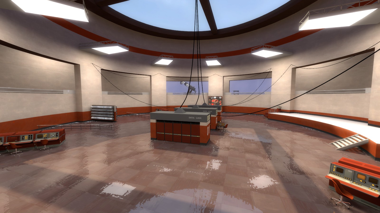
-Cool floor, I'm guessing with water? I think I saw the same gamebanana map and tutorial. Although how did they get the floor this clean? Where is the cleaning supplies? Do they use some tech instrument to do it this well? Where is that hidden away at the moment then?
-With how important this place is, how high tech the equipment and the door seem to be, the windows protecting such an environment are seemingly weak and bad for such a role. I can't even tell there's glass there it's so non-tinted.
-Your HDR bloom is all over the place, should tone it down or decrease the difference in the max and min.
-The three middle thick important wires are cool, and interesting. The wires connecting the server sections that go around the rest of the room seem totally redudant for space, but I suppose do they have the real estate if they just wanted needless style. Should have done some more fancy tech surrounding the room in that circle balcony, like a tech pipeline with a revolving generator of sorts that makes a noise and it churns around the room.
iiboharz2:
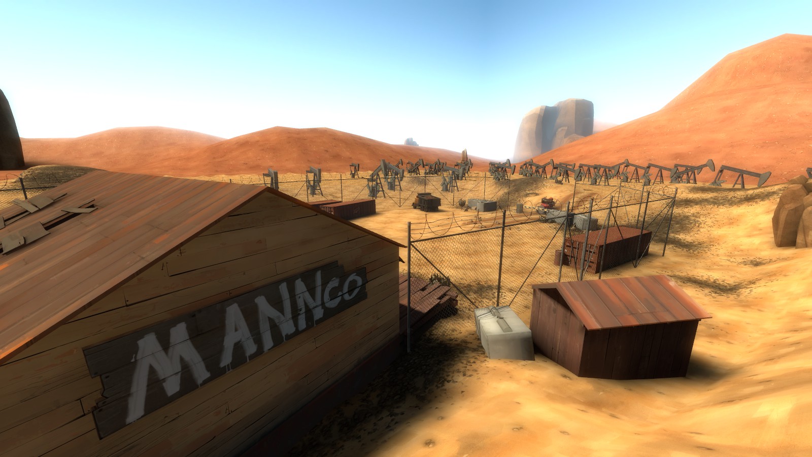
-The bloom is hell on my eyes. If you're trying to give the impression that it's blisteringly hot outside, I'm pretty sure that doesn't look like this (unless you have references?).
-The outside state and missing boards of the building gives the impression its abandoned, but then the inside is still technical and functional but to no seemingly clear purpose. Also no lightswitches?
-Good use of sounds for the truck I suppose.
-Middle I feel could have been utilised for something at least, trash, or a small divot or hole, or tracks.
-Where did the shipping containers come from? If they're old and like part of the original colony structure - well still how did it get here? By truck? Over these massive hills surrounding the area? By helicopter? In the middle of nowhere? By train? Where are the train tracks..?
johnraveneye:
-I can tell this is one of your first maps because you're using a lot of rookie-habits and things. For starters, watch Crash's video of hints here:
https://www.youtube.com/watch?v=Rzz14Fu_lGc
-For one of your first cracks at hammer, this is a pretty good show; a lot of the basics are here and good.
-The metal door attached to the garage door thing looks like it'd be really heavy, and would require additionally detailed attachments or power, or treads, or something to lift.
-Not every overlay needs to be rotated! Or at least not as extreme as this!
-That red boiler room outside in the cage is extremely cramped and unnatural-looking. The window could have been made a bit better with a metal frame or a different grate texture entirely. Also the light inside is plainly white and has no source.
-Making the displacement ground outside connect to areas better could have made the area more interesting, like creeping the ground up as it comes nearer to buildings or rocks slightly, or adding junk in the corners of the fences to make it feel lived in.
killohurtz:
-The main building design is pretty interesting, and overall the buildings and area is unique and feels good and different.
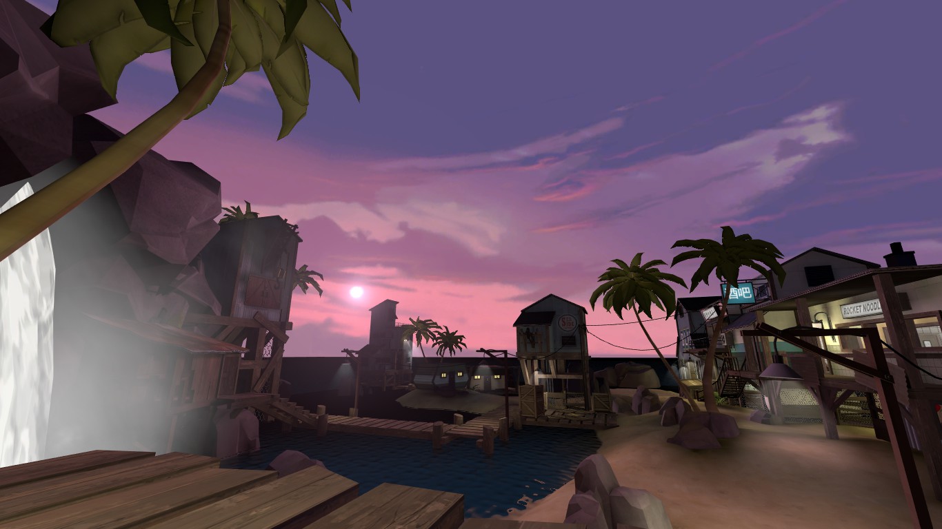
-The lighting and skybox on its own looks cool, but I feel like in comparison to how relaxed and happy this area could be what with the basics-of-a-resort, and the orange tiled walls in the chair-stocked restaurant, it looks almost depressing how blue and purple you've pushed it. Almost like you just used color correction. Reminds me of the xbox game 'I-Ninja'; a clash of styles.
-No cubemaps or soundscapes hurt the overall feeling. With cubemaps you could have made the transition between world and skybox water better.
-The cookery and supported side rooms on stilts could use more chimneys and outputs of greasy fuel lines dripping into the scenic water for comedic effect.
-The boat house outside on the water looks not weather at all and weirdly so, otherwise cool idea.
-No source for the waterfall looks odd, unless it's like an underwater geyser but maybe you could have mentioned that on signs and shit, like as if that's what people would come to this place to see - in the middle of the ocean?
lampenpam:
-I can tell it's like a mystical wizard's observatory, almost other-worldy. But to be honest that's where the interesting stops. Maybe you could have let use explore more of a building or a go through a teleporter wormhole to his lab, and see through the lens into the sky, or something of that sort.
-The repeaty and non-bumped water texture is ugly and looks like electrified plasma of sorts.
-The cliff walls are kinda boring all around, don't be afraid to drastically change the look of something with extremes (I mean, it's already a new detail theme yes but what's with the rest of things being simple?).
pliplop:
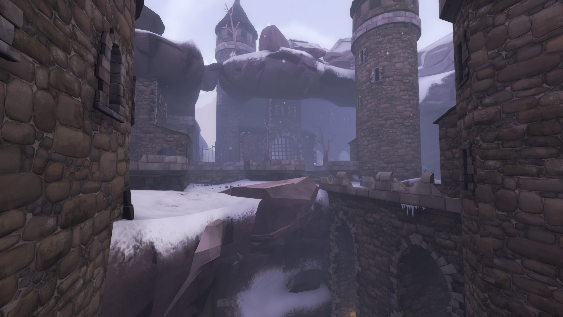
-Should add a constraint onto that windy snow particle, it's going through everything.
-The lower outside bit is well done, and the idea overall is pretty alright. It reminds me a tiny bit of castle dracula in the movie Vanhelsing (people say its a bad movie, but you should definitely watch it if you haven't).
-The interiors and remnants of the castle are really cool and interesting and well done, but of course could use more polish and smut in the corners.
-Got some weird light bugs going on on some rocks here. One looks green, and another higher up looks red-tinted.
prettyboy:
-I can't tell if this type of place exists anywhere. Why does the sign say sea side if we're not next to the sea? Why do the stones at the bottom look so weathered and used under a roof? Just odd choices of details in general.
-It almost, a little bit, seems like it's random. But it doesn't make much sense to me.
-For what it's worth, the dark wall with the cool white lighting seemed okay, and decent. Almost as if it was your starting point.
taka:
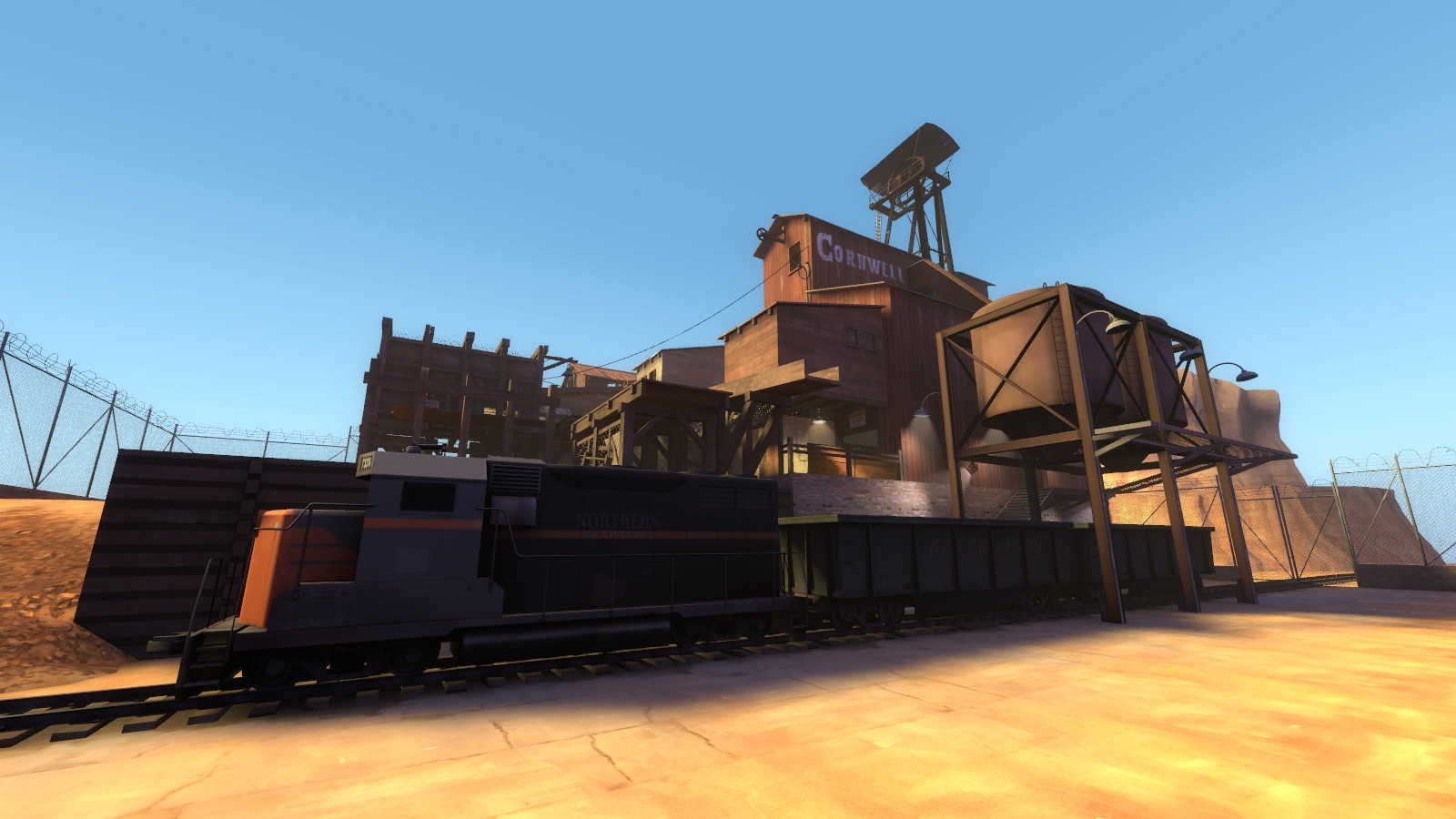
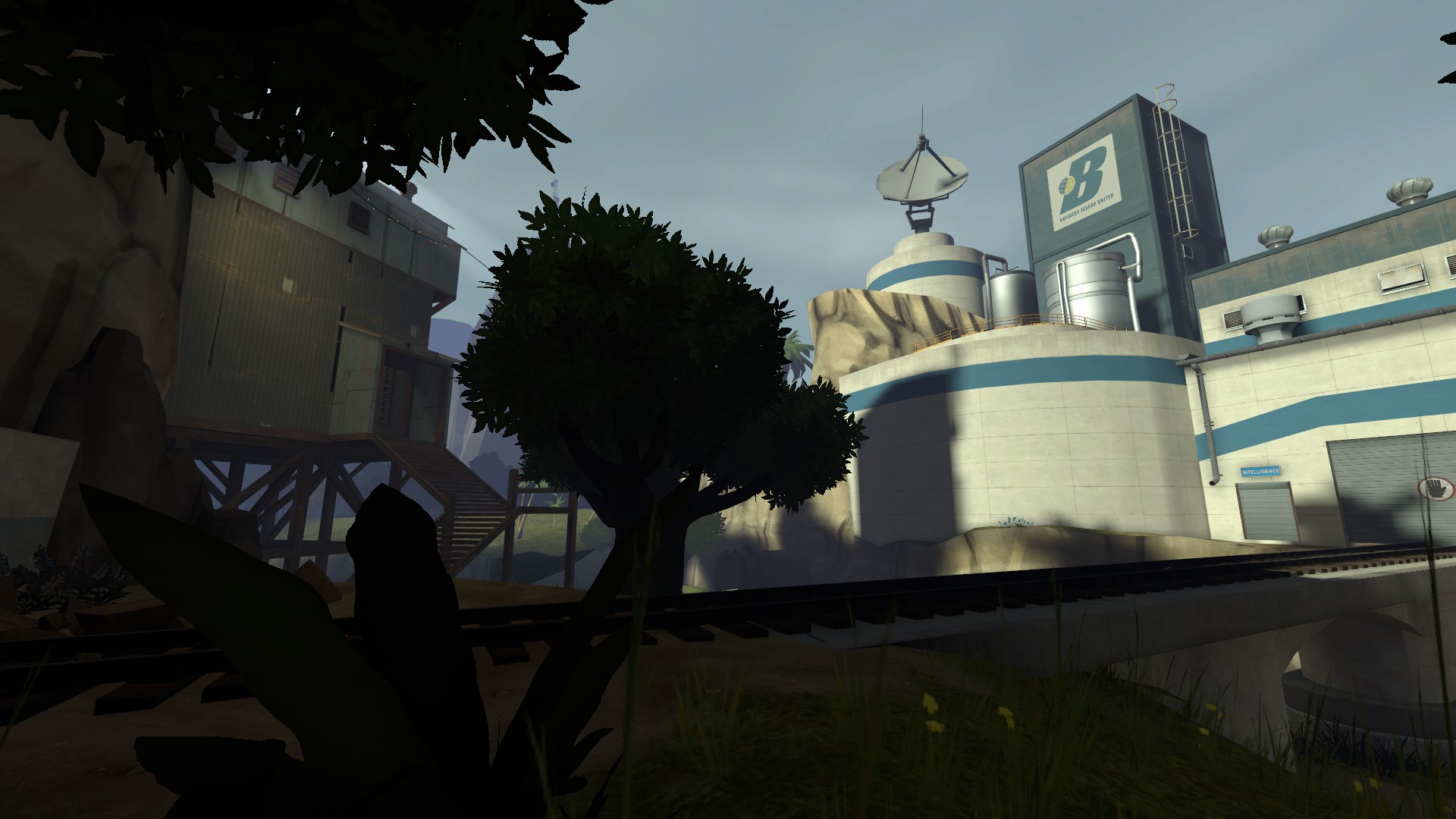
-From what I can tell it's a fuel depot base thing somewhere in foresty mountains with a river and a train crossing in the center. But what is the top area for? It's got storage and a kitchen, what is it for? Is that more fuel? Is that where they store fuel? Does it store something else? Is that the living area? It's got a kitchen stove thing but no chairs or anything else making it seem like a liveable place.. There's a tent up here so maybe..
-The transition on land with the fence from world to skybox is okay, does a decent job to portray the map position, but the basic prop rock mountains in every direction are a little drab.
-You show the necessities of a base, you've got the spytech, the fuel, the working area, the garage for the transport, the transport - even in multiple fashions in a decently detailed area. But I feel like you could really expand on the narrative driving this mountain fuel depot location because at the moment it's not gripping my attention and making me interested in exploring it. There are lots of hazardous waste barrels around this fuel depot area.. Is this fuel coming from something harmful and blue is turning it into fuel? Is that the waste product coming off of some harbourous machine in the back room? Or in general what is it for? Why are so many trains passing through this area? Why is a tent in the area - is this a temporary living space or a shanty town living space for only a few people?
-I'm glad you have a soundscape entity at least somewhere so it wasn't entirely quiet in the map, but I had to search for it and so it was at least annoying at first.
-Make sure all your water is on the same cubemap so it doesn't get different reflections along its surface.
tech:
-It's difficult to enter into this work because of how the sublime beauty of the negative space endangers the devious simplicity of the larger carcass. I'm surprised that no one's mentioned yet that the reductive quality of the Egyptian motifs notates the eloquence of these pieces.
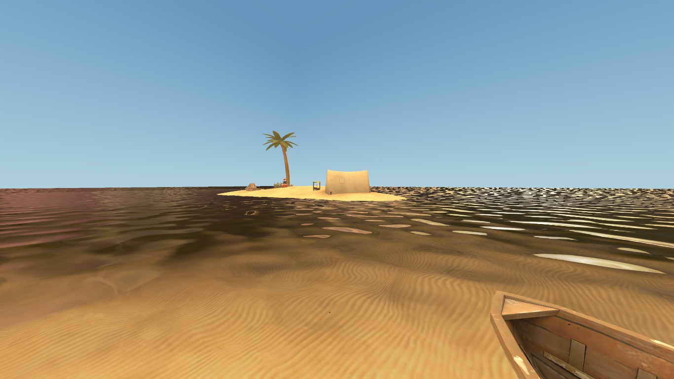
-You didn't align your world water and skybox water, at the very least man.
theof114:
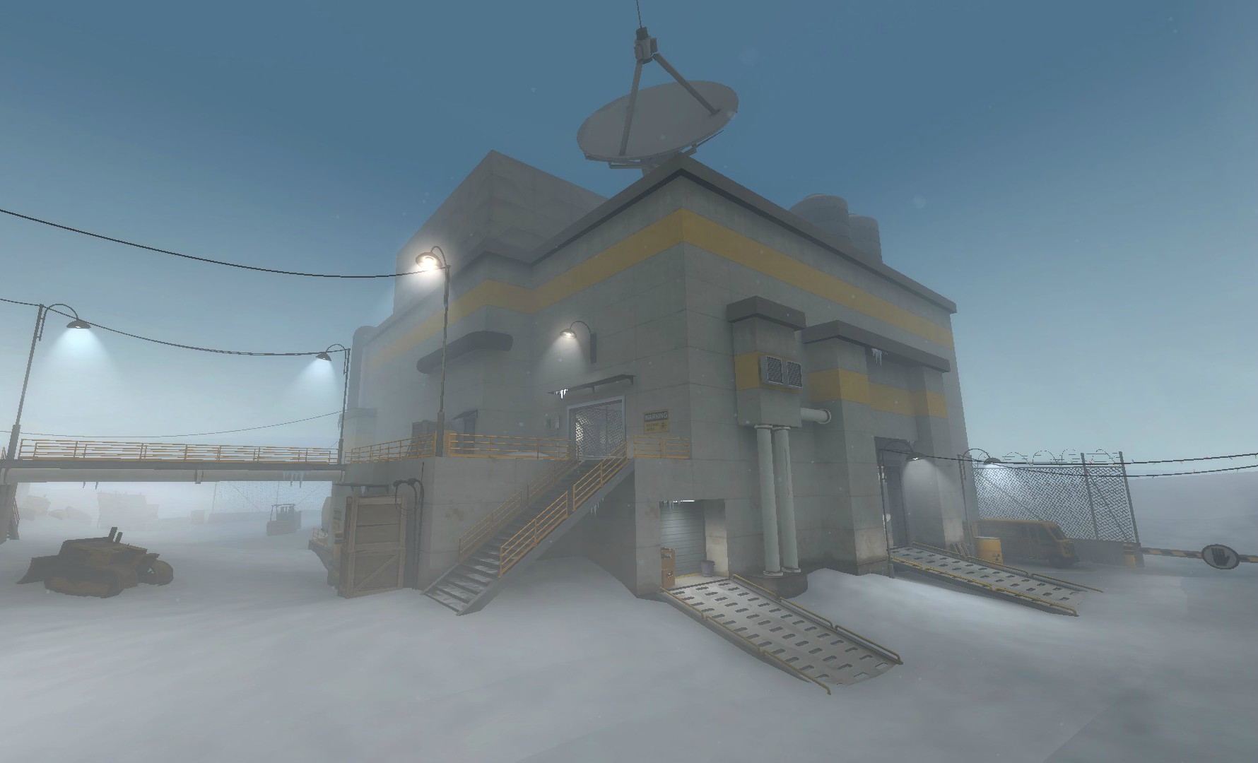
-The detail is good throughout the area which holds the idea of the cold shifted storage and transport and shipping base in hand or whatever the heck it is.
-The smaller building, the bridge connecting it, and the small details outside are all well done and look good.
-The windy snow particles clipping through the building look bad since its in my face when i look in this building's direction.
-In one room of the base you have some shipping trucks and containers and things as if its the shipping room, and you have the connectors leading to the other major room, but no clear idea of what the other room is for. It's not necessary I suppose, it's vague enough I suppose that could be it's use - that it has lots of uses. It has an elevator exit so clearly the base goes lower and this must be the main entrance or something, but I don't actually get its purpose.
tmp:
-Surprisingly good lighting, but I suppose its all like 1 lightmap scale lol.
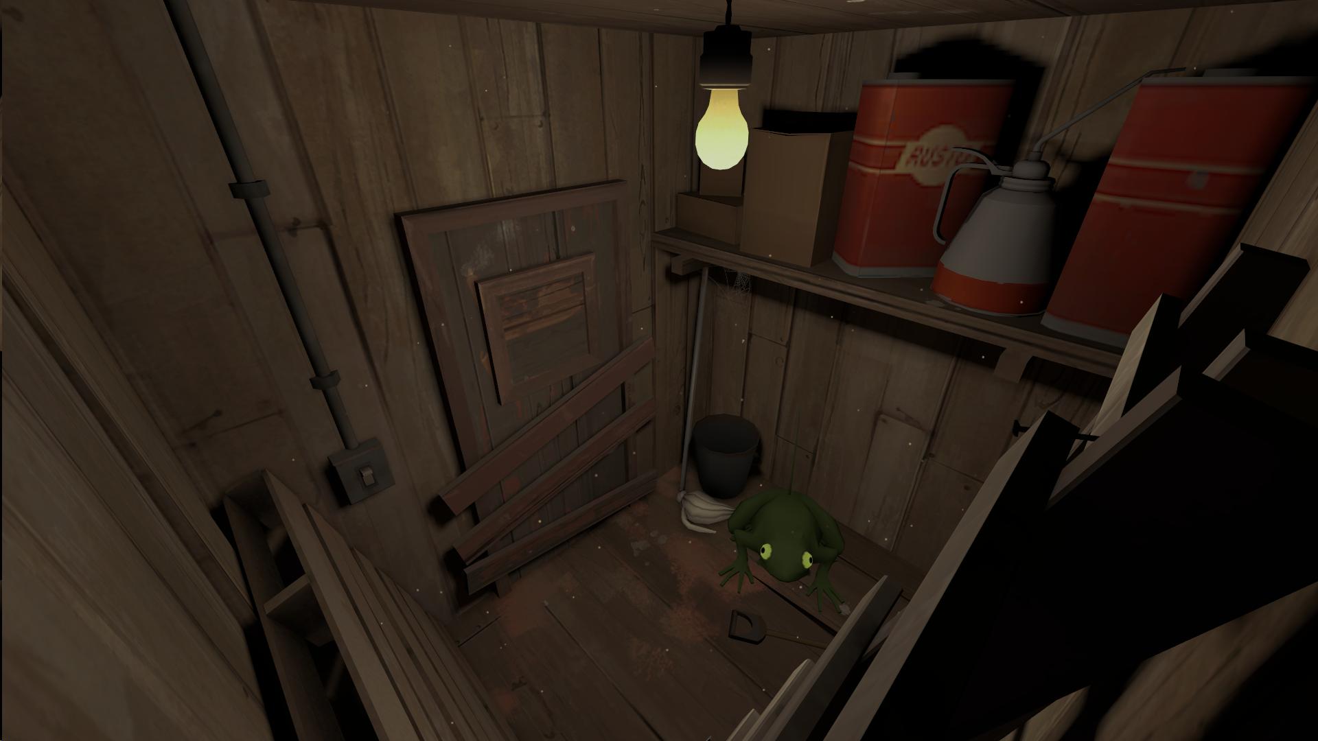
-Kinda weird that there's boards on the inside of the closet door.
-As an advocate of the Big Mac Aesthetic, I feel that the iconicity of the purity of line makes resonant the distinctive formal juxtapositions.
waffledoctor:
-Whatever the place is, it looks cool, although the area feels still a little boxy, like the cliffs are in the shape of a box around me in the area.
-Very cool tech implementation. I like that its all hidden behind old servers, good stuff. In general this detail looks cool. Good vibrant lights (although maybe not totally intentional..).
-It feels like your hdr cubemaps are not built because the reflective props are super bright.
-water in tf2 looks bad at this scale, should turn it up a bit so it's less repeat-y.
-Why is there a power line holder out there in the middle of the water with no connected power lines? Is it some radio tower? Put like a blinking red sprite on it if so cause I have no idea what it is!! Especially cause like, you include a lighthouse to make sure ships don't hit the cliff here, but then you don't have any indication for those poor sea captains that there's a hard rock just farther out even.
ynders:
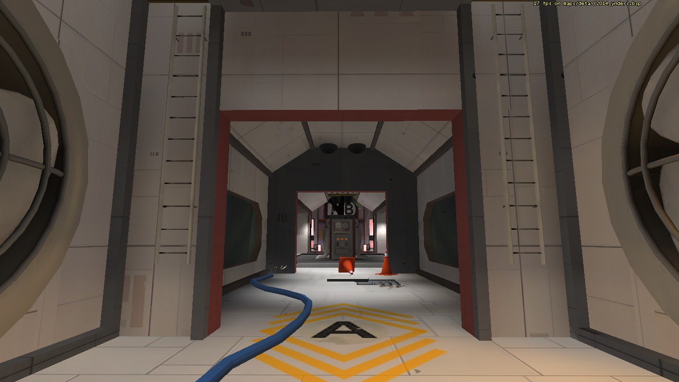
-Lots of really cool ideas everywhere, probably not fit for map gameplay but its fun to explore so whatever.
-That floating ship darts back to its starting position in a bad animation, probably could have like killed it and respawned it instead of just looping the animation all buggy like that.
-I didn't understand how each area connected to each other until I flew out in noclip mode and saw that half of it was a connected rocket to a little base, which made it all feel even cooler. You should have incorporated this view into it somehow, or gave more indication on what was going on with signs and status things.
-These massive staircases and things probably aren't a good use of space on such a space station as this, but it's cool I guess anyway.
