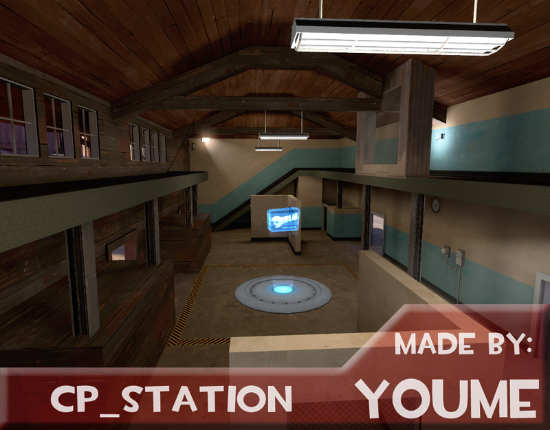
Detail Mini-Contest 2014 - Voting Thread

Vote for any number of entries

  • detail2014_hqdefault

    Votes: 4 6.8%
  • detail2014_iiboharz

    Votes: 7 11.9%
  • detail2014_iiboharz2

    Votes: 4 6.8%
  • detail2014_lampenpam

    Votes: 5 8.5%
  • detail2014_fantasmos

    Votes: 7 11.9%
  • detail2014_waffledoctor

    Votes: 26 44.1%
  • detail2014_theof114

    Votes: 26 44.1%
  • detail2014_prettyboy

    Votes: 2 3.4%
  • detail2014_idolon4

    Votes: 17 28.8%
  • detail2014_killohurtz

    Votes: 16 27.1%
  • detail2014_tmp

    Votes: 11 18.6%
  • detail2014_ynders

    Votes: 14 23.7%
  • detail2014_cubemap

    Votes: 7 11.9%
  • detail2014_aly

    Votes: 12 20.3%
  • detail2014_tech

    Votes: 3 5.1%
  • detail2014_drsasha

    Votes: 19 32.2%
  • detail2014_taka

    Votes: 12 20.3%
  • detail2014_plipplop

    Votes: 19 32.2%
  • detail2014_JohnRavenEye

    Votes: 3 5.1%
  • detail2014_Alex76

    Votes: 14 23.7%

  • Total voters
    59
  • Poll closed .

marshmallie

L2: Junior Member
Oct 4, 2014
51
155
~double post because of the different topic~

I don't know if participants are allowed to vote yet, but I really liked the entries in this contest. Each one of them were fun to explore in their own ways.

My top three:

1. Fantasmos- The sense of serenity here is very nice, and I really like the (brushwork?) stones on the path. I just wish it weren't so small. Incredible Japanese-theme execution, anyways.

2. Theof114- Great use of fog and snow in the map. The architecture was also very well done. The interior was ok- a little bland, though, I have to say. It didn't seem to have much of a purpose.

3. PlipPlop- I like the overall feeling of this one, however I think it's very lacking in detail. I don't think the snowy-medieval theme has ever been done before. The design is very creative.
 
Last edited:

HQDefault

...what
aa
Aug 6, 2014
1,056
536
hqdefault:
-I think it looks like a weathered and ruined TFC base, and if that's what it is you did a good job representing that. It could have been done better all around though.
-The ripped up ground doesn't make sense to me, but maybe it actually does make sense irl? To me, it looks like someone or something tore up half of the ground except around key components, and then cleaned up after themselves to get rid of the garbage, but like, why would they do that in such a place as this and leave the rest of the building let alone the rest of the ground?
-In general the ground looks way to clean; there's some staining but I except to see like leaves and smut blown in through the broken windows, or dust and dirt in the corners, sounds and signs of rats and animals taken shelter in the decaying base.
-Your displacements don't really match the skycards surrounding them, it looks noisey for the sake of noise. Although, you did an okay job on that displacement mountain/waterfall.
-Wish I could see more of the SD rocket platform because it's cool and monstrous but you hardly see it past the windows.
-It would have been cool had you included more sounds, like dripping of the water, or a dull hint of the waterfall outside, or again wildlife noises.
-It would have been cool had you implied more of a narrative to the situation. There's a ladder in the middle of the room suggesting someone came into the room to observe or tear apart at the middle columns, is that a robber? Is that someone who just rediscovered this base, turned the light on, and is checking for damage? If the latter you should imply that more like with a rope descending into the open hatch, or with a car nearby with the engine rumbling and murmurs outside from people inspecting.

This is a lot of nice feedback, and you've given me more info about how other players respond to the entry than any other feedback source.

I'd like to point out that the reason the floor looks all torn up is because it creates a MUCH better sense of destruction than if it were a plain texture. It was originally just the plain concrete texture, but that was way too clean. It was purely aesthetic, and I didn't intend for it to make sense in universe. (Some guy pointed out that a person had time to board up the broken window, but didn't have time to pick the old one up off the ground)

Noises. I understand I didn't live up to my potential when it comes to sounds. But I'm not experienced with ambient_generics, and it was hard finding good sounds to use, and the ones I found I had a hard time aligning to natural positions.

As for the SD rocket... yeah... It was meant to be a simple outdoor detail. I was expecting people to take a few glances at it, and move on to the more major details. I did not expect it to be the centerpiece of the map 0_0

You're right on the narrative. It easily could've gone far, but I didn't go anywhere with it.
I did, however, plan out a basic narrative as to what happened:
In the classic wars, this was one of RED's largest control centers, but unfortunately, near the end, BLU team blew the whole place sky high, to the point that RED could not repair the place with their current technology. Years later, in the gravel wars, the new team of mercenaries had begun flipping through their files and found out about the old location. Miss Pauling takes the liberty of having an initial safety inspection, and clears out any immediate hazards. They then send you, to take the final safety inspection, as well as hook up the old machinery to a power source, in hopes of getting the facility working again.

If I were to make a comic on this, I probably would've forced the engie into doing this.
 

radarhead

Basically? Kind of a Huge Mess
aa
Mar 6, 2013
1,044
627
Feedback on all the entries:
HQDefault: I liked your broken edges and holes, they looked very nice and flawless! However, the layout felt messy and some material choices were odd, like the red painted concrete slabs on the floor, and the wooden floor under the computers.
Iiboharz: Felt pretty empty, but I really want to know where you got that computer bank model!
Iiboharz 2: A little empty as well, but not as much as your first. Also, the building somehow reminded me of HL2EP2.
Lampenpam: This entry felt... weird. Nice cliffs, but the cartoon water, floating island, and phantom study felt like you were going for something really artsy that didn't translate well.
Fantasmos: Kinda shoddy 3d skybox, but the map was super pretty. Nice ambiance!
Waffledoctor: This map gave me the chills. Excellent example of how to use lighting to create temperature, and you executed it in a way that was more colorful than any existing snow map I've played on.
TheoF114: Another nice execution of coldness, this one with particles. I found one beam on your map that floated above the ground. Otherwise, this map heavily reminded me of the EOTL video (a good thing) and I liked your inclusion of moonbase props.
PrettyBoySwagg: You really should have just put a skybox texture up there.
Idolon: Felt more expansive than many of the maps. Almost lost points with the "lazy" room, but that was more than made up for with that tunnel system. The offshoots and cramped spaces made me feel almost like I've been in a place just like that. And I haven't!
Killohurtz: A little small, but cool and clever detailing brought this tiny island together in a way that left a great impression. Felt like a familiar cartoon setting.
TMP: The narrative here is amazing. Why am I in this closet? Why is there water underneath? And why, oh why, is that frog staring at me?
Ynders: Little bits of this map were amazing: the demo room made me laugh, and the auto-building stairs wowed me. Layout felt a bit messy, kind of like a mashup of ideas. Regardless, I enjoyed it.
Cubemap: Very clean and professional! Loved the custom glass. Would have liked it if the roof of the building was not nodrawed.
Aly: Another example of amazing ambience! And you even detailed the top? +80 wish fulfillment points. (-20 for odd shadows up there)
Tech: No one can coast on duck roasting forever.
Dr. Sasha: Excellent use of fog and particles! The endless cascade of shacks parading off into the distance made this for me. The factory seemed to have a couple of odd texture choices, but this map was still high on my list,
Takabuschik: A little messy in some places, but overall, not bad. Great view on spawn, as well! The blue metal shack seemed like it didn't fit in the same map as the factory, though.
PlipPlop: I didn't expect an underwater tunnel, but there was one! Tons of great and memorable spaces on this map, complete with a great aesthetic. Soundscapes seemed to have been working on other maps, so I don't know if it was you or me that created a machine hum thoughout a deserted castle.
JohnRavenEye: An excellent attempt, I'm wondering in something didn't get corrupted in this map. Several models seem to be in the wrong places, and many brushes and not aligned correctly to the surrounding geometry.
Alex76: Quaint little seaside town, another great aesthetic. I enjoyed exploring this one, however it didn't have as much of a narrative as many of the others.

Wow, I never knew I could type so much!
 

Dr. Sasha

L4: Comfortable Member
Aug 5, 2013
185
86
umbratile said:
detail2014_drsasha: but it's kind of hampered by the fact that it's snowing inside

It's actually not snowing inside. I made it so all the triggers surround the inside of the buildings, not the inside. What you're describing is the fact that snow is being blown into the building because of the wind.
 
Last edited:

HQDefault

...what
aa
Aug 6, 2014
1,056
536
You know, I generally wanted to keep my feelings on how the voting towards me turned out rather tame. And I even understood: "well, you lose, you lose, what you gonna do?" And then last night I hit a horrible realization, and now THIS, is my breaking point:

I worked for 4 WEEKS on that entry, and people apparently didn't think I did any better that SOMEONE WHO SPENT 20 MINUTES ON THEIR ENTRY. For the people who keep telling me to be glad I entered, I understand what you're saying, but honestly, given that people like 4 weeks of my work just as much as a 20-minute scraped-up project, what the hell was the point of that? Look, I wasn't coming in to win, I knew I wasn't gonna win. I make maps for people to enjoy what I created. But according to THESE statistics, I failed at my job.
 
Sep 19, 2010
476
500
You know, I generally wanted to keep my feelings on how the voting towards me turned out rather tame. And I even understood: "well, you lose, you lose, what you gonna do?" And then last night I hit a horrible realization, and now THIS, is my breaking point:

I worked for 4 WEEKS on that entry, and people apparently didn't think I did any better that SOMEONE WHO SPENT 20 MINUTES ON THEIR ENTRY. For the people who keep telling me to be glad I entered, I understand what you're saying, but honestly, given that people like 4 weeks of my work just as much as a 20-minute scraped-up project, what the hell was the point of that? Look, I wasn't coming in to win, I knew I wasn't gonna win. I make maps for people to enjoy what I created. But according to THESE statistics, I failed at my job.
Ok, I've been out of the loop for awhile now, but it looks like you joined in August 2014. I don't know for certain, but I'm going to assume you had never mapped before joining TF2Maps. Look at it this way, you were able to spend four weeks improving your craft where as TMP only spent "20 minutes". Take what you learned in this contest and apply it to your next map.

But please, don't complain that people didn't like your entry. People don't have to like everything you do as a mapper. If you set a goal and you accomplished it, that's something to be proud of. It doesn't matter what other people think.
 

YM

LVL100 YM
aa
Dec 5, 2007
7,158
6,079
Dude, you started in august. That's 5 months. You should see what I was doing after 5 months. You shit looks better than my stuff did then.

This was the best I could do then: (I was 16 at the time)
92090.jpg


It takes a lot of hard work to get past the "I'm still shit at this even though I'm putting in a TON of effort" phase.

Here, this might help:
http://vimeo.com/24715531

Anyway, your entry wasn't bad. Not at all, not by any measure. It didn't get many votes because there were a lot that were better by people who have had more experience than you have. Even TMP's 5 hour closet, he's had way more mapping experience than you have. Years more. So don't feel bad that you got less votes than any other entry.

The 72hour contest is coming up and will you begrudge me for creating a finished and fully detailed map in that time? (or a nearly-finished one)? Will you begrudge crash for staying up waaay past his bedtime to create this insane piece of work?
I hope not. You should look at it and see people with more experience working their butts off to make good art and you should double down and work your butt off to make your future art just as good.
 

HQDefault

...what
aa
Aug 6, 2014
1,056
536
But please, don't complain that people didn't like your entry. People don't have to like everything you do as a mapper. If you set a goal and you accomplished it, that's something to be proud of. It doesn't matter what other people think.

That's the problem. My goal is to crate something that people will enjoy. So, no, I did not achieve my goal.
 

TMP

Ancient Pyro Main
aa
Aug 11, 2008
947
560
So I know it sucks and whatnot, losing when you put 4 weeks into something and a lot of work. Trust me, I know the feeling.

Screenshot%202015-01-13%2019.37.35.png


At the very least, it wasn't a 20 minute rush job.

For me, the closet gave me a nice opportunity to do some things that I hadn't done before in mapping. Specifically, color correction. I wanted to make a nice subtle color correction that aided with the idea that you're in a closet. Kinda a desolate. boring feeling to it. You know, you're trapped in a closet. A purposeful split from the bright and colorful world of TF2, I wanted it to just be a bit dull. Something to get a reaction that a lot of people had. "This sure is a closet".

And then as YM said, but even a little more extreme, I have a lot of experience mapping. Moreover, and this is probably more important, I have a lot of experience in making things that meet my expectation in a very short amount of time. That's basically how I work, I can't work at something for 4 weeks and keep refining it. I have to go in guns blazing with a plan in a fit of mania and just do something super, super fast under a tight schedule. That's just how I work. So my entry idea played into my favor there.

HQDefault said:
That's the problem. My goal is to crate something that people will enjoy. So, no, I did not achieve my goal.

We have similar things in that regard. The first major contest I really entered was the Two Skillsets Contest. I wanted people to enjoy my entry and for them to express it. My entry into the first part was probably the most polarizing one, either people loved it or hated it. The second phase, I got demolished. Last place by a MILE. I was not happy with it at all, I was angry at the community and myself, and I stopped mapping for a good bit of time. Missed out on the 72hr contest in the summer because of it.

Pretty big mistake, honestly. Now, when I go back and I look at that score Overwatcher/Highnoon got in that contest, I get kinda angry, yes. In the end though, I learned a LOT from it, and now I have a goal in my head for when I map. If I had not gone through that grueling hell that was making Highnoon in that short period of time, I wouldn't have learned a lot of things about mapping that I never did. Regardless, that goal is to beat Aly in a contest, since she won both portions of the Two Skillsets Contest. And looking back on that inspires me a lot. Hopefully this contest will do the same for you.


EDIT: OHHHHHHH you were talking about Tech's. Yeah, don't worry about that one. Honestly, that's probably due to "Screenshot Syndrome", where a good screenshot will make people more interested in voting for your thing.
 
Last edited:

HQDefault

...what
aa
Aug 6, 2014
1,056
536
So I know it sucks and whatnot, losing when you put 4 weeks into something and a lot of work. Trust me, I know the feeling.

Screenshot%202015-01-13%2019.37.35.png


At the very least, it wasn't a 20 minute rush job.

For me, the closet gave me a nice opportunity to do some things that I hadn't done before in mapping. Specifically, color correction. I wanted to make a nice subtle color correction that aided with the idea that you're in a closet. Kinda a desolate. boring feeling to it. You know, you're trapped in a closet. A purposeful split from the bright and colorful world of TF2, I wanted it to just be a bit dull. Something to get a reaction that a lot of people had. "This sure is a closet".

And then as YM said, but even a little more extreme, I have a lot of experience mapping. Moreover, and this is probably more important, I have a lot of experience in making things that meet my expectation in a very short amount of time. That's basically how I work, I can't work at something for 4 weeks and keep refining it. I have to go in guns blazing with a plan in a fit of mania and just do something super, super fast under a tight schedule. That's just how I work. So my entry idea played into my favor there.

I WASN'T TALKING ABOUT YOU.

I was talking about tech's scraped-together project. It's a hill with water and a few props. I got the same amount of votes as her/him. (excluding the vote I made to myself)
 

TMP

Ancient Pyro Main
aa
Aug 11, 2008
947
560
I WASN'T TALKING ABOUT YOU.

I was talking about tech's scraped-together project. It's a hill with water and a few props. I got the same amount of votes as her/him. (excluding the vote I made to myself)

Oh.

You beat him, didn't you?

Yeah, you beat him by 1.

He probably voted for himself too.

Keep in mind a lot of people vote off of screenshots, and his entry is kinda nice in a screenshot.
 
Last edited:

HQDefault

...what
aa
Aug 6, 2014
1,056
536
I was expecting most everyone to actually follow the rules and download the map :|
So I didn't try to hard with the screenshot. Especially considering the fact that there were very few spots I could take a screenshot without spoiling the whole map.