WiP in WiP, post your screenshots!

Pocket

Half a Lambert is better than one.
aa
Nov 14, 2009
4,701
2,583
Hey guys, I need an opinion here, I'm trying to cut down on the amount of trims I'm using after the feedback I got from the MVM contest. I returned to the map that I put on hold in order to enter the contest, and I'm wondering if I'm using too many trims/borders, and if it looks ugly. Also, visual feedback in general would be appreciated.
Firstly, I think the combination of lots of trusses near the ceiling and the stripy planks-with-gaps-inbetween texture for the ceiling itself is over-detailing at best and potentially moiré-inducing at worst. Secondly, I think realistically you wouldn't have wooden supports on the outside of a brick building. (I dislike that one set of Frontline textures for that very reason.) If someone can back me up or point out that I'm wrong about that, I'd appreciate it.
 

signalmanx

L1: Registered
Apr 6, 2014
23
72
Firstly, I think the combination of lots of trusses near the ceiling and the stripy planks-with-gaps-inbetween texture for the ceiling itself is over-detailing at best and potentially moiré-inducing at worst. Secondly, I think realistically you wouldn't have wooden supports on the outside of a brick building. (I dislike that one set of Frontline textures for that very reason.) If someone can back me up or point out that I'm wrong about that, I'd appreciate it.
I see what you're saying about the ceiling there, I'll try and find a better texture to back it. But traditional English coastal towns do actually look like that, though.
 

Idolon

they/them
aa
Feb 7, 2008
2,123
6,137

The wood framing looks alright. It's a bit noisy and i would maybe tone it down a bit. These windows all individually call attention to themselves, so I'd start by removing them first. Not every building would have them anyways, especially where the building steps back and the roof window isn't actually in a proper attic (but instead appears to be coming out of a floor that is half the height it should be, or is a clerestory window to the floor below).

This vent doesn't belong here, it's far too pristine to be outside and also isn't an appropriate size (most air intake/outtake vents are very large because they serve the entire building. They have to be sized for the air flow of the entire building as opposed to a vent in a room which is sized to just that room's air flow. In theory you could have a vent like this and it would work but in practice it's probably very inefficient).

The floor decoration made sense in other screenshots (public plazas tend to have that sort of decorative tile work because they're meant to look nice) but I don't think it belongs in a place like this. Keep industrial areas simple.

Randomize your stair textures so they don't repeat obviously.

Is this quicksand?

It looks like there's a public plaza of sorts on the roof of these buildings, which is unusual. The buildings should probably just be walls instead because what tenant wants to put their business in that awkward and inflexible of a location?

Firstly, I think the combination of lots of trusses near the ceiling and the stripy planks-with-gaps-inbetween texture for the ceiling itself is over-detailing at best and potentially moiré-inducing at worst.

It looks over-detailed because it's lit. Some maps have pretty intense ceiling beam work but you don't really get a good look at it because it's all in shadow.

Secondly, I think realistically you wouldn't have wooden supports on the outside of a brick building. (I dislike that one set of Frontline textures for that very reason.) If someone can back me up or point out that I'm wrong about that, I'd appreciate it.

https://en.wikipedia.org/wiki/Timber_framing#Half-timbering
 
Last edited:

Midlou

L5: Dapper Member
Jan 12, 2016
222
254
Halloween? Jungle? NNaahhh :v

utcruqG.jpg

...WIP...​
 

LeSwordfish

semi-trained quasi-professional
aa
Aug 8, 2010
4,101
6,597
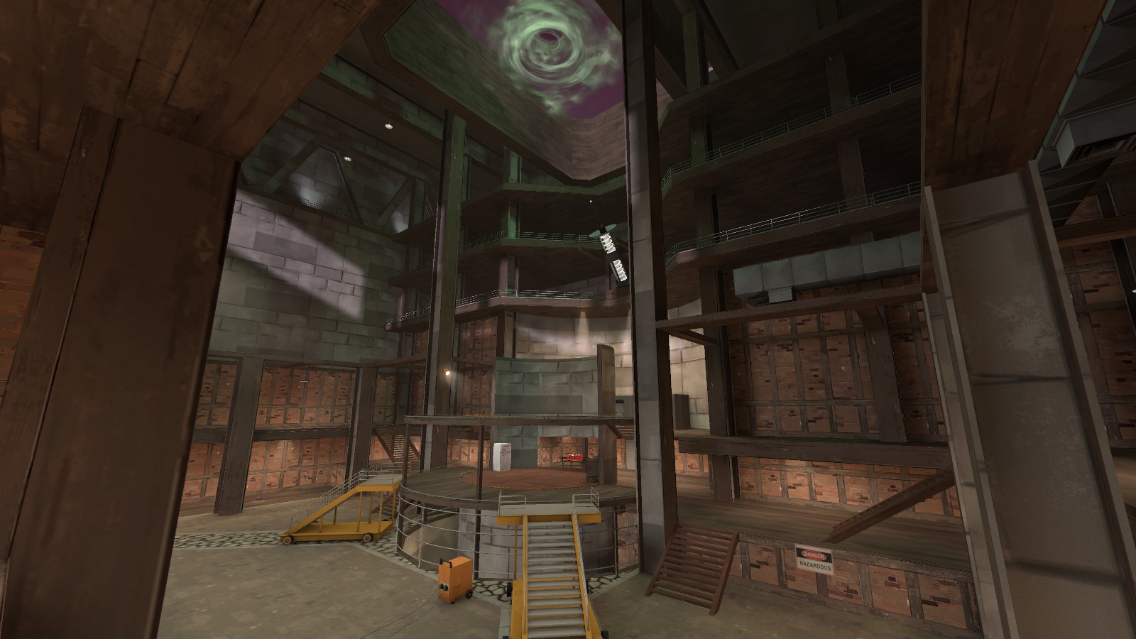
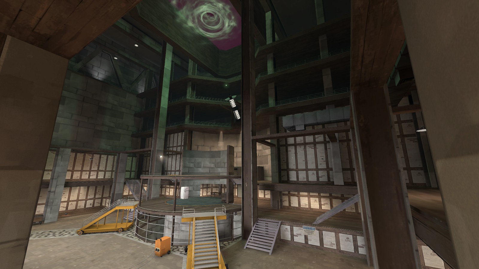
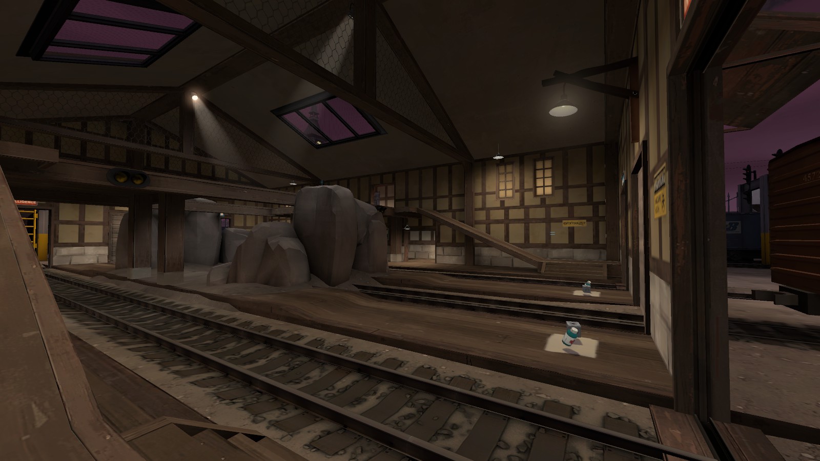
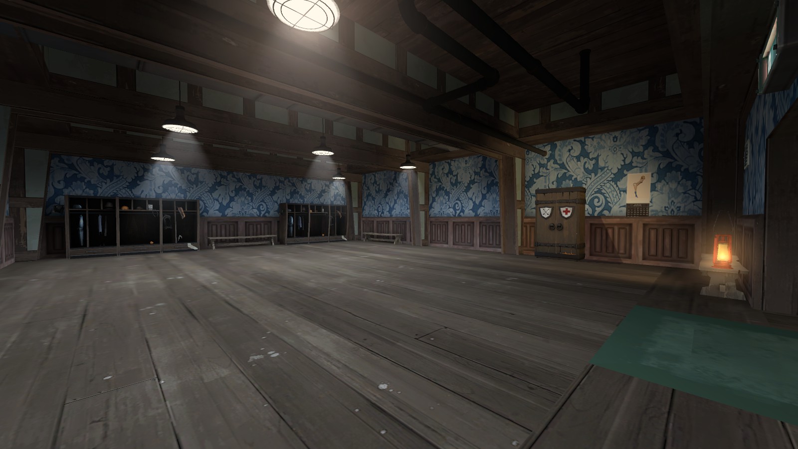
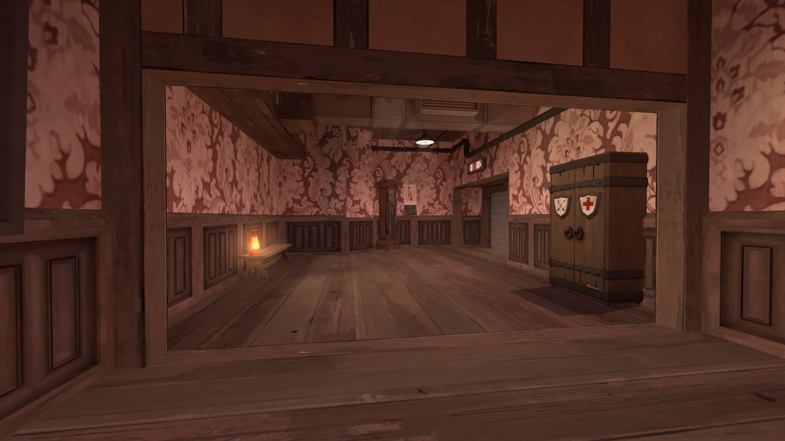
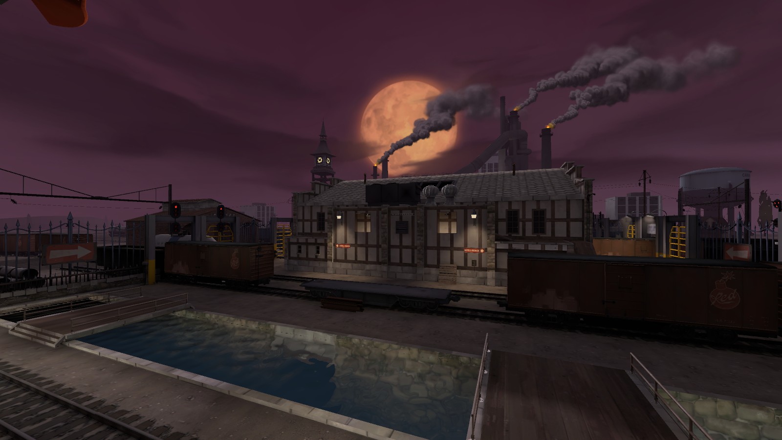
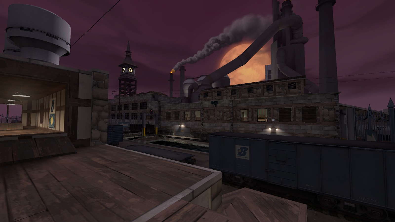
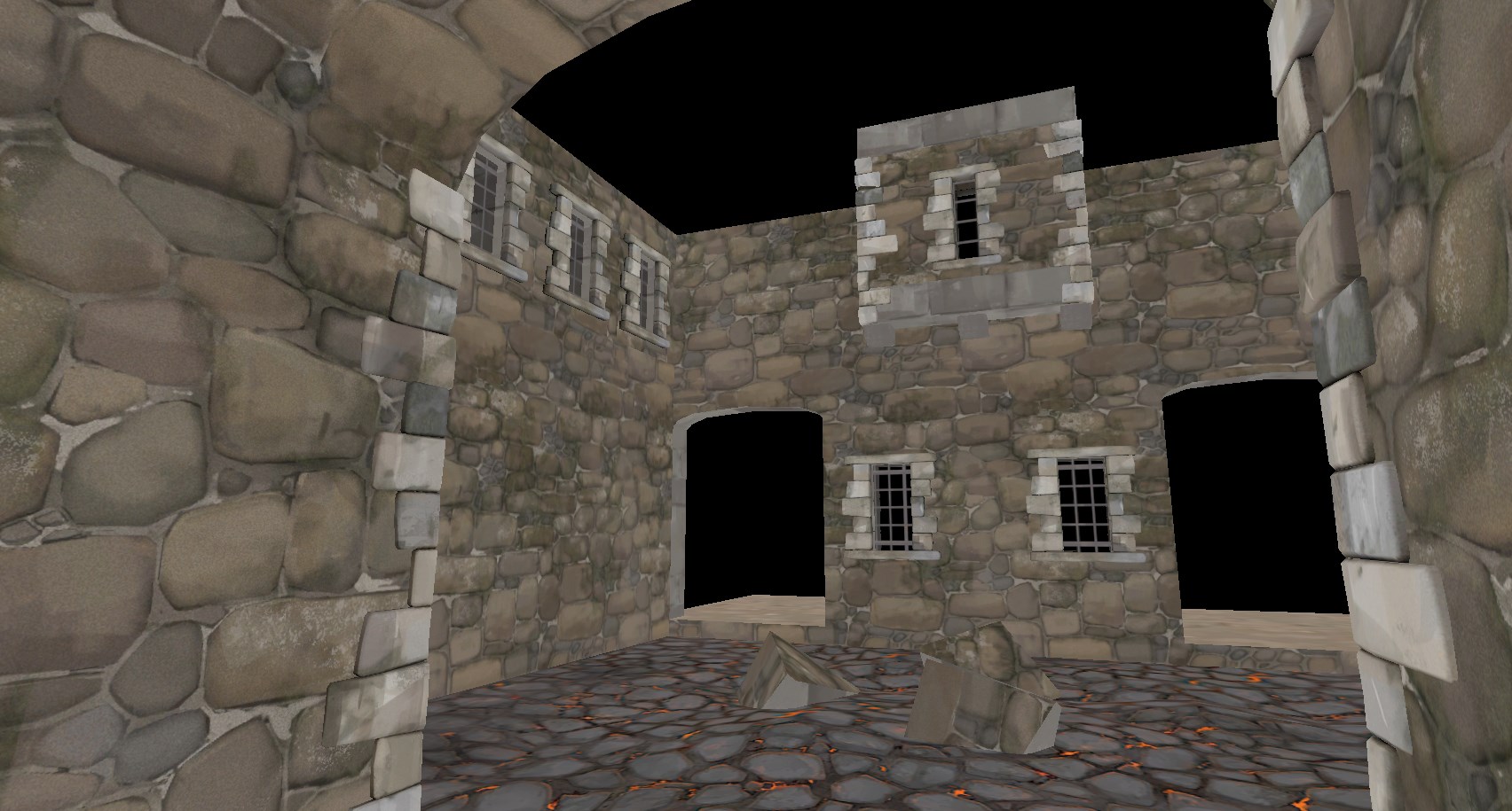
I have screenshots from in the game now! Need to work on getting the brush count down and I still have to replace a lot of props that are outside with Medieval/Halloween stuff.
BDEDFDC11D80ED46939E01C67E8B4A8028C73887

832F5AE580C083AD34CFF2F3A23A11AE0FB2D9BB

26F9C38DA882FF02027F6D1384D5B16D4B8B3131

33BC368C36282E3775A189E6558021E24DED1B69

629362134AD01B084196258A56DFFE746B29C562

AAE821070A339EE3C6468E5DC91CDEA009F87ABA

487DDACF15E03054F9DAB151A5F4C0A95EB8DF61

Iiiiii'm really not a fan of this? Because it looks like you've just slapped a halloween facelift on the exact same brushwork with basically no consideration to making it make sense in a halloween context? In that first screenshot, you have thin curved stone walls, stone I-beams... there's such cool stuff you could do making that final point "haunted house" themed but you haven't done any of it, just made it the same as before but with bricks.
 

red3pit

High on melancholy
aa
Dec 3, 2016
262
309
upload_2017-9-13_0-45-31.jpeg
upload_2017-9-13_0-45-43.jpeg


I'm experimenting with some additional entrences to the last on sg_downwards and I'm quite happy with this route here.
 

Empyre

L6: Sharp Member
Feb 8, 2011
309
187
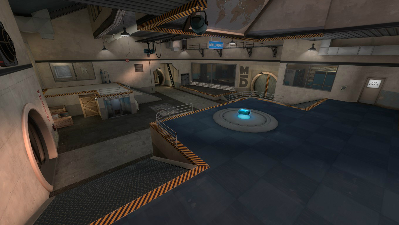
It looks odd to me that the cords that are holding the platform have some slack in them. Shouldn't they be completely taut because of all the weight they're holding? It also seems odd that there is a track, something that is completely rigid, leading to a platform suspended in such a was that it could sway (in the real world).

You have a window placed right on a gap in the wall, which makes it look like the window is put on the wall like a poster, rather than looking like it goes through the wall. If you scroll the texture on the wall so that the gap is behind the sign, it would look better. Likewise, I don't like the gap right against the doorway.

Fixing these things would help make it look like a real place.

Remember, I am not picking it apart to be mean. I am trying to help.
 

Crowbar

aa
Dec 19, 2015
1,455
1,298
It looks odd to me that the cords that are holding the platform have some slack in them. Shouldn't they be completely taut because of all the weight they're holding? It also seems odd that there is a track, something that is completely rigid, leading to a platform suspended in such a was that it could sway (in the real world).
Maybe the rails are supporting the platform and that's why the cords are slacked ;)
 

Idolon

they/them
aa
Feb 7, 2008
2,123
6,137
That's just how the prop (originally from Well) looks. It's not entirely out of the question that the weight of the cable itself is creating slack - it would just need to be really heavy cables with a light load, which makes sense it's built to lift heavy stuff but currently isn't loaded.
 

Sor

L2: Junior Member
Jul 29, 2016
87
8
The Well prop has slack because it's resting on a platform. Cables can't have such slack when hanging. Even with very low load.
 

Idolon

they/them
aa
Feb 7, 2008
2,123
6,137
The Well prop has slack because it's resting on a platform.

The platform hangs freely. Just very slightly and I can't blame you for missing it.

Cables can't have such slack when hanging. Even with very low load.

It's possible I used the term slack where it did not belong. However, I still believe it's possible for a loaded cable to curve due to its own weight.

Suppose you hung a rope from the ceiling and pulled down on it at an angle such that the rope was straight. If you added a weight to the middle of the rope, you would have to pull harder on it before it was a straight line from the ceiling to your hand. If you continue adding weights, you'll eventually be unable to pull the rope completely straight, despite pulling with all your might.

Imagine you pulling down on the rope represents the weight of the platform and the weights on the rope represent the weight of the cables. That's what is happening here. I'm not sure the platform in Well looks right, or if the curvature of the cables is physically accurate, but I believe that it is based in reality.
 

ics

http://ics-base.net
aa
Jun 17, 2010
841
543
That well mid cable prop has been there for years and not too many noticed that slack in that time. Besides it look better with it as it is now.
 

Fruity Snacks

Creator of blackholes & memes. Destroyer of forums
aa
Sep 5, 2010
6,394
5,573
That's just how the prop (originally from Well) looks. It's not entirely out of the question that the weight of the cable itself is creating slack - it would just need to be really heavy cables with a light load, which makes sense it's built to lift heavy stuff but currently isn't loaded.

REALLY heavy cables with a light platform would still be taught and not look like that.
 
Jul 26, 2015
697
822
Nov 13, 2015
138
512
started to work on a capture point model, he spins around when neutral, turn to face the attacking team once captured, has some idles for laughs and look around, might also add some type of capture animation when the attacking team is close to capture,

scull_capture.JPG