WiP in WiP, post your screenshots!

Etasus

L420: High Member
Jul 24, 2016
463
251
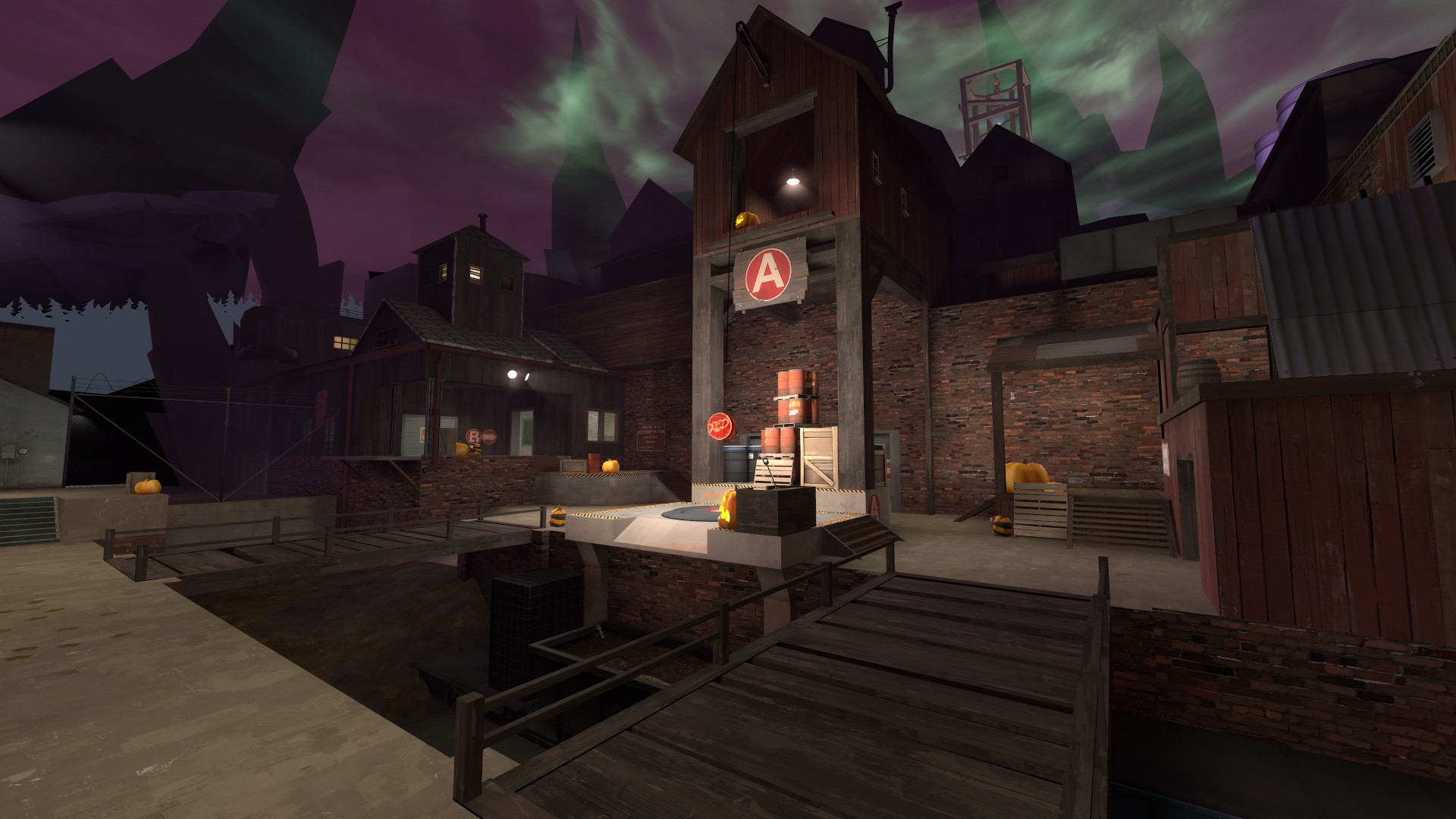
I think it would look really good if you had the ceilings much darker, and had the lights actually glow. I think you're using just basic light, so try spotlights to create that effect
Spotlights do work, but for the glow effect you just thought about, you would need to use a light sprite (don't remember the specific name off the top of my head), but that glowy thing...
 

Crash

func_nerd
aa
Mar 1, 2010
3,349
5,524
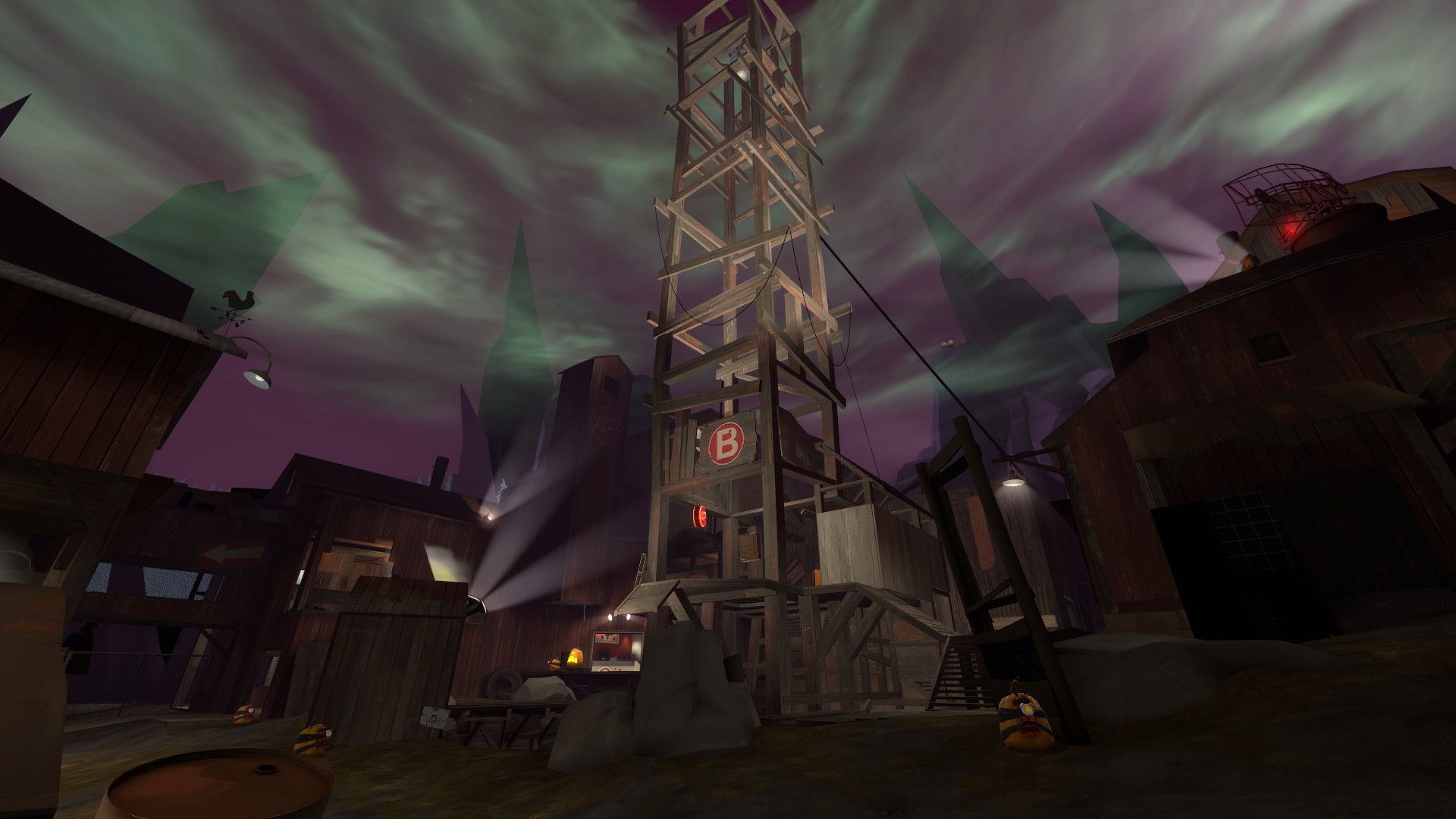
The intersecting metal beams look weird too. I usually try to just make my geometry match the models rather than the other way around. Extend some things out if you have to to get them looking right.
 

Dayal

L3: Member
Feb 8, 2017
123
293
The dump trucks being used to transport the yellow barrels still feels so wierd to me, as does the proliferation of barrels with seemingly no rhyme or reason. But that is a significant improvement over what was there before.

You might want to vary how the rock wall meets the top of the concrete a bit, make it seem a bit more natural.

The premise of the map is that trains come there to dump their radioactive waste which trucks move to an underground facility where it gets stored. But don't worry, I changed a couple of props around so that the yellow barrels aren't such a repetitive prop anymore. Like, no more yellow barrels at the front, removed a couple of them around the map, etc.

I think it would look really good if you had the ceilings much darker, and had the lights actually glow. I think you're using just basic light, so try spotlights to create that effect

Yeah, the lights are spotlights paired with a very faint pointlight. And the light glow is I think a particle effect, but sure, I can add the effect and remove the faint pointlights if it makes it look better.

The intersecting metal beams look weird too. I usually try to just make my geometry match the models rather than the other way around. Extend some things out if you have to to get them looking right.

Some people already pointed that out and I changed the beams and support placement a bit since then so that it looks a bit less weird. Similar as to how Mannhattan does it inside the warehouse. Originally it had different support beams that fit the scenery more, but when I showed it to someone who knows a bit about building structures irl, he said it made him cringe. So I had to place something different.

But I guess I can try to make it look more believable.
 

red3pit

High on melancholy
aa
Dec 3, 2016
262
309
upload_2017-9-19_23-16-2.jpeg

I'm more then sure, that I won't have this done before this year's halloween, but this also means I have way more time to work.
See ya in 12 months, nerds!
 
May 25, 2015
390
307
Spooks
-snip-
2F9672AE8454ED2734269A0B3B1CE502DCBA640C

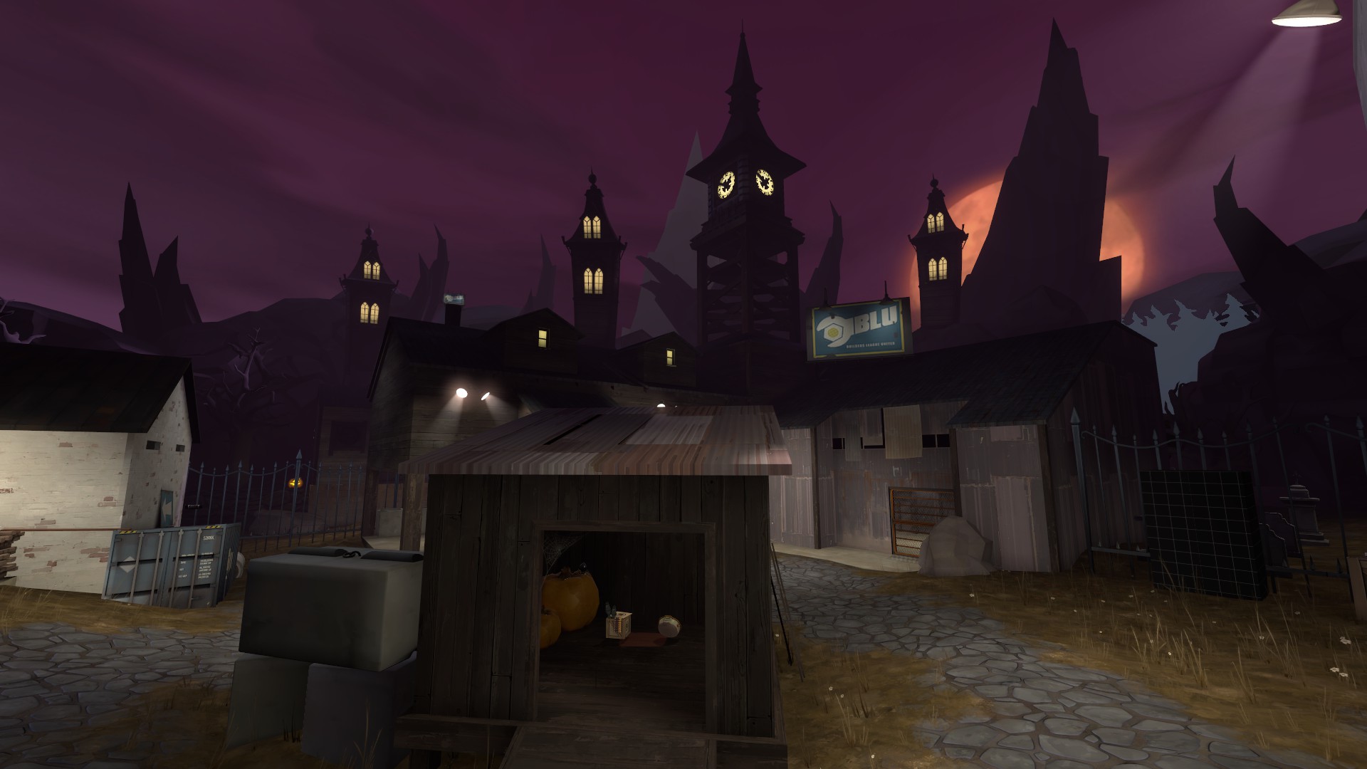
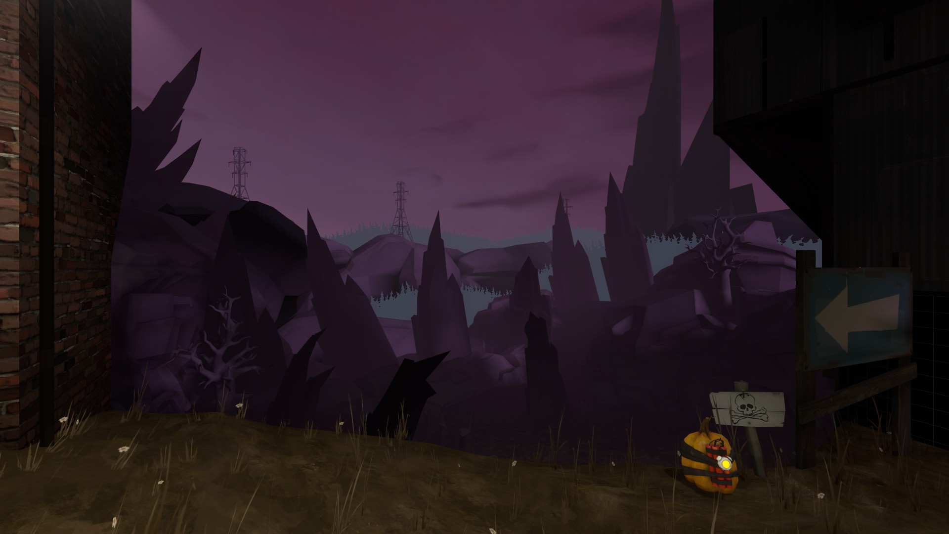
I think those supposedly foggy trees look a bit weird since the rocks between them are not in fog. I know ground level fog is a thing, but I don't think it would match up with the shape of the trees that perfectly.

Other than that, it's a solid looking halloween map!
 

Asd417

Sample Text
aa
Mar 20, 2016
1,461
1,035
Stone I-beam: No
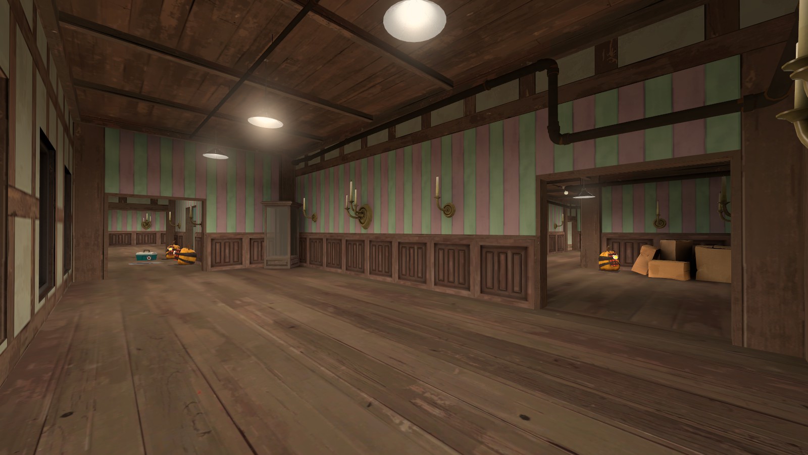
There is a window without a window frame.
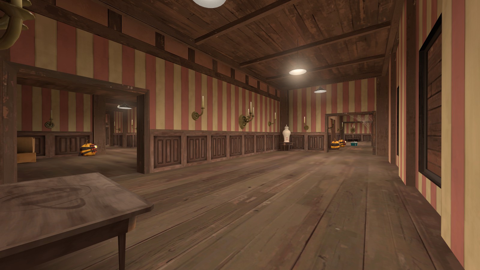
The plaster material is really weak and it is not fit for supporting stone bricks and making large structures.
I recommend using mann manor or a castle style for the building.
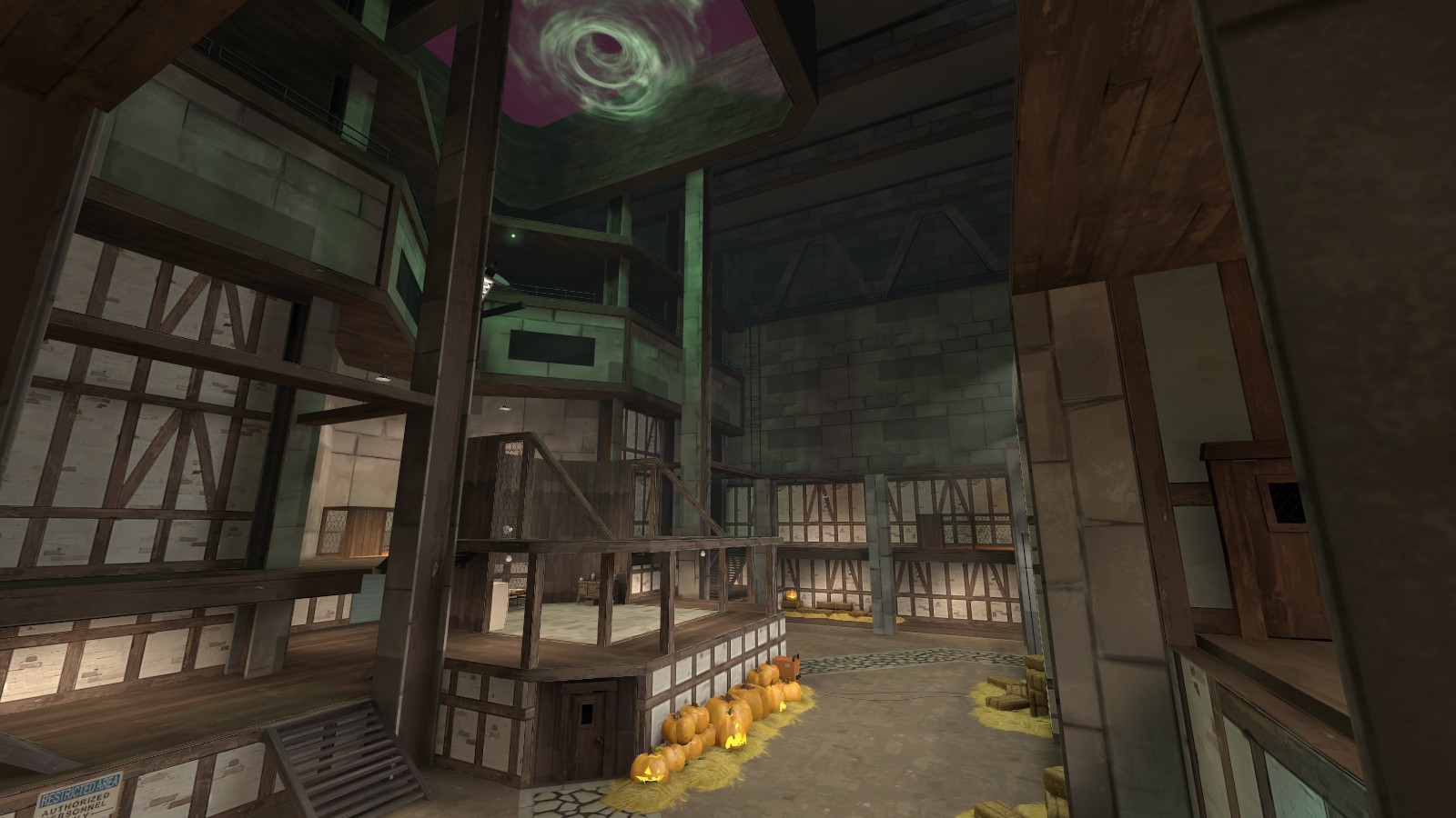
There is not much explanation as to why would anyone want to capture the last point since (from what I can tell), it is practically a kitchen in the middle of a big, big room. The kitchen makes no sense to be there unless there is a huge, long medieval dining table very near. (even so, it makes no sense to have kitchen in a broad space.)
If the halloween portal wasn't there, the building would essentially have a big hole on its ceiling. Makes no sense. You can put a simple narration like: "A portal was opened by a some evil magician and broke the roof."
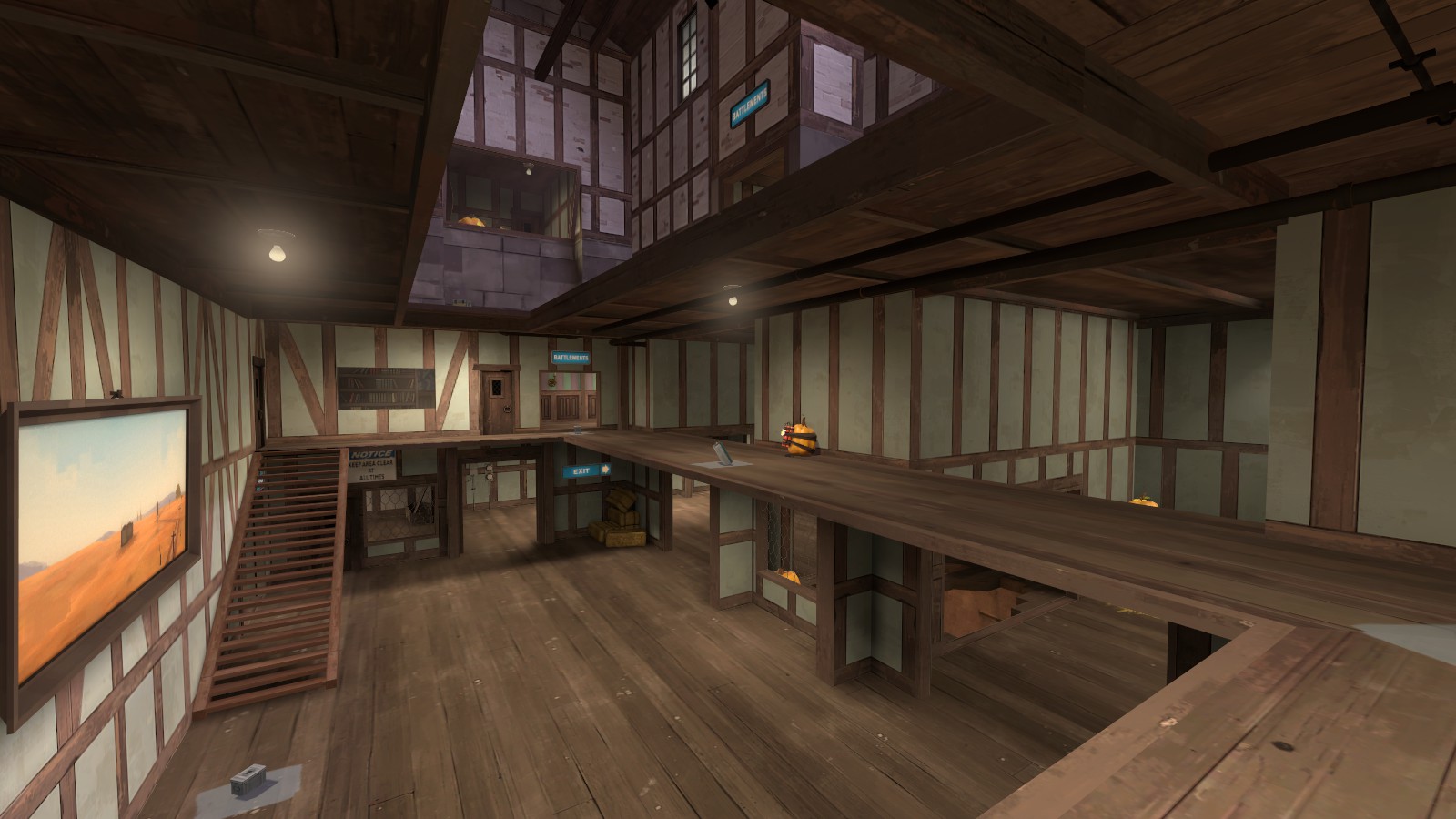
I would like to see more erratic changes to the geometry of the room since anything above the second floor can basically be anything else. You can make, idk, a town with a huge plaza in the middle, a garden of a mansion, or anything you imagine as long as the gameplay remains similar. (actually even the gameplay can change drastically like how they did with helltower)
 

Glubbable

L2: Junior Member
Sep 1, 2013
53
146
I was just going to read this and move on but some of this is just rubbing me the wrong way. So I'm sorry if this is coming off as either being blunt, harsh or overly defensive.

Stone I-beam: No
I'll change it.

There is a window without a window frame.
Which one? Be specific, this is extremely vague and unhelpful.

The plaster material is really weak and it is not fit for supporting stone bricks and making large structures.
Plastering is used to cover existing brick work as a form of protective or decorative coating, which is kind of the whole point of plaster? I mean, you could argue that it looks like the entire room is made out of plaster but that wouldn't be how plaster works in the first place. Plus then you could ask why the top isn't covered as well. But that would be an easily self-answering double-edged sword if you really wanted to go there.

I recommend using mann manor or a castle style for the building.
I'm trying to go for a mix between Manor & Castle in the first place. I mean, why try to stick to the same themes if you can attempt to create your own? I know the response to this would be something like "well you're not doing a very good job at it". But these things are subjective to most people. I mean, I'm not trying to be dismissive of this but it's just that I'm trying to do something different from the norm and not everyone can or will see it as such. It's sort of the same way that you can't make everyone happy.

There is not much explanation as to why would anyone want to capture the last point since (from what I can tell), it is practically a kitchen in the middle of a big, big room. The kitchen makes no sense to be there unless there is a huge, long medieval dining table very near. (even so, it makes no sense to have kitchen in a broad space.)
Tbh, it's hard to see the transparent pizza intel bag I have in that screenshot. But also, lore wise Merasmus is a wizard who's capable of slaughtering all of the mercs yet is helpless and terrified of whatever mafia or gang he happens to borrow money from. Meanwhile we had the two mann brothers who believed gravel was the center point of the world and we didn't even know that until it was explained in the comics. So asking for this kind of thing when the game has repetitively thrown it out the window is asking for a lot.

If the halloween portal wasn't there, the building would essentially have a big hole on its ceiling. Makes no sense. You can put a simple narration like: "A portal was opened by a some evil magician and broke the roof."
Kind of hurts that you didn't notice the big ray gun pointing up at the portal with the glowing tip. I guess I'll need to detail that section level with the ray gun to make it more apparent that it's more of a lair type setup.

I would like to see more erratic changes to the geometry of the room since anything above the second floor can basically be anything else. You can make, idk, a town with a huge plaza in the middle, a garden of a mansion, or anything you imagine as long as the gameplay remains similar. (actually even the gameplay can change drastically like how they did with helltower)
Helltower added Spells, The Witching Hour, One Extra Death Hazard and an Underworld/Hell. Outside of those 4 things Helltower remained mostly the same outside of visual changes. But I guess instead of keeping it a surprise there is going to be a custom monster in the map along with an Underworld, Pumpkin Bombs and Spells I haven't added in yet. Plus there's the whole spin on delivering pizza to the Underworld.

Not every map has to go wild with redesigning, especially since I specifically wanted to do a reskin that preserved most of the existing brushwork. The original idea being that Merasmus needs help to get out of trouble and the location happens to be in a spookie trainyard with two evilish lair bases.
 

FancySnacks

L1: Registered
Aug 16, 2016
20
28
For the custom monster, please make it more like an additional hazard, kind of like HHH works. The boss battles get old really quick and become a pain in the ass if you fought it before.

I dont remember if HHH activates truce on spawn but it was really nice when the gameplay didnt change much but you had a giant monster hunting people down. And a minigame when you had to melee people to tag them.


I mean, if by "monster" you mean a boss ofcourse.
 

Benoist3012

L3: Member
Dec 25, 2015
148
207
I'll answer this concern since I'm the modder/monster maker here, these monsters will act as additional hazard, they won't be direct threat.
I can't tell you why we made them but this is for a specific goal.

Also since you mention bosses we do have one planned, although no promise on it, but if it's made it will like an additional hazard :)
It won't stop the gameplay to start a fight against it.