WiP in WiP, post your screenshots!
- Thread starter Arhurt
- Start date
You are using an out of date browser. It may not display this or other websites correctly.
You should upgrade or use an alternative browser.
You should upgrade or use an alternative browser.
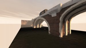
It reminds me a bot of the bridge from Half-Life 2.
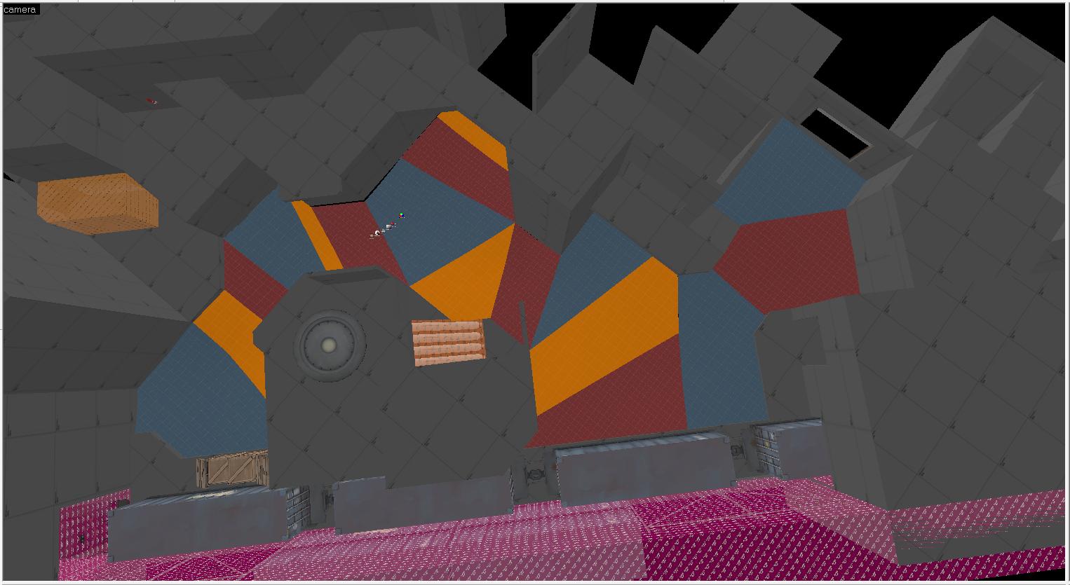
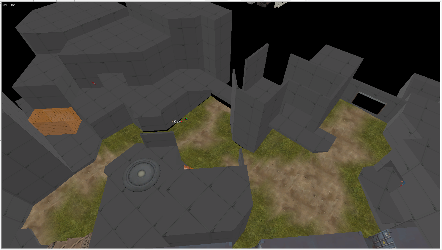
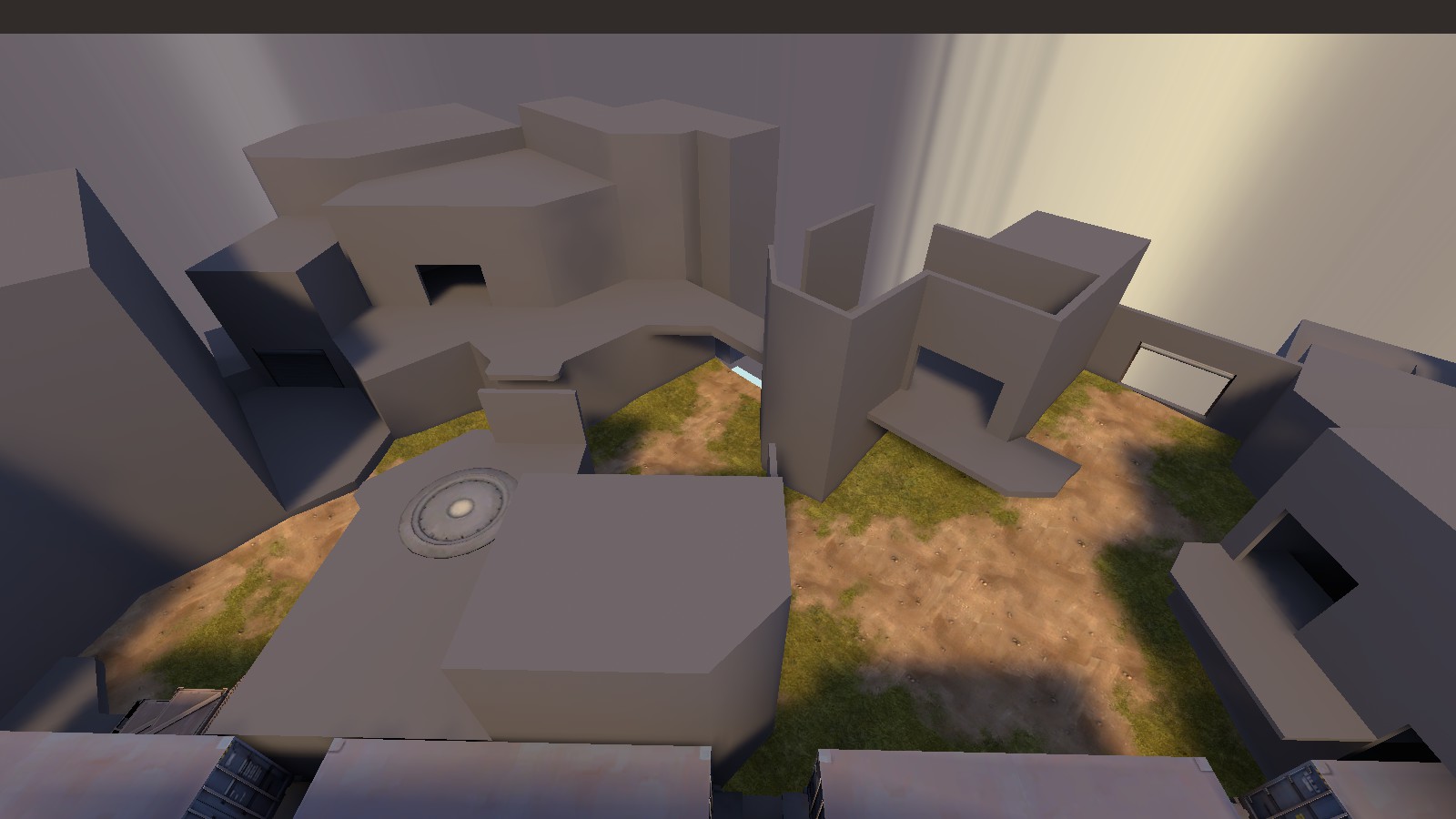
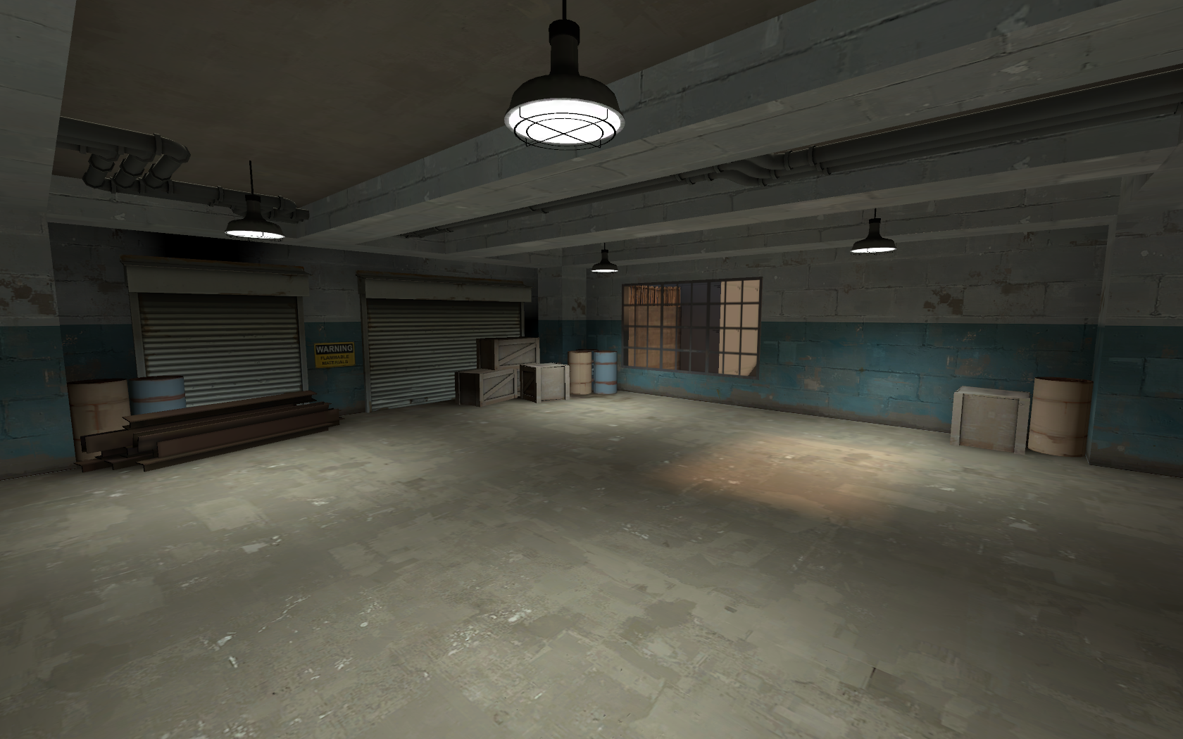
So, after a short discussion about spytech bases in the chat, i remade the spawn of Bloodshed... again.
This isn't 100% finished, there are still some things that i want to touch, but i probably won't be able to work on it for the next few days, so i wanted to show it off.

Outside (Same as before, probably has to change to account for the bigger underlying structure.)

Inside
This isn't 100% finished, there are still some things that i want to touch, but i probably won't be able to work on it for the next few days, so i wanted to show it off.
Outside (Same as before, probably has to change to account for the bigger underlying structure.)
Inside
So, after a short discussion about spytech bases in the chat, i remade the spawn of Bloodshed... again.
This isn't 100% finished, there are still some things that i want to touch, but i probably won't be able to work on it for the next few days, so i wanted to show it off.

Outside (Same as before, probably has to change to account for the bigger underlying structure.)

Inside
I really like your texturing choices! Though you may want to replace that grate texture with glass; the fine lines often look messy from farther away, plus glass makes more sense thematically.
So, after a short discussion about spytech bases in the chat, i remade the spawn of Bloodshed... again.
This isn't 100% finished, there are still some things that i want to touch, but i probably won't be able to work on it for the next few days, so i wanted to show it off.
Outside (Same as before, probably has to change to account for the bigger underlying structure.)
Inside
I think an actual wall with some cool windows instead of the weird metal grate wall would be more spytech. The current setup looks like something you could have inside a barn imo.
edit: oh KubeKing beat me to it
I think the bigger issue is that the room can't decide if it wants to be a warehouse or a spytech operations room. The big dividing wall would make sense in a warehouse for fire code and security reasons, but that type of architecture just doesn't make sense with the computers and nicely painted walls. I would recommend going full spytech or full warehouse, rather than trying to fit both programs into one space.
The way the divider is made also doesn't make a whole lot of sense - staggering the horizontal structural beams like this only really makes sense on a small scale structure. Should you choose to keep the divider, it should be organized as a grid so that the horizontal members line up with each other. You should also consider adding in diagonal beams.
The way the room is laid out also doesn't make a whole lot of sense - there's a few nooks and crannies that really don't need to exist and are just not efficient uses of space. My guess is that a lot of this comes from trying to give the upper spawn exit a comfortable amount of room for players to maneuver. That particular mass sitting on top of the ground floor just divides the space really awkwardly.
I would recommend thinking about the "ground floor" the interior as being level with the higher spawn exit, and relegating the bottom two exits to a basement level. The upper exit landing won't divide the room up at all, giving you a bit more freedom to mess around with the rest of the space. Plus, this correlates nicely with how the building appears from the outside.
God, so many good ideas, and i'll have to wait for almost a full week to try it out. I won't forget it though, thanks for the feedback!
*Edit: I have to admit that it originally started with me looking at pictures of Moonraker base and seeing the platform/stairs alignment in there. Then, halfway in i realized that what i had in mind would turn out way too big, so i had to cut edges until i arrived where i am right now. Your posts (and the discussion in chat) inspired me to rethink the ideas i had, and the next iteration will probably come out way better.
*Edit: I have to admit that it originally started with me looking at pictures of Moonraker base and seeing the platform/stairs alignment in there. Then, halfway in i realized that what i had in mind would turn out way too big, so i had to cut edges until i arrived where i am right now. Your posts (and the discussion in chat) inspired me to rethink the ideas i had, and the next iteration will probably come out way better.
Last edited:
Those ceiling supports are probably too thin and too far away from the ceiling. I would raise them and make them wider/thicker. Also, instead of keeping those ceiling duct props in the corner, I would make them more apparent or go for some other design which covers more of the ceiling. It's fun to have them wind around light props and such.So I had no internet for hours. And OOPS I DETAILED BLU SPAWN ON SUNRISE
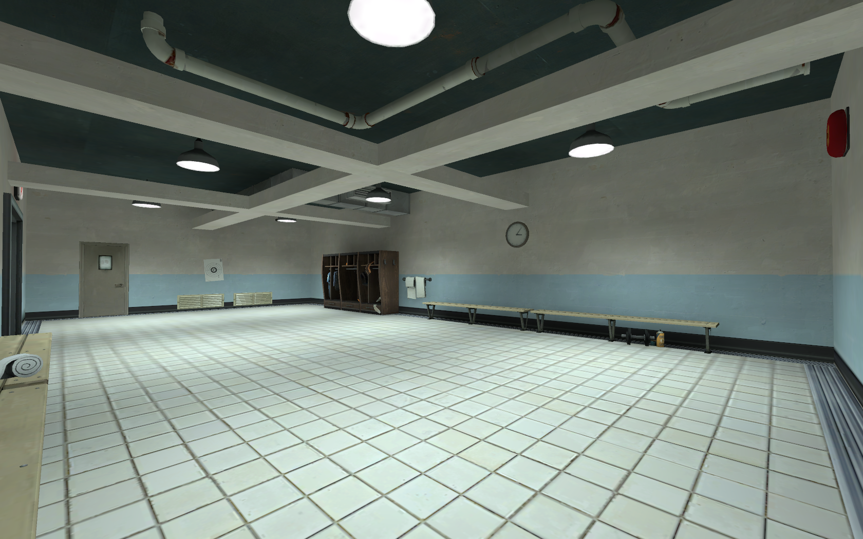
Another note which isn't that big of a deal is that the tile floor you're using is mostly used sparingly in that spawnroom theme. Or, it indicates some important area or smaller room. Larger rooms use the fainter, white tiles instead. This is just if you want to keep consistent with the other maps.
If you study the stock maps with this theme you'll probably see what I mean.
example
Last edited:
seth
aa
- May 31, 2013
- 1,021
- 852
The ceiling supports were more added for pizazz than realism. I was planning on going back and making them a bit more realistic. I was gonna have more ventwork around the spawn area, but I was having some trouble with the props, so I might not do that. As for those tiles, I think they look fine, but I see your point.Those ceiling supports are probably too thin and too far away from the ceiling. I would raise them and make them wider/thicker. Also, instead of keeping those ceiling duct props in the corner, I would make them more apparent or go for some other design which covers more of the ceiling. It's fun to have them wind around light props and such.
Another note which isn't that big of a deal is that the tile floor you're using is mostly used sparingly in that spawnroom theme. Or, it indicates some important area or smaller room. Larger rooms use the fainter, white tiles instead. This is just if you want to keep consistent with the other maps.
If you study the stock maps with this theme you'll probably see what I mean.
example
This isn't 100% done obviously, but I don't know how much I'm gonna touch any more detailing until I get to Beta


