WiP in WiP, post your screenshots!
- Thread starter Arhurt
- Start date
You are using an out of date browser. It may not display this or other websites correctly.
You should upgrade or use an alternative browser.
You should upgrade or use an alternative browser.
RataDeOrdenador
L5: Dapper Member
- Oct 12, 2015
- 230
- 105
burp
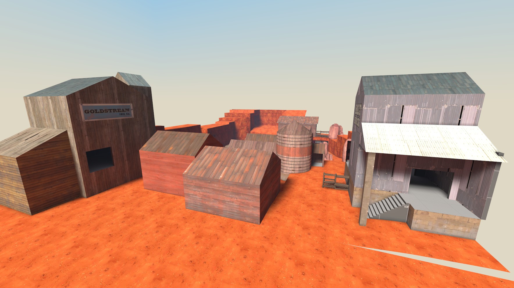
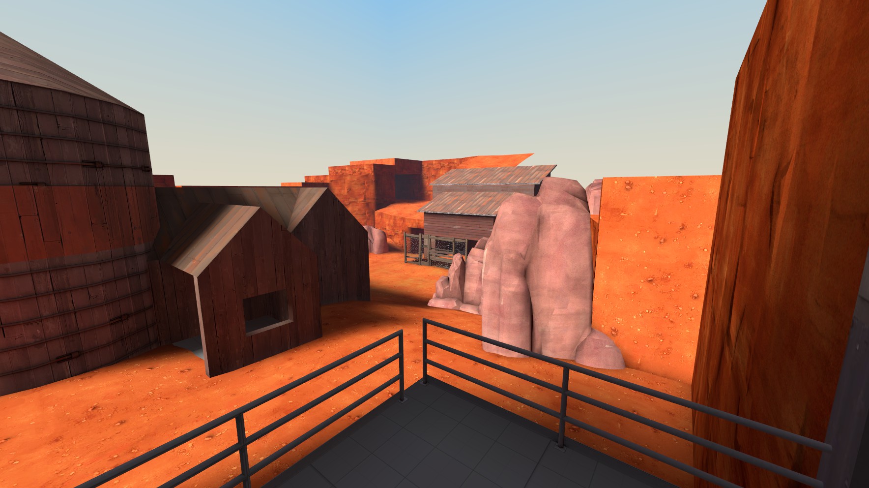
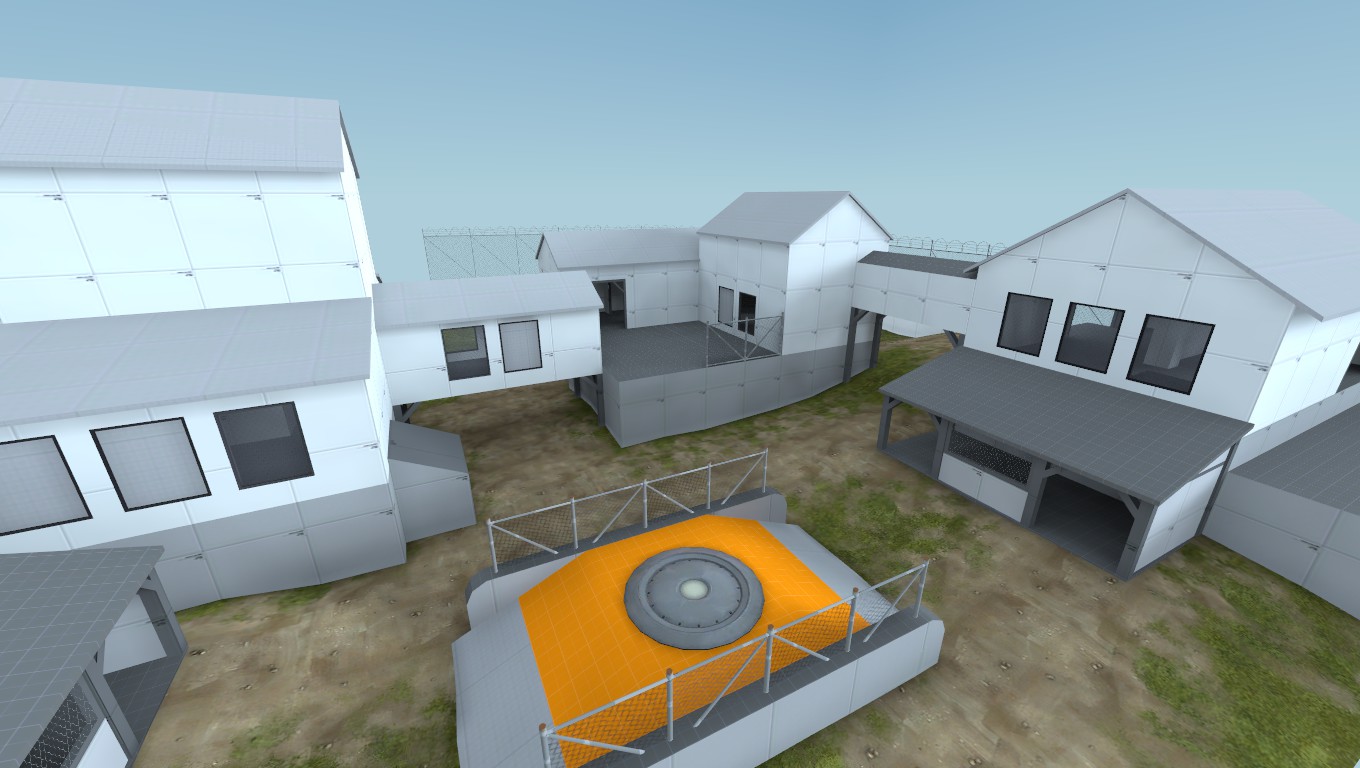
I like that orange-ish sand/rock,although it doesn't blend quite well with that white-ish wood. With the red one it fits real nice.
Anyways,it looks good. ye. ;D
seth
aa
- May 31, 2013
- 1,021
- 852
Stick that in Butterzone and give us a new version. I want to play that map again.
Yep, all clipped. I only clipped the sides of the signs though, this allows people to get on top of the shorter display cabinets by using them as steps.
Edit: Nope, light props arn't solid.
Edit: Nope, light props arn't solid.
Last edited:
Unexpectedly entering the discussion by smashing through the window, here comes your bi-annual (Valve time) report of me trying to render VMF files in JavaScript !
So, I suddenly decided to start working on that again. You know, for fun ! But, I was quickly pulled back into the dark realm of reality when I remembered just how terrible my existing code was:

(346 lines of undocumented code in a single file, yay)
Some cleanup had to be done. With a flamethrower. Then I recoded everything. I'll skip most of the uninteresting implementation details, just know that instead of a monolithic approach the code is now broken up in many small components. This makes it incredibly easy to implement things that should be easy to implement anyway, like brush entities (just add a brush component for each solid in the entity) or instances (just throw another map in the map).

As you may have noticed from the above screenshot, I also add lights in the scene corresponding to the various light entities in Source. It doesn't have the exact same look however since this is all done in realtime AND in a browser, but it makes the map look a little less flat.

Of course, it would be even better with the textures. And guess what, I've been working on it ! I wrote a simple bridge toTerabithia VTFLib and HLLib in C++. Then, when the app starts, I try to find out where the SteamApps folder is, and search for every *_dir.vpk file I can find. And load every single one. It's not actually that long, about one minute on my machine, and the process is asynchronous anyway, so it just happens in the background while the application is in use.
The only problem here is: it doesn't work in the browser. Not because of the native code, as it's actually possible to compile that to JavaScript, but running it in a sandboxed environnement would mean loading all the data through HTTP (= wait one hour while the browser downloads the entire game in memory).
Another approach would be to load the pre-exracted textures from a web server. This is something I tried (by loading all the tools textures from the Wiki page), and it works well (it's also really easy to implement, I just have to swap the texture loading module), but it also means redistributing copyrighted materials (litteraly). I'm a developper, not a lawyer, but I have enough common sense not to try it.
So for now, you can visualize your map with the textures in an Electron app, or in the browser but only as colored solids.

The UV Mapping still needs some work anyway, as well as the displacements.

(Dispinfo must be the most unpractical way to encode a tesselated plane ...)
So, I suddenly decided to start working on that again. You know, for fun ! But, I was quickly pulled back into the dark realm of reality when I remembered just how terrible my existing code was:

(346 lines of undocumented code in a single file, yay)
Some cleanup had to be done. With a flamethrower. Then I recoded everything. I'll skip most of the uninteresting implementation details, just know that instead of a monolithic approach the code is now broken up in many small components. This makes it incredibly easy to implement things that should be easy to implement anyway, like brush entities (just add a brush component for each solid in the entity) or instances (just throw another map in the map).
As you may have noticed from the above screenshot, I also add lights in the scene corresponding to the various light entities in Source. It doesn't have the exact same look however since this is all done in realtime AND in a browser, but it makes the map look a little less flat.
Of course, it would be even better with the textures. And guess what, I've been working on it ! I wrote a simple bridge to
The only problem here is: it doesn't work in the browser. Not because of the native code, as it's actually possible to compile that to JavaScript, but running it in a sandboxed environnement would mean loading all the data through HTTP (= wait one hour while the browser downloads the entire game in memory).
Another approach would be to load the pre-exracted textures from a web server. This is something I tried (by loading all the tools textures from the Wiki page), and it works well (it's also really easy to implement, I just have to swap the texture loading module), but it also means redistributing copyrighted materials (litteraly). I'm a developper, not a lawyer, but I have enough common sense not to try it.
So for now, you can visualize your map with the textures in an Electron app, or in the browser but only as colored solids.
The UV Mapping still needs some work anyway, as well as the displacements.
(Dispinfo must be the most unpractical way to encode a tesselated plane ...)
I didn't find enough different reddish wood textures without making it look boringI like that orange-ish sand/rock,although it doesn't blend quite well with that white-ish wood. With the red one it fits real nice.
Anyways,it looks good. ye. ;D
Nighttime71
L2: Junior Member
- Jan 11, 2016
- 86
- 40

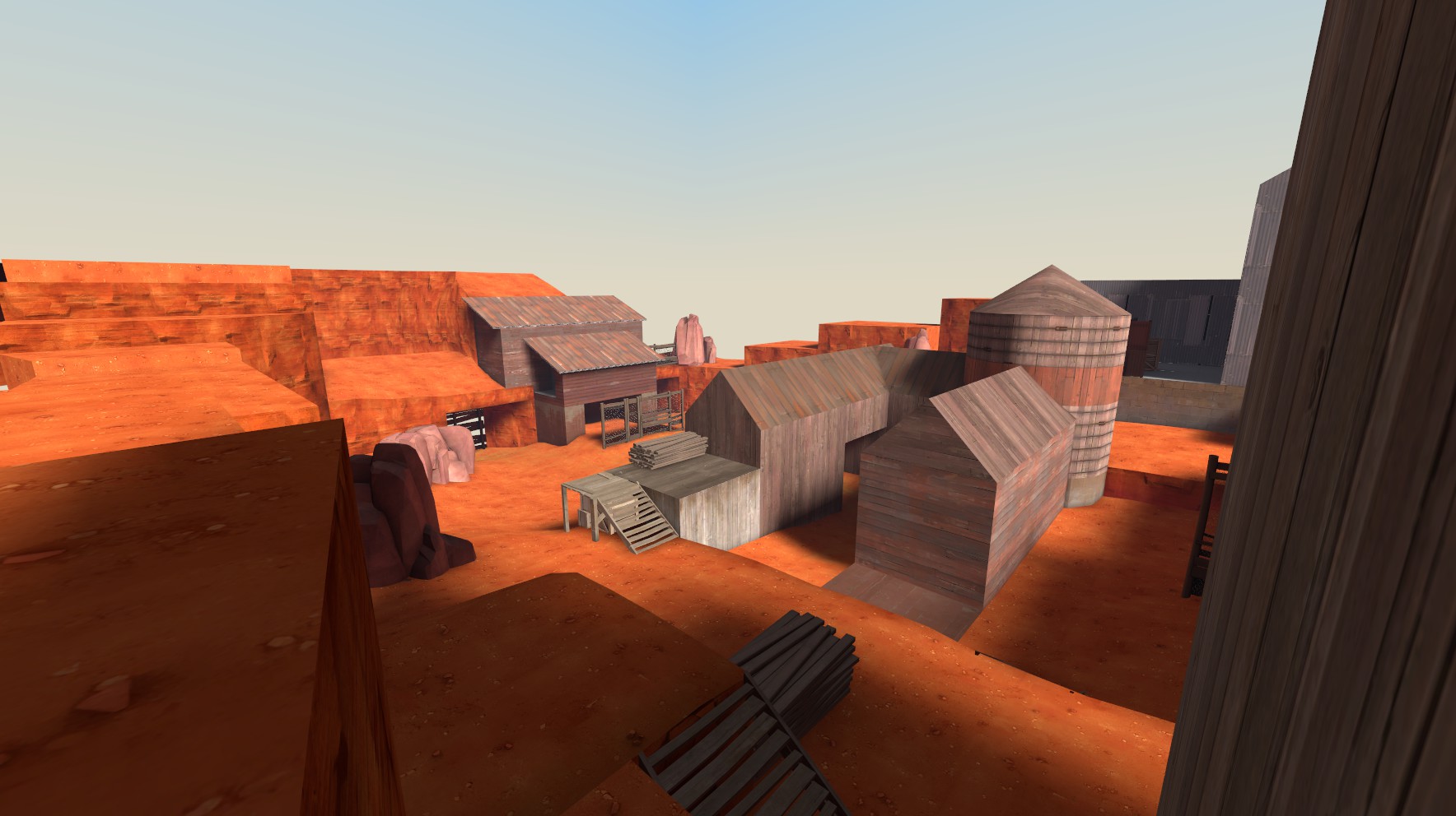
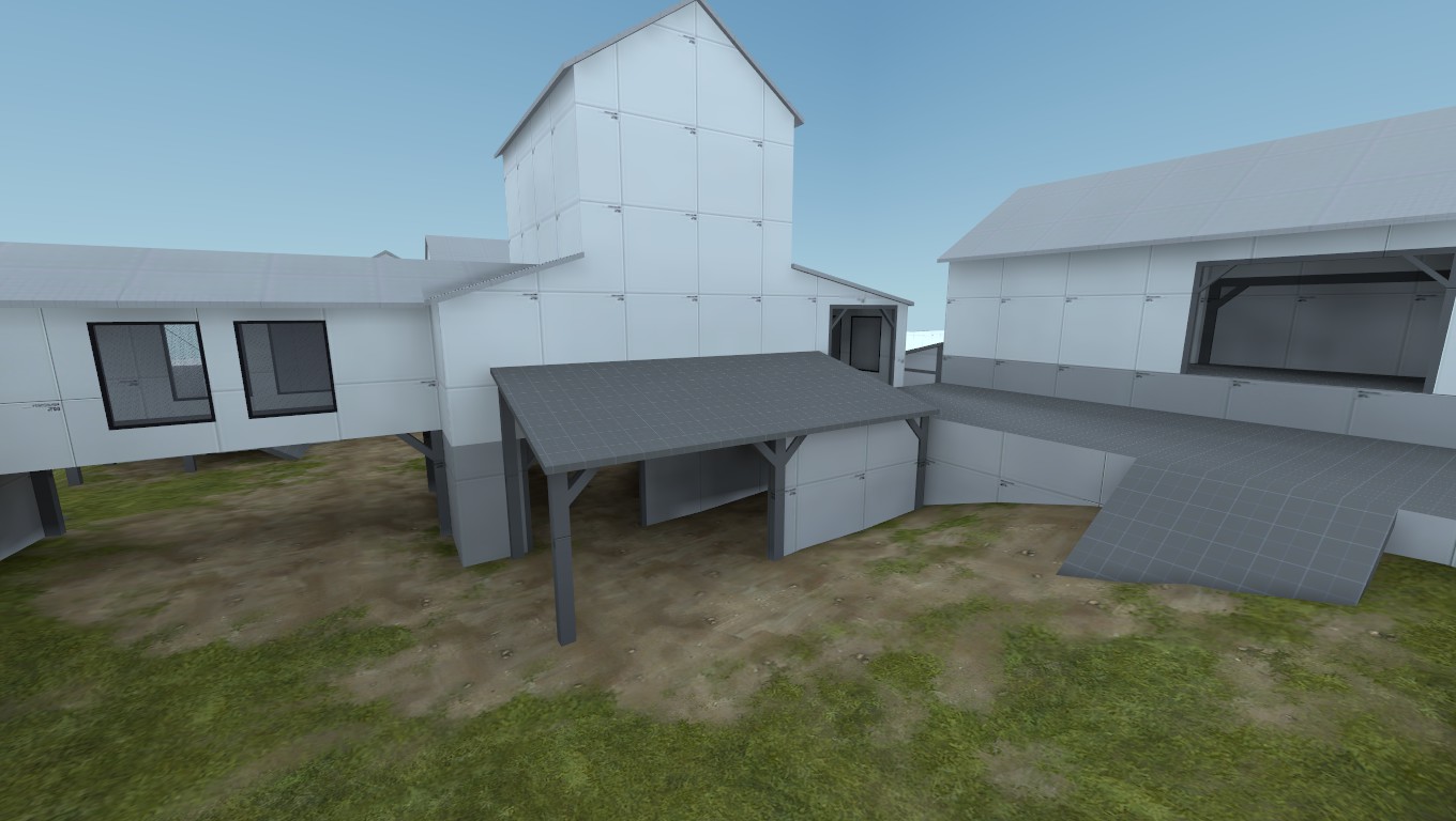
Suggestions?
A sign to warn testers of not getting a heart attack over a huge sightline.


