WiP in WiP, post your screenshots!
- Thread starter Arhurt
- Start date
You are using an out of date browser. It may not display this or other websites correctly.
You should upgrade or use an alternative browser.
You should upgrade or use an alternative browser.

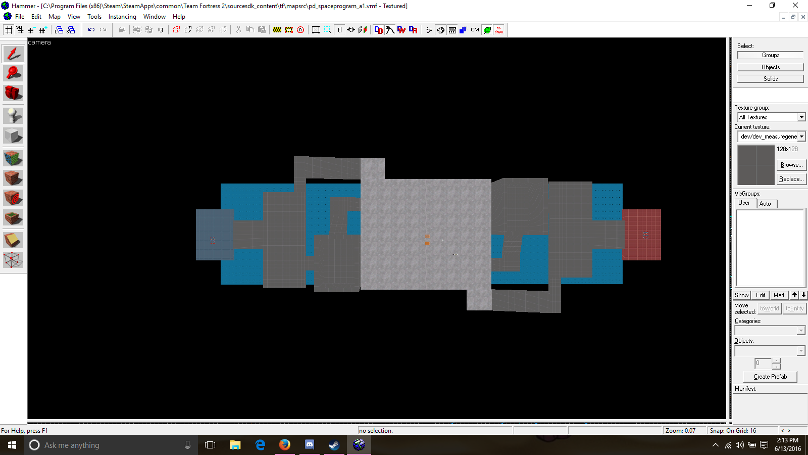
Just general layout work right now. Its hard to tell but everything past the middle moon textured area sits up higher and keeps climbing up to each spawn. Also that path that leads down out of the buildings next to the middle goes under the middle.
That grass area looks very flat and very big. Might not be a problem if it's just a courtyard outside of spawn, but ever then, it looks very large.WIP koth_woodlodge_a1
Could rework the "building to the other courtyard to the point" part

Still can't believe this thread is still alive and people still post WIP stuff, including me. ._.
Skittelz
L6: Sharp Member
- Mar 17, 2016
- 399
- 281
That grass area looks very flat and very big. Might not be a problem if it's just a courtyard outside of spawn, but ever then, it looks very large.
I copied the displacements in Viaduct and made it a little bit longer.
Skittelz
L6: Sharp Member
- Mar 17, 2016
- 399
- 281
Well, I also deleted the entire thing and and replaced it with a big brush with the exact size. Is that still a problem?decompiled displacements are definitely not a thing you want to copy, that's for sure
Don't make one large brush and then use power 4 displacements. Use smaller brushes to get a general size and shape, then use power 3 displacements on them. You'll have a lot more detail with it and you're not using power 4 displacements which can cause issues in-game.Well, I also deleted the entire thing and and replaced it with a big brush with the exact size. Is that still a problem?
Power 2 isn't very accurate on disps >256Generally you won't even need to go above power 2
Defaults arent allways the best. Installers show this in general unless you are a fan of bloatware.The default is power 3
Displacement wise its best to start at a power of 2. Its as minimalistic as possible and for that reason good. Once noticing the power 2 isnt capable of handling the requireed detail (or a random displacement bug shows up - where a non aligned displacement randomly would match a part of the power 3 displacement, but not on the power 2 - and suddenly projectiles go through the floor), only then should you go for power 3.
Also, if your disps go above 256 it can be 2 reasons: the path is too wide, or again it doesnt handle bumpyness.
Keep in mind that for a pathway 1024HU long you could use 2 power 3 displacements (efectivly mimicing 8 power 2), or 6 power 2 displacements for a somewhat similar effect. Yes, its slightly less detail, but thats exactly what the power 2 could be used for. And in this case, if a specific section would require additional detail, you might have gone for the power 4 on the left example, but for the right one a single power 3 might do well enough aswel.
The numbers on the image say how many spots can be edited on each side to explain the density a bit, the left example has 16 verticaly, and 8 horizontal, the right has 12 vertical and 8 horizontal.
Although for optimizing it isnt ideal, this situation allows adding detail later on much easier as its just clicking it up 1 power. And its very unlikely you would ever reach a power 4 that way.
The rest was, but its allways good to remind people of these things when they arent aware of the sarcastic part. As i know many use power 3 as a default (and its not incorrect to do, but if you do it you should at least be able to explain why, and 'i find it very hard to work with power 2' is valid on that).Thanks for the tips on displacements! Though my post was actually sarcastic


