WiP in WiP, post your screenshots!
- Thread starter Arhurt
- Start date
You are using an out of date browser. It may not display this or other websites correctly.
You should upgrade or use an alternative browser.
You should upgrade or use an alternative browser.
nightwatch
aa
- Sep 7, 2012
- 638
- 501
wip red spawn on pass_cuisine:
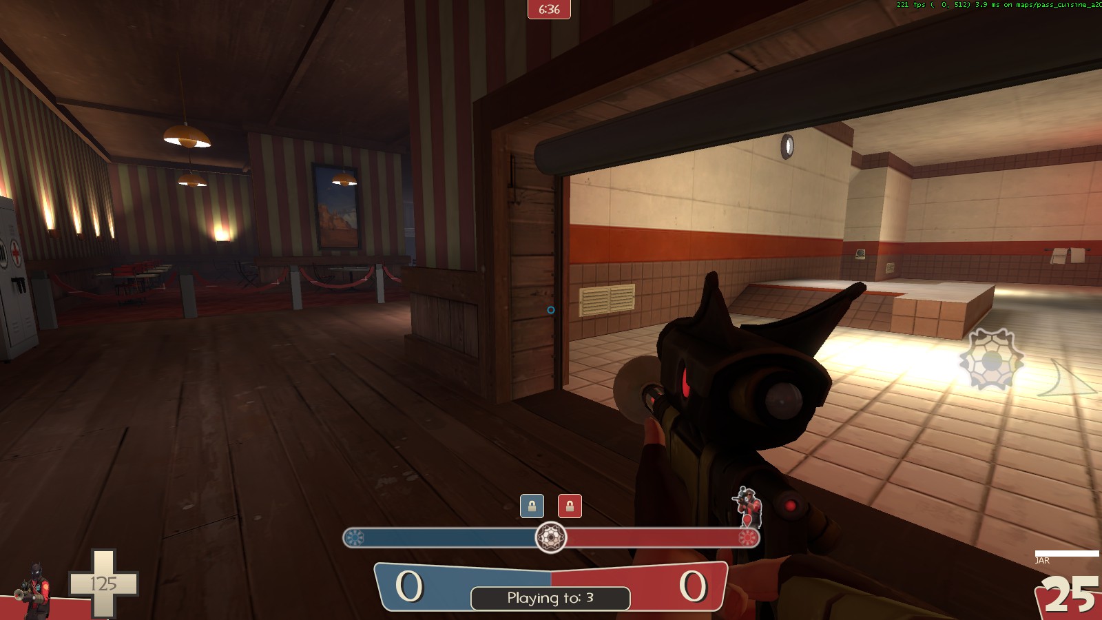
red is 'Red Ribeye' and blue is 'Blue Bass'. haven't started blue yet, but it's next. Still don't quite know what all the outside-of-spawn area will be. I was thinking kitchen, and I just remembered there is a sink prop in 2fort.
I can't help thinking that a few more wallpaper textures would be a great addition to the current library of non-industrial assets in the game. While your scene does look quite nice, my familiarity with the wall textures puts me off because of how memorable they are.
But you are standing at the exit, so surely you would want there to be bright to attract people to it
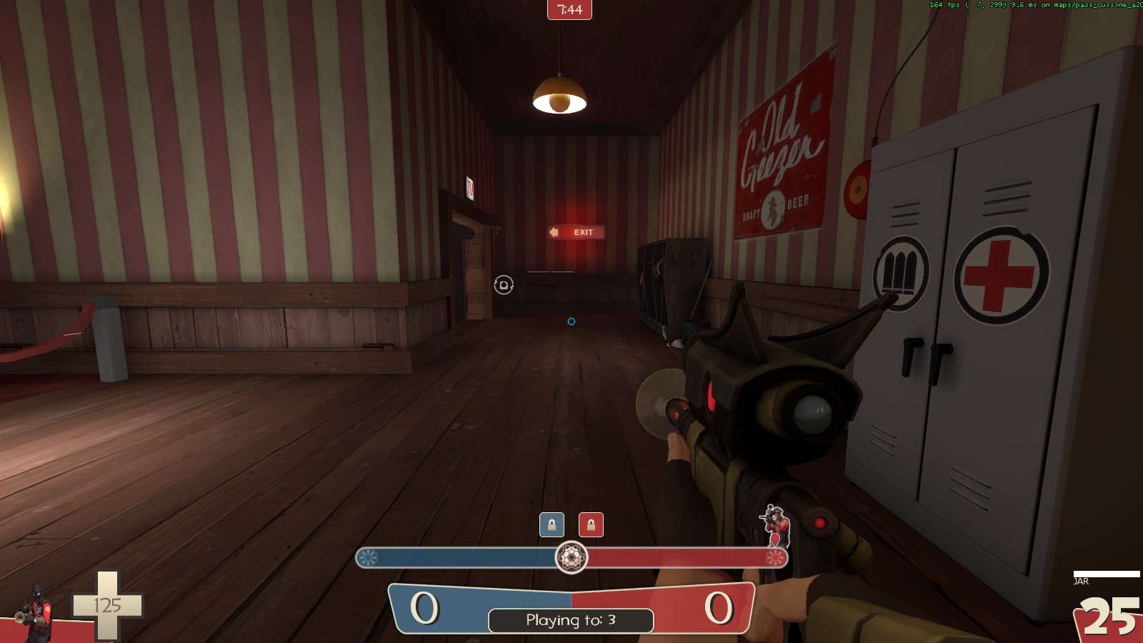
I can't help thinking that a few more wallpaper textures would be a great addition to the current library of non-industrial assets in the game. While your scene does look quite nice, my familiarity with the wall textures puts me off because of how memorable they are.
I can experiment with using the $color vmt params; I think it looks okay at the moment, but I'll keep it in mind.
Koth_Fourth is a bit of a mouthful but Koth_Horizon seems a bit over dramatic. Oh well, I'll sleep on it.
Bot tests bore ill tidings for this map's state. I'm getting the feeling it is too narrow and constricting but we won't know until we test it will we. As long as I'm worrying about things it's probably too small as well
I tried to round off every corner but the Interlopers Compile Log courteously informed me if I continued to do that the game would hard crash on load so that's cool.
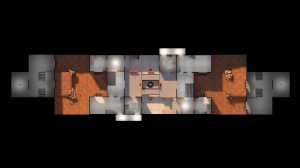
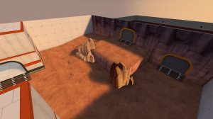
Am I expecting too much from a map I spent eleven days on? I don't know, I guess I'm afraid the map will be unredeemable and it takes me two months to see that. Fuck! It's Friday night! Happy times! Look! Here's a thing wot I did, yay!
Bot tests bore ill tidings for this map's state. I'm getting the feeling it is too narrow and constricting but we won't know until we test it will we. As long as I'm worrying about things it's probably too small as well
I tried to round off every corner but the Interlopers Compile Log courteously informed me if I continued to do that the game would hard crash on load so that's cool.


Am I expecting too much from a map I spent eleven days on? I don't know, I guess I'm afraid the map will be unredeemable and it takes me two months to see that. Fuck! It's Friday night! Happy times! Look! Here's a thing wot I did, yay!
Koth_Fourth is a bit of a mouthful but Koth_Horizon seems a bit over dramatic. Oh well, I'll sleep on it.
Bot tests bore ill tidings for this map's state. I'm getting the feeling it is too narrow and constricting but we won't know until we test it will we. As long as I'm worrying about things it's probably too small as well
I tried to round off every corner but the Interlopers Compile Log courteously informed me if I continued to do that the game would hard crash on load so that's cool.


Am I expecting too much from a map I spent eleven days on? I don't know, I guess I'm afraid the map will be unredeemable and it takes me two months to see that. Fuck! It's Friday night! Happy times! Look! Here's a thing wot I did, yay!
Is that an ultiduo map? If not convert it, it could totally work!
Does it allow you to paint lightmaps?Experimenting with microbrush lighting
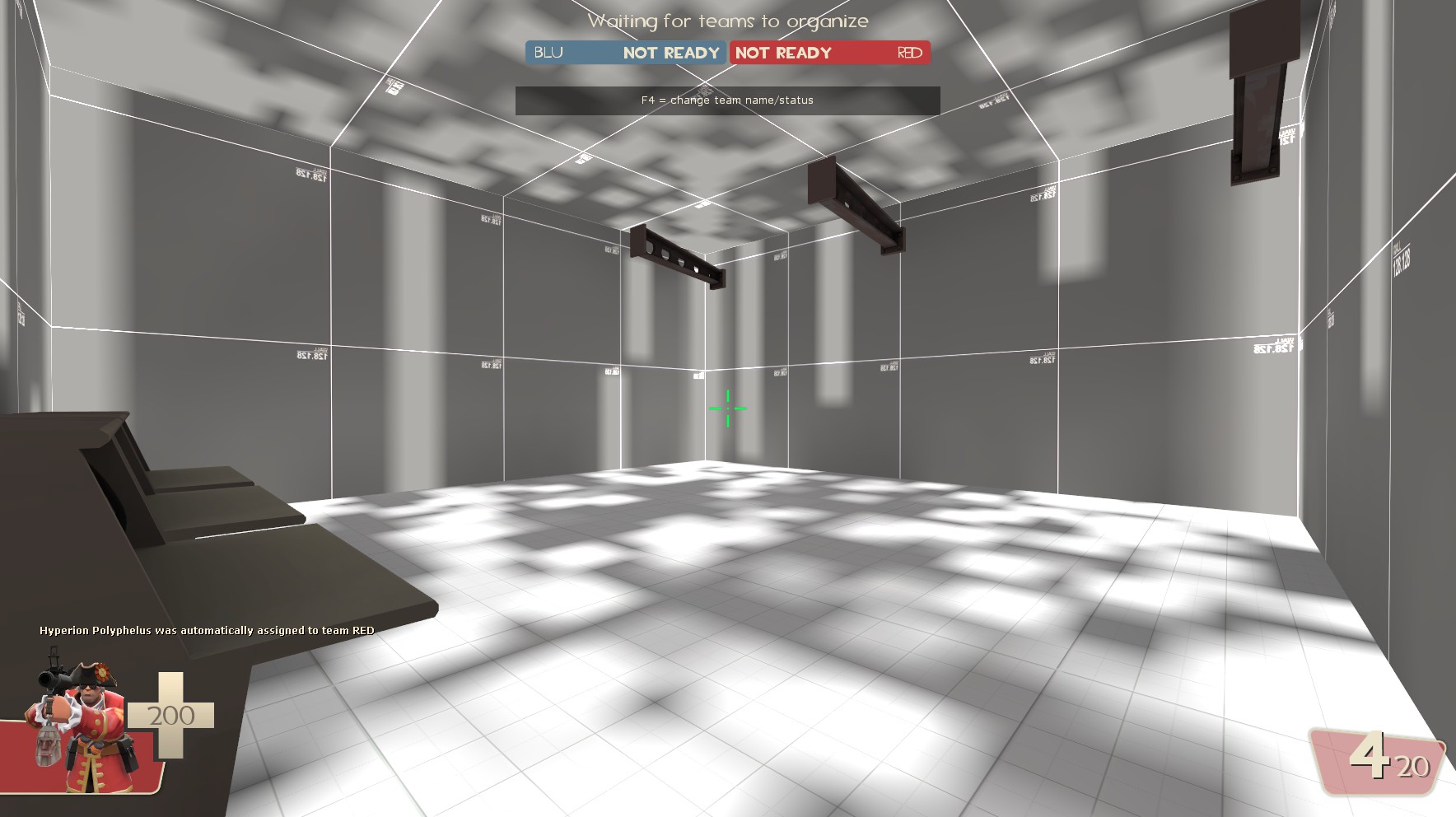
The skybox for MvM giza

And how it looks in the map

Definitely nice to see themes utilizing other color palettes through lighting, sorta how Sawmill and Thunder Mountain are both still Alpine themed but look so different from Lumberyard. It's refreshing!
Definitely nice to see themes utilizing other color palettes through lighting, sorta how Sawmill and Thunder Mountain are both still Alpine themed but look so different from Lumberyard. It's refreshing!
If there's anything I've learned about detailing in my two years here: lighting sells the level.
@UKCS-Alias, all that lighting tweaking you've done sure is paying off. You're making me want to do a sunset map.
wip red spawn on pass_cuisine:

red is 'Red Ribeye' and blue is 'Blue Bass'. haven't started blue yet, but it's next. Still don't quite know what all the outside-of-spawn area will be. I was thinking kitchen, and I just remembered there is a sink prop in 2fort.
Funnily enough, I was going to do a dueling restaurants theme for last year's Summer 72-Hour Contest. "RED-Staurant" vs "BLU Portside Diner..." you've certainly chosen cleverer names.
Last edited:
The light setting is somewhat done, the diffirences you mostly notice are the colors for fog. Depending on the direction you look the fog changes color. 1 color is facing the sun and is matching the skybox color in such way you can still see the pyramid shapes well. The other color is for facing away and again was ment to blend in with the background, that color is atm still not the way i want it to be (although its not ugly at least). but again, it uses a color from the skybox and more specificly its clouds. the pyramid in the map itself blends well with it, but the distant sand does not.If there's anything I've learned about detailing in my two years here: lighting sells the level.
@UKCS-Alias, all that lighting tweaking you've done sure is paying off. You're making me want to do a sunset map.
There's actually a keyvalue for env_fog_controller called "Secondary fog color". Combined with the angle settings and enabling fog blend, it allows for blending between fog colors automaticly depending on which direction the player is looking. You don't have to change the fog color through inputs.I knew that you could change fog dynamically but never knew that you could do it based on where the player is looking. Super neat!


