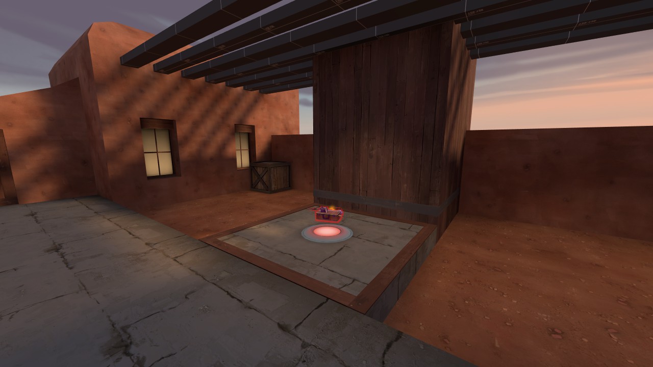
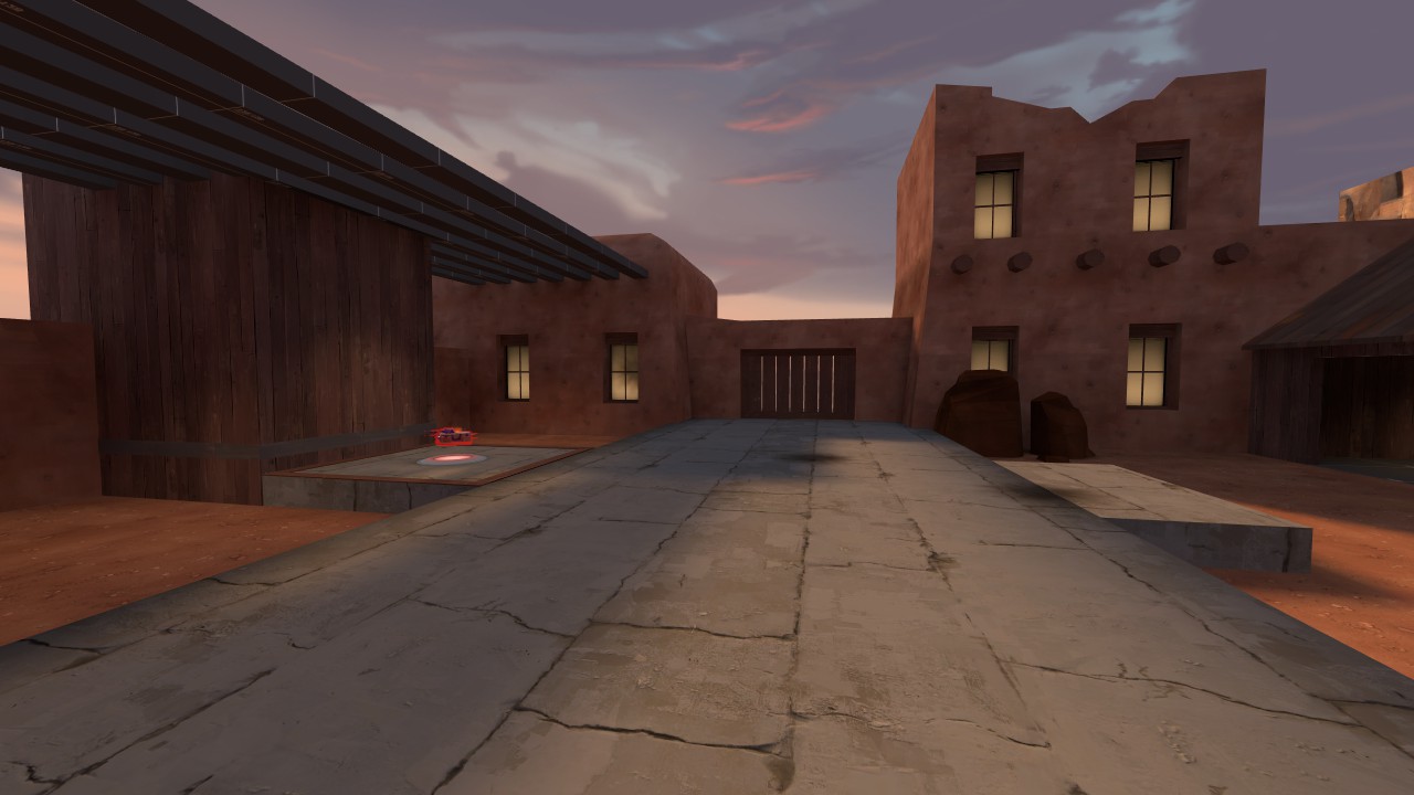
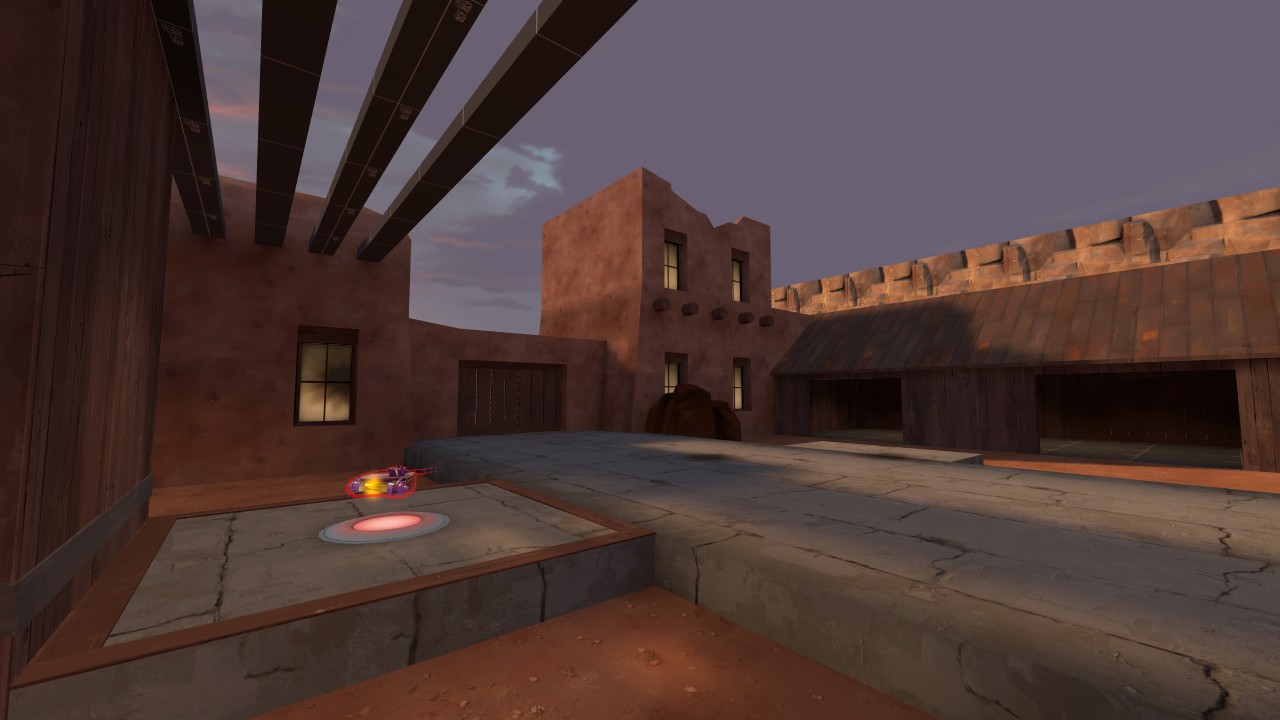
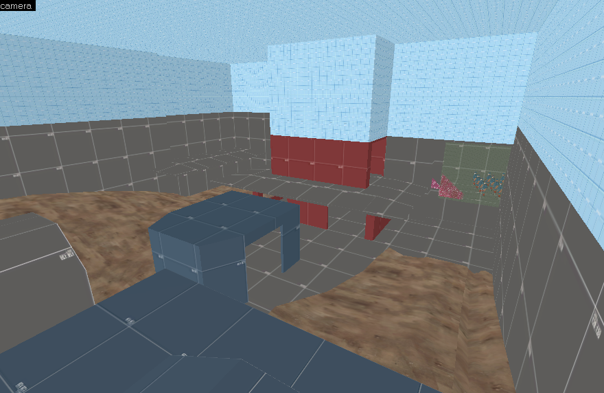
WiP in WiP, post your screenshots!

Izotope

Sourcerer
aa
May 13, 2013
698
764

EArkham

Necromancer
aa
Aug 14, 2009
1,625
2,774
I've still got the zip with the models as it turns out. I'm not friends with ChemicalAlia, but I've posted a comment on her profile asking if she'll let me repost them.
 

Idolon

they/them
aa
Feb 7, 2008
2,123
6,137
kdV5sPc.jpg

Think about how your utilities are integrating into the material. To install a manhole where you've put it, you would have to individually cut the circle into each stone of the floor. To ease construction, the circle would probably be cut into a single, larger block of stone (or concrete, which is a surprisingly old building material). (EDIT: As it turns out, this actually does happen! However, small bricks like this are easier to cut on-site than large stones.)

The metal fusebox would also be difficult to attach to a stone wall as you have it now. Metal is typically attached to things via welding (I doubt you can weld stuff to stone) or with bolts (difficult to integrate into stone, although I imagine that it's entirely possible, especially if you line the bolts up with the mortar between each masonry unit).

Judging by the garage sign, I'm assuming this little alcove is for parking a car. In that case, the floor here should probably be much more solid. Things made of a lot of pieces (i.e. almost any kind of masonry), regardless of how well they're attached together, aren't great at resisting large loads over an extended period of time. (See the EDIT picture again, and note how much the ground has fallen apart. This is a pedestrian-only area, too!)

While you could "solve" this by making the floor concrete, I would suggest reprogramming the space - that is, remove the garage sign. This space appears to be a public walkway (which would make a lot of sense, since it provides shade in an otherwise miserably hot climate), and could also function as the entry to the building's private space above.

This is a relatively in-depth analysis of what you're making as just an SFM setpiece, but anything is worth considering if it means learning more. Don't feel pressured to solve every flaw you find; what matters most is just being aware.
 
Last edited:

Pocket

Half a Lambert is better than one.
aa
Nov 14, 2009
4,701
2,583
If the original download had a thread, wouldn't it still be possible for an admin to just add the ZIP file and convert it to a working download post?
 

killohurtz

Distinction in Applied Carving
aa
Feb 22, 2014
1,016
1,277
I feel that this is a special case because the assets were never given a proper download thread on the old site. It would be best to ask permission before creating a new download that didn't exist before.
 

The Siphon

L6: Sharp Member
Mar 2, 2015
278
190
Judging by the garage sign, I'm assuming this little alcove is for parking a car. In that case, the floor here should probably be much more solid. Things made of a lot of pieces (i.e. almost any kind of masonry), regardless of how well they're attached together, aren't great at resisting large loads over an extended period of time. (See the EDIT picture again, and note how much the ground has fallen apart. This is a pedestrian-only area, too!)

While you could "solve" this by making the floor concrete, I would suggest reprogramming the space - that is, remove the garage sign. This space appears to be a public walkway (which would make a lot of sense, since it provides shade in an otherwise miserably hot climate), and could also function as the entry to the building's private space above.

This is a relatively in-depth analysis of what you're making as just an SFM setpiece, but anything is worth considering if it means learning more. Don't feel pressured to solve every flaw you find; what matters most is just being aware.

Thank you. The tunnel under the building is supposed to be a passage route. Not really a car area since its not big and two cars would not fit there. The area in general is supposed to be a park. in middle of the city. I will add more to that tunnel later. Its supposed to be bit like this from de_dust.
vtSDjRd.jpg
 

iiboharz

eternally tired
aa
Nov 5, 2014
858
1,292
Some detailing of Blu respawn.


-snip-

Looks like you don't have a tonemap controller (or if you do have one, its settings are outta wack), I'd suggest implementing one. Even ripping the setup from 2fort would be good enough. You need a logic_auto to drive it, however, but with some quick research you can probably figure it out.
 

Fantaboi

Gone and one day forgotten
aa
Mar 11, 2013
892
1,050
May not be the easiest stuff to get an impression from eyeballing, but did some cp_Dame work.

New spawn area:
eWIP3l0.png


New connector for 2nd spawn to the control point area.
biyeeBZ.png


Revitalizing other areas is definitely taking some time, but hopefully should be able to get a new version for testing eventually.
 

Vel0city

func_fish
aa
Dec 6, 2014
1,947
1,589
For the 2016 detailing contest. I have a bad feeling, I will loose.

qjr7AMu.jpg

jioSh75.jpg
rbLVQa4.jpg
Mate, that looks fokn awesome. It fits TF2 brilliantly.

I do see a lot of blue reflections though. Give your cubemaps a visit, and see if the models are taking the proper cubemap. Another thing: be consistent with your lamp models. I see floor lights and fluorescent lights on the same ceiling.