WiP in WiP, post your screenshots!
- Thread starter Arhurt
- Start date
You are using an out of date browser. It may not display this or other websites correctly.
You should upgrade or use an alternative browser.
You should upgrade or use an alternative browser.
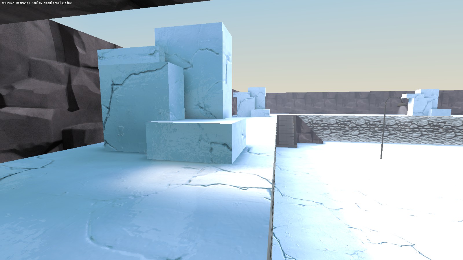
Now we need a clear ice texture that refracts the underlying surface in real-time and add a func_fish_pool under it.
Refraction only works with func_brush, which would mean bouncy stickies.
Does it have normal maps?
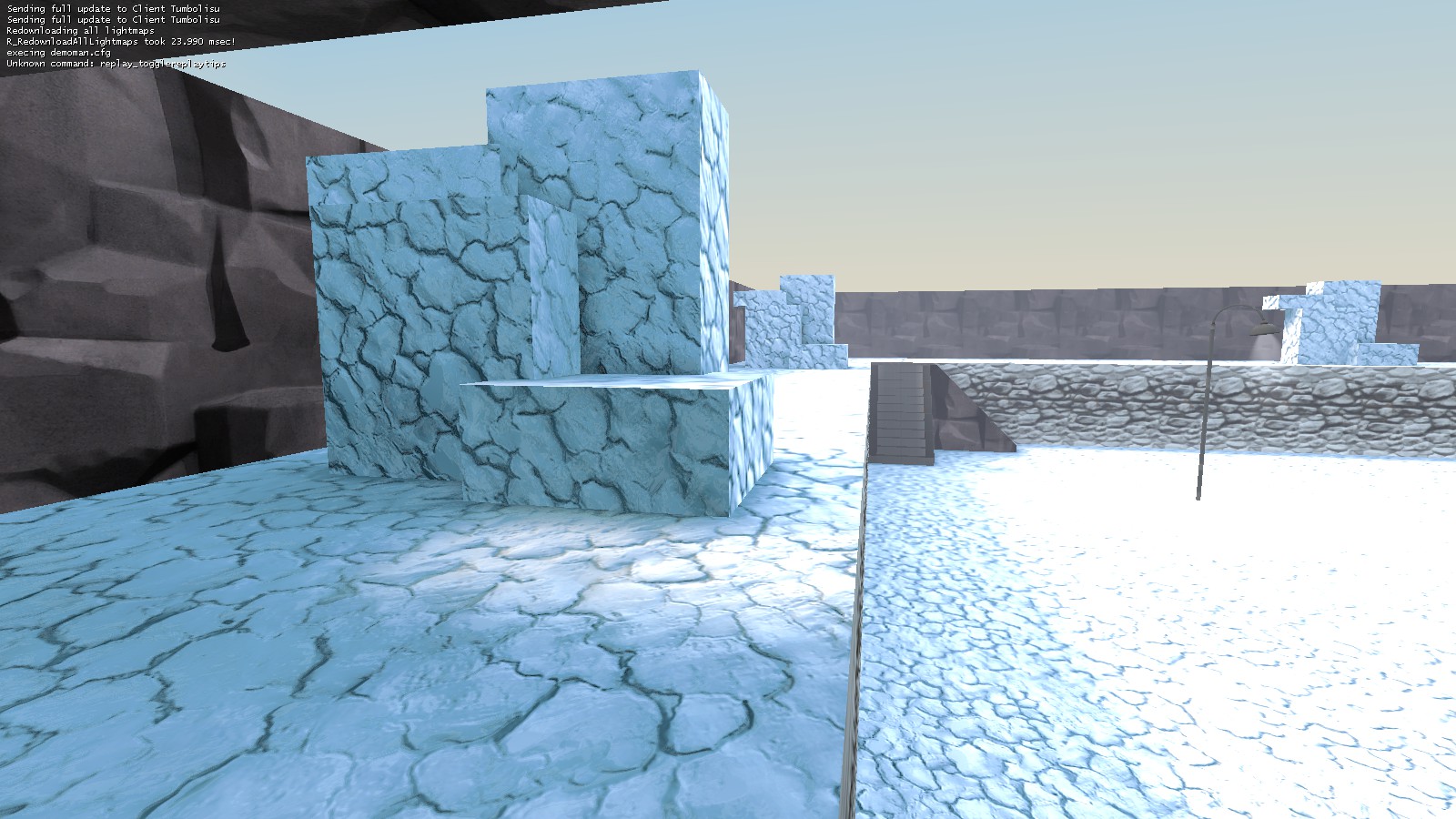
This is snow texture + cubemap + ssbump.
None of these things are custom made. All ingame already.
tehOMGfather
L1: Registered
- Nov 15, 2009
- 27
- 3
is this crumbly?
Hahaha, possibly too crumbly.
That image sans the cracks is kind of what I had imagined, that kind of snowy ice that's tightly packed but still reflective. Not quite snow, yet not quite solid ice so it has that somewhat uniform semi-gloss texture to it.
- Dec 15, 2013
- 535
- 803
Refraction only works with func_brush, which would mean bouncy stickies.
It... doesn't...
I had a real-time refraction texture on my map for the 2014 Detail contest (the elevator doors behind the spawn position). Those things weren't even func_detail'd. Just world brushes.
- Aug 6, 2014
- 1,056
- 536
- Mar 6, 2013
- 1,044
- 627
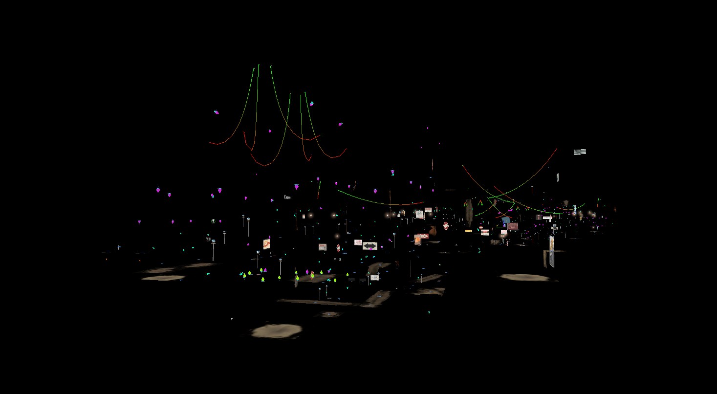
It's cp_glassworks, the chandelier looking ropes in the foreground are around the doomsday devices above last.
I was hoping it was a Wubwubwub sequel that was completely pitchblack except for neon lights around.
Just finished making some extremely-clean sign textures for the Arctic Theme Pack:
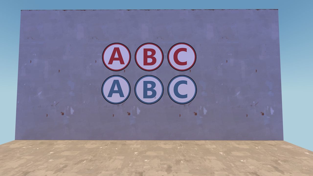
I imagine this delves into more of the spytech side of the theme. I might make more to designate the payload, as well as some arrows. Enjoy (I stuck to the palette this time)!
Oh, and a special thanks to Crash for this wonderful tutorial!

I imagine this delves into more of the spytech side of the theme. I might make more to designate the payload, as well as some arrows. Enjoy (I stuck to the palette this time)!
Oh, and a special thanks to Crash for this wonderful tutorial!
Last edited:
- Mar 6, 2013
- 1,044
- 627
Just finished making some extremely-clean sign textures for the Arctic Theme Pack:

I imagine this delves into more of the spytech side of the theme. I might make more to designate the payload, as well as some arrows. Enjoy (I stuck to the palette this time)!
Oh, and a special thanks to Crash for this wonderful tutorial!
I'm liking the contrasts, but I feel like they could use something else. I'm not sure what, though. Maybe more worn?
I like these! I'm not sure about the thin black outline they have - those looks a little strange to me. But I can definitely imagine these in an arctic setting.Just finished making some extremely-clean sign textures for the Arctic Theme Pack:

I imagine this delves into more of the spytech side of the theme. I might make more to designate the payload, as well as some arrows. Enjoy (I stuck to the palette this time)!
Oh, and a special thanks to Crash for this wonderful tutorial!
I see where you get that from, as many of the similar stock signs are worn. Still, I don't think I'll be applying that technique here, as I wanted to give a viable option to flesh out clean, sterile environments in maps. The wall texture might've not been the best choice to convey this...I'm liking the contrasts, but I feel like they could use something else. I'm not sure what, though. Maybe more worn?
I think that rescaling the overlay would help, and I can see the texture being used as the 'defining sign' of a capture point (the large sign right above or to the side of the designated area).I like these! I'm not sure about the thin black outline they have - those looks a little strange to me. But I can definitely imagine these in an arctic setting.
Thanks to both for the feedback. I might personally use these textures in a map of my own, and then we'd be able to truly get a grasp of how they would look and function in a gameplay space.
Here's a quick update on the status of the spray paint can:
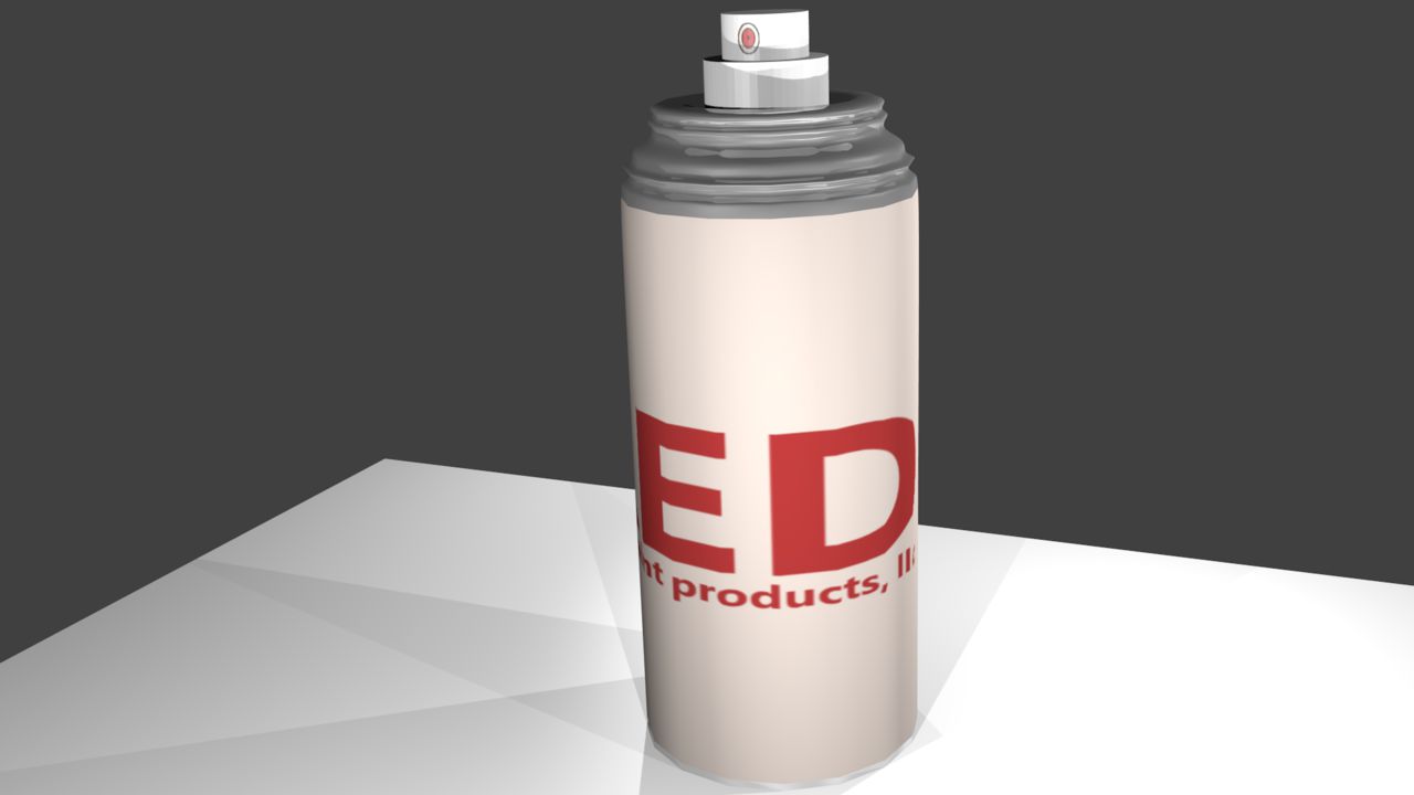
Next up would probably be to add some wear-and-tear to the label. And remember, this in actuality should be pretty small (just like a real-life paint can!)
Last edited:


