WiP in WiP, post your screenshots!

Kube

Not the correct way to make lasagna
aa
Aug 31, 2014
1,342
1,850
I'm starting to make assets for the Arctic Pack.

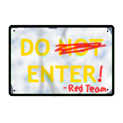
Here's an unfinished sign texture:
sign1_temp.png

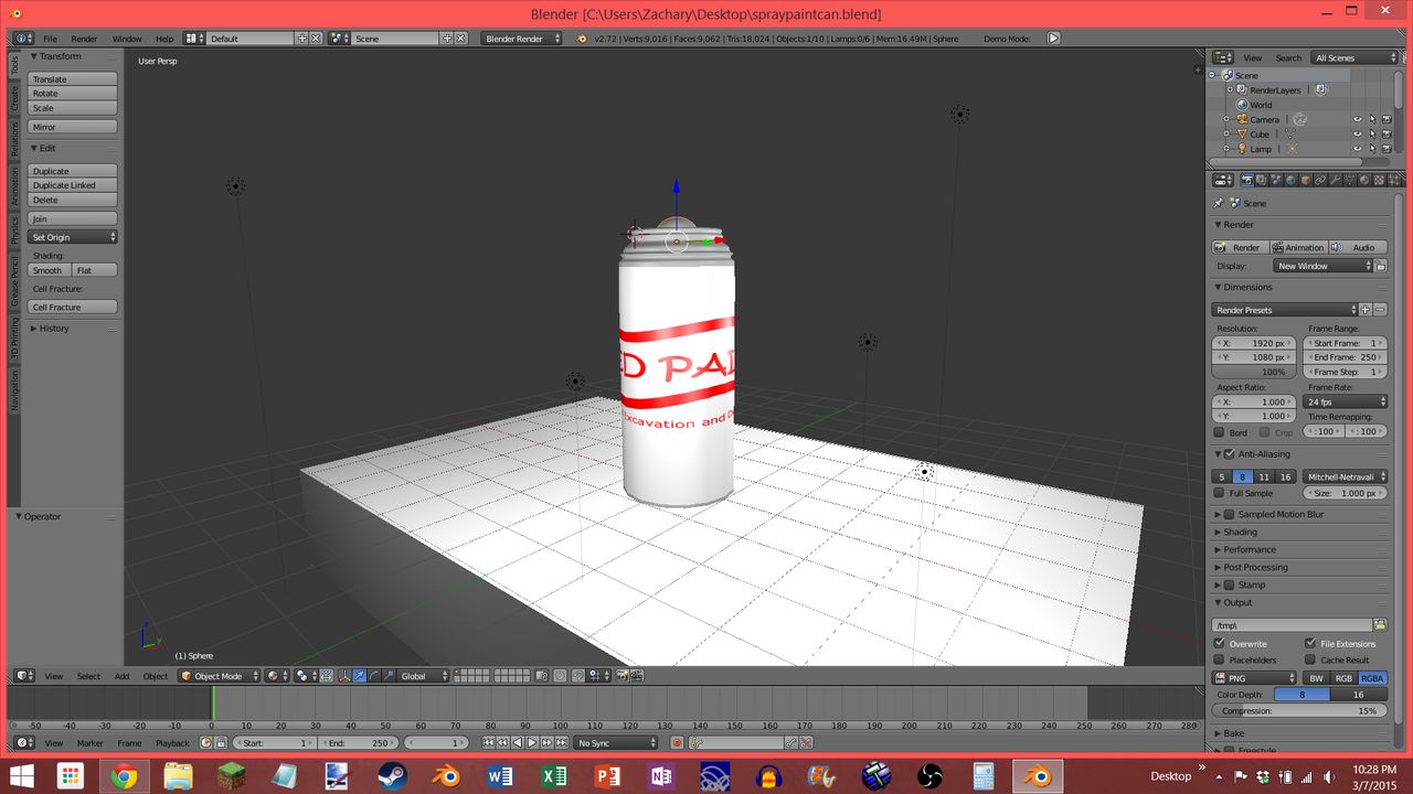
It looks a bit funky at the moment, especially with how large it is in the post. I'm also working on a spraypaint can to go along with it (note- this is even more unfinished!):
Untitled.png


I would highly appreciate a bit of feedback on this work (even in their unfinished states), including changes that I should make. For those of you wondering, I use paint.net as my primary image editing and creation tool, which is certainly not a bad choice for the 'normal stuff', but here, I have to play around with the effects a bit to get everything 'just right' (for example, the spraypaint over the sign is made using the Paintbrush tool, with a Fragment Blur, and on a Glow effect layer). I'm using Blender for the spraypaint can.

I hope to work on more stuff like this in the future, and I'm very happy to have a great opportunity to expand my skill like this!
 
Last edited:

Berry

resident homo
aa
Dec 27, 2012
1,056
1,898
I'm starting to make assets for the Arctic Pack.

Here's an unfinished sign texture:
sign1_temp.png

It looks a bit funky at the moment, especially with how large it is in the post. I'm also working on a spraypaint can to go along with it (note- this is even more unfinished!):
Untitled.png

I would highly appreciate a bit of feedback on this work (even in their unfinished states), including changes that I should make. For those of you wondering, I use paint.net as my primary image editing and creation tool, which is certainly not a bad choice for the 'normal stuff', but here, I have to play around with the effects a bit to get everything 'just right' (for example, the spraypaint over the sign is made using the Paintbrush tool, with a Fragment Blur, and on a Glow effect layer). I'm using Blender for the spraypaint can.

I hope to work on more stuff like this in the future, and I'm very happy to have a great opportunity to expand my skill like this!

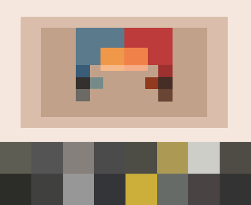
Those colours are going to look absolutely gross and incredibly contrasting & out of place in game, make sure you stick with the TF2 palette:
palette.jpeg
 

Kube

Not the correct way to make lasagna
aa
Aug 31, 2014
1,342
1,850
Those colours are going to look absolutely gross and incredibly contrasting & out of place in game, make sure you stick with the TF2 palette:

palette.jpeg

Certainly noted. I'm going to do some color corrections to try and get those yellows and reds in the sign to match the palette. As for the spraypaint can, that texture is just temporary (I pretty much threw it together!), and I'll change it with some gray accents and possibly some contrasts, as well. I kept the palette open when I first started making the sign but closed it soon afterwards, as to me, the off-tone-ness didn't look quite right. My mistake :p

Before I release these assets, I'm going to throw them into some different lighting environments, just to see how they fare, and to make any last-minute changes.

And while we're on the subject, are there any specific filters/techniques anyone would recommend to help the sign fit the TF2 style and its palette, other than starting with it from the beginning? I'm always looking for help in some way.

May the force be with you, Berry!
 
Last edited:

killohurtz

Distinction in Applied Carving
aa
Feb 22, 2014
1,016
1,277
You can just use a a lightwarptexture for the blue. That means, well lit parts stay white and dark areas become blue.
https://www.dropbox.com/s/opqh3c7lj7ahe50/lightwarp_ice01.7z?dl=0
Try this one. "$lightwarptexture" "[path to the vtf]"
If you want to change it, make sure to use the same flags and compression format.
Clamp S, Clamp T, RGB888

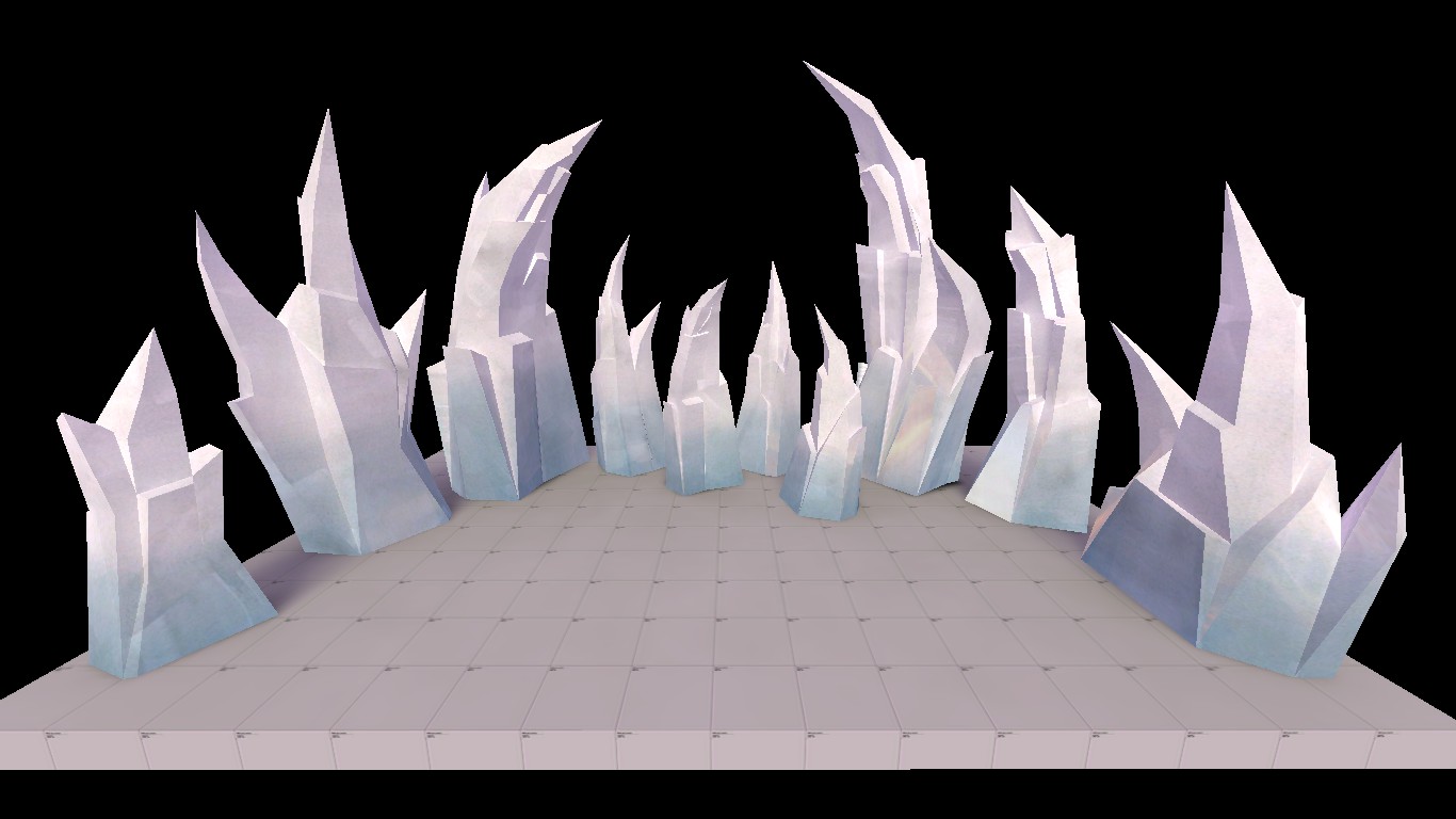
I actually worked on them a bit more yesterday - I took Crash's suggestion and muted the colors, and also threw on a specular map so only the bluish part of the model is reflective. Here's what they look like now:
VnjgZUu.jpg


I'll still try your lightwarp texture though, and see if it looks any better :thumbup:
 

Vel0city

func_fish
aa
Dec 6, 2014
1,947
1,589
I actually worked on them a bit more yesterday - I took Crash's suggestion and muted the colors, and also threw on a specular map so only the bluish part of the model is reflective. Here's what they look like now:
VnjgZUu.jpg


I'll still try your lightwarp texture though, and see if it looks any better :thumbup:

This already looks great.
 

Bull

L4: Comfortable Member
Aug 30, 2011
193
144
I actually worked on them a bit more yesterday - I took Crash's suggestion and muted the colors, and also threw on a specular map so only the bluish part of the model is reflective. Here's what they look like now

I'll still try your lightwarp texture though, and see if it looks any better :thumbup:

That's amazing.
 

Muddy

Muddy
aa
Sep 5, 2014
2,581
4,597
I actually worked on them a bit more yesterday - I took Crash's suggestion and muted the colors, and also threw on a specular map so only the bluish part of the model is reflective. Here's what they look like now:
VnjgZUu.jpg


I'll still try your lightwarp texture though, and see if it looks any better :thumbup:
Noice.

no pun intended
 

Tumby

aa
May 12, 2013
1,087
1,196
0A197FA204070B1474C35889171351FB87A21B2C

C0BED818CEF1B192C0DA58497308B617CAC5B4CF


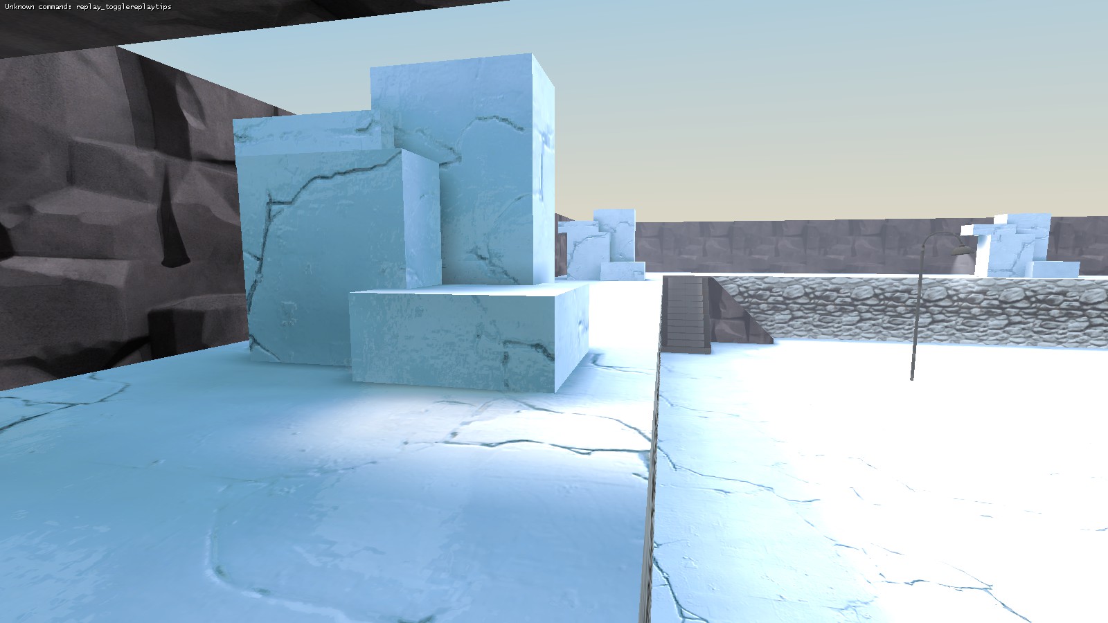
What do you think?

EDIT:

IT'S ABOUT THE MATERIAL, GUYS!

Code:
"LightmappedGeneric"
{
	"$basetexture" "Nature/snow_full001"
	"$surfaceprop" "ice"
	"$lightwarptexture" "lightwarp_ice01"
	"$reflectivity" "[.4 .45 .45]"
	"$envmap" "cubemaps/cubemap_shapes002"
	"$envmaptint" "[.085 .088 .091]"
	"%keywords" "tf,custom,arctic"
}

lightwarp_ice01
9584c5dce8.png
 
Last edited:

UKCS-Alias

Mann vs Machine... or... Mapper vs Meta?
aa
Sep 8, 2008
1,264
817
The parts are neatly apart from each other making it look a bit fake. Try to vary in the distances they are apart from each other. Generaly close to the solid ice part (or the center) the gaps are smaller as there is less room for movement. only near the edge it can spread quite far. And since we only see 1 section we cant realy tell from which side it is and how far the broken ice goes.
 

Tumby

aa
May 12, 2013
1,087
1,196
And again, people complaining about the geometry. And nothing but the geometry.
Maybe I should add in very big letters:

IT'S ABOUT THE MATERIAL, GUYS!
 

Tumby

aa
May 12, 2013
1,087
1,196
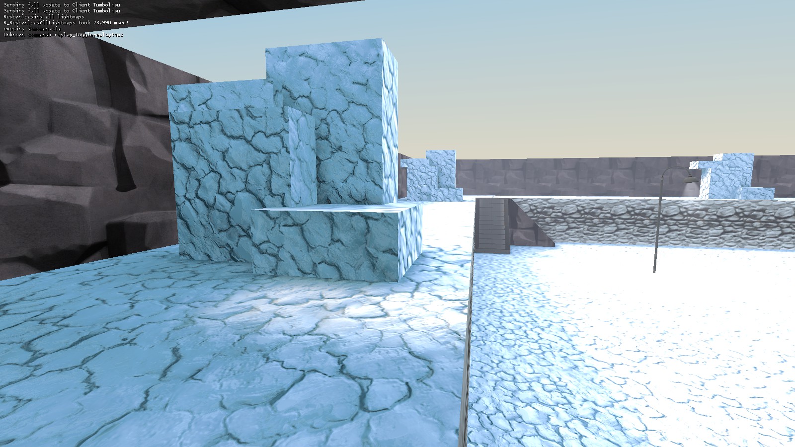
Made it darker. (And changed the water to well for some reason.)

89532DE5A2EDA2AA82E3BC33B5ED91C0F8A36FF6


Code:
"LightmappedGeneric"
{
	"$basetexture" "Nature/snow_full001"
	"$surfaceprop" "ice"
	"$color" "[.8 .81 .82]"
	"$lightwarptexture" "customtest/lightwarp_ice01"
	"$reflectivity" "[.4 .45 .45]"
	"$envmap" "cubemaps/cubemap_shapes002"
	"$envmaptint" "[.085 .088 .091]"
	"%keywords" "tf,custom,arctic"
}

lightwarp_ice01 changed to
59426b4c5e.png