WiP in WiP, post your screenshots!
- Thread starter Arhurt
- Start date
You are using an out of date browser. It may not display this or other websites correctly.
You should upgrade or use an alternative browser.
You should upgrade or use an alternative browser.
lucrative
L1: Registered
- Dec 28, 2018
- 40
- 83
Live streamed the modelling of this today, another one for the vehicle pack
Plans for it: 4 skins, plain grey with team coloured stripes, plain grey with no stripes and a yellow one. I want to animate it as well but I'm no good at that so animations will come later on.
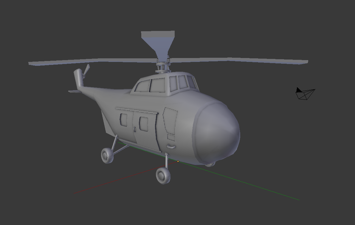
hm. I think that might be too cartoony for tf2. Reminds me of the yoshi helicopter.
It looks like you're using the Sikorsky H-34 as reference
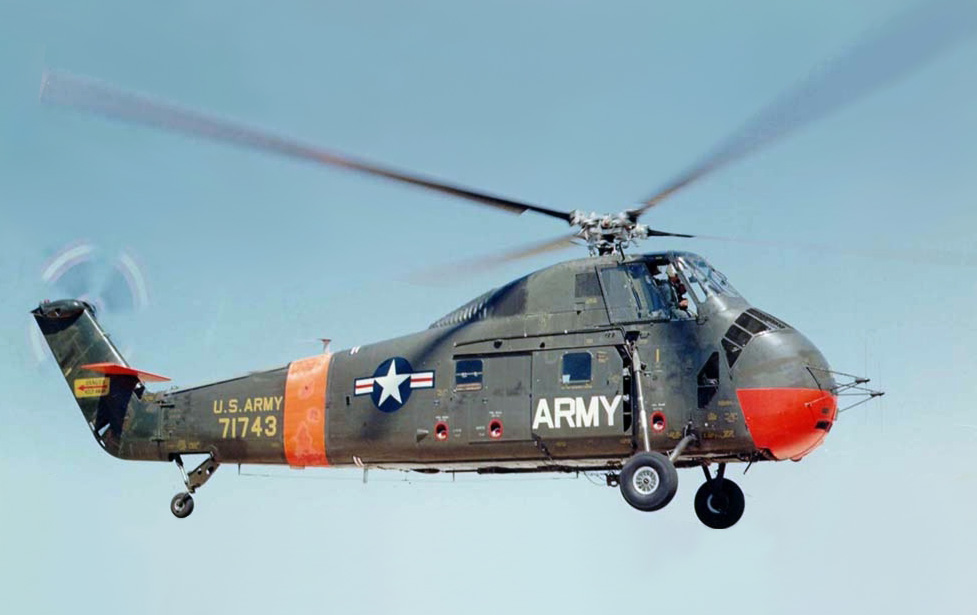
The 4 wheels you have might be what makes it look too goofy. Your model is also short and stubby, and maybe it's the perspective, but the rear rudder looks warped. The current helicopter model doesn't seem to fit in with the other vehicles when the proportions are overly exaggerated. TF2 environments have generally realistic proportions and the cartoony aspect is brought with simplistic textures and impressionistic backgrounds. Now that I mention it, the exhaust of the tractor trailers has wonky proportions.
hm. I think that might be too cartoony for tf2. Reminds me of the yoshi helicopter.
It looks like you're using the Sikorsky H-34 as reference
The 4 wheels you have might be what makes it look too goofy. Your model is also short and stubby, and maybe it's the perspective, but the rear rudder looks warped. The current helicopter model doesn't seem to fit in with the other vehicles when the proportions are overly exaggerated. TF2 environments have generally realistic proportions and the cartoony aspect is brought with simplistic textures and impressionistic backgrounds. Now that I mention it, the exhaust of the tractor trailers has wonky proportions.
Its based of a Sikorsky, but the version:
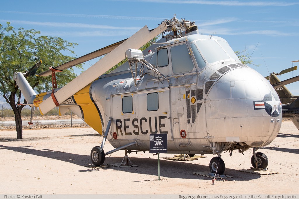
I might mess around with the nose cause I made it really big on purpose, but I think the rest of the model is pretty similar to the inspiration. And with the exhaust, I made it really bit in purpose as well, but since I've got a fair bit of feedback on its size Ill be changing that one. Thanks for the criticism, ill have a work on it!
Jeff Magnum
L1: Registered
- Jul 4, 2018
- 25
- 15
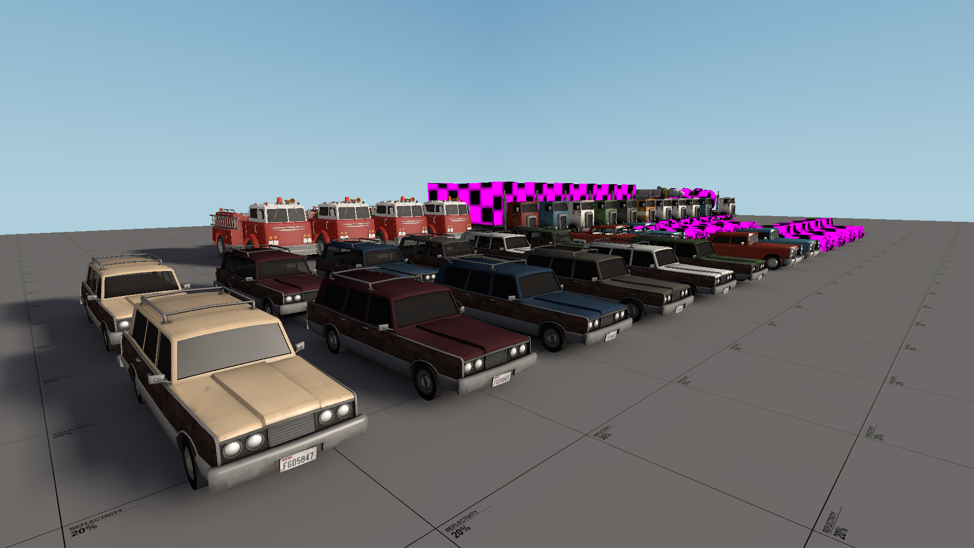
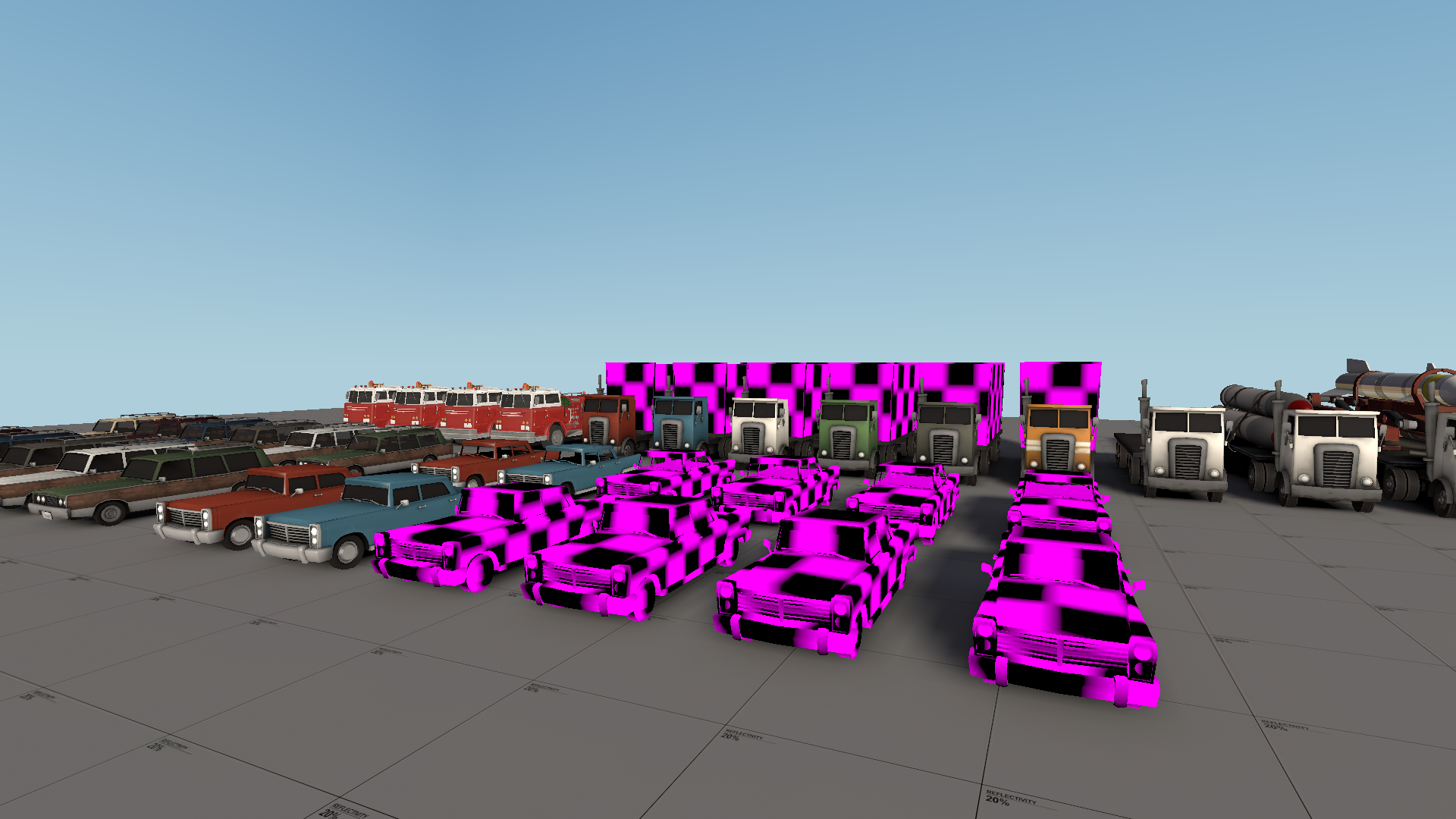
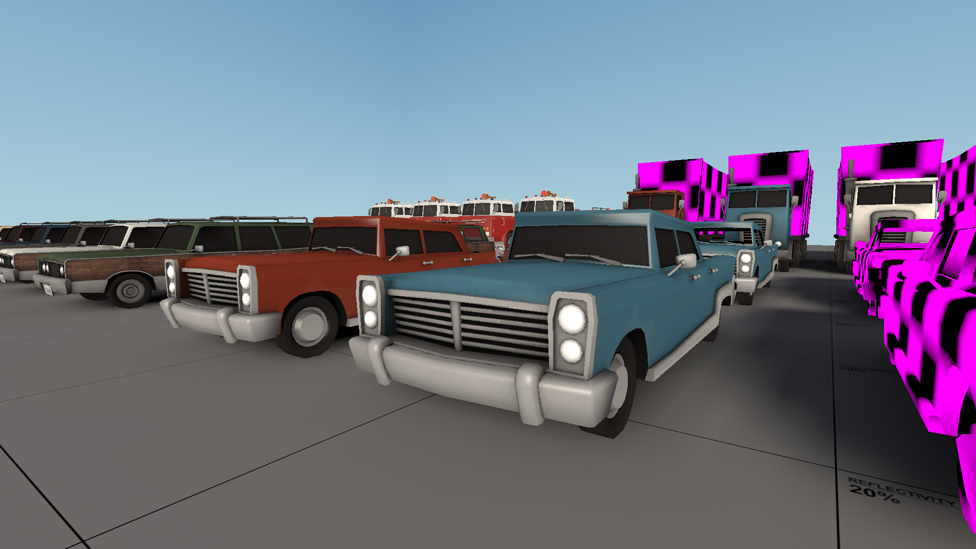
Added the Executive, a fancy urban car. Textures are still to be worked on for all models, details, phong, etc.
Will the wood panels be polished or matte?
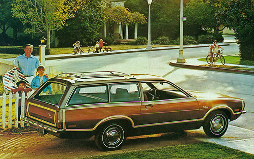
Will the wood panels be polished or matte?

Im not too sure, whichever people prefer. The station wagon looks a little different now, still might need texture changes.
I was watching the Dev videos on this one earlier, and it's changed alot since! Looking niceSome detailing for plr_rush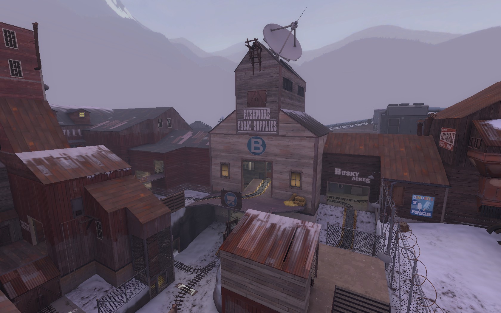
SnakedSnack
L1: Registered
- Aug 26, 2017
- 25
- 4
Malachite Man
L6: Sharp Member
- Oct 16, 2015
- 394
- 254
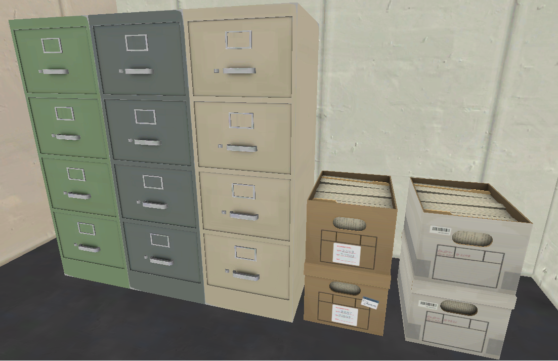
"And Stanley took the door on the left''File management is important
RevolutionTeam
L4: Comfortable Member
- May 19, 2019
- 173
- 45
Here's a first map that I'm working on: right now, I call it "Home Plate". It's a single stage payload map that takes place in the heart of RED's armory. You capture "The Silo", "The Bomb Building", and "The Gate" before destroying a rocket at the end.
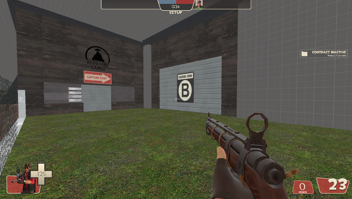
Here's the gate that opens when capture point 3 is opened.
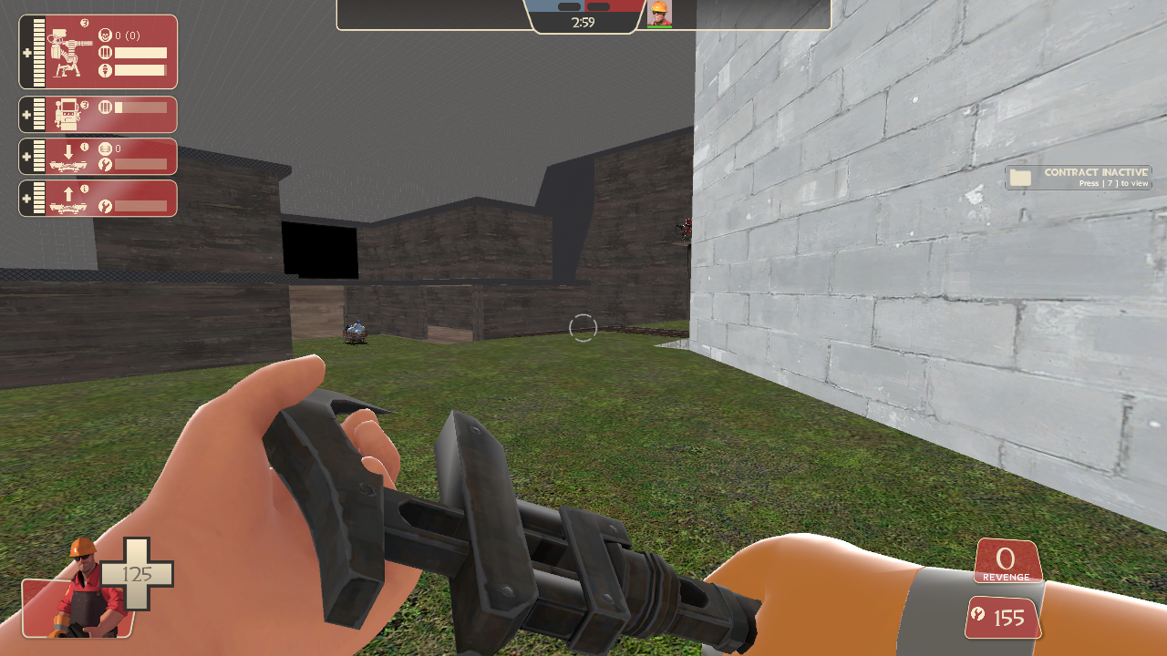
This is BLU's first spawn. To the right is the silo. Note that I'm using the scrapped "End of the Line" bomb cart.
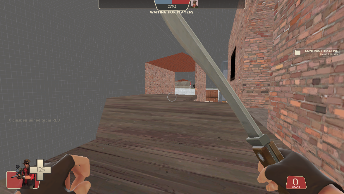
Here's the section leading up to the Bomb Building...
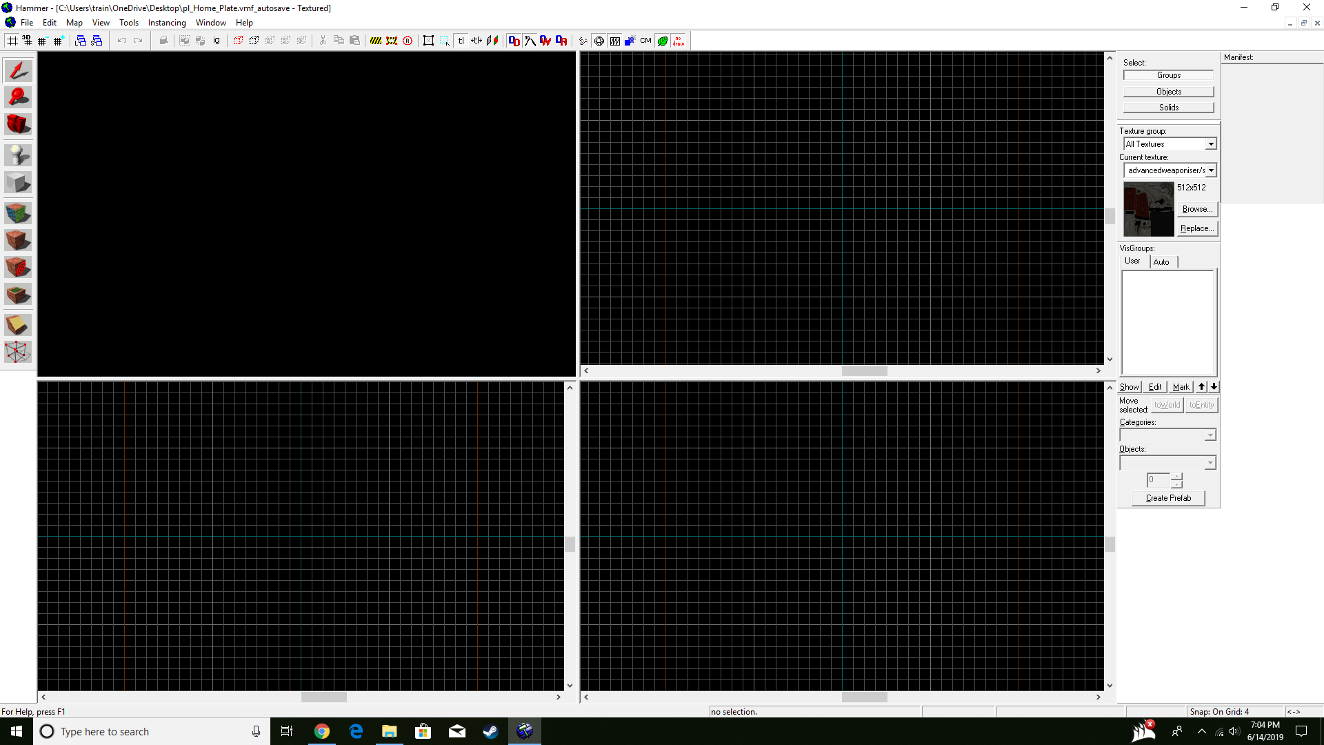
And then after adding the logic, hammer fucked me over and removed my ability to edit. Well, that sucks for me.
Edit: So, I've decided to start anew, with a file for the map, and a file for the map with logic so I don't lose all my progress when I add the payload logic.
Here's the gate that opens when capture point 3 is opened.
This is BLU's first spawn. To the right is the silo. Note that I'm using the scrapped "End of the Line" bomb cart.
Here's the section leading up to the Bomb Building...
And then after adding the logic, hammer fucked me over and removed my ability to edit. Well, that sucks for me.
Edit: So, I've decided to start anew, with a file for the map, and a file for the map with logic so I don't lose all my progress when I add the payload logic.
Last edited:


