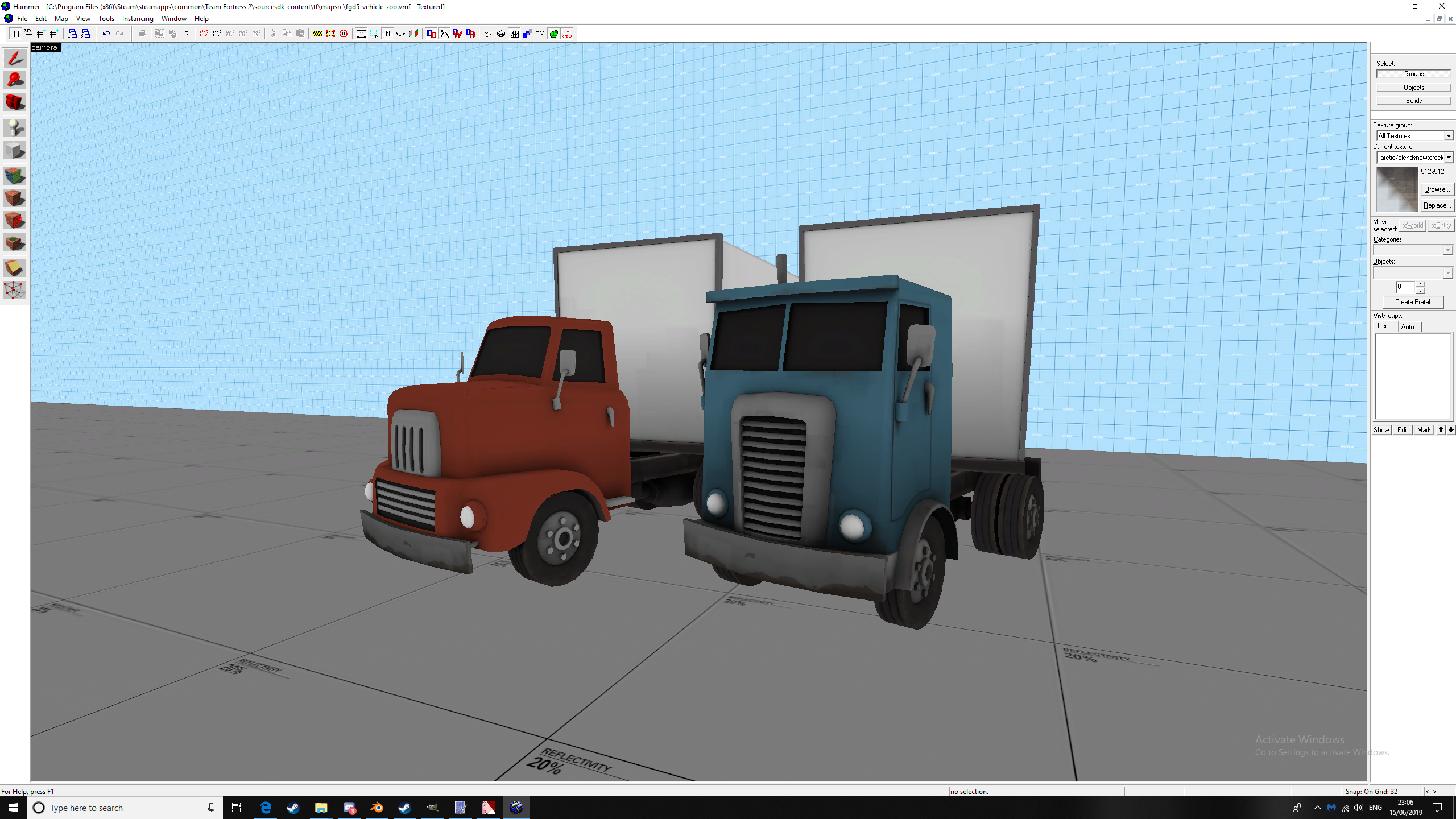
Logo you say? Freight Gets Delivered for FGD?The next additions to more vehicles is coming along nicely, the truck cab just needs some little texture tweaks and the trailer needs logos. Also, I added a 2nd cab to spice things up a bit, still to be properly textured of course.
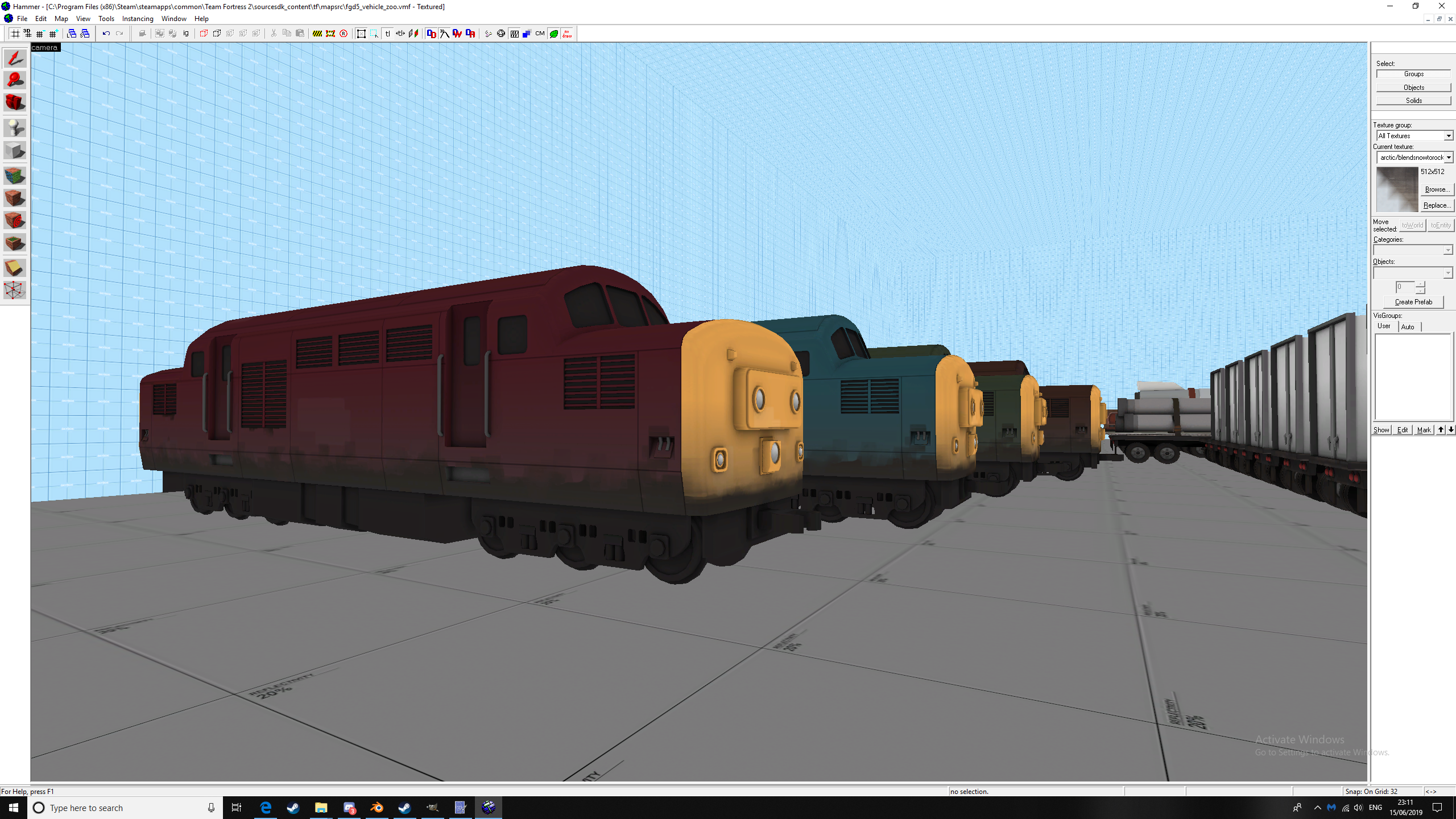
And the train from above is on its way
WiP in WiP, post your screenshots!
- Thread starter Arhurt
- Start date
You are using an out of date browser. It may not display this or other websites correctly.
You should upgrade or use an alternative browser.
You should upgrade or use an alternative browser.
I like that one, very cleverLogo you say? Freight Gets Delivered for FGD?
Goldenes_Klo
L1: Registered
- Jun 10, 2019
- 8
- 5
Hello, first time posting screenshots of my map.
It's a mvm map set at a logging facilty near a forest. Currently it's mostly made up of dev textures but I wanted to ask for some general tips on how to design the gameplay space. Most of the props and detailing serve gameplay purposes.
Any feedback is appreciated.
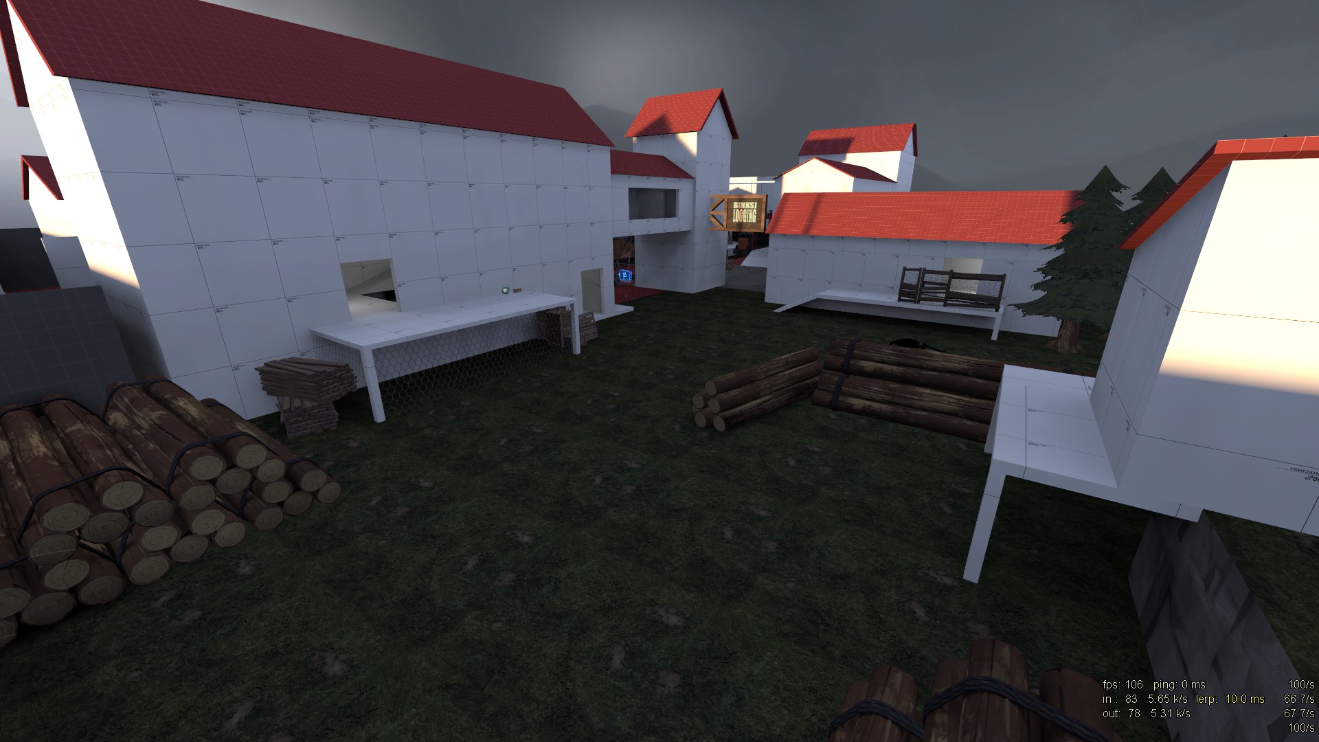
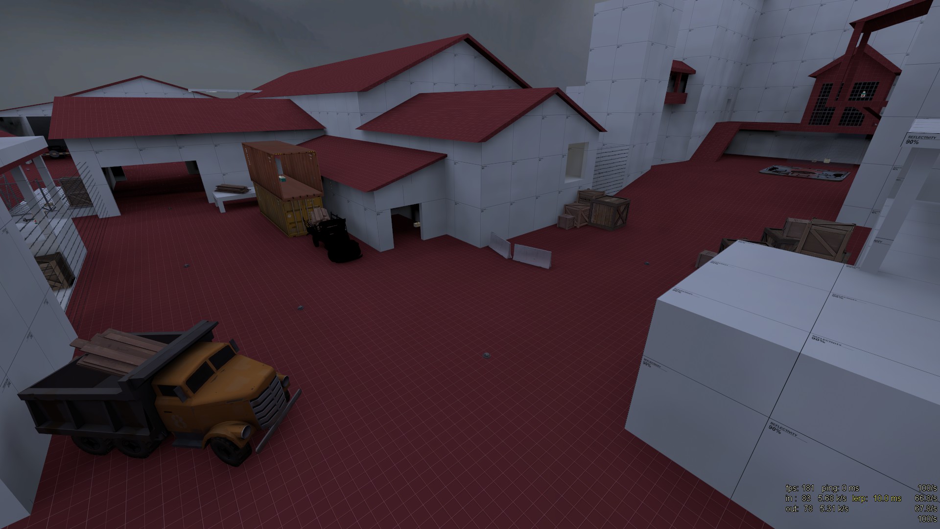
robot spawn/"forest entrance"
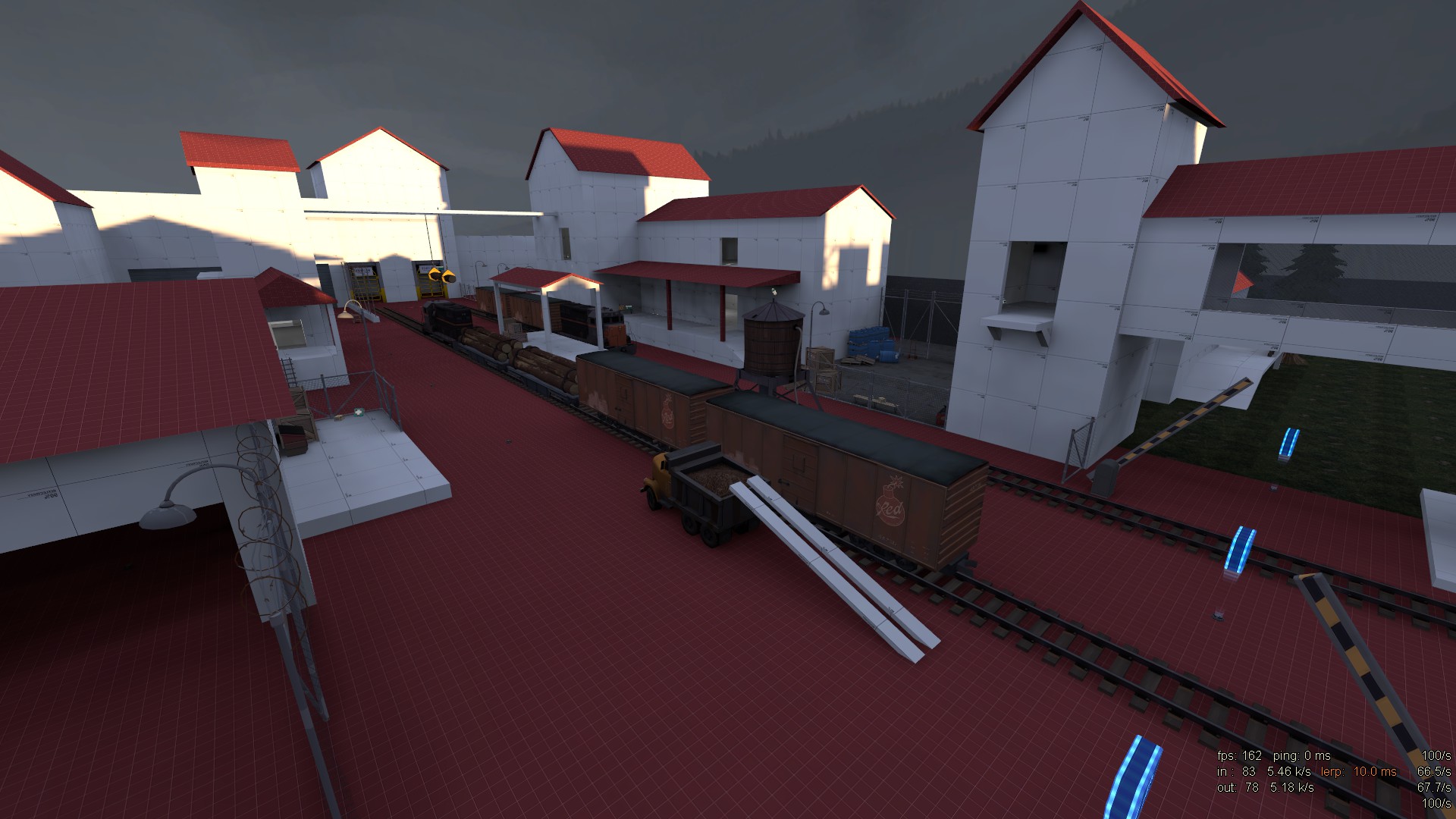
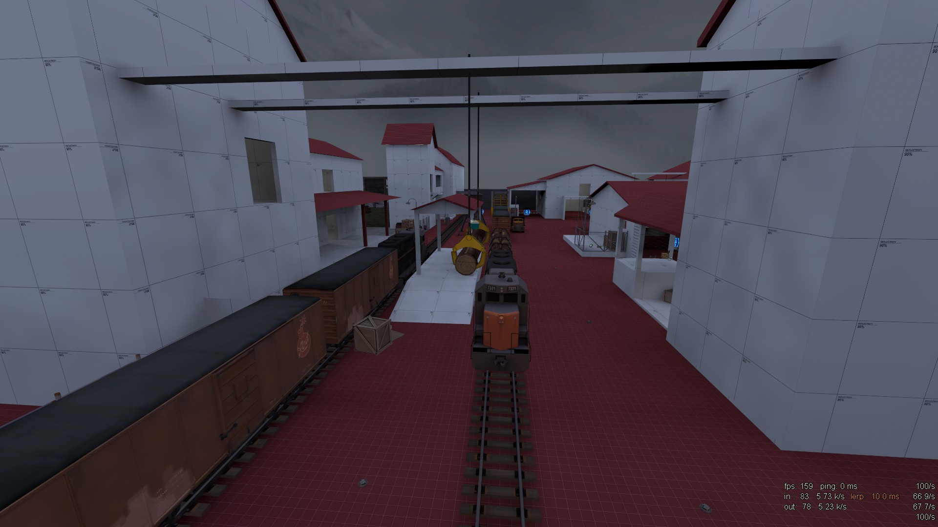
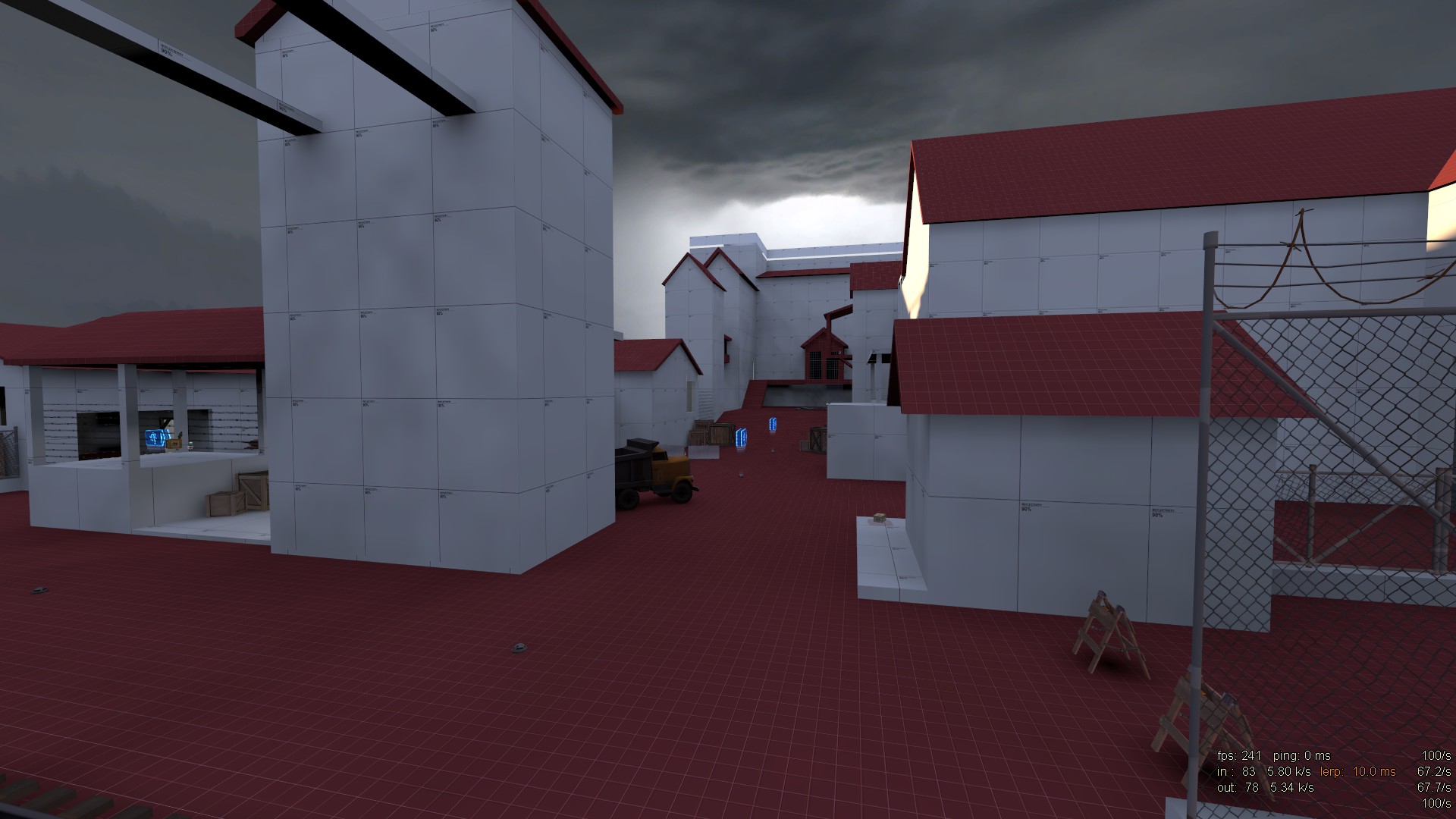
"trainyard area"
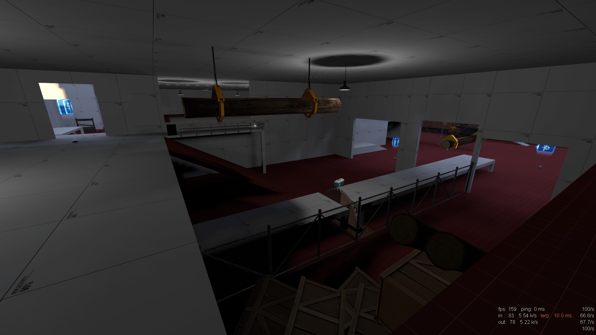
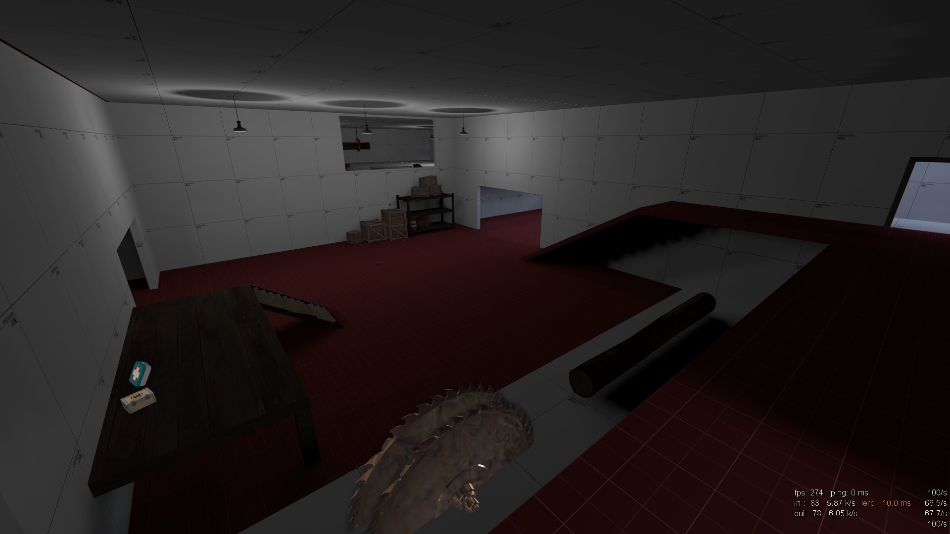 inside of the sawmill
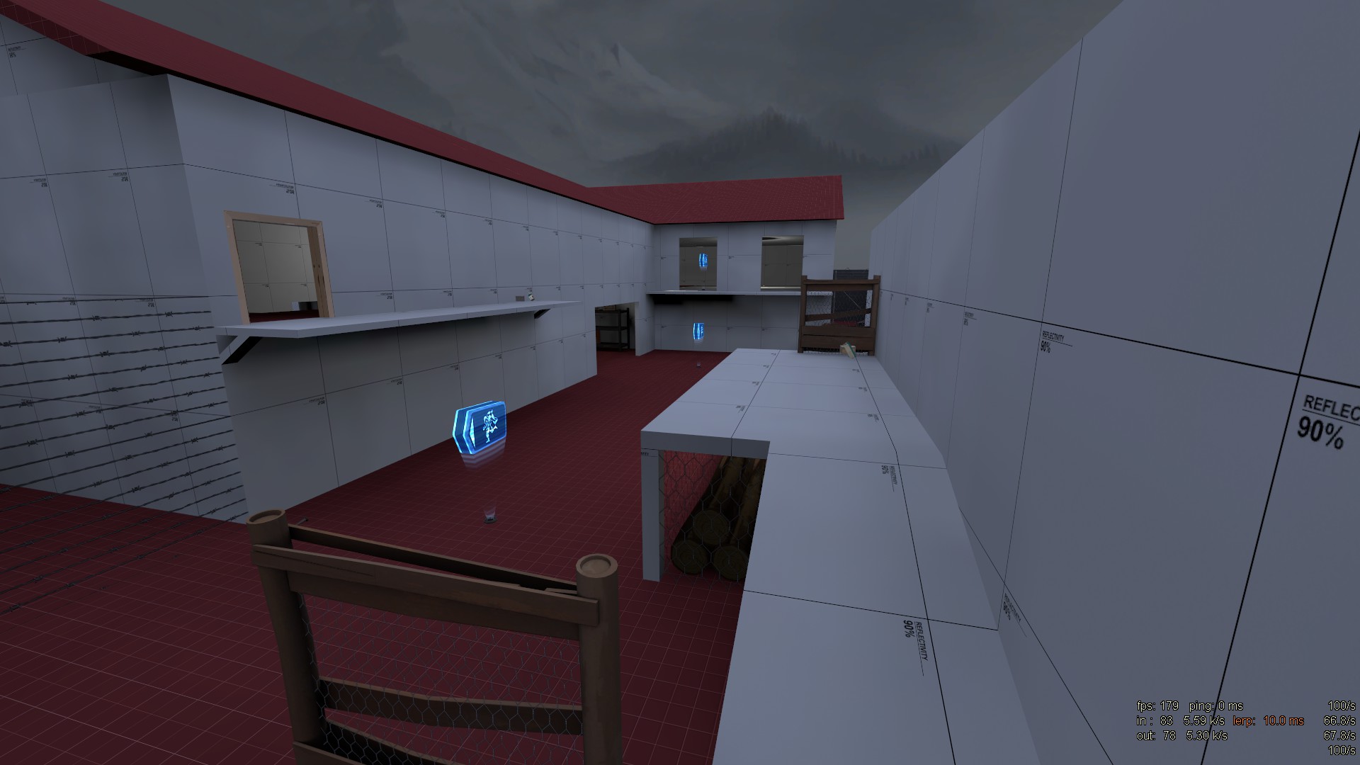
left path to the hatch
right path to the hatch
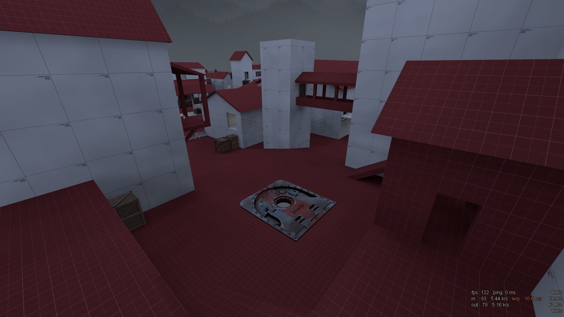
hatch area/player spawn
It's a mvm map set at a logging facilty near a forest. Currently it's mostly made up of dev textures but I wanted to ask for some general tips on how to design the gameplay space. Most of the props and detailing serve gameplay purposes.
Any feedback is appreciated.
robot spawn/"forest entrance"
"trainyard area"
left path to the hatch
right path to the hatch
hatch area/player spawn

robot spawn/"forest entrance"


"trainyard area"
These first three pictures look very flat on the ground level, also I'd recommend increasing the map brightness a bit or changing the sun angle, the map overall looks pretty dark.
- Mar 23, 2017
- 1,338
- 996
Any idea how to fix things like this?
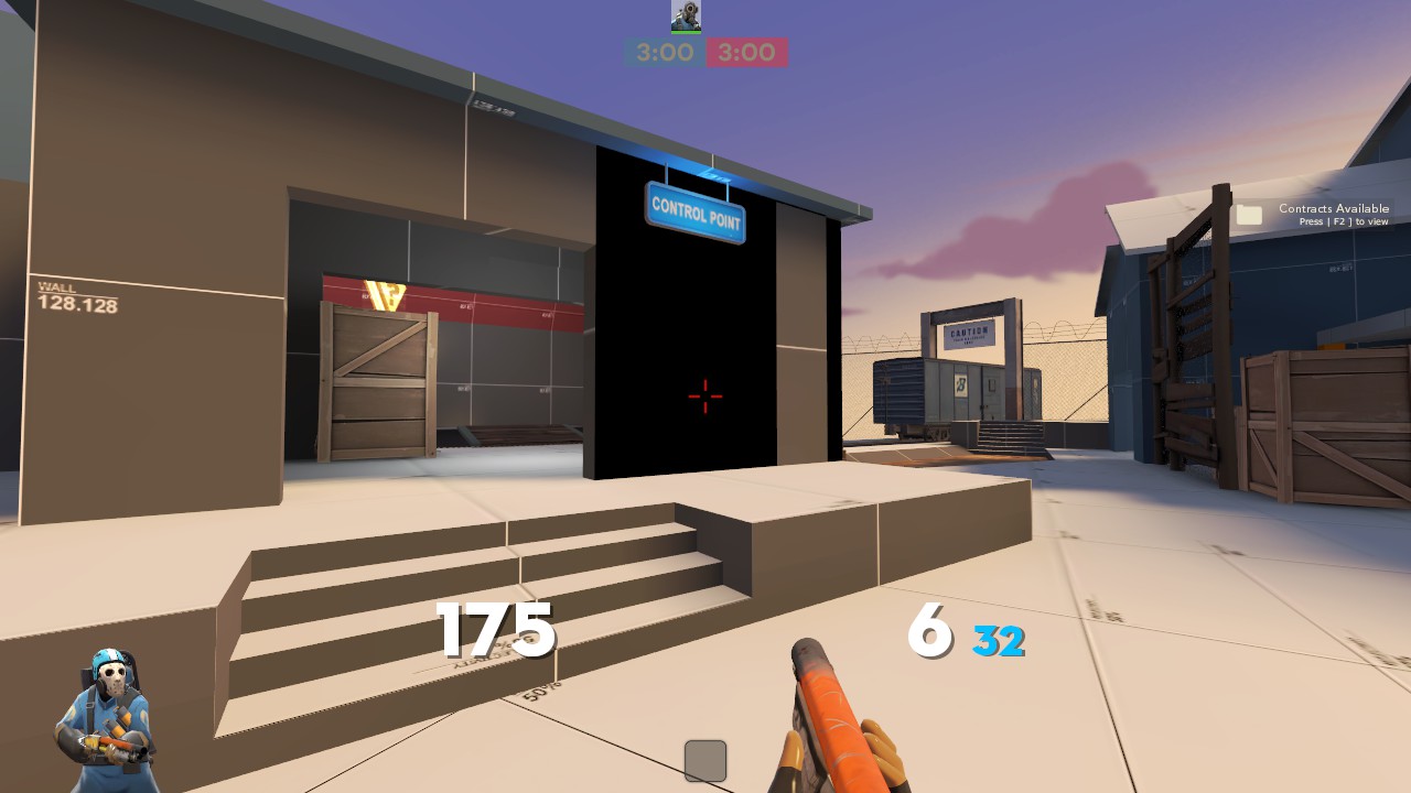
You should remake the brush. This is the sort of thing you should should ask about in the #mapping-help channel on the tf2maps Discord though.
RevolutionTeam
L4: Comfortable Member
- May 19, 2019
- 173
- 45
Goldenes_Klo
L1: Registered
- Jun 10, 2019
- 8
- 5
Okay so I've redone the robot spawn area to feature some basic height differences and turned the ground into displacements. I've also changed the lighting of the map to make it brighter and resemble sawmill a lot more. Still it's quite basic and any feedback or ideas are appreciated.Hello, first time posting screenshots of my map.
It's a mvm map set at a logging facilty near a forest. Currently it's mostly made up of dev textures but I wanted to ask for some general tips on how to design the gameplay space. Most of the props and detailing serve gameplay purposes.
Any feedback is appreciated.

robot spawn/"forest entrance"


"trainyard area"
 inside of the sawmill


left path to the hatch

right path to the hatch

hatch area/player spawn
Skittelz
L6: Sharp Member
- Mar 17, 2016
- 399
- 281
Okay so I've redone the robot spawn area to feature some basic height differences and turned the ground into displacements. I've also changed the lighting of the map to make it brighter and resemble sawmill a lot more. Still it's quite basic and any feedback or ideas are appreciated.
Sweet but I hate how those displacement textures don't align properly
DioJoestar
L2: Junior Member
- Jul 1, 2014
- 71
- 169
DioJoestar
L2: Junior Member
- Jul 1, 2014
- 71
- 169
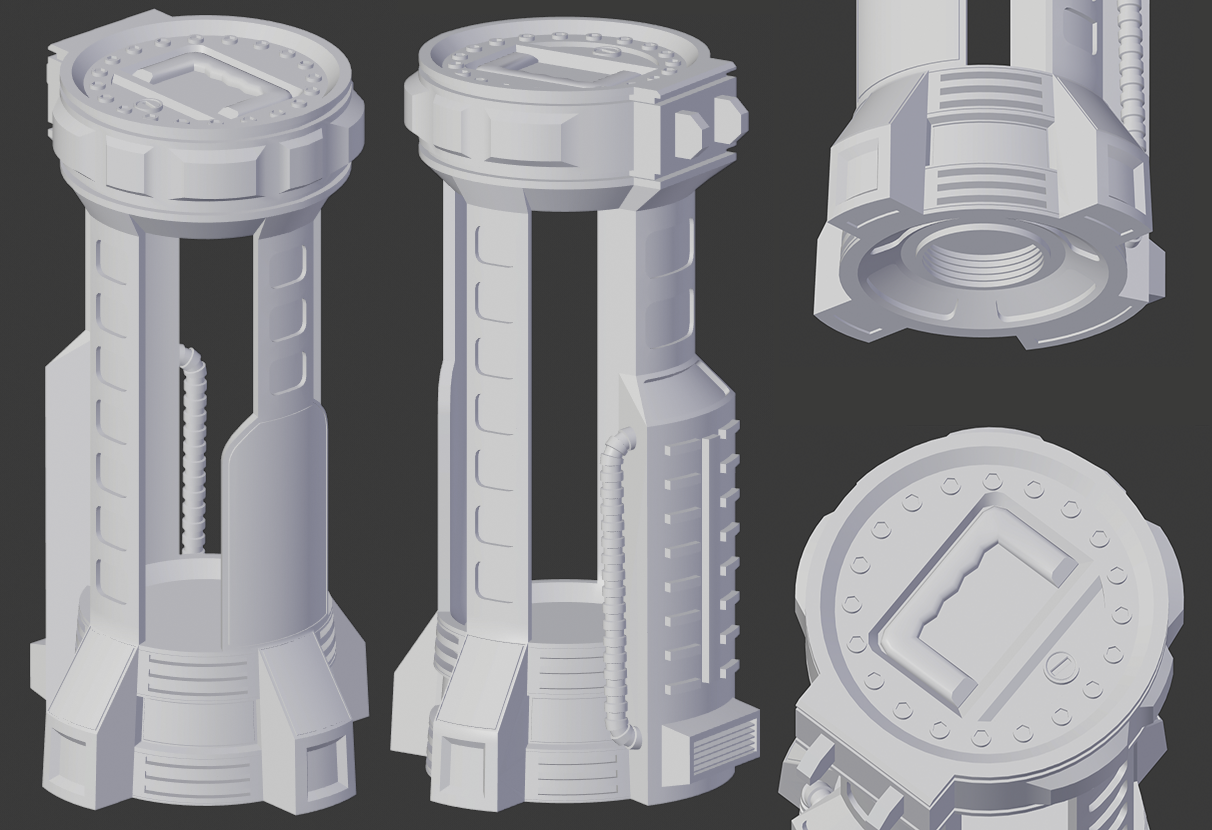
It has too much detail for something TF2 styled. I'd suggest simplifying the mesh a lot and moving most of the details to the texture/material instead
Thats the point, baking that model into the texture of a low poly version.
Depends on the size of the prop. That level of detail would fit tf2 if it is as big as the nucleus reactor prop.
As you can see, theres a handle on the top, so you can make an idea of the size. I wanted to make a different version of the intel from the asteroid map.
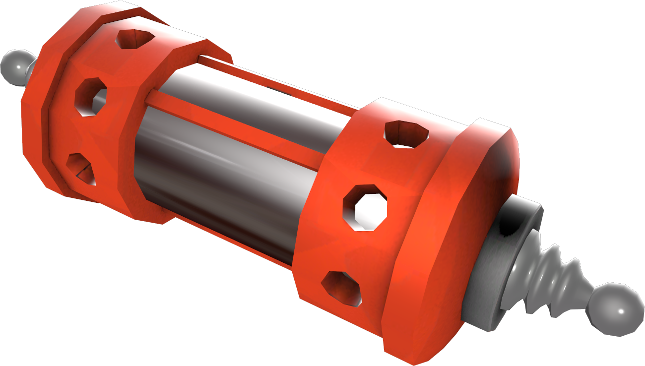
I also thought on model something to attach the prop to the wall, like a slot. I took the idea from the initializer and stabilizer from dino crisis video game.
Last edited:
SnakedSnack
L1: Registered
- Aug 26, 2017
- 25
- 4
RevolutionTeam
L4: Comfortable Member
- May 19, 2019
- 173
- 45
That's all? Just a RED house, a BLU house, and a capture point? Am I missing something here?i finally finished most of the map only thing left is mirroring the map, creating the spawnroom and completing the skybox.
Reas
L1: Registered
- Oct 6, 2018
- 40
- 31
i actually still have plans to add some stuff to the map as i develop it. Or perhaps even make the map longer. But i mean you can’t expect too much from a small koth map.That's all? Just a RED house, a BLU house, and a capture point? Am I missing something here?


