WiP in WiP, post your screenshots!
- Thread starter Arhurt
- Start date
You are using an out of date browser. It may not display this or other websites correctly.
You should upgrade or use an alternative browser.
You should upgrade or use an alternative browser.
SSX
aa
- Feb 2, 2014
- 392
- 411
That doesn't look too bad. Kind of excited to try that.
Have you thought about any sort of setpieces you might like for the area?
Like, how it will look?
If it's that, I'm gonna be attempting at a spytech mining facility sorta thing.
Setpiece as in like, some focal prop of the area. Not all have them, but if you're doing a spytech mining theme, you could get away with a giant drill or something. Was just curious, sounds like a great idea.
SSX
aa
- Feb 2, 2014
- 392
- 411
Setpiece as in like, some focal prop of the area. Not all have them, but if you're doing a spytech mining theme, you could get away with a giant drill or something. Was just curious, sounds like a great idea.
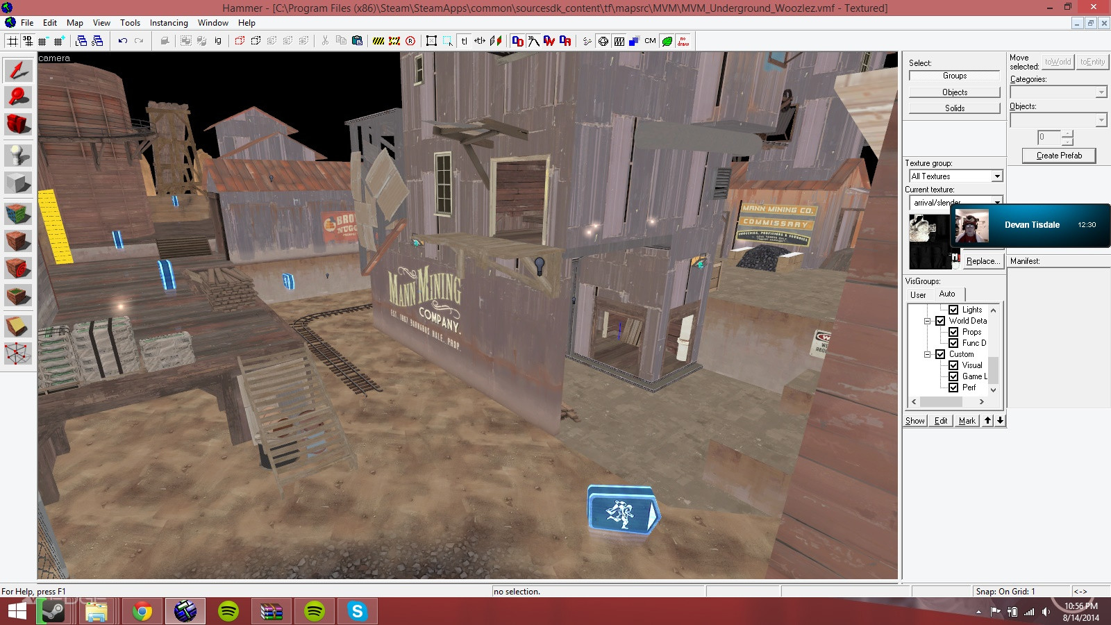
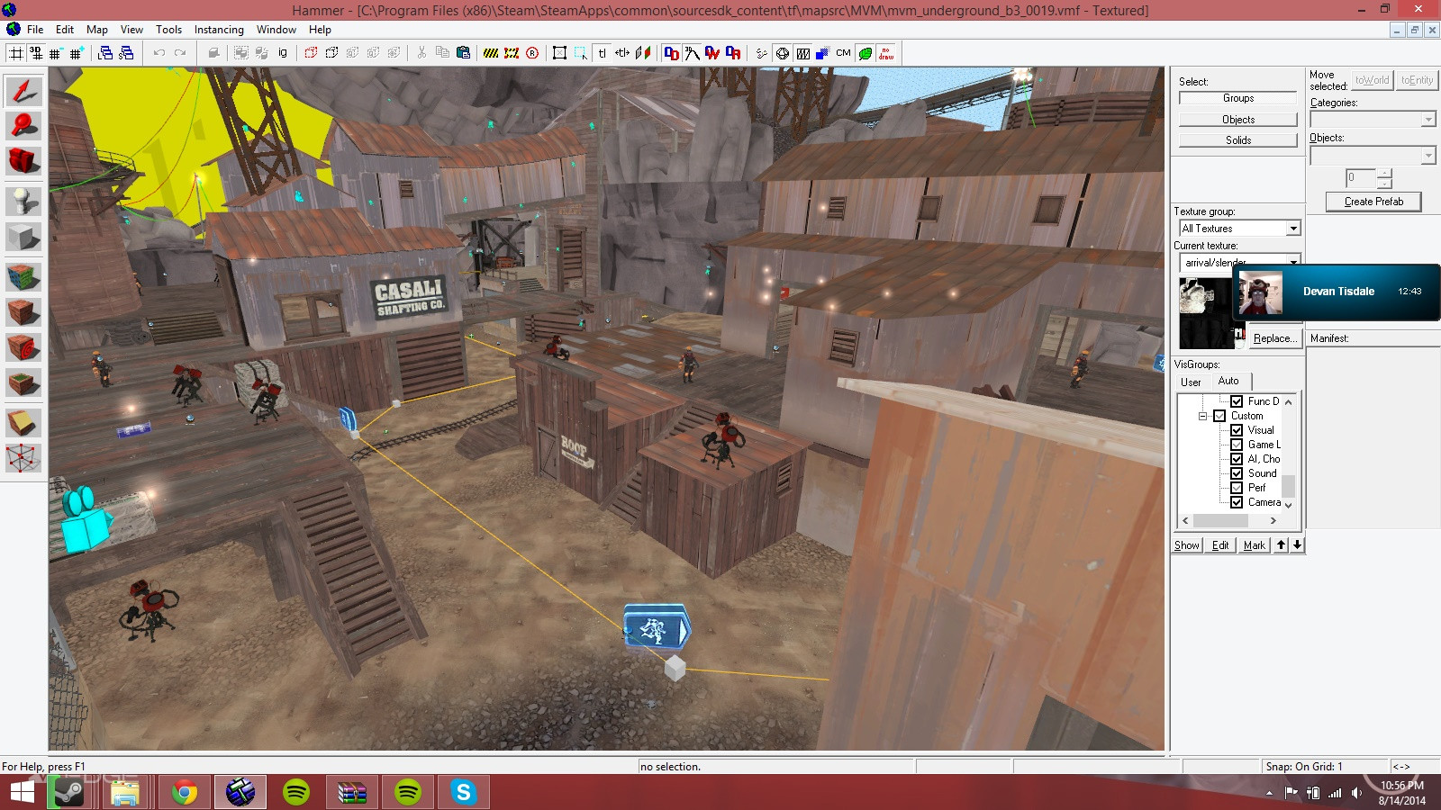
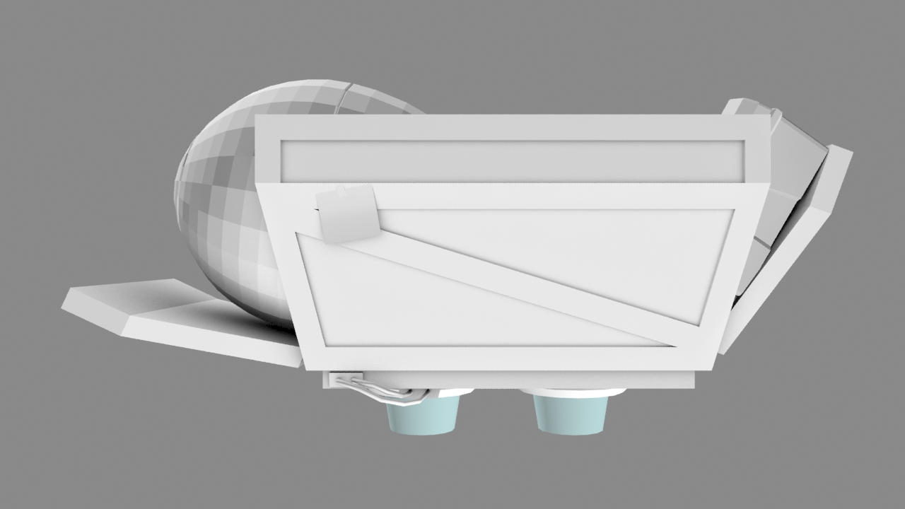
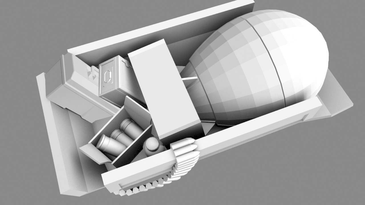
Well, you see that pallet with the gold behind the point?
Under it is a deathpit, and the pallet of gold is a lift out of the mine.
Dain
L3: Member
- Oct 21, 2009
- 106
- 43
KOTH map I'm working on. I'm getting Mid pretty much how I want it layout-wise before making everything else. Only major thing left to do here is make the ramps at the bottom right of the first pic into spiral staircases.
(Mad props to A Boojum Snark for helping me with the stairs around the cap!)
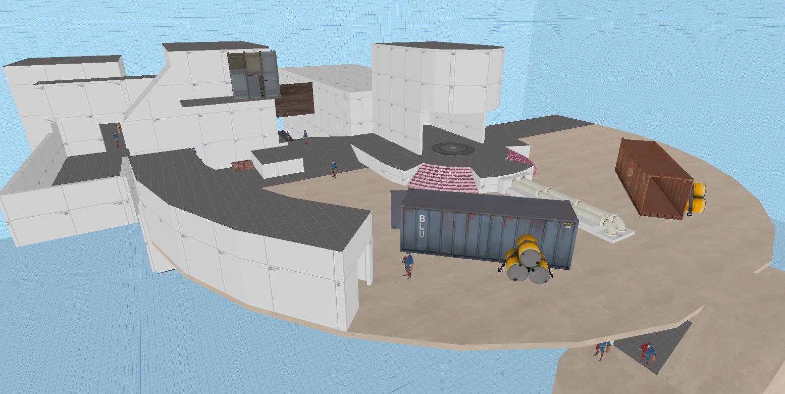
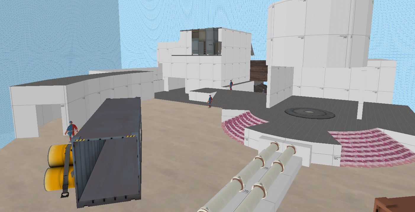
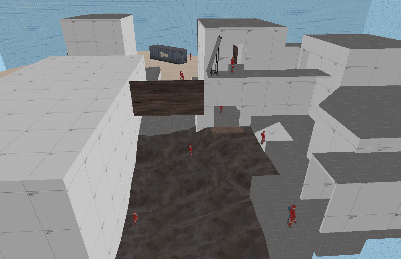
(might be a little hard to make out details with the devtextures :s)
(Mad props to A Boojum Snark for helping me with the stairs around the cap!)


(might be a little hard to make out details with the devtextures :s)
A word to the wise: If you made the clip brushes yourself, they're going to be invalid solids unless you split the top face diagonally by selecting the opposing corners in vertex-edit mode and hitting Ctrl+F. Which opposing corners, I don't know. One way makes it just slightly concave, and the other makes it just slightly convex; you want the latter, but I don't know how you'd check without trial and error.
Dain
L3: Member
- Oct 21, 2009
- 106
- 43
A word to the wise: If you made the clip brushes yourself, they're going to be invalid solids unless you split the top face diagonally by selecting the opposing corners in vertex-edit mode and hitting Ctrl+F. Which opposing corners, I don't know. One way makes it just slightly concave, and the other makes it just slightly convex; you want the latter, but I don't know how you'd check without trial and error.
You mean the purple clip brushes on the staircase? I just used vertex edit mode and pulled down the top-outer vertices to the bottom so they became wedges. Alt-p doesn't show any problems and it compiles fine.
Well, you might have problems when you actually go into the map, due to attempts to "fix" the brushes. You'll definitely get a message when you reload the VMF. Basically, the only wedges that are likely to be valid are ones placed at 90 or 45 degree angles, since the solid is perfectly symmetrical. All others fall prey to irregularities caused by grid snapping.
arena_unusual:
Fear my lightmaps

Can you play gmod with me someday?
I think a bit more overhang of those roofs would be nicer. Only on the gray building the overhang looks good with its shadow, but on the other buildings it looks thin. Barely any shadow is coming from them.
Oh, and that ladder on the left blocks light. Either make it not block light, or change the compile options so it doesnt just use the bounding box for light (personaly i recommend this to do, there are a few light parameters for vrad allowing better results)
Oh, and that ladder on the left blocks light. Either make it not block light, or change the compile options so it doesnt just use the bounding box for light (personaly i recommend this to do, there are a few light parameters for vrad allowing better results)
Shogun
L6: Sharp Member
- Jan 31, 2014
- 260
- 221
I get bored easily...
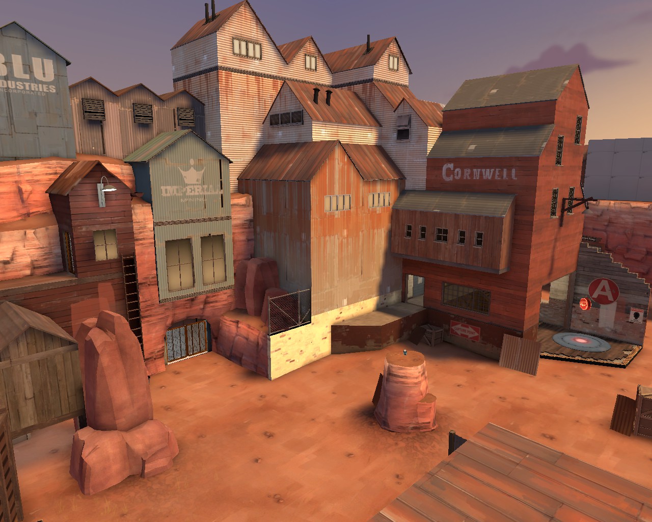
Not a fan of the broken wood on top of concrete the control point is on. It looks odd to me.


