WiP in WiP, post your screenshots!
- Thread starter Arhurt
- Start date
You are using an out of date browser. It may not display this or other websites correctly.
You should upgrade or use an alternative browser.
You should upgrade or use an alternative browser.
SSX
aa
- Feb 2, 2014
- 392
- 411
Not a fan of the broken wood on top of concrete the control point is on. It looks odd to me.
Well it's supposed to be an area that was under construction then one day just stopped. I don't know exactly how else I'd be capable of making it look that way.


I think I still need to add, like, 5 more barns before this map is done.
Your density of detail feels off to me. Those struts make the barns feel very busy and messy- i'm not sure i could pick out much but them in that area.
Your density of detail feels off to me. Those struts make the barns feel very busy and messy- i'm not sure i could pick out much but them in that area.
But look how pretty it looks
These are the voyages of the Starship Devtexture.
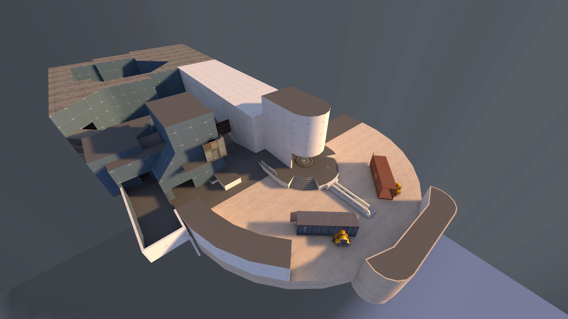
This gameplay area looks very open. Keep in mind that many people will choose the path of least resistance, not many people will go to the outer edge, even if you happen to fluff it up with pickups. In a similar fashion there was a KotH map about 6 months ago that was set up in a V shape, and they somewhat fixed the issue by making the apex of the V the high-ground above the point, made it necessary to take control of the point section.
Well it's supposed to be an area that was under construction then one day just stopped. I don't know exactly how else I'd be capable of making it look that way.
Make the concrete not flat but make it have little bumps. These bumps show that the concrete at the incomplete areas wasnt finished yet. Using that trick you can actualy make some of the wooden parts go underneath the concrete showing that the concrete went over the wood.
However, technicaly thats still an odd thing to do since usualy they use metal for that since the wooden parts can still rot easily in concrete (since concrete is wet and thats not good for wood, and although metal does rust its easier to protect that against it). (or whatever other reasons, anyway i have never seen wood being used that way)
Detail shouldnt distact the players and also help in the gameflow. At those areas i cant realy tell if they are able to walk on the areas of screen 1 and 3. If they can walk it should be more clear yet at the same time, if they cant walk it also should be clear. Although 1 rocket jump can be enough to find out, im sure that many arent just going to be soldier to find that out.But look how pretty it looks
This means if it can be reached that people initialy wont know it can be used, or if it cant be reached, people would still pay attention since they dont know if someone would go there.
Only on the 2nd screen its clear enough and to me that area is nicely detailed.
Dain
L3: Member
- Oct 21, 2009
- 106
- 43
This gameplay area looks very open. Keep in mind that many people will choose the path of least resistance, not many people will go to the outer edge, even if you happen to fluff it up with pickups. In a similar fashion there was a KotH map about 6 months ago that was set up in a V shape, and they somewhat fixed the issue by making the apex of the V the high-ground above the point, made it necessary to take control of the point section.
Thanks for the tip! I don't think it'd be a good idea to put a high ground on the apex of this map's V, because the sightline would be ridiculous. How about on top of the curled corridors going round the edge?
Also, do you happen to have the name of that KOTH map? I'd like to study it.
Last edited:
Thanks for the tip! I don't think it'd be a good idea to put a high ground on the apex of this map's V, because the sightline would be ridiculous. How about on top of the curled corridors going round the edge?
Also, do you happen to have the name of that KOTH map? I'd like to study it.
As mentioned, the area looks a little bit open and flat, which usually equates to boring gameplay. You may want to move those curly walls in closer, and make them a route from the balcony, idk if you planned that already - but you can make them similar to the routes from the upper walkway to the crates on granary.
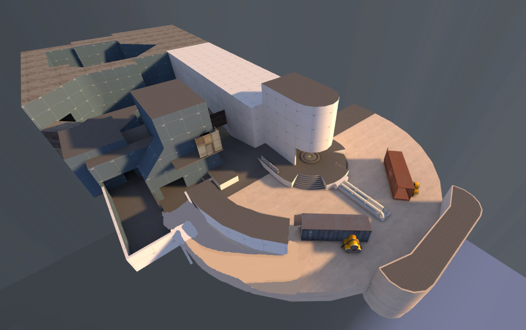
Here's the map I was thinking of, I guess it was a little bit longer than 6 months ago.
nightwatch
aa
- Sep 7, 2012
- 638
- 501
Your density of detail feels off to me. Those struts make the barns feel very busy and messy- i'm not sure i could pick out much but them in that area.
If I had to guess I'd say that wasn't a gameplay area. But I could be incorrect.
My suggestion to make outer parts used more often is to allow a better setup for an engy camp. Basicly focussing the outer parts on a 1way route similar to the blue 1 way path in badwater near the V at CP4 aswell.
It might not make it the main path, but it creates a strong pushing position once an engineers sets his base there.
It might not make it the main path, but it creates a strong pushing position once an engineers sets his base there.
Dain
L3: Member
- Oct 21, 2009
- 106
- 43
How about something like this?
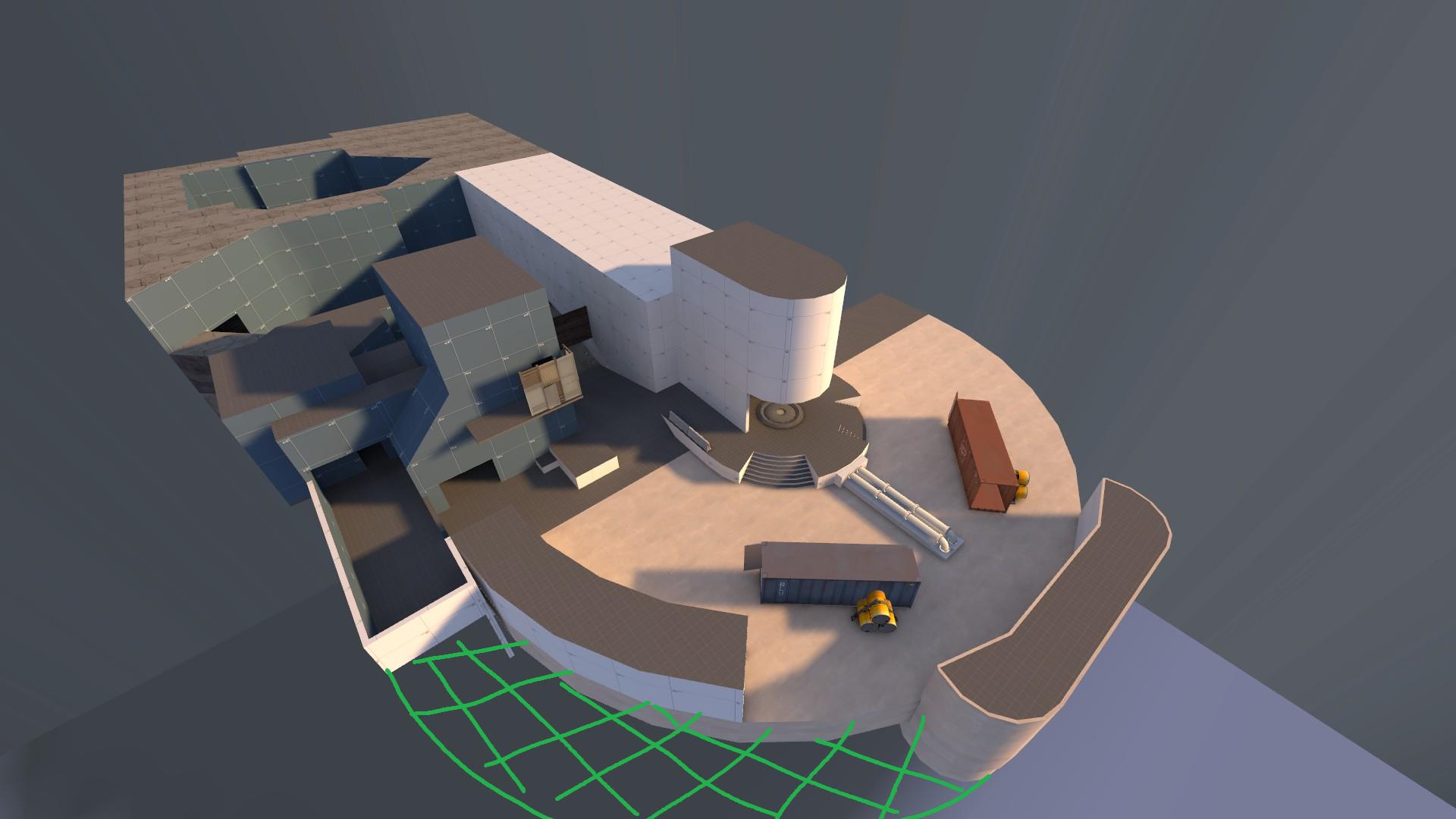
The area behind the curly corridor would give a safe place for engineers to build a nest. Also yes, you can jump from the balcony to the roof of the curly corridor. I'll have to add some cover to the inside edge so it doesn't make snipers completely OP though.

The area behind the curly corridor would give a safe place for engineers to build a nest. Also yes, you can jump from the balcony to the roof of the curly corridor. I'll have to add some cover to the inside edge so it doesn't make snipers completely OP though.
If I had to guess I'd say that wasn't a gameplay area. But I could be incorrect.
Even worse! Then you're attracting players attention to an area for no reason whatsoever.
Even worse! Then you're attracting players attention to an area for no reason whatsoever.
It's out of bounds. While I wouldn't say that you're wrong about detail dnsity, I did try to keep the silhouettes of the buildings fairly intact despite the noise of the framing. That, and the main gameplay doesn't take place near these buildings at all.
I'll probably simplify them a bit if I decide I don't like them, but I don't personally find it to be a big issue.
I'm in a slump with actual mapping, so I decided to fuck around with creating a day cycle-ish effect instead.
Sheltr
L3: Member
- Feb 24, 2011
- 107
- 73
I'm in a slump with actual mapping, so I decided to fuck around with creating a day cycle-ish effect instead.
Looks nice, you should add some clouds to the skybox. though, you could add a sky dome and maybe have it so the time is randomized each time you start a match if possible, I've never really messed around the this kind of stuff so i'm not even sure.
Looks nice, you should add some clouds to the skybox.
I already thought about this, but I can't do it as of now because of a downside to this that I'm still trying to figure out how to get around. The sky is actually controlled by fog, and I'm able to manipulate it in order to change colors/density/distance at a specific speed. However, I can't do the same for skybox fog, as the sky_camera entity doesn't have the inputs needed. As such, you can't use a skybox, and placing clouds in the map itself would look extremely iffy.
I'm aware of a possible solution, but I'm not able to get it to work. I'll just make a thread to ask about it, though.


