WiP in WiP, post your screenshots!

xzzy

aa
Jan 30, 2010
815
531
I wouldn't worry about the depth too much, going for too much realism generates the risk of sacrificing aesthetics or gameplay. I do agree the windows look out of place, I don't mind having windows there, but those specific props belong outdoors on a brick building. In a high tech environment it feels like lazy mapping syndrome.

One concern I do have is why that room even exists.. there's no doors in the back, and no health/ammo either. What possible reason would players have going back there? Would it make more sense to seal the room behind glass so it functions solely as a set piece?

Also, if the area remains playable, I'd worry about players getting stuck in the water. Is it easy to jump out of the water and over the fence?


Ignoring all of that I think the water and bits in the water look pretty great. The lighting is good too, and even the details around the edges of the room fit in well.
 

UKCS-Alias

Mann vs Machine... or... Mapper vs Meta?
aa
Sep 8, 2008
1,264
817
When i see that i wouldnt call it a fission room but a room that was used to store used rods instead. Although that still wouldnt be safe in this case.

And as next thing i would also give some indication of the surface of the water being able to close, to mimic that they have countermeasures if something went wrong and they have to shield the surface from radiation. Ofcourse, in this case it should remain open to keep the detail as it is now.
Also, if the area remains playable, I'd worry about players getting stuck in the water. Is it easy to jump out of the water and over the fence?
If its playable then that area should be a deathpit.
 

Plushypie

L1: Registered
Nov 11, 2013
15
86
Actually, the room is sealed off behind a set of windows and functions only as detail and, after I read Dr. Element's great feedback about the water being there to shield workers from radiation, hopefully it will be good for a chuckle or two as well as I added in a little easter egg.

As for added realism, I'm still working on it - the windows will have to stay in one form or another, though, since the room is sealed off behind them. The only reason I used those large windows (which, indeed, look better outside) is because I used them on the facade as well. I'll see if I can cobble up something better looking. I did however add some sort of fuel-rod crane and made the water a little bit deeper, as well as rearranged the fuel rods to make them look a bit neater.

Unfortunately I'm no engineer, so if this imaginary power plant has a catastrophic meltdown, I won't take any responsibility for it. :p
 

Beetle

L9: Fashionable Member
Aug 17, 2008
627
178
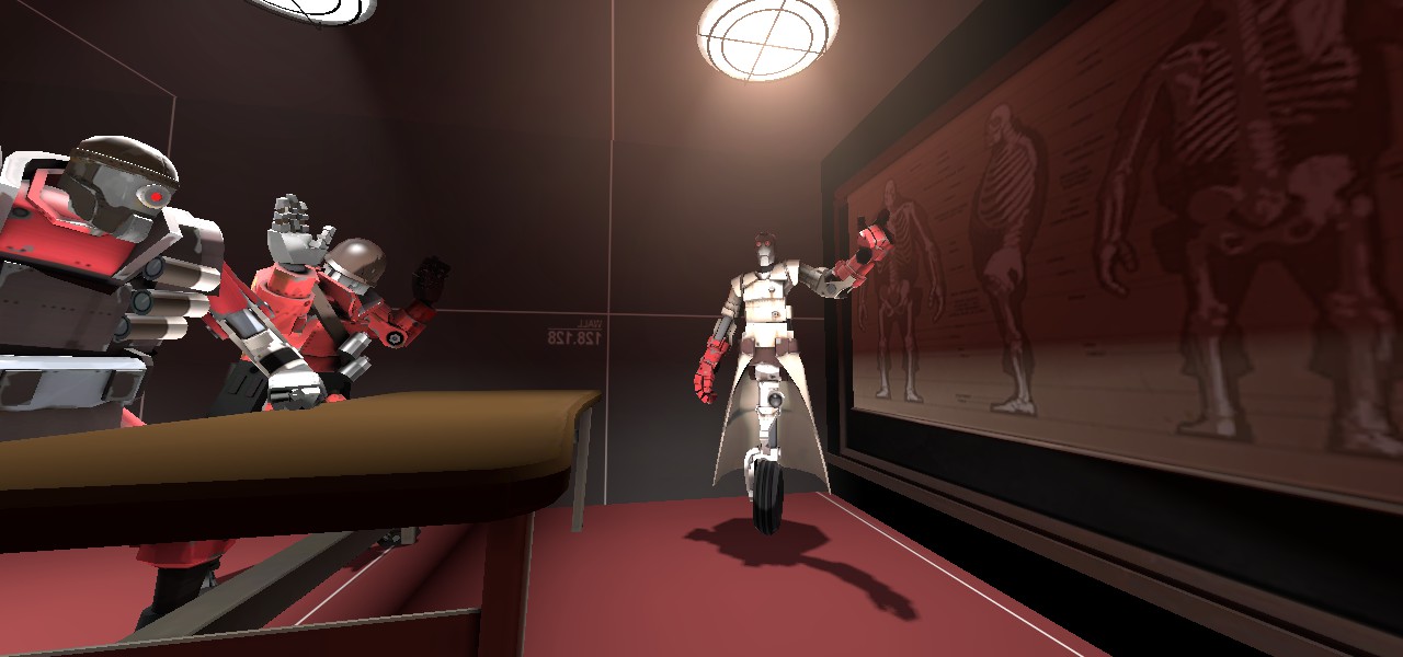
Trying a different, yet still cartoony, art style
JvJPG9Hl.jpg
 
Last edited:

Woozlez

L3: Member
Jul 28, 2010
129
287
Here's what I have for the names for my missions on mvm_underground:

Normal: Unarming Undercity
Intermediate 1: Unhinged Undertaking
Intermediate 2: Undented Uproar
Advanced 1: Unary Ultimatum
Advanced 2: Unrestful Update
Expert: Utterly Decimated

I've been working on a Normal and a single Advanced mission. I could use some help coming up with the other missions though. If you would like to help make the other missions, please message me.
 

fauks

L2: Junior Member
Jul 7, 2013
68
17
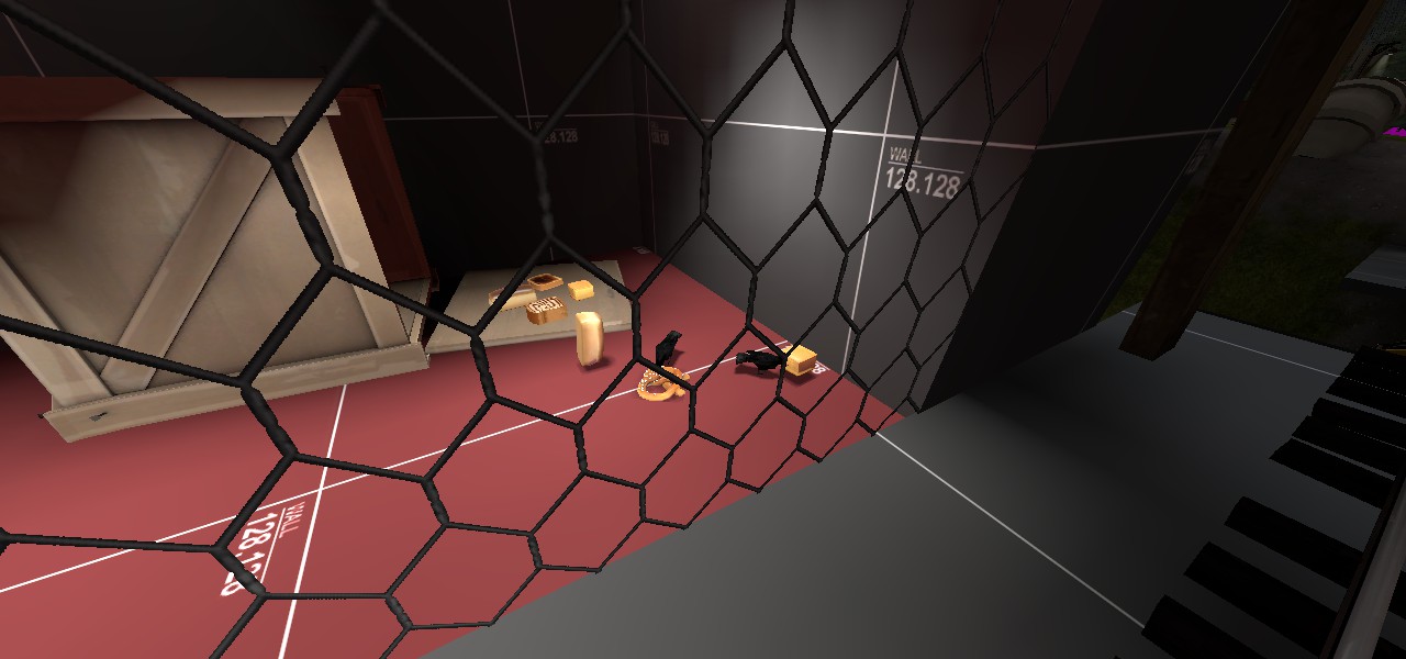
I think the room overall should be darker, the ceiling darker, but the red cylinder area brighter. It needs contrast.
 

wareya

L420: High Member
Jun 17, 2012
493
191
I think it's mostly okay even how it is. Maybe a darker texture for the ceiling and maybe a brick upper wall.
 

Idolon

they/them
aa
Feb 7, 2008
2,123
6,137
I think it needs a bit more out-of-bounds stuff going on. For example, that red patch on the floor could be a grated floor that looks into another room. Also, there isn't much of a sense of place. What would this room be used for realistically? Some spytech (computer terminals, world maps, etc) would make it concievably look like a planning room, or metal scroll doors and tire tracks would make it look more like a shipping center.

Speaking of sense of place, you should definitely have glass panels laying about somewhere in the map. If you want the bases to be glass manufacturing/shipping bases, people aren't gonna get that unless they see some glass that isn't installed yet.
 

Crash

func_nerd
aa
Mar 1, 2010
3,349
5,524
Under the red patch there is actually more gameplay space and used to have grating on top of it but that made the space pretty unusable as you could see anyone trying to sneak up through that route.

And yeah it needs some more stuff to it. The industrial panels/ consoles will be step one of that, for sure. The opposite wall of the above screenshot is going to have some large windows overlooking the actual glass panel factory floor.

As for Glass panels themselves, I've got a bunch of breakable ones above final that turned out pretty neat. I do plan on tossing a few more racks around, probably in the front area of the final building.

Thanks for the feedback, guys!