'The Dark Souls of TF2 Maps'That cathedral is some Dark Souls level stuff
WiP in WiP, post your screenshots!
- Thread starter Arhurt
- Start date
You are using an out of date browser. It may not display this or other websites correctly.
You should upgrade or use an alternative browser.
You should upgrade or use an alternative browser.
@Invalid nick inspired me to make a spacey themed map... Won't be set on mars though... Maybe?
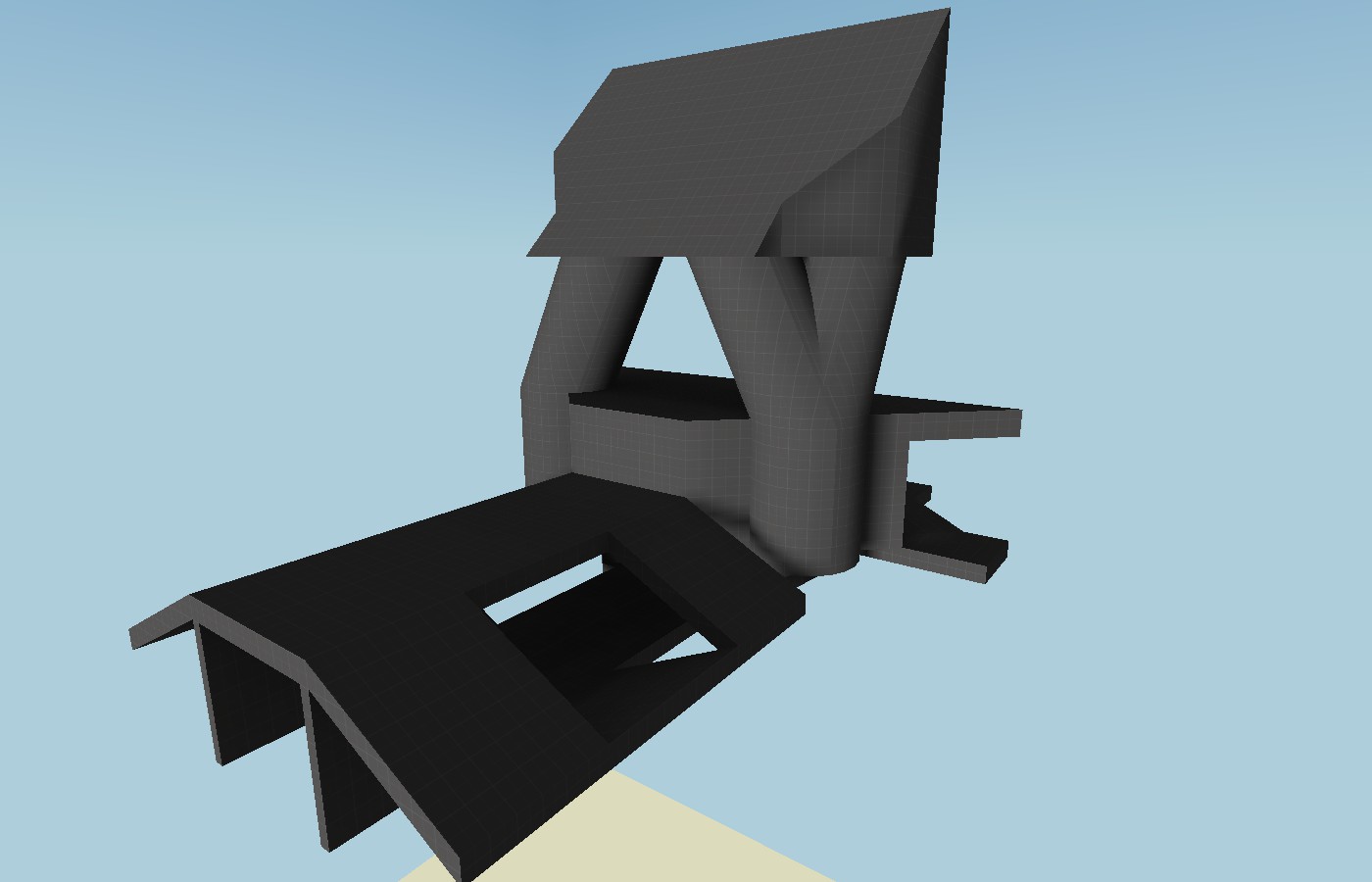
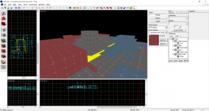
At the moment, I'm calling it turning test... Not Turing test, as I don't want to make it to similar... thoughts on the interesting geometry?
At the moment, I'm calling it turning test... Not Turing test, as I don't want to make it to similar... thoughts on the interesting geometry?
@Invalid nick inspired me to make a spacey themed map... Won't be set on mars though... Maybe?
-snip snop-
At the moment, I'm calling it turning test... Not Turing test, as I don't want to make it to similar... thoughts on the interesting geometry?
sure, there's some interesting geo in what little brushwork is there; but it's not actual playspace, just columns. would like to see the same unique-ness in the actual game area
No idea how it's gonna turn out in the end... I don't even have a layout fully designed yet, so we will see how it goes from here... I do hope to implement said geometry into the actual map...sure, there's some interesting geo in what little brushwork is there; but it's not actual playspace, just columns. would like to see the same unique-ness in the actual game area
fleshed out mid a bit more than in the previous shot... I'm really liking how this is 'turning' out, and i can't wait to 'test' it... I also think im gonna stick with the name: turning test...
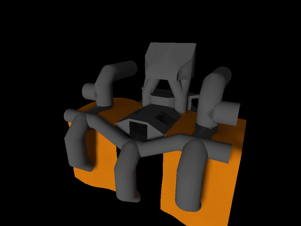
also, managed to creat a 45 degree angled set of stairs... very happy with the results...
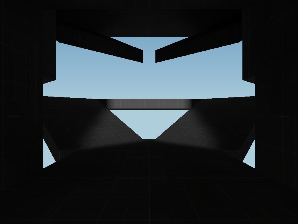
These screenshots, very oddly enough, remind me of the first post in this thread.
Specifically, this first image:
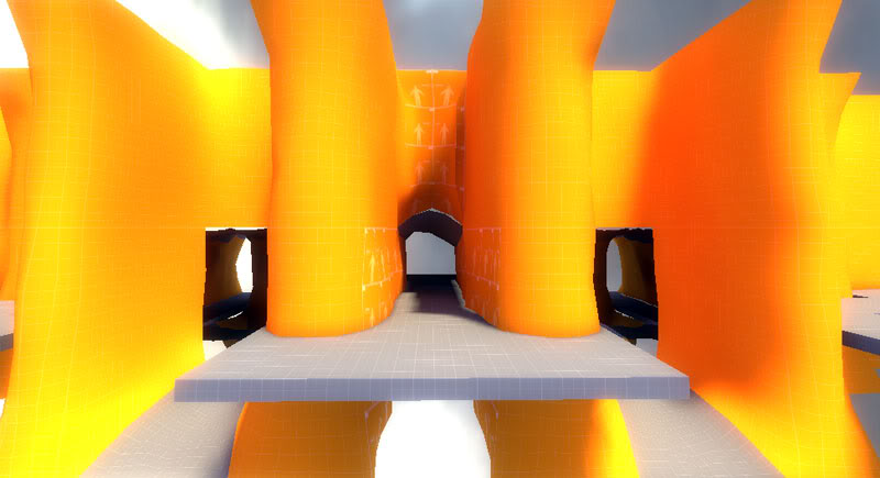
Anyways, everything's looking great, @SmallBiscuit! I love your use of a large pipe structure: it makes sense for both theme and gameplay.
- Oct 11, 2013
- 273
- 413
Malachite Man
L6: Sharp Member
- Oct 16, 2015
- 394
- 254
Something i would suggest is make it maybe look more old and torn up.
Now working on a signature overlay! It's still a draft, however. I want to mimic the TF2 style and I'd like some advice
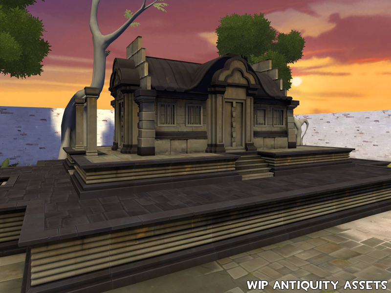
Testing lighting, fit and stuff. I need to go through the props and adjust $illumposition and add in $ambientboost because the shadowing when they're adjoined gets ugly fast if they don't have it. Was hoping to have these released by now, but I need to switch to a work project for awhile.
Maybe I'll carve out some time this weekend to recompile and then release (sadly I won't have time to get to the trees yet but the Borneo ones look fine).
Another day of work... =]
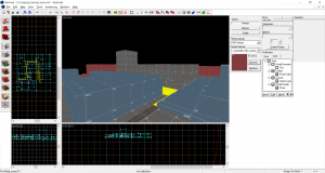
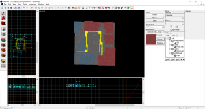
This is the main overview, it is about 3,300 HU from the center to where I eventually intend to place the spawn doors...
The weird pathways with no walls will eventually be the indoor section...
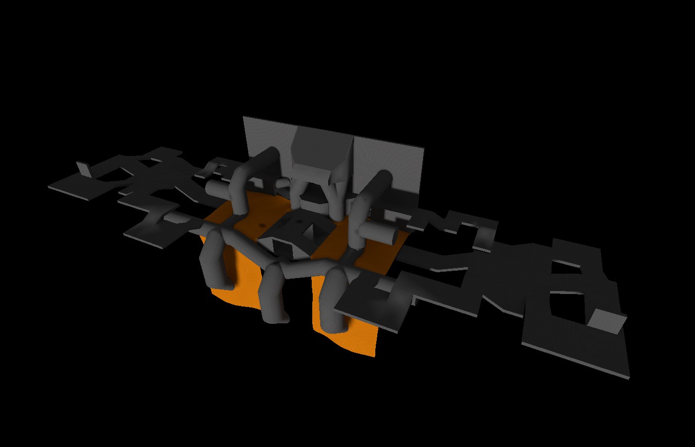
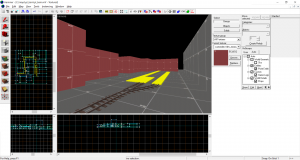
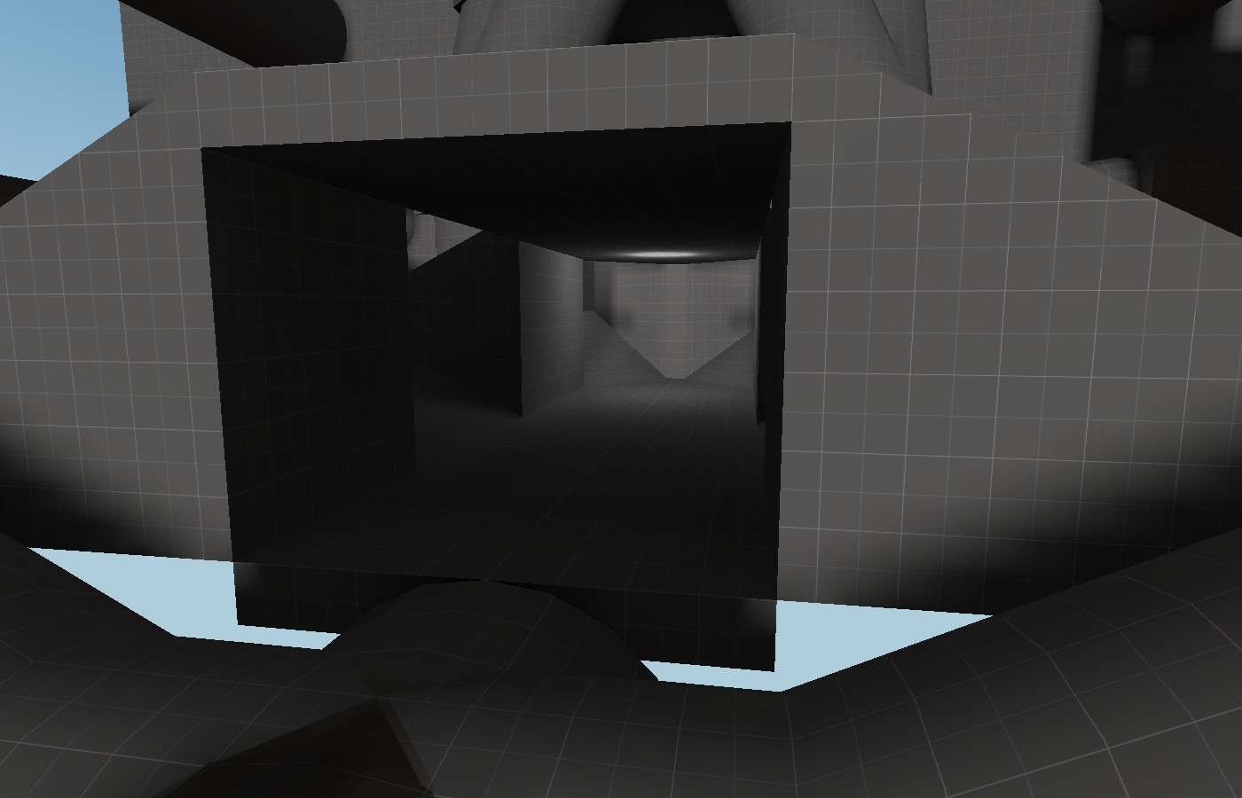
I made 45 degree angled ramps! they look phenomenal!
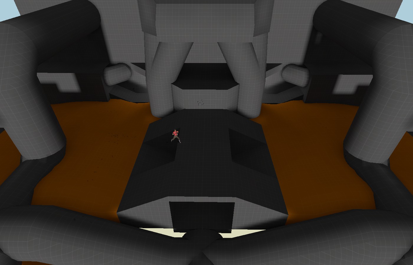
A small scout for scale... Ignore the bullet holes, he got a bit feisty...
This is the main overview, it is about 3,300 HU from the center to where I eventually intend to place the spawn doors...
The weird pathways with no walls will eventually be the indoor section...
I made 45 degree angled ramps! they look phenomenal!
A small scout for scale... Ignore the bullet holes, he got a bit feisty...
Now working on a signature overlay! It's still a draft, however. I want to mimic the TF2 style and I'd like some advice
If you would want to be more subtle, you could probably leave out "A criminal bunny." If there's a drawing of a bunny already on a wanted poster, then it would be inferred it's a criminal bunny. Also, wanted posters usually state a reward in big letters/numbers.

Now working on a signature overlay! It's still a draft, however. I want to mimic the TF2 style and I'd like some advice
I'd say the art style of the bunny itself doesn't quite match, but I don't know what would make it more fitting. Maybe a painting of an actual bunny?
I'd say the art style of the bunny itself doesn't quite match, but I don't know what would make it more fitting. Maybe a painting of an actual bunny?
I think a sketch would be better, but a painting could work also. It's a medieval style map, so it has to fit that.
- Oct 11, 2013
- 273
- 413
I thought of it too, but I had trouble coming up with something else. I also felt that writing the reward in any currency felt more western like than medieval. I may make a non-medieval version for regular maps, and now that I think of it it could look similar to this oneIf you would want to be more subtle, you could probably leave out "A criminal bunny." If there's a drawing of a bunny already on a wanted poster, then it would be inferred it's a criminal bunny. Also, wanted posters usually state a reward in big letters/numbers.
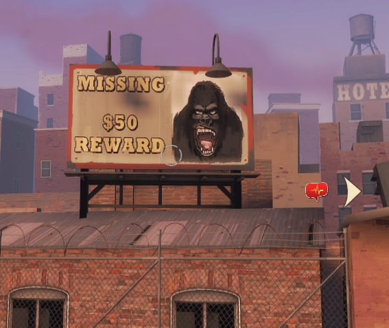
I'd say the art style of the bunny itself doesn't quite match, but I don't know what would make it more fitting. Maybe a painting of an actual bunny?
I originally tried to follow this style of wanted poster, so I just outlined the bunny. So I could do either a cartoon bunny sketch or a more realistic painting. Also, that explains what I wanted to write a name.I think a sketch would be better, but a painting could work also. It's a medieval style map, so it has to fit that.
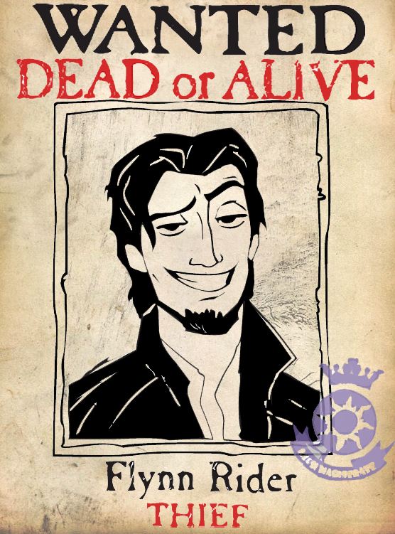
- Oct 11, 2013
- 273
- 413
I totally get it, it was just some kind of draft to get a general idea. I'll get some custom brushes and try to make it more ink-y or something and then I'll come backWhat I meant was it looks too obviously drawn with a computer program, not an organic sketch.
Zaphod Beeblebrox
L1: Registered
- Feb 19, 2017
- 3
- 5


