WiP in WiP, post your screenshots!
- Thread starter Arhurt
- Start date
You are using an out of date browser. It may not display this or other websites correctly.
You should upgrade or use an alternative browser.
You should upgrade or use an alternative browser.
rating farm below
I wholly agree with this sentiment. Now, back to work on that PL map of mine...
I feel like this map is going to be king of the hill...
From the pictures it already looks very cramped. I suggest making those rooms bigger? Especially if this is a big combat zone. Also, the pipes will probably have to be flank routes and not actually the main routes like how sd_doomsday does it.
It could be that the part he made is a flank around the point.From the pictures it already looks very cramped. I suggest making those rooms bigger? Especially if this is a big combat zone. Also, the pipes will probably have to be flank routes and not actually the main routes like how sd_doomsday does it.
But I agree. It is really cramped and long. One pyro can probably shut down the route completely
I felt like making a new CsGo map, so I did! It's called De_Tuggernaug, and you can subscribe to it on the workshop here: http://steamcommunity.com/sharedfiles/filedetails/?id=831464087
More screenshots are on the workshop page.
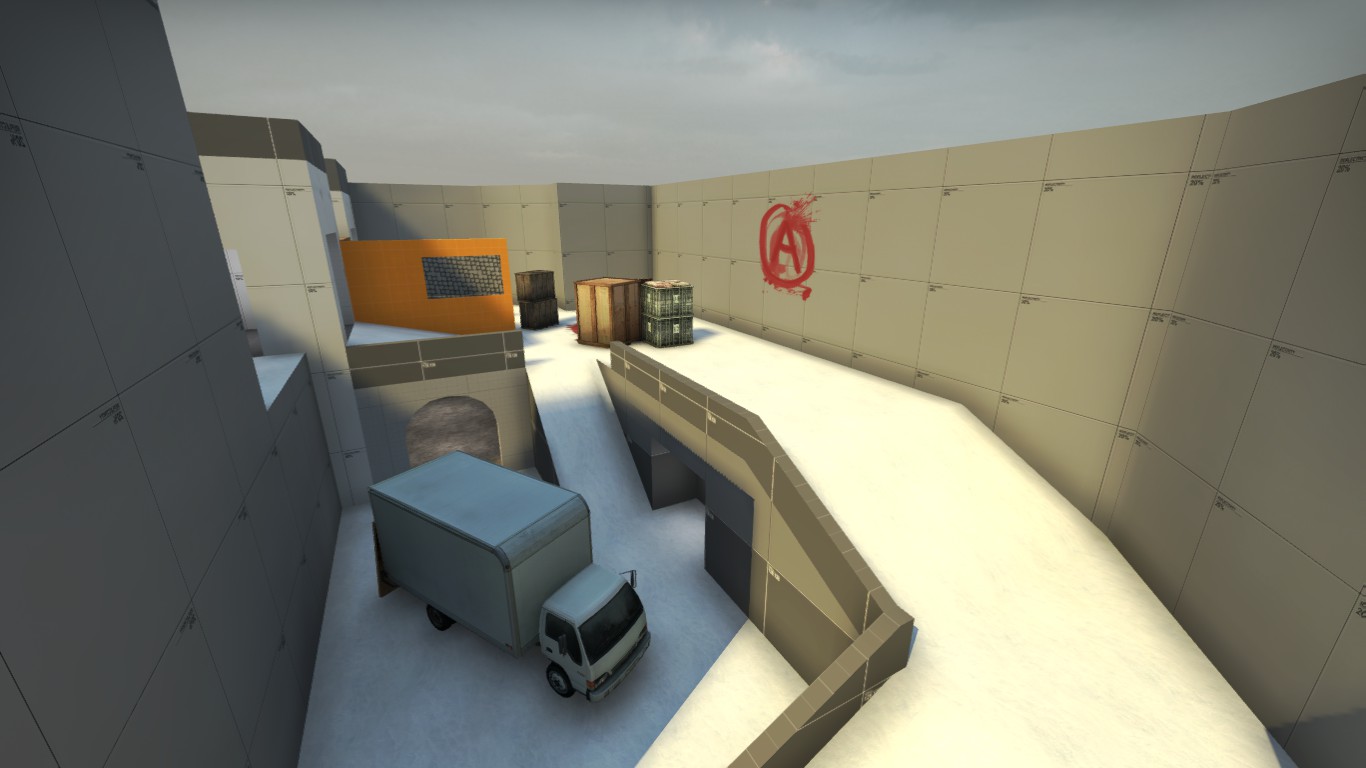
I used my new tablet to sketch up the design for it!

More screenshots are on the workshop page.
I used my new tablet to sketch up the design for it!
what i'm planning is to make the pipes be flank routes for pyros and spy's, and that small room in-between the two pipes is actually going to be a building, directly next to the point on both sides, meaning that it won't be a major gameplay space, but that every single thing i have built is just a flank route, and nothing more...From the pictures it already looks very cramped. I suggest making those rooms bigger? Especially if this is a big combat zone. Also, the pipes will probably have to be flank routes and not actually the main routes like how sd_doomsday does it.
(I intend on putting a full healthpack in the middle of the middle pipe, to make that gameplay space be used a little more...)
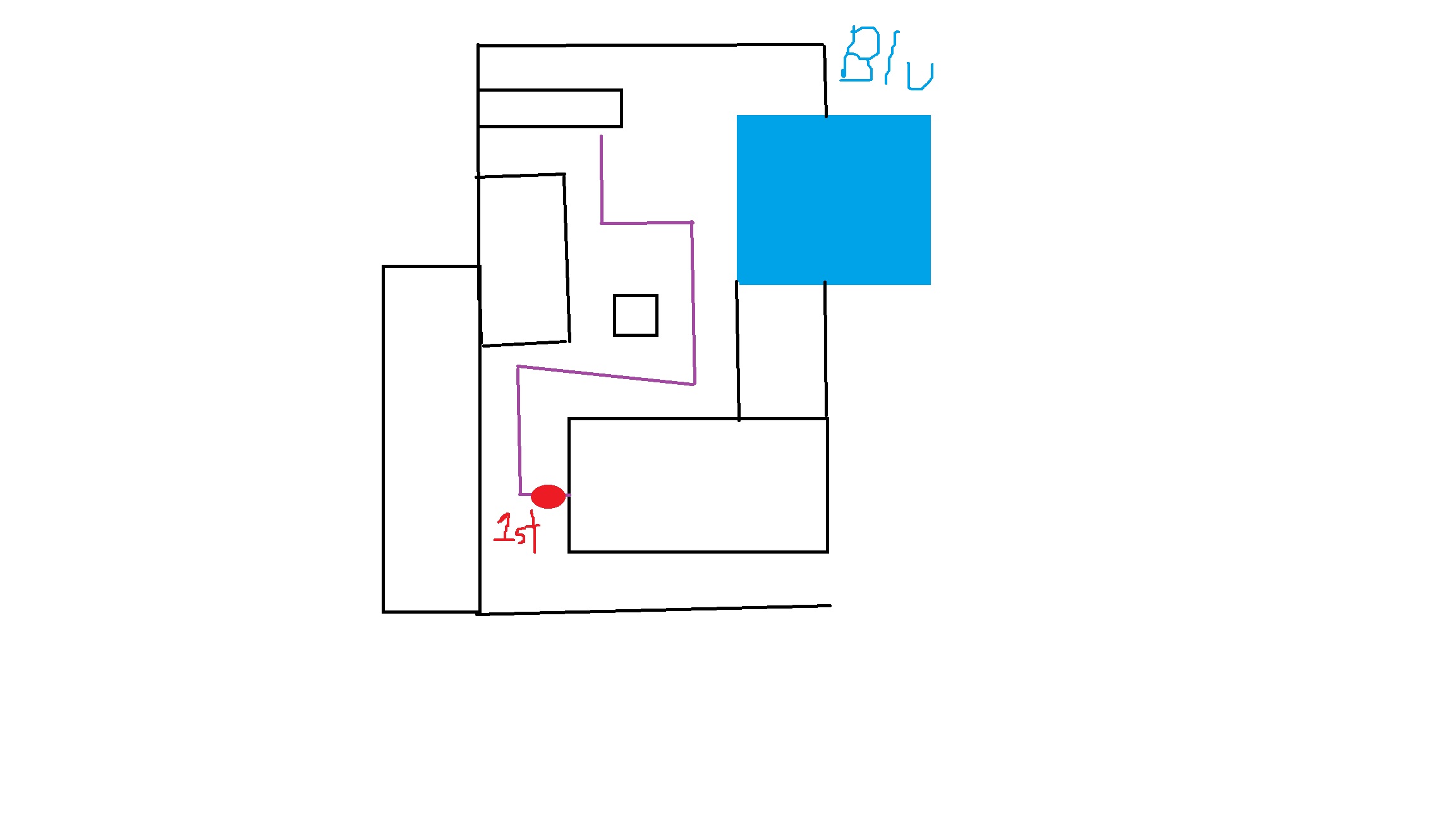
this is actually a general WIP of the map that i have intended... I through this together just now, so everything beyond what is already made is subject to change, but this is my general idea:
With everything deleted (It looks wierd, as my sketch application stopped working, so i had to physically remove the areas by deleting parts of the image) except for the things that are already made...
@zahndah sent me over the vmf for Villa to mess around with detailing on it. I spent an hour or two detailing this one building and the boards around it. I also redid the lighting and changed the skybox texture, though I think the shadows are a bit too blue. My Cuba detail practice helped here alot as I knew about the adobe and shale textures, and how to use them.
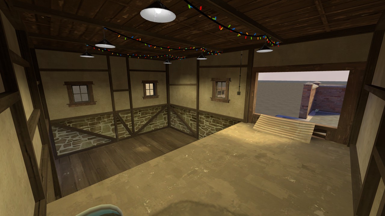
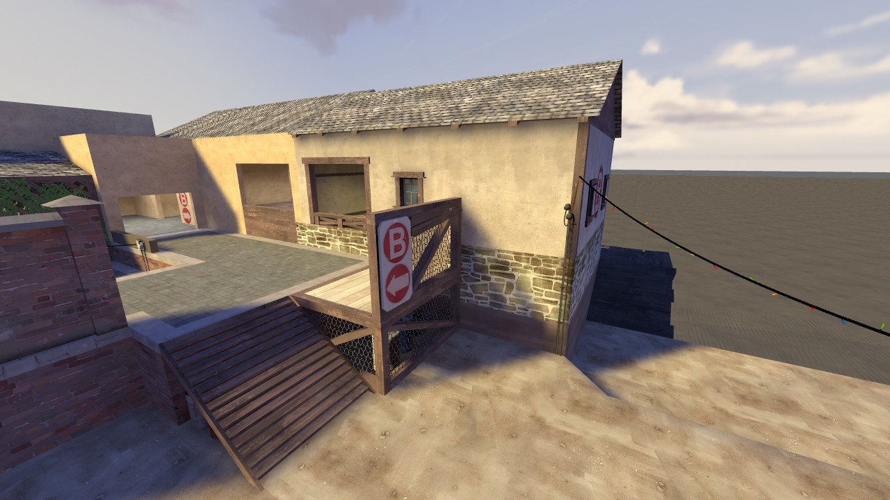
I always love putting this "watch your step" sign next to deathpits
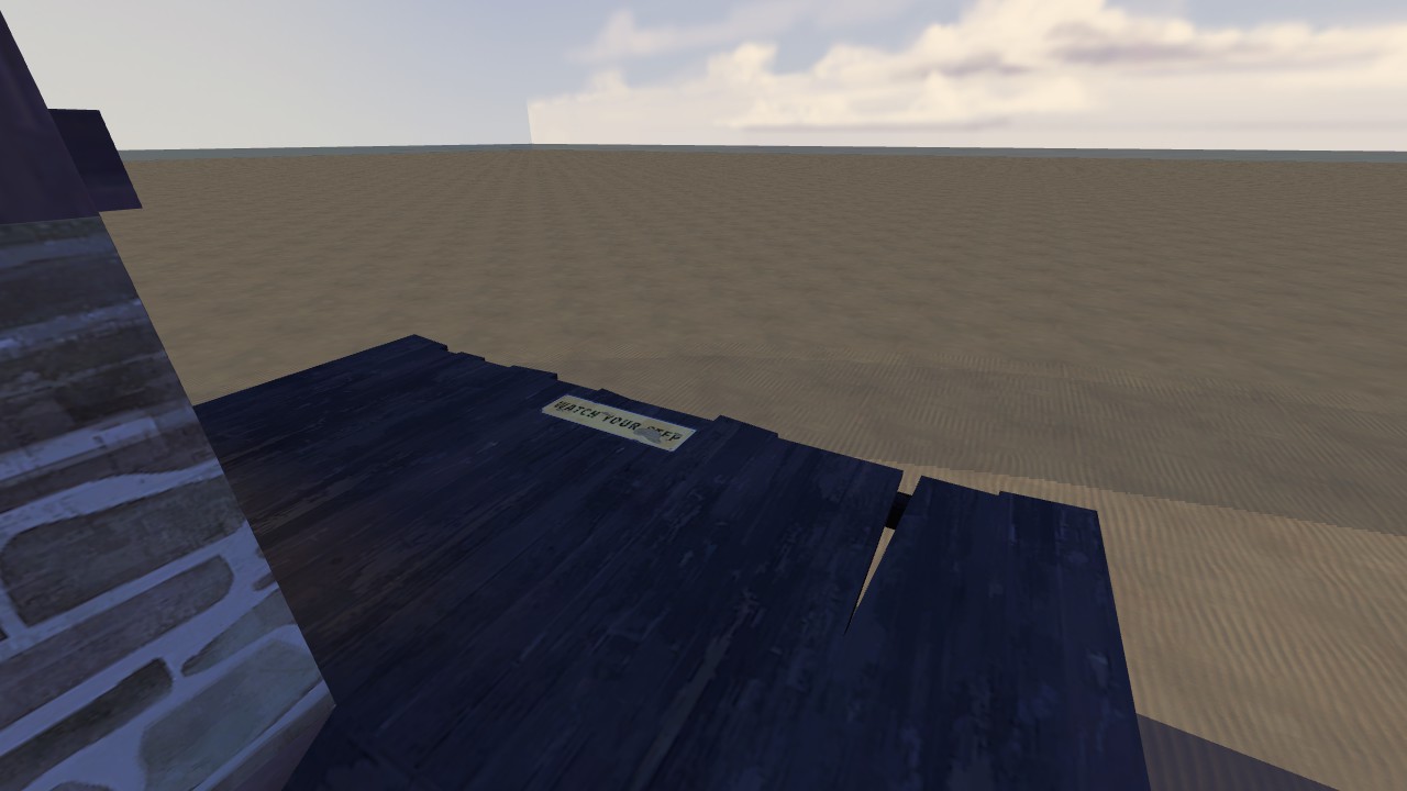
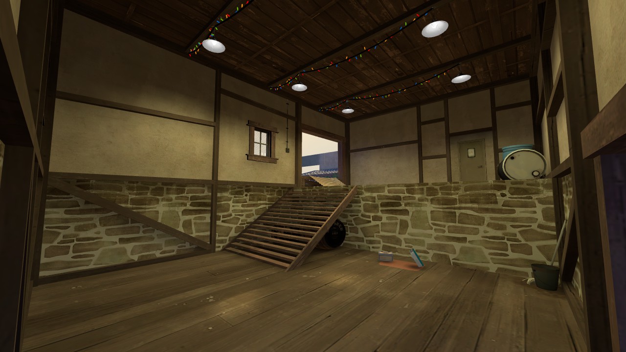
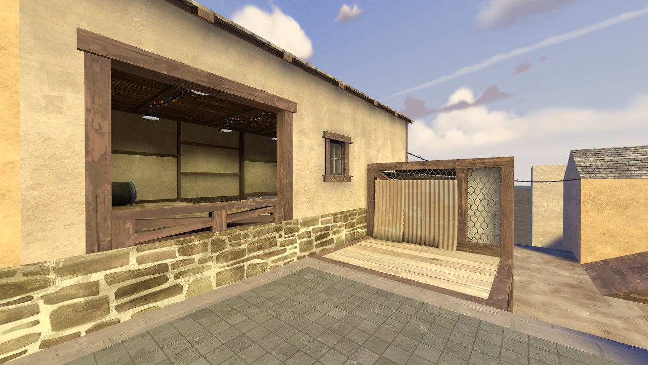
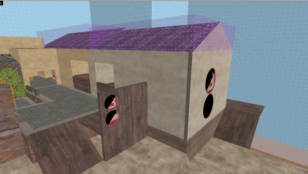
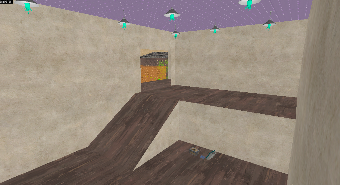
I always love putting this "watch your step" sign next to deathpits
Crrrrrrystal
L1: Registered
- Jan 1, 2017
- 25
- 52
Didn't arena mode break after the smissmas update?Detailing @zahndah 's arena_saluto.

Lighting is still gross and wip but you get the idea

tfw when you add lots of lights to try and make the lighting interesting and end up making the whole thing flat and boring

so much still to doooooooo
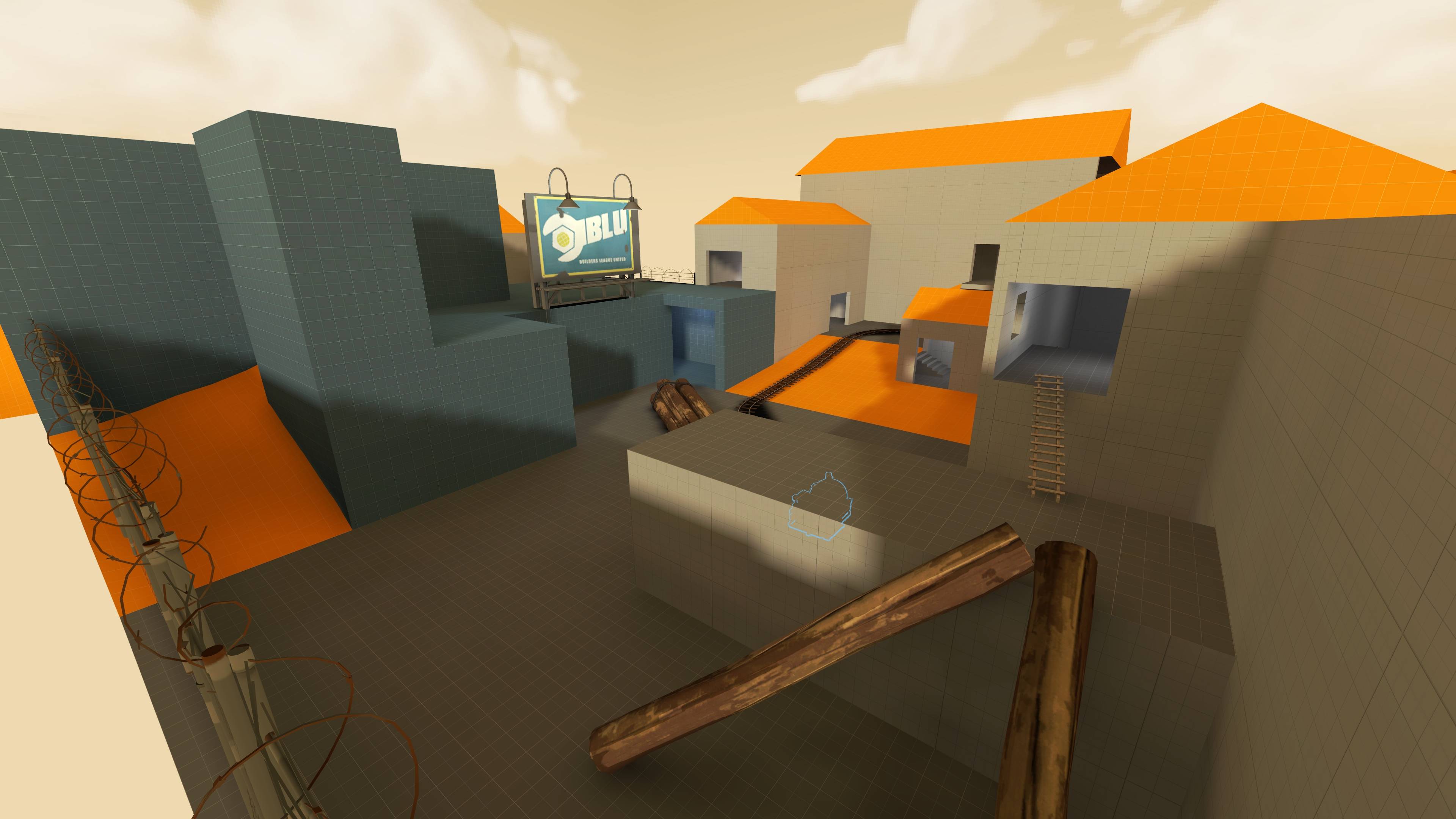
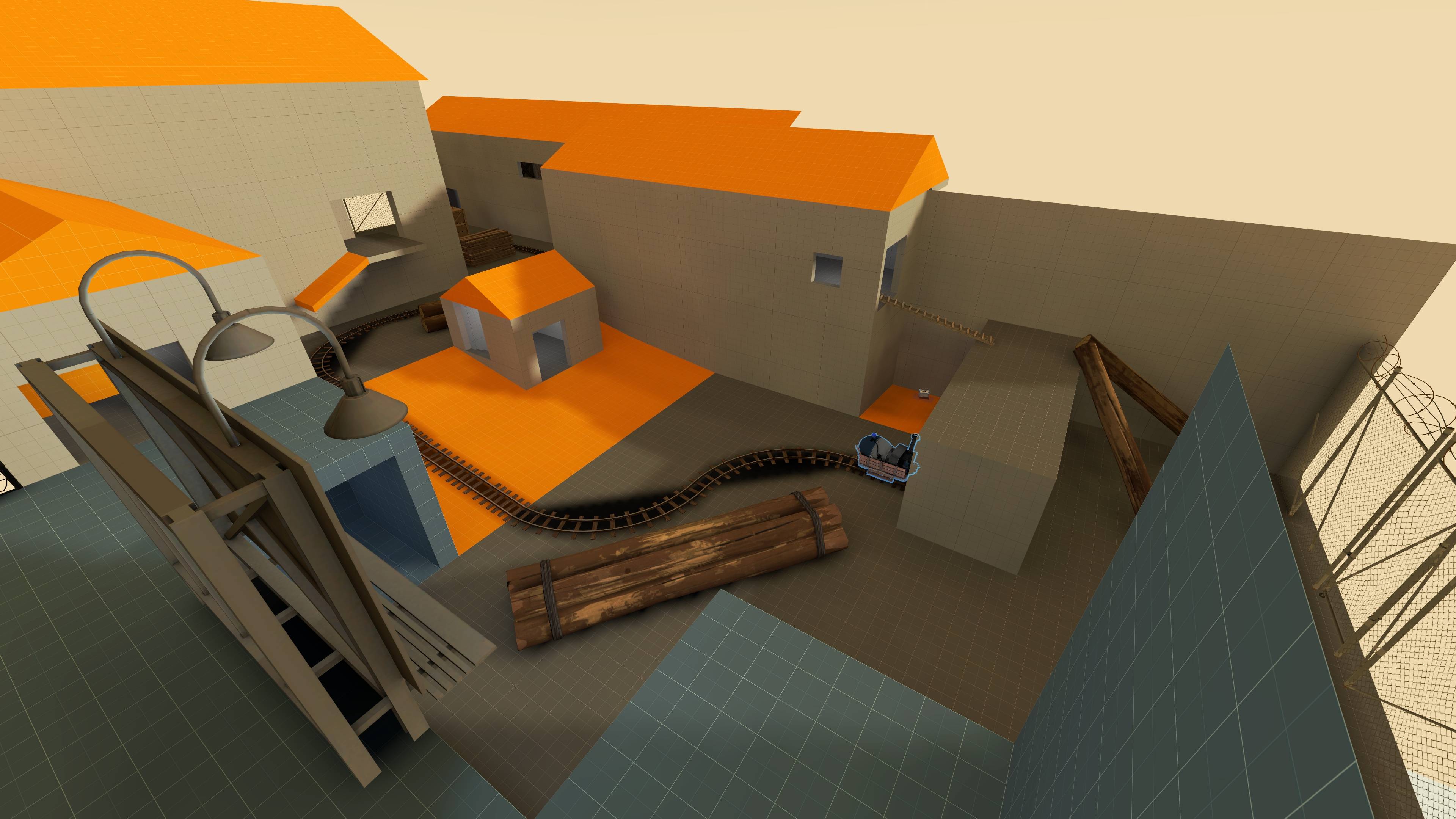
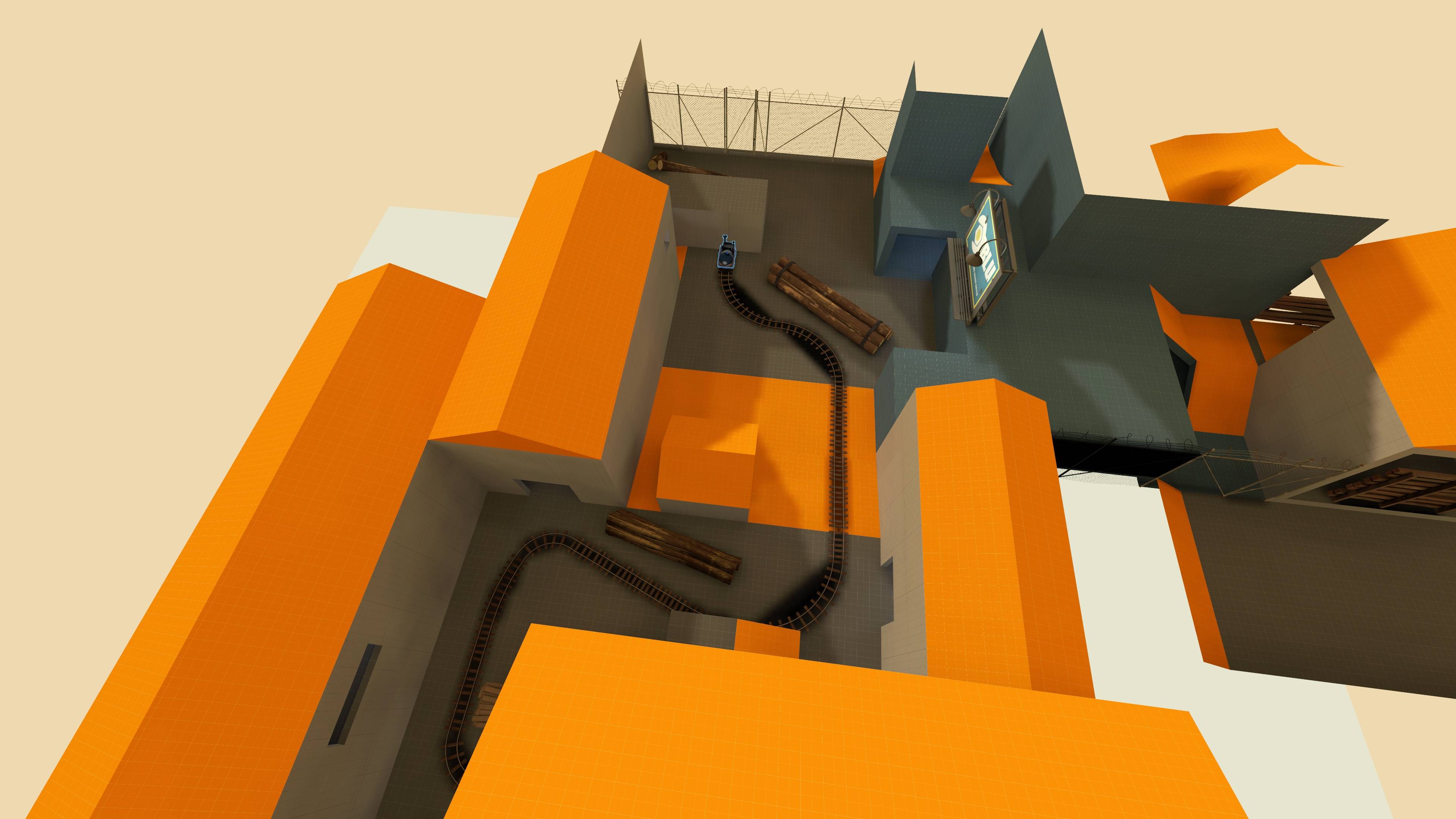
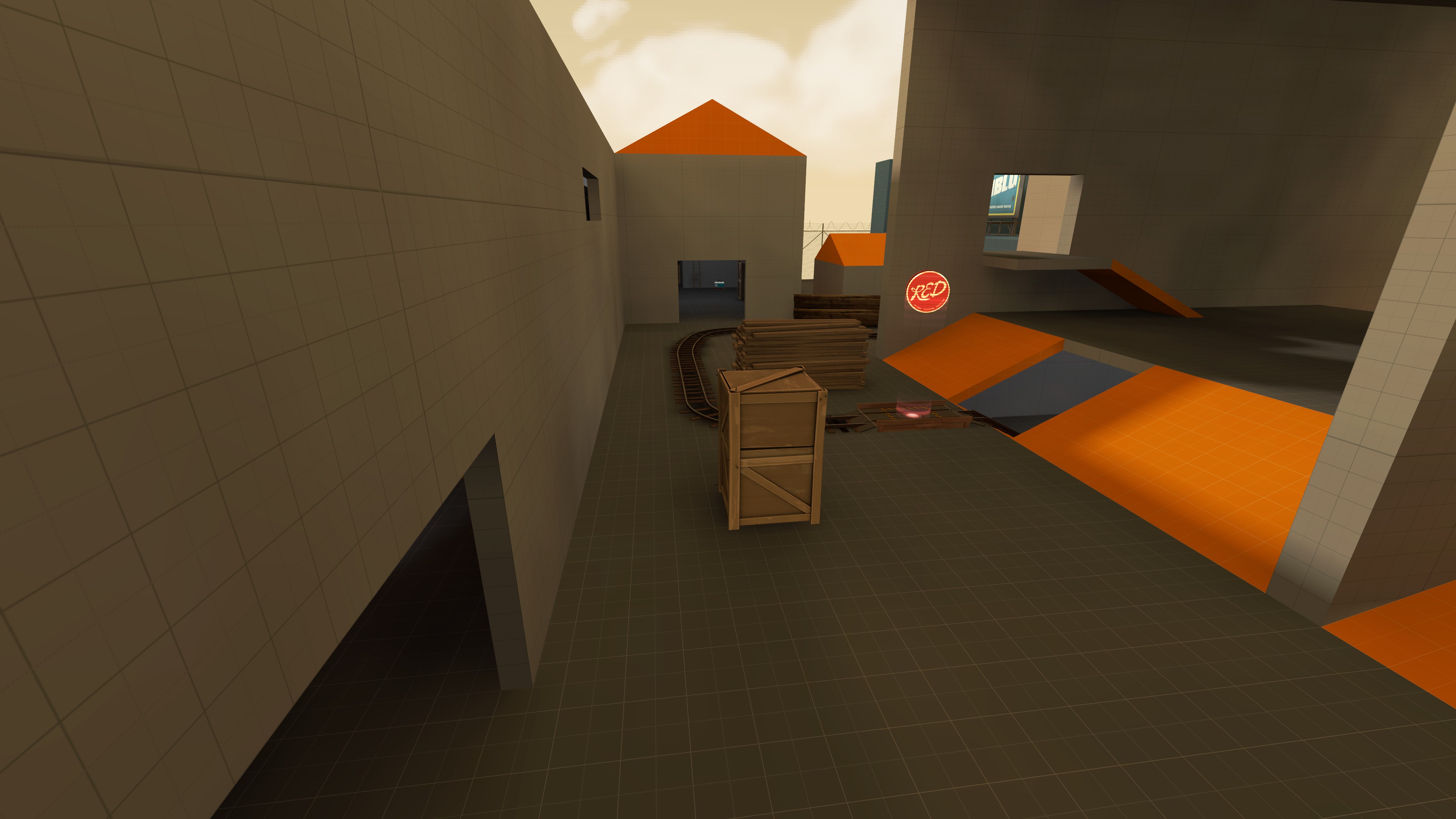
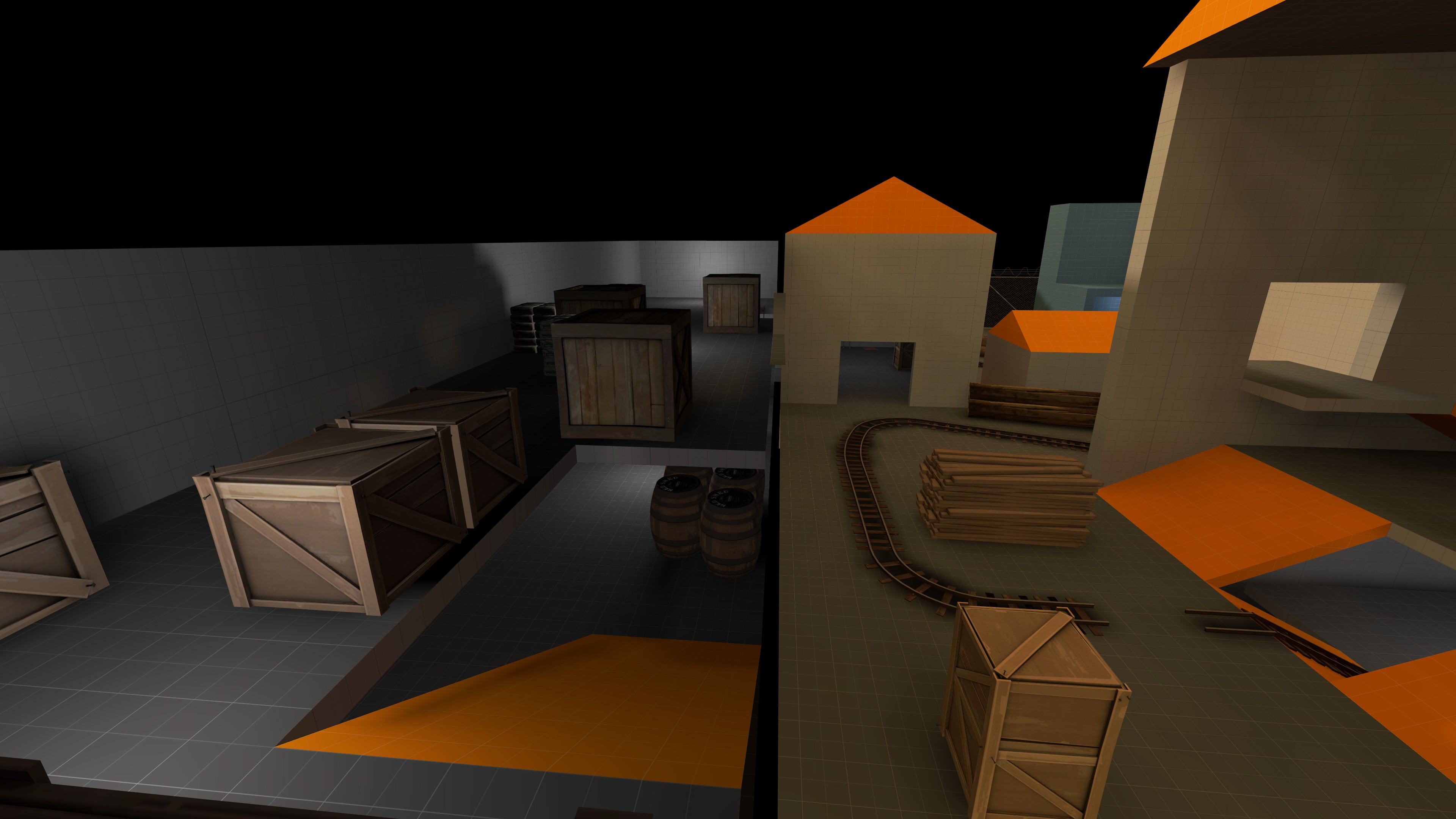
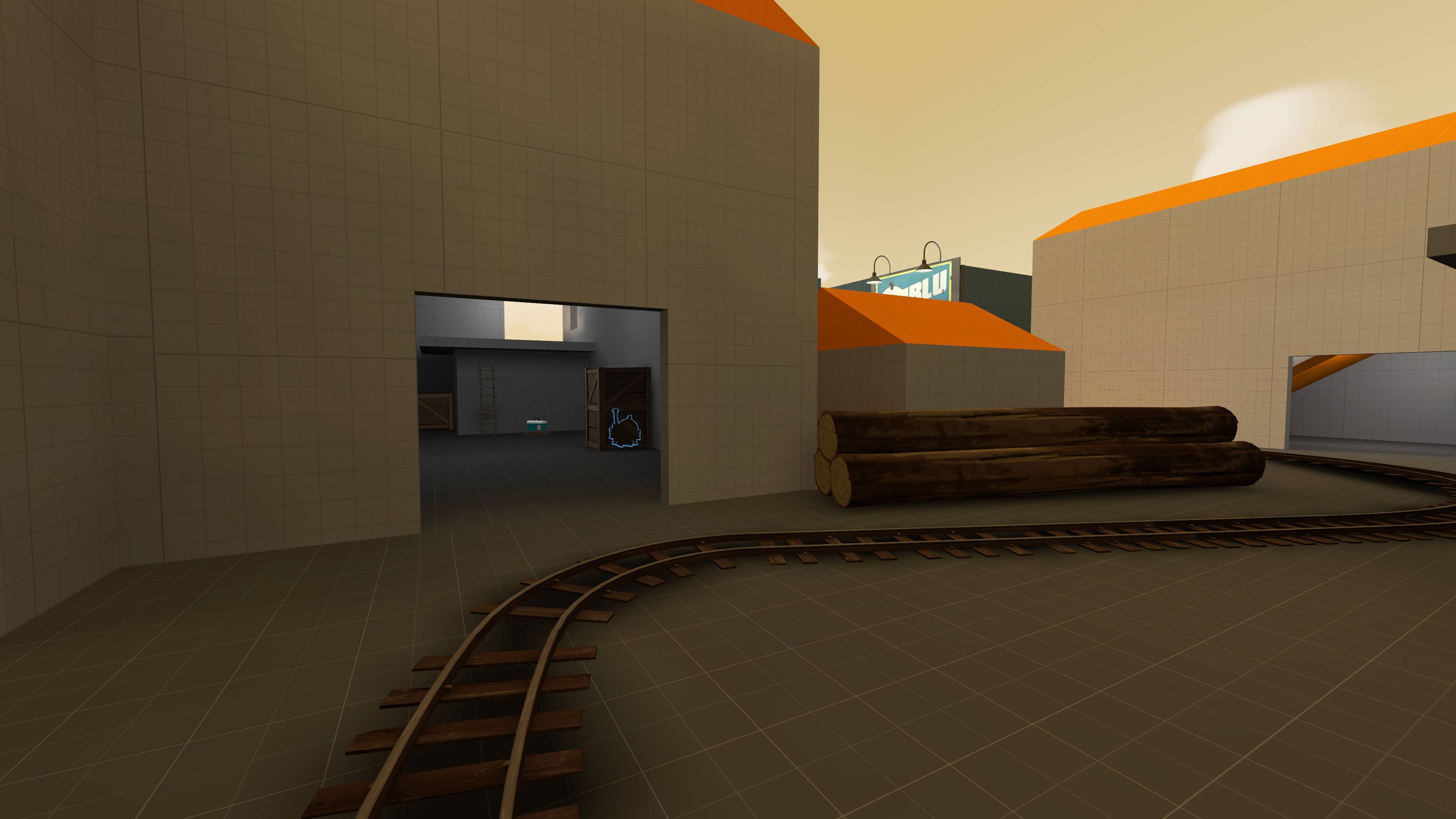
Don't forget to disable the shadows on those rails!My very first point in my very first attempt at a map! Here's a few angles:
While this does get rid of ugly track shadows, it can lead to the tracks appearing to "float" on the ground, since they should be casting a subtle shadow on the ground. The proper solution is to compile with -staticproppolys enabled, but it'll make your compile time longer, which you might not want.Don't forget to disable the shadows on those rails!


