WiP in WiP, post your screenshots!
- Thread starter Arhurt
- Start date
You are using an out of date browser. It may not display this or other websites correctly.
You should upgrade or use an alternative browser.
You should upgrade or use an alternative browser.
Last edited by a moderator:
Dain
L3: Member
- Oct 21, 2009
- 106
- 43
Couch jumping works as well (they were the dain of my existence)
;o
- Mar 11, 2013
- 892
- 1,050
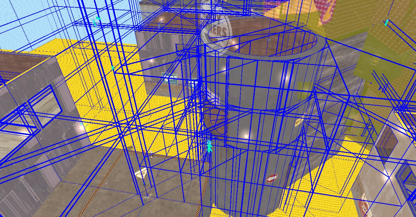
These sightlines look waay to small, please make them a bit larger.
Last edited by a moderator:
The mist should be a lot less common, and maybe a bit slower. Either that, or more consistent, rather than dramatically pulsating. The rest looks fine.
EDIT: just noticed that there's some longer streaks of rain mixed in too. The fact that they're longer seems to imply that they'd move faster than the other rain drops, but they actually move slower? Kinda strange.
EDIT: just noticed that there's some longer streaks of rain mixed in too. The fact that they're longer seems to imply that they'd move faster than the other rain drops, but they actually move slower? Kinda strange.
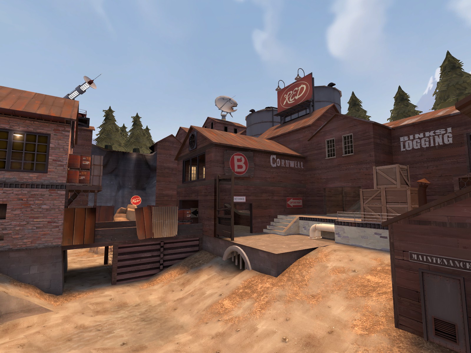
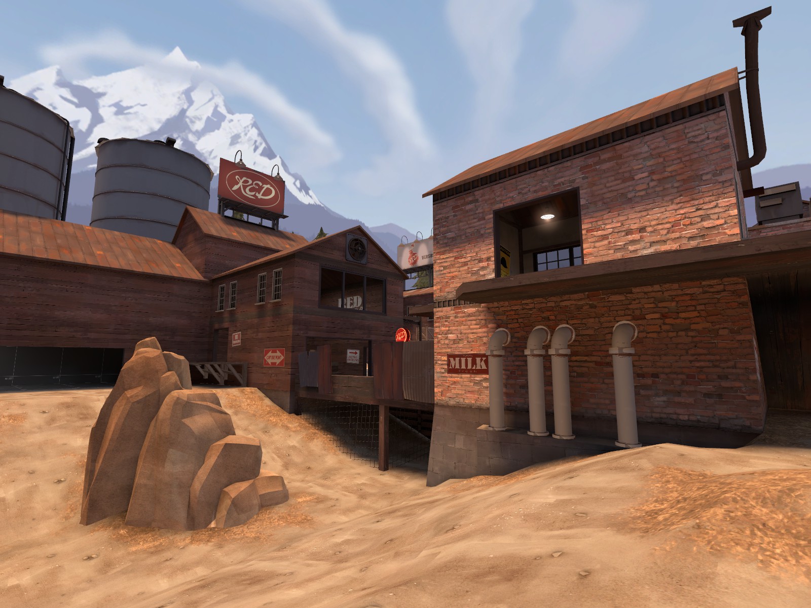
I would put some gutters on your roofs, like on dustbowl stage 3 (in some areas you could make your roofs more interesting in general, dustbowl has some crazy stuff going on its roofs. and it makes them look really neat.) That being said, the flat roof style is nice.
I would put some gutters on your roofs, like on dustbowl stage 3 (in some areas you could make your roofs more interesting in general, dustbowl has some crazy stuff going on its roofs. and it makes them look really neat.) That being said, the flat roof style is nice.
Honestly I've barely started detailing compared to what I want the B to be complete, and the left building in screenshot #2 has a gutter (I haven't gotten around to putting the rest on yet).
As for stuff on the roofs, I do think some metal sheets and tires could certainly make things better like dustbowl, or even just plain missing tiles.
Looks really nice, Berry; I love the colors. You should bring some of the green from the out of bounds areas into the gameplay area with some small plants - look at how Hydro does its foliage.
Also, more chimneys.
EDIT: Maybe some dirt overlays under the water to show it a bit better?
Same again about the detail, but yeah, more chimneys, stuff going on with the roofs + the foliage and dirt overlays to show the puddle more all sound like good ideas.
Last edited:
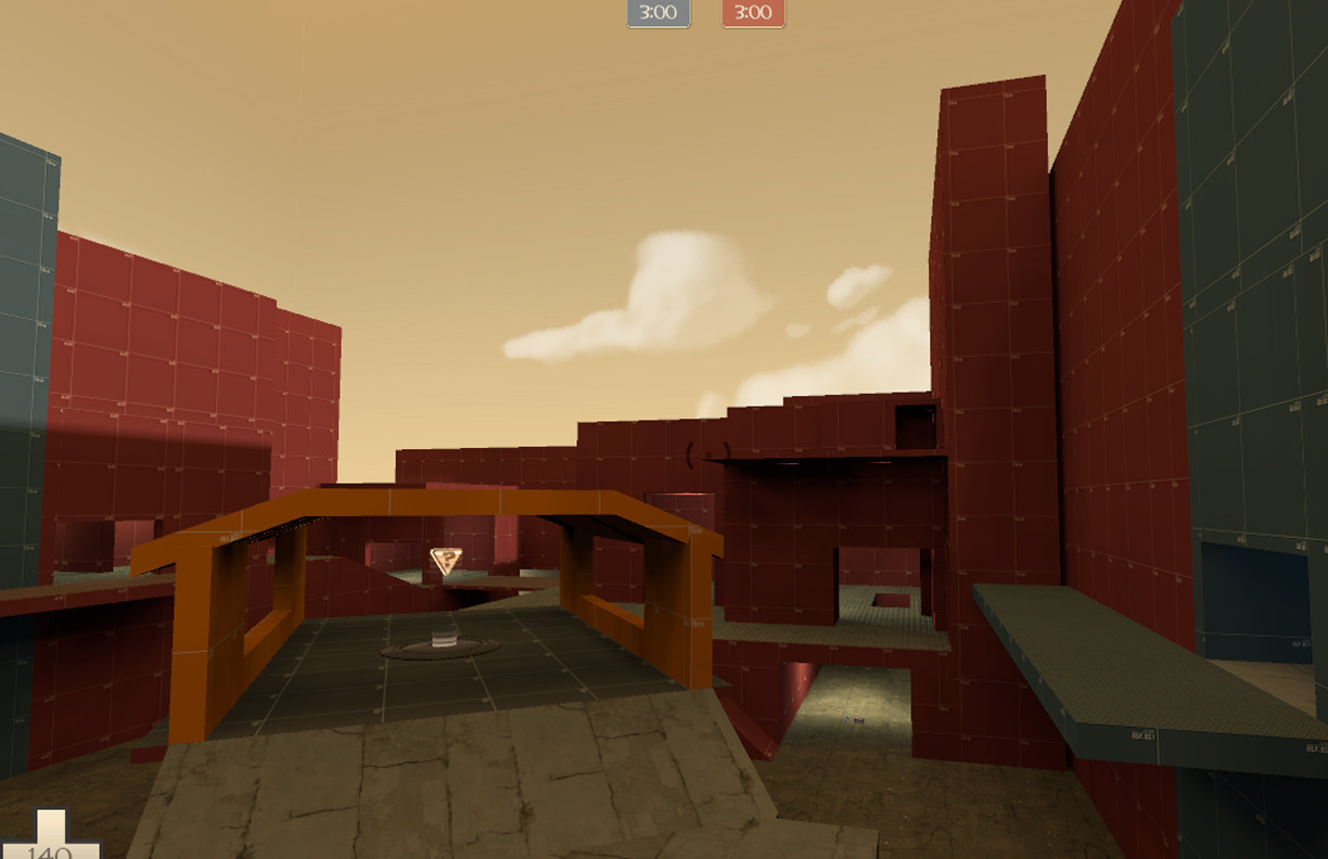
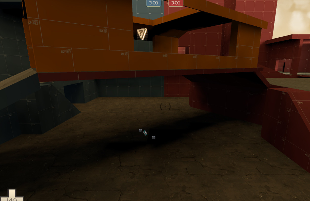
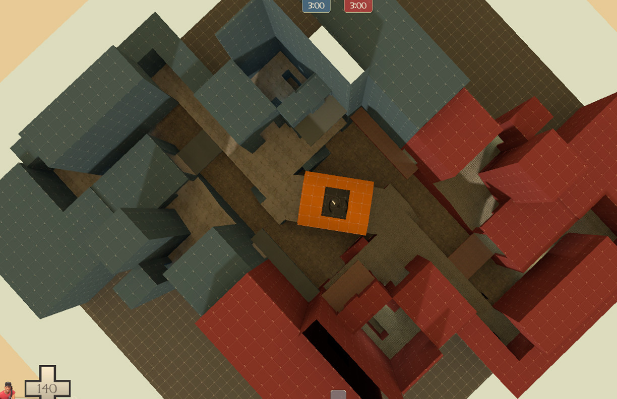
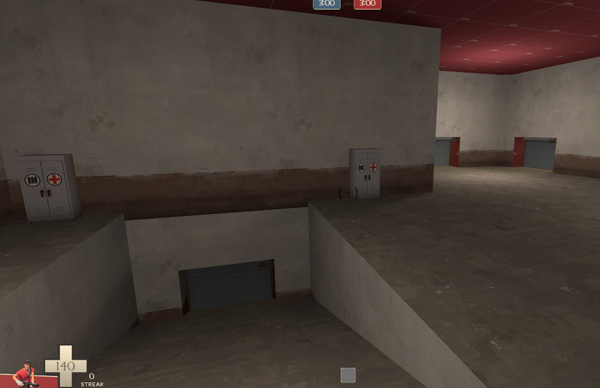
It looks great Aman! But perhaps a bit overscaled. If you use the control point as a reference then the entire area looks pretty large. But I love the height differences and your inside areas look interesting. Reminds me a lot of koth_king.
Thank you. I will work on the scaling. Also I'm happy that the map reminds you of Koth_king because aesthetically that is what half of this map is supposed to be going for. The other half being aesthetically reminiscent to foundry perhaps.


