TF2Maps.net Major Contest #16: Back To Basics [RESULTS]

Idolon

they/them
aa
Feb 7, 2008
2,123
6,137
tf2m back to basics banner.png


Main Thread | Upload Thread | Preliminary Voting | Finalist Voting | Results

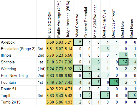
128 days and 32 maps in the making, this contest is coming to a close. Big thank you to everyone who participated! I feel like this has been one of the more successful contests in recent memory. Here are your results:

Symmetrical maps:

1st place: Shithole, by @Wilson
2nd place: Illinois, by @Paper_
3rd place: Escalation (Stage 2), by @LoovyTurgz

Asymmetrical maps:

1st place: Fountain, by @tyler and @vanSulli
2nd place: Emil New Thing, by @Emil_Rusboi
3rd place: Tarpit, by @DrSquishy

Honorary Titles:

Most Creative: Axlebox and Waterlog (5 votes)
Greatest potential: Emil New Thing and Tarpit (5 votes)
Most Well-Rounded: Fountain (7 votes)
Best Alpha Style: Tarpit (7 votes)
Best Spawnroom: Fountain (15 votes)
Best Hole: Shithole (12 votes)
Best Name: Tarpit (6 votes)

upload_2019-12-2_19-53-16.png


upload_2019-12-2_20-10-6.png


upload_2019-12-2_20-10-25.png

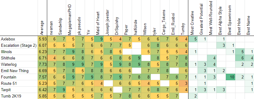
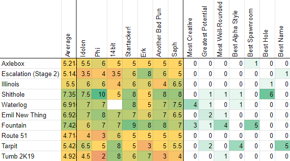
Link to full results (Google Sheets page)
(See attached file below for .xlsx download of scores)
Again, big thank you to everyone who participated, especially the public voters and the judges for giving up their time to score these maps! Judge feedback will follow shortly (within one or two days). Someone on staff will be contacting the winners with info on how to claim their game key prizes, and Mapper's Medallions will also be going out shortly.
 

tyler

aa
Sep 11, 2013
5,100
4,621
Thank you for liking my map, and congrats to the other winners.

I agree that this has been one of the best contests the site has ever seen, honestly maybe the best in terms of quality maps produced. It was a great concept and there were a lot of great maps. Good work everyone.
 

Idolon

they/them
aa
Feb 7, 2008
2,123
6,137
Time for me to hand over the hammer! Who should take it though? Wilson or Tyler or VanSulli?
Tyler would by default by having the highest scoring map. However, he has decided to defer it to Wilson.
 

14bit

L14: Bit Member
aa
Oct 5, 2014
661
2,121
Congratulations to everyone who placed, and extra special congrats to the winners! I'm really looking forward to seeing some of these maps evolve in the future, and can't wait to see them tweaked and detailed.
 

Idolon

they/them
aa
Feb 7, 2008
2,123
6,137

Overall notes
Idolon
My scores are based on gauging what my gut reaction is when I realize I'm about to play a map. Sometimes I adjust scores if I think a map is well-designed despite not being fun, but it is a minor adjustment. How much I actually want to play the map is my main priority in scoring.

Saph
As this was a gameplay contest, I tried to neutralise my emotional reactions to each map in these final notes, but there are still distinct tonal differences in writing. However, scores don’t necessarily reflect an ‘objective’ quality of the map. Feedback is organised by a progression throughout the map itself. Asymmetrical maps are described from the attackers’ perspective while symmetrical maps move towards the center. If you have any questions of would like more specific notes from individual tests, feel free to ask.

Axlebox
abp
The gameplay spaces are passible but the overall flow of the map is messy and unsatisfying. Being on the losing team prevents you from having much fun. The lighting is often too dark where it shouldn't be, like on control points A and C.

Idolon
Splitting teams between three different objectives is asking for trouble. This map can be fun to play in a chaotic way, but I think that ultimately the main problem with it is a direct result of the gamemode - splitting teams up between three objectives often means you’re attacking an objective by yourself, and the whole “playing with teammates” part of TF2, which I believe to be the main thing that makes this game fun, is harder to come by. This is further accentuated by the fact that respawn times are short - you often aren’t respawning with teammates, and you have nobody to group up with when leaving spawn. The most fun I had with this map is when I actually attacked an objective in coordination with some of my teammates, but it didn’t happen as often as I would like. By the same card, the map is more fun when there are multiple enemies to attack, but often I am fighting one or two enemies at most for the entire duration of capping an objective. It was rare that I had a fight bigger than a 2v2 on this map.

Mid is also just an undesirable place to defend. There are several different routes you can be ambushed from and the most successful strategy I found for taking mid was crouching behind a train for cover and hoping for the best. The layout might work in a different gamemode where teams are more coordinated, but due to the problems above, it mostly just makes me anxious to be on. The ideal version of this map might be one where every objective is designed specifically to make 2v2 gameplay fun.

Saph
The gamemode severely limits the potential of the map while the layout forces teams to be strewn out, creating a DM environment around objectives.
  • The spawn and outer courtyards are well-designed for directing players to the points while allowing for rotations. However, the opposition could push forward and hold in the long side or central lobby.
  • The square lobby for A and C works well for combat while giving some interesting height differences, but the balcony was rarely used to attack the point. The central lobby has too much going on as there’s two tight corridors, doors leading to two different points, and an upper area that makes sense, but isn’t good. The narrow path into the lobbies for A and C feels two tight while the area doesn’t lend itself towards teamwork.
  • A and C are annoying to fight around. The gates are useful for defenders, but they prove frustrating when attacking. Navigating up is a struggle, regardless of the path taken.
  • The central point, B, isn’t any better. Players can pour out from every direction and the point feels as though it should be extended. The low cover of the train cars doesn’t make much of a difference as attackers often come from above.
  • There’s so many connectors — some direct, others leading through lobbies — that disrupt gameplay. The separation is necessary, but areas are too drastically different for the map to feel coherent.
  • Most pickups were well-distributed. Aesthetics did not impact gameplay.

Startacker
  • Gamemode isn’t really fun to play
  • Doesn’t feel substantial to capture a control point
  • Teams felt really split, a lot of my fights were 1v1s or 2v2s
  • Overtime is needless, losing team is usually in a position where they can’t win

Escalation (stage 2)
abp
I enjoy the mid of this map and the main connector, generally. The most exciting moments tend to be at the very start of the round when neither team has full control of mid. After this initial fight however, the sheer size and openess of mid means that a team ends up fighting just to get out of their base for long periods of time, which gets tiring after a while. As a result the gameplay can become stalematey and fall flat, which you don't want in a multi-stage map.

Idolon
I struggle to find fun on this map. Mid feels like it *should* be fun, but I think the fact that the mid is all high ground and attackers have no high ground to use means that attacking it is a total slog. At the same time, crossing mid to attack the final area feels impenetrable most of the time, and the game tends to stalemate directly on either side of the connector. I suspect part of the problem is that every single route through the connector is somehow connected to the main path, meaning it is more or less impossible to sneak through the connector without being seen, as well as the issue I have with mid that makes it difficult to push back out once you’ve lost mid.

Saph
This map usually devolved into DM due to the track length, eventually resulting in stalemate after stalemate. The initial midfight is extremely enjoyable, but beyond that, brute force is required to have a successful cap.
  • The spawn was well-constructed and provides a handful of decent ways out. The outer courtyard feels nice and naturally directs players forward, but the upper spawn area’s distance from the track and ‘dead end’ nature led it to be used rarely. The one side building would often be used by attackers moving towards the opposition’s spawn door, leading to spawncamping.
  • The simplicity of the cart’s starting room and mines led to the areas playing out predictably in fights while being the safer way of attacking the point. The middle room was well-designed as it drew players in while providing a fun area to fight around despite its connector being used rarely. The other side room was alright, mainly used for reaching the flank.
  • Fighting around the rocks and bridge was super enjoyable unless both carts were near one another. I liked the short ramp up, but wish I could jump up behind the telephone pole. The train was surprisingly not annoying.
  • The flanks and side huts were once again simple, but offered a nice flank and new angle of attack for either team. They became highly contested later in the round.
  • Pickups were well-distributed. Aesthetics did not impact gameplay, but the diffused lighting felt flat, making it a little sickening.

Startacker
  • Map is fun up to the final section
  • If both teams get their carts to the lobby before each teams spawn it enters a deadlock for whoever can hold mid and never let go
  • Overtime doesn’t communicate anything and doesn’t solve the original problem if a round stalemates
  • Also overtime, what is the defending team supposed to do at this point other than lose? Might as well just end it where it needs to

Illinois
abp
Lobby has to carry too much weight in the layout - it's like a swiss cheese room of doors, and the overall layout suffers because of it. Despite mid having a hole in the middle, it's mostly boring because it's so easy for people to travel and flank wherever they want. The overal openess doesn't help things either.

Idolon
KotH is a gamemode where I need something unique to latch onto about the map or else my mind shuts off and playing TF2 just feels like I’m going through the motions. The hole in the center of the map doesn’t seem to do much other than just catch unaware players, which doesn’t do much for me. The layout seems to work, I certainly had more fun on it than the bog-standard TF2M Viaduct clone, but ultimately it doesn’t do a lot for me.

Saph
This was an alright map. It did small things right, but felt overly generic and missed the mark on some occasions.
  • The spawn works, but I wish the resupply cabinets were closer to the door. The outer courtyard feels a little bland. The main lobby was fun at times, but its geometry could lead to frustrating situations as it lacked polish and could make it hard to get far from spawn. The side routes were useful for avoiding fights, but they could also be easily missed. I disliked the tightness of the sniping balcony and upper platforms outside of the lobby.
  • The buildings on the sides of the point were great for flanking classes. I wish the spool jump was slightly easier as it was frustratingly inconsistent. The platform outside of these buildings also proved useful for getting a small height advantage over the point or attacking a back line.
  • The outside area felt extremely bland as did the point itself, and they left players vulnerable with few safe areas. Players would try moving to the corners, but even that was useless. The hole itself was an annoying gimmick.
  • Most pickups were well-distributed. Aesthetics did not impact gameplay.

Startacker
  • Okay, but not really fun to play on
  • This map has mutated in a way from its first few iterations that seem more for the worse
  • Maybe the initial hype for hole map has worn off? I dunno

Shithole
abp
Unexpectedly well made - the gimmick of the map works way more than it really ought to, but I think this is because the side buildings, lobbies, and general routes are super clear and easy to understand. In particular, going left means attacking up high, going right means attacking down low, and this is always the case. The pickup placement is also on point. Lobby probably has too many doors though.

Idolon
KotH is a gamemode where I need something unique to latch onto about the map or else my mind shuts off and playing TF2 just feels like I’m going through the motions. The hole in the center of the map is a neat new idea and the map plays differently from pretty much any other KotH map I’ve played. My main gripe with this map is how chaotic it is - it works when everyone else is leaning into the chaos, but it tends to buckle under pressure once someone really wants to win - a single teleporter or a heavy/medic combo in the right spot can completely shut a team out for the full three minutes of capture time.

Saph
This map was consistently enjoyable to play on. Every route, room, and area felt purposeful, meaning the gameplay itself followed well.
  • Spawns were plain, but effective in providing multiple ways out. I feel like the spawn, initial room, and outside area could have been made more interesting. The lobby followed with fantastic areas that pair well with a variety of playstyles and classes while providing a sense of teamwork spread across its entirety. Backing off and navigating upwards could feel awkward while the one small connector should have its geometry simplified. Although not intended, it was easy to camp in the lobby at times.
  • The upper side rooms continued the openness and were clean to fight in. Moving up and down between the two lobbies was smooth. The lower room was extremely useful.
  • The outside areas were alright. I enjoyed the sides more than the center due to the amount of jumping to the point or inability to defend your side.
  • The point itself was quite interesting to play on, but flawed. Playing on top provides a unique vulnerability while the bottom allows for being safe, meaning the point didn’t change hands all that often. You were close to hitting it on the head, but I don’t have changes to suggest.
  • Pickups were well-distributed. Aesthetics did not impact gameplay.
This map received my vote for best hole.

Startacker
  • Really fun control point
  • The lobby feels a bit weird, but the layout seems really solid

Waterlog
abp
A site is vertical, B site is flat and low. The contrast worrks well in the gamemode. The DM is fun. Controlling the middle area is important, but not imporotant enough to make it overpowered. The water allows for lots of verticality without being overly punishing. Good job.

Idolon
The overall design concept for this map is a neat new take on PD which I quite enjoy. The map layout needs work though - B is considerably more fun and interesting to play on than A. I’ve already said a lot to this effect and I don’t feel like repeating myself, so I’ll just add one new idea: What if there was a sneakier way to climb A? The jump pads are a nice addition but leave you extremely vulnerable and ultimately are not a good way to actually try and clear the area of enemies (not to mention they only seem to work like 50% of the time and are made even worse when the capture zone isn’t active). I would love it if there was a way I could walk directly up to A and also have some cover to use when attacking enemies either on the point or approaching it.

Saph
I’ll preface this by saying that although I’m not really a fan of DM-centric gamemodes outside of arena shooters, I do enjoy a good shake-up in gamemodes every now and then, especially if the map does something new that accentuates the gamemode. Player destruction can be fun, but it is insanely hard to pull off well.

My initial impressions started high as I saw the large areas with platforms to navigate the verticality. The layout complimented an ebb and flow along the axis as a team, but camping still plagued the gamemode.
  • Spawns were well-constructed with their lobbies offering plenty of ways out. The corridor towards A was underused due to its poor placement, but wasn’t necessarily awful. The path to B had one awkward corner by the lower ramp and felt tight at times, but still worked well. The larger lobbies with height variation could be off putting at times, but could be used by both teams depending on their needs.
  • A was surprisingly interesting with its height variation. The connection to the central route made things feel a bit tight, but the area played well. The water area had neat dynamics depending on each class with the way it wrapped along the underside of the point making pushes viable. The vents were far more meaningful than Reactor, turning the gimmick into an actual mode of transport. Players seemed to naturally gravitate towards this point as it was memorable.
  • The lower ground of B created a unique vulnerability, but allowed it to be camped easily. Both the trees and low barriers provided cover that provoked large amounts of movement and teamwork. There was a pervading flatness due to the cliff and low ground, but it didn’t affect gameplay.
  • The central spine of the map allowed teams to build up along the sides while rotating quickly through the center. The outer paths allowed for teams to move as a unit while the inside favored smaller numbers of players, but supported them well with pickups and means of rotating within a fight.
Pickups were well-distributed. Aesthetics did not impact gameplay.
This map received my vote for most creative.


Startacker
  • Fun to deathmatch on
  • Transitioning from A to B or vice versa is exciting, enjoyable to contest an area before a control point is activated

Emil New Thing
abp
Blu's spawn yard is probably too short and wide. A point is pretty fun! The tension between the red garage where red tends to set up and the rooftops blu has access to makes for a fun fight. I think that the left route that blu has is probably too tight, however.

I enjoy the connectors to B but the point is too open. As a consequence it feels as though it doesn't matter what route I take as a certain class - I will probably get sniped regardless. The openess of last and lack of good sentry spots there means red will want to push into the routes, which makes things worse. I do like the waterfront area.

Idolon
I don’t know what to say about this map that hasn’t already been said, so I’ll just leave it at this: A is pretty fun, B isn’t.

Saph
I enjoyed this map a fair amount. Time spent detailing could have instead been used for changing up parts of the layout, but it still felt solid.
  • The initial area was alright. It gave plenty of room for attackers to push out from while being decently challenged by defenders. There isn’t much of an established lobby, but it still plays well while offering plenty of diversity for attacking A. Some portions of geometry remain far too underdeveloped — such as the ramps up from the beach — but still do succeed in providing another option for both teams. The garage allowed for an engineer nest to form, but teams had varying degrees of success.
  • The path from A to B was rough at times. The forward spawn was in an awkward position, leaving it easy to camp. The connectors had issues too, mostly with awkward combat and rotations from defensive and offensive positions. Paths sometimes felt underdeveloped, but still functioned and were unique. Combat was always fun, even if a tad messy at times.
  • Last was all over the place. It felt underdeveloped and could use polish, but worked well for both teams. There were plenty of spots for defenses to be set up,with smaller fights breaking out along the edges, and interesting places for pickups. Rounds were almost always extremely close victories or defeats.The seaside routes were messy. I’d recommend cleaning them up, reworking the point to ground its position better, and develop a more meaningful defender spawn that doesn’t have a choke.
  • Pickups had alright locations. Detailing was messy and sometimes obstructed gameplay, but aesthetics did not impact gameplay in a substantial way.

Startacker
  • Almost solid layout
  • Some weird dead-end routes
  • Weird defender situations, not sure if its a team problem or if it’s just really easy for red to hold blu back from their connectors

Fountain
abp
Blue's forward spawn probably changes one too many times. C point should be pushed back and the last point is too difficult to defend. Nobuild that one sentry spot. The map is fine other than that.

Idolon
Every point on this map feels close to being good, but none of them quite are. Attacking A feels like every route is easily spammed from almost the same position. Defending B is a mystery in that it feels like it should be doable, and sometimes it does get held for a bit, but I don’t know how to do it at all. I don’t understand C at all and I’m not quite sure what you were going for. (Also, I didn’t discover the underground route until I loaded this map to run around it solo… both entrances are masterfully hidden from view.) Attacking D feels like living under a surveillance state, where the lobby gives flanking defenders so much freedom to get behind you no matter where you are.

Some things that I think might improve this map:
  1. Put red spawn closer to B for defending B, and give them more safe advantages for defending. This point reminds me of Upward B, except red team has fewer options and the options they have are less obvious.
  2. Redesign C. I feel like you were going for something like Barnblitz B, but it’s backwards, and red’s only sensible defensive position is a barricade you can jump over and faces the wrong way. Easily the worst point on the map.
  3. Give red more time to set up on C. This might be in the form of adding more cart track length between B and C to act as a buffer zone (see Upward or Badwater) or making the door after B take a moment to open (Snowycoast, Steel). Either solution would work. Ideally, this is enough buffer space that you can have red spawn at last instead of the intermediate spawn, but I don’t know if you can make that work.
Saph
This was a breath of fresh air in terms of hybrid maps. For the most part, the layout complimented the gamemode with abstract geometry that made teamwork and movement essential, but some areas felt messy.
  • The area before the capture point was spot-on. The spawnroom gave plenty of options while the courtyard allowed for plenty of rotations and smaller fights to break out. When fighting near the point, things quickly fell apart. Sustained combat could become frustrating, both with the close flank and issue behind the point that cropped up once.
  • The first section of payload was alright. Once again, moving around was fun, but defending after the cart passed the first few buildings was hard. One or two small spots were probably unnecessary.
  • My thoughts of the initial portion after B were heavily influenced by my initial impressions, but the area itself is decently developed. Its complexity of multiple layers is well-defined, but some spots along the track become cramped, hindering the gameplay. C had some fun organic geometry, but felt underused.
  • The path to final felt a little messy, as there was so much going on with columns, stairs, and elevated geometry. However, it created a solid foundation for attackers to push from. Final itself felt pretty standard, but the track length felt inconsistent and awkward. Its layout provides plenty of room for rotations and counterpushes, but definitely favors certain strategies over others.
  • Pickups were well-distributed. Aesthetics did not impact gameplay.
This map received my vote for best well-rounded and best spawnroom.

Startacker
  • It’s about time this gamemode made its way into TF2
  • Really fun last, fun layout overall

Route 51
abp
I like the first half of this map but it mostly feels unfinished and unpolished layout wise. The cart path consistently feels to sightliney and red team usually just ends up defending corners or small chokes.

Idolon
A is the strongest point of this map. I don’t have many complaints.

B is confusing. The flanks don’t feel like they really support the main map, and I can easily get lost. Red players also use these flanks to leave spawn, meaning blue players can end up at red spawn without even seeing the cart.

C is very difficult to attack and tends to not be a ton of fun. It is very flat, and all of blue’s entrances into the soundstage area of the map are so close together that red can easily lock it all down.

D has a similar issue, none of the blue entrances into the area are much fun. There’s a skeleton of a good last here, but the flanks are not useful. The innermost one is a comically cluttered and cramped room that feels like what would happen if the map room in Badwater was shrunk to the size of a broom closet. The outermost flank is so far from the action and immediately visible to anyone leaving red spawn, making it also rarely useful for attacking. The bottom flank is maybe the only useful route for attacking.

Saph
The map was on the right track, but needs a fair amount of work to polish up the layout. Flanks were often winding, giving attackers an extreme amount of freedom and movement that would be hard to manage as a defender while the cart path remained decently interesting throughout its length. Defenders could often overextend without being punished.
  • The initial staging area was enjoyable nearly every time I played it. There’s plenty of room for combat along a front or for smaller fights to break out in different areas, aided by the movement in the area generally feeling good.
  • Moving along through both A and B is where things fell apart. The introduction of routes with multiple connections made them overused and too powerful, meaning defenses could always be cracked easily. The unique geometry leads to interesting combat in this area, but it’s more of a transitionary area than anything that defenders can lock down.
  • The path to C is a mess. The one-way dropdown was fun at times, but was incredibly frustrating to deal with as a defender. There were two established fronts for combat — the two large doors and back behind the point. It was frustrating to play because of some messy geometry, openness preventing a solid push, players being able to dip out of the fight extremely easily, and flanks not aiding in the actual push. The door that opens later was a nice thought, but would often be exploited in forward holds.
  • Last almost got it right. The route there is fairly uninteresting, but the way it leads into the multiple layers of combat was decent. Flanks were tight and tricky to use while engineers could build up nests and dig in easily — with the far flank being cut off, the close flank being easily spammed out due to a poorly-placed door, and the lower flank being underutilised by both teams. The concept was there, but the execution leaves some to be desired.
  • Details did hinder gameplay at times, especially with prop collisions and brushwork structures’ doorways being easily caught on. Lighting was no issue.

Startacker
  • Really brutal A for blu, from the looks of things
  • Neat aesthetics but this isn’t an aesthetics contest
  • C? Is weird

Tarpit
abp
Cool start. Too chokey and often connectors feel more like long hallways than fleshed out gameplay spaces. Some of the chokes like the one before B are really awful and not very enjoyable. There's often too many sightlines in the connectors as well. I think last is cool looking, but I don't recall ever defending it successfully. The tar doesn't look like it can kill you - however, I like the big rake sunk into it.

Idolon
There’s a good map in here somewhere, but every point has some flaws.

A feels well-designed but can be a slog if red manages to hold the very small choke that all of blue has to fit through. I would recommend changing the cliff route a bit so its more difficult for a couple of red explosives classes to jump up to this route and hold it - open it up a bit, give blue players more room to work with when trying to push in here.

The connector to B is weird and has potential to fail if red manages to set up correctly. This area should probably be redesigned to eliminate the tiny stairwell on blue’s left and replaced with some other route for blue to use for attacking. Where this would be, I have no idea.

B itself simply doesn’t give blue enough to work with. The flank is decent, but doesn’t offer a vantage point onto anything useful and red can respond to any attack fairly easily. I think this point would work better if the B area was a bit larger (more distance between the cart entrance and the point) and blue had more options/cover for approaching through the main route.

C is okay, but it has sightline issues, and I feel like the routes into the final area don’t give blue very many options.. I haven’t really made up my mind on what I don’t like about it, but it feels awkward.

Saph
I found some parts of Tarpit to be solid, while other parts of the map would be consistently rolled, leading to some hesitation in my score. Although the map may have been hard to learn at first, it was decently fun in every round regardless of winning or losing.
  • I found the initial area to be extremely enjoyable as there were various spots to have a solid hold, but plenty of creative means to counter them. The area felt straightforward and emphasised teamwork.
  • The first section after A is where things fell apart. The routes all converge into one central building without providing many options for moving around it, even in the area following it. The portion afterwards felt fairly simple, but worked well. I do wish there was another route into the B area, but the area’s larger scaling doesn’t require it. Pushing into B allows for a decent amount of flanking and movement, but the point suffers from large amounts of dead space.
  • Following the B point, there were tons of interesting things present within the path, but defenders would often be wiped, leading to a roll. Although there was diverse geometry — the columns, catwalks around the outside, and upper glass room — it all felt underused by both teams. The lobby provides a good foundation for attacking the final point, but combat sometimes felt messy as teams would ram heads. I’d say you’re close to nailing down the final point, but large changes are needed elsewhere to make the lobby after B play out better.
  • Some forward holds by defenders or the locations of spawns were questionable. Pickups were well-distributed. Outside of the edges of some platforms being hard to see due to lighting, aesthetics did not impact gameplay.
This map received my vote for greatest potential, best alpha style, and best name.

Startacker
  • Red seems to have always had a good hold up until last, where everything breaks for them and they die instantly
  • Awful deathpit hole

Tumb2K19
abp
All hail Barnacle Man!

It almost feels like cheating to have this map in the asymmetric category. The outside areas are pretty flat and open, especially the area outside of spawn. The inside areas are probably the most interesting but you can't access them for about half the round. The map is less fun as a result.

Idolon
This map has a neat concept but not much else. The actual areas for fighting aren’t much fun and the strategic options are very limited until the middle room opens up, at which point most of the fighting has already happened.

Saph
I’ll preface this by saying that although I’m not really a fan of DM-centric gamemodes outside of arena shooters, I do enjoy a good shake-up in gamemodes every now and then, especially if the map does something new that compliments the gamemode. I find arena especially fun when the teamwork aspect is incorporated, but it’s always hard as teams usually fall apart before the endgame of each round.
Strategies developed as players gained more experience on the map, but the same issue kept popping up — all points of conflict feel generic and underdeveloped, with some areas having varying degrees of success. Although the map is asymmetrical, the differences between each side don’t feel substantial, leading to hints of confusion at times.
  • The sides routes (near the cliff and garage) feel corridor-like and don’t give much room for dynamic play. Even things like jumping or rotating through other areas isn’t possible due to the limitations in height variation and distance to other connecting areas. It leads teams to either push one side or all bunch up.
  • The central point — intended to break the possibility of stalemates as in other arena maps — feels lacking. The room itself is bland and the structure is frustrating to maneuver or fight around, especially with the water underneath. Often times, players would end up waiting by the doorways to fight over the point early, or completely avoid the room altogether — even if it was being captured.
  • I found that the most successful part of the map — by far — were the two-story lobbies found to the left of each spawn. Although being hit from above was annoying at times, combat in this zone was always interesting as players sought to climb above and had some options for mobility, especially early in the round.
  • Other small issues that cropped up included the distribution of pickups — namely the full ammo packs, especially outside of spawn — and a spot or two that may be questionable in allowing players to be there. Occasionally, columns could get caught on, but overall, aesthetics did not impact gameplay.

Startacker
  • Fun arena map!
  • Asymmetrical parts aren’t really substantial, this could’ve been the same as a symm map
  • Water pit sucks to be in