-
This map is featured! Our best maps, all together in one place for your viewing pleasure.
You are using an out of date browser. It may not display this or other websites correctly.
You should upgrade or use an alternative browser.
You should upgrade or use an alternative browser.


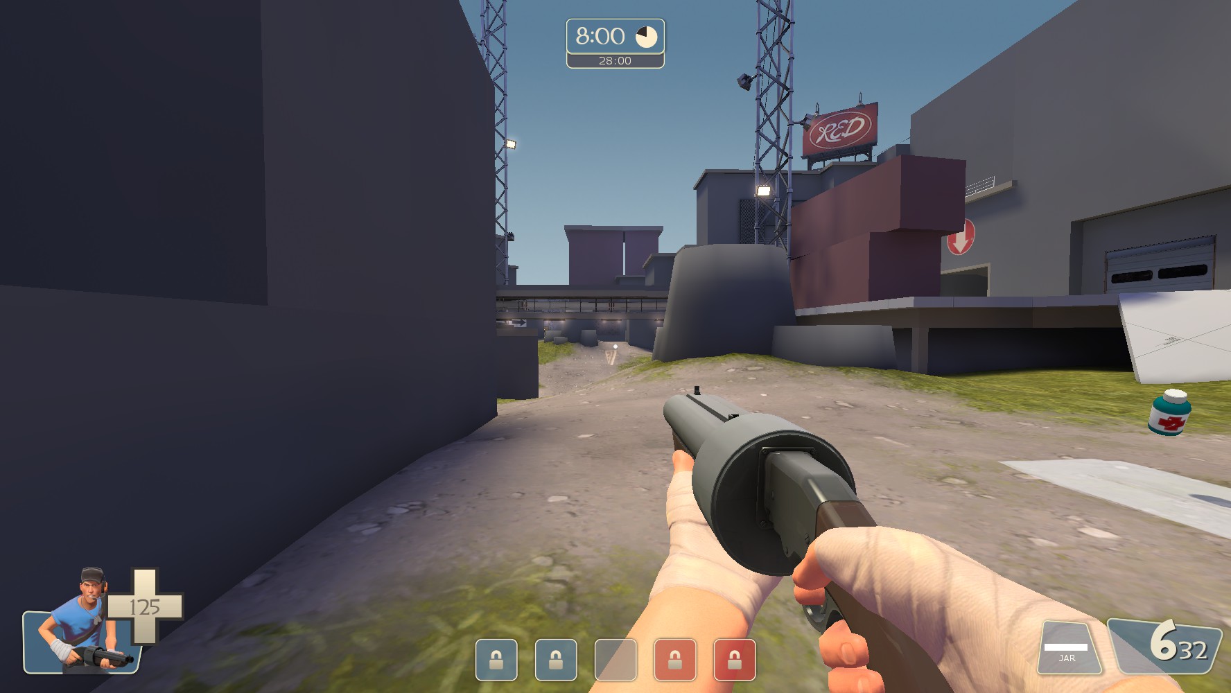
I really enjoy this map so far, so I decided to go in for fun. Noticed a few bugs/issues so here they are.
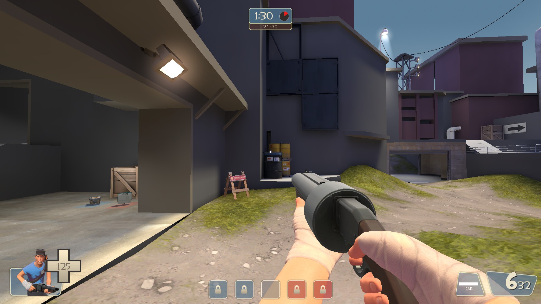
Spooky hole behind the barrels here
Floating light??
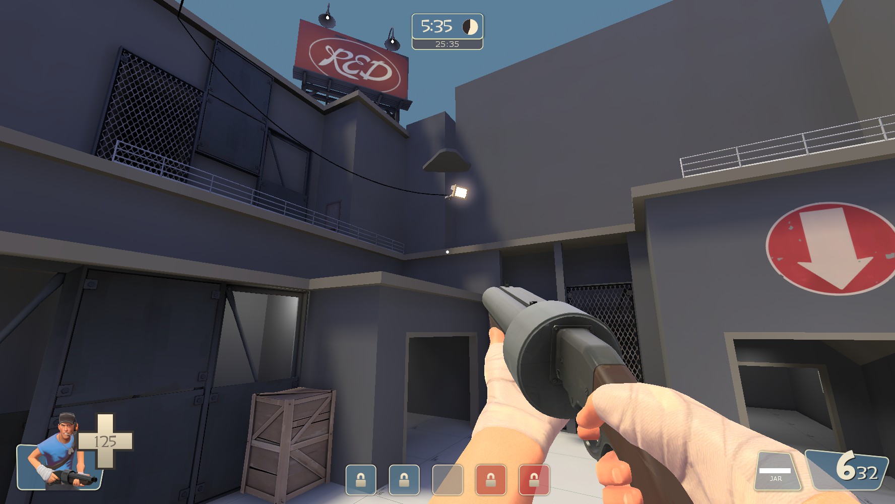
Another spooky hole inside a building
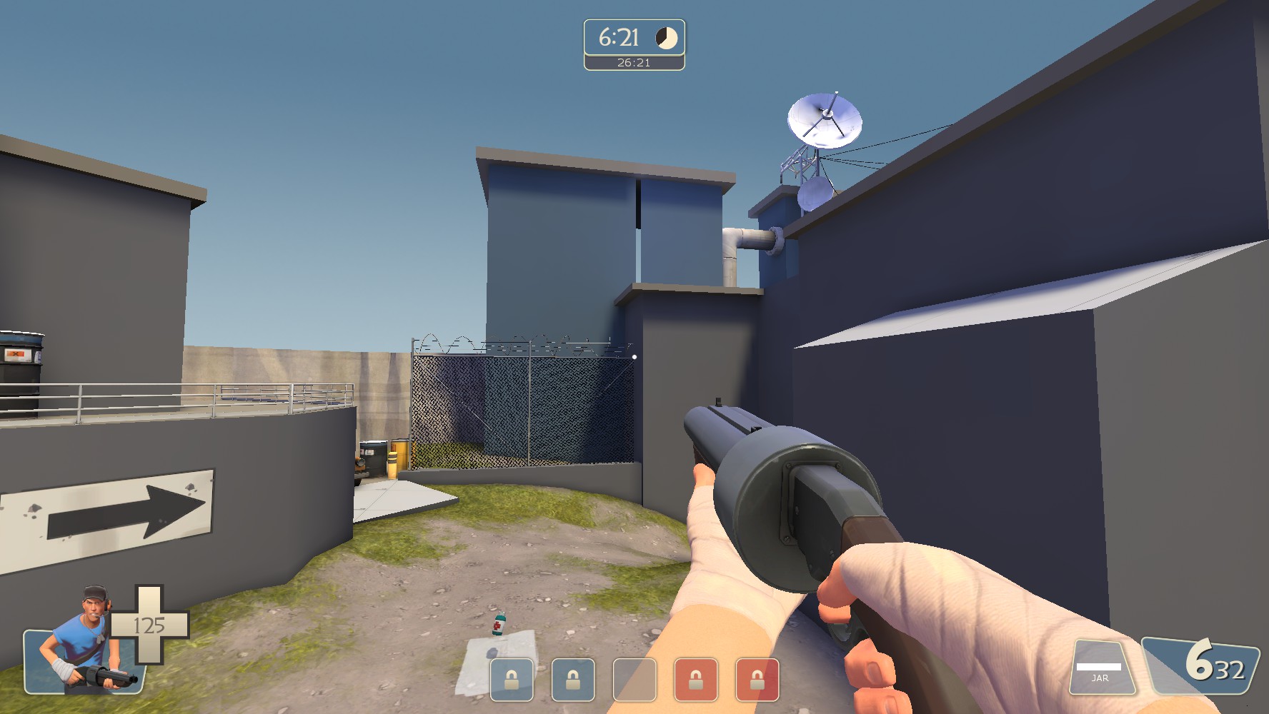
NASTY sightline from here into blu's base
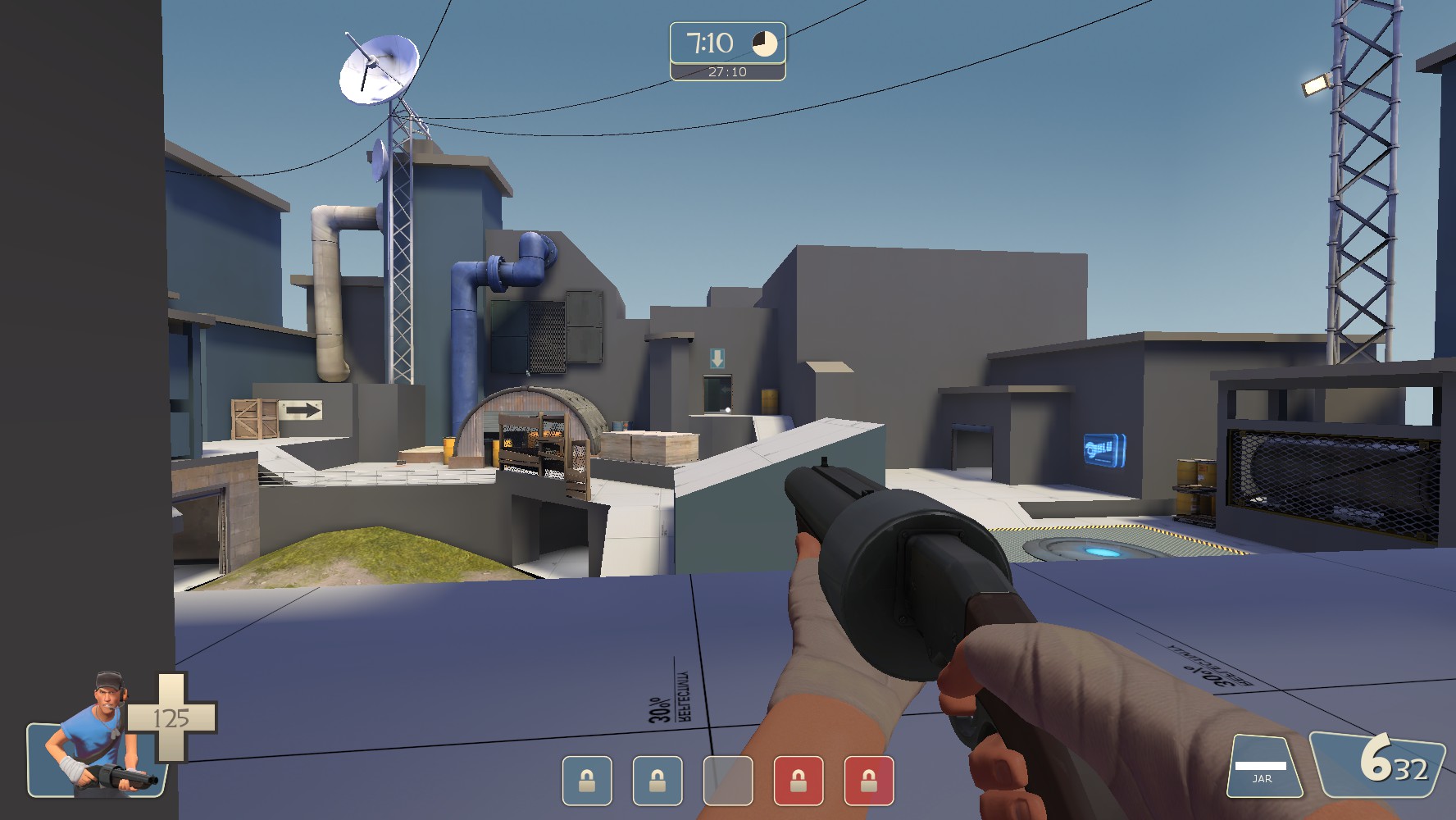
Another nasty sightline, but you can fix this by adding a little more cover and freeing up space on the left
Once again spooky hole
Spooky hole behind the barrels here
Floating light??
Another spooky hole inside a building
NASTY sightline from here into blu's base
Another nasty sightline, but you can fix this by adding a little more cover and freeing up space on the left
Once again spooky hole
With mid so low and plenty of rooftops as well as a bridge for the scouts & soldiers, won't this make it very difficult to retake mid even with an uber? Plus being low means roller spam on people capping.
I'd suggest splitting the difference in height between the very low cap and the bridge/pipe thing above it. Like, lower the bridge part so that you go down, then walk up onto the point if you're going through the valley, and have to go down stairs/ramp to reach it from the upper platform. That should mitigate roller spam a little, while giving a bit of a height advantage for cappers on those coming down the valley, but still leaving them at a disadvantage from the sides. I can do a paintover if you don't quite get what I mean.
This does mean you'd have to change the placement of those doorways flanking the cap though.
What I intended to do with the mid point was provide some sort of fight akin to the old Yukon point - soldiers/demomen pushing in would commit to the high ground and do their best to push the other team out, scouts could either take the high or low ground depending on what they wanted to do - to get chip shots on the enemy, they'd have to sacrifice capping the point early, and if they wanted to start the cap as fast as possible they'd have to give up height advantage.
It's a bit of a tradeoff game, with the two even entrances into the mid's middle ground I think pushing in wouldn't be too much of an issue. The mid's designed to play around the point as an optional objective during the retake fight, that the team will either decide to take after the battle has finished or determine whether they have enough advantage to send a scout or two into the low ground to cap early.
All theorycrafting, of course, but it's something.
Yeah, this is just a different model than the typical point-on-a-hill design we see with a lot of 5cp and KotH maps. With the cap zone in a more vulnerable position, I imagine it will play similarly to Process, where teams usually ignore the objective to first try and secure the area via the flanks and high ground. This design feels like it places more emphasis on deathmatch in midfights by turning the point into a reward for the team that pushes the other back, as opposed to a primary objective that encourages both teams to butt heads over the single most advantageous position in the area.
• lowered bridge on mid
• removed one crate on each side on mid
• blocked sightline across mid
• changed around building beside mid
• shortened the ends by a bit
• simplified area around hut
• simplified lower lobby entrance from second a bit: removed many pillars
• moved the last point forward a little
• lengthened last cap time from 2 to 3
• added small health-ammo pair in middle ground on left side for defenders
• changed clipping around metal railings to playerclip instead of blockbullet
Read the rest of this update entry...
Here's a new version of everybody's favorite new Phi map.
Changelog includes (but is not limited to):
Mid:
• Shortened by about 128u on each side (widthwise) and 600u on each end (lengthwise)
• Alt entrance from mid-lobby made smaller and changed slightly
• Height difference between high and low ground (point) shortened by about 96u
• Mid-lobby made smaller
• Added slight height positions for roamers jumping in through lower-connector
Second:
• Changed up lower grassy entrance...
Read the rest of this update entry...
i have downsized everything a lot, thank you b4nny for the feedback, thanks to a lot of others for various bits and pieces
• pushed in sides of mid, all 4 sides
• moved rocks closer to the point on mid
• made flat areas beside mid smaller by 128u. added cover.
• moved around a little geometry on second due to resizing on mid.
• resized lobby a lot.
• resized last a lot.
• removed secret
• pushed sides of last in.. shortened right entrance from attacker's perspective
Read the rest of this update entry...
Beta 1. It's coming. Away goes the old, dreary theme of the map and in comes something bright, clean - and new.
I've distributed prerelease versions to a handful of people. Officially, Beta 1 should come out very shortly.
Now for the exciting bit: B4nny will be streaming, LIVE, his reactions to the prerelease build. No telling when exactly - but it's tonight, and it'll be during his stream. Come visit when he goes live: https://www.twitch.tv/b4nny
Here's beta 1. Say what you will.
Changelog:
• Detailed the map.
• Various geometry changes across the entire map due to detailing
• Opened up little shutter door into second (the top entrance) from 96x128u to 136x160u (a 42% increase in width, a 25% increase in hight)
• Widened the playspace of the platform immediately outside little shutter door.
• Added detail railings on either side of small slope in lobby (does not affect play)
• Filled in holes on small ramps up to mid.
• Changed glass texture on barriers at last to a more noticeable green texture.
• Moved pillars on left (relative to defenders) side of last in to give more space for spam into sentry nests
• Slightly moved around various geometry to allow for easier spam angles on sentry nests over the whole of last
• Removed barrel prop on far right (rel. to def.) side of last
• Nobuilded the top of every prop in last.
• Added health-ammo pair on lowground in lobby – added detail railings nearby
Read the rest of this update entry...

although i love the architectural and paint style, i can't help thinking that there are too many neutral colours. It just seems very tonally (hue-illy? not sure there's a word for that) noisy.

this screenshot is a case in point. In this one screen there are large chunks of yellow, green, red and to a smaller extent blue (in the shadows and windows mainly). At first glance it's actually pretty hard to tell which side of the map you're on, and which way you should be going. Despite this being red's second point, the majority of the colour accenting isnt red.
Edit: Forgot to say, i think blu side's colours mesh a lot better, my gripes mainly with red