- Feb 18, 2012
- 246
- 407
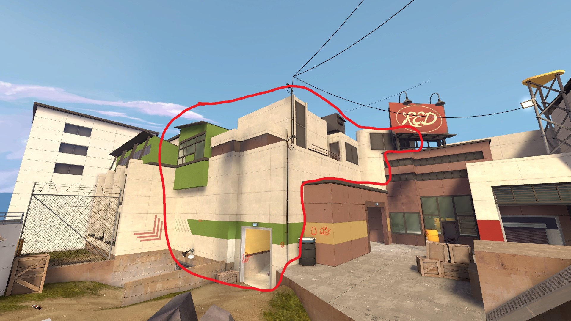
There's something about the detailing I'm not too keen on TBH. While I believe the theme can work in TF2, I think it's a bit messy and inconsistent right now. I think part of the problem is that there are a lot of differently styled structures which are small and not clearly separated. Therefore, they blend together into those these big white chaotic messes with no single consistent style (but instead having four different kinds of windows for example). It works in de_season since all the structures with crazy different styles and shapes have a more clearly defined composition and are separated and contrasted by simpler, consistent structures.
Speaking of consistency, the platform at 2nd really seems out of place, as if it were ripped out of snakewater: There are four different kinds of staircases/ramps each out of different materials, the wooden railings and old rusty shack don't fit in with the metallic and sterile look of the map and why are the fences torn up, when everything else is so well kept?
I think the same can also be said about the platform and bridge above mid. It doesn't feel like it fit in with its surroundings. Perhaps change the colour of the metal catwalk to black (since everywhere else black is used for beams and grates)?
I apologize if this post is a bit overkill. I know this is only B1, but I still wanted to share some of my thoughts (I have been wanting to make this post for days). Otherwise, the map is fun, and the forward hold platform through lobby-last is cool.
Red structure seems like a big jumbled mess:
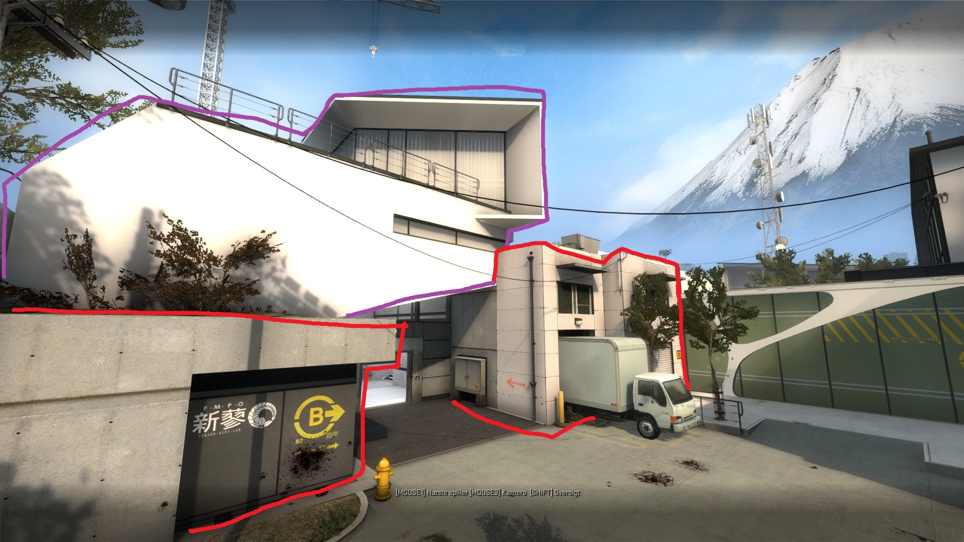
Purple structures seperated by red structures by both materials and shape/composition:
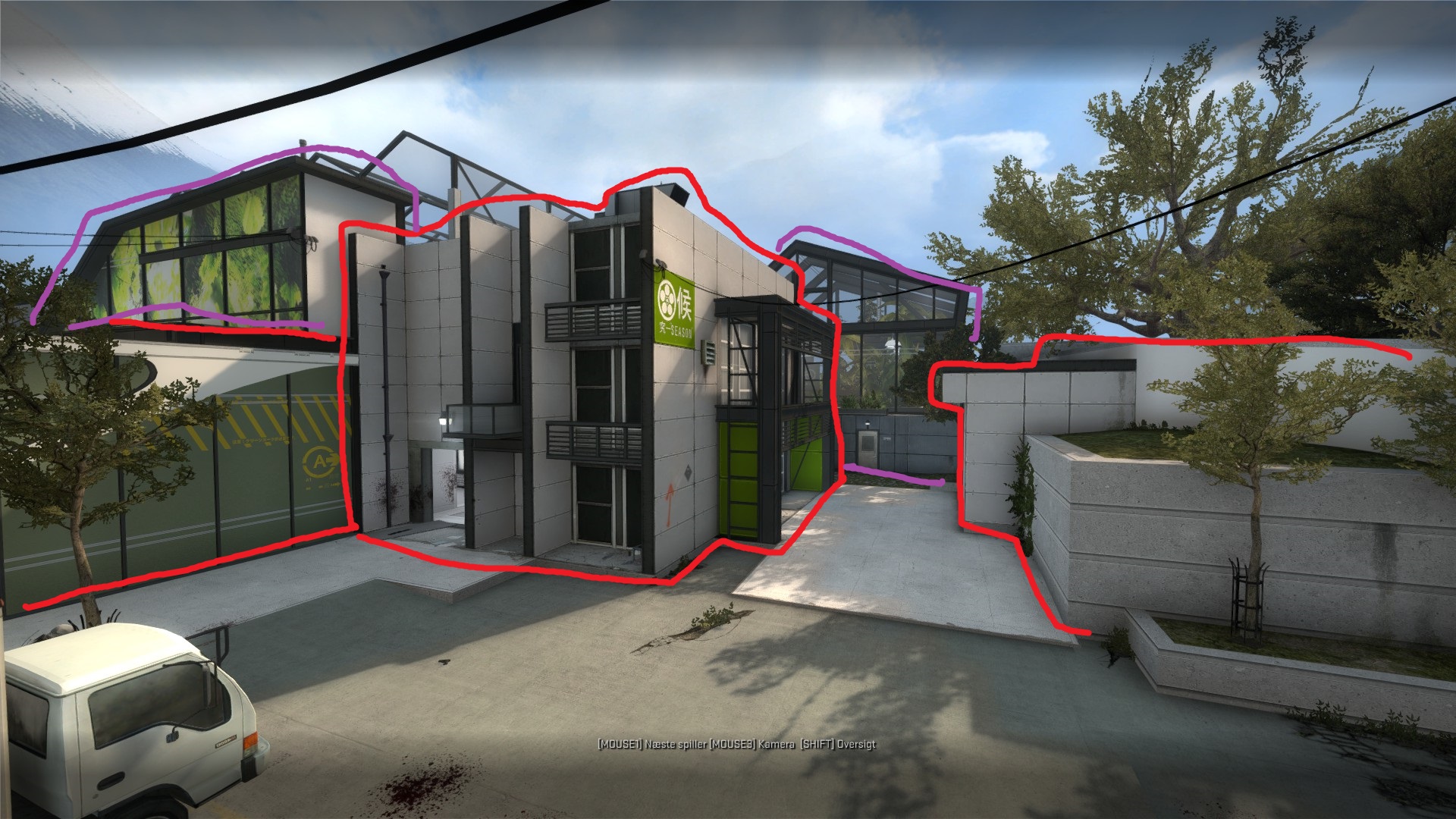
Purple structures seperated by red structures by both materials and shape/composition:
Speaking of consistency, the platform at 2nd really seems out of place, as if it were ripped out of snakewater: There are four different kinds of staircases/ramps each out of different materials, the wooden railings and old rusty shack don't fit in with the metallic and sterile look of the map and why are the fences torn up, when everything else is so well kept?
I think the same can also be said about the platform and bridge above mid. It doesn't feel like it fit in with its surroundings. Perhaps change the colour of the metal catwalk to black (since everywhere else black is used for beams and grates)?
I apologize if this post is a bit overkill. I know this is only B1, but I still wanted to share some of my thoughts (I have been wanting to make this post for days). Otherwise, the map is fun, and the forward hold platform through lobby-last is cool.


