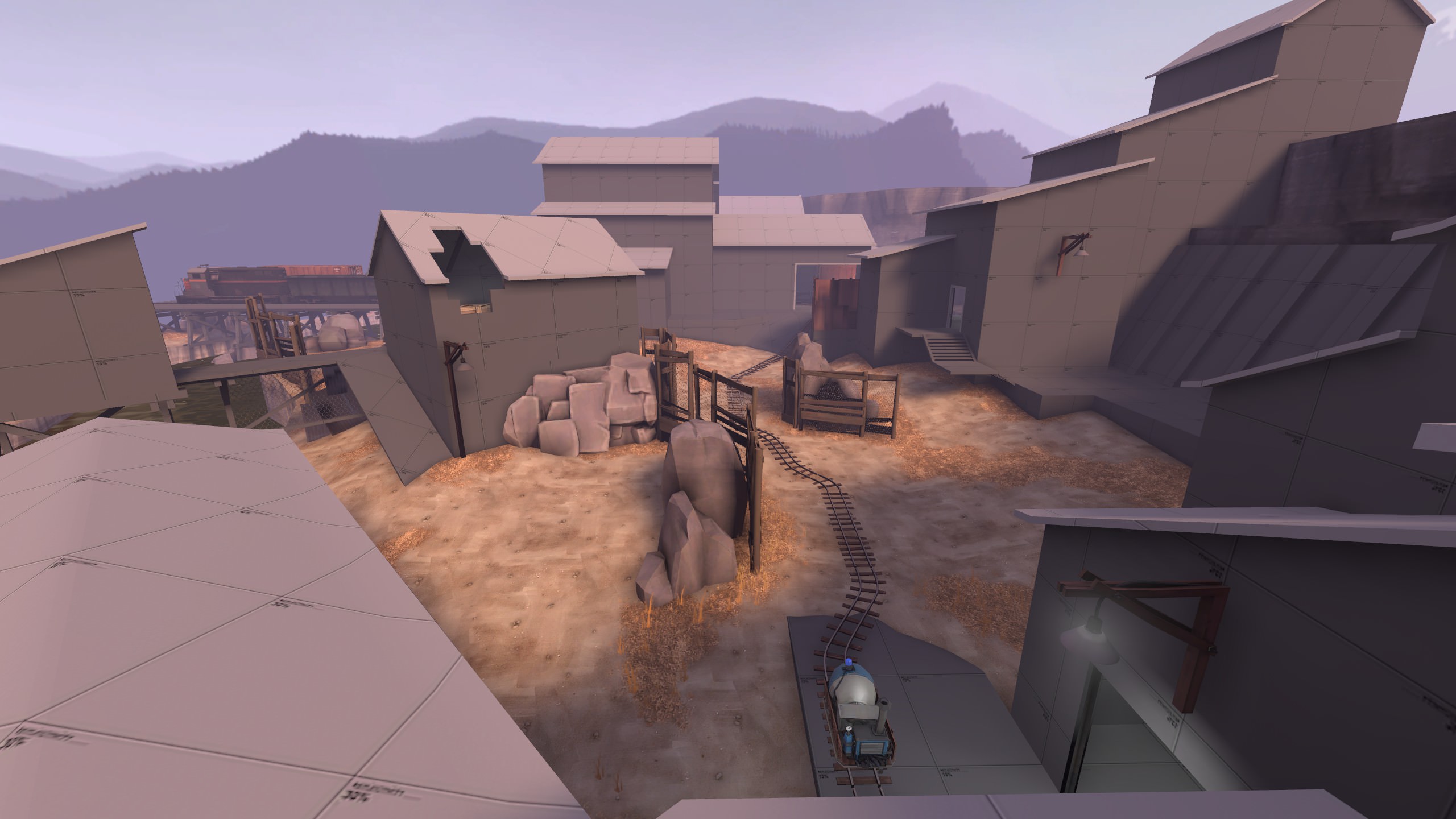
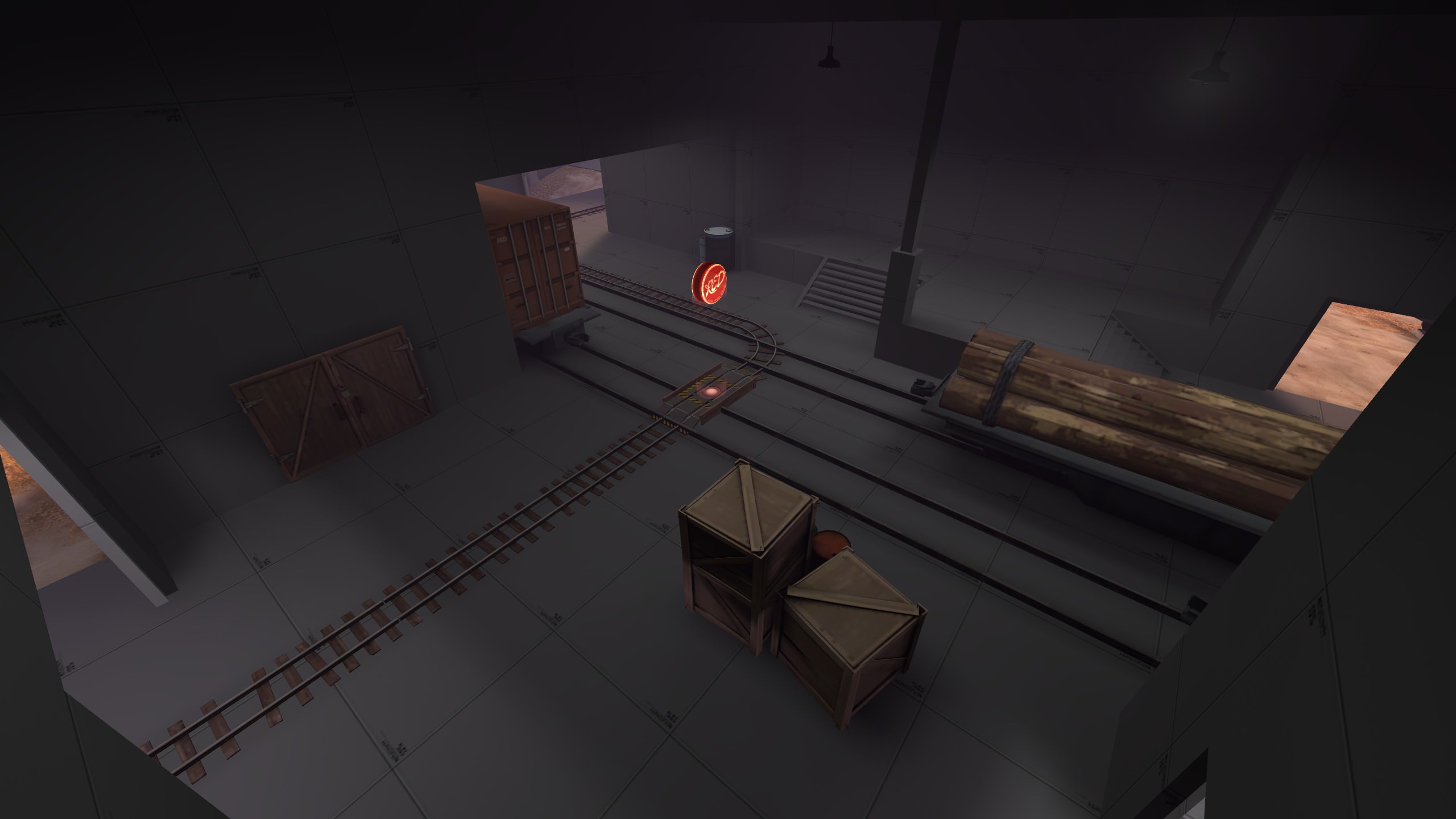
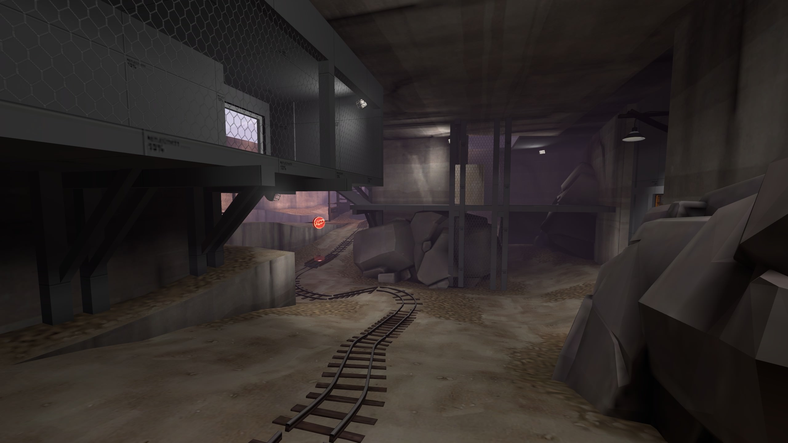
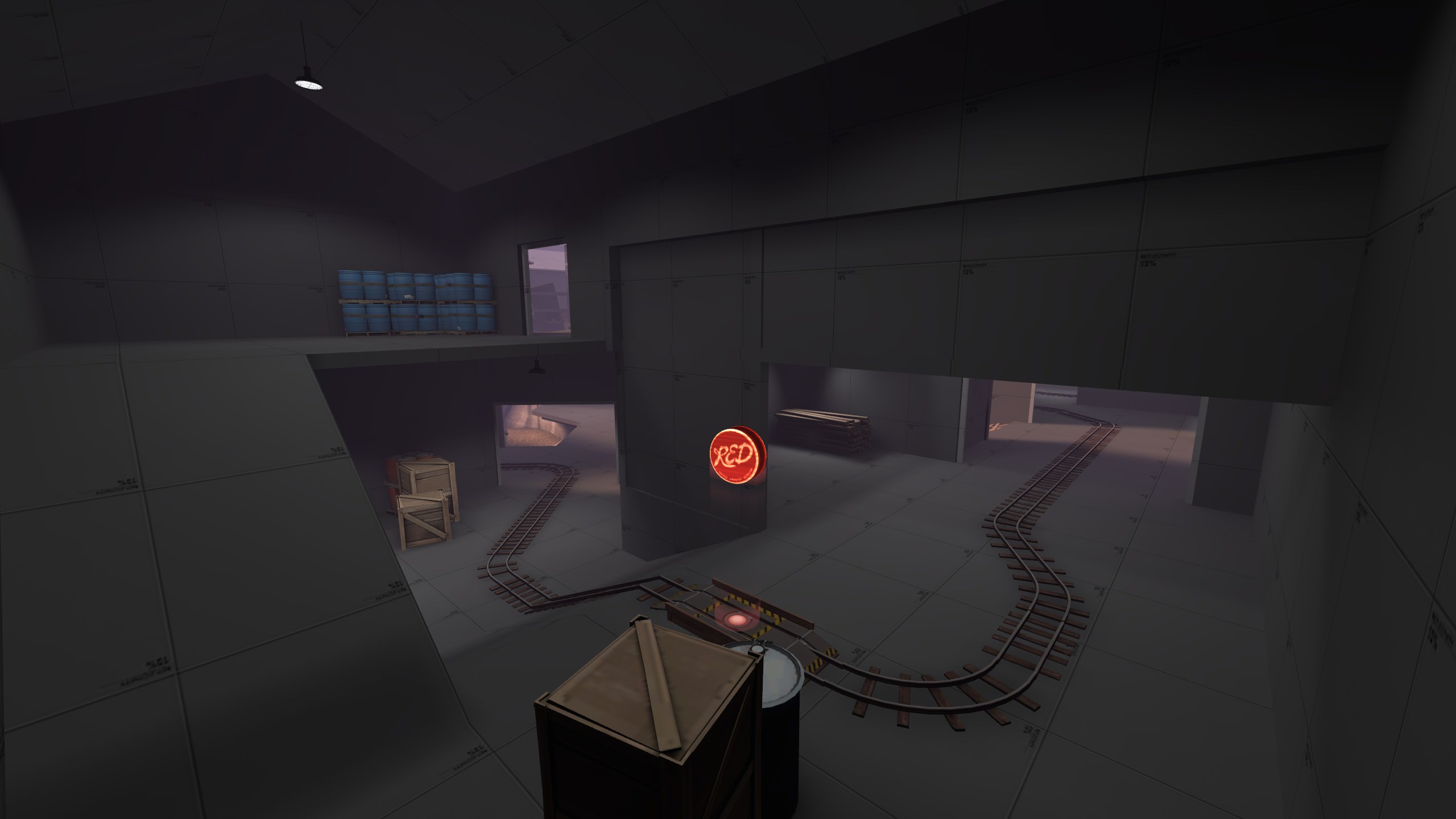
WiP in WiP, post your screenshots!
- Thread starter Arhurt
- Start date
You are using an out of date browser. It may not display this or other websites correctly.
You should upgrade or use an alternative browser.
You should upgrade or use an alternative browser.
...mind if I use this as a background lmao
looks amazing
Sure, go for it! That's a hell of a compliment haha...mind if I use this as a background lmao
looks amazing
I might recognize that map from really long time ago but it's differentHappy 10th, WIP in WIP
Happy 10th to this thread!
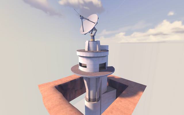
Here's something I whipped up pretty quick, clearly inspired by Hydro's radar dish~
Does anyone think this kind of thing could work in a comp map? Maybe as a 2nd Point spire? With scaled down verticality and more surrounding terrain and buildings? asking for a friend
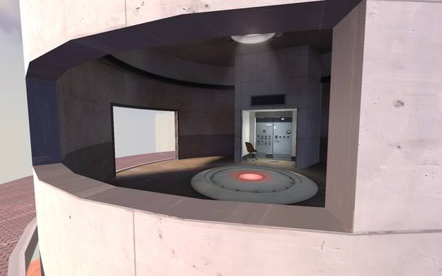
btw that sign above the computer alcove has the 'data link' sign overlay on it, I forgot it wasn't lit up for some reason :c
gosh darn I just love Hydro's visuals so much, even this simple scene is made much more appealing with its light_environment settings
Here's something I whipped up pretty quick, clearly inspired by Hydro's radar dish~
Does anyone think this kind of thing could work in a comp map? Maybe as a 2nd Point spire? With scaled down verticality and more surrounding terrain and buildings? asking for a friend


btw that sign above the computer alcove has the 'data link' sign overlay on it, I forgot it wasn't lit up for some reason :c
gosh darn I just love Hydro's visuals so much, even this simple scene is made much more appealing with its light_environment settings
Great architecture you've got there.Happy 10th to this thread!
Here's something I whipped up pretty quick, clearly inspired by Hydro's radar dish
It's rather closed in. I don't know a ton about competitive, but Sunshine probably has the most closed in 2nd point of any 5cp map and it is still considerably more open/accessible. The combination of being difficult to walk up to and being enclosed will probably make it difficult to attack.Does anyone think this kind of thing could work in a comp map?

There are no deathpits in Comp mapsHappy 10th to this thread!
Here's something I whipped up pretty quick, clearly inspired by Hydro's radar dish~
Does anyone think this kind of thing could work in a comp map? Maybe as a 2nd Point spire? With scaled down verticality and more surrounding terrain and buildings? asking for a friend


btw that sign above the computer alcove has the 'data link' sign overlay on it, I forgot it wasn't lit up for some reason :c
gosh darn I just love Hydro's visuals so much, even this simple scene is made much more appealing with its light_environment settings
There are no deathpits in Comp maps
Just because there isn't doesn't mean there can't be.
G.bo
L4: Comfortable Member
- Sep 24, 2017
- 183
- 195
There are no deathpits in Comp maps
Steel, Upward, and in a technical sense all payload maps with bomb hatches have death pits.
[Though I can't recall any in 6v6, those are still technically comp maps.]
It feels as though the detail is not really consistent despite being just one building. A lot of visual clutters around the point too.Intrusion seems to have gotten a major makeover for A...
P
Prosciutto
yeah this map has like 4 different themes thrown inIntrusion seems to have gotten a major makeover for A...
New version coming within the next few days, I know lots of you have been patient for this.
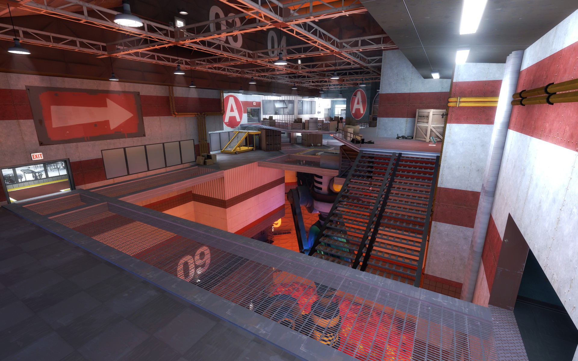
I think it's quite thematically consistent as some kind of metalworks or something but I will agree there's a lot of visual noise created by the grates and girders, and the blue/green Nucleus device below in the lava clashes a bit IMO. If it were attracting your eye to an important gameplay element it'd be just fine.
That said, I love the sense of vertigo created by the grate walkways! Reminds me a little of the first levels of Doom 2016. Keep at it!
That said, I love the sense of vertigo created by the grate walkways! Reminds me a little of the first levels of Doom 2016. Keep at it!
OMg phahaha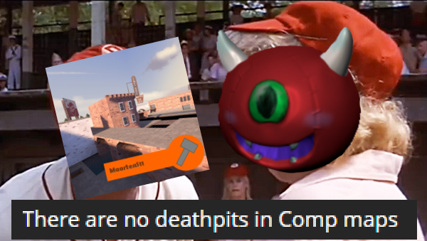
Just because there isn't doesn't mean there can't be.
yeah, I guess it's more a matter of doing everything you can to give your map a chance at being accepted by the comp community, and putting in hazards like deathpits mostly gets in the way of that.
Maybe you could create a really dangerous low-ground instead of a deathpits that runs under the point? I'm thinking something visually similar to the caves in Hydro.
Harritron
L4: Comfortable Member
- Feb 26, 2017
- 167
- 83
It’s kind of hard to see in the screenshot, but the point is located just above the nucleus (its hidden behind the slab of concrete). I purposely did this to help attract the eye towards the point (even if it is below it). I’ll see what others think once this gets thrown onto an imp.I think it's quite thematically consistent as some kind of metalworks or something but I will agree there's a lot of visual noise created by the grates and girders, and the blue/green Nucleus device below in the lava clashes a bit IMO. If it were attracting your eye to an important gameplay element it'd be just fine.
That said, I love the sense of vertigo created by the grate walkways! Reminds me a little of the first levels of Doom 2016. Keep at it!
Harritron
L4: Comfortable Member
- Feb 26, 2017
- 167
- 83
Redid Intrusion’s skybox too, so it creates a consistent jungle theme (feedback from the last test suggested a theme remake, but others liked the 1st area, so I extended the jungle theme throughout the map)
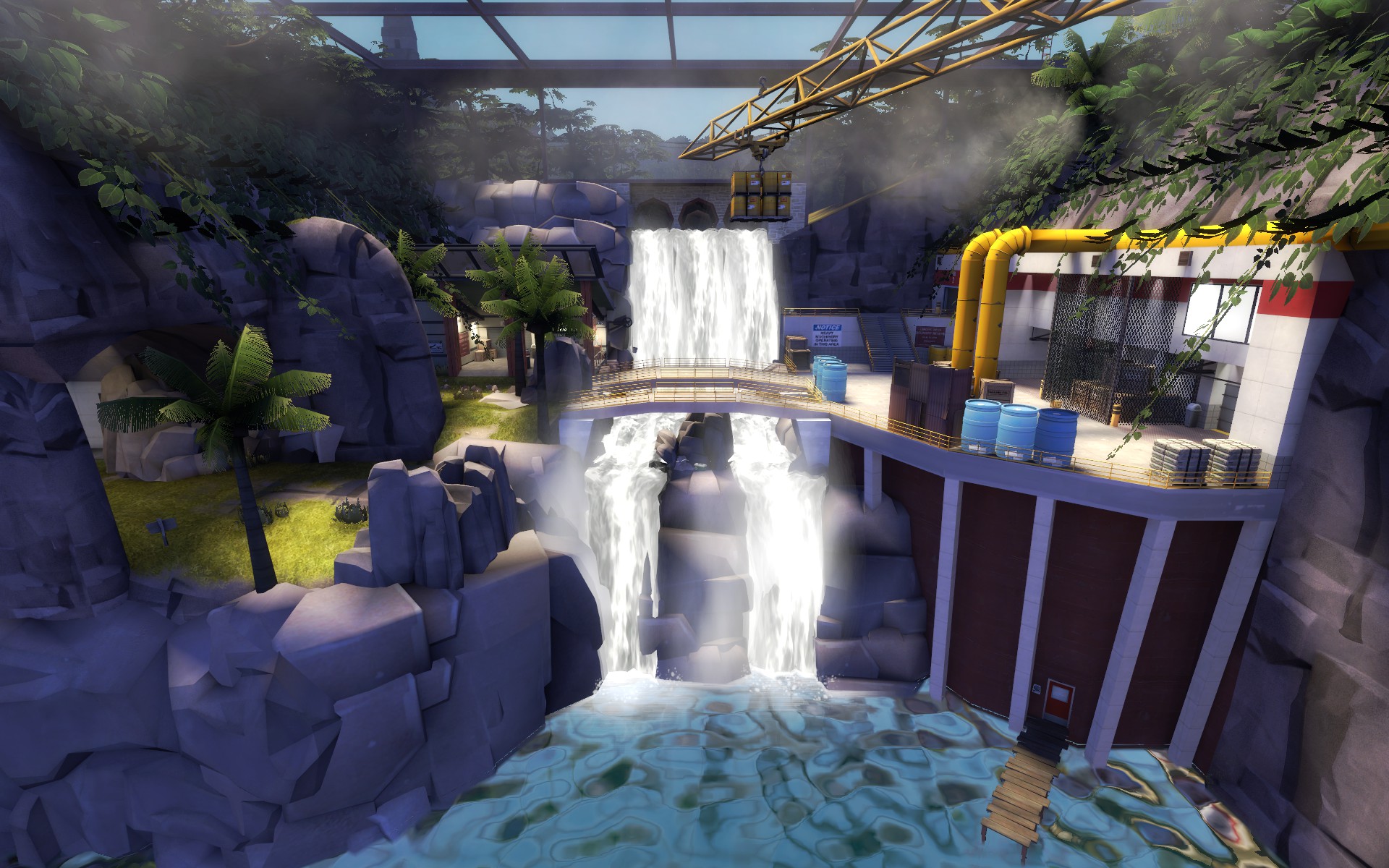
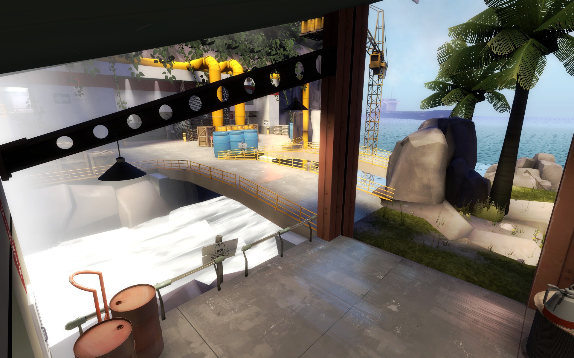
I guess you can call this “Original Mercenary Park remake without the god-awful chokes”
Edit: Ignore the water seam in screenshot 2.
I guess you can call this “Original Mercenary Park remake without the god-awful chokes”
Edit: Ignore the water seam in screenshot 2.
Last edited:


