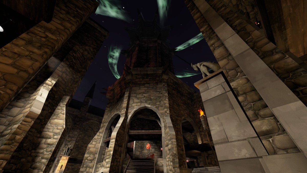
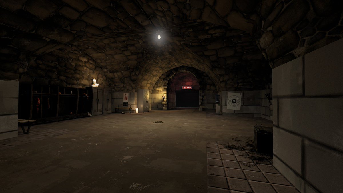
WiP in WiP, post your screenshots!

P

Prosciutto

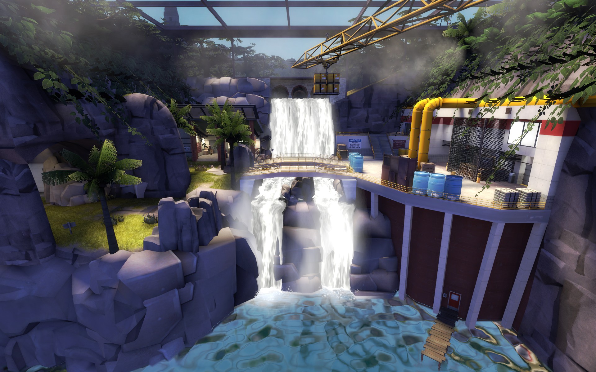
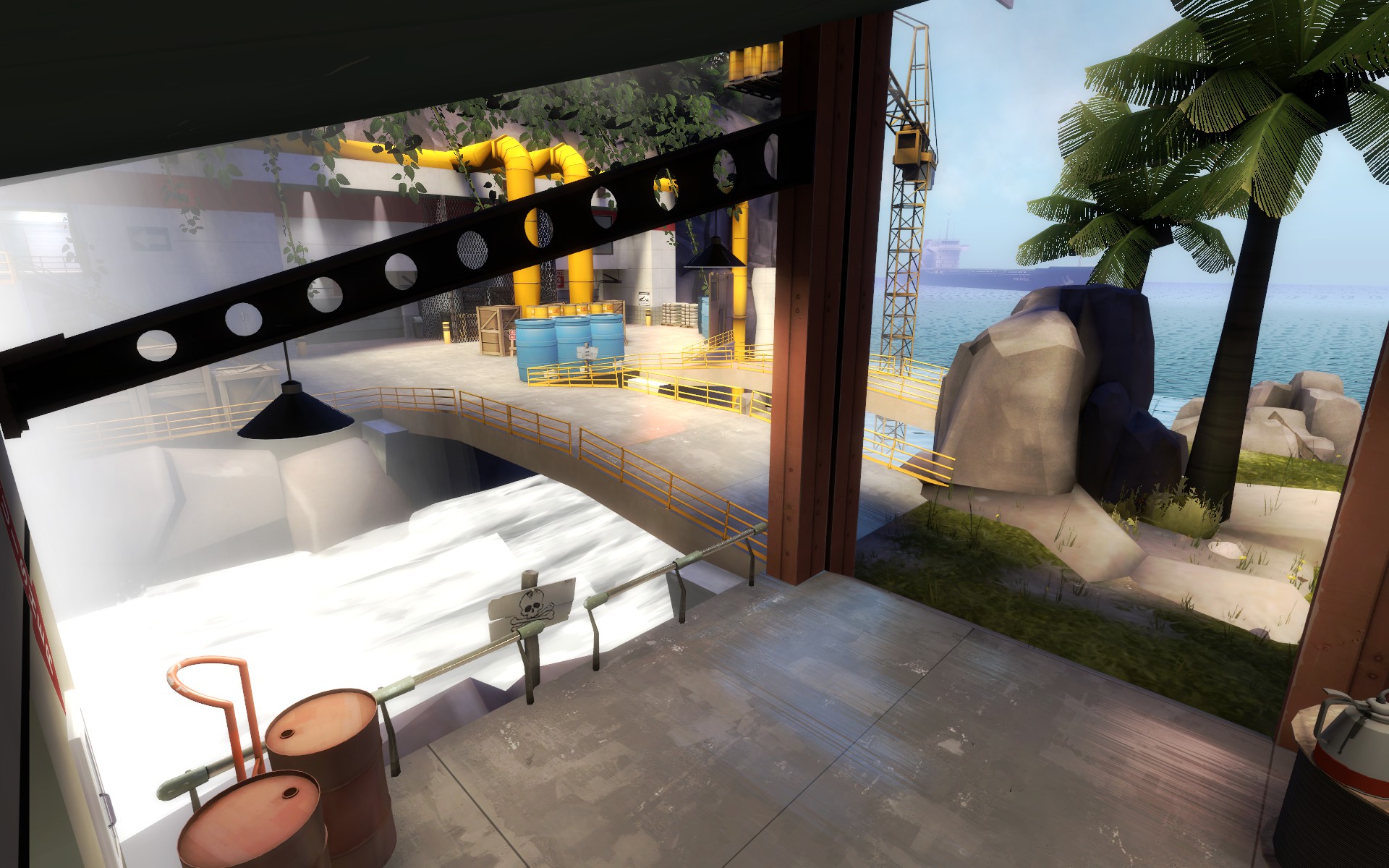
Redid Intrusion’s skybox too, so it creates a consistent jungle theme (feedback from the last test suggested a theme remake, but others liked the 1st area, so I extended the jungle theme throughout the map)
upload_2018-9-1_8-52-55.jpeg

upload_2018-9-1_8-53-21.jpeg

I guess you can call this “Original Mercenary Park remake without the god-awful chokes”

Edit: Ignore the water seem in screenshot 2.
it now being fully jungle themed is way better than being a weird mix of jungle, farm and alpine
 

DrSquishy

we've all had better times to die
aa
Feb 10, 2017
1,331
989
Redid Intrusion’s skybox too, so it creates a consistent jungle theme (feedback from the last test suggested a theme remake, but others liked the 1st area, so I extended the jungle theme throughout the map)
The vegetation on the cliff walls on the left and right looks a little repetitive
 

Harritron

L4: Comfortable Member
Feb 26, 2017
167
83
it now being fully jungle themed is way better than being a weird mix of jungle, farm and alpine
That’s what I found out after the last imp. The greenhouse was a nice idea, but some people didn’t like the skybox (it was about 50/50).

As for B, the glass “case” is probably going to remain there, but with some visual changes (maybe the addition of offices, not sure yet.) After this next compile, BLU spawn through A-B Flanks will pretty much be 100% finished. All that’s left to detail will be B and RED spawn.
 

I dinne ken

Has currently had enough
aa
Apr 16, 2016
324
433
Heres pl_blur, named that because I was listening to blur when I named it. Its name will probably change if the project gets anywhere.

20180902145014_1.jpg
20180902145112_1.jpg

20180902145303_1.jpg
20180902145737_1.jpg


The main gimmick of the map is going to be that lift in the second screenshot. It'll be interesting to see how it plays. I've also got a small but steep section of track near last which the cart rolls down on its own (not pictured as this is even more wip). This should make the gameplay around last a bit more vertical. Or it might be shite. ¯\_(ツ)_/¯

If it ever gets to it, theme-wise I'm wanting to achieve a mixture of barnblitz and upward. Skybox is sky_rose btw. Lovely looking thing.
 

Darius_III

L1: Registered
Nov 23, 2015
4
0
Redid Intrusion’s skybox too, so it creates a consistent jungle theme (feedback from the last test suggested a theme remake, but others liked the 1st area, so I extended the jungle theme throughout the map)

upload_2018-9-1_8-52-55.jpeg

upload_2018-9-1_8-53-21.jpeg

I guess you can call this “Original Mercenary Park remake without the god-awful chokes”

Edit: Ignore the water seam in screenshot 2.
Where are these famous choke points?
 

SnickerPuffs

(*single chuckle*)
aa
Apr 10, 2014
1,326
1,867
Where are these famous choke points?
Not chokepoints. Literal chokes.

If you stand still in certain places for too long, Robin Walker materializes from your monitor(s) and strangles you.
 

Cincomma

bonk sploosh
aa
Aug 2, 2017
429
413
Ok, I'm making an A/D Map atm, and I made a chokepoint at last w/ a large flank on one side and a small one on the other. It's kinda tight though, should I make it wider or have more flanks (or wider flanks) ?
choke.jpg
 

Harritron

L4: Comfortable Member
Feb 26, 2017
167
83
Did some more tinkering today...
20180902175157_1.jpg

Blue Spawn to A is 100% Finished Now!
20180902175206_1.jpg

I know this room is dark, but I kinda like the way the light from the lava casts onto the ceiling and onto players who stand over the grates (don't worry, you can still see each other fine in this room).
20180902175336_1.jpg
20180902175306_1.jpg
God I love the Autumnal Pack's Holograms.
 

Spipper

Former cheese man Gorgonzola
aa
Feb 18, 2012
246
407
Phew
DmIi7fCX0AA0NhZ.jpg

DmIjBpGXsAAdUzo.jpg

Finally done with the detailing around the last point.
Now for the fun part!... func_detailing, sealing, clipping, optimisation, fixing entities, skyboxes, the underworld, making sure I stay within the brushlimit for a huge map etc.
Gosh I'm tired - but I still believe I can finish it this time around!

Also, I haven't really been active on this site for a long time, since I have been fooling around a bit in the Quake singleplayer mapping scene (I needed a break from TF2 and there is some amazing talent in the Quake scene - and also a lot of superficial drama but whatever).
Moreover, I started using Twitter a bit more: https://twitter.com/Spipper
 

Cincomma

bonk sploosh
aa
Aug 2, 2017
429
413
I've been working under everyone's nose ever since February never mind the fact that I just started in February, I continued only a few days ago... But I came up with
CP Grist! A 2cp attack/defend map with a Granary Aesthetic. It's currently in A1, so much can and will change.
20180903113354_1.jpg
20180903113457_1.jpg
20180903113522_1.jpg
20180903113413_1.jpg
20180902123114_1.jpg
20180902123129_1.jpg
 

FloofCollie

I really suck!
aa
Nov 5, 2016
600
670
@Heronherald I really like the fourth shot for some reason. Reminds me of a McDonald's, with the grain elevator being the kids' area slide :D

All silliness aside, it's looking to be great already! The structures already look solid and imposing, and everything looks open and free.
 

Yaki

aa
Sep 3, 2018
424
261
Hi! I just started mapping today and made a little dinky piece of a map that I thought looked cool.

tf2map!!.png

It is going to be a Medieval CTF...I kind of drew basic concept art on paper, but really everything is in my head and not fleshed out. I'd appreciate any tips to approach map making Medieval mode (or any tips!).

Thanks! :)
 

Cincomma

bonk sploosh
aa
Aug 2, 2017
429
413

YOYOYO

50 crashes and counting!
aa
Jul 10, 2017
622
556
It is going to be a Medieval CTF...I kind of drew basic concept art on paper, but really everything is in my head and not fleshed out. I'd appreciate any tips to approach map making Medieval mode (or any tips!).

Thanks! :)
How did you figure out those kind of arches on your first map?! It took me so long to figure out to clip it around the model and stuff.
Anyway, here's some input that should probably help. Its a medieval map, so its going to be noticeably small. with this in mind, make it quite open, since sight-lines aren't an issue.

And in my opinion, the main thing that will make your map really enjoyable is all the secret gimmicks that come with medieval maps. Like trimp rocks and braziers, though this should be implemented at a time of your choosing.
Hope some of this helps. You can contact me through discussion or add me on steam if you need more help :)
 

Da Spud Lord

Occasionally I make maps
aa
Mar 23, 2017
1,339
994
with this in mind, make it quite open, since sight-lines aren't an issue.
Ehh... Remember, Huntsman still exists.
 

YOYOYO

50 crashes and counting!
aa
Jul 10, 2017
622
556
Ehh... Remember, Huntsman still exists.
Trust me, huntsman can usually be considered a melee weapon :p

edit: what I mean is, the huntsman is not powerful or accurate enough to really be a sight line problem.
 
Last edited: