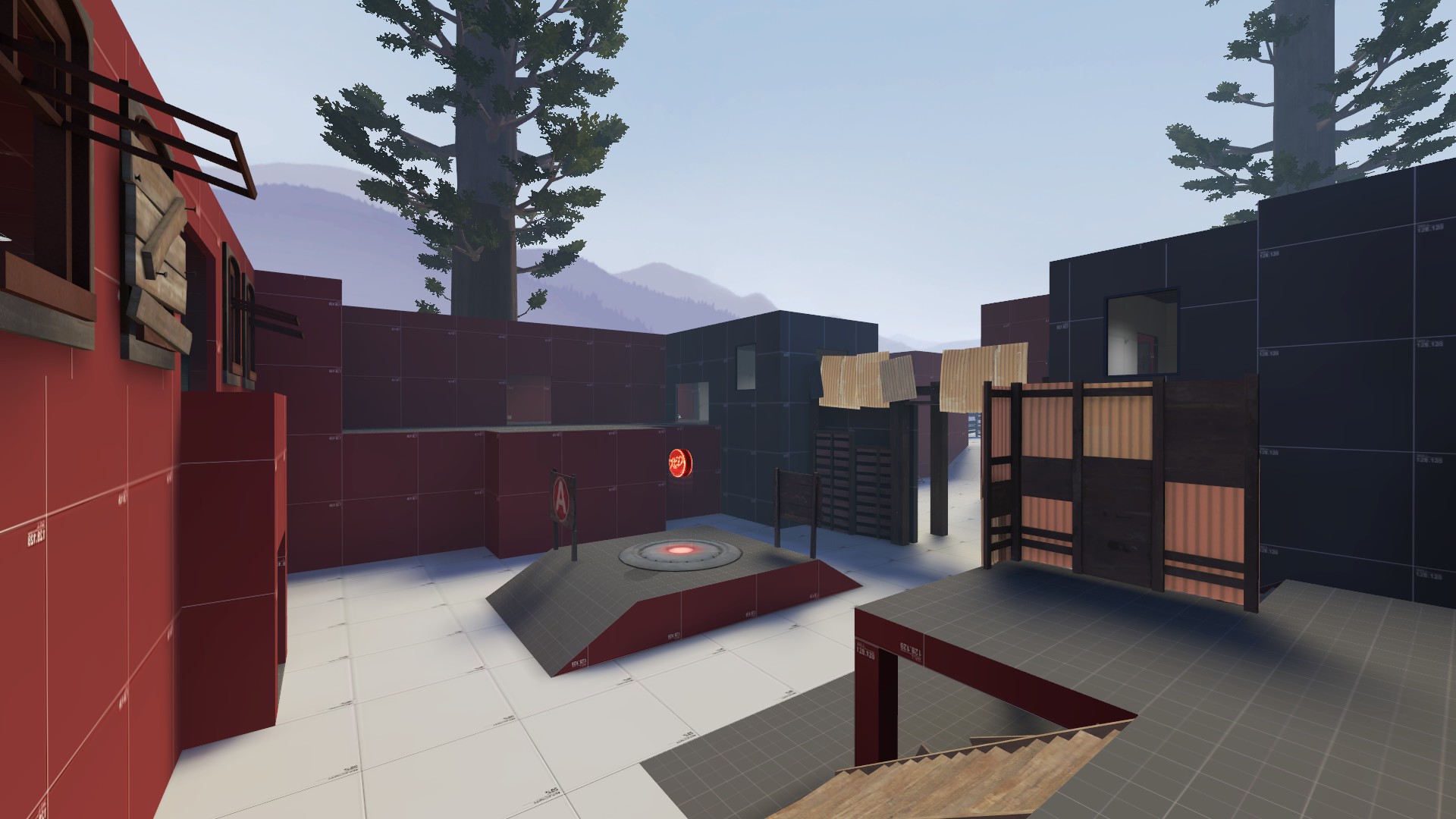
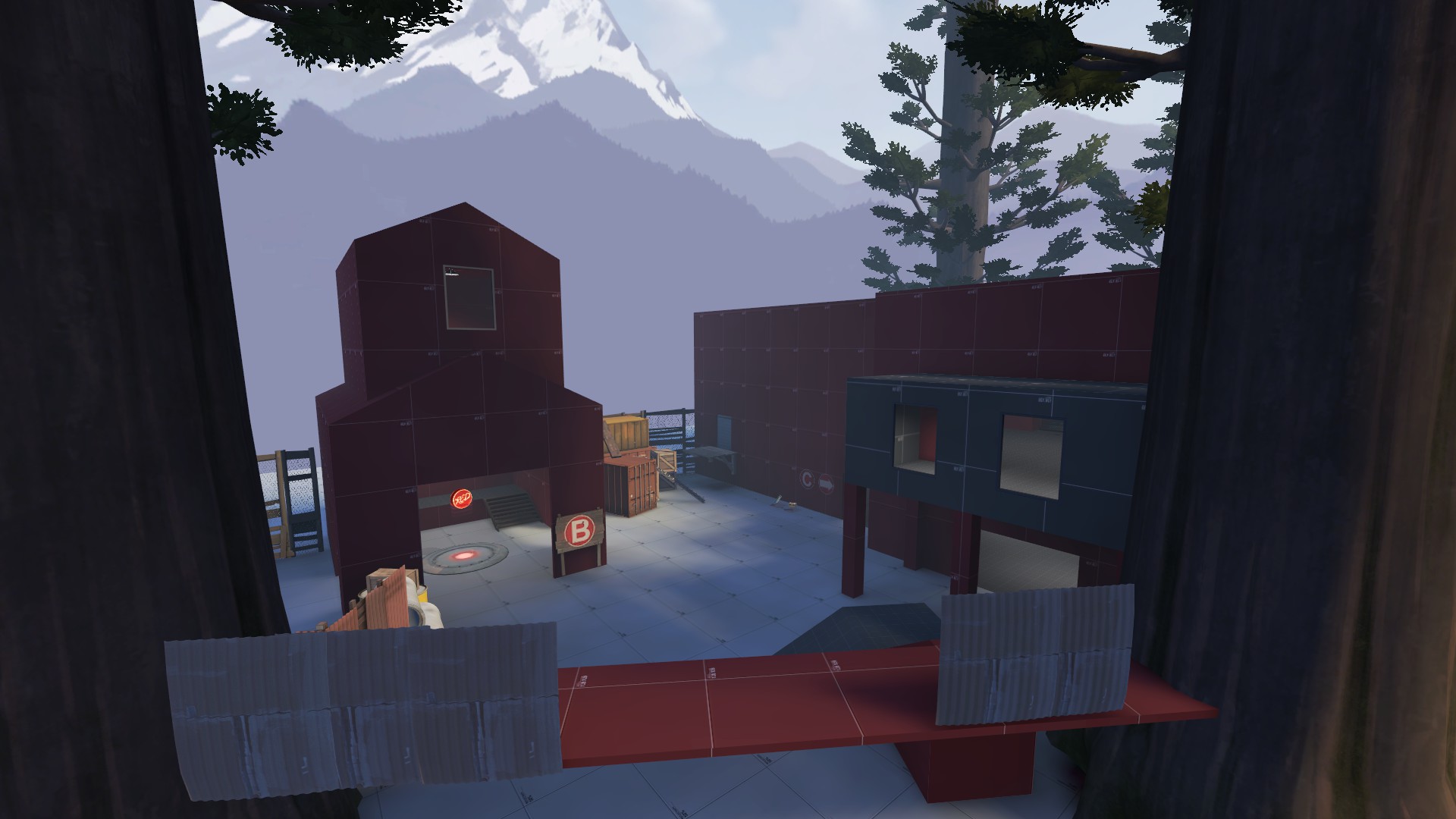
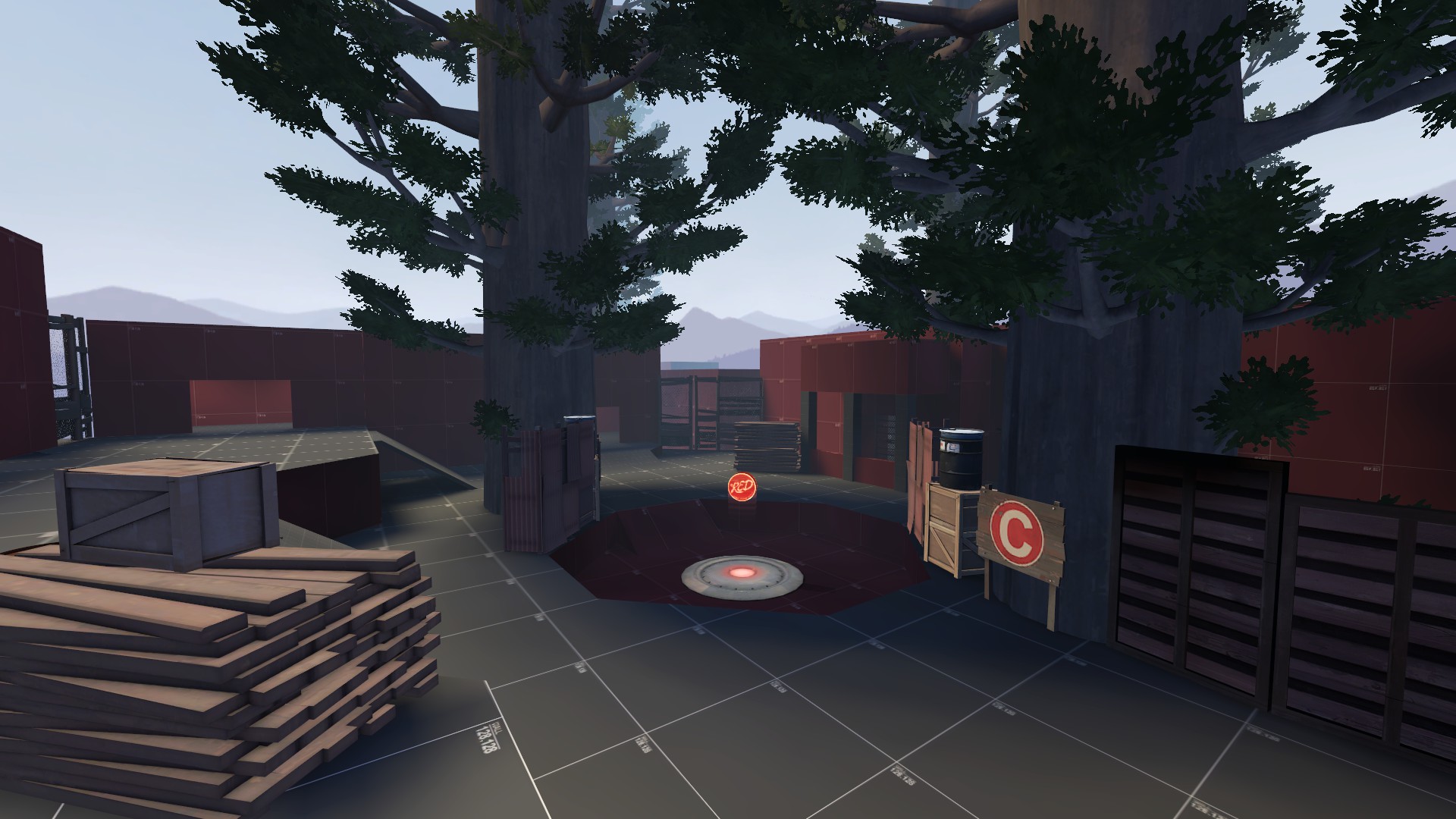
WiP in WiP, post your screenshots!
- Thread starter Arhurt
- Start date
You are using an out of date browser. It may not display this or other websites correctly.
You should upgrade or use an alternative browser.
You should upgrade or use an alternative browser.
i'm loving the spookyness
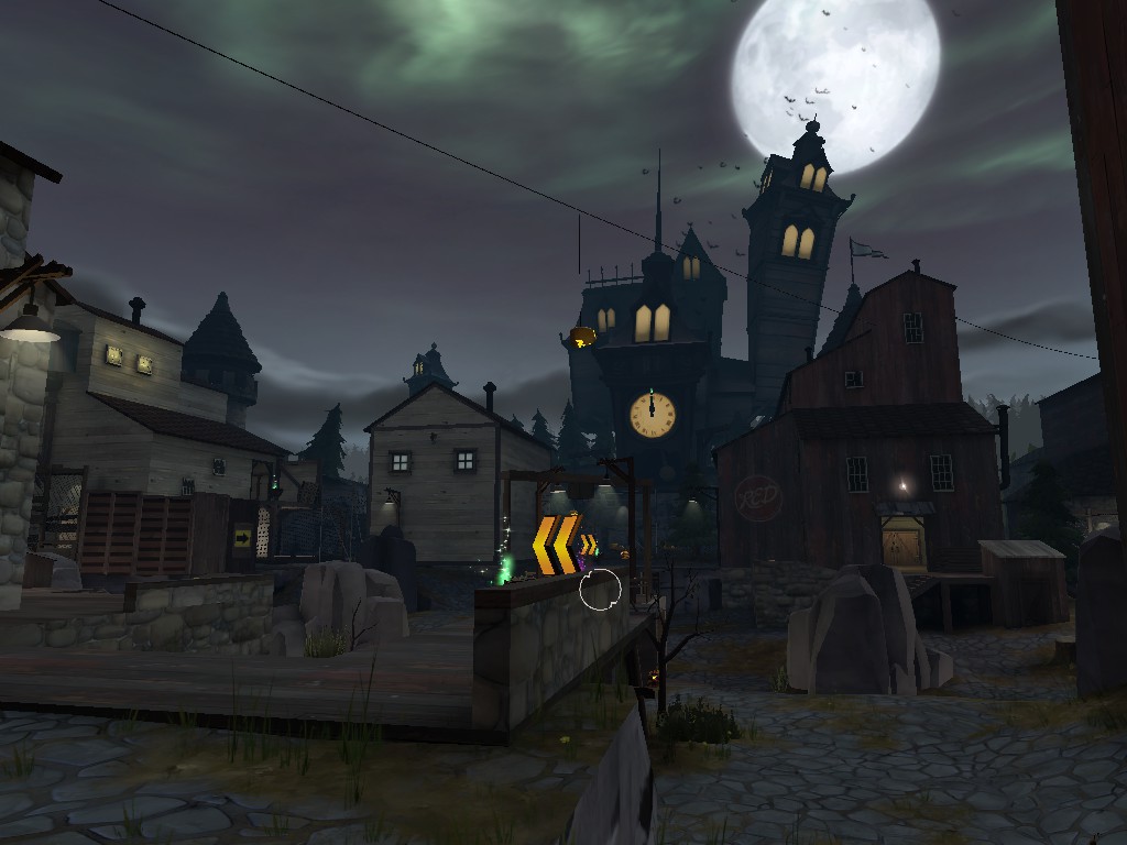
I'm actually surprised with how much you were able to improve the looks of the map, good job!
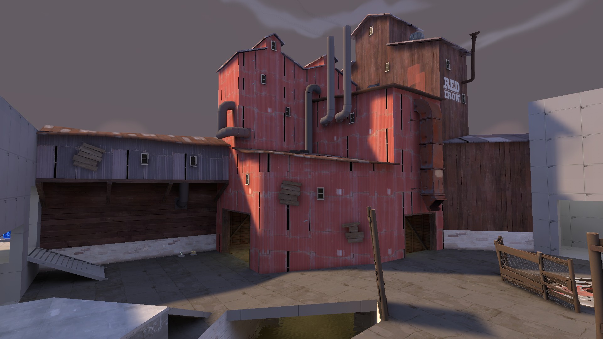
that texture repetition though. The metal with the huge black gaps is meant for background building in the skybox or unplayable areas, hinting at a dark interior. Having a gap that doesn't match with the inside looks weird. Also turn up your texture scaling to avoid obvious repetition (this texture repeats very badly, another reason not do use it here. besides that I like the geometry and detailing, although perhaps give that wood building some depth. It would look more realistic and increase immersion, showing that there is a world outside the direct play area.
This act of shameless self promotion might help the situation a bitThe metal with the huge black gaps is meant for background building in the skybox or unplayable areas, hinting at a dark interior. Having a gap that doesn't match with the inside looks weird. Also turn up your texture scaling to avoid obvious repetition (this texture repeats very badly, another reason not do use it hereNot halloween, but I'm happy how this starts looking:
marshmallie
L2: Junior Member
- Oct 4, 2014
- 51
- 155
Changed a few things in the area, like:
-added the spotlight effect to the lamps
-removed the pointlights
-changed the beams so they don't clip through the support anymore
-the rocky walls are more rocky, although not really that noticeable from this angle, but you can see it when looking to the sides
-etc.
Badland uses that curb/road style to mark a specific path through the area. Using it for the entire floor doesn't quite have the same effect, as the caution tape is a rather eye-catching material but it isn't being used here to draw your eye to anything particular since it's everywhere.
Little update:
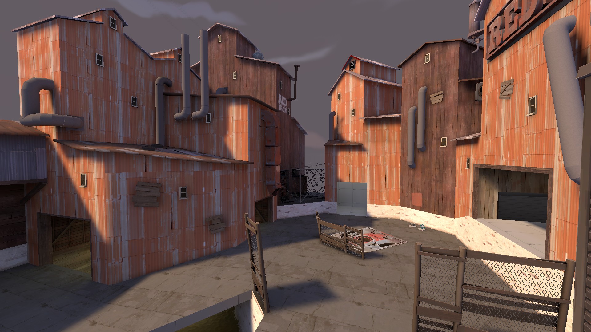
I changed the texture to avoid the obvious repetition and changed the wood building a little bit and added a small out-of-bounds area. I will add more behind it later (3d-skybox). However, I fell like the area at the bottom of the buildings and around the hatch seems empty at the moment. Any ideas how I could add some geometry there (I don't want to prop spam).that texture repetition though. The metal with the huge black gaps is meant for background building in the skybox or unplayable areas, hinting at a dark interior. Having a gap that doesn't match with the inside looks weird. Also turn up your texture scaling to avoid obvious repetition (this texture repeats very badly, another reason not do use it here. besides that I like the geometry and detailing, although perhaps give that wood building some depth. It would look more realistic and increase immersion, showing that there is a world outside the direct play area.Follow this tutorial to merge the building with the skybox seamlessly, I think it would look awesome if you did this for the wood and red metal buildings to add to the industrial warehouse district effect.
using displacements to get grass and dirt along the edges of the building would look cool, but I think it is fine. focus on gameplay for now, and add small detail props (tires & such) to break up the long walls, but don't worry about detailing the entire length of the wall, I think it looks fine as it is. A bigger issue I think is having 3 buildings next to each other with the same texture (the wood is darker and stands out less with one building in the background, so i don't think that is an issue).
However, I fell like the area at the bottom of the buildings and around the hatch seems empty at the moment. Any ideas how I could add some geometry there (I don't want to prop spam).
Try putting little concrete curbs on the ground in some places, like in Dayal's image two posts above. I think it would help make the ground less bland.
Who jammed on the bottom of that jimijam poster?I'm creating spooky versions of existing overlays for people to put in their Halloween maps. If you want, tell me some spooky overlays that you would want done for your map!
- Mar 23, 2017
- 1,338
- 996
https://imgur.com/a/TAe9W
Do you think any of these sightlines are too long? If so, how do you suppose I fix them? Setting is an intercity downtown area. I was thinking of adding cars on the road, but then snipers could just climb on them. I also thought about a truck/train crash, but I don't think I have enough room to make flanks around it. Any ideas?
Do you think any of these sightlines are too long? If so, how do you suppose I fix them? Setting is an intercity downtown area. I was thinking of adding cars on the road, but then snipers could just climb on them. I also thought about a truck/train crash, but I don't think I have enough room to make flanks around it. Any ideas?
- Mar 23, 2017
- 1,338
- 996
Dude, that third sightlines is hella too long. First two look bad, but depending on the layout may be tolerable.https://imgur.com/a/TAe9W
Do you think any of these sightlines are too long? If so, how do you suppose I fix them? Setting is an intercity downtown area. I was thinking of adding cars on the road, but then snipers could just climb on them. I also thought about a truck/train crash, but I don't think I have enough room to make flanks around it. Any ideas?
One way to fix sightlines is to add tall buildings (after all, downtown city areas have lots of these), and rather than making long, straight roads, make your roads curve and weave around buildings.


