WiP in WiP, post your screenshots!

Asd417

Sample Text
aa
Mar 20, 2016
1,452
1,031
sGUU7nV.jpg

JbQR9Mz.jpg

oDc96kx.jpg

Trying to learn how to detail. Please critique/advise.

In my opinion, it is great in general. Probably better than me.
I'm bad at english so let me give you a visual summary
JbQR9Mz.jpg

I meant to say the
'bit more cargo will give clearer narrative. A payload or some sort will work nice. Take a look at upwards if you want to know what I mean.'
 
Last edited:

Cytosolic

L5: Dapper Member
May 1, 2015
201
169
sGUU7nV.jpg

JbQR9Mz.jpg

oDc96kx.jpg

Trying to learn how to detail. Please critique/advise.

I think you've got a great start already. Some parts are a little bit empty, but most of the time it's better to have too little than too much detailing. Density of detailing is unbelievable important and it looks like you've struck a nice balance already. There are a few blank walls were maybe you could add a window or electrical box, or light or whatever. Just as long as unimportant areas have less than the important areas, E.g. capture points, common enemy holding positions.

You're texturing seems pretty good, no complaint there. You're lighting looks a little bland, and probably could use some refinements. Honestly, I don't know everything about detailing, and even less about lighting, so I can't really help you there. Although there a few great tutorials I recommend reading if you're stuck on something.
 

Another Bad Pun

In the shadows, he saw four eyes lit by fire
aa
Jan 15, 2011
802
1,845
Trying to learn how to detail. Please critique/advise.
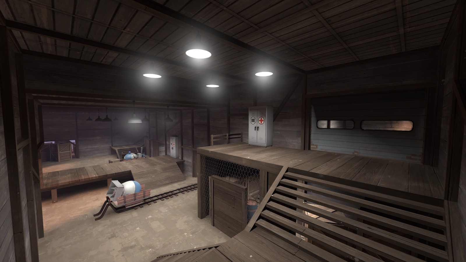
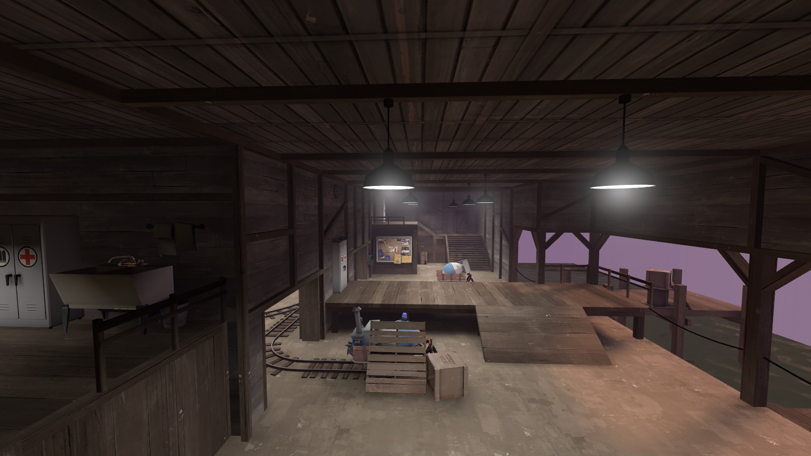
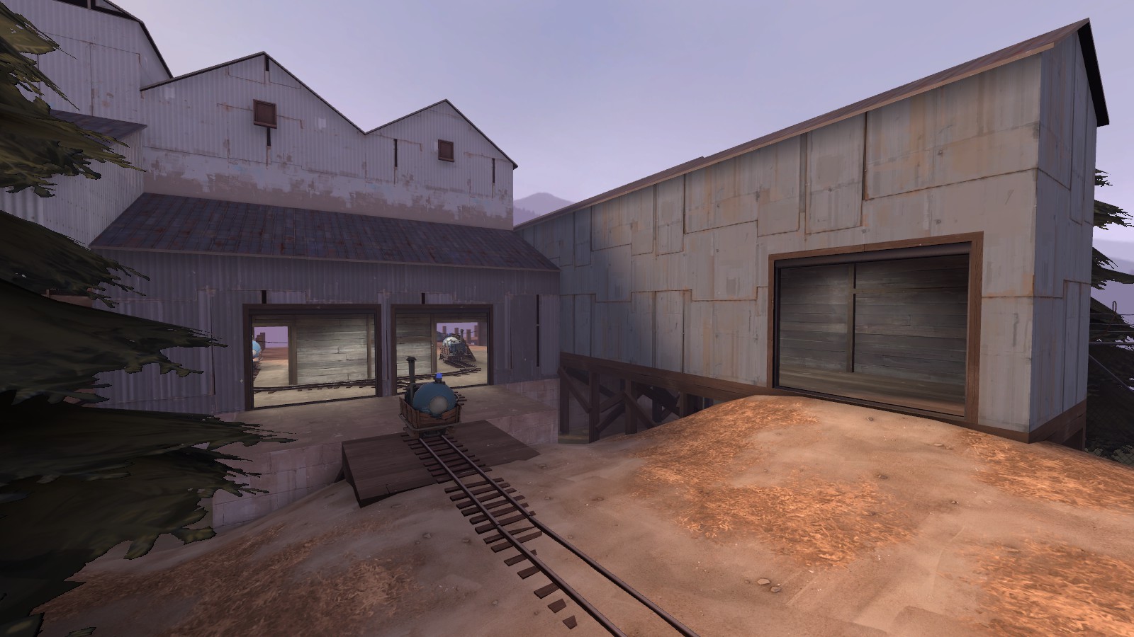
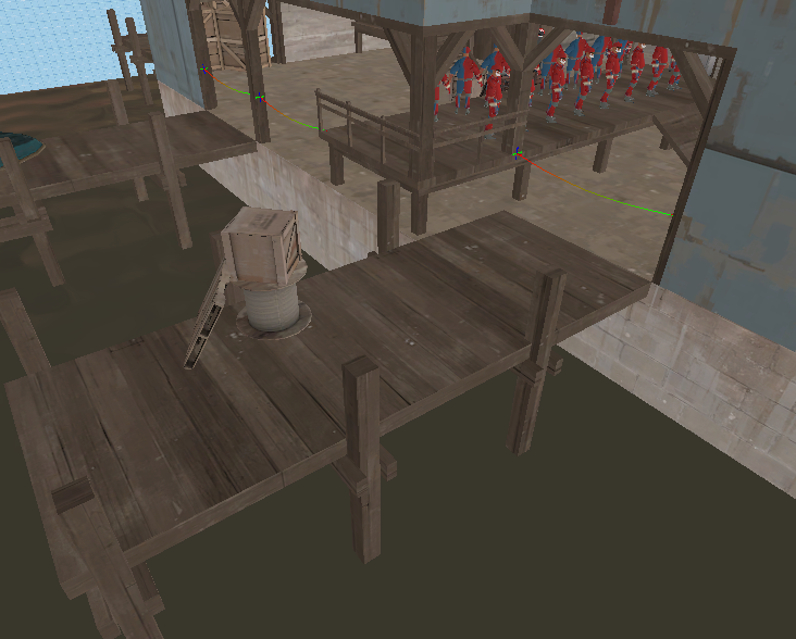
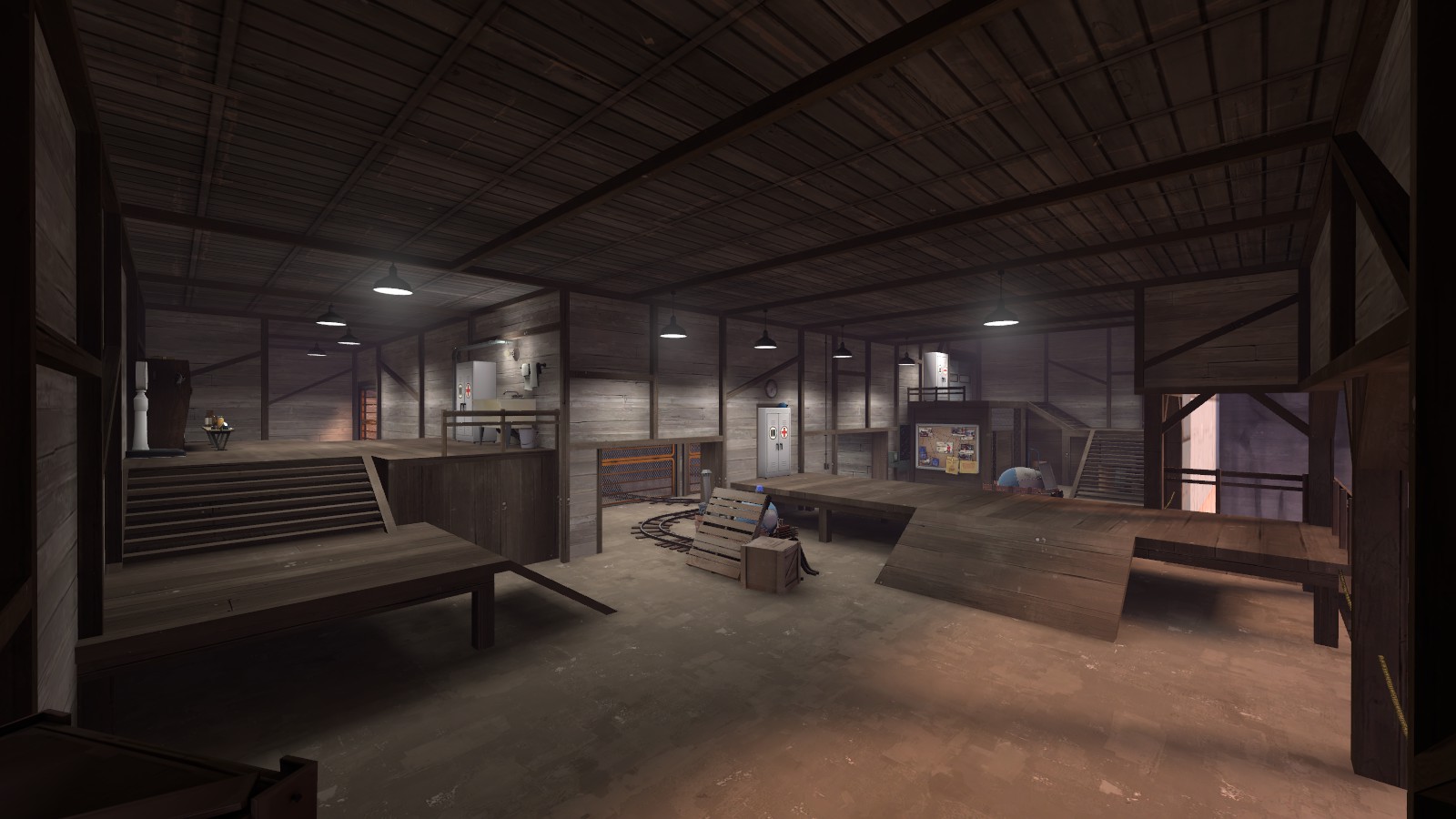
You may be using too much white light in spawn, and that wood wall texture works, but everything is a little samey in there. The floor, walls, and ceiling are both a creamy beige color, as well as the ground outside. The building exterior textures are a very faded blue, and I think darker, stronger blue metal textures might look better. The environment lighting settings also look pretty pale - the shadow ambient is pretty lite, as is the intensity of the sunshine.
Sticking to a soft color scheme is fine, I mean, this is mostly my preference, but it may cause a distinct lack in variation. For instance, in my opinion, you never want any lighting or details in indoor areas that look too similar to the outdoor areas - otherwise, the map ends up feeling homogeneous and has a sense of placelessness.

So I would prefer it if the sections you showed had more contrast going on, both in terms of lighting, and texture choice.
 

CriminalBunny

Lasers are just deadly rainbows
aa
Oct 11, 2013
273
413
sGUU7nV.jpg

JbQR9Mz.jpg

oDc96kx.jpg

Trying to learn how to detail. Please critique/advise.
Looks a bit Upward inspired. I like it!
I can't really say anything that hasn't been said, but I think the wall on the right of the last picture looks rather bland. I think just one window (if you don't want people to look inside/outside just have it boarded up) would be enough to break the monotony, but as the exits are more important maybe you can get away with leaving it like that
 

Idolon

they/them
aa
Feb 7, 2008
2,110
6,119
hJYbOsa.png

Easily detachable rope is used in places that probably don't need permanent blocking, but a more permanent handrail is built on the deck where people would want to walk through. There's more than one way to solve this - maybe the handrail has a gate and the ropes are also handrails? Also consider extending the boundary out to the entire deck instead of blocking it in the middle (and add a roof if the handrail doesn't feel complete as a level boundary).

See if you can get away without any electrical lighting in this space (or, rather, only use it where necessary). Realistically, if the sun is only just coming up/down the lights might still be on, but using just natural light in an interior space is a unique lighting condition that not a lot of maps use.

Another note on lighting: Getting light cones to appear on walls can really help make lighting feel less bland. Moving your lights close to walls (and also centering them over a doorway) is a great technique.

Last note: Add stains.
 

ibex

aa
Sep 1, 2013
308
528
hJYbOsa.png

Easily detachable rope is used in places that probably don't need permanent blocking, but a more permanent handrail is built on the deck where people would want to walk through. There's more than one way to solve this - maybe the handrail has a gate and the ropes are also handrails? Also consider extending the boundary out to the entire deck instead of blocking it in the middle (and add a roof if the handrail doesn't feel complete as a level boundary).

See if you can get away without any electrical lighting in this space (or, rather, only use it where necessary). Realistically, if the sun is only just coming up/down the lights might still be on, but using just natural light in an interior space is a unique lighting condition that not a lot of maps use.

Another note on lighting: Getting light cones to appear on walls can really help make lighting feel less bland. Moving your lights close to walls (and also centering them over a doorway) is a great technique.

Last note: Add stains.

Opps, that angle makes that look weird. Those are two separate pieces.
wy1PSwz.png

Also, thanks for all the feedback, everyone. Completely forgot to use overlays at all, but I haven't really used them before besides item placements. Electrical and piping is something I could add, too. And I have been looking at upward for inspiration!

Definitely need to study up on lighting. Hopefully I have time in the contest to make the lighting suck less.
 

Pocket

Half a Lambert is better than one.
aa
Nov 14, 2009
4,697
2,581
I recommend using the actual rope texture (swamp/cable/rope_swamp) for those ropes.
 

UKCS-Alias

Mann vs Machine... or... Mapper vs Meta?
aa
Sep 8, 2008
1,264
816
In my opinion, it is great in general. Probably better than me.
I'm bad at english so let me give you a visual summary
JbQR9Mz.jpg

I meant to say the
'bit more cargo will give clearer narrative. A payload or some sort will work nice. Take a look at upwards if you want to know what I mean.'
Tbh, i think some of your comments are actualy invalid. Since detailing is also about attracting attention. And not allways just a 'is a player very well visible here/does the player blend in with the background'
You call 1 wall to dark. If its a spot commonly used or is a primary ambush point it surely should be lit well. but from the screen it doesnt look like that. Which means that the lack of brightness might be just fine. As long as players can be spot well. And for that, its often that people will see it from the other side making that darker spot completely irrelevant to that.
You call the raised floor a little bit bland, but if players cant crouch under it, then it surely should be bland. I however would agree that some additional supports can be welcome there.
Also, it looks like this is inside the spawnroom (because of that locker) in which case a dark area wouldnt be a problem at all since its a combat free zone.

Some additional comment:
i would generaly prefer to see the rope being attached to something solid. For the pillars this is fine enough (no prop needed unless optimize wise it wouldnt harm), but that section ending on the raised platform seems like its floating and not realy connected to anything solid. From the other side the pillar going upward brings just enough to make it look like a solid connection.

I also think that the docks are relatively short in length. With 2 bridges this close you would expect boats also being connected from the side, but at these lengths that barely would fit. Although heightwise it might just imply to only support a larger ship. But then a handrail is generaly recommended.
 

ibex

aa
Sep 1, 2013
308
528
I really should just start detailing other areas, but I wanted to try the lighting again. Tried to work on what Ido suggested.
9TSj3BA.jpg

Also, changed the wall textures, but I find myself liking the bland/neutral color palette haha. Maybe I'll attempt some brighter colors in the red areas.

About the docks; they were probably one of the first things I built when originally blocking the map together, and I can't decide how they should function ahah. I added rowboats, but ofc they are much too high off the water. Kinda wish there was a stock/generic tug boat type thing. I'll probably have to come back to that idea to really flesh them out.
 

UKCS-Alias

Mann vs Machine... or... Mapper vs Meta?
aa
Sep 8, 2008
1,264
816
You could just have 1 of the docks raised and 1 lowered with a staircase. The height diffirence also gives a reason to have 2 of them very close to each other. And again, increase the length of the docks by about 50%-100%. They look way to short, even more with that corner into it. With such corner i would expect a boat to fit well into that without risking collisions. For a rowboat expect that a motorboat has to make a 180 degree turn to rotate and get out. It should provide enough room to easily perform it.
(in theory they can move it backward and instantly turn right, but a short left turn prob would be easier)
 

Cytosolic

L5: Dapper Member
May 1, 2015
201
169
I'm having a hard time thinking of what i should do with this point for segil
0RHTud9.png

should i give it cover or should i make second story routes with viable paths?
any feedback is nice

It looks really flat, try to add some height variation to the sides and in the connectors. The area shown looks like the main battle field, so it's ok that it's so open. Just make sure there a couple sneaky routes around the main entrance. If this is an A/D map make sure Red has some good defense positions. This guide is focused on A/D specifically, but if you're you're not making one it still has some good points.

Sorry for the info dump when you just wanted ideas. Hope I helped in some way.
 

Crowbar

Spiritual preprocessor
aa
Dec 19, 2015
1,455
1,297
If you meant mod, that's pretty much Team Fortress 2.
If, what is more probable, mode, it's koth and even has an entity setup except spawns.
 

Crowbar

Spiritual preprocessor
aa
Dec 19, 2015
1,455
1,297
I think I'll do something about it when I ensure I have a project going somewhere. I don't really have enough stuff to have a decent orphanage thread, maybe I should make one? And I sorts wanna give these 400 brushes into good hands (not implying yours or anybody else's aren't), and I had plans for it, etc, etc, etc.
A collab would be possible this is awkward i was just going for ratings send help