WiP in WiP, post your screenshots!

B!scuit

L5: Dapper Member
Aug 12, 2016
205
267
Trying to make a skybox, didn't go what I wanted
I get the same error every time I add a 3D skybox to anything.
It usually happens if I leave a sky_camera at 0,0,0 in the proper map or the 3D skybox has a gap in the skybox brushes surrounding it.
 

Malachite Man

L6: Sharp Member
Oct 16, 2015
378
225
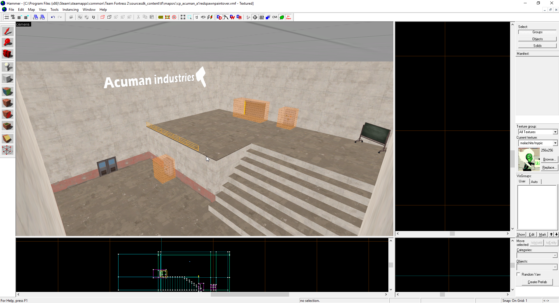
2016-10-02_01-17-55.png

I have cool ideas.
 

Cytosolic

L5: Dapper Member
May 1, 2015
201
169
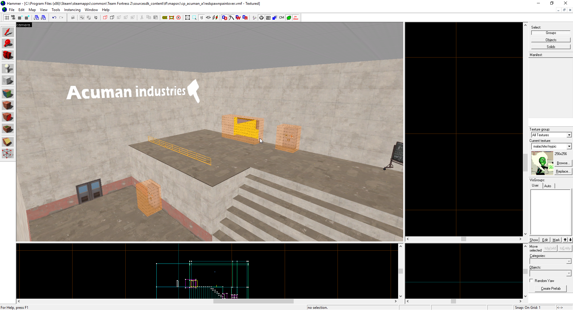
upload_2016-10-2_1-28-6.png
\
The new version

That whole room looks kind of over scaled, or at least pretty empty for the size of the space. Since there are resupply cabinets I'm guessing it's a respawn room? Respawn rooms don't need to be that big, preferably small and tight to block sight lines in to the spawn.
 

AsG_Alligator

qhull precision error
aa
Aug 5, 2016
620
1,223
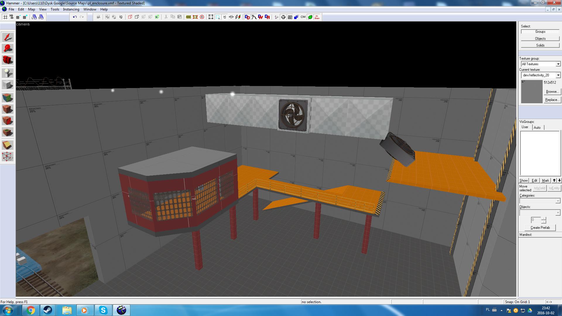
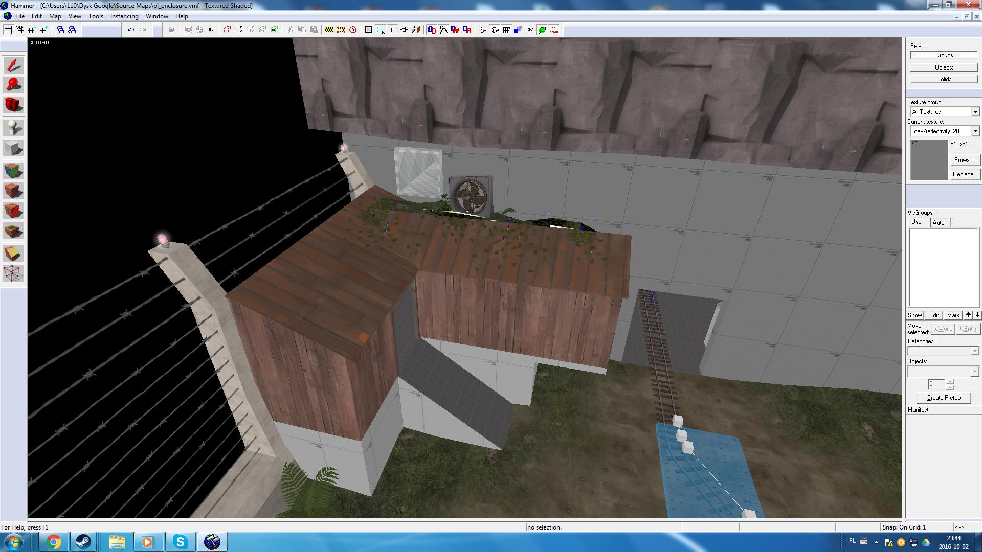
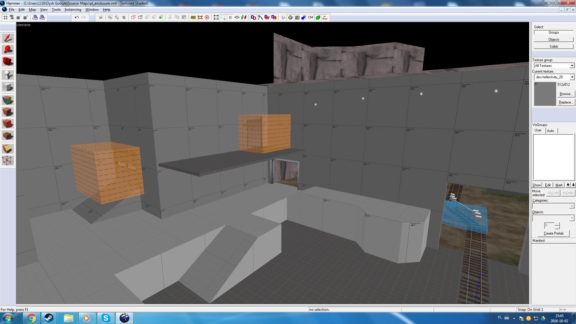
I uploaded first version of koth_frostline onto steam workshop. Meanwhile I had this idea for a map floating around - pl_enclosure

I started with final capture point:
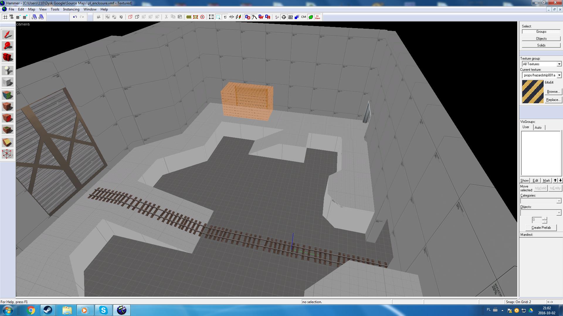
GVGym0d.jpg

5NRvWq8.jpg


This time I'm going full improvisation mode - no layout plan or anything.
 

Cytosolic

L5: Dapper Member
May 1, 2015
201
169
I uploaded first version of koth_frostline onto steam workshop. Meanwhile I had this idea for a map floating around - pl_enclosure

I started with final capture point:
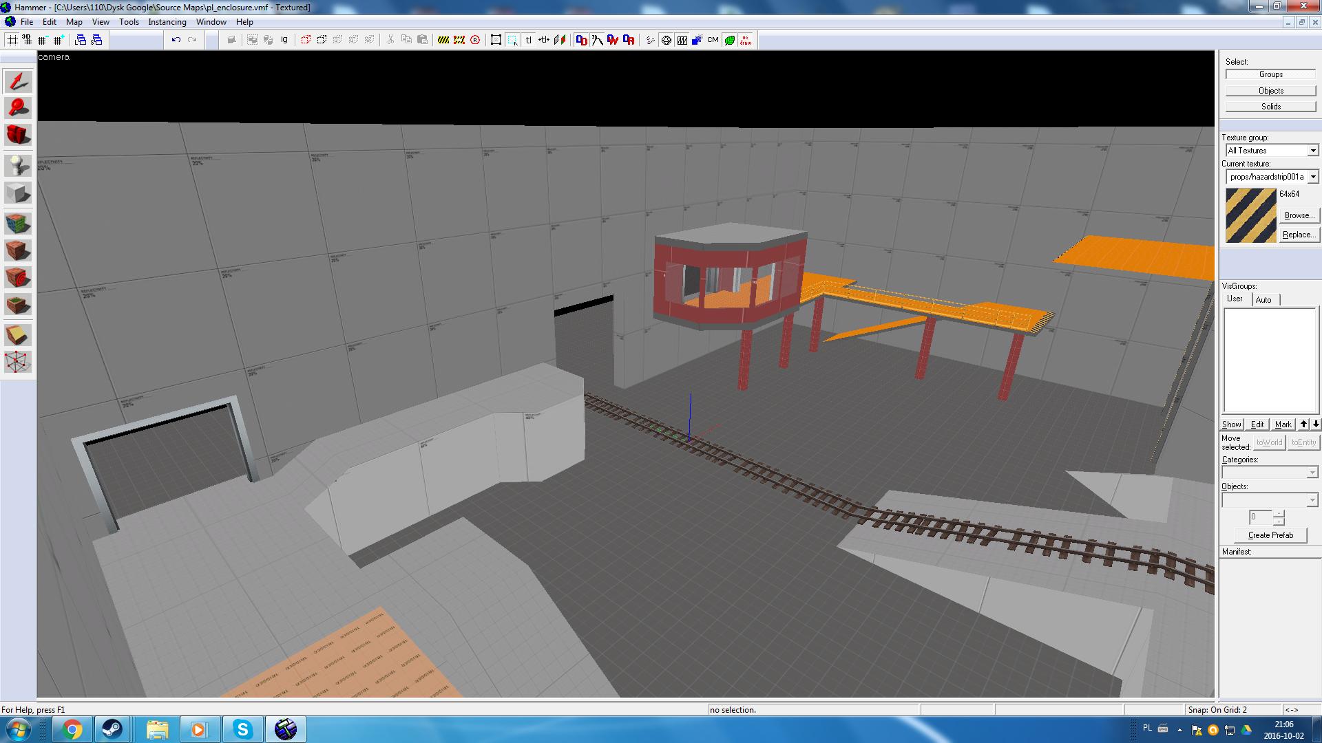
GVGym0d.jpg

5NRvWq8.jpg


This time I'm going full improvisation mode - no layout plan or anything.

Too flat and boxy. Those skirting platforms look a little too small to maneuver on. although you have three separate entrances into last, they all come though the same wall, with no cover, so it'll be pretty chokey. Gold Rush stage two does this but sorta gets away with it because of that big building in the middle to block sightlines. yours doesn't have that.

I'm sorry if I came off a bit negative, i thought you might want some feedback, since you posted it, and I understand that sometimes when you impromptu map, things just kinda take shape. For better or worse.
 

AsG_Alligator

qhull precision error
aa
Aug 5, 2016
620
1,223
Too flat and boxy. Those skirting platforms look a little too small to maneuver on. although you have three separate entrances into last, they all come though the same wall, with no cover, so it'll be pretty chokey. Gold Rush stage two does this but sorta gets away with it because of that big building in the middle to block sightlines. yours doesn't have that.

I'm sorry if I came off a bit negative, i thought you might want some feedback, since you posted it, and I understand that sometimes when you impromptu map, things just kinda take shape. For better or worse.
Thats allright. I'm just throwing stuff together and seeing if it sticks. Blockiness will go away when I do an artpass.

I'm not too happy about that spawnroom exit location, but i cant think of a better spot for it in the room.

As for entrances on a single wall - Gorge does it too (and that red room with windows and side exit is a bit similar to the one on Gorge as well).

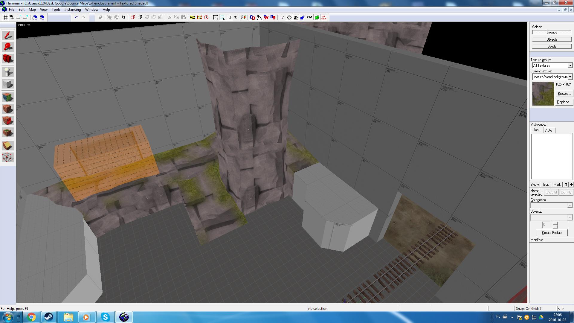
I'm considering inserting some rock surfaces to the interior of the final point building:
teqdj19.jpg
 
Last edited:

Diva Dan

hello!
aa
Mar 20, 2016
1,034
1,954
Looks fantastic, void! You should place some comic books and soda cans by the dock so it's as if kids sneaked out of their cabin at night to imitate an anagram they saw. I think that would add a cool story element to the map.
 

Void

Local Man Unable To Map, Sources Say
aa
Sep 14, 2008
1,874
2,985
Looks fantastic, void! You should place some comic books and soda cans by the dock so it's as if kids sneaked out of their cabin at night to imitate an anagram they saw. I think that would add a cool story element to the map.


Cytosolic

L5: Dapper Member
May 1, 2015
201
169
Thats allright. I'm just throwing stuff together and seeing if it sticks. Blockiness will go away when I do an artpass.

I'm not too happy about that spawnroom exit location, but i cant think of a better spot for it in the room.

As for entrances on a single wall - Gorge does it too (and that red room with windows and side exit is a bit similar to the one on Gorge as well).

I'm considering inserting some rock surfaces to the interior of the final point building:
teqdj19.jpg

I think having some more geometry will help a lot, I know Gorge does the all on one wall thing but it has some pretty protected flanks and a lot of height advantage over the center pit. Maybe you could expand and raise the side platforms and red room and do something similar to Badwater?
As for the spawn exit try to have multiple exits behind the cap with some sort of advantage over the battlefield, height advantage is a common one. Just make sure they can defend from inside their spawns.
 

AsG_Alligator

qhull precision error
aa
Aug 5, 2016
620
1,223
I'll give it a shot.

Meanwhile, when I was browsing models I came across this one:
HGA75DN.png


I definitely don't remember seeing this model before.

Asteroid not being dead confirmed?
 

DrLambda

L69: Teeheehee, Member
aa
Feb 18, 2015
458
475
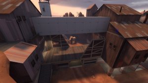
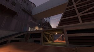
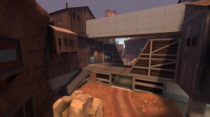
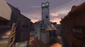
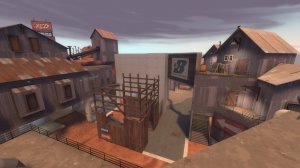
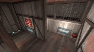
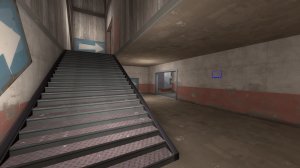
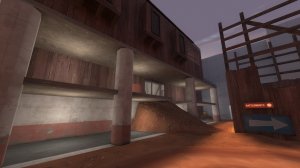
Still rough around the edges, but this is as far as i was able to artpass Epicenter so we can play it on LAN tomorrow. No release, because i want to do some more stuff before that (1. no dev-textures. 2. cables. 3. Better optimization. Soundscapes and 3DSky in later versions.) I'm beginning to feel happy for what i've done till now. Hopefully i'll be able to do this classic justice.

20161003005415_1.jpg 20161003005421_1.jpg 20161003005429_1.jpg 20161003005438_1.jpg 20161003005450_1.jpg 20161003005456_1.jpg 20161003005504_1.jpg 20161003005512_1.jpg 20161003005551_1.jpg 20161003005602_1.jpg 20161003005614_1.jpg 20161003005626_1.jpg
 

nickybakes

You should've played Rumbleverse
aa
Jul 28, 2015
912
1,741
So last friday (September 23rd), @Crash forwards someone requesting a trade map to me. We discussed some stuff about what will be in the map, but I didn't know what theme he wanted. He then proceeded to link me the Robin Hood: Men in Tights trailer. Since then I've spent every single minute of my free time to make this. From my little experience of trade maps, I remember them always looking pretty ugly. So my goal was to create a map that looked good. I know its not the best detailing, but I am very proud of it. Even after re-compiling 5 or 6 times (about one and a half hours each) to fix stupid errors, and get the lighting good.

20161002235642_1.jpg
20161002235658_1.jpg
20161002235730_1.jpg


Red spawn:
20161002235811_1.jpg


Spy Crab area:
20161002235944_1.jpg


Boxing ring:
20161003000049_1.jpg


Side view:
20161003000157_1.jpg


Another cool shot:
20161003000215_1.jpg


Some of the errors I had (thanks Source):

Hunk Overflow:
engine_hunk.PNG

Invisible glass?:
20161002211059_1.jpg


With the money I earned from the commision, I was able to donate to TF2Maps!

You can find the server running the map here (its a Hungarian server, so ping may be bad): 185.80.50.84:27015

Conclusion: I'm tired and I want to sleep.
 
Last edited: