WiP in WiP, post your screenshots!
- Thread starter Arhurt
- Start date
You are using an out of date browser. It may not display this or other websites correctly.
You should upgrade or use an alternative browser.
You should upgrade or use an alternative browser.
Anderpan
L1: Registered
- Sep 9, 2016
- 4
- 33
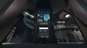
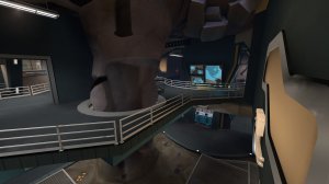
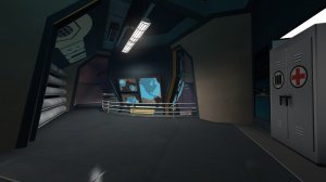
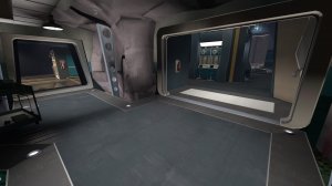
Hope I'm not spamming the thread, but I made this spawn room for that contest thingie months and months ago. Was too busy and never got the chance to submit on time, so here it is anyway. Underground BLU base with a mix of spytech and moonbase for that futurisitc look.
Attachments
3:34 AM - Mike: Hey, Corvatile!
3:37 AM - Corvatile: what
3:37 AM - Mike: Remember that arena_honeyville map you made a year or so ago?
3:38 AM - Corvatile: what
3:38 AM - Mike: The spawnrooms in that map were hideous. Like, totally gross, weren't they?
3:38 AM - Corvatile: who is this

3:39 AM - Mike: They were those gross, boxy buildings. Looked totally unrealistic.
3:39 AM - Corvatile: seriously who are you
3:39 AM - Mike: And those interiors! Ugly, cramped rectangular rooms which didn't have enough room to swing a cat!
3:40 AM - Corvatile: how did you get this number

3:40 AM - Mike: Seeing as Honeyville is basically the only map you've ever finished and it looks like something you'd find in a Playstation One game, you should really do something about that!
3:41 AM - Corvatile: who are you
3:41 AM - Corvatile: dude its 3 in the morning
3:41 AM - Mike: Imagine something like THIS!

3:41 AM - Mike: What an improvement! Sure, it's still a bit boxy but it has CHARACTER! Imagine a whole remake of Honeyville that looked this pretty!
3:42 AM - Corvatile: what the hell are you talking about

3:42 AM - Mike: Maybe a neat little crane too; now it looks like the kind of place people might actually work in!
3:42 AM - Corvatile: stop contacting me
3:42 AM - Mike: And what about a cool interior, complete with dramatic lighting and wooden supports not auto-generated by an external application!
3:43 AM - Mike: That roof still looks a bit odd though. Should probably make it steeper. It would make the building less boxy. Not to worry though, you're still learning!
3:43 AM - Corvatile: seriously
3:43 AM - Corvatile: stop

3:44 AM - Mike: I can't wait to see the new version of Honeyville with palatable detailing and HEIGHT VARIATION!
3:44 AM - Mike: I'm fully braced for a map that will blow my socks off!
3:44 AM - Corvatile: im calling the police
3:37 AM - Corvatile: what
3:37 AM - Mike: Remember that arena_honeyville map you made a year or so ago?
3:38 AM - Corvatile: what
3:38 AM - Mike: The spawnrooms in that map were hideous. Like, totally gross, weren't they?
3:38 AM - Corvatile: who is this

3:39 AM - Mike: They were those gross, boxy buildings. Looked totally unrealistic.
3:39 AM - Corvatile: seriously who are you
3:39 AM - Mike: And those interiors! Ugly, cramped rectangular rooms which didn't have enough room to swing a cat!
3:40 AM - Corvatile: how did you get this number

3:40 AM - Mike: Seeing as Honeyville is basically the only map you've ever finished and it looks like something you'd find in a Playstation One game, you should really do something about that!
3:41 AM - Corvatile: who are you
3:41 AM - Corvatile: dude its 3 in the morning
3:41 AM - Mike: Imagine something like THIS!

3:41 AM - Mike: What an improvement! Sure, it's still a bit boxy but it has CHARACTER! Imagine a whole remake of Honeyville that looked this pretty!
3:42 AM - Corvatile: what the hell are you talking about

3:42 AM - Mike: Maybe a neat little crane too; now it looks like the kind of place people might actually work in!
3:42 AM - Corvatile: stop contacting me
3:42 AM - Mike: And what about a cool interior, complete with dramatic lighting and wooden supports not auto-generated by an external application!
3:43 AM - Mike: That roof still looks a bit odd though. Should probably make it steeper. It would make the building less boxy. Not to worry though, you're still learning!
3:43 AM - Corvatile: seriously
3:43 AM - Corvatile: stop

3:44 AM - Mike: I can't wait to see the new version of Honeyville with palatable detailing and HEIGHT VARIATION!
3:44 AM - Mike: I'm fully braced for a map that will blow my socks off!
3:44 AM - Corvatile: im calling the police
I think wires should attach to the base of the lamp, not the lightbulb itself. Other than that, looks really cool!
edit: also I think a bit more "overhang" on the roofs could look neat and make it look less boxy and that crane hook prop looks a tad too heavy for a small wooden crane like that.
Last edited:
holy shit im in loveHope I'm not spamming the thread, but I made this spawn room for that contest thingie months and months ago. Was too busy and never got the chance to submit on time, so here it is anyway. Underground BLU base with a mix of spytech and moonbase for that futurisitc look.
this is probably the earliest wip picture ever posted...probably
this is a sketch of a map i want to make called pl_nuker_a1 (not the final name)
so what do you think?
BS means blue spawn
RS means red spawn
NS means no spawn, so it's just a room the 2 teams can use for resupplying
it's not properly scaled
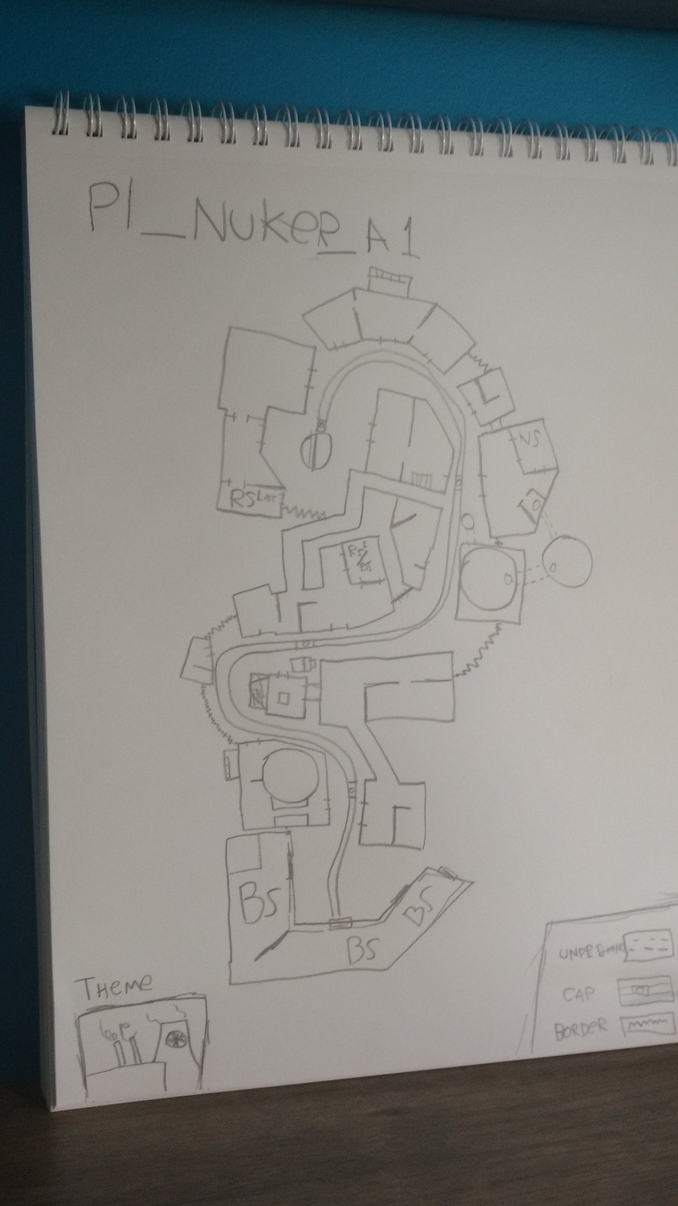
this is a sketch of a map i want to make called pl_nuker_a1 (not the final name)
so what do you think?
BS means blue spawn
RS means red spawn
NS means no spawn, so it's just a room the 2 teams can use for resupplying
it's not properly scaled
Last edited:


Point 'A' on the 2CP arena map I'm making! I think it will play decent considering I put a lot of thought into sightlines and what is visible from where. Time to do the other 3/4 of the map! (connector, B, spawns)
this is probably the earliest wip picture ever posted...probably
this is a sketch of a map i want to make called pl_nuker_a1 (not the final name)
so what do you think?
BS means blue spawn
RS means red spawn
NS means no spawn, so it's just a room the 2 teams can use for resupplying
it's not properly scaled
Aside from the fact that a 2D drawing can never show verticality, and while i think that you probably thought about it, i still want to emphasize on how important it is to have height differences.
First -> A looks really boring. It doesn't matter if it goes up- or downhill, it's just a straight line. Every other point you have changes direction, which is a good thing, but A looks like "Uh, i need another point somewhere in here."
B -> C has this problem on a smaller scale, depending on how far off your scale is.
Rather than having a room dedicated for resupply, you should probably just stick to a full health/full ammo kit if it is necessary. Having an actual fight happening around a func_regenerate is a bad idea.
RED Last spawn doesn't give RED enough options, it looks like there is just one exit, nothing that could stop BLU from rolling through if they get the upper hand for a short moment.
Last but not least, in my own opinion, "Nuker" is a very bad name.
These are the problems that i suspect could exists from what i see in your plan (which is almost always something different than what the mapper sees in his own plans, because said plans are usually not very descriptive for other people.)
thank you for your input! there is going to be a lot of height variation in the actual map, this was really just to get the layout down and i'm sure that just translating it to hammer will affect the layout a lot!Aside from the fact that a 2D drawing can never show verticality, and while i think that you probably thought about it, i still want to emphasize on how important it is to have height differences.
First -> A looks really boring. It doesn't matter if it goes up- or downhill, it's just a straight line. Every other point you have changes direction, which is a good thing, but A looks like "Uh, i need another point somewhere in here."
B -> C has this problem on a smaller scale, depending on how far off your scale is.
Rather than having a room dedicated for resupply, you should probably just stick to a full health/full ammo kit if it is necessary. Having an actual fight happening around a func_regenerate is a bad idea.
RED Last spawn doesn't give RED enough options, it looks like there is just one exit, nothing that could stop BLU from rolling through if they get the upper hand for a short moment.
Last but not least, in my own opinion, "Nuker" is a very bad name.
These are the problems that i suspect could exists from what i see in your plan (which is almost always something different than what the mapper sees in his own plans, because said plans are usually not very descriptive for other people.)
as for the name "nuker" this was mainly just a placeholder and a way to remind myself that the theme is nuclear power.
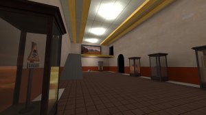
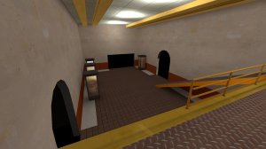
Off Peak might be a while away before being ready for detailing, but I decided to do a practice run to try to get the War Museum aesthetic down. I don't think I achieved it with this attempt, but I'll be doing multiple test and experiments. If anyone has any feedback or suggestions on how to achieve the museum look, I'm open to ideas...


Damn, you waste such a ton of screen space, espically with your 4:3 display!
That AD map might be something.
Off Peak might be a while away before being ready for detailing, but I decided to do a practice run to try to get the War Museum aesthetic down. I don't think I achieved it with this attempt, but I'll be doing multiple test and experiments. If anyone has any feedback or suggestions on how to achieve the museum look, I'm open to ideas...


I just remembered a CS 1.6 map that did the museum theme really well. Its name is (fittingly) de_museum and you can find it here. If you don't have CS 1.6 installed, you can probably find more screenshots of it on the interwebs. The main thing i see that are differing between your detailing and the map is: Really high ceiling height (good for gameplay too!), actual presentation of the exhibits - Pedestals, height differences, descriptive signs (theres a lot of space for humor here in the TF2 universe,) raised walkways and a general pompous feel.
I think there is a lot of room to create something awesome here.
Of if you have CSS: http://gamebanana.com/maps/65487de_museum and you can find it here. If you don't have CS 1.6 installed, you can probably find more screenshots of it on the interwebs.
(note that its not a remake of the cs 1.6 map)
Last edited:
Of if you have CSS: http://gamebanana.com/maps/65487
(note that its not a remake of the cs 1.6 map)
or if you have CS:GO:


