WiP in WiP, post your screenshots!

Uncuepa

aa
Oct 25, 2014
799
1,168
Shout out!
2015-12-10_00002.jpg
2015-12-10_00003.jpg
 

Vel0city

func_fish
aa
Dec 6, 2014
1,947
1,589
Alloy is looking mighty fine. Going to touch up those telephone masts and add wires sometime soon. Pushing the skycard back a little so that it fades with the fog. Other than that, nearing completion.

mDRy04v.jpg
Holy crap that looks beautiful.
 
Nov 13, 2015
138
512
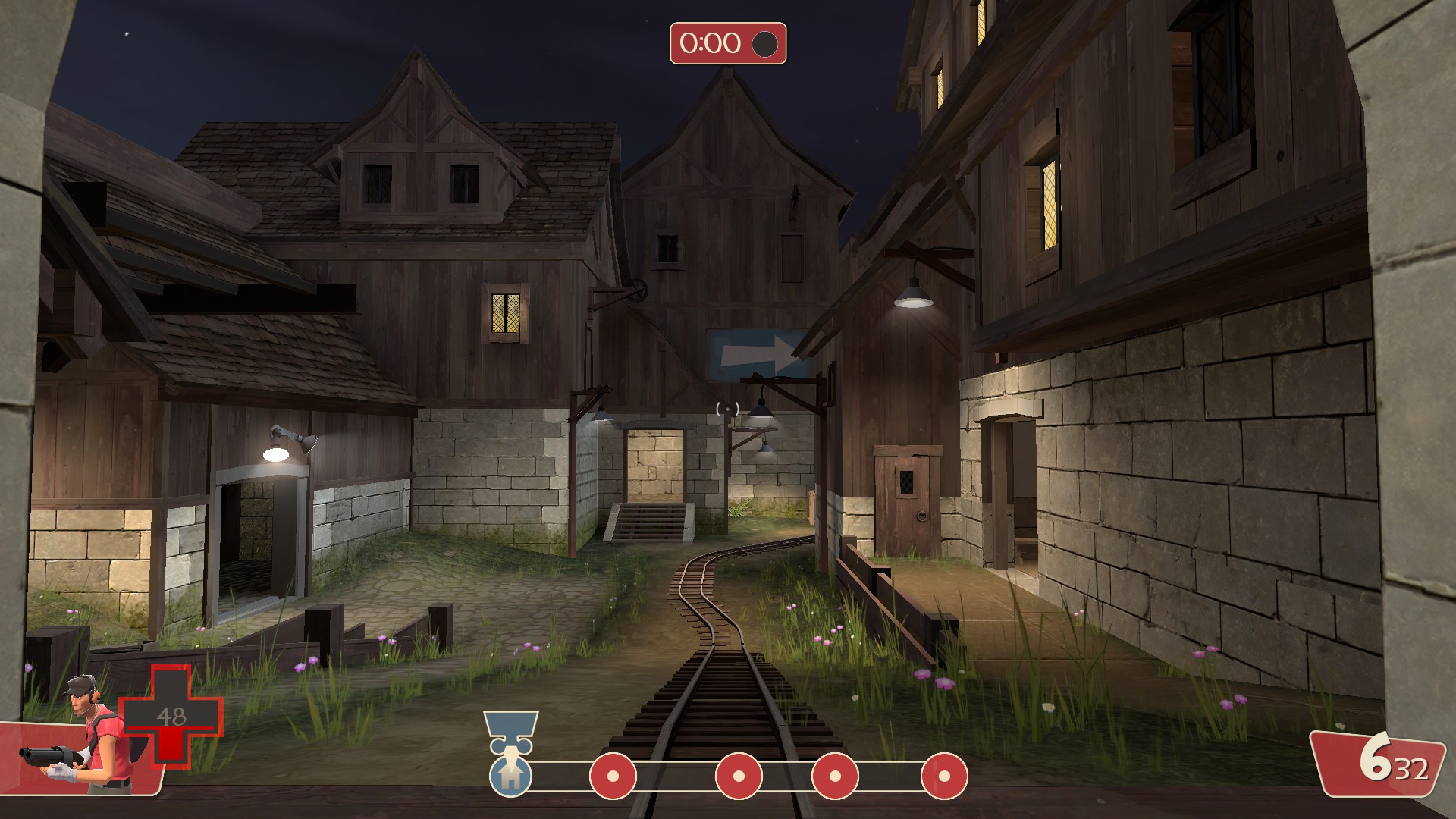
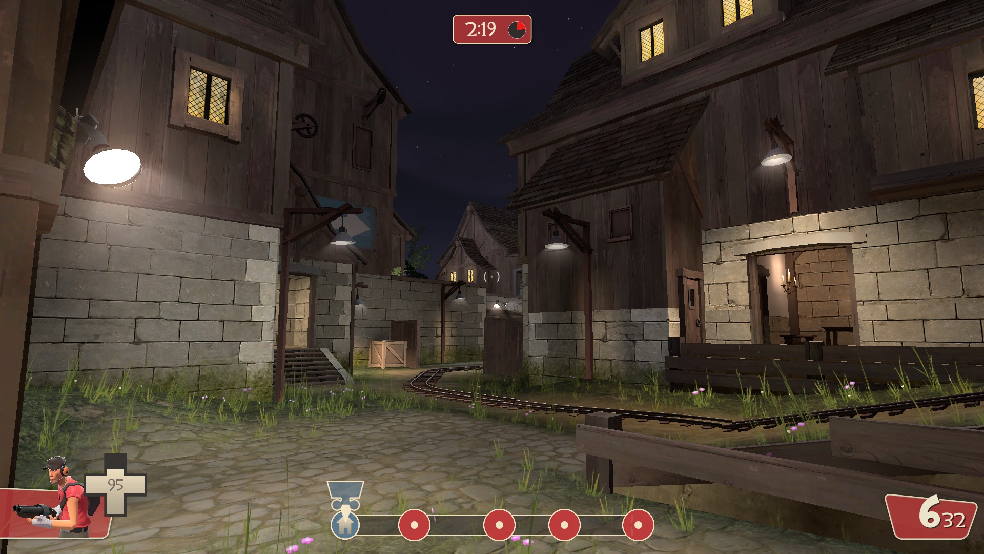
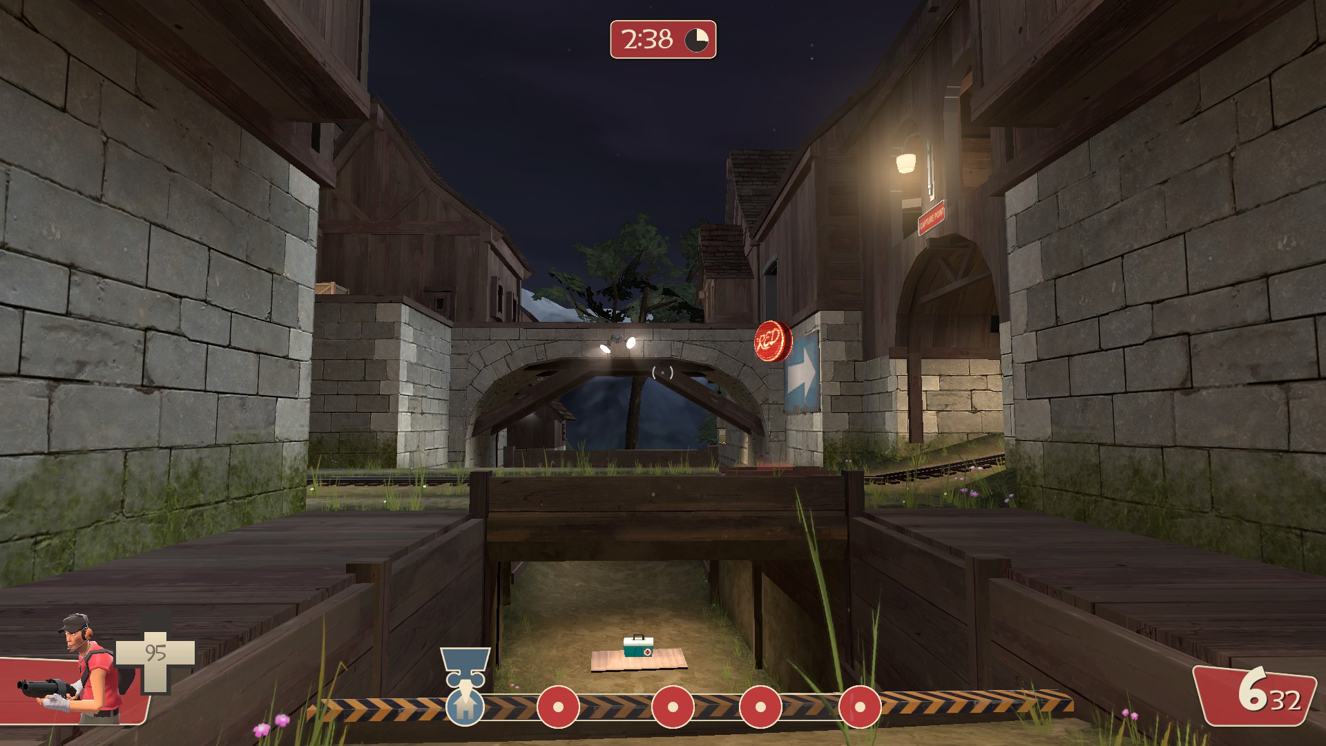
Some pics of the area between checkpoint 2 and 3 from my little mountain village map,
A few weeks back we did a playtest of it, I've updated it with all (useful) feedback from that playtest - thanks to everyone that provided it!
I've noticed a few problems, sometimes the light spots does not seem to lit the ground, can't remember what I did to get it working properly last time, started hitting the roof for solids so have been converting as much of the detailing as possible into models, also the hammer shipped with tf2 seems rather old, have been noticing a bunch of minor bugs (that I haven't seen since CS:S)

12386C96624DD6402C9C00B6BE1B386A18628F76


34F19FAF5797A3F8CDC0B293A2CBB8E52B4BCF52


A68F6678398749F6DC161F7340C2A3B188658871


Was hoping to get it done for the Winter Wonderland, but as of right now I need a Christmas miracle to beat the deadline :)
 

Idolon

they/them
aa
Feb 7, 2008
2,123
6,137
Good shit. I love the stone edge detail. A few small nitpicks, though - the level of contrast in the stone (stone face vs. edges between stones) is a lot higher than the contrast in the wood texture right above it, which looks a little inconsistent. I'd either reduce the contrast in the stone, or increase the contrast in the wood.

I'd also extend the wood out in this doorway to cover the entire face. The inner faces of a doorway are almost always covered entirely by a doorframe in order to cover up any ugly construction methods, or simply left exposed.

There's also a small alignment issue.
 

Uncuepa

aa
Oct 25, 2014
799
1,168
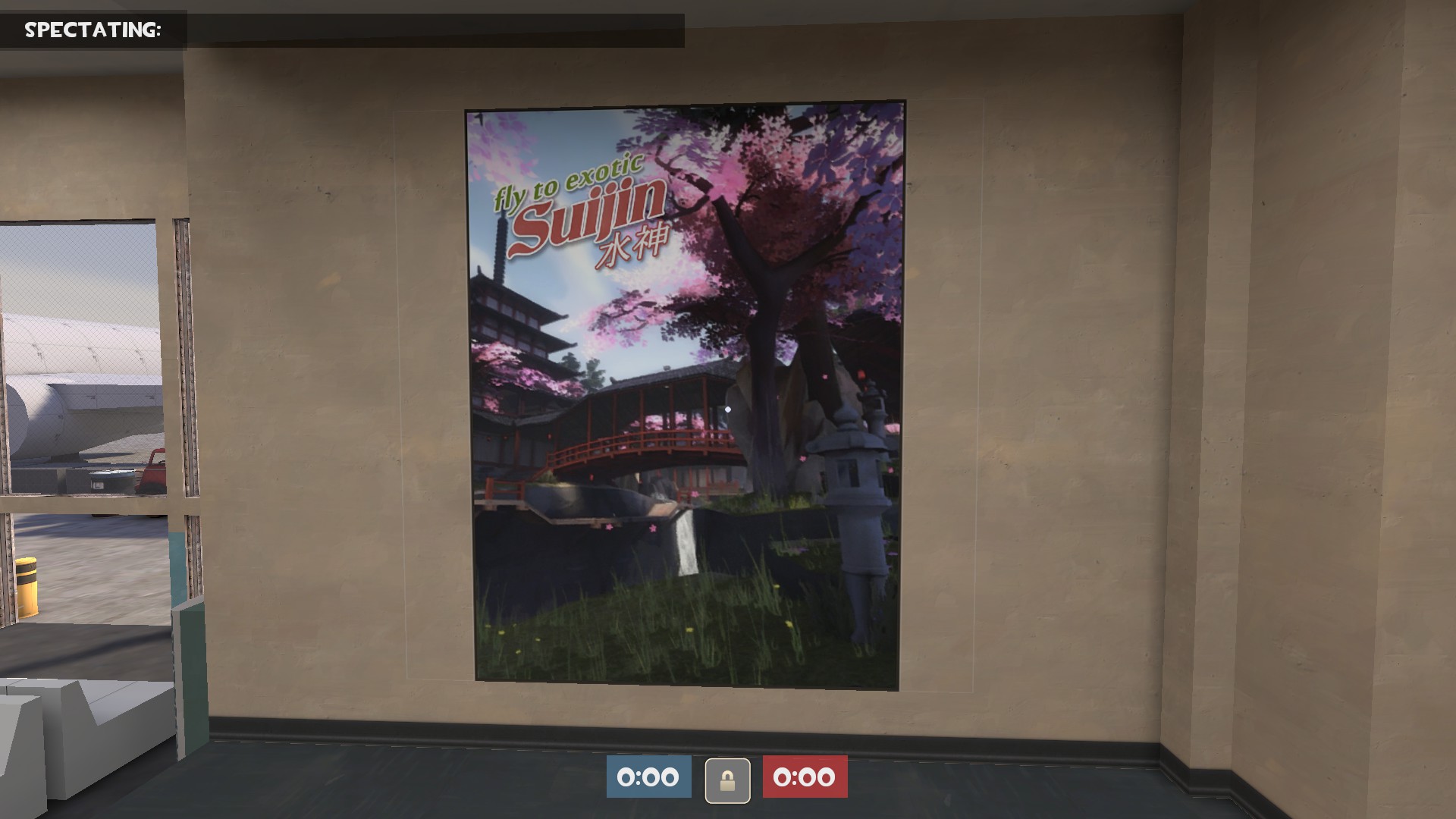
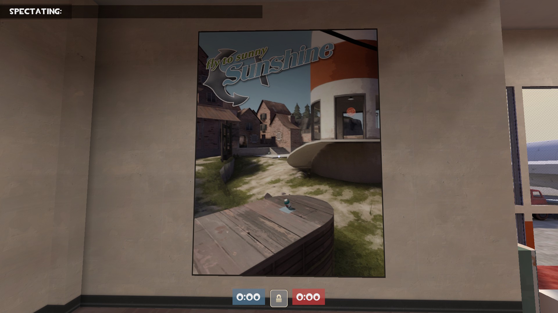
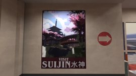
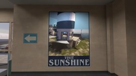
I like the idea, but I think it could be improved by making the posters more simple. There's a lot for the eye to look at in those pictures.
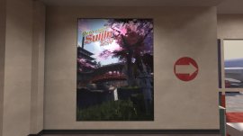
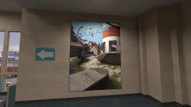
I took some time tonight to research 60s travelling posters and made some alternate versions. Not sure which ones I like better so I'd love some second opinions.

OLD VERSIONS
2015-12-11_00004.jpg 2015-12-11_00003.jpg

NEW VERSIONS
2015-12-11_00006.jpg 2015-12-11_00005.jpg
 

theatreTECHIE

Yet another Techie for the net...
aa
Jun 19, 2015
455
458
I took some time tonight to research 60s travelling posters and made some alternate versions. Not sure which ones I like better so I'd love some second opinions.

OLD VERSIONS
-snip-

NEW VERSIONS
-snip-

The new one definitely look better, as they are also have a stronger focal point in the pictures
 

Vel0city

func_fish
aa
Dec 6, 2014
1,947
1,589
I took some time tonight to research 60s travelling posters and made some alternate versions. Not sure which ones I like better so I'd love some second opinions.

OLD VERSIONS
2015-12-11_00004.jpg 2015-12-11_00003.jpg

NEW VERSIONS
2015-12-11_00006.jpg 2015-12-11_00005.jpg
I'm gonna go with the 2nd ones.
 

TyeZenneth

L6: Sharp Member
May 31, 2014
340
294
The new ones are better, but getting actual art for it would be ideal.
I can see why you wouldn't want to spend the time getting or doing that, though.
 

Bunbun

aa
May 18, 2014
401
782
Meanwhile in the waiting room for delayed flights....
k9W5Ixb.jpg

oqanwXe.jpg

NJ7OZTr.jpg

Not sure if the handles would effect the gameplay.