Microcontest #21: 1024/512

Buic

Dragon Hugger
Jul 8, 2016
36
25

Time limits are certainly not my strong suit...

That and I only remembered this was happening 4 or so hours before I needed to be asleep lol.
 

Conga Lyne

L2: Junior Member
Sep 2, 2017
65
48

Not my proudest work, but a very proud lesson learnt not to underestimate verticality.

Bonus Stamp achieved
I'm sorry for anyone who has to play through this.
 

DrSquishy

we've all had better times to die
aa
Feb 10, 2017
1,329
989
 

pont

rawr
aa
Mar 15, 2018
346
523
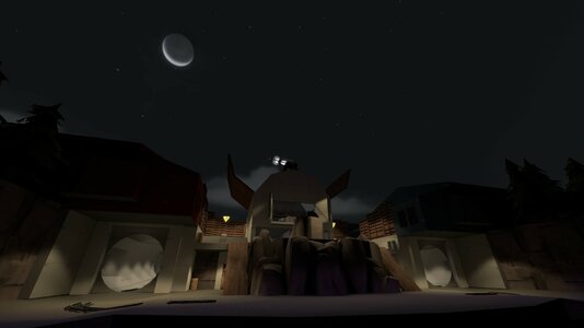
bwomp https://tf2maps.net/downloads/pont-mc21.12937/

20220501134003_1.jpg
 
Last edited:

14bit

L14: Bit Member
aa
Oct 5, 2014
661
2,121
Time is up, and the thread has been temporarily locked while I collect the maps. If you are still compiling as this is posted, you are safe; just let me know on Discord and post back here when it's unlocked.

The thread has been unlocked, these users past this point are cleared for entry:
  • DoctorDoomtrain64
 
Last edited:

DoctorDoomtrain64

func_witch
Server Staff
Nov 26, 2012
132
160
A Payload map set in a rainy Urban City w/ a split Payload path!
 

14bit

L14: Bit Member
aa
Oct 5, 2014
661
2,121
this is my first microcontest and i want to die
Captial letters in map file names can break servers, please recompile with lowercase letters and a new version string so we can test this without the server breaking!
 

14bit

L14: Bit Member
aa
Oct 5, 2014
661
2,121
Wow, you were all very excited for a new season! We shattered our previous record of 28 maps (MC4) with an astounding 33 maps, which had to be played over three testing sessions. Incredible! Without further ado, here's the feedback!

@Sarexicus
Very difficult to cross mid, since it's the only real defensible place on the map; instead of fights happening around the flags, everyone just piles into one or two hallways. The use of the distance is neat, seeing the "grid" of intelligence is fun, but having so much of it being underwater isn't terribly fun. This is compounded by the fact that the main path out of the water is directly in the center of the enemy's base where you have height disadvantage and it makes going for the flag harder than I feel it should be.

@Harve_Gaming
This map is unnecessarily maze-like; the outing to mid is just a bunch of cramped hallways that feel like they just shuttle you to mid without letting you make any choices as to how you approach the point. I'd open things up, maybe by removing the first of the two buildings you pass through on the way to mid, the expand the one touching mid? The first building doesn't do anything but add unnecessary complexity in my mind. The lower point unfortunately feels like an afterthought rather than being something the map was designed around. It's too low compared to the surrounding areas to be able to be held at all. I'd expand the underground with more routes, more space, lower the surrounding areas, raise the point, or some mixture of those things to make it feel like it belongs. Stacked KotH is a neat idea and a decent use of the distance requirement, but it's too disconnected to feel good in this instance.

@Ian Sanok
Simple but it works! Very Quake Team Fortress feeling. It seems like it needs just a little something more though, since at the moment it's just both teams pushing head on until one breaks. The easy solution is adding another route in the water, since at the moment it's just kind of there without doing much for the map, but then you've just made 2fort again. Maybe try two bridges across mid? It's so simple I genuinely don't know what I'd do with it. The use of the distance is good.

@Le Codex
I want to love this, but having the tracks pass directly in front of spawn without any way to help them pass leads to long matches where both of the carts stall. I'd take a look at Orbit, 14bit MC8, and Snowthistle to see how they deal with it. All three use rollforwards in conjunction with buffer zones between spawns and the track to make sure that teams can push through. Honestly I don't think you need to change much to get it to play okay, just replace the forward exit with a window and move it to the side of the building, maybe with a route that connects the lower part of mid and the track in front of spawn. If that's still not enough, throw a rollforwards on the track near the right spawn exit to clear that out too. Great use of the distance requirement; I love the track layout and it's fun when the carts are moving.

@Squaggies
I love the paint meter! The logic is impressive, but I don't think this is the right layout for this mode. There is no way to coordinate and/or make a push since the layout is so free-form. The last one worked since there were defined areas (the upper zones, and the lower zone, with others between) but here there's no real way to defend at point. Sure, strategies developed over the course of the round, but it felt like the whole time we were fighting the map. I think a simpler, less-multileveled approach would work better. Besides that, the elevators are fun! The use of the required distances was very impressive and creative too; flipping the control points to have the triggers below is so creative I can't get mad at it and claim it to be invalid. Well played!

@Rhamkin
Sadly, it seems the logic was broken since Blue can't cap. Very fast and chaotic, which might have been what you were going for, but I'm not personally a fan. The grapple hooks make everything feel closer and let teams meet much faster than in other modes, which I don't think improves Arena mode. It's so fast none of the interesting stuff that happens in arena happens, like teams rotating past each other, ubers building and getting dropped, or desperate last-minute plays to capture. The geometry that is there is fun and works well with the grapple hooks, I just wish there was more map to explore. I do like how the points are positioned though, they use the distance well.

@Mâché
I don't know how this works but it does? Sort of? Looking at the layout it looks like it shouldn't work in my mind, but then it does, mostly. So well done at making something that feels new! I think it's because the map is really wide but short, which isn't a common design for A/D in TF2. The good places to defend aren't obvious, which makes both attacking and defending more difficult that it probably should be; lots of hiding on that ramp to the side of first. Final is weird to defend, since attackers can come from behind/underneath you so you kind of just have to defend from the center of the room in a way that makes you feel very exposed. It's frantic and interesting, but I'd have to play it more to tell if I was enjoying it. The brushwork is really solid, and you did a good job of making the distance between the points feel much larger than it is.

@Tiftid
This is very strange, and I don't think I'm a fan of either stage. Neither of the layouts really work, and it's unclear what is happening most of the time. On the CTF stage the routes don't really flow well, and it seems that the map wants you to make weird jumps to get around in a lot of places. Terrifyingly maze-like, no clear points of contact between teams for fights to happen at, and way too easy to cheese a capture with the jetpack. The distance is used well though; the flag do feel quite far apart. The CTF stage is the better of the two, I think. I don't like the CP stage at all. U-shaped symmetrical maps are hard to get right, usually relying on stacked routes to provide enough options for each team, but here it's very flat and there's a single choke point. There's so much space around the edges, but it just goes unused. The beeping is annoying; while I understand it's a workaround since you can't visually show capture progress with the CTF HUD up, I think it's a deal-breaker and you should just split these into different maps or cut one entirely if you continue. I don't think this distance is used well on this stage; they capture points are close but the map struggles to deal with it.

@Aulli
Really neat idea, one of the highlights in my eyes! Shame it's quite bugged; the intel drops randomly a lot. I like this layout, it's got a nice mix of spaces to play in and around, with enough routes to slip in and out of the fight as needed. I'm struggling to come up with things to say since the gameplay twist is so unique. I'd need to play it more to figure out what does and doesn't work; during the test I was distracted with the intel-dropping bug, though I was still having a lot of fun despite the issues. You've used the required distance incredibly well, and built something unique around it. Well done!

@chibby
Very pretty! It just needs something... more. There's not much going on, no real interesting decisions to make or routes to push. It's perfectly functional, decently balanced, and looks nice; unfortunately it's just not a terribly interesting game mode, and doesn't do anything new with it. Maybe a good base for a TC map, or see how it plays as 2cp Arena? Perhaps even Invade CTF with a capture time on the drop site? (I don't think I've ever seen that last one, or even know if it's possible) I'd love to see this with a bit more visual variety or different lighting; at the moment it's very samey even if it looks good. It's fun, it just needs some kind of spark that is missing.

@14bit
Once again, I've made a terrible mistake by making something I'm happy with, adding another map to the never-ending list. Most of the spaces work well, though perhaps opening the door for some kind of overtime after too long of a stalemate might be needed; it may be too easy to camp the points as it stands. One or two small health packs per side might be needed as well, though I'm not sure where I'd put them. The shacks at the sides might need to be reworked to be a stronger way to push the enemy point, not sure. I feel like I used the distance well.

@halfcircle
The first point is neat, and clears off nicely for Red to fall back and defend (sometimes), but I'm not sure about final. I love the combat space behind A, and I wish it saw more use. With how final is positioned it doesn't get fully used since the best route is to stick to the inside edge, which just turns into an absolute meat grinder. I think it's mostly the height difference doing it; the map dips down so that both teams have height over the same route and neither team can gain ground. If the outer route was more viable this could work, but as it stands that is a bit too far out of the way to be useful. I think it's neat how you used height to add length to the map while keeping within the distance requirements for the point, though you might have leaned into it a bit hard.

@Tang
I wasn't a huge fan of this, but I'm 90% sure that I'm in the minority here. To me it's alright, if a bit short, with a really uninteresting final choke. Everyone else else was raving about how much fun it was, but I didn't care for it myself, so I'm not sure what kind of feedback to give for it. The most important thing I've learned through mapping is what voices to listen to when receiving feedback about something; which voices to act on and which to ignore. For you and this map, I very well might be one of those voices you need to ignore. Keep that in mind. I'm not I'm not a fan of how the carts don't interact much for the first half; I like to fight over the carts in PLR but here you don't get that until the second half, and even then it's in a killer choke. The angles around the map are fun. The vertical distance between objectives is used well, well done! I am sad that the two sets of objectives aren't 1024/512hu apart, though I understand this was a loophole in the way I wrote the rules so it gets a pass as valid.

@MegapiemanPHD
Fullbright in LDR for a1, and totally fullbright in a1a. The logic was partially broken in the version we played a few rounds, but it played alright in the few rounds we did do! Winning via capture ended the whole match instead of counting as a won round, at times teams couldn't capture one of the points, and Blu even kept a point between rounds in one of the matches. Overall the layout seems fun, though there's not much of a reason to enter the building across the bridge from A. Maybe some health in there to make it a strategic point to hold? Also, almost all the fights took place in the hallways connecting the points, which are sadly not interesting to fight in but are the best way to rotate. I'm not sure how you'd fix that other than trying it with those blocked up, but then it might be too hard to rotate. I personally don't like the Lumberyard ghost system; I much prefer to spectate my teammates when I'm dead instead of having the responsibility of having to track down and follow my them, but that's a personal gripe and not an issue with the map. Additionally, I'm not actually sure that this counts as a valid entry; it appears that the distance between the centers of the control point props are roughly 1037hu apart (approximated by using getpos and a calculator), which is neither 1024 nor 512. If I am correct that the distance is invalid, I suspect this is because the two points are not at the same height and you were only measuring distance from above instead of the true, diagonal, linear distance 0between the centers of the control point props.

@everyone back to the base
Unfortunately way too small and campable. There's almost no map here to talk about. Each team has one lowground spawn exit that is extremely campbable, and teams can just rotate past each other at what could charitably be called mid. There are two options: take the flank and get free highground, or go mid which has no cover. Either way it devolves into spawn camping as the most viable strategy. I appreciate the attempt to do a CTF with the flags so close together, but the rest of the map needs to be much larger to account for that, which you haven't done.

@Thetriztheexistentialneko
I kind of like this, it's neat. It's fun, but a bit awkward and has some issues. Defense at A crumbles almost instantly; I think this is because you give Blu easy access to highground over most of the cart path, instead of making that highground be able to be held by Red. Moving that ramp at the start to the other side of the initial highground might be enough to solve it, or you might need to rework that highground to be disconnected from the upper floor in the next building so Red can hold there after the initial highground falls. B seems the weakest, just because there's not much going on and neither attack nor defense gets to do anything interesting; the only flank goes past the point, making it strange to both attack and defend. Point 3 reminds me of that one bit from upward with the switchback over the edge of the cliff. The flanks on final seem too far apart, maybe? It worked in the end, but Blu really had to commit to splitting the team to make progress up until the one-way door. Finally, I am slightly worried this may not be a valid entry; it appears to the naked eye that the distances between the checkpoints might not be quite right, or if they are it is very hard to tell due to the fact that they're all at different levels and not lined up cleanly on a grid. Doing some quick approximations with getpos and a calculator I've gotten a lot of stuff that's close to 1024/512 but not quite. My main concern is the distance between A and B, my numbers show it's about 20hu off. I'd love to see the skip brushes in hammer sometime to make sure they're right.

@norfolk
I love the idea and theming but the execution falls flat due to layout issues, mainly the single choke point. The geometry is really clean and impressive; zooming out in spectator and realizing the road up top was actual playspace and fully on an angle blew my mind. Collecting and delivering cows is very fun, but there's not much to do on defense; having at least one pickup zone that is easier to defend could be really fun and allow for a bit more flexibility in how you play. Do you just defend the drop site? Do you defend the pickup zones? Do you try to split and do both? Do you shift strategies as the cows are delivered and/or sent back to the pickup spots? I think these would be interesting questions to explore. While you used the distance requirements well for the initial version, I think you might have to break from them to effectively explore those ideas moving forwards.

@KKBig
Heads up, please don't use capital letters in map file names, they can break servers!I don't think I've every played 2-flag Invade CTF before, and it's kind of fun. Unfortunately, you've made a rather uninteresting layout that has the classic "U-bend" issue, where all the routes for both teams meet in exactly one choke point where the map turns. I'd recommend using height to solve this with an underground, alternate route or equivalent so that teams have more space to fight in and through. The best way to reach the dropsites is to stick to the outer edge it seems, as there's no cover to rely on when running down the main route; sadly you are forced to cross that zone of no cover, making it hard to push. You made pretty good use of the distance requirement, you just fell into the trap that most other 180 or 90-degree turn maps make; the turn is too tight of a choke.

@SuperLuxDeluxe
I like this a lot, but it's got a few problems. The intel rooms are really neat, but the doors are a disaster for both attackers and defenders. If someone so much as taps the flag and dies, attackers are locked out for almost a minute while the flag resets. Yeah there's other routes, but at that point what's the point of the doors? Yes, it's to stop jumping classes from having an easy exit and force them to mid, but I feel there's gotta be a more elegant solution. I don't feel like the height differences are spread out enough, specifically on the non-main-spawn side (there seems to be a spawn on both sides, so ???) with the tall ramps; pushing up from lower mid into that is a nightmare since you can't see what's above. I'd step that whole lobby over a few elevation changes so you can actually push up through there. The trains can push you into walls without killing you. The playerclip ramps on the tracks are very annoying and confusing; please just remove them and add proper ramps to in the geo just off the tracks or raise the trains so you don't notice them as much. Really great use of the distance requirement, well done!

@Buic
It took me a very long time to figure out what was going on; I think it would probably be better to spawn the flag in front of the team, not on a player, with some indicator that you should pick it up. Maybe a training popup telling you to deliver the flag? I understand you had to put the flag where you did for the distance requirements, but I'm not sure on it. When it works it's pretty fun, but adding a second flag doesn't fix the Invade CTF Arena problem of turtling always being the best option. While it's not an issue when everyone has fully bought into playing a round out and trying hard, you can't guarantee that and someday it's bound to stalemate. I don't have a solution for you, but it's something to think about. In terms of layout, it feels weirdly cramped and boxy; I think it might be the high walls just making it feel that way though. There's a very clear "you attack on this side and defend on this side" that makes rounds feel a bit samey after a while. The tunnel route helps break this up, but I feel some kind of change to the upper mid could help here. Pretty interesting use of the distance, neat!

@Conga Lyne
It's no secret I don't like SD, so take all this with a grain of salt. That being said, this is one of the better microcontest SD maps I've seen. Get rid of that fence in the spawn courtyard and put the Australium and Rocket signs outside of spawn and this'll be be instantly significantly easier to navigate. The routing is very tight in a lot of places, which makes them difficult to fight in, most notably around the Australium drop site. I'd love to see more than one viable route to enter the Australium fight at the start of the rounds. It's also got the classic SD issue of "you can mostly just stick to your side when carrying the Australium to the rocket". I'd close up the vent routes and just push all the routes to the central one. Neat use of the distance, and I really think it's creative that you made the lift go to the side instead of up to reach the next objective.

@DrSquishy
Incredibly impressive! I'm having a hard time wrapping my head around the layout and what works and what doesn't, but it's fun. After a while it starts to click, but steps could be taken to make that happen faster, like more signage and more obvious routing. The first point caps way, way too fast. Overall, I think it needs more space to breath, all the stairwells are too cramped and I feel that the main path could swing out from and back towards the central column more to help. The big ramp past the shutter is a great example of that. Not sure how you'll do it with the next section up the tower without breaking the shape of the dam though. Incredibly impressive use of the distance restrictions, great work!

@pont
An interesting conversation piece, but I don't think it really works, like, at all. One player, at all times, has to sacrifice being able to have fun in order to stand on the enemy cart. I'm pretty sure I won a few rounds for my team just standing pretty much AFK at the cart while it sat at the start. The enemy team couldn't attack me, since they were all trying to stand on our cart or risk losing, and my team won the opening fight and were all piled on the cart. In the cases where I did have to attack and successfully cleared enemies off the cart, the reward for that is that you get to just stand there, alone; if you leave to go refill your health the cart starts moving. In nomal PLR you can leave and come back, but here you can't and it just isn't interesting or fun. Half the game is babysitting, and the other half is spawncamping to ensure your cart keeps moving; the regular distraction of "oh shit, someone snuck out and is pushing their cart, fall back" doesn't apply since there's always someone watching the cart. Layout-wise, this can probably be reworked into a decent normal PLR with some track retooling. Your use of the distance requirement is alright, considering you did two sets that are 1024hu without the sets themselves being 1024/512 apart. Bit of a shame, but a perfectly legal and valid loophole.

@Sonoma
Incredible. I don't even know where to begin here, other than apparently you fucked up and used a wood texture from 2011/Upward somewhere in the map, according to my friend who was watching. I'd love to give actual layout feedback, but it was a roll every time; on defense we could never stop the cart, and every time I was on attack we never got past the second checkpoint, despite team scrambles. Was I the reason we lost? Am I just bad at the game? Jokes aside, the jokes are great and this feels like a classic April Fools map. The soundscape stuff gave me a headache after a while, so maybe tone it back a little if possible, or after a certain checkpoint, or only after the round starts and between rounds set things back to normal for a bit of a break if possible. I'm very curious as to whether the distances between points are valid; they seem right but since there's a few height differences between the points I worry you may have measured just one axis and not linearly between two points. The one I was most iffy on I did approximate with getpos and a calculator and it was close enough to probably be right, so I'll give it a pass.

@scrly
I like the verticallity here, it's really fun to fight on and around. There's plenty of space, but it doesn't feel overscaled. I love the areas behind the large silos in particular; I love when maps have functional dead space like that. I wish there was a bit more ammo and smaller cover in some places. Additionally, it's very easy to get bombed while capping one of the side points if you don't own mid. Not sure how you'd be able to solve that without getting rid of the height though. In general, I really like this! Unfortunately, I fear this may be an invalid entry; the linear distance between the the centers the upper control point prop and the centers of the lower ones (where the distance is supposed to be measured from for control points) is roughly 1145hu (approximated by using getpos and a calculator), which is neither 1024 nor 512. If I am correct that the distance is invalid, I suspect this is because you've measured from the edges of the triggers. I'd love to see the skip brushes to prove me wrong, however!

@Isbjorn52
Pretty solid base for a simple A/D map! A bit small; could have used a bit more distance between A and B, maybe by swinging the map out wider or something if you want to keep the distance requirement in play. As it stands Red can very easily retake the area around A after it is capped since there's nowhere to really set up at B and A is so close. Because of this, fighting really only took place at A, meaning there's not much to say on the rest of the map. Now that the microcontest is over, I'd consider moving the points farther apart rather than keeping it though.

@onra77
Interesting idea, but weird execution. I'm not a big fan of how this plays; it's got the big issue that a lot of SD has in that the moment you grab the flag you can just stick to your side until you reach the drop site, but the instant-cap nature of the point just compounds it. As a scout with the flag you can hide on your side, and then just double jump to the platform and instant-cap as it moves by. Watch the demo; I won one of the rounds by doing that. It's no secret I don't like SD, but one of the more interesting parts is the hold at the end, and with instant-cap that part of the mode never happens. Having to wait at the bottom sort of fulfills that role, but something about the movement of the platform being disconnected from the objective being on a point feels... wrong. If there was a zone that standing on made the platform move out from the waterfall I think it would work better. Creative use of the distance requirement, though!

@Paper Shadow
I like this idea a lot! But it needs tweaking to be easier to understand. I'd use the timer to show when red is going to get points, like how the timer is used in Snowplow to show when the next trap is going to smash the train. If possible, I'd also see if you can keep/re-add the Asteroid overtime system as well, so Blu can steal back for a short bit after Red's bar fills, or if it fills while Blu is holding the core the game doesn't instantly end. There were a lot of people in the test saying to just put red on a timer instead of giving them points over time, and I think that is a terrible idea and completely ruins the entire idea of Red trying to fill a bar and Blu trying to drain it. Really not sure what to say on the layout itself; it seems to work fine for now though Red spawn is underwhelming and the road is really bumpy and wavy. Incredibly cool use of this distance requirement, I love the window!

@Kiglirs
I get passionate about bad PD, and even more passionate about middling PD. This is middling at best. For the sake of both of our sanities I will refrain from going on a 19 page teardown of what does and doesn't work like I did last time I encountered an aggressively middling PD map, and just do the basics. The two main combat spaces are... not actually combat spaces. There's two points surrounded by a mess of hallways, meaning far to much fighting happens in those hallways instead of in interesting places for fighting to happen. PD is the closest thing to Deathmatch that TF2 has, so you need to throw people into arenas that are fun to DM in to get the most out of the mode. On top of that issue, the routing isn't great and lacking signage, which makes it so the areas don't flow well and makes it hard to rotate between the points. It's playable, and works, but PD can be so much more when done better than "okay" and this is just "okay" at the moment. Alright use of the distance requirement, nothing special.

@Will Alfred
This works far better than I expected it to, though I still don't fully understand how the timers work. If I played it again I would probably pick it back up, but in this moment a few days after the test I can't remember. As interesting as the idea in the map are, it commits the cardinal sin of TF2 mapping: this map bores me. It's way too hard to start your timer once the other team has started theirs, and with a single spawn exit and little cover across the map it's just not fun to push. Even when winning it feels like there's no urgency at all to hold things. The train is really interesting and adds some fun, but the combat spaces are too large and lacking in cover and variation to save it. Decent use of the distance requirement.

@Hadull
I'll be honest right off the bat; this doesn't work at all but there's something in here that might. It's just way, way too big. Run time as Pyro from Final to Second is 14.5 seconds, and Second to Mid is 17. For context, those same run times for Pyro on Granary are 8.6 and 12.4, respectively. Basically, the routing between points is too complex and there's just too much map. The distances between the points themselves are fine, it's just the stuff between. Just start cutting and simplifying until it's half the current size. The general structure is neat, and I like how the points use the distance requirement.

@DoctorDoomtrain64
This does not work well, though you probably noticed that in the test. Both spawns are just too close to the combat spaces and the height isn't used well. Both spawns are very campable. I think this track layout could work, or at least something similar, but you'll need to do something drastic, like pulling the spawns back and raising them both up to the middle point between the highest and lowest track bits. Overall it's pretty simple which is both good and bad; the flaws are glaring but so are the interesting bits. The use of distance is neat, but the surrounding map doesn't play nicely with it.

@Ismaciodismorphus
I'd like to preface this by saying that I've not played MvM since your last microcontest entry, and that in general I'm not terribly good at it. In the future I'd recommend leaning on the easier side for Microcontest entries, since I know very little about MvM wave design and can't offer much feedback in that area. That being said, the waves have some issues this time around, considering we tried for about a half hour on the first wave before giving up due to the server crashing. The soldiers in combination with the large heavies were a nightmare that we just barely scraped by, and a crash right after soured the mood and we bailed. I wish we could have played more to see both bomb pits in action, but I don't think we'd survive the tanks in the first wave if the heavies gave us that much trouble. In terms of the layout it's pretty neat. I like the park, though I'm concerned about the other potential bot entrance we initially set up at; it's very close to one of the pits and there's not really anywhere to hold from since it's so high up. It's very hard to cross from one side to the other once you're at ground level. In fact, it's very hard to rotate anywhere at all. Additionally, I fear this may be an invalid entry; while both bomb pits appear to be 1024hu apart, the bomb(s) themselves don't appear to start 1024/512hu apart from each other or either of the pits. All map objectives were required to meet the distance requirements, so I'm afraid your map may be invalid.

Here's the mode breakdown:
Code:
CTF          5
KOTH         3
PLC          1
SPLAT        1
Arena        4
A/D          4
CTF+A/D      1
2CP          1
PLR          2
PL           3
COW          1
Invade CTF   1
MvM          1
SD           2
5CP          1
PD           1
A/D CTF+RD   1

Great work everyone, see you in microcontest 22!
 
Last edited: