WiP in WiP, post your screenshots!

Crowbar

aa
Dec 19, 2015
1,455
1,298
Well, the author said they liked the previous shadow position more, so rotating the map (and, obviously enough, remaking the light_env angles) is a way to leave it so while matching the sun on skybox, as is shifting the skybox for 90 degrees.
 

Erk

erk
aa
Aug 6, 2016
443
1,106
20161019201648_1.jpg
20161019201708_1.jpg


3 Stage Attack / Defend Hud looks super wierd in spectator.
upload_2016-10-19_18-25-20.png


This area that I highlighted looks a little flat, I think maybe adding some height variation to the outer edges could work as a flanking route for Blu.
 

Hipster_Duck

L2: Junior Member
Dec 20, 2015
99
71
Seriously? That's Snowplow stage 2.

The point area was inspired by mountainlab's first cp and the rest I just built up myself trying to work with instances (cause all my previous projects haven't had any interesting angles or geometry). Tbh I forgot Snowplow existed but now looking at it it is kinda similar with the route with the high-ground.
 

Hipster_Duck

L2: Junior Member
Dec 20, 2015
99
71
To be fair I was the one that suggested lowering the middle spawn exit, before it was level with the others I believe
Nah it was half the height of the highest one. Anyway, I like it the way it is for the moment so I'll see how it plays before making any major decisions.
 

Twist.vmf

L420: High Member
Jul 29, 2016
439
208
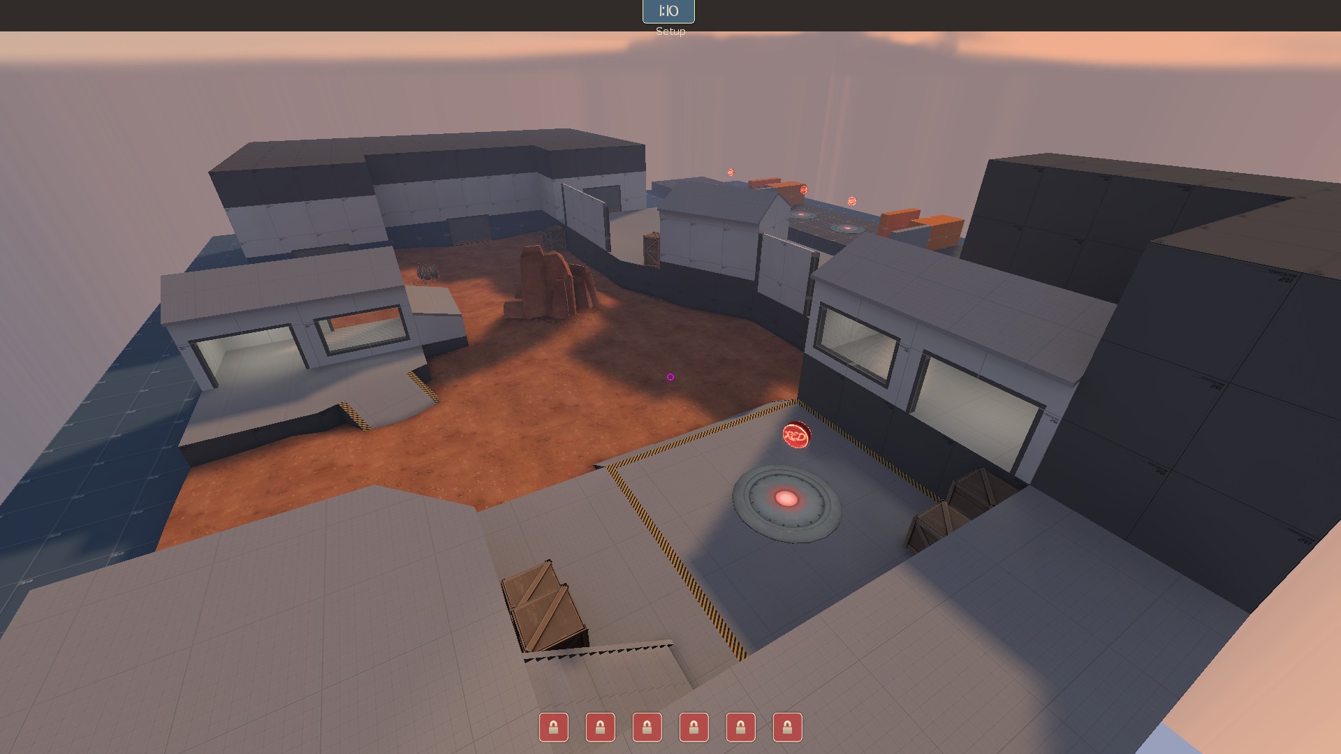
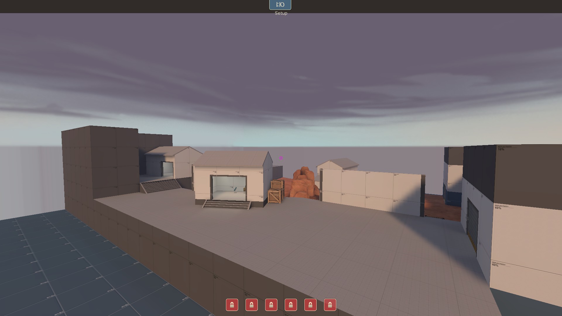
got inspired by a map and decided to make something new! hopefully my time in this site and in testing has prepared me to make a good map for once!
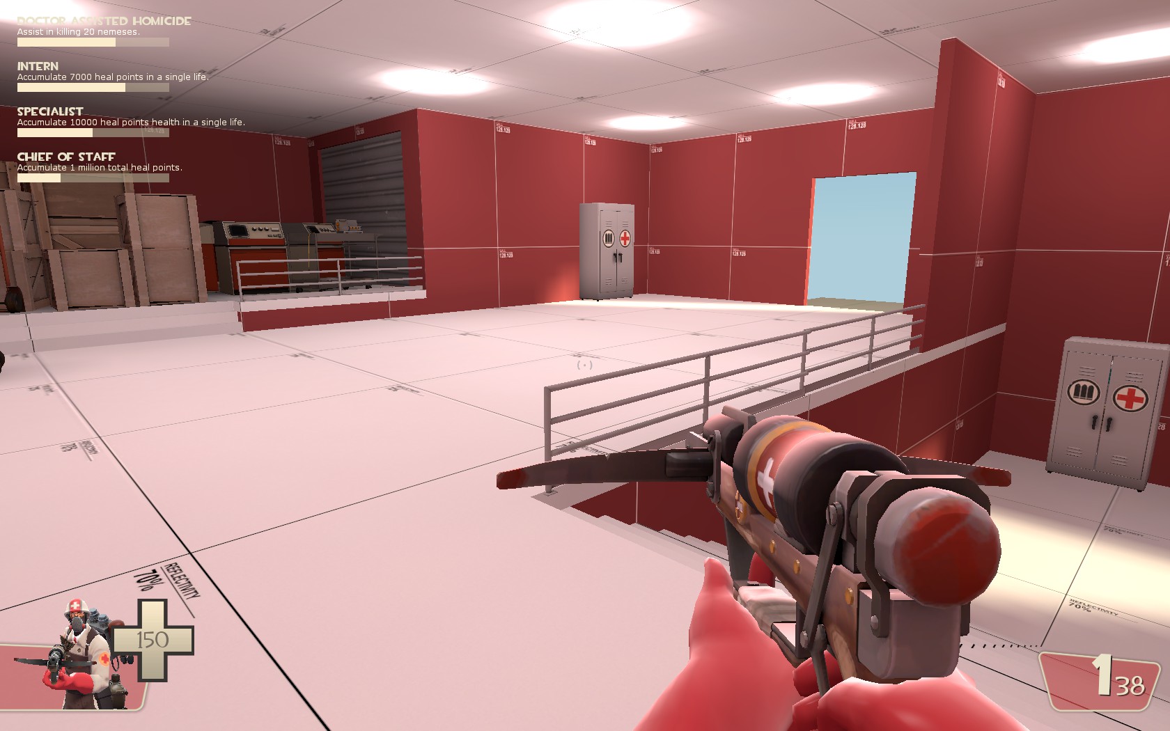
20161020230618_1.jpg


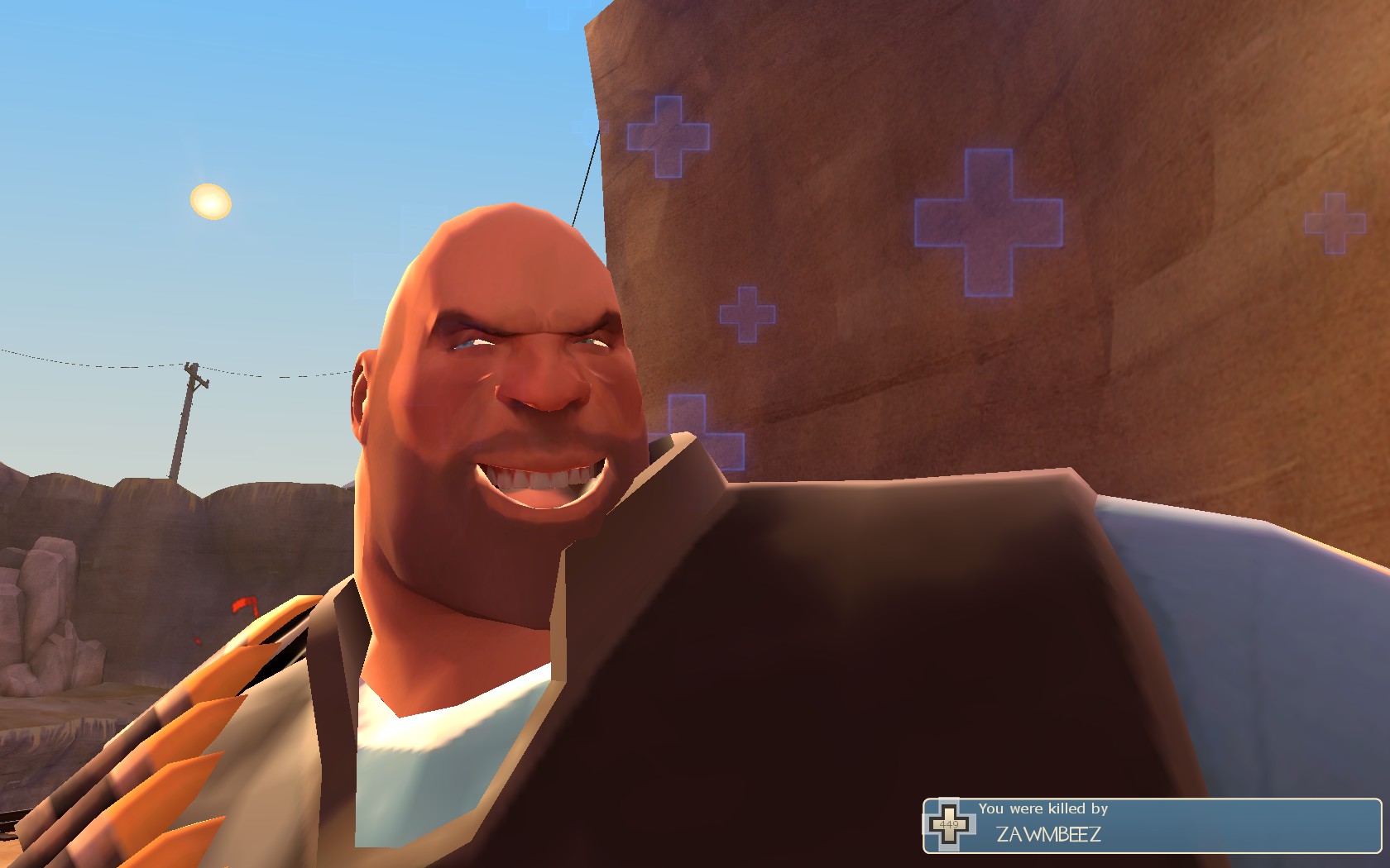
also look at this face!!!
20161019205712_1.jpg
 

Yrr

An Actual Deer
aa
Sep 20, 2015
1,317
2,759

Pocket

Half a Lambert is better than one.
aa
Nov 14, 2009
4,701
2,583
We6OamY.png


Gotta say, for a desperate last minute stab at a Minecraft skycard, this didn't turn out too bad. But there must have been a less ridiculous way to make it.
 

theatreTECHIE

Yet another Techie for the net...
aa
Jun 19, 2015
455
458
I need some suggestions on what I can do for this building, which at the moment looks quite bad:
20161022234158_1.jpg
20161022234203_1.jpg
20161022234209_1.jpg
20161022234217_1.jpg


And here's the surroundings for some context:
20161022234227_1.jpg

(Ignore the visual artifacts, this is much higher than players will be able to go normally - even with a rocket jump, so I'm not that worried about it)
There are a few things that I definitely want included in this structure:
  • The inside wall (closest to the observatory) needs to stay as high as it is to allow chaining rocket jumps off of it
  • There needs to be a wall and roof on the lower route to prevent pyros camping in the tunnel entrance and airblasting people off the cliff from there (I want it to be at least a bit safe)
  • Vision between the upper and lower route needs to remain as is
  • It should be obvious that you can't stand on top of the structure
Other than that, I don't really mind what happens with the structure. It just needs to look good and fit in place.
I have thought of using just walls instead of a structure, but I think that walls that tall would look weird. Any ideas are appreciated <3
 

Urban

aa
Jul 27, 2009
212
354
At the moment that shack/corridor serves no discernible purpose, how about turning it into a cable car house or something? Not much of it needs to be gameplay space for it to work and I think it will gel well with the surrounding cliffs. Gives you some detail to put in the skybox later down the line too.
 

theatreTECHIE

Yet another Techie for the net...
aa
Jun 19, 2015
455
458
At the moment that shack/corridor serves no discernible purpose, how about turning it into a cable car house or something? Not much of it needs to be gameplay space for it to work and I think it will gel well with the surrounding cliffs. Gives you some detail to put in the skybox later down the line too.
Hadn't thought of that, and it could work quite well. Now just to think of how to lay it out so that the walls can stay and not look strange.
 

Yrr

An Actual Deer
aa
Sep 20, 2015
1,317
2,759
you can extend into Out Of Bounds and just wall it off so you can't access the rest
 

Cytosolic

L5: Dapper Member
May 1, 2015
201
169
It looks weird that there's no foundation, it's just plopped on some grass right now. It's also odd how the building walls are flush with the cliff walls below. Like Yrr said you should extend it over the cliff a bit so you can add some shape to it.

EDIT: I'm going to reiterate my response to @theatreTECHIE in more detail. Having such a large building without a proper foundation looks odd, and breaks game illusion. Simply changing the floor material to concrete would do the trick. Like I, and many others, said extending the building over the cliff a bit would give you more space to work with and break up the monotony of the cliff face. In addition, the building is pretty flat. Adding a simple trim, more brush details, and trying to break up the boxy shape would go miles. Moving on to a more detailed level, the main thing to remember per building is purpose, which many others have said. It's not vital to have a clear purpose, just make it seem like everything you add has a reason to be there.
 
Last edited: