WiP in WiP, post your screenshots!

  • If you're asking a question make sure to set the thread type to be a question!

AsG_Alligator

qhull precision error
aa
Aug 5, 2016
595
1,191
Yeah, those cliffs originally were buildings. I'll work on them. I'll also have to switch these tree models out cause I dont like the way they get lit.

That texture sure looks better. I'll have to make a blend material for it though.

Unless I get lazy and just use craploads of overlays instead.
 
Last edited:

dryerlint

L5: Dapper Member
Mar 28, 2016
204
190
q5HkdER.png

Who wants to take a guess as to what I'm trying to make?
 

UKCS-Alias

Mann vs Machine... or... Mapper vs Meta?
aa
Sep 8, 2008
1,264
816
I would reinforce the wood a bit though. A thicker beam and some beams to balance the top would be a must to make it look plausible. But that wood can carry a concrete block isnt realy that weird. safe is other, but hey... its tf2. if it works then in many cases its fine.
 

AsG_Alligator

qhull precision error
aa
Aug 5, 2016
595
1,191
I know, its not final compile anyway, besides I'll use -StaticPropLighting for final build.

Speaking of static props:
x5BS1zb.png

Does this stuff even work? I tried playing around with it some time ago but it didnt work then.
 
Last edited:

Idolon

they/them
aa
Feb 7, 2008
2,105
6,106
Does this stuff even work? I tried playing around with it some time ago but it didnt work then.

You have to compile with vertex lighting (-staticproplighting in your vrad options) for prop lightmaps to show. While I think the feature works on all props, any props with shared UV space can turn out looking weird.
 

BenCo

L5: Dapper Member
Dec 30, 2015
242
135
So I released koth_isonzo_a1. I'm gonna Imp/Gameday it but before that any thoughts here?
BLU base:
20160818131256_1.jpg
Middle:
20160818131312_1.jpg
 

zahndah

professional letter
aa
Jul 4, 2015
721
642
I dont think the fact that your mid is so interchangable is a good thing, there isnt any highground above the point as the mid is just a flat plane with a mid building plastered on top.
 

UKCS-Alias

Mann vs Machine... or... Mapper vs Meta?
aa
Sep 8, 2008
1,264
816
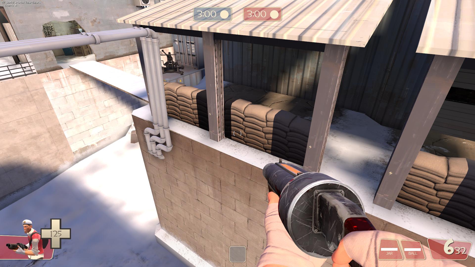
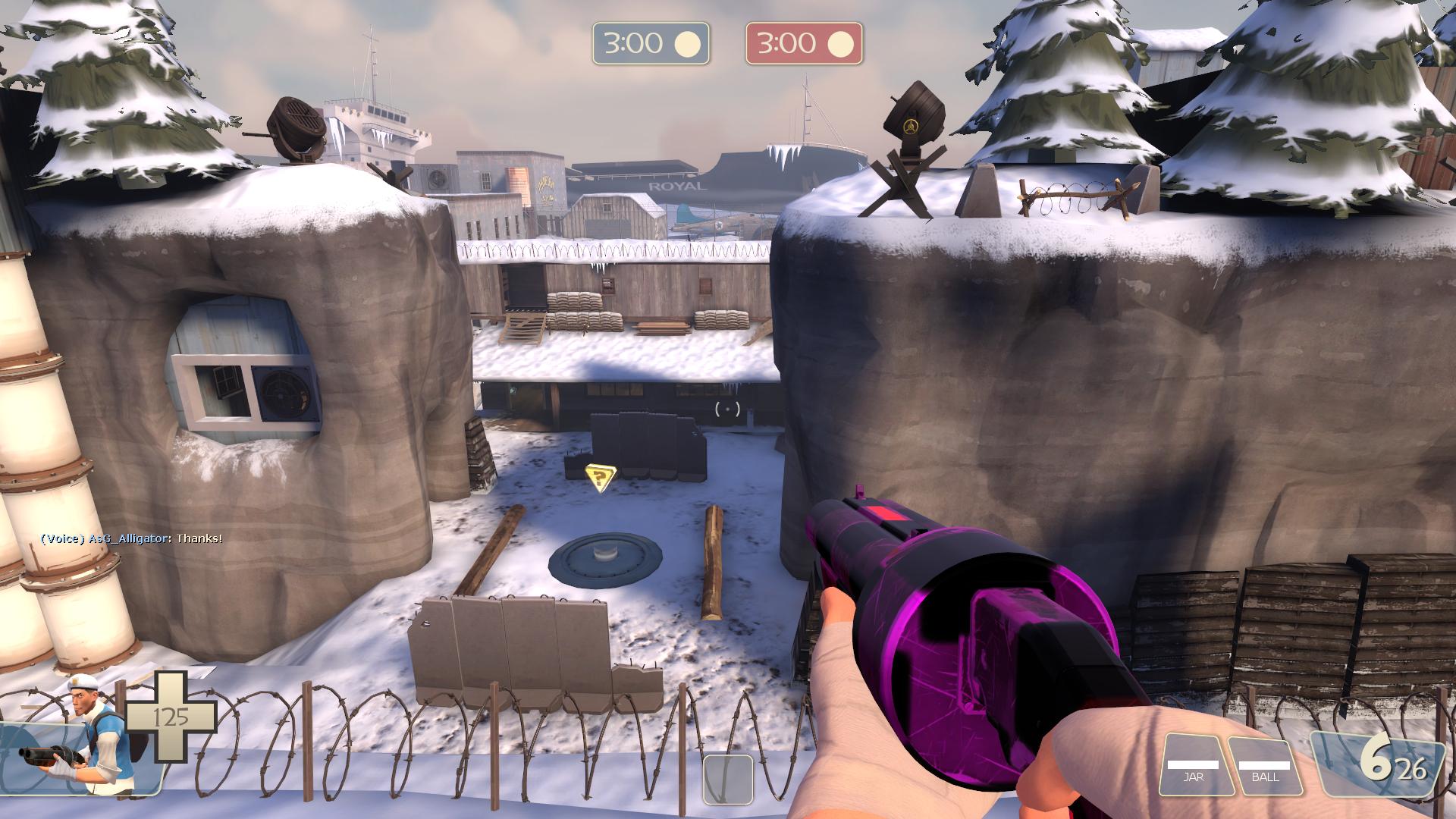
For a part zahndah is correct. if you can just dump every single random piece you make in such area, its not good. It means your center is too generic and effectively does the 'empty box' effect. But that you can interchange it can be fine if they realy change something. those 2 buildings you made do somewhat the same and a flat ground with 2 entrances on the same level is in many cases bad (look how even cp well allows some soldiers to rocket jump in - and that already is a capture point that is far from ideal).

You realy need to use height alot more. And instead of having a building you can rotate, try to build it in such a way rotating cant be done. That way each entrance to the point can remain unique. and this also makes you able to have higher areas connected to side areas.

Further, you made this mistake because of 1 reason: too early at detailing. You first need to know how the area plays well before trying to detail it all. at most some simple placeholder brushwork can be used to mark the detail. if it then doesnt work out, yuo can easily dump it and rethink the idea. Both of those 2 buildings in the current state sound like a waste of work to me as both dont fit well enough.
 

Uncuepa

aa
Oct 25, 2014
793
1,159
I dont think the fact that your mid is so interchangable is a good thing, there isnt any highground above the point as the mid is just a flat plane with a mid building plastered on top.

There are plenty of great maps that you have room to change the point. It's not so much that it is interchangeable as it is versatile. Each of those points plays differently and so each changes the dynamic. Without a good sense of the surrounding areas I could see where you're coming from but from early tests with Lain it has seemed fine.

Further, you made this mistake because of 1 reason: too early at detailing.

That's just how I map, take a look at the WIP I posted the other day where I experimented with themed brushwork. The detailing limit in this map right now is hedges for negative space, those few windows visible here and 4 trees. Saying this is detailed is an insult to detailing.
 

Another Bad Pun

In the shadows, he saw four eyes lit by fire
aa
Jan 15, 2011
801
1,844
B is the best option in context. C is literally nothing, and A has entrances that face the wrong way. It may as well be rigged in B's favor.
Ignoring the interchangeable bit, I think alias and zandah are correct saying that from your screens it looks like the point lacks depth or much height.
B is still the best though based off that one screen. You can't tell much from them.
 
Last edited: